Optimizing Your Accessibility User Experience in 2026

Sidharth Nayyar
Accessibility user experience isn't a niche feature. It's a universal design practice that improves usability for everyone, directly boosts conversions, reduces legal risk, and helps brands serve a $13T disability market.
Developers often still treat accessibility as a compliance task they'll get to after launch. That's backwards. In 2025, 96.3% of the top one million websites had at least one detectable WCAG accessibility failure, and the average homepage contained around 51 accessibility errors according to Tenet's accessibility statistics roundup. If almost every site is creating friction, accessibility becomes a competitive advantage the moment you take it seriously.
There's also a simple commercial reality. Accessibility problems don't sit in a legal spreadsheet. They show up in abandoned forms, confusing product pages, broken navigation paths, and checkout drop-off. The same decisions that help a screen reader user complete a task often help a distracted mobile shopper, a tired employee, or a non-native speaker finish the same flow faster.
What Is Accessibility UX Really
Accessibility UX is the practice of designing and building digital experiences that more people can successfully use, in more situations, with less friction. That includes people with permanent disabilities, temporary impairments, assistive technology needs, and people dealing with ordinary context problems like fatigue, glare, stress, or divided attention.
A lot of accessibility conversations start too narrowly. Teams ask which disability group they need to support. The better question is where the experience fails under real human conditions. Research summarized by Nimdzi on inclusive experiences notes that accessibility barriers often come from a misalignment between cognitive characteristics and product design, and that design choices like easy language, short paragraphs, and intuitive navigation help far more people than disability labels alone suggest.
Accessibility is usability under pressure
The curb cut is still the best analogy. It was created for wheelchair users, but parents with strollers, delivery workers, travelers with rolling luggage, and people recovering from injuries all benefit from it. Digital accessibility works the same way.
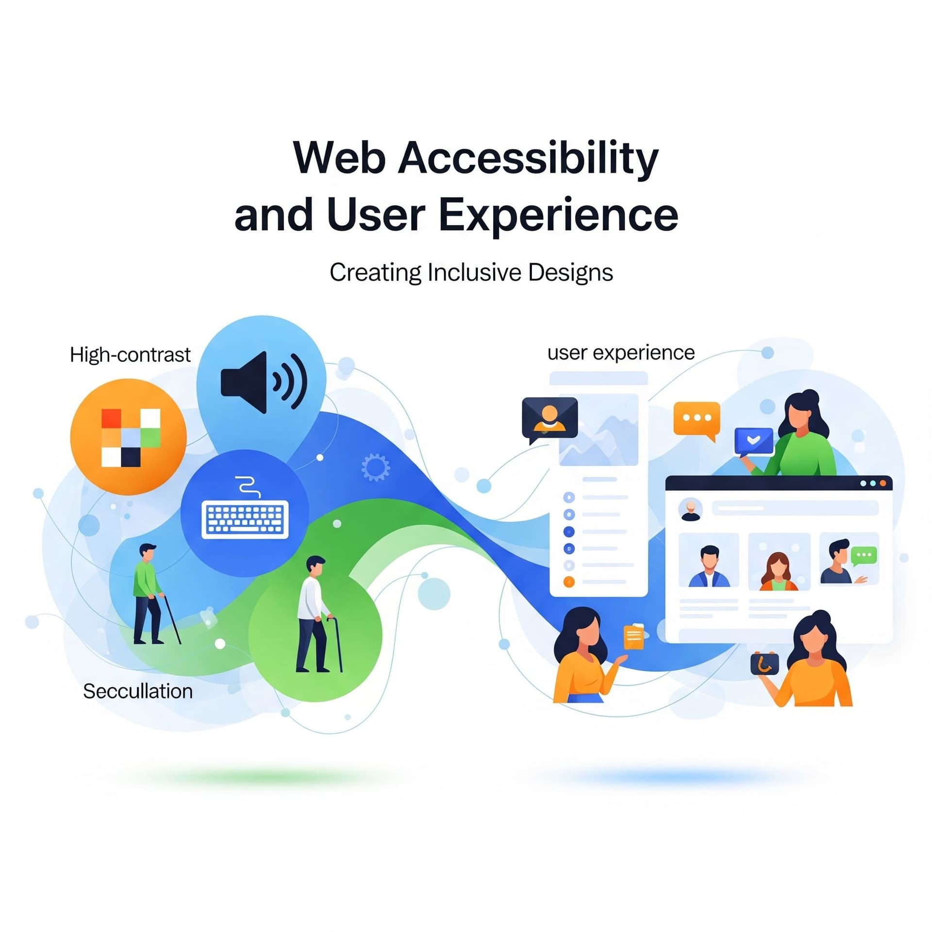
Clear labels help screen reader users. They also help everyone scanning quickly. Strong contrast helps low-vision users. It also helps someone checking your site outdoors on a bright phone screen. Keyboard support matters for users who can't use a mouse, but it also improves efficiency for power users and testers moving quickly through interfaces.
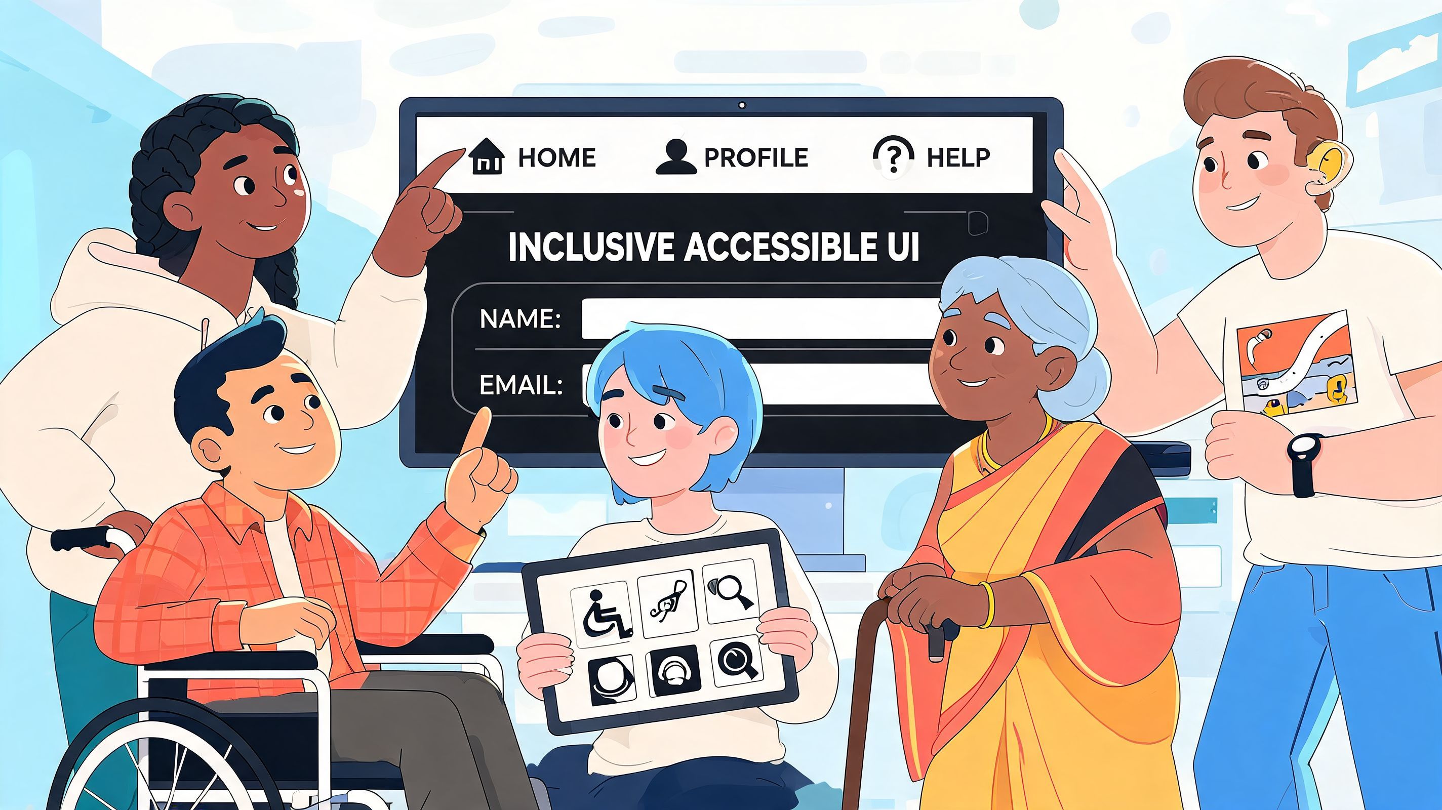
Accessibility user experience is what happens when a product still makes sense even when the user is tired, rushed, overloaded, or using assistive technology.
That's why accessibility shouldn't live only in QA or legal review. It belongs in product strategy, UX writing, design systems, front-end development, and CRO work.
Good accessibility lowers cognitive load
When teams think only in terms of technical compliance, they miss the design upside. Accessibility UX reduces the amount of work a user has to do to understand, move through, and complete a task. That matters on product listing pages, pricing pages, account forms, learning platforms, dashboards, and support journeys.
Practical examples include:
- Shorter copy blocks: Easier to process for users with dyslexia, fatigue, or limited attention.
- Predictable navigation: Easier for keyboard users and easier for anyone returning to the site after a break.
- Explicit button labels: Better for screen reader output and better for conversion-focused interfaces.
- Visible focus states: Essential for keyboard use and useful for QA and interaction clarity.
If your team needs the standards context behind these practices, start by learning how to understand WCAG and compliance. The point isn't to memorize rules. It's to connect those rules to the moments where users either continue or leave.
The Undeniable Business Case for Inclusive Experiences
Organizations that invest in accessibility report stronger UX, higher customer satisfaction, and better commercial performance. In the 2025 to 2026 State of Digital Accessibility Report, 91% of organizations reported improved user experience and 90% reported higher customer satisfaction after prioritizing accessibility. The same report cites a potential $100 return for every $1 invested in UX, which is why accessibility belongs in budget conversations about growth, not only compliance, according to Level Access.
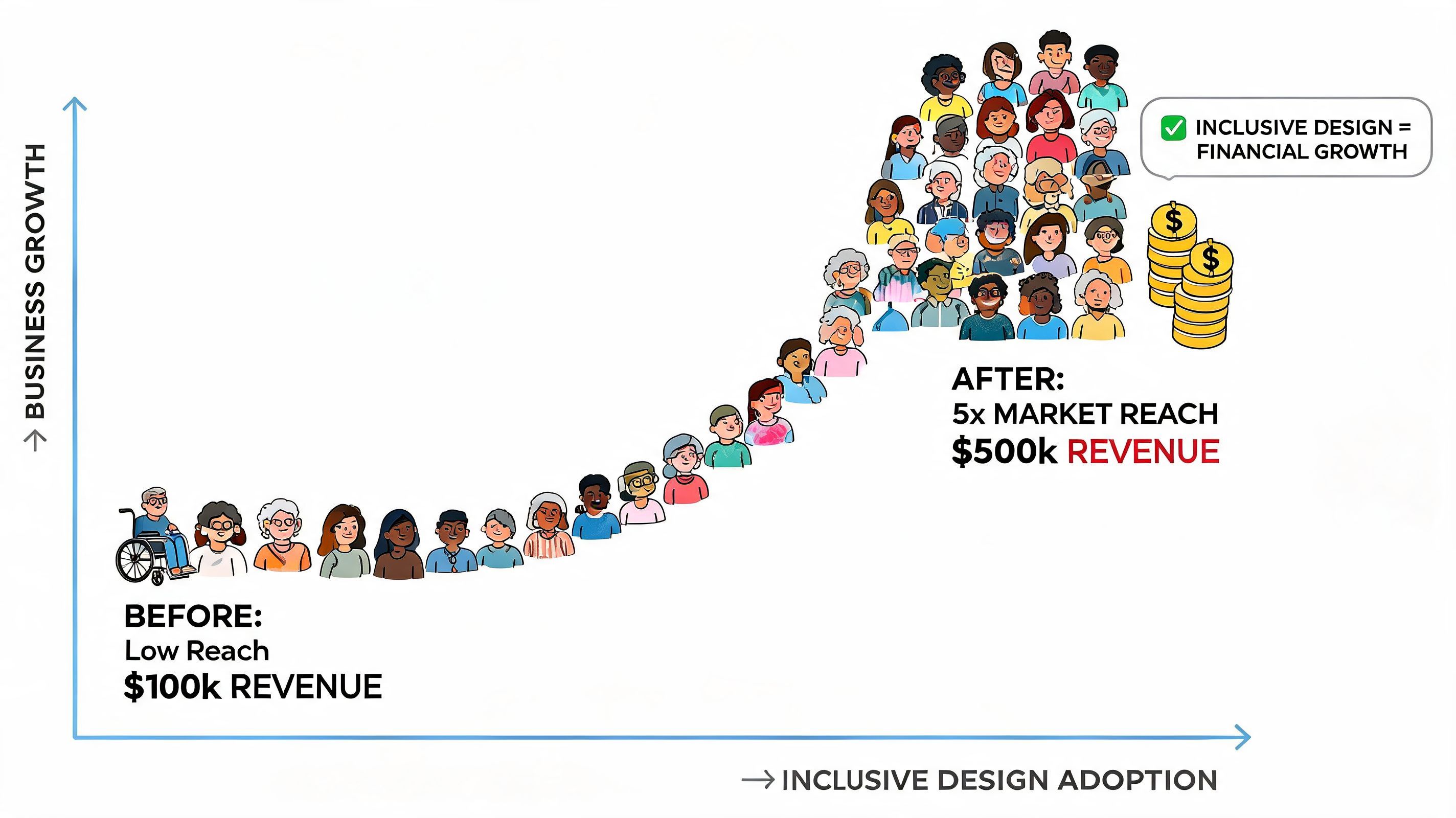
Revenue, not just remediation
Accessibility issues show up as conversion issues long before anyone logs them as compliance defects.
A missing form label increases hesitation at checkout. Low contrast slows product comparison on mobile. A keyboard trap blocks a user from applying a promo code or submitting a lead form. Teams often classify those as isolated UX bugs, but in practice they reduce completion rates, increase support contacts, and waste acquisition spend.
That is why accessibility should sit inside the same operating model as CRO. If your team is already working on checkout friction, product page clarity, and mobile usability, this guide on how to improve ecommerce customer experience is a useful companion read because many of the highest-impact CX fixes overlap with accessibility basics.
Market reach matters too. The disability market represents meaningful spending power, and inaccessible journeys cut off demand that brands have already paid to attract. In retail, that shows up as abandoned baskets. In SaaS, it appears in failed onboarding and lower trial-to-paid conversion. In service businesses, it often appears as a spike in avoidable calls, chats, and manual assistance.
Accessibility strengthens trust and reduces exposure
Trust drops fast when people cannot complete a basic task. Users rarely distinguish between a design decision, a code defect, and a WCAG failure. They remember that the form was confusing, the button was hard to find, or the page did not work with their setup. That memory affects repeat visits, brand preference, and referral behavior.
Legal risk still deserves attention, but it is a trailing indicator of a weaker customer experience. The better operating model is to fix accessibility where it affects revenue and confidence first. Start with high-traffic templates, product detail pages, lead forms, account creation, support flows, and checkout. That approach gives teams measurable wins while reducing exposure at the same time.
Teams that want a broader framework can use accessibility to improve user experience via accessibility while building a more disciplined process for design, content, engineering, and QA.
A short explainer can help internal stakeholders connect the dots:
Mapping Design Principles to WCAG Standards
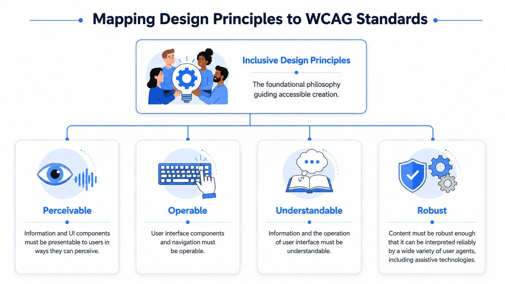
WCAG can feel abstract until you map it to actual user behavior. The simplest way to make it practical is the POUR framework: Perceivable, Operable, Understandable, and Adaptable. Those four principles explain why people get blocked and what teams need to fix.
What each principle means in practice
Perceivable means users must be able to detect and interpret content. Images need text alternatives. Text needs readable contrast. Media needs alternatives where needed. If content can't be perceived, the journey ends before it starts.
Operable means users must be able to move through the interface and trigger controls. That includes keyboard navigation, logical tab order, and visible focus indicators. According to AudioEye's WCAG and UX overview, WCAG's Operable principle requires full keyboard navigation under 2.1.1 and visible focus indicators under 2.4.7. When teams miss those basics, users can get trapped, and task completion time can increase by 200% to 300%.
Understandable means the interface behaves in expected ways. Forms need clear labels and instructions. Errors should explain what happened and what to do next. Navigation patterns should stay consistent.
Reliable means the code works with assistive technologies and across user agents. Semantic HTML, valid structure, and correct ARIA usage are what allow screen readers and other tools to interpret content properly.
Practical rule: Don't start with WCAG as a legal document. Start with the user action that matters, then trace the technical requirement that supports it.
A working translation from standards to UX
| POUR principle | Common failure | UX result | Business impact |
|---|---|---|---|
| Perceivable | Missing alt text or weak contrast | Users miss meaning or struggle to read | Lower engagement on product, content, and support pages |
| Operable | Keyboard trap or invisible focus state | Users can't navigate or complete tasks | Form abandonment, checkout friction, support escalation |
| Understandable | Vague labels and inconsistent interactions | Users hesitate, make errors, or stop | Lost conversions and weaker trust |
| Robust | Div-based controls with poor semantics or broken ARIA | Assistive tech reads the interface badly | Critical flows fail for users who depend on AT |
Before and after examples
A “before” version of an ecommerce filter panel often looks polished visually but fails operationally. The buttons are custom divs, focus is invisible, and filters collapse without announcing state changes. A keyboard user or screen reader user loses context fast.
The “after” version uses actual buttons, preserves visible focus, exposes expanded or collapsed states properly, and keeps headings and regions meaningful. The visual design may barely change, but the experience changes completely.
If your team needs a broader standards reference beyond the basics, Website Builder Australia's accessibility guide gives another practical view of how accessibility standards shape design decisions in real projects.
For teams documenting acceptance criteria, the most useful move is to tie every component in the design system back to the specific success criteria needed to achieve ADA and WCAG compliance. That's where accessibility user experience becomes repeatable instead of reactive.
Practical Patterns for Accessible Implementation
The fastest accessibility wins usually come from a handful of implementation patterns that affect many templates at once. Navigation, forms, interactive controls, headings, links, and media handling do more work than is generally acknowledged.
Start with semantic structure
Semantic HTML is still the most effective accessibility work a front-end team can do. It gives assistive technologies a reliable map of the page. It also makes interfaces easier to maintain because behavior is grounded in native elements instead of custom scripts trying to simulate them.
Data summarized by A11Y Collective shows that proper semantic HTML and ARIA roles can enable 70% faster task completion for screen reader users. The same source notes that missing skip links under WCAG 2.4.1 can increase user fatigue by 150%.
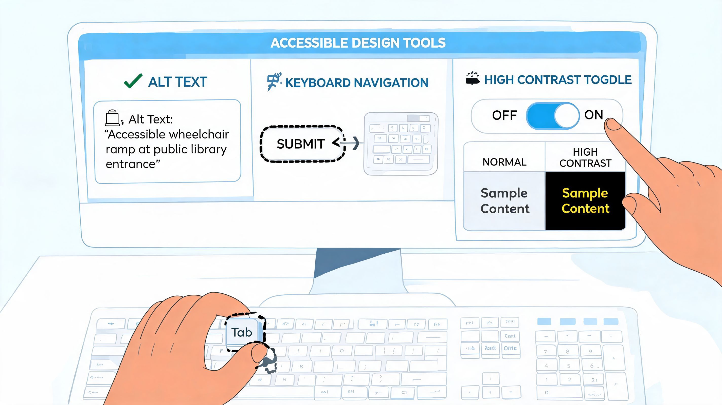
That makes a simple checklist worth enforcing in every build:
- Use native elements first: Buttons for actions, links for navigation, labels for inputs, headings for content hierarchy.
- Add a skip link: It's a small feature with outsized value on content-heavy pages and admin interfaces.
- Name regions clearly: Navigation, search, main content, and complementary areas should be easy to identify.
- Reserve ARIA for enhancement: Use it to clarify semantics, not to patch over poor structure.
Fix forms where revenue happens
Most conversion-critical barriers live in forms. Sign-up, quote requests, checkout, login, support intake, and newsletter capture all break when labels are unclear or error handling is vague.
Good accessible forms usually share the same traits:
- Persistent labels instead of placeholder-only fields
- Instructions placed before the input, not buried after it
- Error messages tied to the field and written in plain language
- Keyboard focus moved intelligently when validation fails
- Input formats explained without guesswork
A lot of teams also miss media accessibility inside conversion flows. Product demos, onboarding videos, and support clips need captions and clear language. If your team publishes video content regularly, this walkthrough on translating YouTube videos with CoffeeTrans is useful for handling subtitles and language access more cleanly.
Managed tooling can accelerate the work
Accessibility platforms can help teams move faster, especially when they need scanning, issue tracking, user personalization features, and a shared operational view across many sites. For example, WebAbility.io provides 24/7 scanning, a centralized dashboard, audit support, and an accessibility widget with 40+ features such as keyboard navigation support, text scaling, high-contrast modes, text-to-speech, translation, and personal profiles, based on the publisher information provided for this article.
Clean code handles the foundation. User controls help people tailor the experience to their needs in real time.
That's the right way to think about implementation. Build strong structure first, then add tooling and personalization features that help more users succeed without forcing one rigid interface on everyone.
Testing Methods and Measuring Accessibility Success
The biggest testing mistake is assuming a scan equals usability. Automated tools matter. They catch recurring patterns fast, help teams monitor regressions, and give program owners visibility across templates. But they don't tell you whether real people can complete key tasks.
Use a layered testing model
A practical accessibility testing model has three layers.
Automated scanning handles broad coverage. It catches issues like missing alt attributes, contrast failures, empty buttons, and structural problems at scale. Continuous monitoring earns its keep through this process, especially on large sites with frequent releases.
Expert manual audits catch the nuance that scanners miss. An auditor can evaluate reading order, keyboard behavior in complex components, modal focus management, error recovery, and whether content makes sense when announced by assistive technology.
Assistive technology user testing is where teams find the most revealing issues. Research summarized by PMC on accessibility barriers and user needs points to a major blind spot in many design processes: organizations often fail to include actual assistive technology users in testing, even though real barriers are often only discovered through feedback from screen reader, voice control, and switch users across the development lifecycle.
What to measure instead of chasing a score
Compliance scores have value, but they're not the whole story. Teams need operational metrics tied to user outcomes.
Useful measures include:
- Task completion for key flows: Can users finish checkout, sign-up, or support requests with keyboard and assistive technology?
- Time to complete core actions: Especially for forms, search, and account tasks.
- Accessibility-related support tickets: Track recurring issues by template or component.
- Regression rate after releases: Which teams or components reintroduce failures?
- Template coverage: Which high-value page types have been audited and retested?
If a page technically passes but users still get lost, your process needs work, not better reporting.
A good measurement model combines defect tracking with user evidence. Review recordings from keyboard sessions. Capture notes from AT user testing. Compare conversion behavior on remediated templates against prior friction points. Teams that want a tighter KPI framework should use this guide to web accessibility measurement as a starting point for building dashboards that matter to product, legal, and executive stakeholders.
Establishing an Accessibility Governance Roadmap
Accessibility fails in organizations for a simple reason. No one owns the full lifecycle. Design writes one set of intentions, engineering ships another, QA checks too late, and leadership only gets involved when a complaint lands.
A working governance model fixes that by assigning ownership, setting review points, and making accessibility visible in normal delivery workflows.
Phase one and phase two
Start with audit and benchmark. Review the pages and user flows that carry the highest commercial or service importance. That usually means homepage templates, navigation systems, category or search pages, product detail pages, lead forms, checkout, authentication, support, and document libraries. Capture issues by severity, affected journey, and effort to remediate.
Then move into prioritize and remediate. Don't begin with obscure edge cases if your cart, forms, or menus are failing. Fix what blocks task completion first. Accessibility governance works best when prioritization reflects both user harm and business impact.
Phase three and phase four
Next comes integration into the design system and SDLC. Turn fixes into reusable standards. Add accessible component requirements to Figma libraries, engineering definitions of done, QA scripts, and content publishing rules. Train designers on interaction patterns, writers on clarity, and developers on semantic structure and focus management.
Finally, establish monitoring and maintenance. Accessibility isn't a one-time project because sites change constantly. New campaigns launch. Plugins update. product teams add experiments. Someone has to watch for regressions, route issues to the right owners, preserve an audit trail, and report status upward in plain language.
A mature roadmap usually includes these operational pieces:
- Named ownership: Product, engineering, design, QA, legal, and content each need defined responsibilities.
- Release gates: Critical accessibility checks should happen before launch, not after complaints.
- Component governance: Fix once in the system, not ten times in ten templates.
- Executive reporting: Summaries should connect accessibility work to UX quality, risk posture, and business outcomes.
Teams scale faster when this sits in one shared operational model instead of scattered spreadsheets and one-off audits.
Frequently Asked Questions About Accessibility UX
Is accessibility UX only relevant for users with disabilities
No. Accessibility UX improves clarity, consistency, input handling, navigation, and readability for everyone. That includes users on mobile, users in poor lighting, people under time pressure, and anyone dealing with cognitive load. Good accessibility often looks like good product design because both reduce friction.
Where should a company start if budget is limited
Start with the pages that matter most to revenue, lead generation, or essential services. Audit top templates, main navigation, forms, checkout, and account flows first. Fix repeated component issues before page-by-page polish. That gives you broader impact with less waste.
Do accessibility widgets have a role
Yes. They can add useful personalization features such as contrast controls, text scaling, reading support, keyboard enhancements, and other user adjustments. They're most effective when they're part of a broader accessibility program that also includes semantic code, manual review, and ongoing testing. That combination gives users both a stronger foundation and more control.
How do I make the case to leadership
Tie accessibility to outcomes leadership already tracks. Use conversion-critical flows, support burden, customer experience, brand trust, and legal readiness. The strongest case isn't abstract inclusion language alone. It's showing where users are getting blocked and what that friction is costing the business.
How often should accessibility testing happen
Continuously for scanning, at defined milestones for manual audits, and during research cycles for assistive technology user testing. Major redesigns, new components, campaign launches, and checkout changes should all trigger accessibility review. If testing only happens once a year, teams will spend most of their time rediscovering old problems.
Who should own accessibility internally
One team should coordinate it, but several teams need to own parts of it. Product should set priorities. Design should define accessible patterns. Engineering should implement them correctly. QA should test them. Content teams should publish accessibly. Legal and procurement should support governance. Shared responsibility works only when responsibilities are explicit.
If your team needs a practical way to turn accessibility user experience into an operational program, WebAbility.io can help centralize scanning, reporting, issue tracking, user personalization, and expert guidance across the full compliance lifecycle. That makes it easier to improve UX, support CRO goals, and maintain accessibility as the site evolves.
Quick Questions
Tap to ask AI about this article