Accessible Fonts for Devices: A Complete Guide (2026)

Sidharth Nayyar
Sidharth Nayyar
Tap to ask AI about this article
Ready to make your website accessible? Engage with our team or start a free trial today.
Start with a sans-serif font such as Arial, Verdana, or Atkinson Hyperlegible, set body text at 16px (1rem) or larger, maintain at least 4.5:1 contrast, and give users controls to adjust text size and style. On modern devices, that combination supports readability, helps with WCAG and Section 508 alignment, and modern accessibility platforms can manage those controls for users without forcing a one-size-fits-all experience.
Teams usually run into this problem after the visual design already looks approved. The brand font works in Figma, the mockup looks polished on a desktop monitor, and then the site ships to phones, tablets, kiosks, assistive tech, and aging displays where the text suddenly feels cramped, faint, or harder to parse than anyone expected.
Accessible fonts for devices aren't a cosmetic choice. They affect whether people can read product details, complete forms, trust your interface, and stay long enough to convert. They also shape whether your typography holds up under accessibility review, especially once users resize text, increase spacing, or switch devices.
A font decision can derail a page that is otherwise well built. I've seen teams spend weeks refining copy and interaction design, then lose clarity because the chosen typeface looked elegant in headers but broke down in body text, filters, and mobile labels.
That's why accessible typography belongs in conversion work, not just compliance checklists.

When users struggle to read, they don't file a typography complaint. They leave, hesitate, or abandon the task. That matters because accessible fonts reduce bounce rates by 25% for disabled users and connect directly to the $13 trillion disability economy, as noted in the Section 508 typography guidance.
The same source explains why this has been a compliance issue for a long time. Section 508, enacted in 1998, established foundational requirements for accessible typography on devices, including sans-serif fonts and high contrast, and it was designed to serve over 26 million Americans with visual impairments at the time. It also notes research from the British Dyslexia Association showing that appropriate sans-serif fonts can improve readability by 15-20% for the 10% of the global population with dyslexia.
Those aren't edge cases. They're a substantial part of the buying audience.
Practical rule: If the body font makes users work harder, every downstream metric gets more expensive to improve.
Accessible font choices also help teams avoid preventable exposure. Typography is often part of what fails under scrutiny because text is too small, too low-contrast, too thin, or too rigid when users zoom and reflow content.
For teams building governance into design systems, a broader accessibility practice is particularly important. A solid reference point is Kogifi's guide to web accessibility, especially if you're aligning design, development, and QA around shared standards rather than treating accessibility as a final audit.
For a practical baseline inside your own workflow, keep a central web accessibility guide close to design reviews and front-end handoff.
Accessible fonts for devices do three things at once:
Teams that treat typography as infrastructure usually produce cleaner UI copy, stronger forms, and more resilient mobile experiences. That shows up in outcomes, not just aesthetics.
A redesign can look polished in Figma and still fail the moment real users hit a mobile checkout flow at 200% zoom. I see this often. The font looked “clean” in review, but its letterforms collapse on smaller screens, users hesitate in forms, and support tickets rise because people misread labels, prices, or confirmation steps.
That is why font selection should start with structure, not taste. Readable type reduces friction in the places that affect revenue and compliance most: product detail pages, account creation, form fields, settings, and transactional screens.
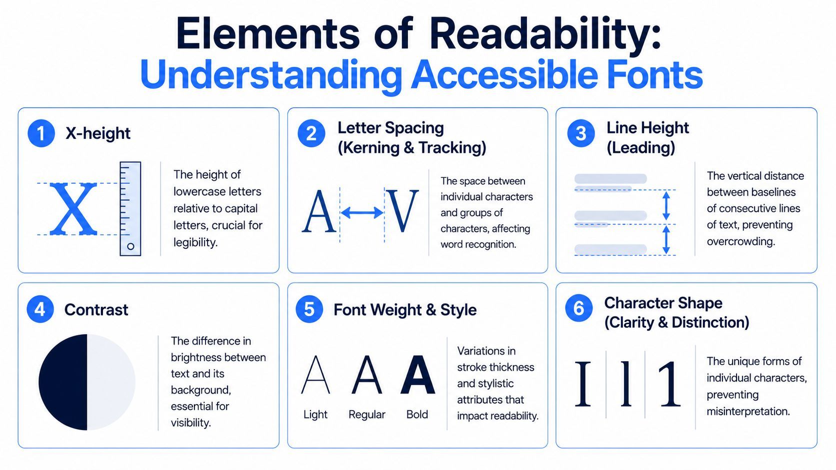
A readable font lets users recognize words quickly instead of decoding individual characters. On devices, that depends on a few repeatable traits.
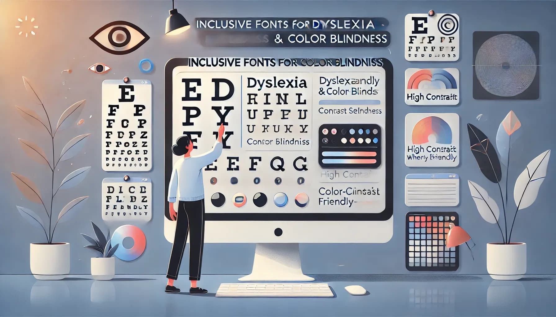
I, l, 1, 0, and O early. If those characters are too similar, users are more likely to make mistakes in forms, passwords, codes, and financial data.a, e, o, and p should remain visible at body size, not close up into dark blobs.AudioEye's analysis of accessible fonts notes two problems teams regularly underestimate: ambiguous characters can slow reading for people with dyslexia, and narrow or tightly spaced fonts can create spacing and reflow issues on mobile screens and under text-spacing requirements. Those are not cosmetic defects. They affect task completion, error rates, and audit exposure. See AudioEye's accessible fonts analysis for the original discussion.
If users have to stop and interpret the letterforms, the font is adding friction where the interface should feel clear.
For teams documenting review criteria, the WebAbility.io glossary on content accessibility is a useful reference for the terminology behind readable text.
The strongest digital fonts are usually quiet performers. They preserve clarity under pressure: small screens, variable brightness, custom zoom, long-form reading, and cramped interface layouts.
Fonts usually work well on devices when they have:
| Trait | Why it helps |
|---|---|
| Large lowercase forms | Improves body-text legibility |
| Moderate width | Prevents cramped words |
| Distinct numerals and letters | Reduces misreading in forms and UI |
| Regular to semibold usable weights | Supports hierarchy without fuzziness |
Fonts usually struggle when they rely on:
| Pattern | Common issue |
|---|---|
| Thin strokes | Break down on bright or dense screens |
| Decorative terminals | Add noise in body copy |
| Compressed width | Hurt scanning and spacing |
| Overly tight spacing | Increases crowding on mobile |
Trade-offs matter here. A branded typeface can still be usable if it includes readable weights, clear numerals, and enough spacing control in code. A stylish condensed font may help fit more into a header, but it often creates a larger cost later in readability, QA exceptions, and accessibility remediation.
Teams should review fonts in real product states, not specimen sheets alone. Test body copy, error messages, tables, buttons, and form fields on actual phones. Check zoom, dark mode, and bold text settings. Good font anatomy is not just a design preference. It supports faster reading, fewer input errors, stronger WCAG alignment, and a better chance of converting users who would otherwise drop off.
A quick visual explainer helps when you're reviewing with non-design stakeholders:
You don't need dozens of font options. You need a short, dependable set that survives real screens, real zoom behavior, and real content density.
Arial remains one of the safest defaults for body text and interface copy. It's widely available, familiar, and generally holds up well across browsers and devices. If a team wants the least risky path, Arial is still a sensible answer.
Verdana is stronger when you need extra letter clarity. Its spacing and screen-oriented design make it especially useful in forms, dashboards, and compact UI where labels can otherwise blur together.
Helvetica can work well in controlled environments, especially for product UI and navigation, but it needs careful testing. Thin weights are where teams get into trouble. Use regular or slightly heavier weights, not ultra-light variants.
Tahoma is often overlooked. In practice, it performs well in tighter UI spaces because it stays readable without feeling too wide.
Atkinson Hyperlegible is a strong option when character distinction is the priority. It was designed to make commonly confused letterforms easier to tell apart, which can help in navigation, settings, and transactional flows.
Some projects need more than a standard system sans-serif.
OpenDyslexic can be valuable as a user-selectable option. I don't recommend forcing it as a brand default for every visitor, but it makes sense as a personalization feature for people who prefer it.
APHont and similar low-vision-oriented faces can also serve specialized applications, especially in portals or public-facing services where clarity matters more than brand expression.
For teams that want a practical rule, use one reliable sans-serif for core reading and offer optional reading modes rather than trying to make one font perfect for everyone.
A good default font solves the common case. User controls solve the individual case.
| Font Name | Key Feature | Best Use Case | License |
|---|---|---|---|
| Arial | Familiar sans-serif with stable screen readability | Body text, forms, general UI | Commercial system font |
| Verdana | Spacious letterforms and strong clarity | Mobile UI, dense labels, dashboards | Commercial system font |
| Helvetica | Clean structure and readable regular weights | Navigation, product UI, headings | Commercial system font |
| Tahoma | Compact but readable sans-serif | Buttons, menus, compact interface text | Commercial system font |
| Atkinson Hyperlegible | Strong distinction between similar characters | Public services, accessible reading interfaces | Check project license terms |
| OpenDyslexic | Dyslexia-oriented letterform design | Optional user preference mode | Check project license terms |
| APHont | Accessibility-focused legibility | Low-vision reading environments | Check project license terms |
If you're deciding under delivery pressure, use this filter:
That approach keeps the brand visible without letting stylistic typography carry the reading load.
A common failure pattern looks like this: the brand font is approved, the mockup looks polished, and the live product still ends up hard to read on phones. Text scales badly, labels crowd form fields, and light gray copy disappears outdoors. That hurts task completion, support volume, conversion, and ADA risk at the same time.
Font accessibility has to survive implementation.
WCAG requires text to resize up to 200% without loss of content or function. Teams that hard-code small text or lock containers to fixed heights usually fail this in production, especially in account flows, checkout, and mobile navigation.
Start body text at 16px or 1rem. Use relative units so browser zoom, OS text scaling, and user preferences can work as intended. That choice supports compliance, but it also protects revenue. Users who can read pricing, instructions, and form errors are more likely to finish the task.
A practical default looks like this:
html { font-size: 100%; } body { font-family: Arial, Verdana, sans-serif; font-size: 1rem; line-height: 1.5; font-weight: 400; letter-spacing: 0.02em; color: #111; background: #fff; } One caution from real projects. Designers often ask for 14px body copy to fit more content above the fold. On dense enterprise screens, that can be a reasonable exception if contrast is strong, spacing is generous, and the text is not carrying critical instructions. For general reading, 16px remains the safer default.
Spacing decisions affect readability as much as the font itself. Tight leading, compressed labels, and clipped button text usually show up after code review, not during design signoff.
Use these settings as a starting point:
1.5.For interactive or dense content, try:
p, li, input, button, label { line-height: 1.5; letter-spacing: 0.02em; } h1, h2, h3 { line-height: 1.2; } Check the result at 200% zoom and at the narrowest mobile breakpoint. If headings wrap into buttons, helper text collides with inputs, or cards crop content, the typography system is not ready.
For a front-end handoff, this guide to CSS best practices for accessible fonts gives implementation detail without changing the accessibility goal.
Contrast is not a final visual polish pass. It belongs in your design tokens, component specs, and QA checklist.
Use at least 4.5:1 contrast for normal text. Avoid ultra-light gray for product copy, help text, placeholder text, and form instructions. Those treatments may pass brand review and still underperform with real users, particularly on lower-quality screens or in bright environments.
These combinations usually hold up well:
Common failures are predictable. Thin text on tinted backgrounds, placeholder text used as the only label, and small copy inside brand-color buttons all create reading friction. Reading friction lowers completion rates, increases abandonment, and creates evidence of preventable accessibility defects if a complaint reaches legal review.
Code defensively. Accessibility is cheaper to build into the typography system than to retrofit after a release.
Typography that passes on a designer's laptop can still fail on the devices your audience uses. That's the last gap many teams miss.
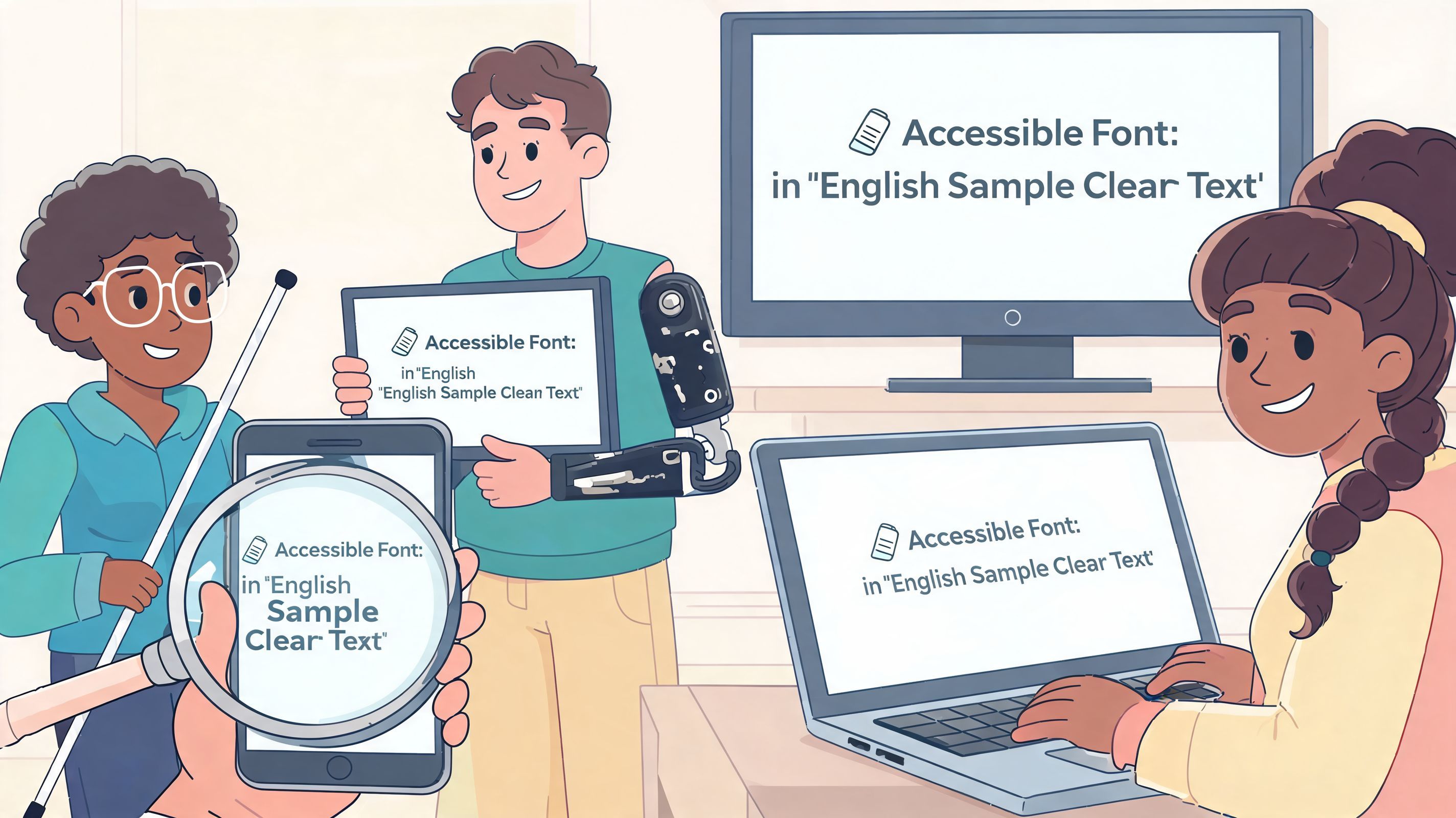
Modern devices render type differently. According to Perkins School for the Blind's resource on fonts for print disabilities, anti-aliasing on OLED screens can blur thin strokes and reduce legibility by up to 25% for low-vision users. The same source notes that standard web fonts fail WCAG AA on an estimated 40% of mobile browsers without custom media queries, and that user-controlled settings can bridge that gap.
That means your testing should include:
No team can manually optimize for every vision condition, device display, reading preference, and browsing context. The scalable answer is to build a solid default and let users adjust the experience when they need to.
That includes controls for:
One way to support that is with an accessibility platform that exposes user-side controls. WebAbility.io includes features such as dyslexia-friendly fonts, text scaling, high-contrast modes, and personal profiles, which helps visitors tailor the reading experience without requiring teams to hand-code every preference path.
You should still test your own styles directly. For quick validation of text and background pairings, use a dedicated color contrast checker during QA.
The most dependable pattern is this: choose a readable default, test it on real devices, then let users fine-tune the parts you can't predict.
Once the basic typography decisions are made, the practical questions start. Most of them come down to licensing, delivery, and whether newer font technologies help or complicate accessibility.
If a font is installed by default on major operating systems, deployment is usually straightforward. That's one reason system and web-safe choices remain attractive for accessible fonts for devices. They reduce rendering surprises and simplify implementation.
For licensed commercial fonts, check the actual usage terms before product launch. Teams often assume a desktop license covers web embedding, app use, marketing assets, and self-hosting. It often doesn't. Legal clarity matters as much as visual quality here, especially when a font becomes part of a design system.
If you're auditing a large font inventory across products, a technical catalog such as the Company fonts API can help teams map what they're using and where standardization might reduce complexity.
Sometimes yes. Sometimes no.
Variable fonts can help when they give you fine control over weight and width without loading multiple files. That can support performance and let teams tune a typeface more carefully for different contexts.
But they can also create accessibility drift. If teams use width axes to compress text or choose very light weights because they look refined, readability drops fast. Variable fonts only help if the accessible ranges are documented in the design system and enforced in code review.
A practical policy is to limit approved ranges. Define which weights and widths are allowed for body text, form labels, and interactive elements, then block everything else.
Icon fonts are still common, but SVG icons are often easier to control and less likely to fail in confusing ways. When an icon font doesn't load, users may see stray characters instead of meaningful UI. SVGs generally offer clearer semantics and more predictable rendering.
For text fonts, always define a fallback stack. If the preferred face fails to load, your interface should drop to another readable sans-serif without changing layout so drastically that content breaks.
A dependable pattern looks like this:
font-family: "Preferred Font", Arial, Verdana, sans-serif; That fallback plan is part of accessibility. It protects readability during slow connections, blocked assets, and device-level substitution.
Typography decisions usually feel small because each one is incremental. In production, they accumulate. Weight, spacing, fallback behavior, contrast, and user controls decide whether text feels easy or effortful.
If you're tightening typography across templates, apps, or client sites, WebAbility.io can support the process with accessibility tooling, user controls, monitoring, and compliance-focused workflows. It's a practical option for teams that want readable defaults, device-aware testing support, and a scalable way to give users more control over how text is presented.