ADA Website Compliance Requirements: Your Essential Guide

Sidharth Nayyar
TL;DR
To make your website ADA compliant, you must ensure it's usable by people with disabilities. The courts and the Department of Justice consistently point to the Web Content Accessibility Guidelines (WCAG) 2.1 Level AA as the standard to meet. Failing to comply opens your business to significant legal risk, including costly lawsuits. Key actions include providing alt text for images, ensuring full keyboard navigation, using proper color contrast, and creating clear, predictable content. Accessibility isn't just a legal requirement; it's a smart business practice that expands your market, improves SEO, and enhances the user experience for everyone.
If you’re looking for the short version, here it is: To make your website ADA compliant, you need to ensure people with disabilities can use it. The best way to do that is by following a set of standards called the Web Content Accessibility Guidelines (WCAG) 2.1 AA. If you don't, you're not just alienating a huge chunk of potential customers—you're opening yourself up to serious legal trouble.
Now, let's unpack what that really means for your business.
So, What Does ADA Website Compliance Actually Entail?
At its core, ADA compliance for your website is about breaking down digital barriers. For the full technical breakdown, see WebAbility's guide to the ADA website requirements that map to WCAG 2.1 Level AA. It's about making sure that anyone, regardless of their physical or cognitive abilities, can access the information and services you offer online.
Think of it this way: your physical storefront would have a ramp for wheelchair users, right? An accessible website is the digital equivalent of that ramp. It needs built-in features that allow people using assistive technologies—like screen readers for the visually impaired or special keyboards for those with motor difficulties—to navigate and understand your content just as easily as anyone else.
This isn't just about ticking a legal box or doing the right thing (though it is). It's also smart business. An incredible 26% of adults in the United States live with a disability. If your website isn't accessible, you're essentially putting up a "closed" sign for a massive part of the market.
The Four Pillars of a Truly Accessible Website
To bring some order to this, the global web community created the Web Content Accessibility Guidelines (WCAG). These guidelines are built on four simple but powerful principles. Everything you do to make your site accessible should fall under one of these pillars.
The goal is to ensure your website is:
- Perceivable: Can users see your content, or is there an alternative way to consume it? This is where things like alt text for images and captions for videos come into play.
- Operable: Can everyone actually use your site? People should be able to navigate with just a keyboard, without being forced to use a mouse they may not be able to operate.
- Understandable: Is your site straightforward and predictable? The language should be clear, and the navigation should make sense, preventing users from getting lost or confused.
- Robust: Will your site work with different technologies, now and in the future? It needs to play nice with various browsers, devices, and especially the assistive tools people with disabilities rely on.
This hierarchy shows how the legal demands of the ADA are directly connected to the technical standards of WCAG. They're two sides of the same coin.
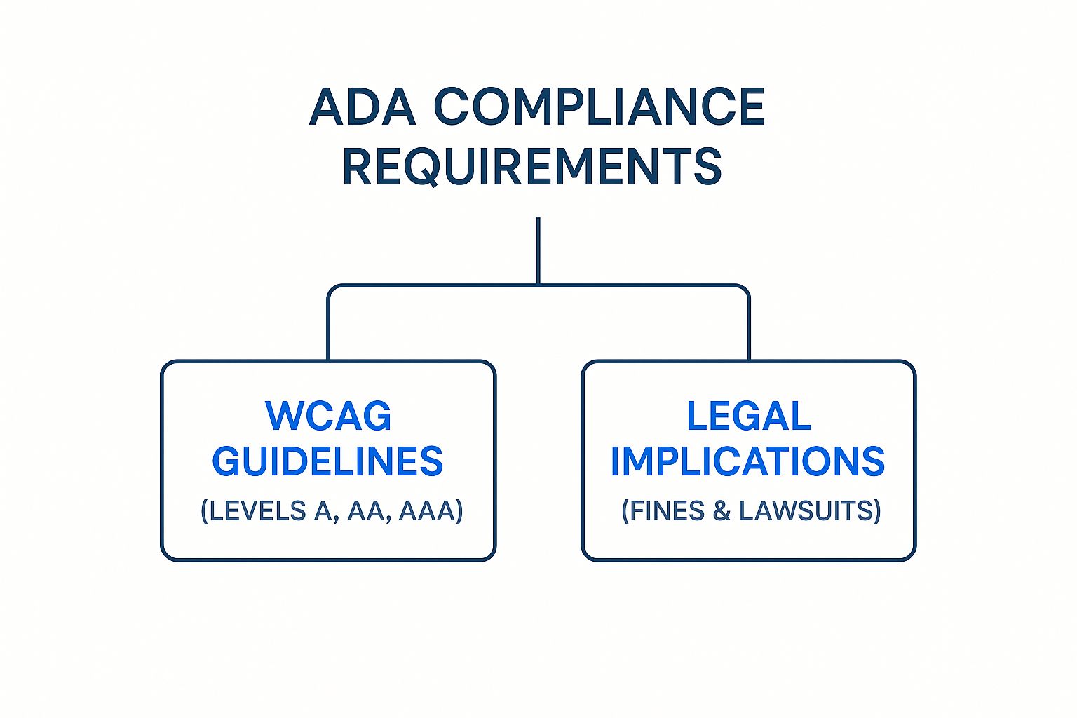
As you can see, getting this right means understanding both the technical guidelines and the very real legal consequences of falling short.
To make this even clearer, let's break down those four principles.
The Four Core Principles of WCAG Explained
This table translates the official WCAG principles into plain English, showing what they mean in practice.
| Principle | What It Means for Your Website | Simple Example |
|---|---|---|
| Perceivable | Users must be able to process the information on your site, even if they can't see or hear it in the traditional sense. | Providing text descriptions (alt text) for all important images so a screen reader can describe the image to a blind user. |
| Operable | The website's navigation and interactive elements must be usable by everyone, regardless of the device or input method they use. | Ensuring a user can navigate through your entire website, including menus and forms, using only their keyboard's Tab key. |
| Understandable | Your content and site functionality must be clear, consistent, and predictable. Don't make users guess what will happen next. | Using simple language and placing your navigation menu in the same spot on every page so it's easy to find. |
| Robust | Your website must be built with clean code that can be reliably interpreted by a wide range of technologies, especially assistive ones. | Writing clean HTML so that a screen reader announces a "button" as a button, not just a random piece of text. |
Understanding these four points is the first step toward building a website that truly works for everyone.
Why WCAG Has Become the Unofficial Law of the Land
Here's a crucial point: the Americans with Disabilities Act was written in 1990, long before the internet became a central part of public life. As a result, the law itself doesn't explicitly mention websites.
However, U.S. courts have consistently interpreted the law to mean that websites are "places of public accommodation," just like a restaurant or a retail store. This means they fall under the ADA's purview.
In legal battles over web accessibility, both the courts and the Department of Justice repeatedly point to WCAG 2.1 AA as the gold standard. It has become the de facto benchmark for determining whether a website is compliant. For any business owner, this makes getting familiar with these guidelines non-negotiable.
Understanding the Legal Risks of Non-Compliance
Let’s be blunt: ignoring website accessibility isn't just a poor business decision; it’s a direct invitation for a lawsuit. The idea that the Americans with Disabilities Act (ADA) doesn't apply to the digital world is a dangerous—and expensive—misconception. Courts are consistently ruling that an inaccessible website is discriminatory, plain and simple.
This isn't some far-off, abstract threat. It's a very real business risk with serious financial consequences. When a person with a disability can't use your site, they have the right to sue under Title III of the ADA. That single complaint can kick off a costly, time-consuming legal battle that pulls your team's focus and resources away from what you do best.
The Rising Tide of Accessibility Lawsuits
The number of web accessibility lawsuits isn't just holding steady—it's climbing. In one recent year alone, nearly 8,800 federal complaints were filed over inaccessible websites. That’s a 7% jump from the year before, signaling a clear trend: the days of ignoring digital accessibility are over.
And don't make the mistake of thinking this is only a "big company" problem. Quite the opposite. A staggering 77% of ADA lawsuits were filed against businesses with less than $25 million in annual revenue. The myth that small and mid-sized companies can fly under the radar has been completely busted.
“In the eyes of the law, an inaccessible website is the digital equivalent of a shop with no wheelchair ramp. The message is clear: if your digital door is closed to people with disabilities, you are discriminating.”
So, what actually triggers a lawsuit? It often starts with a single moment of frustration. Someone using a screen reader can't complete a purchase because the checkout form is broken. A person who is deaf or hard of hearing can't understand a promotional video because there are no captions. A user who can't operate a mouse is stuck because the site isn't navigable by keyboard. That one bad experience is all it takes to spark a formal legal complaint.
The True Cost of Non-Compliance
If a lawsuit lands on your desk, the financial hit goes way beyond just the settlement amount. The costs add up fast and can be crippling for a business. It's critical to understand exactly what you're up against.
Here’s a breakdown of the typical expenses:
- Your Own Legal Fees: The minute you're sued, you have to hire a lawyer. Defending your business can easily cost tens of thousands of dollars, even if you ultimately win (which is unlikely without a compliant site).
- Plaintiff's Attorney Fees: Here's the kicker—if you lose or settle, you're almost always on the hook for the plaintiff's legal fees, too. This can effectively double your bill.
- Settlement Costs: To avoid a long, uncertain court battle, most businesses choose to settle. These agreements almost always include a monetary payment and a legally binding commitment to fix the website.
- Remediation Expenses: On top of everything else, the court will order you to make your site accessible. This means hiring accessibility experts and developers to perform a full audit and remediation, which is another major cost. You can get a full picture of the financial and legal risks of ADA non-compliance in our detailed guide.
Beyond the direct hit to your bank account, the damage to your brand's reputation can be severe and long-lasting. A public lawsuit paints a picture of a company that doesn't care about inclusivity, eroding customer trust. That kind of reputational harm is often harder to recover from than the legal fees themselves.
Ultimately, investing in your website's accessibility isn't just another expense. It's one of the smartest risk management decisions you can make. Being proactive protects your finances, defends your brand image, and ensures you're building a digital presence that truly welcomes everyone. At this point, the question isn't if non-compliance will cause a problem, but when.
The Bottom Line on ADA Compliance
The Americans with Disabilities Act (ADA) mandates that your website must be accessible to people with disabilities. While the law itself doesn't lay out a technical checklist, U.S. courts have consistently pointed to one clear standard: the Web Content Accessibility Guidelines (WCAG) 2.1 Level AA.
Failing to meet these guidelines isn't just a legal risk—it can lead to costly lawsuits, tarnish your brand's reputation, and shut out a huge segment of potential customers.
To stay compliant, you'll need to focus on key actions like providing text alternatives for images, making sure your site works perfectly with just a keyboard, using proper color contrast, and creating clear, predictable content. Think of it this way: compliance isn't just a legal hoop to jump through; it's a strategic move that enhances the user experience for everyone and expands your market reach.
Translating WCAG 2.1 AA into Plain English
Let's be honest—the Web Content Accessibility Guidelines (WCAG) can read like a dense, technical manual written for developers. But you don't need to be a coding expert to understand the core principles. The heart of meeting ada website compliance requirements is about translating those technical rules into practical, human-centered goals.

Instead of getting bogged down in the 50 individual success criteria, we can group them into three common-sense themes: making visuals accessible, ensuring smooth navigation, and creating intuitive content. This approach makes the standards much easier to discuss with your team and, more importantly, to act on.
Making Visuals Accessible for Everyone
A huge part of accessibility is ensuring that people who can't see the screen don't miss out on vital information. It’s all about making your visual content understandable through non-visual means.
One of the most foundational rules is providing alternative text (alt text) for images. Think of alt text as a short, descriptive label that a screen reader announces to a user who is blind. If a picture contains important information—like a product shot or a data chart—the alt text needs to describe what it is. This is the core of WCAG 1.1.1 (Non-text Content).
Color is another major hurdle. Many people have some form of color blindness, and text with low contrast can be impossible for users with low vision to read.
That's where WCAG 1.4.3 (Contrast Minimum) comes in. It sets specific ratios for text against its background, requiring a contrast of at least 4.5:1 for normal text. This simple rule ensures your words don’t just blend into the background, making your site readable for a much wider audience.
Bottom line: Never rely on color alone to convey information. If a form uses red text to flag an error, you must also include a text label like "Error:" or an icon. That way, someone who can't perceive the color red still gets the message.
Ensuring Smooth Keyboard Navigation
Many people with motor disabilities can't use a mouse. They rely entirely on a keyboard—or assistive devices that act like one—to get around the web. This theme is all about making sure your site is 100% functional without a mouse.
Every interactive element, from links and buttons to forms and menus, must be reachable and usable with the keyboard. Most often, users hit the "Tab" key to jump from one element to the next.
This introduces two non-negotiable requirements:
- Visible Focus (WCAG 2.4.7): As someone tabs through your site, there has to be a clear visual sign—like a box or a highlight—showing exactly which element is currently selected. Without it, keyboard users are flying blind, with no idea where they are on the page.
- No Keyboard Trap (WCAG 2.1.2): Once a user tabs into an element, they must be able to tab out of it. A keyboard trap is when they get stuck inside a component, like a video player or a pop-up, and can't leave. Their only option is to close the page entirely.
Imagine walking into a room, and the doorknob vanishes behind you. That's a keyboard trap. It’s a dead end that makes a site unusable.
Creating Intuitive and Predictable Content
The final piece of the puzzle is all about clarity and consistency. An accessible website doesn't surprise or confuse people. The content is easy to understand, and the layout is predictable, which helps users find what they need and know how to interact with it.
This principle touches on several key areas:
- Clear Page Titles (WCAG 2.4.2): Every page needs a unique, descriptive title. This helps screen reader users know where they are as they switch between browser tabs. "Product Page" is unhelpful. "Men's Waterproof Hiking Boots | Acme Outdoors" is perfect.
- Descriptive Links (WCAG 2.4.4): The text of a link should make sense out of context. Vague phrases like "Click Here" are a nightmare for screen reader users who often scan a page by jumping from link to link. Instead, use link text like "Read Our Full Refund Policy" to provide clear context.
- Logical Heading Structure (WCAG 1.3.1): Headings (H1, H2, H3) create a digital outline for your page. Using them in the correct order allows screen reader users to grasp the page's structure at a glance and jump straight to the section they need.
- Consistent Navigation (WCAG 3.2.3): Your main navigation menu should look and feel the same on every single page. This predictability helps all users, especially those with cognitive disabilities, build a mental map of your site and navigate it with confidence.
By breaking down the technical jargon, these ada website compliance requirements become far more approachable. It’s less about obscure coding rules and more about thoughtful, inclusive design.
For a deeper look into the different levels of compliance, check out our guide to navigating WCAG standards, which explains the crucial differences between A, AA, and AAA. Arming yourself with this knowledge will help you have more productive conversations with your team and ensure your digital doorstep is open to everyone.
Common Accessibility Failures and How to Fix Them
Knowing the technical guidelines is one thing, but seeing where websites actually go wrong is where the rubber meets the road. I’ve seen countless businesses make the same recurring mistakes, unintentionally putting up walls for users with disabilities. Once you learn to spot these common pitfalls, you can prioritize your fixes and make a huge impact, fast.
Think of it like this: if you find the most common weak spots in a building's foundation, you know exactly where to start reinforcing the whole structure. The best part? Most of these issues have surprisingly straightforward solutions.
The Most Widespread Accessibility Errors
Year after year, the data tells the same story: a handful of errors are responsible for the vast majority of accessibility problems online. An annual analysis of a million homepages, famously known as the WebAIM Million report, found that a staggering 96% of all detected errors fall into just six categories.
The top offenders are things like low contrast text (on 79.1% of pages), missing alternative text for images (55.5%), missing form input labels (48.2%), and empty links (45.4%). This data gives us a crystal-clear roadmap for where to start.
1. Low Contrast Text
This is, without a doubt, the single most common accessibility failure out there. It happens when your text color is too similar to its background, making it a nightmare for people with low vision or color blindness to read.
- The Problem: Picture trying to read light gray text on a white background. For many people, that text might as well be invisible.
- The Fix: Grab a color contrast checker tool. Your goal is to hit the WCAG 2.1 AA standard of a 4.5:1 contrast ratio for normal text and 3:1 for large text. You may need to tweak your brand's color palette, but prioritizing readability is always worth it.
2. Missing Alternative Text for Images
If an image on your site conveys any real information, that information needs to be available to people who can't see it. That's exactly what alternative text (or "alt text") is for.
- The Problem: When a screen reader lands on an image without alt text, it might just say "image" or read a cryptic filename. A product photo, an important chart, or a helpful infographic suddenly becomes a useless blank space.
- The Fix: Write a short, descriptive alt text for every single image that adds meaning. If an image is purely for decoration, use an empty alt attribute (
alt=""). This tells screen readers they can safely skip right over it.
Fixing Your Interactive Elements
Beyond the static stuff, a ton of accessibility issues crop up in the parts of your site that people need to interact with—think forms and links. These are the money-makers for most websites, so getting them right is critical.
A website's interactive elements are its doors and buttons. If a user can't tell what a button does or how to fill out a form, they're effectively locked out of taking any meaningful action on your site.
3. Missing Form Labels
Every single field in a form needs a proper label that’s programmatically connected to it. That placeholder text you see inside the box? It doesn't count. It often disappears and isn't reliably picked up by assistive technology.
- The Problem: A screen reader user gets to a form and just hears "edit text, edit text, edit text." They have absolutely no clue what information goes in each box.
- The Fix: Make sure every form input has a corresponding
<label>tag in the HTML code. This creates a direct, unbreakable link between the visual label and its field, making the experience seamless for everyone.
4. Vague or Empty Links
Links are the pathways of the web, and their text should act like a clear signpost. Vague phrases like "Click Here" or "Learn More" are useless for screen reader users, who often navigate by pulling up a list of all the links on a page.
- The Problem: Imagine scanning a list of links and hearing "click here, click here, read more." It’s impossible to know where any of them go.
- The Fix: Write link text that actually describes the destination. Instead of "Download our guide here," make the link text itself the description: "Download our 2024 marketing guide." This simple change makes your site infinitely easier to navigate.
Your Actionable ADA Compliance Checklist
Let's be clear: achieving ADA compliance isn't a one-time project you can check off a list and forget. It’s an ongoing commitment. But that doesn't mean it has to be overwhelming.
The best way to tackle it is by breaking the journey down into four manageable phases. We'll start with an Initial Audit to find the low-hanging fruit, move on to Content Fixes like adding alt text, then address deeper Technical Improvements like keyboard navigation, and finally, establish a process for Ongoing Maintenance.
Knowing the principles is one thing, but putting them into practice is what really matters. This checklist will give you a repeatable process to guide you from your first scan to a state of sustained compliance. Think of it less like a sprint and more like a roadmap for a long-term journey.
We’ve laid out the work in four logical steps. Each one builds on the last, helping you make steady, measurable progress toward meeting your compliance goals.
Phase 1: Initial Audit and Quick Wins
You can't fix what you don't know is broken. This first phase is all about getting a clear picture of your website's current accessibility health and spotting the easiest issues to fix for an immediate impact.
- Run an Automated Scan: Use an accessibility scanning tool to crawl your site. These tools are fantastic for catching common problems like missing alt text, low-contrast colors, and empty links. This scan will give you a high-level map of your biggest problem areas.
- Perform a Manual Keyboard Check: Seriously, put your mouse away. Try to navigate your website using only your keyboard. Can you get to every link, button, and form field with the
Tabkey? Just as important, is there a clear visual indicator—often a blue box—showing you exactly where you are on the page? - Spot-Check Your Five Most Important Pages: Manually review your homepage, contact page, a key product or service page, your main lead form or checkout process, and your privacy policy. These high-traffic, high-value pages are the most critical places to start.
Phase 2: Content and Design Fixes
With your initial audit in hand, you can now dive into the content and design issues that directly affect your users. The great thing is, many of these fixes don't require a developer, making them perfect tasks for content managers and marketers.
- Review and Rewrite Alt Text: Go through every important image on your site and make sure it has descriptive, accurate alt text. For images that are purely decorative, confirm they have an empty alt attribute (
alt="") so screen readers know to skip over them. - Check Color Contrast: Use a contrast checking tool to make sure all text meets the minimum 4.5:1 ratio against its background. Pay special attention to text on top of images, inside colored buttons, and in your site's header and footer.
- Clarify Link Text: Go on a hunt for vague link text. Every instance of "Click Here" or "Learn More" is a missed opportunity. Replace them with descriptive phrases that tell users exactly where they're going, like "Read Our Case Studies" or "Download the Free Guide."
"An accessible website is a journey, not a destination. The goal is continuous improvement, which starts with a single, actionable checklist. Each item you check off is a barrier you've removed for a potential customer."
Phase 3: Technical and Structural Improvements
Now it's time to tackle the deeper, code-level issues that your automated scan likely flagged. These fixes usually require a developer's help, but they are absolutely essential for making your site robust enough for assistive technologies.
- Ensure Proper Heading Structure: Audit your pages to make sure headings follow a logical order (H1, then H2, then H3—no skipping levels!). A clean heading structure acts like a table of contents, making it easy for screen reader users to understand and navigate the page.
- Add Labels to All Form Fields: This is a big one. Work with your developers to ensure every single input field on every form has a visible
<label>that's programmatically linked to it. Placeholder text is not a substitute for a proper label. - Provide Video Captions and Transcripts: For any prerecorded video, you need accurate, synchronized captions. It's also a best practice to provide a full text transcript right on the page.
- Test for Keyboard Traps: Check all of your interactive elements, like pop-up modals, video players, and any third-party widgets. A keyboard user must be able to navigate into and back out of these components without getting stuck.
Phase 4: Ongoing Maintenance and Governance
Finally, remember that accessibility isn't a one-and-done project. Every new blog post, feature, or design tweak can introduce new barriers. You need a plan to maintain compliance for the long haul. For a deeper dive, this comprehensive ADA compliance checklist for websites offers excellent long-term strategies.
- Publish an Accessibility Statement: Create a dedicated page on your site that signals your commitment to accessibility. This statement should explain the steps you've taken and provide contact information for users to report any issues they encounter.
- Incorporate Accessibility into Your Workflow: Train your team—content creators, designers, and developers—on accessibility best practices. Make it a standard part of your definition of "done," not an afterthought.
- Schedule Regular Audits: Plan to conduct a full accessibility audit at least once a year. You should also perform checks whenever you launch a major site redesign or roll out a significant new feature. Continuous monitoring is the only way to prevent your hard work from slipping.
To help you get started, here's a quick table you can use to perform a high-level spot-check on your own site. It covers some of the most common and impactful issues we see every day.
ADA Website Compliance Quick-Check Table
| Check Area | What to Look For | Pass / Fail |
|---|---|---|
| Keyboard Navigation | Can you tab to every interactive element (links, buttons, forms)? Is the focus always visible? | |
| Image Alt Text | Do all meaningful images have descriptive alt text? Are decorative images empty (alt="")? | |
| Color Contrast | Is all text easy to read? Does it meet the 4.5:1 contrast ratio against its background? | |
| Link Clarity | Are all links descriptive? Is it clear where a link will take you without reading the surrounding text? | |
| Heading Structure | Are headings used in a logical order (H1 > H2 > H3)? Is there only one H1 per page? | |
| Form Labels | Does every form field have a visible, correctly associated label? |
This simple check won't catch everything, but it's a fantastic starting point. If you find yourself marking "Fail" on several of these items, it's a strong sign that it's time to begin a more thorough accessibility audit.
Why Accessibility Is a Business Superpower
It’s easy to look at ADA website requirements as just another legal box to check. While staying out of court is certainly a good reason to pay attention, thinking of it only as a defensive move is a huge missed opportunity. The real magic happens when you start seeing accessibility as a strategic advantage. An accessible website isn't just about avoiding trouble; it's about driving serious business growth.

When you make that mental shift, compliance stops being a chore and starts feeling like a superpower. Building an inclusive digital space opens you up to new customers, makes your site better for everyone, and strengthens your brand in a way that your competitors are probably ignoring. It’s an investment that pays off in innovation.
Expand Your Market Reach
One of the most immediate perks of an accessible website is tapping into a massive, and frankly, overlooked market. Think about it: about one in four adults in the United States lives with some kind of disability. On a global scale, the disposable income of people with disabilities and their families tops $13 trillion.
If your website isn’t built for them, you’re basically putting up a "Closed" sign. The numbers are pretty shocking—right now, only about 4% of websites are ADA compliant. That leaves the other 96% with barriers that shut people out. By making accessibility a priority, you’re opening your doors to millions of potential customers, a move that can directly boost your revenue. You can dig into more data on this persistent accessibility gap to see the full picture.
When your website works for everyone, you're doing more than just following the law—you're showing that your brand is for everyone. That builds incredible customer loyalty and makes you stand out.
Improve User Experience for Everyone
Here’s a secret that great designers know: the foundations of accessible design are the same as the foundations of great design, period. Features you add to help users with disabilities almost always end up making the experience better for every single person who visits your site.
For example:
- Clear Captions: Sure, captions are essential for people who are deaf or hard of hearing. But they’re also a lifesaver for anyone watching a video in a loud coffee shop or scrolling through social media with the sound off.
- High-Contrast Text: Text that’s easy for someone with low vision to read is also far more pleasant for a person trying to browse your site on their phone in the bright sun.
- Logical Navigation: A clean, predictable site structure that’s a breeze for screen readers is also less confusing for everyone else. It just feels intuitive, which keeps people on your site longer.
Boost Your Search Engine Optimization
There’s a fantastic overlap between what’s good for accessibility and what’s good for SEO. Search engine crawlers, like Google’s bots, are a lot like screen readers—they’re both trying to figure out what your site is about by analyzing its structure and content.
Many of the things you do for accessibility give your SEO a direct lift:
- Descriptive Alt Text: Adding alt text to your images doesn't just describe them for visually impaired users; it gives search engines crucial context that helps your images show up in search results.
- Proper Heading Structure: Using headings (H1, H2, H3) in the right order creates a logical outline. This helps assistive tech navigate the page, and it helps search engines understand what your content is about.
- Video Transcripts: Transcripts make your video content accessible, but they also make every word in your video searchable and indexable by Google. That’s a huge win for ranking on more keywords.
At the end of the day, meeting ADA website compliance requirements is an investment in your company’s future. It pushes you to innovate, builds a loyal customer base, and drives real, sustainable growth.
Common Questions We Hear About ADA Compliance
Let's tackle some of the most common questions that come up around ADA website compliance. It's easy to get tangled in the myths and realities, but straightforward answers are the best foundation for a solid accessibility plan.
Does My Small Business Website Really Need to Be ADA Compliant?
Yes, it absolutely does. There's a persistent myth that the ADA only targets huge corporations, but that’s just not true. Courts have repeatedly decided that commercial websites qualify as "places of public accommodation," regardless of their size.
In fact, small businesses are often seen as easy targets for accessibility lawsuits because compliance is so frequently overlooked. The legal risk is very real, no matter your annual revenue or how many people you employ.
Can I Just Use an Accessibility Plugin or Overlay to Fix Everything?
If only it were that simple. While plugins and overlays can help catch some of the more obvious problems, they are far from a complete solution. These automated tools are notorious for missing subtle issues that require a human touch and actual code changes. Worse yet, they can sometimes clash with the very assistive technologies they're supposed to help.
Think of an overlay as a fresh coat of paint on a building with a cracked foundation. It makes things look better on the surface, but it does nothing to fix the deep structural problems that make the building unsafe.
Relying entirely on an overlay gives you a false sense of security. A truly effective strategy uses automated tools as a starting point, followed by manual testing and expert remediation to fix the core accessibility problems built into your site's code.
How Often Should I Check My Website for Accessibility?
Accessibility isn't a one-and-done task; it's an ongoing process. Your website is constantly evolving. Every time you add a new blog post, launch a new product, or tweak the design, you risk introducing new barriers for users with disabilities.
As a rule of thumb, it's smart to schedule a comprehensive audit at least once a year. Beyond that, you should get in the habit of running smaller, more routine checks quarterly. It's also critical to scan your site after launching any significant new features or content. This rhythm of continuous monitoring is what keeps your site accessible for everyone in the long run.
Ready to move from questions to action? WebAbility.io provides an end-to-end platform to achieve and maintain ADA compliance with confidence. Our AI-enhanced tools, real-time monitoring, and expert support make creating an inclusive website straightforward. Start your free trial today.
Article created using Outrank
Quick Questions
Tap to ask AI about this article