How to Improve User Experience Beyond the Basics

Sidharth Nayyar
Sidharth Nayyar
Ready to make your website accessible? Engage with our team or start a free trial today.
Tap to ask AI about this article
TL;DR: To improve user experience, focus on core principles: speed, accessibility, and clear navigation. Optimize your site's performance for fast loading, design for everyone by embracing web accessibility, and create an intuitive layout. Listen to user feedback through analytics and direct surveys to guide your improvements. Simple, scannable content with clear headings is key to respecting users' time.
When we talk about improving user experience, we're not just chasing the latest design trend. It's about something much more fundamental: respecting your user's time and attention. The goal is to make your website an easy, even enjoyable, place to be.
This means looking past just the visual appeal and focusing on what truly matters to the person on the other side of the screen. Things like speed, clarity, and making sure everyone can use your site, regardless of their ability. When someone can get what they need from you without hitting a wall of frustration, you’ve started building trust.
At its core, a great user experience comes down to a few key principles. It’s about creating a smooth path for your visitors, from the moment they land on your site to the moment they leave.
Think of it this way: a confusing layout or a slow-loading page is like a locked door. Your potential customer might just turn around and go somewhere else. For a deeper look into the nuts and bolts, this practical guide on how to improve website user experience is a great resource to dig into.
User experience isn't just a metric; it's a direct reflection of how much you respect your users. A seamless experience shows you value their time and attention, which is the bedrock of trust online.
To get there, you need to concentrate on a few foundational pillars. These aren't flashy, but they're what separate a good site from a great one.
Here’s a quick summary of the most impactful areas to focus on right away.
| Focus Area | Primary User Benefit | Key Action |
|---|---|---|
| Performance | No frustrating waits; information is available instantly. | Optimize images and scripts to ensure your site loads quickly on all devices. |
| Accessibility | Everyone can use the site, regardless of physical or cognitive ability. | Design with accessibility in mind from the start (e.g., proper color contrast, keyboard navigation). |
| Simplicity | Finding information feels natural and effortless. | Create a clear, intuitive navigation structure and a clean, uncluttered layout. |
| Feedback | The site evolves based on real-world needs and problems. | Actively listen to user feedback through surveys or analytics to identify and fix pain points. |
Nailing these fundamentals—speed, accessibility, simplicity, and a willingness to listen—is how you move from just having a website to creating a valuable digital experience. It's a continuous process, but starting with these core areas will put you on the right path.
In the race for user attention, speed isn't just a feature—it's the foundation of a positive first impression. We've all been there: you click a link and then you wait. And wait. That brief moment of frustration directly shapes how you feel about a brand, often before you’ve even seen a single word of their content.
When you prioritize performance, you're sending a clear signal to your audience that you respect their time. A fast, responsive website feels professional and reliable, building subconscious trust. On the other hand, a sluggish site can feel sloppy or outdated, eroding that credibility in an instant.
The impact of a slow website goes far beyond simple user frustration; it hits your bottom line, hard. The data doesn't lie—even tiny delays can cause significant drops in engagement and conversions.
Think about it this way: trimming your website's load time from 8 seconds down to just 2 seconds can boost conversions by a staggering 74%. That shows just how much every second counts. In fact, just a 1-second delay can lead to a 7% reduction in conversions. Wait longer than 3 seconds, and nearly 40% of your potential visitors will have already clicked away.
Speed is more than a technical metric; it's the first promise you make to your users. A fast website silently communicates efficiency, respect, and reliability, setting a positive tone for the entire user journey.
This is where the interconnected nature of user experience really comes into focus. Speed, accessibility, and navigation all work together.
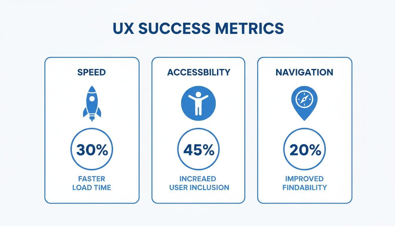
As you can see, a faster site is just the starting point for a truly inclusive and easy-to-navigate experience.
Boosting your site’s speed doesn’t always mean you need a complete overhaul. Often, a few targeted fixes can deliver surprisingly big improvements. The first thing you need to do is figure out what’s actually slowing you down. A thorough performance review can uncover bottlenecks you didn't even know existed. Our guide on how to audit a website is a great place to start for a structured approach.
Once you know where the problems are, you can focus on the high-impact areas that will give your users the most noticeable results.
Here are a few actionable strategies I always recommend:
Optimize Your Images: This is a big one. Large, uncompressed images are probably the most common cause of slow load times. I always suggest using modern formats like WebP and making sure images are sized correctly for where they'll be displayed.
Leverage Browser Caching: Caching is your friend. It stores parts of your site on a visitor's device, so when they come back, they don't have to reload everything from scratch. It makes repeat visits feel almost instant.
Minimize HTTP Requests: Every single element on your page—images, scripts, stylesheets—requires a separate request to the server. You can reduce this by combining files, like merging multiple CSS files into one, which really improves loading efficiency.
Choose a Quality Host: Don't skimp on hosting. Your provider plays a massive role in your site’s performance. A reliable host with a solid infrastructure ensures your site can handle traffic spikes without grinding to a halt.
Making these changes not only makes your site faster but also far more enjoyable to use. It’s a critical step toward building an experience that keeps people coming back.
A great user experience feels seamless and intuitive for every single visitor, not just a select group. This is exactly where web accessibility stops being a technical checklist and becomes a core part of your design strategy. When you build with inclusivity from the ground up, you're not just serving users with disabilities; you're creating a more forgiving and user-friendly interface for everyone.
Thinking about accessibility early on actually pushes you to find more creative and robust design solutions. For example, high color contrast that helps a user with low vision also makes your site easier to read for someone on their phone in bright sunlight. A clear, logical heading structure built for screen readers also makes your content a breeze for anyone to scan and digest.
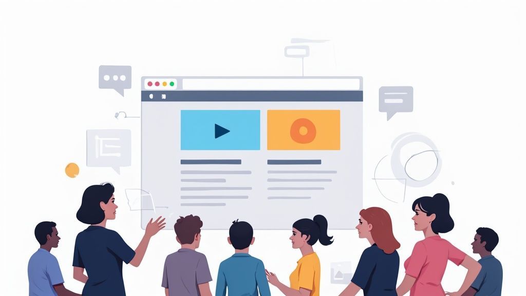
Getting started with an accessible site really boils down to a few fundamental practices. Think of these less as technical fixes and more as foundational elements that dramatically improve the experience for your entire audience.
Descriptive Alt Text for Images: This isn't just for screen readers. Good alt text provides crucial context when an image fails to load and even gives your SEO a nice little boost.
Strong Color Contrast: We've all struggled to read light grey text on a white background. Proper contrast is vital for people with visual impairments, but it also helps anyone using a device in less-than-ideal lighting.
Keyboard-Only Navigation: Try it yourself. Can you get through your entire site using only the Tab, Enter, and arrow keys? This is non-negotiable for users with motor disabilities and a favorite shortcut for many power users.
It's a classic case of "what's essential for some is useful for all."
If you're only thinking about accessibility to check a compliance box, you're missing the point. The real goal is to empower people to interact with your digital space on their own terms. Managed accessibility solutions and widgets can offer a powerful layer of personalization.
Imagine a user with dyslexia instantly switching to a more readable font, or someone with ADHD activating a "reader mode" to strip away distracting clutter. These are not edge cases; they are powerful options that show you genuinely care about your users' needs, which is a surefire way to build trust and loyalty.
When you design for the edges, the center becomes stronger. An inclusive approach doesn't just widen your audience; it forces you to build a more robust, thoughtful, and user-friendly product for everyone.
Embracing accessibility is a smart business move. It connects your brand with the massive $13 trillion global disability market and significantly reduces legal risks. Ultimately, it’s a critical piece of the puzzle for anyone serious about how to improve user experience. For a deeper dive, our article explaining what is web accessibility offers a fantastic overview.
At the end of the day, building an accessible site is simply building a better site. Period.
TL;DR: Make it effortless for users to find what they need. Use simple, predictable navigation, a clear visual hierarchy, and patterns users already recognize. A clean layout with lots of white space reduces confusion and helps guide users to their goals without frustration.
When someone lands on your site, they have a goal. The best user experience lets them achieve that goal without ever having to consciously think about how to use your website. Your navigation and layout should be so intuitive that the path forward feels completely obvious.
This is all about having a solid information architecture. Think of it like organizing a physical store. You wouldn't put milk in the hardware aisle, and you shouldn't bury your pricing page three clicks deep under a vague menu item. A logical structure removes the guesswork and builds a user’s confidence from the very first click.
People come to your website with a lifetime of experience using other sites. They have pre-existing expectations of how things should work. Fighting against these mental models just creates friction. Instead of reinventing the wheel, lean into established design patterns that feel familiar.
For instance, a study of various sales journeys found an astounding 15 different variations for the simple process of choosing and customizing a product. That kind of inconsistency forces users to re-learn your interface with every click, which is a recipe for frustration. Adopting consistent "service patterns" for common actions like checkout or product configuration creates a seamless, predictable flow.
A great layout doesn’t need a manual. It silently guides the user’s eye, making the next logical step feel like their own idea. This effortless journey is the hallmark of an exceptional user experience.
By sticking to familiar patterns, you lower the cognitive load on your visitors. They don’t have to waste mental energy figuring out your unique system; they can focus entirely on getting their task done.
A clear visual hierarchy is one of your most powerful tools for creating a better user experience. It uses visual cues—like size, color, and placement—to signal what’s important and guide a user's attention down the page.
Your most important element, whether it's a "Buy Now" button or a contact form, should be the most visually prominent. Less critical information can be smaller or more subdued in the background.
Here are a few practical tips to establish a strong hierarchy:
Use White Space: Don't be afraid of empty space. It’s not wasted; it reduces clutter, boosts readability, and draws the eye to key elements. Crowded layouts just overwhelm people.
Strategic Color and Contrast: Use color to highlight interactive elements like links and buttons. High contrast makes text easier to read and helps calls-to-action pop off the page.
Logical Heading Structure: Use headings (H1, H2, H3) not just for SEO, but to create a scannable outline of your content. This lets users quickly understand the page's structure and jump to the section they need.
Ultimately, a well-designed layout anticipates what a user needs before they even know they need it. It provides a clear, logical path that eliminates confusion and makes finding information feel effortless. This clarity is a cornerstone of how to improve user experience because it turns a potentially frustrating task into a smooth, successful journey.
Your users are your best guide to a better website. The trick is to stop guessing what they want and start listening to what they're actually telling you. By combining hard numbers with real human stories, you can create a feedback loop that constantly reveals exactly how to improve your site.
To really nail this, you have to look at two different kinds of information. First, there's the quantitative data—the numbers from your analytics. This tells you what people are doing. Think high bounce rates on a certain page or a massive drop-off halfway through your checkout process. It's the hard evidence.
But numbers alone don't give you the full story. That's where qualitative data comes in. This is the why behind the what. It’s the feedback you get from surveys, user interviews, and support tickets that reveals the frustrations and motivations driving those numbers.
Standard analytics are a great start, but to get the full picture, you need to dig deeper. I've found that tools providing visual feedback are game-changers here. Heatmaps, for instance, show you precisely where people are clicking, moving their mouse, and scrolling. They'll instantly highlight which parts of your page grab attention and which are completely ignored.
Session recordings take it even further. These are anonymized videos of real user journeys on your site. Honestly, there's no better way to spot usability problems you'd never find on your own. You might watch five different people try to click on a bit of text that isn't a link, and boom—you've just uncovered a major point of confusion in your design.
Moving from guesswork to a data-informed strategy is the most significant step you can take. Your users' behavior is a goldmine of insights, showing you precisely where to focus your efforts for the biggest impact.
So, you’ve collected all this great feedback. Now what? The real work is turning that raw data into tangible improvements. This means sifting through everything, spotting the recurring themes, and deciding what to tackle first based on which fixes will give you the most bang for your buck.
One incredibly effective technique I've used is the diary study. You get a small group of users to document their experiences with your site over a week or two. This kind of self-reporting captures authentic, real-world interactions that you just can't get in a controlled, one-hour session. It’s brilliant for uncovering those nagging frustrations or identifying key features you might be missing. We dive deeper into structured methods like this in our guide on usability testing.
This cycle—collecting feedback, finding the patterns, making changes, and then measuring the results—is what powers a truly fantastic user experience. It ensures that every single decision is rooted in what your audience actually needs.
TL;DR: Make your content scannable. Think clear headings, super short paragraphs, and lots of visual breaks like bullet points and images. Good design and typography let people get what they need fast, which is the whole point.
Let's be honest, your content is a conversation with your visitors. How you shape that conversation determines whether they find it helpful and effortless or just plain frustrating. The real goal is to make your message so clear that people can grasp it without even trying.
That means we have to let go of the "wall of text." It’s intimidating and ineffective. People don’t read websites like they read novels; they scan. They jump from heading to heading, looking for keywords that signal they're in the right place. A well-structured page leans into this behavior, making their search for information a breeze.
Boosting your user experience through content doesn't require reinventing the wheel. It really boils down to a few powerful, straightforward techniques. The most important one? Break down complex ideas into bite-sized pieces. I can't stress this enough: keep your paragraphs short, ideally just two to three sentences at most.
Next, use headings that are sharp and descriptive. Think of them as signposts on a highway. They create a clear visual map, letting someone instantly understand what your page is about and jump straight to the section they care about.
Here are a few other things that make a huge difference:
Lean on Bullet Points: They’re your best friend for listing out features, steps, or key ideas. It makes a complicated list much easier to digest.
Don't Fear White Space: Giving your text and images room to breathe is essential. It lowers the mental effort required to read and helps users focus.
Pick a Solid Font: Your typography shouldn't be a design statement; it should be invisible. Choose a clean, simple font that’s easy to read on any screen size.
The best content doesn't just have the right answers—it presents them in a way that respects the user's time and attention. Making things scannable isn't just a design trend; it's a fundamental part of a great user experience.
When you put these strategies into practice, your website stops being a static document and starts becoming a truly helpful guide. You're empowering people to find what they need and get things done, and that’s what builds trust and keeps them coming back.
TL;DR: Start with the easy wins—things like user feedback and image optimization are cheap but effective. Track your progress with hard numbers, like conversion rates. And remember, making your site accessible is just good UX, full stop. It helps everyone.
When you start digging into how to improve user experience, a few questions always come up. It can seem like a massive, complicated field, but the answers are usually simpler and more practical than you'd expect. Let's walk through some of the most common ones I hear.
Think of this as your practical guide to making smart decisions, whether you're just getting started or looking to level up your existing strategy.
If you're watching your budget, the absolute best place to start is by listening to your users. It's the cheapest, most effective way to find the biggest points of friction on your site. You don't need fancy software; you can use free survey tools or just start digging through your customer support emails to spot common complaints.
Another quick win is performance. Seriously, a slow website is a frustrating website. Optimizing your images and enabling browser caching are technical tweaks that don't cost much but can make a massive difference in how fast your site feels to every single visitor.
You need to connect your UX efforts to real business outcomes. A vague "it feels better" isn't going to cut it. You need cold, hard data to show that your changes are making a positive impact.
The key is to establish a clear baseline before you make changes so you can accurately measure the impact of your work. Without a starting point, you’re just guessing.
Focus on a few key performance indicators (KPIs) that matter to your bottom line:
Conversion Rates: Are more people signing up, buying, or whatever your goal is?
Task Completion Rates: Can people actually finish what they came to do?
User Satisfaction Scores: What are users telling you in surveys?
Also, keep an eye on behavioral metrics in your analytics. Things like bounce rate, time on page, and the paths people take through your site will tell you a story about how their behavior is shifting after your updates.
This is a big one. Web accessibility isn't some separate, niche task to check off a list—it's a core component of a great user experience. When you design for people with disabilities, you almost always end up building a better, more usable product for everyone.
Think about it: high-contrast text that helps someone with low vision also makes your screen easier to read in bright sunlight. A logical site structure that works for a screen reader also makes navigation more intuitive for every other user. Inclusive design choices don't just help a few people; they create a stronger, more user-friendly experience across the board.
Ready to make your website more accessible and improve the user experience for everyone? WebAbility.io provides an end-to-end platform with AI-powered tools and expert support to help you achieve compliance and build a more inclusive digital presence. Start your free trial today and see the difference at https://www.webability.io.