Web Accessibility for Disabled Users: A Complete Guide

Sidharth Nayyar
Many still think accessibility is a cleanup task. It isn't. The WebAIM Million 2026 report found 56,114,377 distinct accessibility errors across the top one million home pages, averaging 56.1 errors per page. Users with disabilities would encounter an error on about 1 in every 26 home-page elements.
That scale changes the conversation. Web accessibility for disabled users isn't about edge cases or pleasing a checklist. It's about whether real people can read your content, complete your forms, use your navigation, and trust your brand enough to convert.
I've seen cross-functional teams make strong progress once they stop treating accessibility as a specialist-only topic. Designers shape clarity. Developers control structure and interaction. Marketers influence content, campaigns, landing pages, and internal linking. When those groups work from the same model, accessibility becomes much easier to improve and much easier to sustain.
TLDR Key Accessibility Takeaways
Web accessibility for disabled users means building websites that people can perceive, operate, understand, and use reliably across devices and assistive technologies. In practice, that includes semantic HTML, keyboard access, readable contrast, meaningful alt text, clear forms, captions, and predictable navigation.
Accessibility is also a business discipline. It supports smoother user journeys, reduces friction in key conversion paths, strengthens important pages through cleaner internal linking, and helps more people complete high-value actions. For many teams, the fastest progress comes from improving transaction flows, forms, help content, and error handling before trying to perfect every page at once.
A workable approach has three parts:
- Use standards: Treat WCAG as your baseline and keep a practical reference like this wcag 2.0 aa checklist close during design, development, and QA.
- Use multiple methods: Automated testing catches recurring technical issues quickly. Manual review catches context, usability, and task-flow failures.
- Use continuous maintenance: Accessibility isn't finished at launch. Content edits, plugins, widgets, experiments, and AI-generated updates can all introduce regressions.
The big mindset shift is simple. Don't frame accessibility as a separate project. Build it into CRO, content quality, design systems, and release workflows.
Why Web Accessibility Is a Business Imperative
Roughly 1 in 4 adults in the United States lives with a disability, according to the CDC disability and functioning data. That is not a niche audience. It is a large part of your market, your applicants, your patients, your donors, and your existing customers.
For business teams, accessibility shows up in familiar places. A shopper cannot activate a filter with a keyboard. A prospect abandons a demo form because the error message is unclear. A customer on mobile zooms in to 200% and the pricing table breaks. Each of those failures blocks a task that matters to revenue.
Accessibility and conversion work often point to the same pages for the same reason. The pages that drive growth usually ask people to compare options, understand details, trust your message, and complete an action. If those paths are hard to use for someone with low vision, limited dexterity, dyslexia, screen reader use, or hearing loss, they are often harder than necessary for everyone else too.
Accessibility affects revenue paths
Cross-functional teams often approach this from different entry points. Designers notice visual hierarchy and contrast. Developers notice focus order, semantic structure, and form behavior. Marketers notice bounce rate, drop-off, and weak landing page performance.
Those are connected signals.
An accessible page usually has clearer headings, more descriptive links, more predictable interactions, and fewer confusing states. That combination helps people complete tasks with less friction. It also gives teams a practical way to prioritize work. Start where business value and user difficulty overlap.
Practical rule: If a key page is hard to use with a keyboard, hard to read at zoom, or hard to complete with assistive technology, it is probably underperforming for more users than your analytics can fully explain.
That is why accessibility belongs inside CRO, not beside it. If your team wants to boost conversions with web accessibility, begin with forms, product discovery, account creation, support content, and checkout flows. For many organizations, those pages produce the fastest return because they sit closest to lead generation and revenue.
Accessibility supports trust and governance
Accessibility also shapes how people judge your organization. A usable site feels cared for. An unusable one creates doubt, even when the branding looks polished.
The business case changes slightly by company type, but the pattern is consistent. Small and midsize businesses often need quick wins on high-intent pages without slowing lean teams down. Enterprises need governance, design system standards, procurement controls, and repeatable testing across many teams. Agencies need delivery processes that keep client launches from creating preventable accessibility debt.
The same principle applies in each case. Automated scans and accessibility widgets can help teams catch recurring issues and give users extra controls, but they do not replace design decisions, semantic code, keyboard testing, content review, and ongoing QA. Accessibility works best as a unified operating model. Use standards to define the target, automation to surface common failures quickly, and manual review to catch the issues tools miss.
That approach lowers risk, improves consistency across devices and assistive tech, and gives teams a clearer basis for design, development, and publishing decisions. It is also cheaper. Choosing accessible patterns during design and build is much less expensive than repairing broken user flows after launch.
Understanding the Core Principles of Accessibility
The main standard teams work from is WCAG 2.1. The W3C defines it as the technical standard for making content perceivable, operable, understandable, and reliable across a broad range of disabilities and devices, and the WCAG 2.1 specification is the baseline many organizations use in practice. The U.S. Department of Justice has also affirmed that state and local government web content should generally meet WCAG 2.1 Level AA.
Think of WCAG like the design requirements for a public building. A building isn't accessible because it has one ramp at the front door. It needs readable signs, usable entrances, reliable doors, predictable paths, and spaces people can move through in different ways. Websites work the same way.
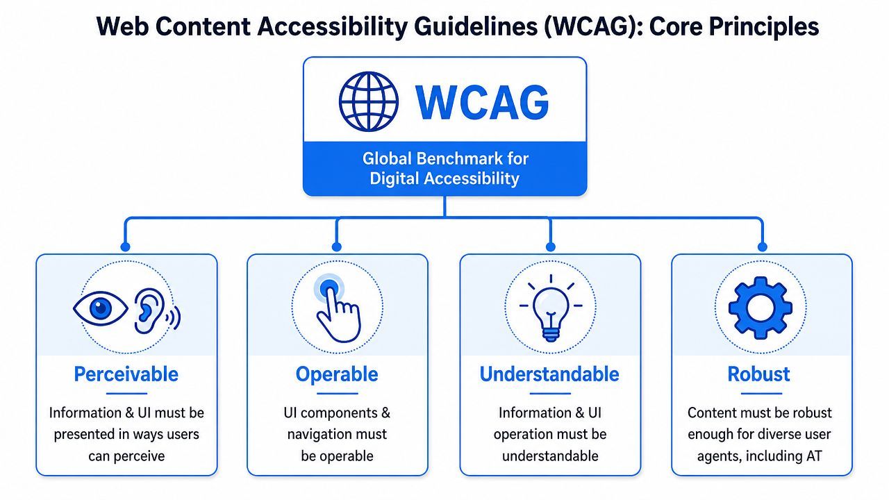
Perceivable
People must be able to detect the information you're presenting.
If an image contains meaning, a blind user needs text that communicates that meaning. If a video teaches something important, a deaf or hard-of-hearing user needs captions or another usable alternative. If text blends into the background, a user with low vision may never get past the first paragraph.
Common examples include:
- Alt text for informative images: Describe the purpose of the image, not every visual detail.
- Captions and transcripts: Help users who can't hear audio clearly, and also help people in quiet or noisy environments.
- Readable contrast: Text needs to stand out from its background.
Operable
Users must be able to interact with the interface.
A surprising number of sites still assume everyone uses a mouse. Many disabled users don't. Some rely on keyboards, switch devices, voice input, or other navigation methods. If your dropdown, modal, filter, or date picker traps focus or can't be activated without a mouse, the task breaks.
Check whether users can:
- Tab through controls in a sensible order.
- See focus states clearly as they move.
- Activate buttons and links without pointer-only gestures.
Understandable
Users need to comprehend both the content and how the interface behaves.
This principle gets overlooked because it feels less technical. It's often the point where teams confuse accessibility with "nice writing." It goes much deeper than tone. Navigation should be predictable. Labels should be specific. Error messages should help someone recover and continue.
Accessibility isn't only about whether a page can be reached. It's also about whether a person can finish what they came to do.
Robust
Your content should work with different browsers, devices, and assistive technologies.
That depends on solid structure. Proper headings, real buttons, associated form labels, and clean HTML give screen readers and other tools a reliable map of the page. If you fake everything with generic containers and scripts, you force assistive tech to guess.
A helpful internal rule is this: use native HTML first, add ARIA only when needed, and test the result with real interaction methods.
Common Barriers and Assistive Technologies
Accessibility becomes real when you connect a defect to a human experience. A missing alt attribute isn't just a code issue. It's a moment when a user loses context. A vague error isn't just weak UX copy. It's a blocked task.
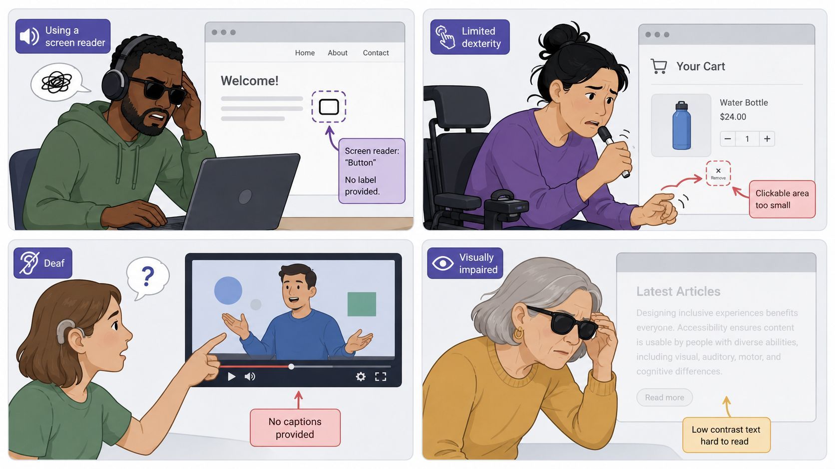
Independent analysis from AudioEye's accessibility statistics roundup says the average webpage has about 297 accessibility issues, and only 2% of websites pass 70% or more of testable accessibility criteria. It highlights recurring failures like missing form labels, low contrast, and poor heading structure. Those issues directly impair assistive technologies.
Visual barriers
A blind user opening a product page with a screen reader depends on structure. If headings are out of order, buttons are unlabeled, and images have no meaningful text alternatives, the page becomes guesswork.
A user with low vision may zoom in, enlarge text, or use screen magnification. If the layout breaks, text overlaps, or controls disappear off screen, they can't continue comfortably.
Assistive technologies commonly used here include:
- Screen readers: Convert digital content into speech or Braille output.
- Screen magnifiers: Enlarge parts of the display for people with low vision.
- High contrast settings: Help users distinguish text and interface elements more easily.
If your team needs a stronger baseline, this guide to understanding assistive technology is a useful companion for designers, developers, and content owners.
Motor and hearing barriers
A keyboard-only user might reach your navigation, but get stuck inside a menu that won't close. They might land on a carousel control with no visible focus. They might open a modal and never reach the close button.
A deaf or hard-of-hearing user faces a different barrier. If your landing page video explains product value without captions, they miss the pitch entirely.
Here's a short demonstration that helps teams see these issues in practice:
Cognitive and learning barriers
This group is often underserved in day-to-day web work. A page can pass basic technical checks and still be hard to complete.
Users may struggle with dense instructions, vague calls to action, inconsistent navigation, or forms that only say "invalid input." In education contexts, this matters even more. Teams supporting students may find this external resource on guidance for university access with SEND helpful because it connects accessibility needs with real learning environments.
Team reminder: If a user has to stop and decode what a page wants from them, accessibility work isn't finished.
Practical Design and Development for Accessibility
Teams don't need to start with a full rebuild. They need repeatable patterns.
The fastest wins usually come from the pages people use most: homepage paths to key categories, signup flows, checkout, support, contact, and any lead form tied to paid traffic. That's where web accessibility for disabled users overlaps directly with CRO.
Start with structure before styling
Developers should treat semantic HTML as the first accessibility tool, not the backup plan. Use one clear H1, logical heading levels, real lists for grouped content, and native form controls whenever possible. Designers can support this by creating component patterns that preserve hierarchy instead of flattening everything into visual boxes.
A simple review checklist:
- Headings: Follow a meaningful order so screen reader users can scan the page.
- Landmarks: Use headers, nav, main content, and footers to create orientation.
- Buttons and links: Make the purpose obvious from the text alone.
- Tables: Use them for tabular data, not page layout.
For a practical implementation reference, this practical accessible web design guide is a strong resource to share across design and engineering.
Write alt text that serves the task
Alt text confuses teams because they try to describe pixels instead of purpose. Ask what the image contributes to the page.
If a product image helps a buyer evaluate an item, describe the product meaningfully. If an icon is purely decorative, it usually shouldn't add noise for screen readers. If a chart carries a core message, the page needs an equivalent text explanation.
Good alt text is concise and specific. It supports the page goal.
Treat forms as conversion infrastructure
The ADA's web guidance emphasizes cognitive accessibility, including clear form instructions and informative error messages so users can fix mistakes. That's not a minor UX preference. It's often the difference between completion and abandonment for people with cognitive disabilities and for screen reader users who need precise feedback.
Strong form design includes:
- Persistent labels: Don't rely on placeholder text as the only label.
- Helpful instructions: Explain required format before the user submits.
- Specific errors: Say what went wrong and how to fix it.
- Programmatic association: Make sure labels, hints, and errors are connected to the field.
A form error should answer three questions immediately: what happened, where it happened, and what to do next.
This is also where content teams can contribute. Marketers often own landing page copy and form microcopy. Their choices affect accessibility as much as layout and code do.
Use ARIA carefully and support cognitive clarity
ARIA can improve accessibility when native HTML can't express the interaction. It can also make things worse when used to patch poor structure. If a standard button works, use a button. If a disclosure pattern can be built with native elements, start there.
For broader pattern libraries and implementation ideas, Nerdify's expertise in accessible design offers useful examples teams can compare against their own work.
A few design habits help cognitive accessibility immediately:
- Keep navigation labels consistent across menus, buttons, and internal links.
- Break long tasks into clear steps when a process is complex.
- Avoid vague link text like "learn more" when several links appear together.
- Place support content near the task so users don't have to hunt for help.
If your internal linking strategy points users toward pricing, demos, category pages, support hubs, or account actions, make those links descriptive. Accessibility and content discoverability improve together.
Building a Sustainable Testing and Maintenance Workflow
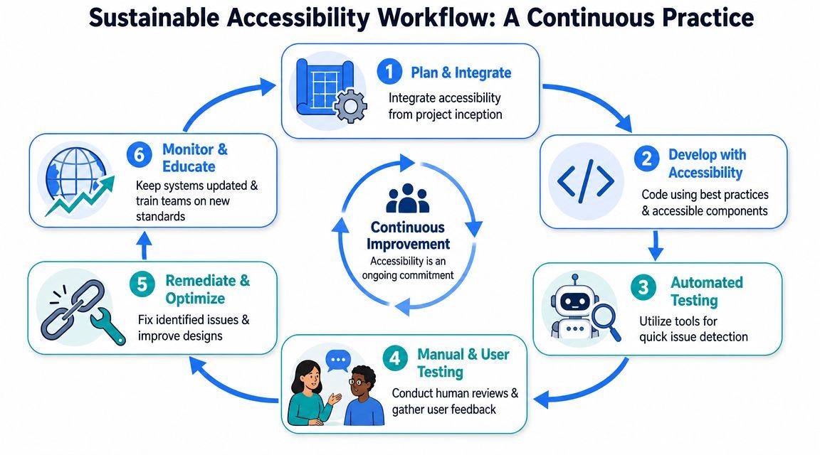
Accessibility problems return the same way weeds do. You can clear a garden once and still find new growth a week later if the soil, tools, and routine stay the same. Websites behave the same way. New campaigns go live, product teams ship features, vendors add scripts, and editors publish pages. Without a repeatable process, old issues come back and new ones slip in.
The W3C accessibility fundamentals overview recommends evaluating accessibility early and throughout development. For teams managing sites that change often, that points to a practical model: combine automated monitoring with scheduled manual checks, then tie both to your release process.
Use a hybrid model
No single testing method can answer every accessibility question.
Automated scans are good at spotting repeated code-level problems across many pages. Manual review catches issues that depend on context, task flow, and judgment. Assistive technology testing shows what the experience is like for someone using a screen reader or keyboard. User-facing accessibility tools can give visitors extra control over the interface, but they do not fix weak markup, unclear copy, or broken interaction patterns.
That mix matters because accessibility failures happen in different layers. A scanner may flag a missing form label in seconds. It will not tell you whether a first-time visitor can recover from an error during signup, or whether a modal traps keyboard focus in a confusing way.
| Workflow element | What it helps catch | Where it struggles |
|---|---|---|
| Automated scanning | Repeated technical errors, missing attributes, obvious structural failures | Context, usability, flow logic |
| Manual expert review | Keyboard behavior, focus order, naming, interaction quality | Coverage at large scale |
| Assistive technology testing | Real-world behavior with screen readers and keyboard navigation | Time and specialist skill |
| User-facing accessibility tools | On-page adjustments and additional access options for visitors | They don't replace code and content quality |
For cross-functional teams, this is usually the clearest mental model: automation gives breadth, manual testing gives depth, and workflow discipline keeps both happening consistently.
Build accessibility into the release process
The easiest way to lose progress is to treat accessibility as a side audit that happens after launch. It works better as a quality check built into the same path you already use for design reviews, QA, publishing, and post-release monitoring.
A sustainable workflow usually includes a few practical checkpoints:
- Design review before build: check reusable components, interactive states, and content requirements before they enter development
- Developer QA before merge: test keyboard flow, focus movement, labels, headings, and error handling
- Automated scans after deployment: catch regressions across templates, campaign pages, and shared components
- Manual checks on high-risk flows: review checkout, login, onboarding, account management, search, and support journeys
- Editorial review for new content: confirm heading order, descriptive links, alt text, captions, and transcript coverage where needed
One rule helps teams stay focused. Test the journeys that change most often, not only the pages with the most traffic.
That approach is especially useful for growth teams. The pages that affect conversion are often the same pages that change every week: landing pages, pricing pages, signup flows, booking steps, and promotional campaigns. If accessibility checks live inside that work, you protect both compliance progress and revenue performance.
For teams that want one place to coordinate monitoring and governance, WebAbility.io combines automated scanning, dashboard reporting, an accessibility widget, and expert support. A setup like that can help organizations manage ongoing checks across marketing sites, apps, and multi-site environments without splitting the work across disconnected tools.
Assign ownership by role
Accessibility maintenance usually breaks down for a simple reason. Work exists, but ownership is fuzzy.
A stronger operating model gives each team a clear lane:
- Designers own component behavior, focus visibility, contrast choices, and state clarity
- Developers own semantics, keyboard support, labels, and implementation quality
- Marketers and content teams own heading structure, link wording, media alternatives, and campaign page reviews
- QA or product operations own regression testing and release readiness
- Leadership owns policy, prioritization, resourcing, and tool selection
This division keeps the program manageable. A small business may handle several of these roles with one person and focus on a handful of templates first. An enterprise may assign owners by product line and tie checks to release governance. An agency may turn the same workflow into a repeatable client delivery process.
That is the larger goal: make accessibility part of how the business ships work. When the process is clear, compliance becomes easier to maintain, conversion paths stay usable, and accessibility supports growth instead of competing with it.
Your Accessibility Roadmap for Business Growth
Every organization needs a different starting point. A small business doesn't need enterprise governance on day one. An enterprise can't rely on ad hoc fixes. Agencies need repeatable systems they can use across clients. Public sector teams need strong policy alignment and documentation discipline.
The useful question isn't "What's the perfect program?" It's "What's the right next roadmap for our context?"
Accessibility roadmap by business type
| Business Type | Top Priority | Recommended Tooling | Key Focus |
|---|---|---|---|
| Small business | Fix core templates and top conversion pages | Accessible CMS theme, automated scanning, widget support, manual review of key flows | Contact forms, service pages, booking or checkout, local trust |
| Digital agency | Standardize delivery across client projects | Accessible design system, pre-launch QA process, repeatable audit checklist, client reporting workflow | Scalable implementation, handoff quality, retained support |
| Enterprise | Establish governance and continuous monitoring | Central dashboard, automated monitoring, expert audits, issue tracking, design system controls | Multi-team consistency, release management, reporting, procurement |
| Public sector and education | Align services with WCAG-based obligations | Policy framework, content review process, document remediation workflow, manual testing for essential services | Forms, service access, PDFs, vendor accountability, public trust |
If you're a small business
Start narrow. Pick the pages that matter most to revenue or lead flow. That usually means your homepage paths, services or product pages, contact forms, and booking or checkout.
Don't wait for a perfect redesign. Improve usability where people are making decisions now. A managed setup with automation, manual review, and user-facing accessibility controls can be a sensible way to move quickly without overloading a small team.
If you're an agency
Agencies benefit from standardizing what good looks like. Build accessibility into your design kits, QA templates, and client launch checklists. If every project starts from accessible heading structures, form patterns, navigation rules, and internal linking conventions, your team avoids preventable rework.
Your commercial upside is clarity. Clients don't just want a polished site. They want a site they can update without creating fresh problems every month.
If you're an enterprise
Enterprise accessibility lives or dies on governance. You need ownership, workflow integration, and reporting that leadership can effectively use. Without that, teams fix isolated pages while regressions keep reappearing elsewhere.
Focus on systems:
- Design systems: Accessible components reduce repeated implementation mistakes.
- Release workflows: Accessibility checks belong in QA and acceptance criteria.
- Vendor review: Third-party tools, embeds, and plugins should be part of your accessibility program.
- Executive visibility: Track issues, remediation status, and risk areas in one place.
If you're in the public sector or education
Your highest priority is service access. People need to complete tasks, retrieve information, submit forms, and engage with essential content independently.
That changes prioritization. A visually polished homepage matters less than whether residents, students, or staff can use the core service paths. Review forms, portals, calendars, notices, and downloadable documents with the same seriousness you give your main website templates.
The best roadmap is the one your team can actually operate every week, not the one that looks complete in a strategy deck.
For any business type, accessibility also supports smarter internal linking. When links are descriptive, page hierarchies are logical, and key destinations are easier to access, users reach high-value pages with less friction. That's good accessibility and good growth strategy at the same time.
Conclusion Start Your Accessibility Journey Today
Web accessibility for disabled users isn't a side task for legal review or a one-off sprint for developers. It's part of how modern teams build usable websites, stronger conversion paths, and more trustworthy digital experiences.
The encouraging part is that you don't need to solve everything at once. Start with your highest-value journeys. Fix the barriers that block reading, navigation, form completion, and error recovery. Put standards into design. Put checks into development. Put maintenance into publishing and release workflows.
That approach gives your team a realistic path forward. It also creates a better experience for everyone who visits your site, including people using keyboards, zoom, captions, screen readers, simpler language, or clearer navigation to get things done.
The best first move is simple. Get a baseline. See where your site creates friction today, then prioritize the fixes that affect core user journeys most.
If you're ready to turn accessibility from a vague requirement into an operational workflow, WebAbility.io gives teams a practical place to start with scanning, monitoring, reporting, user-facing accessibility features, and expert guidance. Run a baseline check, review your highest-priority issues, and build an accessibility process your team can maintain.
Quick Questions
Tap to ask AI about this article