How to Increase Font Size for Users & Developers

Sidharth Nayyar

TL;DR: If you need a bigger font right now, use your browser zoom shortcut: Ctrl/Cmd + +. If you build websites, the reliable way to increase font size is to use relative CSS units like rem and make sure text can scale to 200% without breaking content or functionality to meet WCAG 1.4.4, or use a managed accessibility widget for broader user controls.
Why Font Size Is More Than a Style Choice
About 16% of the world’s population lives with a significant disability, according to theWorld Health Organization. A large share of those users depend on readable, scalable text to use the web comfortably. That makes font size a product decision with direct consequences for usability, conversion, support load, and legal risk.
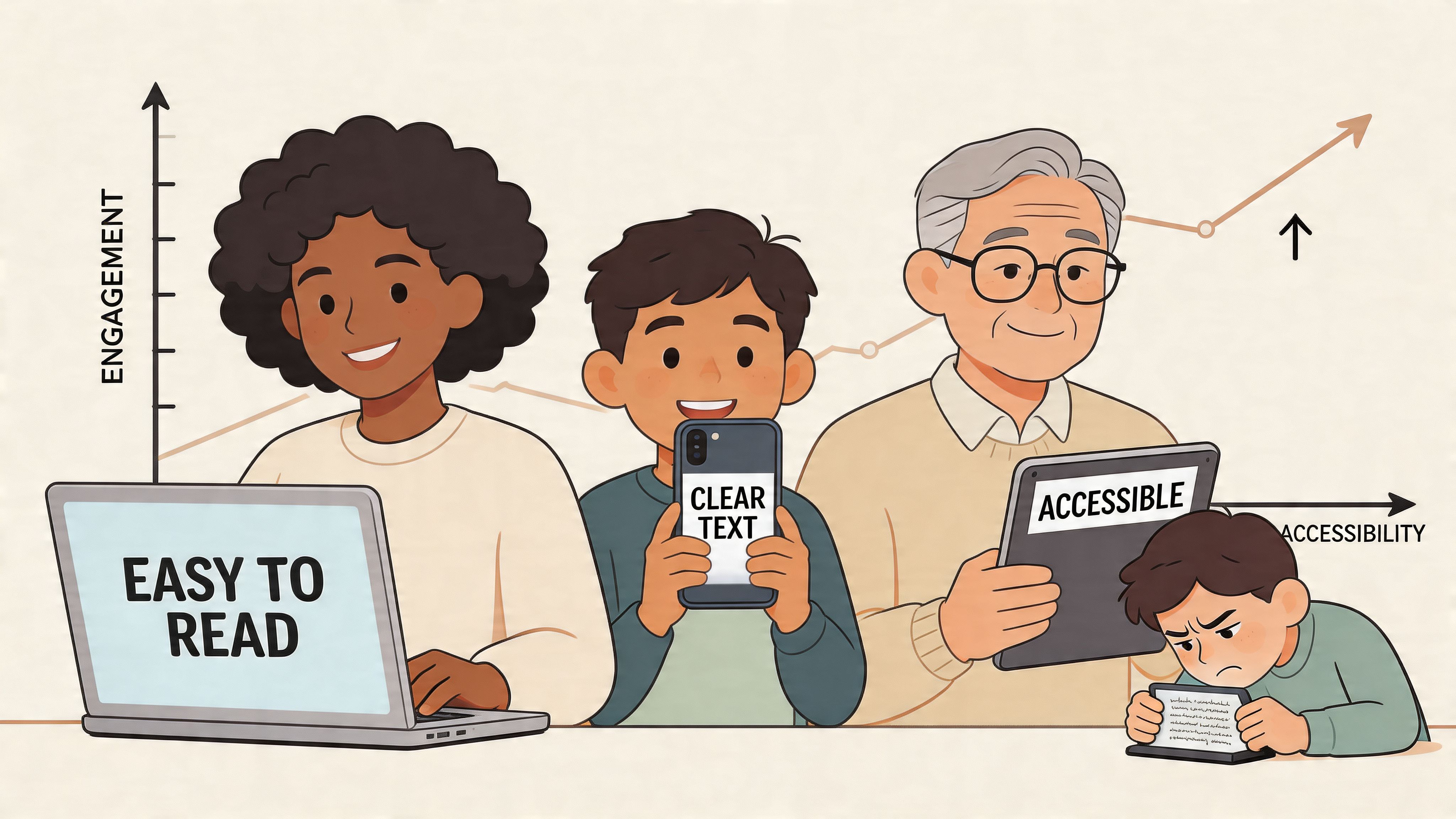
I’ve seen teams spend weeks refining a design system, then watch it fail the moment a user increases text size on a high-resolution display. The common mistake is treating typography as a fixed visual layer instead of a functional part of the interface. Users do not experience text in isolation. They experience text inside buttons, forms, cards, menus, and checkout flows.
For users, the problem is immediate. If text is too small, the page becomes tiring or unusable. If resizing text causes overlap, clipping, or hidden controls, the site tells people with low vision, age-related vision changes, or situational needs that they were not considered.
For developers, the responsibility is structural. The W3C’s understanding of WCAG 2.2 Success Criterion 1.4.4 Resize Text requires text to scale up to 200% without loss of content or functionality. In practice, that means font size, line length, spacing, container rules, and component behavior all need to work together.
One poor CSS decision can break all of it.
Fixed pixel values, hard-coded heights, and layouts that assume one text length are the usual failure points. I see this often in marketing sites and design systems that look polished at default settings but collapse under real user conditions. The trade-off is simple. Tight visual control gives designers predictability, but flexible type gives users access. Accessible products choose access first, then design for it.
Typeface choice matters too, but only as part of the full reading experience. A readable size in a poor font still creates friction, and a good font at a cramped size still fails people. If your team is reviewing both variables, this guide to accessible fonts for digital reading is a useful companion.
Scalable text improves more than compliance. It reduces abandonment, lowers frustration, and helps more people complete tasks without assistance. For large teams, this is why text scaling belongs in the core product experience. For organizations that need to move faster, low-code accessibility tools such as WebAbility.io can speed up user controls and personalization without waiting for a full front-end rebuild.
Quick Fixes for Readable Text Instantly
If you need to increase font size right now, start with the tools already built into your browser and operating system. They work quickly, don’t require extensions, and usually solve the problem in seconds.
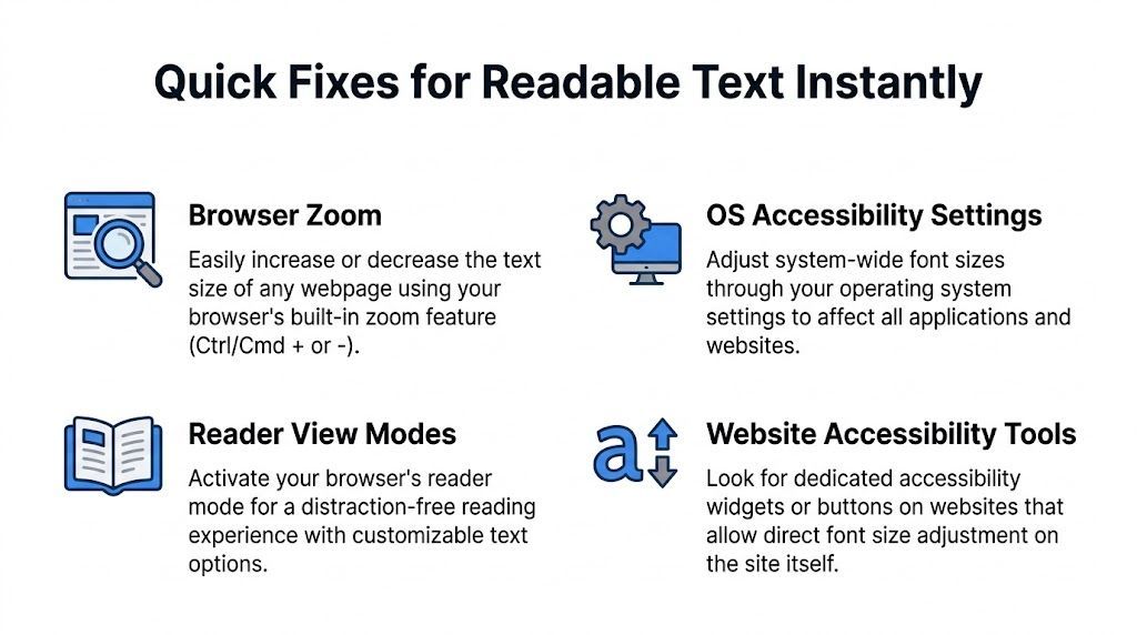
Browser zoom first
For most websites, browser zoom is the fastest answer.
Chrome
Press Ctrl + + on Windows or Cmd + + on macOS to zoom in. Use Ctrl/Cmd + - to zoom out, and Ctrl/Cmd + 0 to reset. Chrome also lets you change the default page zoom in Settings if you need a larger baseline every time.
Firefox
The same shortcuts work. Firefox also has Reader View on supported pages, which strips away clutter and often makes text easier to read.
Safari
On a Mac, use Cmd + + and Cmd + -. Safari also supports Reader mode on many article pages, which is useful when the original layout is dense or distracting.
Edge
Edge follows the same keyboard pattern as Chrome. If you prefer menus, open the browser menu and adjust zoom manually.
Browser zoom is better than pinching and squinting because it scales the page consistently. If the site was built well, text, spacing, and layout should all respond together.
Use system settings when the problem is broader
If text looks small across many apps, change your device settings instead of fixing one site at a time.
Windows
Open display or accessibility settings and increase text or scale. This helps across the system, especially on higher-resolution screens.
macOS
Adjust display scaling and accessibility text options. If your issue appears in several apps, this is usually more effective than changing each app separately.
On websites with accessibility controls
Look for an accessibility button, text size control, or reading settings. Some sites offer direct controls for text size, spacing, and contrast.
Reader modes are underrated. When the page is overloaded with sidebars, popups, and sticky elements, Reader View can improve readability faster than any manual tweak.
If the site offers font controls, use them
Dedicated text resizing controls can be easier than browser settings because they’re visible and purpose-built. That matters for users who don’t remember shortcuts or who need a simpler interface.
If you're also comparing typeface choices, this guide to accessible fonts for websites is a useful companion. Bigger text helps, but typeface, spacing, and stroke clarity affect readability too.
Not every site exposes these controls. When they do, use them. When they don’t, browser zoom remains the most dependable universal fix.
Building Scalable Text for Developers The Right Way
About 1 in 6 people worldwide live with a significant disability, and text scaling is one of the simplest ways to make content usable across that audience, according to the World Health Organization. For developers, that makes font sizing a product decision, not a visual tweak.
The failure pattern is familiar. Teams set type in pixels because handoff feels tidy, then spend the rest of the project fixing clipped buttons, broken cards, and headings that stop making sense once users enlarge text. WCAG requires text to resize up to 200% without loss of content or functionality under Success Criterion 1.4.4 Resize text. The practical path is to build type and layout to scale together from the start.
A reliable baseline starts with relative units. Sites built with rem and em pass WCAG resize tests over 95% of the time, compared with 40% for sites built with fixed pixel sizes.
Why fixed sizing breaks in production
Pixels still have a place for borders, hairlines, and some interface details. They are a poor default for an entire type system.
Hard-coded text sizes create maintenance debt fast. A label wraps in German. A support message runs longer than expected. A modal title grows at 200% and collides with the close button. None of these are edge cases on a public site. They are normal states.
Relative sizing works better because it respects the browser default, user preferences, and zoom behavior at the same time. That matters for accessibility, but it also reduces QA churn and redesign work later.
A practical unit comparison
| Unit | Relative To | Primary Use Case | Accessibility Impact |
|---|---|---|---|
px | Fixed pixel value | Fine-grained visual control | Risky as the default for a full type system because scaling becomes brittle |
rem | Root html font size | Global type scale, spacing systems | Strong choice for consistent text resizing across pages and components |
em | Parent element font size | Component-local scaling | Useful for local relationships, but nested components can grow unexpectedly |
% | Parent or browser default context | Root sizing and proportional adjustments | Helpful for preserving user defaults and broad compatibility |
A clean baseline that scales
Start with the root and keep the relationships simple.
html { font-size: 100%; text-size-adjust: 100%; } body { font-size: 1rem; line-height: 1.5; } h1 { font-size: 1.5rem; } h2 { font-size: 1.375rem; } h3 { font-size: 1.25rem; } h4 { font-size: 1.125rem; } h5, h6 { font-size: 1rem; } This setup preserves the user’s default text size instead of overriding it. It also gives the design system one source of truth. Change the root, and the scale updates predictably across templates, components, and content blocks.
For teams reviewing hierarchy choices, weight, and readability together, this guide on font size and font style in accessible design pairs well with component-level audits.
What holds up under real traffic
Typography does not fail in the style guide. It fails in live content.
A scalable system needs layouts that can absorb larger text without clipping or overlap:
Let cards, buttons, tabs, and nav items grow vertically.
Avoid fixed heights on text containers unless content is strictly controlled.
Use flexbox and grid for reflow instead of positioning text into rigid boxes.
Set line height and spacing with readability in mind, not just visual density.
Test long labels, error states, translated strings, and account screens at enlarged text sizes.
I have seen teams pass a homepage review and still fail accessibility in checkout, account settings, or embedded forms because those surfaces were treated as separate products. Users do not make that distinction. If one part of the experience breaks at larger text, the site breaks.
That is also why website accessibility compliance should be handled as an engineering and operations concern, not only a design review item.
What developers often miss
Embedded widgets, consent banners, support chat, and third-party account tools are common failure points. They often ship with fixed heights, inline pixel values, or iframe constraints that ignore the rest of your system. Audit them early.
The same goes for low-code accessibility tooling. Used well, it can speed up delivery of user controls and personalized settings without waiting for a full rebuild. That is not a shortcut around good CSS. It is a faster way to ship a scalable experience while the underlying design system keeps improving.
The baseline remains consistent. Set the root size carefully, build text in rem, use em where local scaling makes sense, let layouts expand, and test with resized text before release.
Adding User Controls and Meeting WCAG Standards
A strong CSS foundation handles a lot, but many teams also need explicit user controls. That’s where simple on-page text resizing helps.
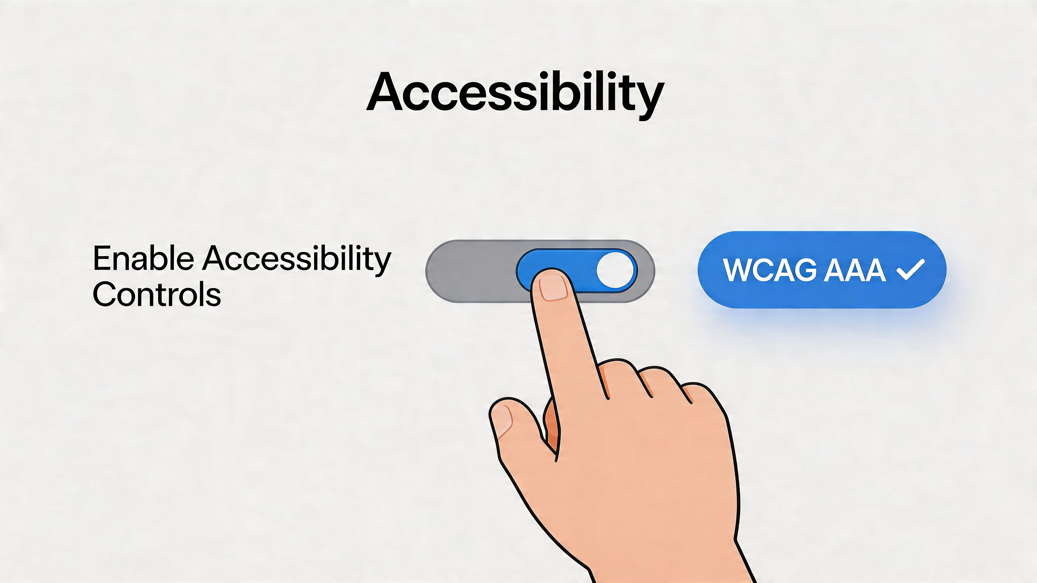
A plain A+ / A- interface is often the right call. It’s easier to understand than a settings menu, and it’s faster to use. Nielsen Norman Group notes that a two-button text resizing interface can reduce task completion time by up to 60% for motor-impaired users compared with dropdowns, and recommends storing the preference in localStorage, as covered in this NN/g article on user-controlled font size.
Keep the control simple
Don’t hide text controls behind a profile menu if readability is the issue. Put them where users can find them and make the labels obvious.
A basic implementation can look like this:
<div class="text-controls" aria-label="Text size controls"> <button id="decrease-text">A-</button> <button id="increase-text">A+</button> </div> html { font-size: 100%; } .text-controls button { font: inherit; padding: 0.5rem 0.75rem; } const html = document.documentElement; const increase = document.getElementById('increase-text'); const decrease = document.getElementById('decrease-text'); function getCurrentSize() { return parseFloat(getComputedStyle(html).fontSize); } function setSize(size) { html.style.fontSize = `${size}px`; localStorage.setItem('preferredFontSize', size); } increase.addEventListener('click', () => { setSize(getCurrentSize() * 1.2); }); decrease.addEventListener('click', () => { setSize(getCurrentSize() / 1.2); }); const saved = localStorage.getItem('preferredFontSize'); if (saved) setSize(parseFloat(saved)); This approach works because it adjusts the root size and lets your rem-based typography respond naturally.
WCAG compliance is about behavior, not just controls
WCAG 1.4.4 requires text to scale to 200% without loss of content or functionality. That doesn’t mean you need a visible A+ button on every site. It means users must be able to enlarge text successfully.
In practice, I check four things:
Text still fits inside buttons, cards, tables, and dialogs.
Navigation still works when labels wrap.
No content is hidden by fixed-height containers or overflow clipping.
Interactive flows remain usable, especially forms, checkout, account settings, and dashboards.
If your team needs a broader governance view, this resource on website accessibility compliance gives helpful context for how text resizing fits into a larger compliance program.
Passing resize text isn’t about making headlines bigger. It’s about making the whole experience survive enlarged text.
A structured review also helps. This wcag compliance checklist is a practical way to catch related failures in layout, focus order, contrast, and keyboard behavior while you test text scaling.
Here’s a visual walkthrough for teams that want to see the pattern in action:
Test the ugly states
A lot of interfaces look fine at default size and fail the moment the content becomes real.
Test with:
Long headings that wrap across multiple lines
Dense forms with helper text and validation
Tables or data-heavy cards that have limited horizontal space
Translated strings that run longer than English
Sticky headers and mobile navs where enlarged text can collide with controls
That’s where the trade-offs become visible. You may need shorter labels, better spacing tokens, flexible containers, or alternate navigation patterns. That isn’t a failure of accessibility. It’s how accessibility forces stronger design decisions.
The Smart Path to Accessibility A Low-Code Solution
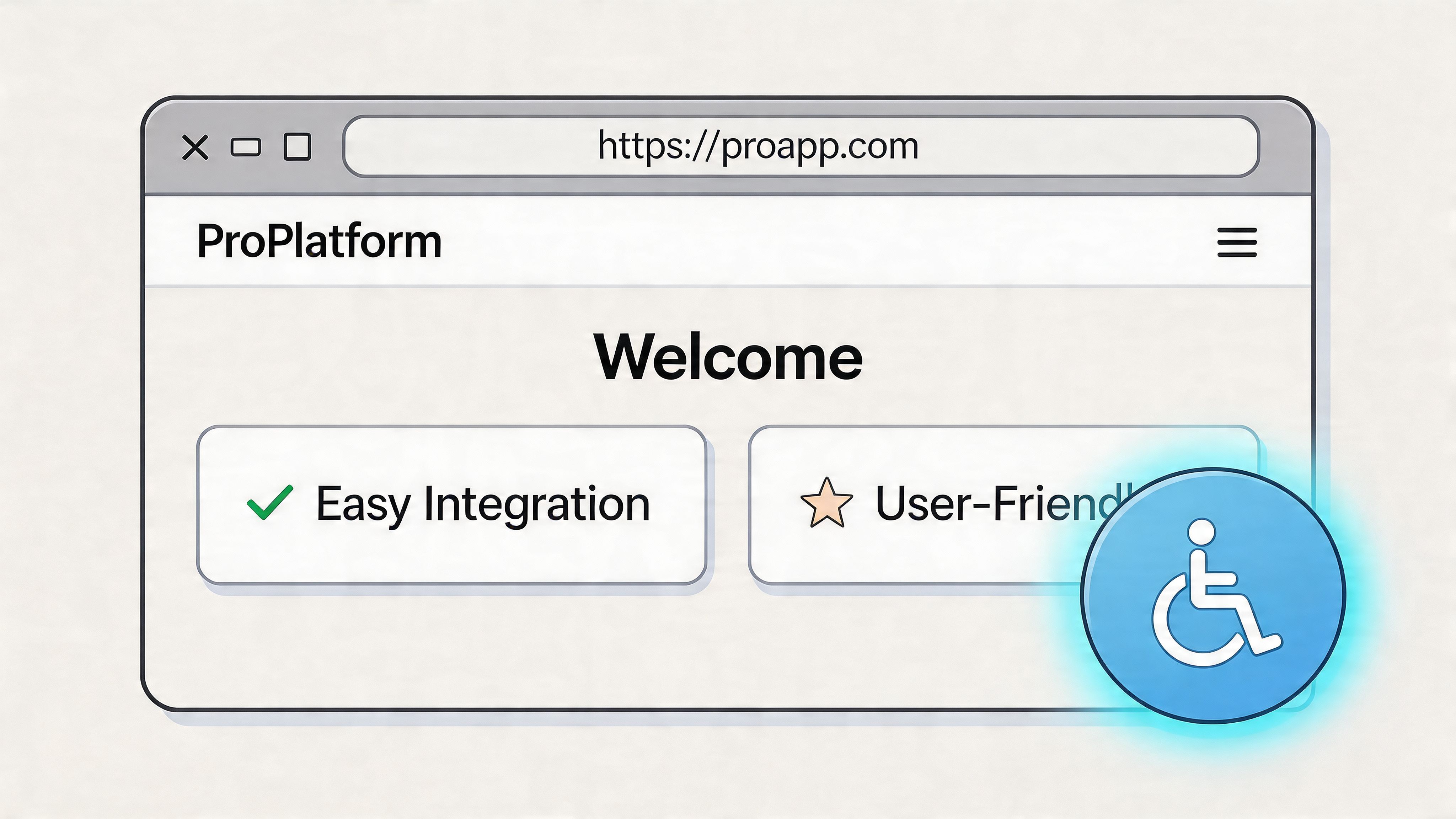
Teams usually reach this section after they learn the hard part: passing text resize checks in code is only the floor. Real users often need a combination of larger text, more spacing, better contrast, and settings that persist across visits.
Why basic resizing isn’t always enough
WCAG defines a minimum expectation. It does not define the exact reading setup that works for each person. For example, U.S. health literacy guidance notes that optimal line height is typically 130% to 150% of font size, and users may need different combinations of size, spacing, and type choices to read comfortably.
That matters in production.
A larger font can improve readability right away, but it will not solve every reading barrier. Some users need more letter or line spacing. Some read better with a different typeface. Others need text scaling and contrast changes together. If those adjustments are missing, the site may technically resize while still feeling hard to use.
Where a managed solution fits
A managed accessibility layer can reduce that gap between minimum compliance and usable personalization. WebAbility.io adds text scaling controls, user preference profiles, and related adjustments through a low-code layer, which can help teams roll out support faster across multiple sites or business units.
I’ve seen this trade-off play out on large web programs. Building every control in-house gives product teams more direct control over behavior and design system alignment, but it also creates ongoing maintenance work, QA load, and version drift between properties. A managed layer helps standardize the user controls while internal teams keep improving the underlying front end.
That split is often practical. Users get immediate ways to adjust the experience now. Developers get time to fix templates, components, and content patterns properly instead of treating every request as a one-off patch.
A strong UI/UX design strategy helps too, because text personalization works better when spacing, component growth, and reading preferences are considered at the system level.
Good low-code accessibility tooling gives users direct control and gives teams a repeatable way to ship that control across properties.
If you are comparing options, this detailed review of accessibility widgets and related tools is a useful starting point for evaluating feature scope, governance needs, and deployment models.
The trade-off to think about
Hand-coded controls are a good fit when a team has strong accessibility engineering capacity, tight product requirements, and time to maintain the experience over multiple releases. Managed solutions are often the better fit when the bigger risk is inconsistent coverage, slow rollout, or fragmented ownership across marketing sites, portals, and content-managed pages.
In practice, many organizations need both. They need semantic HTML, flexible CSS, and resize-safe components in the product itself. They also benefit from a managed layer that gives people personalized text controls without waiting for every template and team to catch up.
Frequently Asked Questions About Font Sizing
Is browser zoom the same as increasing only text size
No. Browser zoom usually scales the entire page, including text, images, and layout. Text-only resizing targets typography more specifically. For users, browser zoom is often the faster fix. For developers, both behaviors matter because layouts still need to hold up when text grows.
What’s a good default font size for a website
A common baseline is setting the root to the browser default and building from there with rem. In practice, many teams start with a body size that maps to the default reading size users already expect, then create a clear heading scale above it. The better question isn’t “what default is perfect?” It’s whether users can comfortably adjust it.
Does larger font size affect SEO
Not directly in the sense of a special ranking bonus for bigger text. But readable content improves usability, scanning, and task completion, which supports the experience search engines want users to have. If text is too small to read comfortably, people often leave before engaging with the page.
Why does text resizing break some websites
Usually because the site uses fixed pixel values, fixed-height containers, or tightly packed components that can’t expand. Resize failures are often layout failures, not typography failures.
Should I offer an A+ and A- control if browser zoom already exists
Often, yes. Browser zoom is universal, but visible on-page controls are easier for many users to discover and use. They’re especially helpful when the audience includes people who don’t know the keyboard shortcuts or who need a more direct option.
What else should change besides font size
Line height, spacing, font family, and contrast often matter just as much. Some users read best with larger text and more breathing room. Others need a different typeface or a simpler presentation mode. Good accessibility work treats readability as a set of related controls, not a single slider.
If your team needs a practical way to support text resizing, personalized reading settings, and ongoing accessibility work across real websites, WebAbility.io is worth evaluating as part of your stack. It gives organizations a way to add user controls, monitor accessibility status, and support broader compliance efforts without slowing down every release.
Quick Questions
Tap to ask AI about this article