Mastering Table Code for HTML: 2026 Guide to Modern Layouts

Sidharth Nayyar

The core table code for html is still the same foundation it has been since HTML 2.0 in November 1995: use <table> for the table, <tr> for rows, <th> for header cells, and <td> for data cells. That gets a table on the page, but it doesn't get you a table that's semantic, readable, responsive, and safe to ship on a production site.
If you're here, you're probably doing one of three things. You're building a quick pricing table, cleaning up AI-generated markup, or trying to make a wide dataset behave on mobile without wrecking usability. All three start with the same markup, and all three go wrong when developers stop at the visual result and ignore structure.
A good table isn't just something that looks like a grid. It tells browsers what the data means, helps assistive technology announce the right context, and stays usable when the screen gets narrow. That's the difference between a demo snippet and production-ready table code for html.
The Fundamental HTML Table Structure
A table usually looks fine in the browser long before it is ready for production. That is where junior developers get burned. The grid renders, the demo passes, and later someone discovers the headers are wrong, the mobile version falls apart, or a screen reader announces cells with no useful context.
HTML gives you more than a way to draw rows and columns. It gives you a way to describe relationships inside a dataset, which is what separates a quick visual mockup from table code you can trust in a product, admin panel, or reporting view.
Start with the smallest working table
This is the bare minimum:
<table> <tr> <td>Plan</td> <td>Price</td> </tr> <tr> <td>Starter</td> <td>$19</td> </tr> </table> Browsers will render that without complaint. The problem is structural. The first row reads like a header row to a person, but the markup defines every cell as ordinary data.
That distinction matters in real projects. CSS can fake the look of a header. It cannot give assistive technology the same meaning, and it does not help future developers understand the table at a glance.
Refactor it into semantic markup
Here is the same table done properly:
<table> <thead> <tr> <th scope="col">Plan</th> <th scope="col">Price</th> </tr> </thead> <tbody> <tr> <td>Starter</td> <td>$19</td> </tr> <tr> <td>Growth</td> <td>$49</td> </tr> </tbody> </table> Now each part has a clear job.
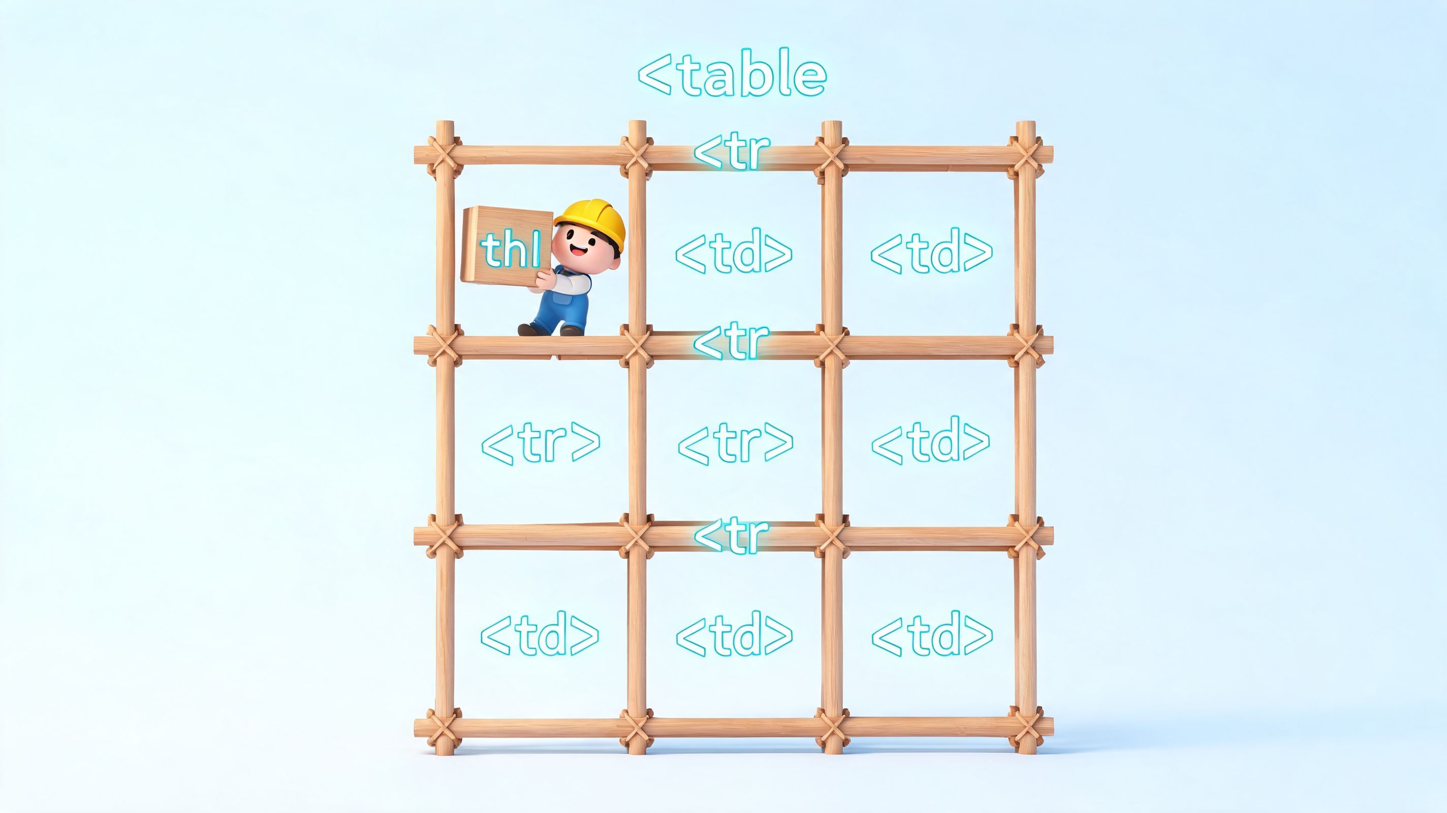
<table>contains the dataset.<thead>groups column headers.<tbody>groups body rows.<tr>creates a row.<th>marks a header cell.<td>holds a data cell.
Use scope="col" for column headers and scope="row" for row headers when the relationship is straightforward. That small attribute saves a lot of guesswork for screen readers and makes AI-generated table markup easier to audit. If a generator gives you a table full of <td> cells and bold text, treat it as a draft, not finished code.
Practical rule: if a cell labels other cells, make it a
<th>.
Use a real-world template
A feature comparison table is a solid pattern to keep around:
<table> <caption>Product feature comparison</caption> <thead> <tr> <th scope="col">Feature</th> <th scope="col">Starter</th> <th scope="col">Pro</th> </tr> </thead> <tbody> <tr> <th scope="row">Custom reports</th> <td>No</td> <td>Yes</td> </tr> <tr> <th scope="row">API access</th> <td>No</td> <td>Yes</td> </tr> <tr> <th scope="row">Priority support</th> <td>No</td> <td>Yes</td> </tr> </tbody> </table> This version does three things right.
<caption> gives the table a clear name, which helps users who jump between tables with assistive tools. The first row uses column headers. The first cell in each body row becomes a row header, which keeps the relationship between feature names and plan values explicit.
That structure also pays off outside accessibility. It makes CSS targeting cleaner, JavaScript sorting less fragile, and QA review faster because the intent is visible in the markup. If your team relies on generated code, this is one of the easiest places to enforce standards that reduce rework later. For a broader foundation, read the WebAbility.io guide to semantic structure.
What to keep and what to avoid
| Approach | Works visually | Holds up in production |
|---|---|---|
<td> everywhere | Yes | No |
| Bold first row with CSS only | Yes | No |
<thead>, <tbody>, <th>, <td> | Yes | Yes |
Build the meaning first. Then style it.
That order matters because every responsive pattern, accessibility fix, and compliance review gets easier when the table starts with correct HTML.
Styling Tables with CSS for Readability
A plain table with correct HTML is functional, but most default browser styling is rough. Tight cells, hard borders, and no row separation make larger datasets tiring to scan.
Start with the basic cleanup
Use this CSS as a reliable baseline:
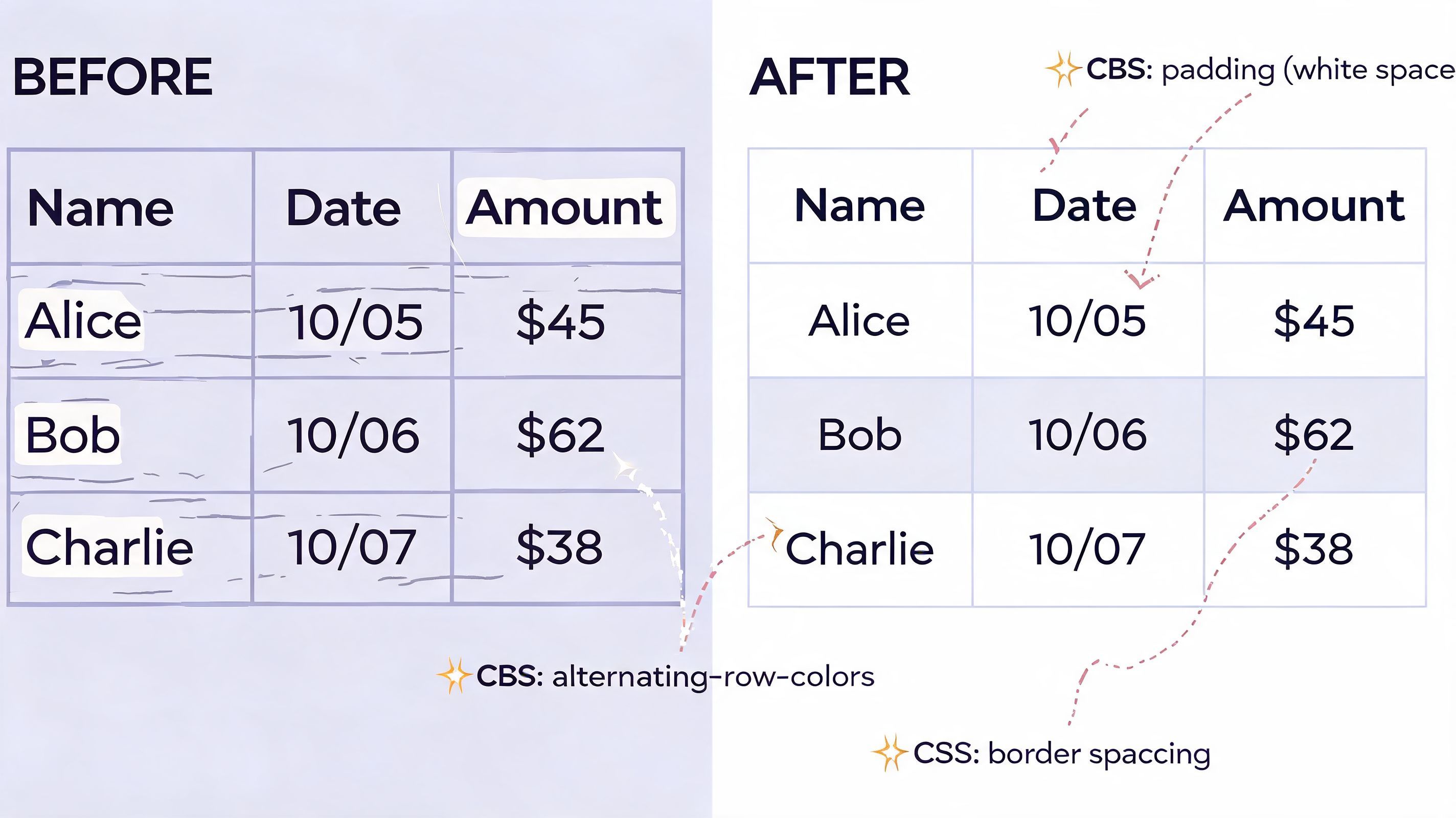
table { width: 100%; border-collapse: collapse; font-size: 0.95rem; } caption { text-align: left; font-weight: 600; margin-bottom: 0.75rem; } th, td { padding: 0.75rem 1rem; border: 1px solid #d9d9d9; text-align: left; vertical-align: top; } thead th { background: #f5f7fa; } tbody th { background: #fafafa; font-weight: 600; } This does four useful things fast. It removes the double-border look with border-collapse, adds breathing room with padding, gives headers a visual anchor, and keeps text aligned in a way that's easier to read.
Add striping for long tables
Long rows blur together. Zebra striping is one of the simplest fixes.
tbody tr:nth-child(even) { background: #fcfcfc; } Applying simple styling like striped rows via CSS nth-child selectors can improve readability and reduce data misreading errors by up to 30%, particularly for users with dyslexia or people scanning large datasets (HubSpot guide to making a table in HTML).
That number lines up with what many frontend teams already see in practice. Subtle striping helps people keep their place without turning the table into a high-contrast mess.
Clean styling should support the data, not compete with it.
A before-and-after mindset
Unstyled tables tend to have these problems:
- Cramped cells make values blend together
- Weak header contrast makes scanning slower
- Uniform rows increase the chance of reading across the wrong line
- Default spacing often looks uneven across browsers
A styled table feels calmer. Users find the right column faster, especially in admin screens, dashboards, pricing matrices, and support portals.
Keep your CSS maintainable
If you're working on a real project, don't bury table rules inside a page component unless the table is a true one-off. Shared table styles belong in a reusable stylesheet or design system layer. That's one reason teams manage styling with external CSS files instead of scattering table rules across templates.
A useful production pattern is to define a class rather than styling every table globally:
.data-table { width: 100%; border-collapse: collapse; } .data-table tbody tr:nth-child(even) { background: #fcfcfc; } Then apply it like this:
<table class="data-table"> ... </table> That gives you control. Marketing tables, financial tables, and backend admin tables usually need different presentation choices, even when the underlying HTML structure is the same.
Implementing Responsive Table Patterns
Responsive tables are where good intentions usually break. A table that feels perfectly reasonable on a laptop can become unusable on a phone as soon as column widths stop fitting the viewport.
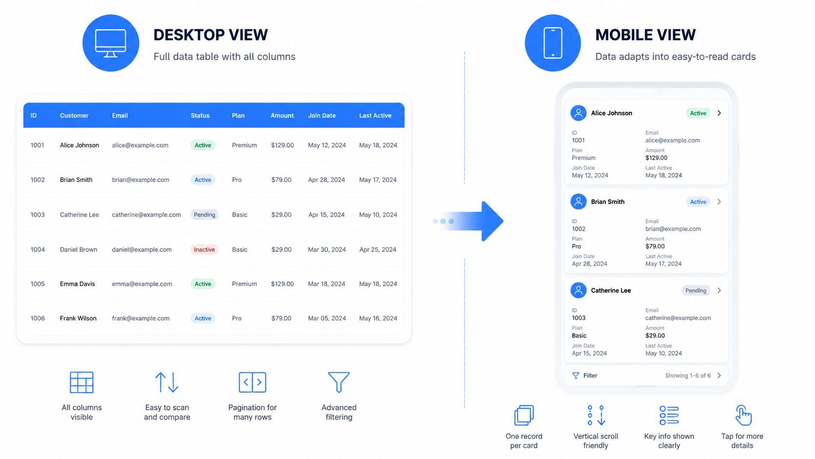
Fixed-width table rendering on small screens renders approximately 60% of tables inaccessible or difficult to use. For tables exceeding 12 columns, users can experience a 50% increase in data comprehension errors due to cognitive overload. That makes responsive handling a usability requirement, not a visual enhancement.
Pattern one with horizontal scrolling
For dense data, horizontal scrolling is often the least bad option.
<div class="table-scroll"> <table class="data-table"> <caption>Quarterly feature rollout status</caption> <thead> <tr> <th scope="col">Team</th> <th scope="col">Q1</th> <th scope="col">Q2</th> <th scope="col">Q3</th> <th scope="col">Q4</th> </tr> </thead> <tbody> <tr> <th scope="row">Platform</th> <td>Done</td> <td>In progress</td> <td>Planned</td> <td>Planned</td> </tr> </tbody> </table> </div> .table-scroll { overflow-x: auto; } .table-scroll table { min-width: 700px; } This pattern preserves the native table structure. That's its biggest advantage.
Use it when:
- Data relationships matter across columns
- Users need to compare values side by side
- You can't collapse columns without losing meaning
The trade-off is obvious. Horizontal scrolling isn't elegant. But for financial data, schedules, specs, or audit logs, it's often the correct choice.
A strong mobile UX depends on more than tables. If you're reviewing broader small-screen behavior across templates, Silva Marketing's guide to mobile websites gives useful context on how mobile design decisions affect real usability.
To see a responsive example in action, this walkthrough is useful:
Pattern two with stacked cards
When a table is more record-based than comparison-based, stack each row into a card on narrow screens.
<table class="responsive-cards"> <thead> <tr> <th scope="col">Plan</th> <th scope="col">Users</th> <th scope="col">Support</th> </tr> </thead> <tbody> <tr> <td data-label="Plan">Starter</td> <td data-label="Users">3</td> <td data-label="Support">Email</td> </tr> </tbody> </table> @media (max-width: 640px) { .responsive-cards thead { position: absolute; left: -9999px; } .responsive-cards tr { display: block; margin-bottom: 1rem; border: 1px solid #ddd; padding: 0.75rem; } .responsive-cards td { display: block; border: 0; padding: 0.5rem 0; } .responsive-cards td::before { content: attr(data-label); display: block; font-weight: 600; margin-bottom: 0.25rem; } } This pattern reads well on phones. It does not preserve cross-column comparison well.
Choose based on data shape
| Pattern | Best for | Main cost |
|---|---|---|
| Horizontal scroll | Wide comparison tables | Users must scroll sideways |
| Stacked cards | Record-style tables | Column comparison gets weaker |
If your table still works when each row becomes a mini summary, cards are fine. If users need to compare columns quickly, keep the table and allow controlled scrolling.
For teams documenting this at a system level, the WebAbility.io accessibility standards guide is a useful reference point for content reflow expectations.
Making Tables Accessible for WCAG Compliance
A table can pass visual QA and still fail the users who rely on screen readers. I see this often with rushed builds and AI-generated snippets. The grid looks clean, the CSS is polished, and the actual relationships between headers and data are missing.
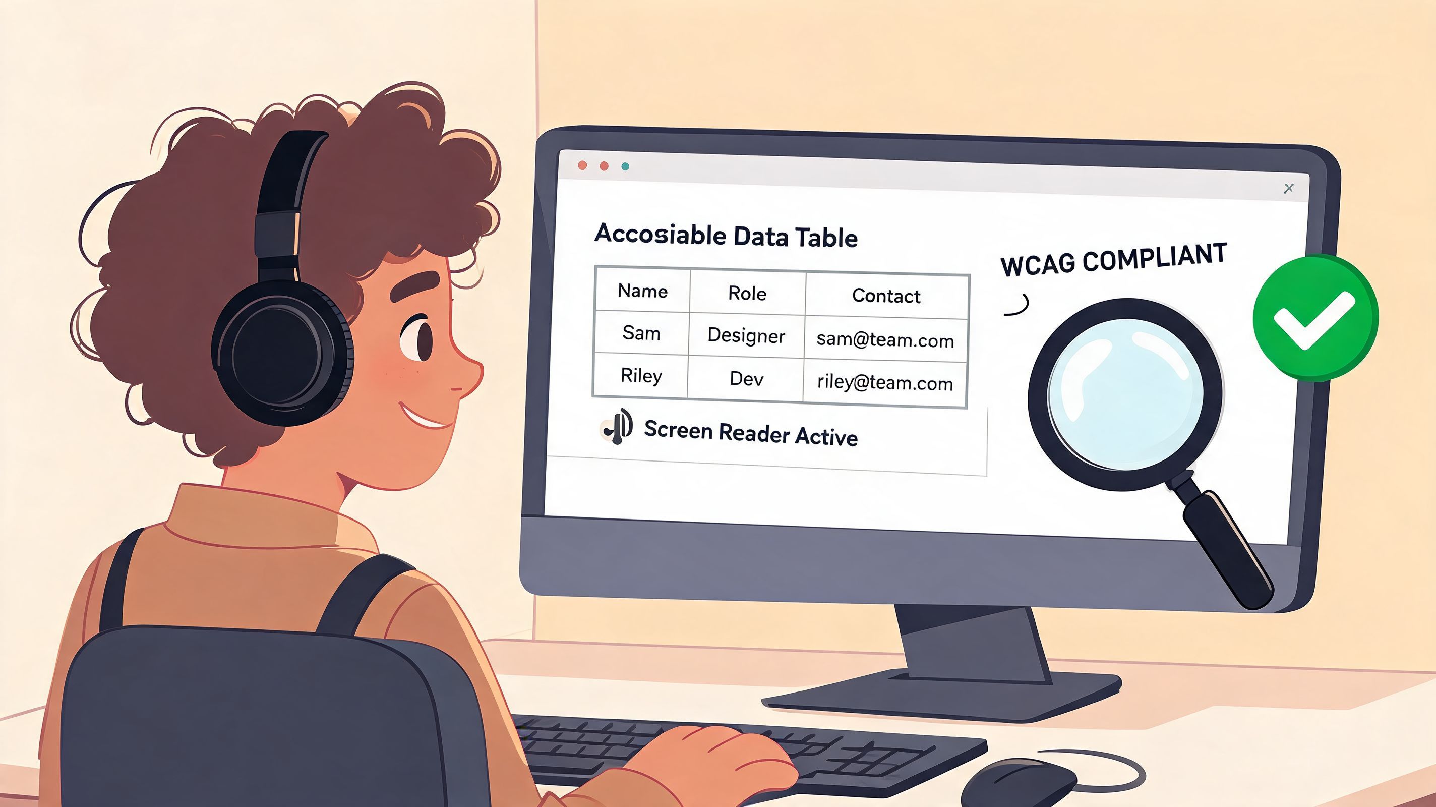
That is not a minor defect. It affects comprehension, creates avoidable legal risk, and turns simple business data into something part of your audience cannot use. Teams that treat accessibility as a release requirement usually end up with clearer markup, fewer support issues, and better QA discipline across the whole frontend.
Start with caption and real header associations
For a straightforward data table, this is the pattern to ship first:
<table> <caption>Support plan comparison</caption> <thead> <tr> <th scope="col">Plan</th> <th scope="col">Response time</th> <th scope="col">Channel</th> </tr> </thead> <tbody> <tr> <th scope="row">Starter</th> <td>Standard</td> <td>Email</td> </tr> <tr> <th scope="row">Pro</th> <td>Priority</td> <td>Email and chat</td> </tr> </tbody> </table> This markup gives assistive technology the context it needs without extra complexity.
<caption>names the tablescope="col"maps column headers to the cells belowscope="row"maps row headers to the related cells in that row
That baseline is still missed more often than it should be. WebAIM's early survey work on data tables found that header markup was frequently absent, which helps explain why many older tables remained hard to interpret for screen reader users (WebAIM screen reader survey on data tables). The age of that survey does not make the issue irrelevant. It shows how long teams have been shipping tables that look correct and read poorly.
Use scope for simple tables. Switch to headers when the structure gets complex
scope is clean and maintainable for standard row and column relationships. Once a table has grouped headings, multi-row headers, or irregular spans, I stop assuming scope will be enough and map the relationships explicitly.
<table> <caption>Regional sales summary</caption> <thead> <tr> <th id="region">Region</th> <th id="q1">Q1</th> <th id="q2">Q2</th> </tr> </thead> <tbody> <tr> <th id="north" headers="region">North</th> <td headers="north q1">Open</td> <td headers="north q2">Closed</td> </tr> </tbody> </table> This is more verbose. That is the trade-off. It also survives audits better because the relationship is explicit in the DOM instead of being guessed from visual layout.
AI tools regularly get this wrong. They tend to output tables that are syntactically valid, but they skip row headers, misuse <td> where <th> belongs, or add ARIA that solves nothing. Treat generated code as a draft. Review every header relationship yourself before it reaches production.
Accessibility work on tables has direct product value
Accessible tables are easier to test, easier to maintain, and easier for everyone to understand. That includes users on zoomed layouts, keyboard users working through interactive cells, and anyone scanning dense pricing or reporting data.
For the broader UX perspective, how to improve website user experience is a useful reminder that accessibility improvements usually help all users, not only users of assistive tech.
Audit the table before merge
Use a short review pass to address actual failure points.
- Confirm the table presents tabular data, not page layout
- Check that every data cell has an associated header
- Add a
<caption>if the table needs context outside surrounding copy - Test keyboard access if cells contain links, buttons, menus, or form controls
- Run one screen reader pass on real content, not placeholder text
- Review mobile and zoom states to make sure the accessible structure still holds
For release review, a wcag aa checklist helps turn these checks into a repeatable QA step.
Avoiding Common Pitfalls and AI Code Traps
A table can look polished and still be broken. That's what catches teams. The browser renders the grid, stakeholders approve the page, and the underlying markup remains fragile.
Stop using tables for layout
Tables are for tabular data. They are not a shortcut for two-column page design, email-like structure, or pixel alignment. When teams inherit layout tables from older themes or CMS output, the right fix is to rebuild the layout with CSS Grid or Flexbox and keep tables only where data relationships exist.
Nested tables are another frequent mess. They increase complexity fast, make debugging harder, and create confusion for assistive technology. If a cell needs richer content, use semantic elements inside the <td>, not another full table unless the nested structure is distinctly separate tabular data.
A table inside a cell should trigger a second review, not an automatic approval.
Be careful with colspan and rowspan
colspan and rowspan are valid, but they raise the difficulty level immediately. They can be useful in schedules, grouped reports, and matrix-style headers. They can also turn a simple table into something no one on the team wants to touch six months later.
My rule is practical. If a junior developer can't explain the header relationships by reading the DOM, the table is too complex and needs simplification or explicit header mapping.
Treat AI-generated table code as a draft
This is one of the biggest modern traps. AI tools often output syntactically valid HTML that skips the semantic and accessibility pieces. A 2025 analysis found that 52% of AI-influenced tables fail basic accessibility checks for row and column associations, often because generated code omits scope or id/headers attributes required by WCAG 2.2 (Portalzine accessibility and HTML table guide).
That failure pattern is easy to recognize. The generated code usually has:
- a first row full of
<td>cells instead of<th> - no
<caption> - no
scope - no grouped sections like
<thead>and<tbody>
Here's the audit pass I recommend after using AI:
- Replace fake headers with real
<th>elements. - Add
<thead>and<tbody>if the output flattened everything. - Add
scopefor simple tables. - Move to
idandheadersif the structure is multi-level. - Test the mobile behavior, not just desktop rendering.
AI can save typing. It doesn't remove the need for judgment.
Frequently Asked Questions about HTML Tables
When should I use a table instead of CSS Grid
Use a table when the content is tabular. That means values are meaningful because of their row and column relationship. Pricing comparisons, order histories, schedules, spec sheets, and reporting data fit well.
Use CSS Grid when you're arranging layout. Cards, dashboards, page shells, and marketing sections are layout problems, not table problems.
A simple test helps. If you removed the visual grid, would the content still need row-column relationships to make sense? If yes, use a table.
Should every table have a caption
Not every table needs a visible essay above it, but most production tables benefit from a <caption>. It gives context quickly and helps users who access content via tables rather than by surrounding page content.
Example:
<table> <caption>Open support tickets by priority</caption> ... </table> If the page already has a nearby heading, some teams still skip caption. I usually don't. The extra clarity is worth the tiny amount of markup.
Is scope enough for accessibility
For simple tables, yes. Use scope="col" for column headers and scope="row" for row headers.
For complex header structures, no. Once headers span multiple levels or apply irregularly, use id and headers so associations are explicit.
Is colspan bad practice
No. Misusing it is bad practice.
colspan is appropriate when one header or cell legitimately spans multiple columns. The problem starts when developers use it to fake layout or patch a design that should have been modeled differently.
Example of valid use:
<tr> <th scope="col" colspan="2">Billing</th> </tr> <tr> <th scope="col">Monthly</th> <th scope="col">Annual</th> </tr> Keep spans understandable. If the markup becomes hard to reason about, simplify the table.
Can I put buttons or forms inside table cells
Yes, as long as the interaction belongs to that row or record. Action buttons in admin tables are common. Inline inputs in editable tables are also common.
What matters is behavior:
- Keep labels clear when fields appear in cells
- Preserve keyboard access for every control
- Don't cram too many actions into one row
- Maintain header context so users know what record they are editing
A row like this is fine:
<tr> <th scope="row">Invoice 1042</th> <td>Pending</td> <td><button type="button">Send reminder</button></td> </tr> A row with three icon-only buttons, an unlabeled checkbox, and an expandable panel usually needs a better interaction model.
Can I build tables with JavaScript
Yes, but server-rendered or static HTML is still easier to audit. If you generate tables in JavaScript, make sure the resulting DOM includes the same semantic structure you would have written by hand.
That means generating:
<caption>where needed<thead>and<tbody><th>instead of fake headersscopeorid/headerswhere appropriate
Frontend frameworks don't change the accessibility rules. React, Vue, Svelte, and plain JavaScript all end up shipping HTML.
What's the safest default pattern for production
If you want a default you can trust, use this:
<table class="data-table"> <caption>Dataset title</caption> <thead> <tr> <th scope="col">Column A</th> <th scope="col">Column B</th> <th scope="col">Column C</th> </tr> </thead> <tbody> <tr> <th scope="row">Row 1</th> <td>Value</td> <td>Value</td> </tr> </tbody> </table> Then add CSS for readability, wrap it for horizontal scroll if it gets wide, and test it with real content instead of placeholder lorem ipsum.
What's the biggest mistake developers make with table code for html
They stop when it looks correct.
That usually leads to one of these outcomes:
- header cells are really just styled data cells
- the mobile version is technically visible but painful to use
- AI-generated markup ships without accessibility associations
- a layout problem gets forced into a data-table element
The browser is forgiving. Users are less forgiving, especially when the table is part of checkout, pricing, reporting, or support workflows.
If your team needs a practical way to monitor accessibility across tables and the rest of your site, WebAbility.io gives you scanning, reporting, and compliance support in one platform. It's a strong fit for agencies, in-house teams, and organizations that want to catch issues earlier, improve user experience, and maintain WCAG 2.2 AA progress over time.
Quick Questions
Tap to ask AI about this article