Mastering Tabindex in HTML for Accessibility

Sidharth Nayyar

Sidharth Nayyar
You’re usually reading about tabindex in html after something has already gone wrong.
A custom button won’t receive focus. A modal opens and the keyboard lands behind it. A React list tabs through items in a strange order. Or QA reports that users can reach a control with a mouse but not with the keyboard. These aren’t edge cases. They’re the daily reality of building modern interfaces.
tabindex looks small, but it controls one of the most important parts of accessibility: focus order. Used well, it helps developers manage keyboard access in custom UI, single-page applications, and component-based systems. Used badly, it creates confusion, compliance issues, and broken user journeys.
TL;DR
Use native HTML first. A real <button> or <a> is almost always better than a styled <div>.
Usetabindex="0" when a custom interactive element must join the normal keyboard order.
Usetabindex="-1" when an element should receive focus only through script, such as a modal container, error summary, or routed SPA heading.
Avoid positive values like tabindex="1" or tabindex="5" in almost every case. They create a custom focus sequence that becomes fragile fast.
In modern apps, tabindex is less about forcing order and more about managing focus intentionally.
Test with the keyboard first, then validate with DevTools and automated scanning.
Press Tab through your own site from the top of the page. If the focus jumps unpredictably, disappears into a component, or lands on something that doesn’t act interactive, users notice immediately.
That’s where tabindex in html matters. The attribute was introduced as a limited feature in HTML 4.01 and expanded to a global attribute in HTML5, which made it available across 100+ HTML elements with a maximum value of 32767, according to MDN’s tabindex reference. That expansion is why tabindex matters so much now. Teams use it not only on classic form controls, but also on custom triggers, dialogs, composite widgets, and app shells.
For day-to-day work, there are really three meanings to remember:
tabindex="0" puts an element into the normal tab sequence.
tabindex="-1" keeps it out of sequential tabbing but still allows script-driven focus.
Positive values create a custom priority order and usually cause more problems than they solve.
Practical rule: If you’re using
tabindexto repair a broken DOM order, fix the DOM order instead.
A solid mental model starts with web accessibility keyboard navigation. Focus should follow the structure and purpose of the interface. Users shouldn’t need to guess where Tab goes next. They should be able to move, act, and recover with confidence.
That’s why experienced accessibility teams treat tabindex as a surgical tool, not a layout shortcut.
Most confusion around tabindex in html comes from treating all values as interchangeable. They’re not. Each value changes how the browser handles focus, and each one has a specific place.
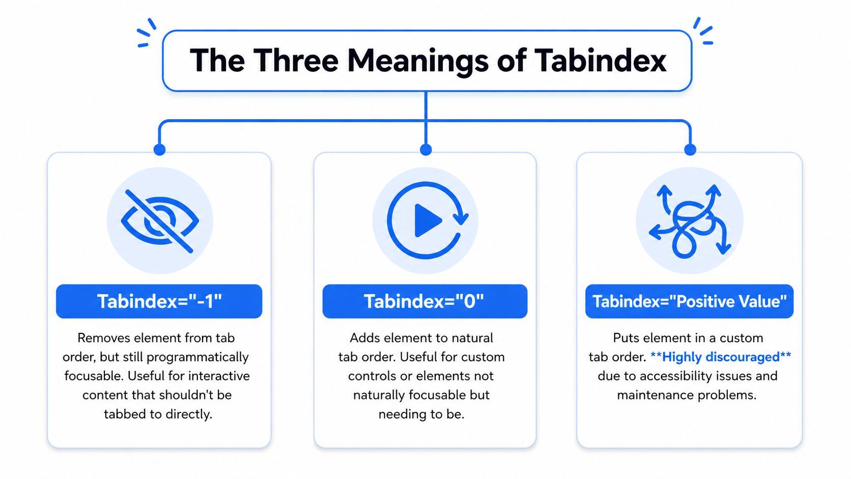
Think of tabindex="-1" as an element that isn’t in the public queue but can still be admitted directly.
The browser won’t stop there during normal Tab navigation. But JavaScript can still call .focus() on it. That makes it useful for components that need temporary focus without adding clutter to the user’s main path.
Common examples include:
Modal containers that should receive initial focus when opened
Error summaries that should be announced after form submission
Route landmarks or headings in SPAs when content updates without a full page load
tabindex="0" places an element into the natural tab order based on where it appears in the DOM. That’s the value typically required by developers when building custom controls.
Use it when an element is interactive but not natively focusable, such as a custom disclosure trigger or a div that has been given button semantics. The important part is that focus still follows document order rather than an invented priority list.
If a non-native control needs
tabindex="0", it usually also needs a role and keyboard event handling.
Any value greater than zero creates a manual focus order. The browser will tab through positive values first, starting from the lowest number, before returning to elements in the default sequence.
That sounds useful until the UI changes. Then the system gets brittle. One inserted field, hidden panel, or conditional step can make the order stop matching the visual layout.
Here’s the practical summary.
| Value | Behavior | Common Use Case |
|---|---|---|
-1 | Removed from sequential tab order, still script-focusable | Modal container, error summary, SPA focus target |
0 | Included in natural DOM tab order | Custom interactive control |
1 to 32767 | Creates custom tab priority | Rare legacy situations, generally avoided |
If someone on the team asks what is the tabindex attribute, this is the short answer: it controls whether an element can receive focus and how that element participates in keyboard order.
Correct tabindex usage isn’t about adding it everywhere. It’s about pairing the right value with the right interaction pattern.
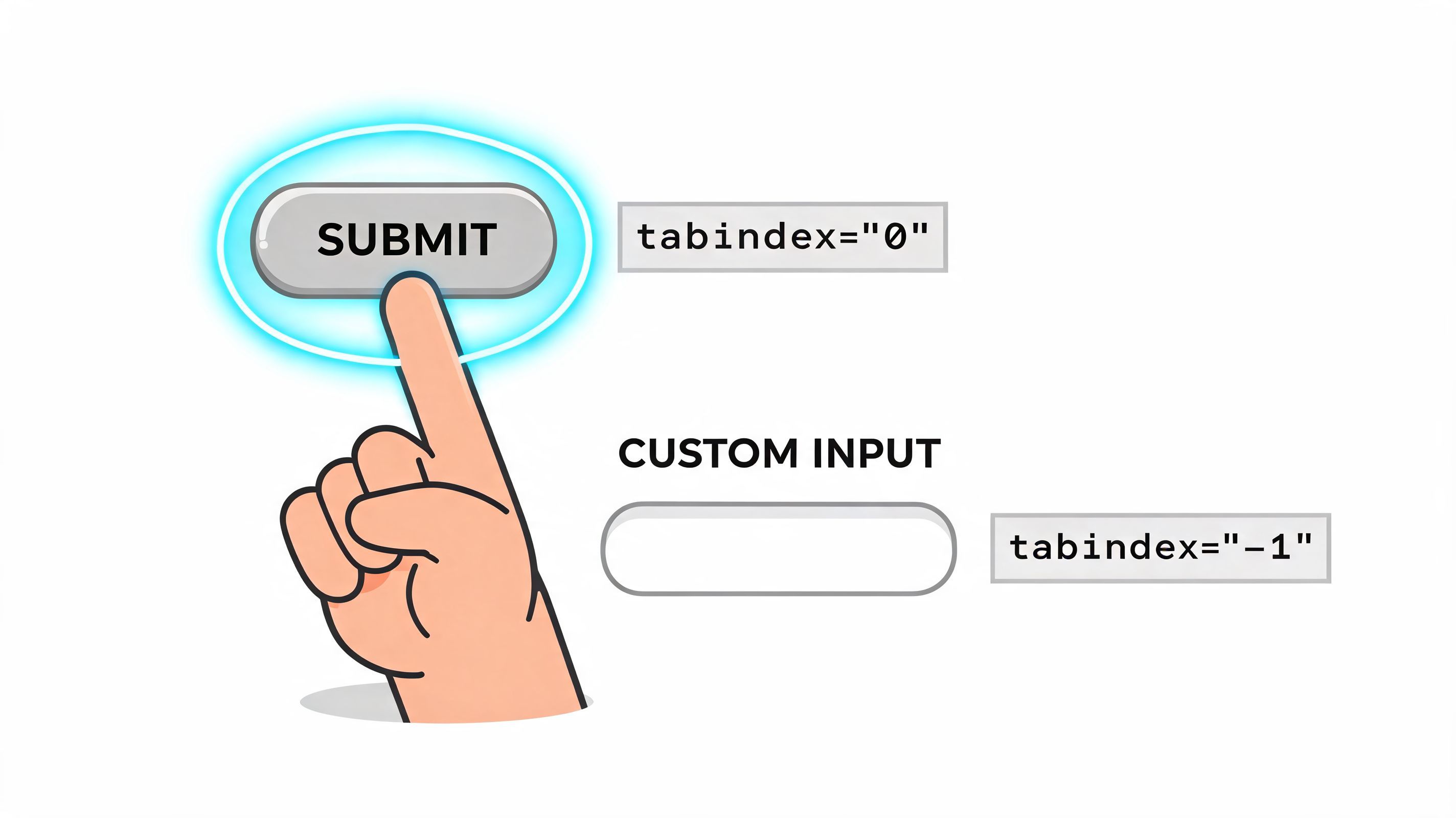
If design or framework constraints force you to build a custom control, tabindex="0" can make it reachable by keyboard. But focusability alone doesn’t make it accessible. It also needs a semantic role and keyboard activation.
<div role="button" tabindex="0" id="saveCard"> Save settings </div> const saveCard = document.getElementById('saveCard'); function activateSave() { console.log('Saved'); } saveCard.addEventListener('click', activateSave); saveCard.addEventListener('keydown', (event) => { if (event.key === 'Enter' || event.key === ' ') { event.preventDefault(); activateSave(); } }); This works, but a native <button> would still be better. Native elements already support focus, activation, and assistive technology expectations. Use this pattern when you have a real reason, not as a default component habit.
tabindex="-1" is the value that turns tabindex from basic attribute knowledge into real application architecture. It lets you move focus with intent.
A modal is the cleanest example. When it opens, keyboard focus should move into it. When it closes, focus should return to the control that launched it.
<button id="openModal">Open details</button> <div id="dialog" role="dialog" aria-modal="true" aria-labelledby="dialogTitle" tabindex="-1" hidden> <h2 id="dialogTitle">Order details</h2> <p>Review your order before confirming.</p> <button id="closeModal">Close</button> </div> const openButton = document.getElementById('openModal'); const closeButton = document.getElementById('closeModal'); const dialog = document.getElementById('dialog'); let lastTrigger = null; openButton.addEventListener('click', () => { lastTrigger = openButton; dialog.hidden = false; dialog.focus(); }); closeButton.addEventListener('click', () => { dialog.hidden = true; if (lastTrigger) lastTrigger.focus(); }); That’s only the start. A production modal also needs a focus trap, Escape handling, and protection against tabbing into background content. But the pattern starts here: the container can receive focus without becoming a permanent stop in the page sequence.
A quick walkthrough helps when teams are implementing this across a component library:
A lot of remediation work comes down to simple distinctions:
Works well: adding tabindex="0" to a custom widget trigger that needs keyboard access
Works well: adding tabindex="-1" to a heading you focus after SPA route changes
Usually fails: adding tabindex="0" to static text just so screen readers “see it”
Usually fails: using tabindex to compensate for visual reordering that should have been solved in markup
Keyboard focus should move because the interaction changed, not because the codebase got inconvenient.
Positive tabindex values look like control. In practice, they create maintenance debt.
According to Pope Tech’s analysis of tabindex usage, improper tabindex usage correlates with 68% of web accessibility failures in keyboard navigation, and positive values greater than zero appear in 22% of violations. The same analysis notes that this can trap 1 in 5 screen reader users in non-linear paths and lead to WCAG 2.4.3 Focus Order failures.
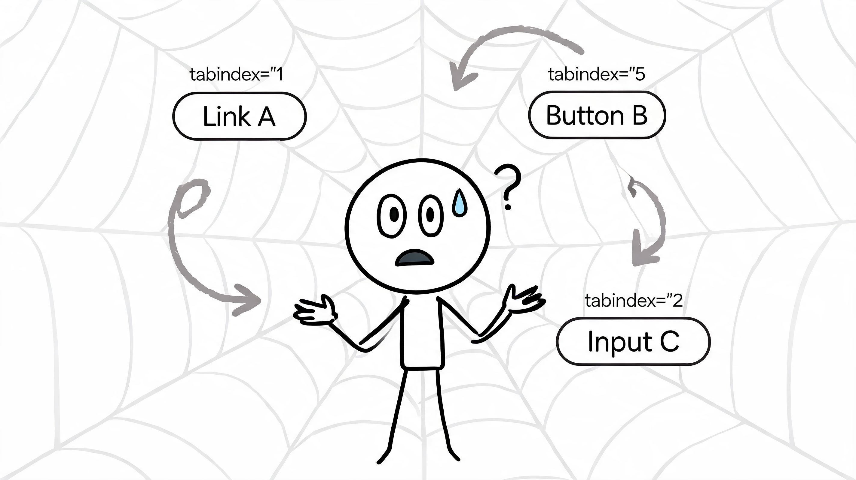
Developers usually add positive values with good intentions:
A form was rearranged visually and the keyboard order no longer feels right
A modal or sidebar was inserted late and needs to “come earlier”
A custom component library has inconsistent DOM structure across templates
The problem is that positive values don’t solve structure. They override it temporarily. Then the next release lands, another control gets inserted, and the entire numbering system has to be maintained by hand.
The tab sequence stops matching what’s on screen. Focus jumps from header to sidebar to footer to an unrelated filter chip. Keyboard users lose orientation. Screen reader users hear a path that doesn’t line up with the interface they’re trying to operate.
That’s how teams create a keyboard trap definition issue even when every control is technically focusable. Reachability isn’t enough. The order has to make sense.
A usable focus order feels invisible. A broken one forces users to build a map in their head while they’re trying to complete a task.
If you need a concise implementation reference, ADA Compliance Pros has a useful guide on when to avoid tabindex greater than 0.
Rely on semantic HTML and source order. If the visual design doesn’t match the interaction order, change the markup or redesign the layout behavior. In accessible systems, DOM order is part of the product, not an internal detail the keyboard has to work around.
Most basic tabindex articles stop being useful at this point.
Modern interfaces don’t live in static documents. They live in routed applications, custom elements, design systems, virtualized tables, and nested overlays. In those environments, tabindex in html becomes part of state management.
Focus inside Shadow DOM requires deliberate handling. It doesn’t automatically pass through encapsulation the way many developers expect. That’s one reason accessibility bugs show up in otherwise polished component systems.
The challenge is large enough that web.dev’s focus guidance notes a key issue with Shadow DOM focus management, and cites a 180% year-over-year rise in queries for “tabindex shadow dom” in a 2025 Stack Overflow analysis.
What tends to work in practice:
Put focus on the host element when that’s the meaningful entry point
Delegate focus to an internal control when the component opens or activates
Keep the host, internal role, and keyboard behavior aligned so users don’t enter a component and lose context
A common mistake is making an internal element focusable without defining how users enter or leave the component. Another is assuming slotted content will solve focus flow automatically. It won’t.
Virtualized interfaces need a different strategy. If a list, grid, or menu can contain many rendered items, making every item part of the tab sequence creates both UX noise and performance cost.
The pattern that scales is roving tabindex. One item has tabindex="0" at a time. The others sit at tabindex="-1". Arrow keys move the active item, and JavaScript updates which item is tabbable.
That gives you a stable keyboard entry point without flooding the page with tab stops.
<ul id="results" role="listbox"> <li tabindex="0" aria-selected="true">Item 1</li> <li tabindex="-1">Item 2</li> <li tabindex="-1">Item 3</li> </ul> const items = [...document.querySelectorAll('#results li')]; let current = 0; document.getElementById('results').addEventListener('keydown', (event) => { if (event.key !== 'ArrowDown' && event.key !== 'ArrowUp') return; items[current].setAttribute('tabindex', '-1'); if (event.key === 'ArrowDown') current = Math.min(current + 1, items.length - 1); if (event.key === 'ArrowUp') current = Math.max(current - 1, 0); items[current].setAttribute('tabindex', '0'); items[current].focus(); }); In advanced UI, tabindex shouldn’t be treated as a property sprinkled onto components after visual QA. It belongs in component contracts.
Document these behaviors in your design system:
entry focus
exit focus
arrow-key movement
modal return focus
route-change focus targets
Shadow DOM boundary behavior
That’s the difference between isolated fixes and a focus model the whole team can maintain.
You don’t need a full audit to catch most tabindex mistakes. You need a repeatable process.
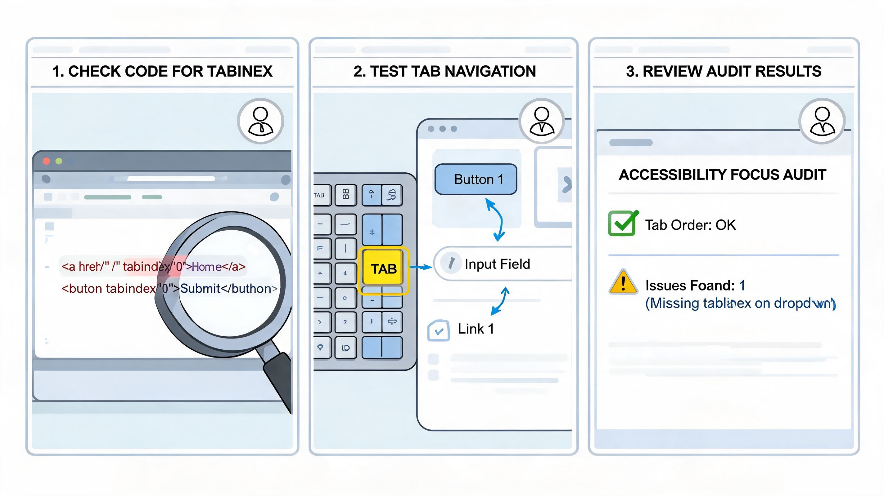
Use Tab, Shift+Tab, Enter, Space, and Escape. Don’t touch the mouse.
Check whether focus is visible, whether it moves in a logical order, whether all interactive controls are reachable, and whether overlays return focus to the right place. This catches more issues than many teams expect, especially in staged environments where component states are already wired.
DevTools helps when the bug is subtle. Inspect the active element, review computed attributes, and confirm whether an element is focusable because it is native, because of tabindex, or because a script changed it at runtime.
This is also where teams notice anti-patterns such as hidden nodes retaining focusability or stale tabindex="0" values left behind after re-rendering.
Manual testing is essential, but large sites need continuous checks. Teams often combine keyboard walkthroughs with browser extensions, CI checks, and platform-level scanning.
For organizations managing many templates or properties, steps for web accessibility compliance usually include both human review and automation. WebAbility.io is one example of a platform that provides automated 24/7 scanning, centralized reporting, and issue tracking for focus order, keyboard access, and related accessibility defects.
The right workflow is simple: humans validate experience, tools catch drift, and teams remediate before regressions spread.
When tabindex problems keep reappearing, the root cause usually isn’t the attribute itself. It’s missing component standards, inconsistent QA, or visual changes that never considered keyboard behavior.
Yes, but only when that element is acting like a real control. If a div or span behaves like a button, menu item, tab, or disclosure trigger, it may need tabindex="0" plus the correct role and keyboard handling.
Don’t add tabindex to static text just to make it focusable. That creates extra tab stops and suggests interactivity where none exists.
No. They solve different problems.
tabindex="-1" affects keyboard focus behavior. aria-hidden="true" affects whether assistive technology should expose that content. An element can be removed from sequential tabbing and still remain part of the accessibility tree. It can also be hidden from assistive tech for other reasons. Don’t treat them as substitutes.
Use a roving tabindex approach when the widget supports directional navigation. According to Allyant’s tabindex guidance, naively applying tabindex="0" to thousands of virtual items can cause a 60% performance hit, while the roving pattern maintains performance and reached 95% screen reader success in A11y Project tests.
Usually no. If a button or field is disabled, it generally shouldn’t remain in the sequential tab order. Leaving it focusable creates friction because users land on something they can’t operate. Follow the semantics of the native control whenever possible.
If your team is cleaning up focus order issues, building accessible custom components, or trying to sustain compliance across a growing site, WebAbility.io can support that work with scanning, reporting, and remediation workflows alongside your manual testing practice.
Tap to ask AI about this article
Ready to make your website accessible? Engage with our team or start a free trial today.
Discover insights about web accessibility and inclusive design practices.
Learn how to use the html lang attribute for accessibility, SEO, and internationalization. Our quick guide covers best practices and validation.
Learn to write clean table code for HTML. Master basic tags, CSS styling, responsive patterns, and WCAG accessibility compliance in our 2026 developer guide.

Learn how the HTML lang attribute impacts screen reader technology, SEO, and user experience. Our guide shows how to implement it correctly for WCAG compliance.

Explore assistive technology for blind and visually impaired users, from screen readers to AI tools, with practical developer tips for accessible web design.

Learn how to check a PDF for accessibility using automated tools, manual reviews, and screen reader testing. Ensure WCAG 2.2 and PDF/UA compliance today.

Learn how to write, test, and remediate accessible links that meet WCAG 2.2, ADA, and Section 508. Includes code examples and a quick audit checklist.

Make form validation accessibility work in real code. Covers ARIA, error patterns, focus management, WCAG, and testing workflows that actually help users.