Comic Sans for Dyslexia: Accessibility Insights

Sidharth Nayyar
Sidharth Nayyar
Ready to make your website accessible? Engage with our team or start a free trial today.
Tap to ask AI about this article
Comic Sans doesn’t have definitive peer-reviewed proof that it’s better than every other font for dyslexia, but it is widely recommended by major dyslexia organizations for letterforms that can reduce ambiguity. For web teams, the smartest move isn’t betting everything on one typeface. It’s giving users control over readable font options, spacing, and text presentation so they can choose what works for them.
Most advice on comic sans for dyslexia gets stuck in a shallow argument. Designers dismiss it as unprofessional. Advocates defend it as a practical reading aid. Neither side is asking the most useful question for a website owner, agency, or product team.
The useful question is this: how do you make text easier to read for the broadest range of users without forcing a single experience on everyone?
That shift matters for accessibility, compliance, and conversion. Dyslexia affects approximately 10% of the population globally, and the broader disability economy is valued at $13 trillion according to BOIA’s overview of Comic Sans and dyslexia. If your content is hard to read, people don’t just struggle. They leave, hesitate, abandon forms, and avoid returning.
Comic Sans has one of the worst reputations in digital design, yet it remains part of serious accessibility conversations for a reason. The font’s value isn’t about brand prestige. It’s about whether some readers can process letters with less friction.
That’s why the internet’s usual advice misses the point. A font can be mocked by designers and still be useful in a reading interface. Accessibility work deals with that tension all the time. Teams often have to choose between visual convention and user performance.
Comic Sans sits in an awkward middle ground. It’s familiar, widely available, and often easier for some dyslexic readers to distinguish than more polished alternatives. At the same time, research doesn’t establish it as universally superior.
That combination creates confusion for developers. They want a clear yes or no. What they need is a decision framework.
Practical rule: If a typography decision depends on individual reading preference, don’t hard-code one answer for everyone when you can offer a controlled set of options.
For accessibility consultants, that’s the key takeaway. The goal isn’t to crown a winner in the Comic Sans debate. The goal is to remove friction for users who process text differently.
A dyslexia-friendly experience usually comes from a combination of factors:
In turn, accessibility can also support CRO. When people can comfortably read product details, policy pages, pricing explanations, and checkout steps, fewer interactions break down. Better readability supports trust. Trust supports action.
For teams building growth-focused websites, comic sans for dyslexia isn’t really a branding debate. It’s a user-control question.
Comic Sans stayed in the accessibility conversation for a simple reason. Some dyslexic readers found it easier to read long before web teams had better personalization tools.
That history matters. Comic Sans was designed by Vincent Connare for Microsoft software in the 1990s, not as a dyslexia-specific typeface. Its later accessibility role came from real-world use in classrooms, support materials, and everyday documents where readers and educators noticed that the letterforms felt easier to separate than those in many default fonts.
The British Dyslexia Association has long included Comic Sans in its readable font guidance, alongside other familiar sans-serif options, in its style guide for dyslexia-friendly writing. That recommendation did not settle the debate, but it gave schools, charities, and content teams a practical reason to test it instead of dismissing it as a design punchline.
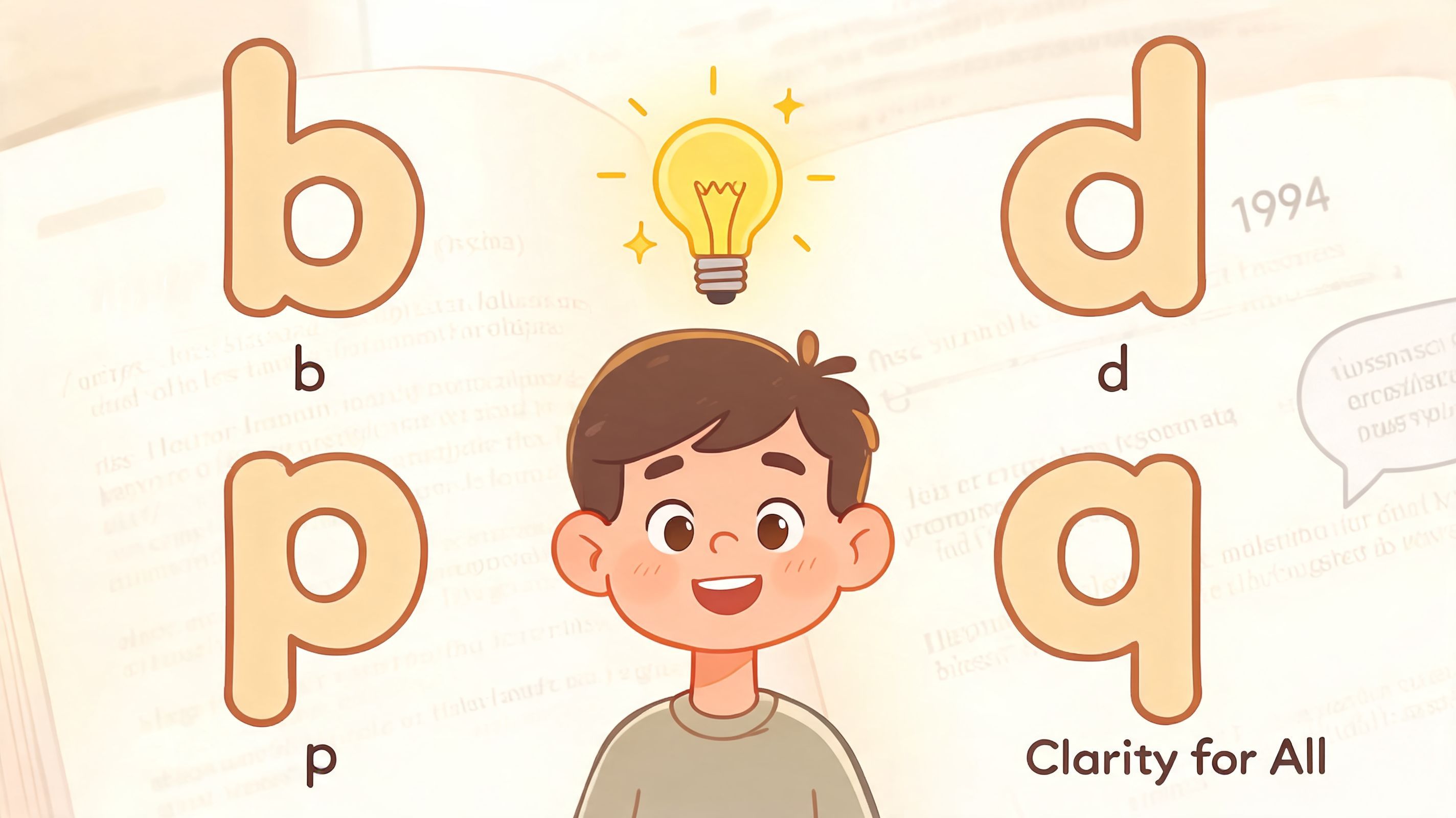
Comic Sans gets attention because its characters are less uniform than many standard UI fonts. For some readers, that makes common problem pairs such as b/d and p/q easier to tell apart during sustained reading.
The practical case is mostly about form:
None of that means Comic Sans is the right default for every site. It means there are understandable reasons some users prefer it.
I do not recommend Comic Sans as a universal answer, and I do not rule it out on taste alone either. In audits, the key question is whether a font choice helps people complete tasks with less friction.
That distinction matters on the web. Brand teams care about presentation. Users care about reading a form label correctly, understanding a pricing table, or finishing a checkout flow without fatigue. If a familiar font improves readability for part of the audience, it deserves a place in testing.
Some dyslexic users describe Comic Sans as helpful for maintaining focus while reading. Lived experience should not replace testing, but it is a valid input when teams choose what options to offer.
For developers and site owners, the better conclusion is operational. Comic Sans became a dyslexia-friendly option because enough people found it easier to read, reputable guidance kept it in circulation, and it was simple to deploy. That history is useful, but user choice is more useful. A controlled font switcher gives visitors access to Comic Sans, Arial, and other readable options without forcing one preference on everyone. That is usually the strongest route to compliance, usability, and conversion support, especially for teams focused on achieving better user experience for all.
The strongest evidence in this topic doesn’t say “use Comic Sans everywhere.” It says readable typography follows patterns. That’s much more useful for web teams because patterns can be implemented consistently across design systems.
A 2010 eye-tracking study of 48 dyslexic Portuguese readers compared 10 fonts and found that sans-serif, monospaced, and roman styles significantly improved reading performance over serif, proportional, and italic fonts, as described in the Good Fonts for Dyslexia study PDF. In that study, Arial showed significantly shorter fixation durations with p=0.020 versus CMU serif, while italic styles had the longest fixation durations.
Fixation duration is a useful concept for developers and content teams. It refers to how long the eye pauses on parts of the text. Shorter fixations can suggest a smoother reading path, even when total reading time doesn’t drop in a dramatic way.
For implementation, the practical lesson is straightforward:
Developers don’t need to become typographers to make better decisions. They need to look for a few recurring readability signals.
| Trait | Usually better for dyslexia-friendly reading | Usually less helpful |
|---|---|---|
| Letter style | Sans-serif | Serif-heavy body text |
| Font posture | Roman/upright | Italic |
| Rhythm | Even, open spacing | Dense proportional texture |
| Character recognition | Distinct letterforms | Similar-looking characters |
These principles matter beyond dyslexia. They also support cognitive accessibility more broadly, which is part of achieving better user experience for all.
Readability improves when text stops fighting the eye. That often comes from plain decisions: upright letters, clear shapes, and enough breathing room.
The science here is more helpful than the brand-name argument. It gives teams criteria they can test in product pages, long articles, account dashboards, and checkout flows.
Once teams move past internet opinions, the main comparison is usually between three categories: Comic Sans, a dyslexia-specific font such as OpenDyslexic, and a standard sans-serif like Arial or Verdana. The most important finding is also the least dramatic. Research doesn’t show that one option wins for everyone.
A 2017 analysis summarized peer-reviewed findings showing no significant readability or comprehension benefits for Comic Sans over standard sans-serifs like Arial or Verdana, and noted that some dyslexia-specific fonts, including OpenDyslexic, created greater difficulty for at least one participant compared with familiar fonts, as discussed in this analysis of comic sans and reading challenges.
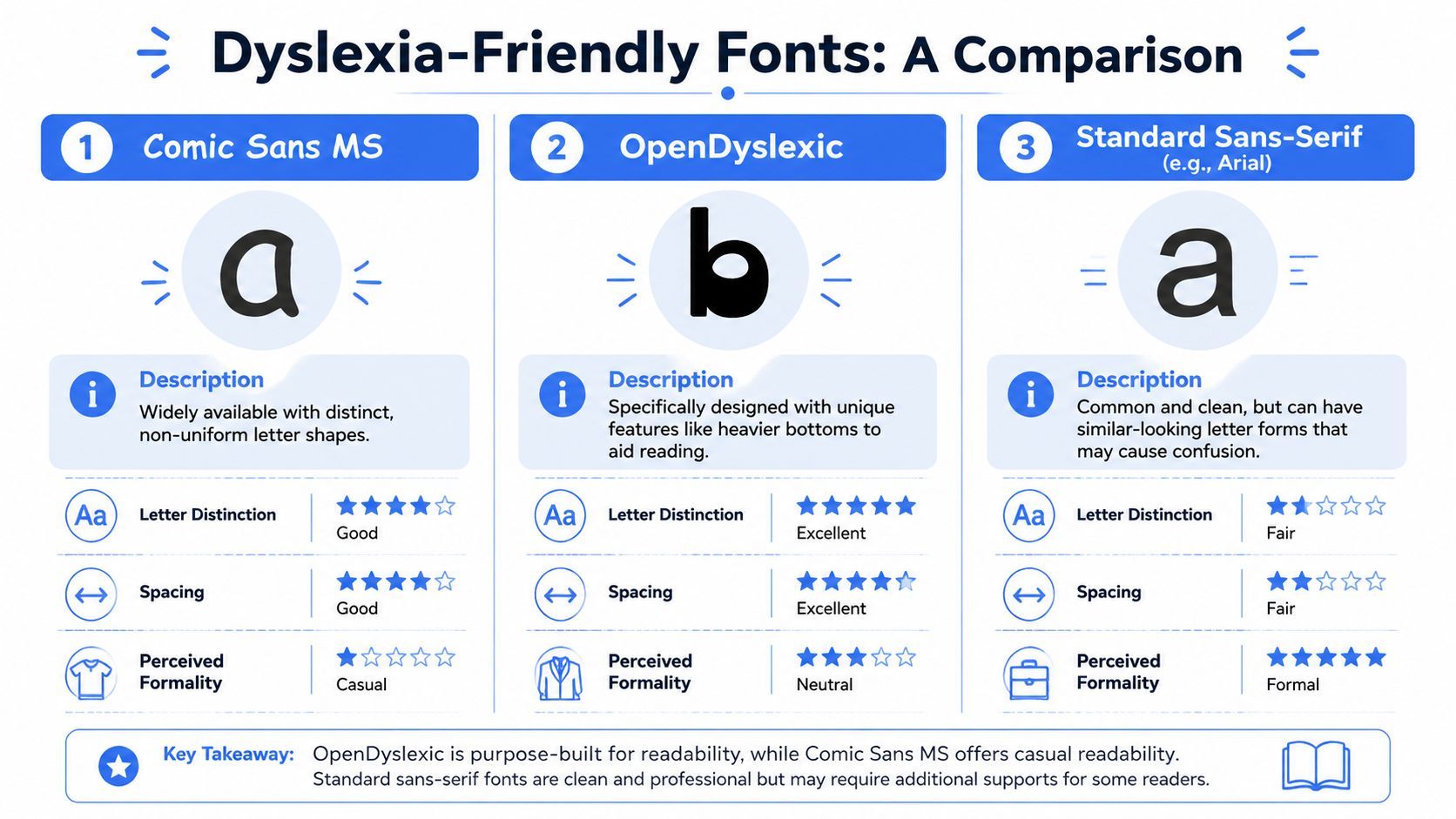
Here’s how I frame the decision with clients.
| Font type | Where it helps | Trade-off to watch |
|---|---|---|
| Comic Sans | Distinct, irregular letterforms. Familiar to many users. Widely available. | Some brands reject its appearance on aesthetic grounds. |
| OpenDyslexic | Designed specifically to differentiate characters with heavier bottoms and altered shapes. | Specialized design doesn’t guarantee better readability for every user. |
| Arial or Verdana | Clean, common, and easy to implement across systems and products. | Some users still prefer more distinctive forms than standard sans-serifs provide. |
The strongest pattern isn’t “Comic Sans beats Arial.” It’s that font familiarity and general sans-serif properties often matter more than any one specific font family. That changes how websites should approach the issue.
Instead of forcing one option, offer a readable default plus alternatives. In practice, that means letting people switch between a standard sans-serif, Comic Sans, and a dyslexia-oriented option if your interface supports it.
For teams working with schools, literacy programs, or family-facing services, broader reading support matters too. This UK guide for dyslexic readers is a useful non-technical resource because it connects font discussions to reading confidence, book format, and everyday support choices.
Use this sequence:
If you want a broader evaluation of alternatives, this guide on comparing top fonts for dyslexia helps frame the trade-offs without treating any one font as magic.
That’s the key nuance in comic sans for dyslexia. It can be a helpful option. It’s just not the only helpful option.
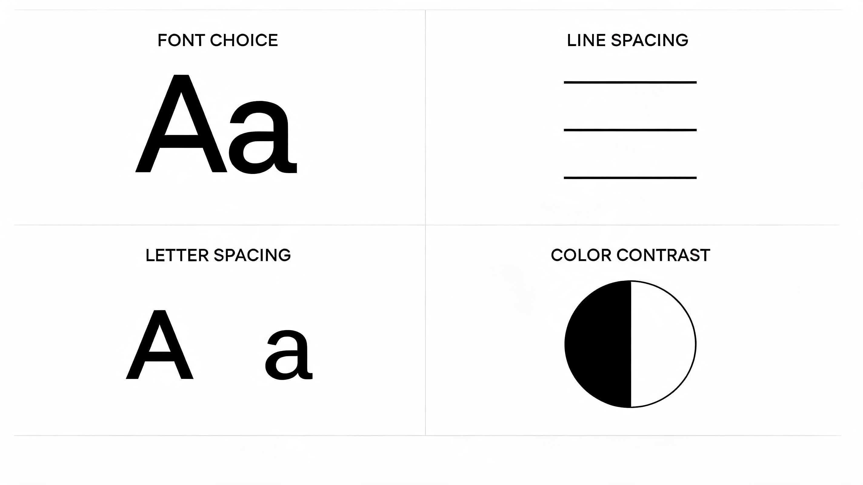
Font family gets too much attention on its own. Most readability problems come from combinations: cramped line spacing, weak contrast, long line lengths, tiny body text, or text styled for aesthetics instead of comprehension.
Accessible typography works better when teams treat it as a system.
Product teams frequently apply accessibility improvements only to article templates while leaving the rest of the site untouched. Then the blog is readable, but the navigation menu, filters, checkout forms, knowledge base, and account settings still create strain.
That weakens both UX and compliance posture.
A better standard is to review typography in these places:
Accessibility improves faster when teams stop treating readable text as a content-team issue and start treating it as a design-system requirement.
Good typography doesn’t just help readers with dyslexia. It also supports scanning, comprehension, and decision-making for distracted users, mobile users, aging users, and anyone trying to complete a task quickly.
Implementation usually starts with a simple question: do you want one better default, or do you want user-level personalization?
A stronger default is easier to ship. Personalization is more inclusive.
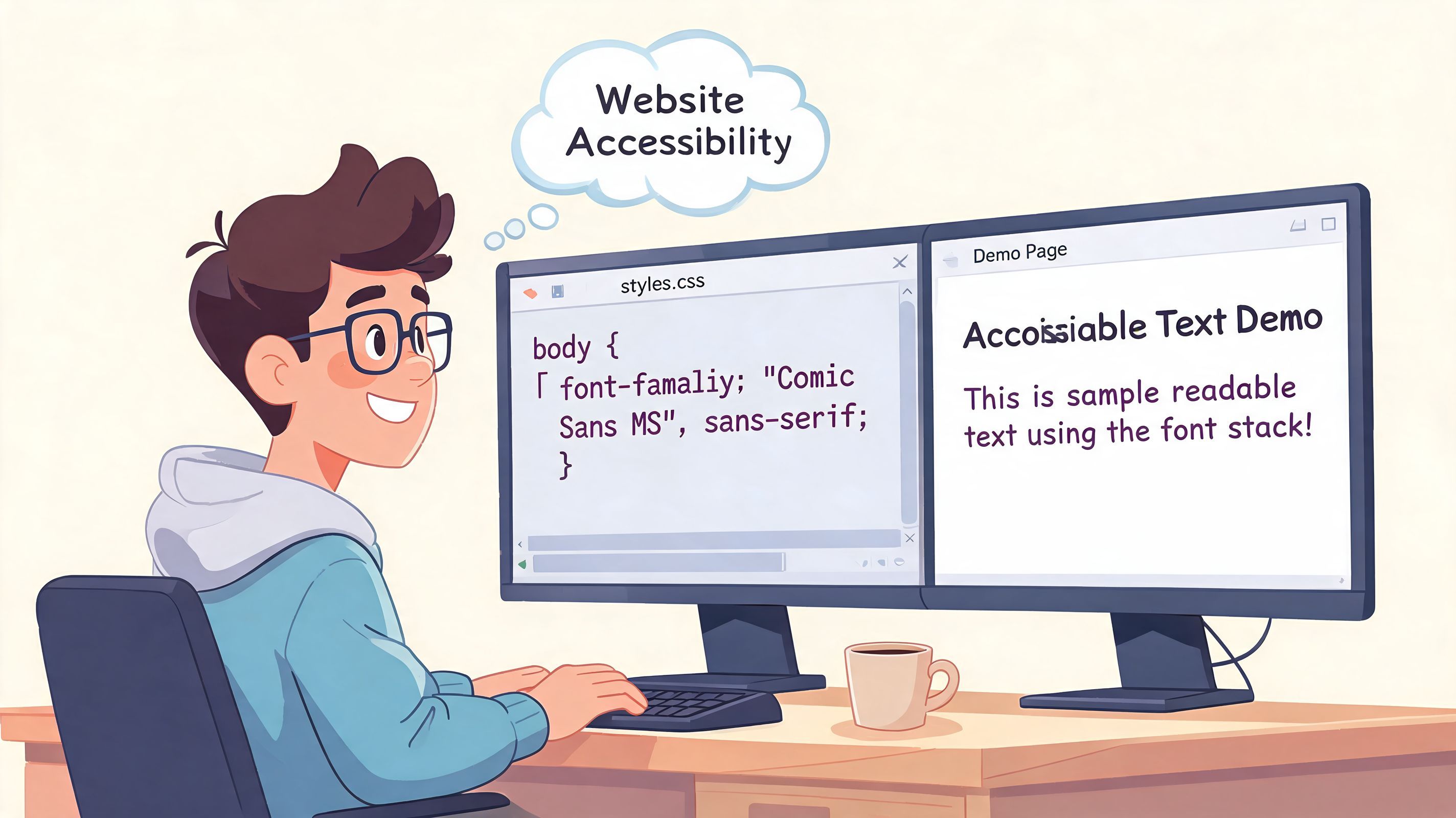
If you’re handling typography directly, start by cleaning up the basics:
That gets you to a competent baseline. It doesn’t solve preference diversity.
When the audience is broad, managed accessibility tools can help users tailor the interface without forcing a redesign of every template for every need. In that model, visitors choose the reading mode that works for them, including font style, text scaling, and spacing adjustments.
That’s where a tool such as WebAbility.io fits. Its accessibility widget includes dyslexia-friendly font options, text scaling, and other user-controlled reading adjustments as part of a broader compliance workflow. For many teams, that approach is easier to maintain because the personalization layer sits alongside the existing site experience rather than replacing the design system.
Here’s the product view in action:
If I were auditing a site that wants better support for comic sans for dyslexia and related reading preferences, I’d prioritize in this order:
The best implementation is the one users can adjust without asking your support team for help.
This is also where accessibility and CRO align nicely. If someone can switch to a more comfortable reading mode and finish a quote request, product comparison, application, or checkout, your site is doing its job.
The practical answer was never going to be a single font. Dyslexic readers do not form one uniform group, and website reading is shaped by context, task length, device, fatigue, and personal preference. Teams that keep arguing about whether Comic Sans is good or bad usually miss the implementation question that matters more. Can a visitor adjust the experience quickly enough to keep reading, complete a task, and stay on the site?
That is the standard I use in audits.
The evidence base still has limits. Commentary on Comic Sans and dyslexic readers regularly points back to a lack of long-term, real-world data on digital reading performance, sustained comprehension, and fatigue, as discussed in Learning and the Brain’s discussion of Comic Sans and dyslexic readers. That matters for web teams because a school portal, benefits form, product page, or patient account is not a controlled reading test. It is a repeat-use environment where small friction points affect completion rates.
For education and public-sector teams, font choice sits inside a wider assistive setup. This guide to exploring assistive technology for K-12 is useful context if you are planning support for different reading needs across devices, classrooms, and home use.
Comic Sans remains a valid option in that mix. It is one readable choice for some users, not a standard to force on everyone. The stronger long-term approach is personalization that supports accessibility compliance and reduces abandonment at the same time.
If you want to offer user-controlled font changes, text scaling, spacing, contrast, and related readability settings while supporting ongoing compliance work, WebAbility.io is one way to add that layer without rebuilding the entire site.