7 Most Accessible Fonts for Websites (2026 Guide)

Sidharth Nayyar
Most Accessible Fonts for Websites (2026): The Complete Guide
Typography is where readability begins. The right font makes content effortless to read for everyone - including users with dyslexia or low vision - while the wrong one quietly turns reading into work. This guide brings together the most accessible fonts for 2026: what makes a typeface readable, the best choices for general readability and for dyslexia, where to get them, and how to pair them with the spacing and settings that make text genuinely inclusive.
TL;DR: Choose clean sans-serif fonts with distinct, hard-to-confuse letterforms. Atkinson Hyperlegible, Lexend, and Open Sans are outstanding all-round picks; OpenDyslexic and Lexend shine for dyslexia. Get them free from Google Fonts, mind your size and spacing, and - best of all - let users adjust the font to their own needs.
This guide simplifies the selection process by detailing seven exceptional fonts, tools, and platforms that empower you to build more readable digital products. We move beyond generic advice to provide a curated roundup of options that champion legibility and accessibility. For each entry, you'll find a focused breakdown of its key features, specific use-case guidance, and direct links to help you implement it immediately. This article will help you make informed decisions, ensuring your typography is not just aesthetically pleasing but also fundamentally accessible.
What Makes a Font Accessible?
Accessible typography is about clarity, not decoration. The goal is to reduce the "visual noise" that makes reading tiring. Clean sans-serif fonts usually win because they avoid the decorative "feet" (serifs) that can cause characters to blur together. The other essential trait is distinct letterforms: well-designed accessible fonts give every character an unmistakable shape so that mirror-image pairs like b/d and p/q, and look-alikes like capital I and lowercase l, can't be confused.
How Dyslexia and Low Vision Affect Reading
Dyslexia has nothing to do with intelligence - it is a neurological difference in how the brain processes written language. For many readers, text can feel like a "visual traffic jam," with letters blurring, swapping places, or drifting off the baseline. A key challenge is visual crowding, where closely packed or similar characters become hard to separate. Low-vision users face related difficulties distinguishing similar shapes. Accessible fonts - plus adequate spacing - directly reduce these problems.
The Most Accessible Fonts
1. Atkinson Hyperlegible
Designed by the Braille Institute to make similar-looking characters easier to tell apart, Atkinson Hyperlegible deliberately exaggerates differences between letters. That precision reduces misreading in places where it matters most - forms, account screens, instructions, and transactional content - making it an excellent high-readability option, especially for low-vision users.
2. Lexend
Lexend is engineered to improve reading proficiency and reduce visual stress, which makes it a comfortable, modern choice for body text and a strong pick for dyslexia-friendly experiences.
3. Open Sans
A safe, neutral default that performs predictably across UI patterns - long paragraphs, form labels, navigation, and help content. Its open shapes hold up whether users are scanning or reading closely, making it a dependable choice for most websites.
4. Roboto
Google's scalable system font renders cleanly at many sizes and weights, making it a reliable, widely available option for dashboards and content-heavy interfaces.
5. IBM Plex Sans
An enterprise-grade, openly licensed typeface with clear letterforms and broad language support - a solid choice for global, compliance-focused sites.
6. OpenDyslexic
A free, open font created specifically for dyslexia, with weighted bottoms that help anchor letters and reduce flipping. It is a popular option to offer as an alternate reading mode.
7. System Fonts (Arial, Helvetica, Trebuchet MS)
Ubiquitous system fonts remain dependable for maximum compatibility and backward compatibility. Their familiarity and consistent rendering make them a low-risk baseline that meets WCAG readability needs.
8. Comic Sans MS (a strategic, optional choice)
Comic Sans makes designers flinch, but its distinct, informal letterforms are genuinely hard to confuse, which can help some readers - particularly in dyslexia-friendly or child-focused contexts. It isn't a default site-wide recommendation, but it is a reasonable optional reading mode worth testing rather than dismissing.
Best Fonts for Dyslexia
For dyslexia specifically, prioritize fonts that maximize character distinction and minimize crowding. The standout options are:
- Lexend - tuned to improve reading proficiency; comfortable for sustained reading.
- OpenDyslexic - purpose-built, with weighted letter bottoms to reduce flipping.
- Atkinson Hyperlegible - exaggerated differences between similar characters.
- Comic Sans MS - an informal but effective optional reading mode for some users.
Whatever you choose, the most powerful move is to let users switch to their preferred font rather than forcing one choice on everyone.
Where to Get Accessible Fonts
- Google Fonts - free, easy to embed, and home to Open Sans, Lexend, Roboto, Atkinson Hyperlegible, and more.
- Adobe Fonts (Creative Cloud) - a large, well-licensed library for teams already in the Adobe ecosystem.
- MyFonts (Monotype) - a marketplace for licensing professional typefaces when you need specific brand fonts.
- OpenDyslexic - available free from its official project for use as an alternate mode.
1. WebAbility.io Widget: A Complete User-Controlled Solution
TL;DR: Instead of locking you into a single "accessible font," the WebAbility.io Widget empowers your website visitors to choose their own ideal reading experience. It provides a user-controlled toolbar with on-demand dyslexia-friendly fonts, text size adjustments, spacing controls, and high-contrast modes, making it a complete, personalized approach to accessible typography.
The search for the single "most accessible font" can be limiting, as readability is highly subjective and depends on individual user needs. WebAbility.io addresses this challenge by shifting the focus from a fixed design choice to user empowerment. This platform isn't a font but a sophisticated accessibility widget that installs on your website, providing visitors with a powerful toolbar to customize their experience in real-time. This dynamic approach ensures your site can cater to a diverse range of visual and cognitive needs without forcing a one-size-fits-all solution.
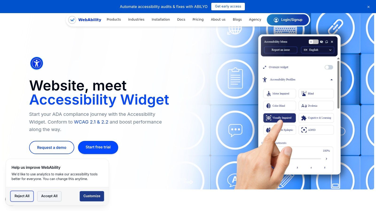
By integrating this tool, you allow users to instantly switch to specialized fonts designed for dyslexia, increase or decrease text size to their comfort level, and modify letter and word spacing. This puts control directly into the hands of those who need it most, turning accessibility from a static feature into an interactive and personalized service.
Standout Features and Practical Applications
WebAbility.io stands out by bundling front-end user tools with a solid back-end compliance management system. This dual-focus makes it an ideal solution for organizations that need both to serve their audience and to maintain rigorous accessibility standards.
- On-Demand Font & Text Customization: Users can select from a curated list of highly legible and dyslexia-friendly fonts, ensuring the content adapts to their specific reading requirements.
- Complete Readability Controls: Beyond fonts, the widget includes adjustable text scaling, line height, and letter spacing. Users can also activate high-contrast, monochrome, or dark modes to reduce eye strain and improve focus.
- AI-Powered Personalization: The platform uses AI to learn user preferences. A visitor can create a profile to save their settings, ensuring a consistent and tailored experience every time they return to your site.
- Integrated Governance & Reporting: For organizations needing to demonstrate compliance with standards like WCAG, ADA, and Section 508, the platform offers automated scanning, real-time monitoring, and detailed compliance reporting.
Why It Deserves the Top Spot
The strength of the WebAbility.io solution lies in its holistic approach. It recognizes that true digital accessibility is an ongoing process, not a one-time fix. For web development teams and digital agencies, the widget offers a quick-to-deploy yet powerful tool that enhances user experience immediately. For enterprise-level clients and public sector institutions, the integrated governance features provide the necessary framework for managing legal risk and sustaining long-term compliance.
Key Insight: Empowering users with choice is a powerful accessibility strategy. Instead of predicting every need, a tool like the WebAbility.io Widget provides a flexible framework that adapts to the individual, ensuring a more inclusive digital environment.
The platform is designed for rapid adoption, with easy installation on major platforms like WordPress and Shopify, and offers a free trial to test its capabilities. By combining a rich set of over 40 user-facing tools with complete back-end monitoring, it delivers a complete and scalable accessibility solution.
- Website:https://www.webability.io/widget
2. Google Fonts
TL;DR: Google Fonts is an indispensable, completely free resource for high-quality, open-source fonts. It provides easy access to some of the most accessible fonts available, such as Atkinson Hyperlegible and Lexend, which can be implemented on websites with a single line of code or downloaded for desktop use at no cost. Its reliability and open-source nature make it a foundational tool for accessible typography.
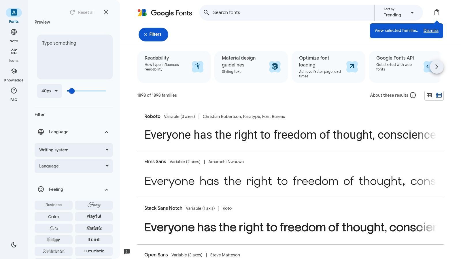
As the largest free, open-source font library, Google Fonts has become the default starting point for web typography. Its mission to make the web more beautiful, fast, and open is a significant boon for digital accessibility. The platform provides unfettered access to a vast catalog of font families, all available for commercial use without licensing fees or restrictions, making it a powerful resource for teams of any size.
Why It Makes the List
The standout feature of Google Fonts is its frictionless access to purpose-built accessible typefaces. While it lacks a dedicated "accessibility" filter, knowing what to look for unlocks its potential. It is the primary host for new fonts like Atkinson Hyperlegible, designed by the Braille Institute, and Lexend, specifically engineered to improve reading proficiency.
Implementation is incredibly straightforward. Designers can download font families for use in mockups, while developers can embed them directly using the Google Fonts API or self-host the files for greater control. This flexibility supports a smooth workflow from design to production.
Pro Tip: When selecting a font, use the "Type something" feature to preview your own text. Test ambiguous character pairs like
Il1(uppercase I, lowercase L, and the number 1) andO0(uppercase O and the number zero) to quickly evaluate a font’s legibility.
How to Use Google Fonts Effectively
To find the most accessible fonts on the platform, you need to search for them by name.
- Search for Specific Families: Start by searching for known accessible options like "Atkinson Hyperlegible," "Lexend," "Noto Sans," and "Rubik."
- Check Language Support: Use the "Language" filter to ensure your chosen font supports all the character sets you need, a key component of inclusive design. The Noto family is particularly powerful, aiming to support all languages with a harmonious look and feel.
- Embed or Download: Once you select a font family, you can either copy the
<link>tag to embed it in your website's HTML or click "Download family" to get the files for desktop and self-hosting use.
Website:https://fonts.google.com
3. Adobe Fonts (Creative Cloud)
TL;DR: Adobe Fonts provides a massive, high-quality font library integrated directly into the Creative Cloud ecosystem. For teams already using Adobe software, it offers smooth font activation for both desktop and web, with simple, worry-free licensing. Its curated collection includes many of the most accessible fonts, making it an excellent choice for professional design workflows.
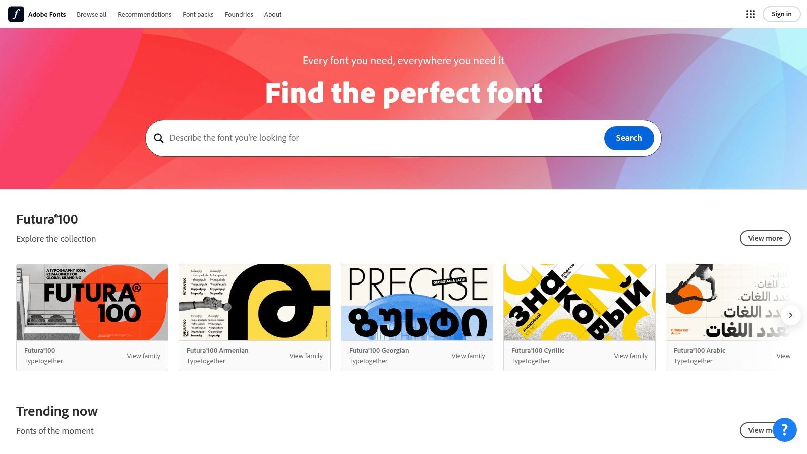
As a core component of the Adobe Creative Cloud subscription, Adobe Fonts (formerly Typekit) offers a premium, curated library of over 20,000 fonts. Its primary advantage is its deep integration with apps like Photoshop, Illustrator, and InDesign, allowing designers to activate and sync fonts with a single click. This simplified process eliminates licensing headaches and ensures brand consistency from initial mockups to live websites.
Why It Makes the List
Adobe Fonts secures its spot by blending convenience with quality. While the full library requires a paid Creative Cloud subscription, the value is immense for professional designers and teams. The platform's worry-free licensing covers both personal and commercial projects, including web use, which simplifies legal compliance. It hosts a strong selection of highly legible workhorse fonts ideal for UI and long-form text, such as Source Sans Pro, Merriweather Sans, and Acumin Pro.
The platform is built for a professional workflow. Activated fonts are automatically available across all your Creative Cloud-connected devices and applications, removing the friction of manually downloading, installing, and managing font files. For web projects, creating and implementing a web font kit is a straightforward process that provides reliable and fast-loading fonts for your site.
Pro Tip: Use the "Properties" filter on the left-hand sidebar to narrow down your search. You can filter by properties like x-height (choose "High" for better readability at small sizes), number style ("Lining" for tabular data), and default figure ("Oldstyle" for body text), which helps you quickly find technically sound and accessible typefaces.
How to Use Adobe Fonts Effectively
Finding accessible fonts requires using the platform’s powerful filtering and search capabilities.
- Filter by Classification and Properties: Start by filtering for "Sans Serif" or "Serif" classifications. Then, use the properties filters to select fonts with a high x-height, wide proportions, and low contrast for optimal legibility.
- Activate for Desktop and Web: Once you find a suitable font, click "Activate" to make it available in your desktop apps. For websites, create a "Web Project," add your chosen fonts, and copy the provided CSS or JavaScript embed code to your site's
<head>. - Explore Font Packs: Adobe curates "Font Packs" for different use cases. Look for packs designed for "UX/UI" or "Clean & Crisp" styles, as these often contain some of the most accessible fonts optimized for screen reading.
Website:https://fonts.adobe.com
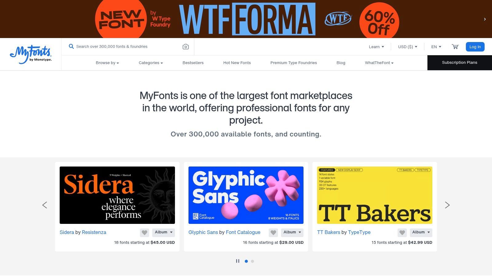
4. MyFonts (Monotype)
TL;DR: MyFonts is a leading commercial font marketplace offering a massive catalog from hundreds of professional foundries. It's an essential resource for purchasing licenses for high-quality, reader-focused typefaces that aren't available for free, with solid filtering options to help you find some of the most accessible fonts for specific commercial needs.
As one of the largest digital font retailers, MyFonts by Monotype is a one-stop shop for professional-grade typography. While open-source fonts provide incredible value, many specialized and carefully crafted accessible fonts are commercial products. MyFonts provides the platform to license these typefaces for desktop, web, app, and ePub use, making it a critical tool for brands that need premium and unique typographic solutions.
Why It Makes the List
MyFonts makes the list because it provides commercial access to a wider world of accessible typography beyond the open-source ecosystem. Many foundries invest heavily in creating highly legible and reader-friendly fonts, and this is the primary marketplace to acquire them. Its solid search and tagging system allows users to filter and discover fonts specifically tagged as "dyslexia-friendly" or "legible," simplifying the search for effective solutions.
The platform simplifies the often-complex world of font licensing. You can purchase the exact license you need for your project, whether it’s for a website with a certain amount of traffic or for embedding in a mobile application. This clarity is invaluable for organizations needing to ensure full legal compliance for all their design assets.
Pro Tip: Use the "More tags" filter when searching to narrow your results. Look for tags like "legible," "reader," "humanist," and "clarity" to surface fonts designed with readability as a top priority. Combining these tags with a sans-serif category search is a great way to find potential candidates.
How to Use MyFonts Effectively
To find accessible fonts, use the platform’s powerful search and filtering tools.
- Use Specific Tags: Start a search and use the built-in tags. Typing "dyslexia" or "legible" into the tag filter will immediately narrow the vast library to relevant options like FS Me or Lexia.
- Test Before You Buy: Use the live text previewer to input your own content. Test for clarity with difficult character combinations (
Il1,O0,rnvsm) and see how the font performs at various sizes and weights. - Understand Licensing: Before purchasing, carefully review the licensing options. A "Webfont" license is based on monthly pageviews, while a "Desktop" license is for use in design software. Ensure you buy the correct license for your intended application to remain compliant.
Website:https://www.myfonts.com
5. Braille Institute, Atkinson Hyperlegible
TL;DR: The Braille Institute’s website provides direct, free access to the Atkinson Hyperlegible font family, a typeface designed from the ground up to improve character recognition for readers with low vision. It's a gold standard for accessibility-focused typography, offered at no cost for both personal and commercial use, making it an easy and impactful choice for any project.
The Braille Institute, a non-profit organization dedicated to eliminating barriers for the blind and visually impaired, took a direct hand in solving a core digital accessibility challenge: legibility. Instead of just recommending fonts, they collaborated with designers to create one. The result is Atkinson Hyperlegible, an award-winning typeface that prioritizes clarity and distinction between letterforms above all else. The font is freely available directly from their website.
Why It Makes the List
This resource makes the list because it's the official, authoritative source for one of the most accessible fonts ever created. Atkinson Hyperlegible was purpose-built to address common points of confusion in typography, such as differentiating I, l, and 1. Every character is designed to be as distinct as possible, which significantly aids readability for individuals with vision impairments. Its recent updates, including the "Next" and "Mono" versions, expand its utility with multiple weights, italics, and variable font technology.
The website provides a straightforward, no-strings-attached download. This direct-from-the-source approach ensures you are getting the latest, most complete version of the font family, free from licensing complexities. For a deeper look at its impact, you can explore how Atkinson Hyperlegible is transforming web accessibility.
Pro Tip: Use Atkinson Hyperlegible for critical UI elements like buttons, navigation links, and form field labels. Its high legibility at smaller sizes ensures that essential interactive components are clear and easy to understand for all users.
How to Use the Braille Institute Website Effectively
Getting the font is simple and is the primary purpose of the landing page.
- Choose Your Version: The site clearly presents the different versions available. For most web projects, Atkinson Hyperlegible Next is the most versatile choice due to its multiple weights and variable font support.
- Download and Install: Click the download button to receive a ZIP file containing the font files (usually in OTF or TTF format). You can install these on your desktop for design work or add them to your project's assets for self-hosting on a website.
- Review the Backstory: Take a moment to read the design philosophy behind the font on the page. Understanding the "why" behind its creation can provide valuable context when advocating for its use in your projects.
Website:https://www.brailleinstitute.org/freefont
6. Lexend
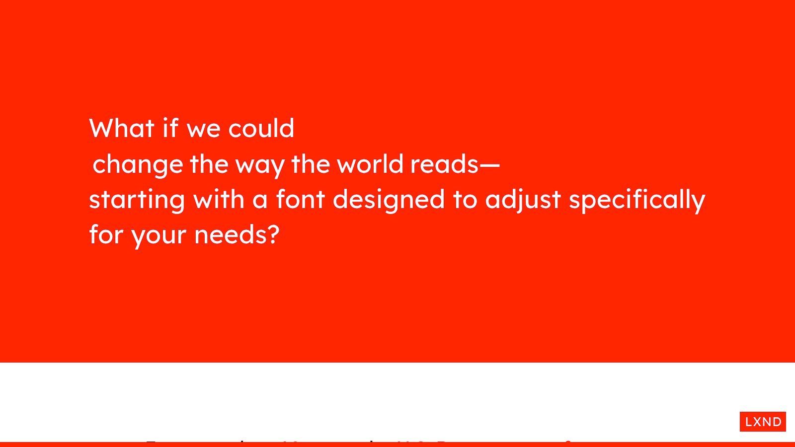
TL;DR: Lexend is an open-source, variable font family specifically engineered to improve reading proficiency and reduce visual stress. Its dedicated website offers direct downloads and interactive demos, allowing designers and developers to use one of the most accessible fonts available, which can be fine-tuned to meet individual reader needs at no cost.
The Lexend project is a prime example of evidence-informed typography. Developed with the specific goal of improving reading fluency, it challenges the one-size-fits-all approach to digital text. Its website is a central hub for the font, providing not only the font files but also the research and context behind its creation. This focus on a single, highly specialized typeface makes it a unique and powerful resource for any project prioritizing reading comfort.
Why It Makes the List
Lexend stands out for its variable font technology, which is designed to be customized. Traditional fonts offer fixed weights, but Lexend allows for fine-tuning of character width and spacing. This hyper-customization can significantly aid readers, including those with dyslexia, by creating a more comfortable reading experience. The font's design is based on the idea that every reader is different, and typography should adapt accordingly.
The font family is completely free under the SIL Open Font License, making it accessible for any commercial or personal project. It’s also available directly on Google Fonts, ensuring widespread support in tools like Figma and easy implementation on the web. This combination of scientific backing and open access makes it an essential tool for inclusive design.
Pro Tip: Use the interactive demos on the Lexend website to find the optimal variant for your target audience. You can adjust the font's properties in real-time to see how changes in spacing and width impact readability, helping you make a more informed choice.
How to Use Lexend Effectively
The Lexend website is the best place to start to understand the font's potential.
- Explore the Variants: The website clearly explains the different Lexend series (Deca, Exa, Giga, etc.), each offering a different character width. Test these to see which provides the best balance for your use case.
- Use Variable Font Power: For advanced use, implement Lexend as a variable font. This allows you to dynamically adjust its properties using CSS, potentially even letting users customize their own reading experience.
- Download or Embed: You can download the entire family directly from the Lexend site for self-hosting or find it on Google Fonts for quick and easy embedding.
Website:https://www.lexend.com
7. OpenDyslexic
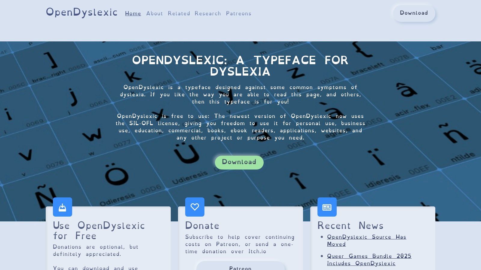
TL;DR: OpenDyslexic is a free, open-source typeface created specifically to improve readability for people with dyslexia. Its unique, bottom-heavy letterforms are designed to prevent character flipping and confusion, and it can be downloaded directly for system-wide use or activated on websites via popular browser extensions.
OpenDyslexic is one of the most recognized and widely available fonts designed with a specific learning disability in mind. Created by Abelardo Gonzalez, it directly addresses common reading challenges faced by individuals with dyslexia, such as letter swapping and line skipping. Its letterforms feature heavily weighted bottoms, which provide a stronger "anchor" to the line, preventing the characters from appearing to rotate or flip.
Why It Makes the List
OpenDyslexic earns its spot as one of the most accessible fonts due to its targeted design and commitment to open access. It is completely free under the SIL Open Font License, allowing for unrestricted personal, educational, and commercial use. This has led to a solid ecosystem of support, including browser extensions like "OpenDyslexic for Chrome," which can apply the font to any webpage, giving users direct control over their reading experience.
The font family includes regular, bold, italic, and a monospaced version, providing versatility for different contexts from body text to code blocks. While its efficacy can vary among individuals, providing it as an option in a website's accessibility settings can be a powerful act of inclusive design. As highlighted in a deep dive into OpenDyslexia fonts, its presence signifies a commitment to neurodiversity.
Pro Tip: Because its aesthetic is highly distinct, OpenDyslexic is often best implemented as a user-selectable option rather than the default body font. Add it to an accessibility toolbar or theme switcher to empower users without altering the primary brand experience for everyone.
How to Use OpenDyslexic Effectively
The website is a central hub for downloading the font files and finding support resources.
- Download for Desktop Use: Click the "Download Now" button on the homepage to get the font files (OTF format) for installation on Windows, macOS, and Linux. This allows designers to use it in mockups and documents.
- Explore Browser Extensions: The website links to browser extensions that allow users to render web content in OpenDyslexic, which is a key way to use its benefits without mandating it for all site visitors.
- Self-Host for Web: Since the font is open-source, developers can download the family and self-host the files on their own server for use with CSS
@font-facerules, ensuring fast performance and reliability.
Website:https://opendyslexic.org
Accessible Fonts, 7-Source Comparison
| Item | Implementation complexity | Resource requirements | Expected outcomes | Ideal use cases | Key advantages |
|---|---|---|---|---|---|
| Widget (WebAbility.io) | Low for basic install; moderate for enterprise integrations | Script + Dashboard; free trial; paid plans for advanced governance | Rapidly adds 40+ assistive features and ongoing compliance monitoring (not full code remediation) | Quick accessibility enablement, multi-site governance, legal/compliance monitoring | Complete toolbar, AI personalization, automated scans and reporting |
| Google Fonts | Very low, embed via API or self-host | Free, CDN or self-hosting bandwidth | Accessible typography options if appropriate families selected | Low-cost trials, web typography updates, broad language support | Free, large catalog, reliable CDN and easy embedding |
| Adobe Fonts (Creative Cloud) | Low for CC users; moderate otherwise | Requires Creative Cloud subscription for full catalog | Smooth activation across Adobe apps and hosted webfonts | Design teams using Adobe tools requiring managed fonts and licensing | Strong CC integration, worry-free licensing, large curated set |
| MyFonts (Monotype) | Moderate, purchase and apply licenses per family | Pay-per-font licensing; multiple license types | Professional, licensed fonts with precise usage rights | Brands needing specific premium families or enterprise licensing | Vast commercial catalog, clear license options, foundry variety |
| Atkinson Hyperlegible (Braille Institute) | Very low, download/self-host or use provided assets | Free for commercial use; minimal hosting | Improved letterform distinction for low-vision readers (requires testing) | Products, signage, interfaces prioritizing low-vision legibility | Purpose-built for accessibility, free, variable fonts and wide language support |
| Lexend | Very low, available via Google Fonts or download | Free, open-source; minimal hosting | Potential reduced visual stress and improved reading fluency (user-dependent) | Reading-focused content, education, UX experiments | Variable fonts, tunable spacing/width, evidence-informed design |
| OpenDyslexic | Very low, download or use extensions | Free, open-source; broad platform support | May help some dyslexic readers; mixed research results | Quick trials for dyslexia-focused support and educational tools | Zero-cost, widely supported across platforms and extensions |
Beyond the Font: A Holistic Readability Strategy
The font is only part of readable typography. To get the full benefit:
- Size: use a comfortable base size (around 16px or larger for body text).
- Spacing: generous line height and adequate letter and paragraph spacing reduce visual crowding.
- Contrast: ensure text meets WCAG contrast ratios (4.5:1 for normal text).
- User control: a tool like the WebAbility.io widget lets visitors switch fonts, enlarge text, and adjust spacing on demand - turning a single design choice into a personalized, inclusive experience.
Accessible Fonts at a Glance
| Font | Best for | Free? |
|---|---|---|
| Atkinson Hyperlegible | Low vision, precision content, high readability | Yes |
| Lexend | Dyslexia, comfortable body text | Yes |
| Open Sans | Neutral default for most sites | Yes |
| Roboto | Dashboards, scalable UI | Yes |
| IBM Plex Sans | Enterprise, multilingual sites | Yes |
| OpenDyslexic | Dyslexia reading mode | Yes |
| System fonts (Arial/Helvetica/Trebuchet) | Compatibility baseline | Yes |
| Comic Sans MS | Optional dyslexia-friendly mode | Yes |
Building a More Readable Web, One Font at a Time
Choosing one of the most accessible fonts from our list is a significant and proactive step toward creating a more inclusive digital experience. We've explored a range of powerful resources, from vast libraries like Google Fonts and Adobe Fonts to specialized, purpose-built typefaces such as Atkinson Hyperlegible and Lexend. Each offers a unique pathway to enhancing readability for a diverse audience.
The core principle connecting all these options is legibility. Clear character differentiation, generous spacing, and unambiguous forms are not just design preferences; they are functional necessities that dismantle barriers for users with visual impairments, dyslexia, and other cognitive differences.
Your Next Steps: From Selection to Implementation
Now that you're equipped with this knowledge, the next step is to put it into action. Your choice of tool or font should align with your project's specific needs, budget, and technical infrastructure.
- For maximum flexibility and no-cost implementation, Google Fonts is an unbeatable starting point for nearly any web project.
- For designers and teams already in the Adobe ecosystem, Adobe Fonts provides a smooth, high-quality solution integrated directly into your creative workflow.
- For specific use-cases targeting reading disabilities, dedicated fonts like Lexend or OpenDyslexic offer scientifically-backed designs that can make a profound difference.
- For an all-in-one approach, accessibility widgets can provide user-facing font adjustments and other tools, offering a layer of customization directly on your website.
Remember, the font is just one piece of a larger accessibility puzzle. To achieve true compliance and create a universally usable experience, you must consider its implementation within your overall design system. Factors like sufficient color contrast, logical information hierarchy, and responsive scaling are equally critical. Ultimately, our goal is to contribute to a more readable web, understanding that accessible font choices are integral to effective website design for lead generation, ensuring a better experience for all users.
Common Questions About Accessible Fonts
What is the most accessible font for a website?
There's no single best font for everyone, but clean sans-serif fonts with distinct letterforms perform best. Strong all-round choices include Atkinson Hyperlegible, Lexend, and Open Sans. The most inclusive approach also lets users adjust the font to their own needs.
What is the best font for dyslexia?
Fonts that make similar letters distinct work best. Lexend, OpenDyslexic, and Atkinson Hyperlegible are popular choices, and Comic Sans is sometimes offered as an optional reading mode because its informal letterforms are hard to confuse.
Is Atkinson Hyperlegible or Lexend better?
Both are excellent. Atkinson Hyperlegible exaggerates character differences to reduce misreading, making it ideal for low-vision users and precision content like forms. Lexend is tuned to improve reading proficiency and works well as a comfortable body font. Many sites use Lexend for general text and offer Atkinson Hyperlegible as a high-readability option.
Are serif fonts bad for accessibility?
Not inherently, but clean sans-serif fonts are usually safer for on-screen reading. Serifs add decorative strokes that can cause visual crowding for some readers, especially those with dyslexia, so simple letterforms are generally preferred for body text.
Does font size and spacing matter as much as the font itself?
Yes. Even the most readable font fails if it's too small or cramped. Use a comfortable base size (around 16px or larger for body text), generous line height, and adequate letter and paragraph spacing.
Conclusion
The most accessible websites don't just pick a "nice" font - they choose typefaces engineered for clarity, set them at readable sizes with room to breathe, and let users adapt the experience. Start with a proven font like Atkinson Hyperlegible, Lexend, or Open Sans, mind your spacing and contrast, and give visitors control. That's how readability becomes a competitive advantage instead of an afterthought.
Ready to move beyond fonts and build a complete accessibility strategy? Discover how WebAbility.io can help you achieve and maintain WCAG compliance with our all-in-one platform, ensuring your digital assets are accessible to everyone, everywhere. Visit WebAbility.io to learn more.
Quick Questions
Tap to ask AI about this article