Top 10 Tools for Web Accessibility for Dyslexia

Sidharth Nayyar
Web accessibility for dyslexia stopped being a niche concern a long time ago. A 2012 paper on “Web accessibility and people with dyslexia” estimated dyslexia affects roughly 15% to 20% of the global population and translated that reality into 41 practical website guidelines for designers, developers, and content teams in the ACM Digital Library. If your site is hard to read, hard to scan, or hard to recover from mistakes on, you're not dealing with an edge case. You're blocking a large slice of your audience.
That matters for usability, compliance, and conversion. In practice, web accessibility for dyslexia isn't just about a special font. It's about structure, spacing, predictable interaction, reading support, reduced distraction, and giving people enough control to adapt the page to how they read best. That's also why the best tool stack usually has two layers: tools for the visitor, and tools for the team shipping the website.
TLDR
Roughly one in five people may experience dyslexia-related reading difficulties, so this is a mainstream web usability issue, not a niche feature request.
The strongest setups cover both sides of the problem. Individual users need reading support they can adjust in the moment. Site owners need tools and workflows that reduce reading friction at the source through better structure, content, styling, and interaction design. If you want a broader view of accessibility tools for websites, use this shortlist as a starting point for choosing the right mix.
- For organizations that want user accommodations plus program oversight: WebAbility.io
- For text-to-speech and reading assistance on the page: Texthelp ReachDeck
- For a highly configurable toolbar on public-facing websites: Recite Me Assistive Toolbar
- For read-aloud support in education and public services: ReadSpeaker webReader
- For teams building reading support directly into the product experience: Microsoft Azure AI Immersive Reader
- For a low-code widget with dyslexia-focused presets: UserWay
- For a managed service model with monitoring and support: AudioEye
- For individual readers who benefit from line-tracking support: BeeLine Reader
- For teams that want a modern dyslexia-friendly font option: Lexend
- For teams that prefer an open-source dyslexia font: OpenDyslexic
One practical caution. A toolbar or font can help many readers, but it does not fix vague headings, dense copy, inconsistent navigation, weak form design, or poor error handling. The useful pattern is layered support: give visitors controls they can use immediately, and keep improving the website itself.
1. WebAbility.io
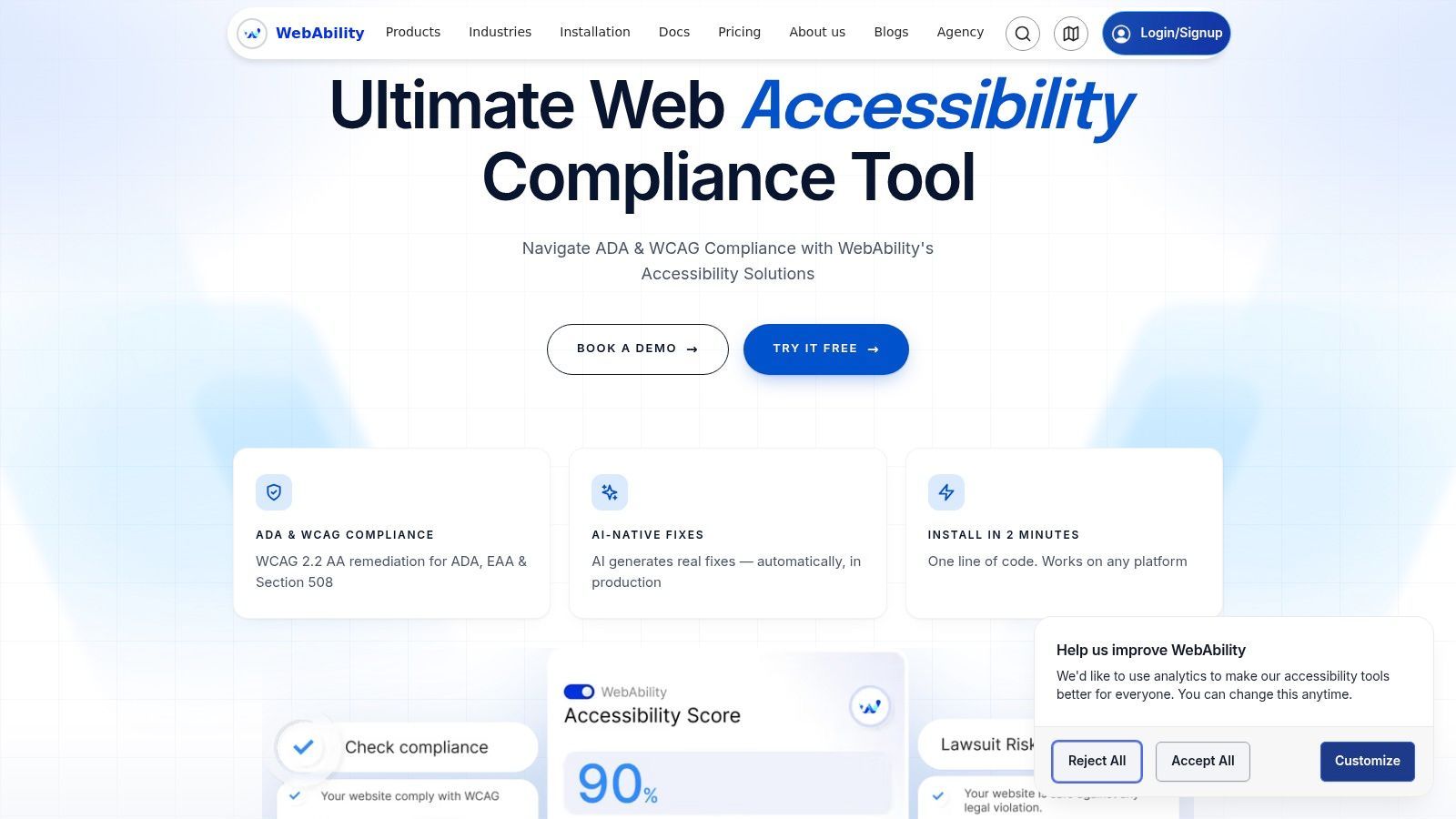
WebAbility.io is the strongest fit here for organizations that need both user-facing accommodations and operational control. It combines an AI-enhanced accessibility widget with governance tools, scanning, reporting, and expert services. For dyslexia support, that matters because real accessibility work rarely lives in one layer only.
The visitor-facing side is broad. Users can adjust text size, contrast, keyboard navigation, text-to-speech, translation, and dyslexia-friendly fonts, then save personal preferences. That makes it useful for people whose dyslexia overlaps with ADHD, low vision, or different reading preferences, where one fixed “dyslexia mode” often isn't enough.
Why it works well in practice
The practical strength is how it closes the gap between quick deployment and sustained remediation. Many teams can install it with minimal engineering effort, then use the dashboard to monitor issues, assign follow-up work, and keep evidence for audits and internal reporting.
That matters because accessibility programs often stall after the first launch. WebAbility gives teams a way to move from “we added a tool” to “we have an ongoing process.”
- User control: Visitors get dyslexia-friendly font options, text scaling, contrast settings, text-to-speech, and profile-based personalization.
- Operational depth: Teams get real-time monitoring, automated scanning, historical reporting, audit trails, and multi-site management.
- Low-code rollout: It supports fast implementation across common platforms, which helps agencies and lean teams ship improvements without rebuilding the stack first.
A second reason it stands out is that it doesn't force a false choice between automation and manual support. Automated fixes can remove a lot of repetitive friction. Human review is still necessary for complex templates, dense layouts, unclear forms, and content structure problems. WebAbility is built for both.
Practical rule: Use the widget for immediate user control, then use the dashboard and expert support to fix the recurring patterns in code and content.
For teams comparing platforms, WebAbility is especially strong when you need one system for user accommodations, scanning, reporting, and remediation workflow instead of stitching together separate tools. If you're evaluating adjacent categories, their guide to accessibility tools for websites is a useful next step.
The main trade-off is procurement and scope planning. Pricing isn't public, so smaller teams will need a sales conversation before budgeting. Also, no platform can remove the need for code-level fixes everywhere. Complex navigation, weak heading structure, and confusing form logic still need design and development attention.
2. Texthelp ReachDeck
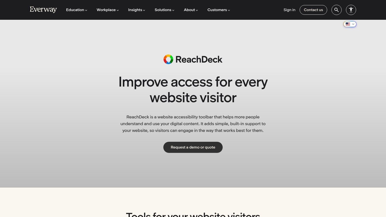
Texthelp ReachDeck is a mature choice for organizations that want a site-embedded reading support layer with strong text-to-speech roots. Its value for dyslexic users isn't limited to reading text aloud. The synchronized highlighting, simplifier mode, screen mask, ruler, and magnifier work together to reduce visual overload and support line tracking.
That's important because many dyslexic users don't struggle with one thing only. Some need audio reinforcement. Some need cleaner visual presentation. Some need help focusing on one line at a time.
Where ReachDeck fits best
ReachDeck tends to work well on content-heavy sites such as public services, higher education, healthcare, and large knowledge bases. The simplifier view is useful when the underlying page is visually busy, and the translation layer can help in multilingual environments where reading difficulty and language complexity overlap.
It also has an organizational side, not just an end-user toolbar. Teams can use auditing and content tools to improve what they publish, including staged environments.
- Best use case: Large informational websites with lots of articles, service pages, or support content
- Strongest features: Read-aloud, synchronized highlighting, simplifier mode, translation, masking, ruler, magnifier
- Main trade-off: You still need to decide how the toolbar appears in the interface so it supports users without getting in the way
I've seen these tools work best when they're introduced clearly. If the toolbar is present but unexplained, many visitors never discover the features that would help them most.
3. Recite Me Assistive Toolbar
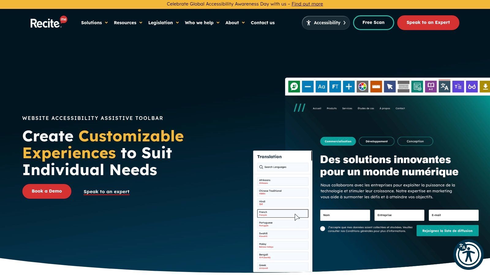
Recite Me Assistive Toolbar is one of the more rounded user-facing toolbars on the market. It goes beyond font switching and read-aloud by giving users control over spacing, styling, color adjustments, text-only mode, masking, ruler support, and translation. For dyslexia accessibility, that breadth is useful because no single reading intervention works for everyone.
A feature I pay attention to in Recite Me is the text simplification layer. That's relevant when users can decode text but still lose the thread because the layout is noisy or the wording is dense. Simplification doesn't replace good writing, but it can reduce friction on public-facing pages.
Best for organizations that want visible user choice
Recite Me is a strong fit for councils, schools, healthcare providers, nonprofits, and service organizations where the audience is broad and support needs are varied. The toolbar can also be customized to better match site branding, which helps it feel more integrated.
More personalization usually helps more users, but only if the underlying page still has a solid heading structure, readable defaults, and predictable navigation.
Two trade-offs are worth noting. First, implementation still needs thought. Placement, activation labels, and onboarding matter. Second, quote-based pricing means it isn't as easy to compare at a glance as flat-rate tools.
Still, if your priority is giving users a wide set of on-page controls without building a custom reading experience from scratch, Recite Me belongs on the shortlist.
4. ReadSpeaker webReader
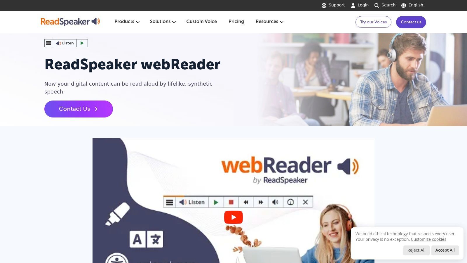
ReadSpeaker webReader is the tool I usually recommend when audio support is the primary need. It gives users a one-click listen function, synchronized highlighting, a cleaner Text Mode, and built-in reading supports such as dictionary help. For dyslexic readers, that combination can make dense content far less tiring.
This isn't the broadest visual customization suite in the list. That's also why it's easier to position. If your users mainly need strong text-to-speech and a distraction-reduced reading pane, webReader is clear and focused.
Why focus can be a strength
A lot of accessibility toolbars try to do everything. ReadSpeaker leans into reading support first. That makes it a natural fit for universities, municipal websites, libraries, policy portals, and long-form content where users need to stay with the text.
Its embedding model is also straightforward for many teams. If you don't need a large preference center and mostly want reliable listen-and-follow support, webReader can be a simpler operational choice than broader widget platforms.
- Choose it when: Audio reinforcement is the highest-value accommodation
- Expect less of: Deep visual styling controls compared with larger toolbar suites
- Watch for: Whether your users also need spacing, contrast, or font controls from another layer
5. Microsoft Azure AI Immersive Reader
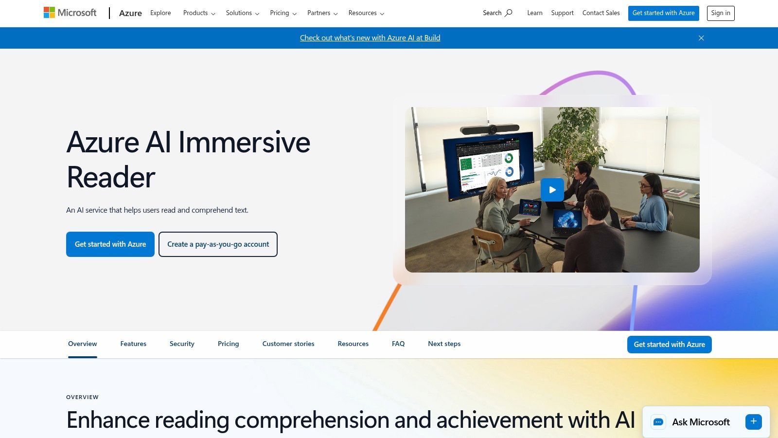
Microsoft Azure AI Immersive Reader is different from the toolbar products above. It isn't just a widget you drop on a site. It's a developer-ready service that lets you embed a dedicated reading experience inside your own interface. That makes it a strong option for product teams building learning platforms, document-heavy apps, or member portals.
Its reading supports are well suited to dyslexia use cases: read-aloud, spacing controls, line focus, grammar and reading preferences, and translation. Because it's embedded into your own experience, it can feel more intentional than a generic floating toolbar.
Best for teams building accessibility into the product itself
This is the right choice when your team has engineering resources and wants tighter UX control. Instead of adding a broad overlay, you can place reading support exactly where it helps most, such as article views, training modules, lesson content, or long-form forms.
That product-led approach also aligns well with the idea that dyslexia support should be part of the experience design, not only a fallback. If your team is aligning work to web content accessibility guidelines, Immersive Reader can complement that foundation with a stronger reading layer.
A 2015 paper on dyslexia and web accessibility argued that WCAG addressed some dyslexia-related barriers but still needed clearer dyslexia-focused inclusion, which is a useful lens here in this W4A paper. In other words, baseline compliance helps, but reading support still needs deliberate design.
The trade-off is obvious. This isn't the fastest route for non-technical teams. You need developer integration and Azure billing, and you'll need product decisions about where and how the reading pane appears.
6. UserWay Accessibility Widget
UserWay is often shortlisted because deployment is fast and the interface is familiar to many site owners. For dyslexia support, it includes readable font options, dyslexia presets, spacing controls, contrast adjustments, reading guides, and keyboard-related helpers.
That combination makes it practical for teams that want quick visitor-facing controls without a large engineering project. It can be especially useful on smaller marketing sites, brochure sites, and CMS-driven properties where the immediate goal is to provide more user choice.
What UserWay does well
The best part of UserWay for this use case is speed plus specificity. Instead of asking users to manually tune every setting, it provides profile-style shortcuts such as a dyslexia setting, which can reduce effort at the moment someone needs support.
If you're evaluating your current pages before adding any tool, start by using a website scanner to test accessibility. That won't tell you everything about dyslexic reading experience, but it will surface obvious baseline problems.
One caution matters here, and it applies to every toolbar in this list. User controls help users adapt the page. They don't replace fixing reading order, form labels, heading structure, or content clarity in the site itself.
7. AudioEye
AudioEye is a platform choice rather than just a toolbar choice. It combines monitoring, automated fixes, managed remediation, reporting, and user-facing tools in one ecosystem. For teams that want a vendor-supported program instead of piecing together separate scanning and support layers, that can be attractive.
The broader market context supports this shift. Business Research Insights projects the global website accessibility software market at USD 0.65 billion in 2026, rising to USD 1.7 billion by 2035, and says approximately 55% of organizations are already implementing accessibility solutions for compliance requirements, with 50% AI adoption in accessibility workflows in its accessibility software market report. Accessibility tooling is becoming infrastructure.
Why AudioEye makes sense for managed programs
AudioEye is worth serious consideration if you need monitoring, remediation support, and reporting in addition to visitor controls. That's especially relevant for enterprises, ecommerce teams, and legal-risk-sensitive organizations that need a programmatic approach rather than a one-time fix.
Its user-facing tools can help with readability, contrast, and simplified views, while the managed services side helps teams keep pace with ongoing site changes. That's useful because accessibility often degrades through normal publishing activity, not just through major redesigns.
The main practical advice here is to confirm the current product packaging and feature names during evaluation. Managed accessibility platforms evolve quickly, and your buying decision should be based on the exact service mix you'll use.
8. BeeLine Reader
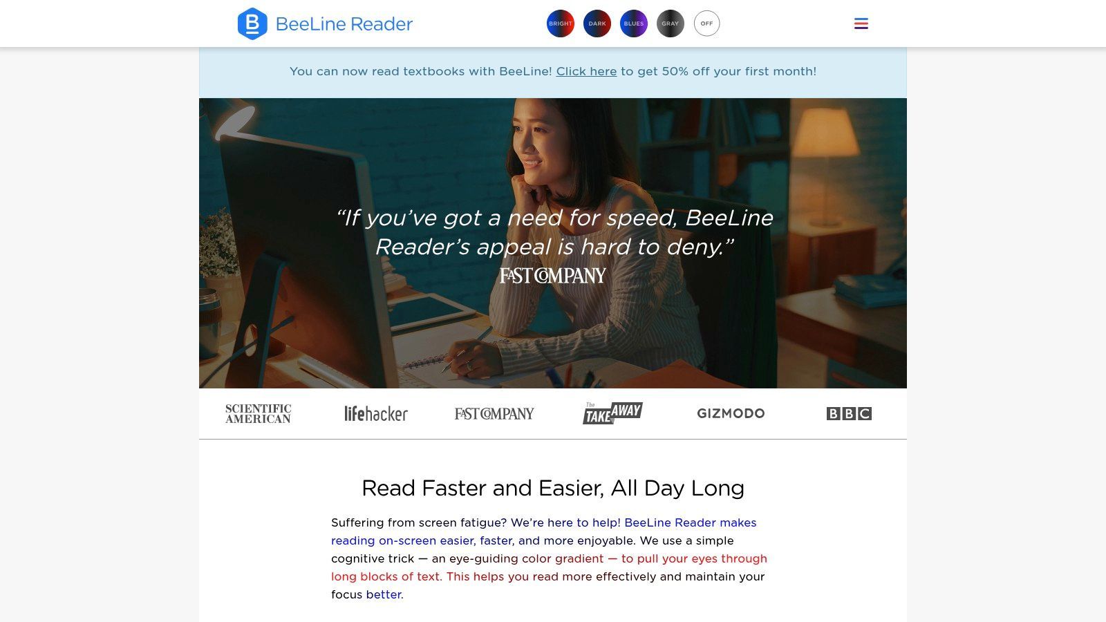
BeeLine Reader solves a narrower problem than most tools here, but it solves it in a distinctive way. It applies a color gradient across lines of text to guide the eye from one line to the next. For users who lose their place easily, especially during long reading sessions, that can be very helpful.
This is primarily a personal reading aid rather than a full accessibility program for site owners. That's exactly why I like it in this list. Web accessibility for dyslexia shouldn't only be discussed from the publisher's side. Some of the most useful tools live with the user.
Best as a complement, not a full stack
BeeLine Reader works well alongside text-to-speech, zoom, spacing changes, or a cleaner reading mode. It doesn't fix poor website structure. It doesn't repair confusing forms. It doesn't rewrite cluttered copy. But it can reduce tracking fatigue on articles, PDFs, and long passages.
If a user struggles mainly with keeping their place on the page, line-guidance tools can help more than a font change.
Because effectiveness varies by person, it's best treated as an option rather than a universal answer. That's true of most dyslexia tools, but it's especially true here.
9. Lexend
Lexend is the font choice I most often recommend when teams want a no-cost, modern-looking typography option they can integrate into a real design system. It's open source, available for web use, and flexible enough to fit product UI and marketing content without screaming “special accessibility font.”
That design neutrality matters. A font gets adopted more easily when design, brand, and accessibility teams can all live with it.
Use it as an option, not a mandate
The right way to use Lexend is usually one of two ways: as the default body font if it fits the brand and performs well in testing, or as a user-selectable reading option. The wrong way is to assume a single font solves dyslexia accessibility on its own.
Typography helps, but spacing, line length, hierarchy, contrast, and interaction design often matter just as much. If you change fonts without reviewing contrast, run a color contrast checker before rollout.
A useful detail from practitioner guidance is that dyslexia support often works better as configurable choice than as one fixed preset. That point comes through clearly in this Smashing Magazine article on a dyslexia-friendly mode. Lexend fits that model well because it can be offered cleanly as part of a broader personalization system.
10. OpenDyslexic
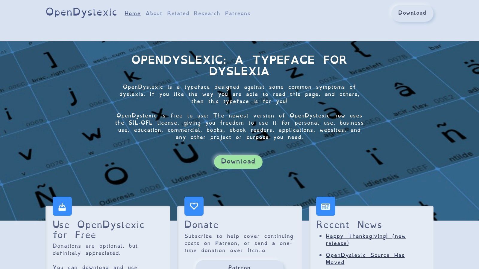
OpenDyslexic is the best-known open-source typeface built specifically for dyslexic readers. Its heavier bottoms and distinctive glyph shapes are designed to reduce letter confusion, and many users actively look for it by name.
That familiarity is one reason to include it as an option. If someone already prefers OpenDyslexic, giving them a toggle is better than forcing them to fight your brand typography on every page.
When OpenDyslexic is the right call
OpenDyslexic makes the most sense as a selectable preference inside a broader accessibility feature set. It can be especially useful on reading-heavy pages, support centers, course platforms, and article archives where people spend time with paragraphs rather than scanning short snippets.
Its limits are practical, not ideological. It won't suit every visual brand. It won't help every dyslexic user equally. And like any font intervention, it doesn't repair cluttered layouts, poor content hierarchy, or distracting UI.
Recent accessibility commentary also points to a broader testing problem: teams talk about readability tips, but often don't test the task flows users engage with, such as forms, search, checkout, and long reading sequences for dyslexic users in this BOIA discussion of dyslexia and accessibility. That's the right framing for OpenDyslexic too. Offer the font, then test whether the journey became easier.
Web Accessibility for Dyslexia: Top 10 Tool Comparison
About 1 in 10 people have dyslexia, so this comparison is not a niche buying guide. It is a practical shortlist for two different jobs: helping individual readers get through web content with less friction, and helping site owners build experiences that reduce reading strain in the first place.
The table below works best if you read it through that split. Some tools are personal reading aids. Some are site-level platforms. A few sit in the middle and support both accommodation and implementation. That distinction matters because a font toggle and a managed accessibility program solve very different problems.
| Product | Core features | Target audience | Best fit | Pricing & deployment |
|---|---|---|---|---|
| WebAbility.io | AI-enhanced accessibility widget, AI auto-fixes, continuous scans, dashboard, compliance scoring, audit trails, API | Enterprises, agencies, public sector, e-commerce, SaaS, SMBs | Teams that want user controls plus monitoring, reporting, and a remediation workflow | Free trial and free tools. Plugins for WordPress, Shopify, Wix, and Webflow. Custom enterprise pricing |
| Texthelp ReachDeck | Read-aloud with highlighting, page simplifier, mask/ruler, magnifier, translation, auditing tools | Public sector, education, organizations serving dyslexic and low-literacy readers | Content-heavy sites that need strong reading support and editorial governance | Quote-based pricing. Script or embed deployment |
| Recite Me Assistive Toolbar | TTS, translations, font and spacing controls, contrast controls, AI text simplifier, customizable toolbar | Enterprises, public sector, education, large sites | Organizations that want a broad user-facing toolbar with strong language support | Quote-based pricing. Custom implementation and onboarding |
| ReadSpeaker webReader | One-click TTS with synchronized highlighting, Text Mode, dictionary, support documentation for compliance review | Education, public sector, publishers | Teams that want dependable text-to-speech without a large rebuild | Quote-based pricing. Script embed |
| Microsoft Azure AI Immersive Reader | SDK and API for read-aloud, line focus, reading preferences, translation, comprehension aids | Developers, edtech, apps that need embedded reading supports | Product teams building support directly into the reading experience | Developer integration required. Usage-based Azure billing |
| UserWay Accessibility Widget | Dyslexia-friendly fonts, text size and spacing controls, contrast settings, reading guide, keyboard helpers, presets | SMBs, CMS sites, low-code teams | Fast deployment where the main need is visible user controls | Low-code install and CMS plugins. Advanced pricing varies by tier |
| AudioEye | Assistive toolbar, monitoring, managed remediation, reporting, support services on higher tiers | Enterprises, compliance-focused organizations | Teams that need ongoing monitoring and outside remediation help | Hosted plans with enterprise services. Feature set and pricing vary by plan |
| BeeLine Reader | Line-guiding color gradients for web and PDF, browser plugins, iOS app, publisher integrations | Individuals, classrooms, publishers | Readers who lose their place easily and want a lightweight aid | Free options available. Paid plans for broader access |
| Lexend | Variable font family, multiple weights, web-ready deployment | Designers, educators, publishers, sites offering optional fonts | Design teams that want a readable optional typeface with low implementation overhead | No-cost. Add through standard web font setup |
| OpenDyslexic | Typeface with weighted bottoms and distinct glyphs, multiple styles, open license | Sites serving dyslexic users, assistive communities | Products that want to offer a familiar user-selected font option | Free to implement. Works best as a selectable preference |
A few patterns show up quickly.
If you own the site, the strongest candidates are usually WebAbility.io, ReachDeck, Recite Me, UserWay, and AudioEye. They give users controls on the front end, but they also help teams manage the operational side: scanning, issue tracking, implementation, and in some cases remediation support. That matters because dyslexia accessibility breaks down as often in content structure and workflow as it does in visual presentation.
If you are building a product feature rather than adding a site-wide toolbar, Microsoft Azure AI Immersive Reader stands apart. It is the tool in this list that fits naturally inside applications, learning platforms, document flows, and custom reading interfaces. The trade-off is development time. You get more control, but you have to design and maintain the experience properly.
For individual readers, BeeLine Reader, Lexend, and OpenDyslexic are the lightest-weight options. They do one job each, and that can be a strength. A reader who mainly needs help tracking lines may prefer BeeLine. Someone who already knows they read better with a specific font may care more about Lexend or OpenDyslexic than about a full toolbar.
No single tool covers every dyslexia-related barrier. Text-to-speech helps with decoding and fatigue. Fonts can reduce visual confusion for some readers. Spacing, masking, and line focus help users keep their place. Simplified views can reduce overload. Site-owner platforms matter because they address the surrounding experience too: cluttered layouts, inconsistent headings, poor error handling, and dense content blocks.
That is the fundamental buying decision here. Choose between a reader aid, a site-layer accommodation tool, or a broader accessibility operations platform. The right answer depends on whether you are trying to support one person's reading session or improve the default experience for everyone who visits the site.
Final Thoughts
The biggest mistake I see in web accessibility for dyslexia is treating it like a typography problem only. Fonts matter. Spacing matters. Contrast matters. But so do form flows, content density, pop-up behavior, heading structure, text-to-speech support, and whether users can recover easily when they lose their place.
That broader view is important because commercial websites still perform poorly on accessibility basics. AudioEye reports that only 2% of websites pass 70% or more of testable accessibility criteria, and the average web page contains 297 WCAG failures based on a scan of roughly 400,000 pages in its 2025 Digital Accessibility Index in AudioEye's accessibility statistics roundup. For dyslexia accessibility, that means you can't rely on a single tool and assume the experience is good enough.
The best tool choice depends on which side of the problem you're solving.
If you're a site owner, platforms such as WebAbility.io, AudioEye, UserWay, ReachDeck, and Recite Me help by adding user controls and, in some cases, governance, scanning, reporting, and remediation support. If you're building a product and want reading support inside the experience itself, Microsoft Azure AI Immersive Reader is a stronger fit. If you're thinking from the reader's perspective, BeeLine Reader, Lexend, and OpenDyslexic are useful because they support the person directly, not just the site.
The strongest setups usually combine both layers. Give users control over how they read. Then fix the underlying structure so they need less rescue in the first place. That means cleaner forms, fewer distractions, more predictable navigation, stronger semantic HTML, and content written for scanning as well as deep reading.
It also means testing what matters. Don't stop at “does the page have a readable font?” Test whether a user can search, complete a form, check out, read a policy page, compare plans, or finish a dashboard task without losing context. Dyslexia accessibility becomes real when the full journey is readable and navigable, not when a settings icon appears in the corner.
For conversion-focused teams, this isn't separate from CRO. Users convert more reliably when they can understand the offer, follow the steps, and finish the action without friction. Accessibility improvements that reduce distraction, improve content hierarchy, and support user-controlled reading often make important pages stronger for everyone, not just for users with diagnosed dyslexia.
If I had to reduce this list to one buying principle, it would be this: pick tools that increase user choice and help your team keep improving the source experience over time. That's what turns accessibility from a feature into a durable advantage.
If you want one platform that combines dyslexia-friendly user controls, automated monitoring, governance reporting, and expert remediation support, WebAbility.io is a strong place to start. It's especially well suited for teams that need web accessibility for dyslexia to support compliance, improve UX on high-value pages, and scale across multiple sites without building a fragmented tool stack.
Quick Questions
Tap to ask AI about this article