Unlocking Digital Access Dyslexia and Assistive Technology

Sidharth Nayyar
tldr; Dyslexia changes how people process digital text, which can create real roadblocks in reading speed, comprehension, and even visual comfort. Assistive technology (AT) tackles these problems head-on with tools that convert text to audio, swap in more readable fonts, and alter screen colors to cut down on eye strain. Building these features into your site isn't just about accessibility; it's about making a better, more usable web and meeting critical compliance standards. Thankfully, modern platforms make it straightforward to deploy these solutions, helping you support every user.
For any professional building digital products—whether you're a developer, designer, or business leader—grasping how dyslexia and assistive technology intersect is where creating truly inclusive experiences begins. Think of assistive technology (AT) as a powerful bridge, offering tools that help users with dyslexia navigate common digital barriers, from text-to-speech readers to specialized fonts and adjustable screen contrasts.
A Quick Guide to Dyslexia and Assistive Technology
Bridging the Digital Reading Gap
For the 15-20% of the population living with dyslexia, a simple wall of text can feel like an impossible climb. This has nothing to do with a person's intelligence—it's about how their brain processes written language. Assistive technologies are the digital toolkit that gives them alternative routes to access and understand the same content.
These tools aren't just niche add-ons; they're a cornerstone of universal design. When you build in features that cater to different ways of learning and processing information, you end up with a more robust and user-friendly product for everyone. To dig deeper into this, you can learn more about dyslexia in our glossary.
Assistive technology empowers people by turning digital hurdles into manageable interactions. It's about providing choice and control, letting users shape their experience to what works best for them.
Key Technologies to Know
A handful of assistive technologies have a particularly big impact for users with dyslexia. Getting to know them is the first step toward putting them to work effectively. Let's look at the most common challenges and how these tools offer a solution.
The table below connects some of the most frequent digital struggles for users with dyslexia to the specific assistive technologies that make a real difference.
Assistive Technology Solutions for Common Dyslexia Challenges
| Digital Challenge | Assistive Technology Solution | Example Implementation Feature |
|---|---|---|
| Difficulty decoding long text blocks | Text-to-Speech (TTS) | An on-page "read aloud" button that converts article text into spoken audio. |
| Letters appearing jumbled or reversed | Dyslexia-Friendly Fonts | A user setting to switch the site's default font to one like OpenDyslexic. |
| Eye strain and losing place on screen | Color & Contrast Adjustments | Controls that let a user change the background to a muted color or increase text contrast. |
Each of these technologies addresses a specific pain point, making digital content more approachable and easier to engage with. Let's briefly break down why they're so effective.
Text-to-Speech (TTS): This is a game-changer. By reading on-screen text aloud, TTS technology lifts the heavy cognitive load of decoding words, freeing up mental energy for comprehension.
Dyslexia-Friendly Fonts: Specialized typefaces, like the well-known OpenDyslexic, are crafted with unique letter shapes and heavier bottoms to help prevent the visual confusion that can make letters seem to flip or blur together.
Color and Contrast Adjustments: Staring at a bright white screen with black text can be jarring and cause significant visual stress. Tools that let users change background colors or boost contrast can dramatically improve focus and reading stamina.
Seeing the Web Through a Different Lens
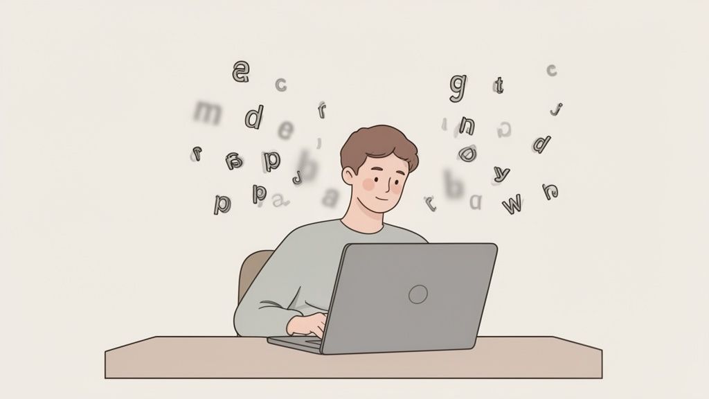
To build digital products that work for everyone, we have to start by seeing the web through their eyes. For someone with dyslexia, a website isn't just a page of words and pictures; it's a landscape that can be filled with cognitive traps and visual static.
Try to imagine reading a paragraph where the letters seem to swim, blur, or jumble themselves up. This isn't just a creative description—it's the day-to-day reality for many people, turning the simple act of reading into an exhausting mental workout.
The scale of this challenge is enormous. Dyslexia affects an estimated 15-20% of the population, which means around 780 million people worldwide struggle with reading, writing, and spelling. Without the right support, millions of kids and adults can feel left behind. This is where dyslexia and assistive technology comes in, offering tools that can level the playing field, build confidence, and enable independence.
Common Digital Hurdles for Users with Dyslexia
What looks like a clean, modern design to one person can feel like a wall of text to someone with dyslexia. Recognizing these common roadblocks is the first real step toward creating websites that are genuinely inclusive, not just compliant.
People with dyslexia often run into a few key problems when they browse the web. These aren't just about reading; they involve how the brain processes visual information, remembers things, and makes sense of structure.
Here are some of the biggest issues:
- Visual Crowding: Think of a dense block of text with lines packed tightly together. For many, the letters and words start to blur into one another, making it nearly impossible to follow a single sentence.
- Decoding Fatigue: The sheer mental energy it takes to figure out each word is immense. This leads to cognitive burnout pretty quickly, causing comprehension to plummet.
- Visual Stress from Glare: That crisp, high-contrast white background so many designers love can create a harsh glare. This often causes eye strain and headaches, making it physically uncomfortable to focus.
- Navigational Overload: Complicated menus, cluttered layouts, and pages that look different from one another can turn the simple act of finding information into a frustrating maze.
The Role of Learning Styles
To make the most of assistive technology, it helps to understand how different people process information. This includes understanding different learning styles, such as visual learning, which is especially important for many individuals with dyslexia.
By designing with these challenges in mind, we shift from creating a one-size-fits-all experience to one that is adaptable and empowering for a much broader audience.
Thinking about these user experiences helps us move beyond a technical checklist and toward true empathy. When we get the "why" behind the need for tools like dyslexia-friendly fonts or adjustable colors, we can build solutions that actually work. This understanding is what separates a website that just ticks a box from one that’s genuinely welcoming.
Your Essential Assistive Technology Toolkit
Moving from understanding dyslexia to actually helping users means getting practical. It's about building a toolkit of assistive technologies that directly tackle the real, frustrating hurdles people with dyslexia face every day online. This isn't about finding one silver bullet; it’s about offering a suite of smart options that let users shape their own digital experience.
The difference these tools make is huge. In fact, a 2023 survey from Texthelp found that over 52% of U.S. teachers view assistive technology as one of the most valuable strategies for their students with dyslexia. That's a powerful endorsement, especially when you consider that dyslexia affects up to 17% of people worldwide—that’s millions who struggle with the simple act of reading.
To help you get started, here's a quick breakdown of the most impactful technologies that should be in every accessibility toolkit.
Key Assistive Technologies and Their Functions
| Assistive Technology | Primary Function | How It Helps Users with Dyslexia |
|---|---|---|
| Text-to-Speech (TTS) | Converts digital text into spoken audio. | Reduces the cognitive load of decoding words, freeing up mental energy for comprehension. |
| Dyslexia-Friendly Fonts | Uses uniquely shaped letters with heavier bottoms. | Prevents letters from "flipping" or "crowding," making text clearer and less confusing. |
| Color/Contrast & Overlays | Allows users to change background/text colors or apply filters. | Minimizes visual stress and eye strain caused by harsh white backgrounds, making text more stable. |
| Screen Readers | Reads all on-screen elements aloud, including menus and buttons. | Provides full auditory navigation of a website or app, not just the content. |
| Keyboard Navigation | Enables users to browse using only a keyboard. | Offers an alternative to mouse-based interaction, which can be difficult for some users. |
Each of these tools plays a vital role in creating a more inclusive and less frustrating online experience.
Text-to-Speech: The Auditory Bridge
For many people with dyslexia, the hardest part of reading is the sheer mental effort it takes just to figure out what the words are. Text-to-Speech (TTS) technology is a game-changer because it acts as a bridge, turning written words into spoken audio and taking that decoding burden away.
Think about someone trying to get through a dense report. Instead of wrestling with each sentence, they can just hit "play" and listen. This frees up their brain to focus on the actual meaning, boosting comprehension and making it easier to remember the information. Essentially, TTS separates the mechanical act of reading from the intellectual act of understanding.
If you're looking to add this to your site, checking out a good guide to the best Text to Speech (TTS) readers is a great place to start.
Dyslexia-Friendly Fonts: A Clearer Typographical Path
Standard fonts can create what’s known as a "visual crowding" effect. For someone with dyslexia, this means letters can look like they’re blurring, flipping around, or melting into one another, making it nearly impossible to tell them apart.
That's precisely the problem dyslexia-friendly fonts were designed to solve. Fonts like OpenDyslexic or Dyslexie use a few smart tricks to make text much easier to read:
- Heavier Bottoms: Letters are weighted at the bottom, giving them a sort of "gravity" that helps stop the brain from flipping them upside down (like a 'p' and a 'b').
- Unique Letter Shapes: Similar-looking letters ('b' and 'd,' for example) are given distinct, non-mirrored shapes so they’re easier to differentiate at a glance.
- Wider Spacing: Extra space between letters and words helps reduce that crowding effect, letting each character breathe and stand on its own.
By simply offering a toggle for a dyslexia-friendly font, you provide a powerful tool that makes text instantly less intimidating and far more accessible.
Color, Contrast, and Overlays: Reducing Visual Stress
The standard black-on-white screen we're all used to can be surprisingly harsh. For some people with dyslexia, this high contrast makes words appear to vibrate or shimmer, which quickly leads to eye strain, headaches, and a complete loss of focus.
This is where letting users control color and contrast becomes so important. These tools allow them to soften the digital page to match their own visual comfort level. Some of the most helpful adjustments include:
- High-Contrast Mode: This often means flipping to white text on a black background or using color pairings like yellow on blue, which many find easier on the eyes.
- Color Overlays: Imagine placing a transparent colored sheet over the page. A soft yellow, blue, or pink filter can dramatically reduce the glare from a white background and help the text feel more stable.
- Adjustable Brightness and Saturation: Putting users in control of these settings lets them dial in the perfect visual balance to cut glare without losing readability.
Getting familiar with the different types of assistive technology helps put all these tools into a bigger context. At the end of the day, the goal is always the same: build a flexible interface that adapts to the user, not the other way around.
How Assistive Tools Fulfill Your Compliance Goals
So, why should your organization care about tools like text-to-speech, adjustable fonts, and color contrast options? It's simple: they aren't just features that make your site nicer for users with dyslexia. They are fundamental to meeting your legal obligations under accessibility standards like the WCAG, the ADA, and Section 508.
When you implement this kind of dyslexia and assistive technology, you're doing more than just improving the user experience. You're actively building a more compliant and legally sound website for everyone.
Thinking about assistive features this way is a game-changer. It moves the conversation beyond user experience and into the realm of legal and ethical responsibility. Understanding how these tools directly map to digital accessibility laws is critical for any organization looking to reduce legal risk and build a platform that truly welcomes everyone.
Frameworks like the Web Content Accessibility Guidelines (WCAG), the Americans with Disabilities Act (ADA), and Section 508 aren't just abstract rulebooks filled with jargon. Think of them as practical blueprints for creating websites and apps that work for people with a huge range of abilities, including those with dyslexia.
Mapping Dyslexia Tools to WCAG Criteria
Every feature you add to support users with dyslexia is a concrete step toward broader compliance because these tools directly address specific WCAG success criteria. Instead of chasing a checklist, you can adopt a user-centered design strategy that naturally satisfies legal requirements along the way.
Let's break down how this works in practice:
- Text-to-Speech (TTS): This is a huge one. It directly supports WCAG 1.1.1 (Non-text Content) by giving people an audio version of written text. It’s a lifeline for anyone who has a hard time decoding words visually.
- Dyslexia-Friendly Fonts & Text Spacing: These features are all about giving users control, which lines up perfectly with WCAG 1.4.12 (Text Spacing). This rule says users must be able to adjust spacing for letters, words, and lines without the page falling apart—exactly what these tools do.
- Color and Contrast Adjustments: Giving users the ability to tweak colors helps meet WCAG 1.4.3 (Contrast Minimum) and 1.4.6 (Contrast Enhanced). Even if your default design is compliant, allowing someone to switch to a high-contrast mode or a custom color scheme can make the difference between a readable page and an unusable one.
You can see how these technologies come together to form a complete accessibility toolkit.
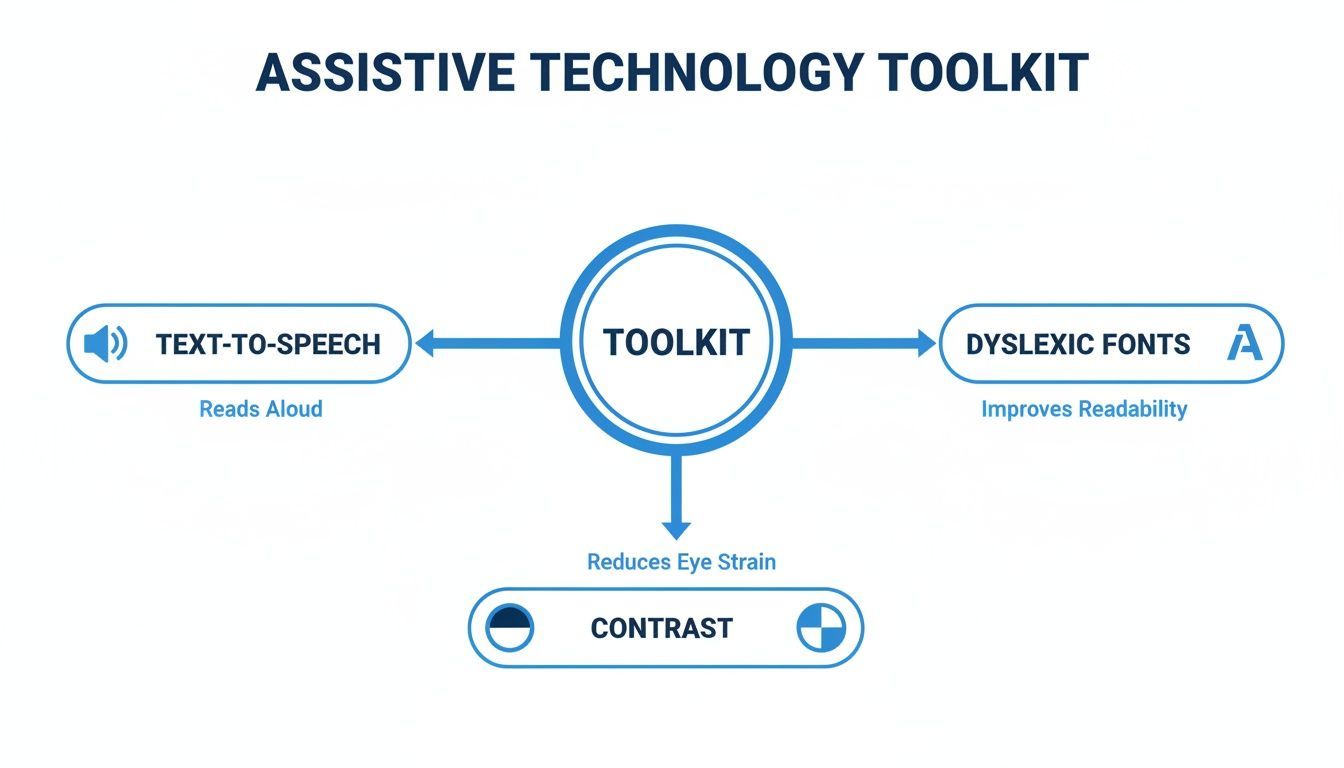
The diagram above shows that things like Text-to-Speech, specialized fonts, and contrast controls aren't just standalone fixes. They are interconnected pieces of a much bigger, more effective accessibility strategy.
From Good Practice to Legal Requirement
It's crucial to grasp that what seems like a "best practice" today can easily become a legal necessity tomorrow. In the U.S., courts have consistently interpreted the ADA to apply to websites as "places of public accommodation." This means a website that's inaccessible to someone with a disability—including dyslexia—can be seen as discriminatory.
When you proactively implement dyslexia and assistive technology, you're not just catering to a user preference. You're building a digital property that respects civil rights and is more defensible against legal challenges.
This direct connection is why getting a firm handle on what WCAG compliance is is so incredibly valuable for any development or marketing team. The WCAG provides the technical foundation you need to meet broader legal mandates like the ADA.
The Universal Benefits of Designing for Dyslexia
Here’s the best part: when you design for dyslexia, you almost always create a better experience for all your users.
Think about it. A clean, highly readable font is easier on everyone's eyes. The option to listen to an article with text-to-speech is a fantastic feature for someone multitasking on their commute or for people who simply prefer to learn by listening.
This is the core idea behind Universal Design. By solving for the needs of users at the edges, you often create a superior product for everyone in the middle. By focusing on the challenges faced by people with dyslexia, your organization will naturally build a more robust, compliant, and universally welcoming digital presence.
Putting Accessibility Into Practice
Knowing the principles of accessibility is one thing, but actually putting them into practice is where the real work—and the real impact—begins. For design and dev teams, it's about shifting from theory to tangible actions. The goal isn't to tack on assistive features as an afterthought, but to weave them into the core of the user experience from day one.
There are a few ways to get there. You could build every accessibility feature from scratch, which gives you incredible control but demands a ton of time and specialized expertise. Or, you can bring in an integrated solution that offers a full suite of assistive tools right out of the box.
Choosing Your Implementation Strategy
The right path really boils down to your team's resources, your timeline, and the size of your digital footprint. Building in-house gives you total control, but it's a slow and often expensive road. You're responsible for coding, testing, and maintaining every single feature, from a text-to-speech engine to a dyslexia-friendly font switcher.
On the flip side, a managed accessibility platform can get you to the finish line much faster. These tools are built to deploy a whole range of features, like those that support dyslexia and assistive technology, without needing much, if any, custom coding. This approach lets teams deliver a powerful, user-controlled experience in a fraction of the time.
The best strategy is always the one that makes accessibility sustainable. Pick an approach that fits your workflow, and you'll find that inclusive design becomes a consistent practice, not just a one-off project.
The Power of Integrated Solutions
An integrated platform provides a single, unified way to manage and deploy accessibility features. Instead of juggling a dozen different tools, you implement one solution that gives users a central control panel to fine-tune their experience. This is a game-changer for supporting users with dyslexia, who often need to combine several aids—like a specific font, adjusted line spacing, and a colored overlay—to read comfortably.
The image below gives you a sense of what this looks like. A platform like WebAbility.io centralizes all these controls into a simple, user-friendly interface.

This kind of setup is incredibly empowering. It puts users in the driver's seat, letting them turn on the exact tools they need, right when they need them.
Embedding Accessibility Into Your Workflow
Real accessibility isn’t something you check for right before launch. It’s the result of a continuous process baked directly into your development lifecycle. It’s about being proactive, not reactive, and catching potential issues long before they ever reach a user.
To make that happen, you need a few core practices:
- Automated Scanning: Integrate tools that scan your code for common accessibility slip-ups with every new build. This is your first line of defense, catching things like missing alt text or bad color contrast before they become bigger headaches.
- Manual Testing Protocols: Automation is great, but it can't tell you what an experience feels like. You need clear, repeatable steps for manual testing. Make it a non-negotiable part of your process for any major feature release.
- Continuous Monitoring: Use a dashboard to keep an eye on the accessibility health of your sites over time. This helps you catch any regressions instantly and track your progress toward compliance, ensuring your hard work doesn't unravel after launch.
Essential Testing Practices for Dyslexia Support
When you’re testing features built to help users with dyslexia, you have to go beyond just checking if a button works. The real question is: are these tools actually helpful?
- Screen Reader Testing: Screen readers are a vital form of dyslexia and assistive technology, not just for users with visual impairments. Fire up a tool like NVDA, JAWS, or VoiceOver and try to navigate your site. Is the content read in a logical order? Are all the buttons and links clearly announced?
- Keyboard-Only Navigation: Can you do everything on your site with just the Tab, Enter, and arrow keys? This is a must for users who find mouse control difficult. Try it yourself—you might be surprised by what you find.
- User Feedback Loops: The only way to truly know if your tools are working is to ask the people who rely on them. Connect with users who have dyslexia and get their direct feedback. Does that font option really make text easier to read? Is the text-to-speech voice clear enough to follow along with?
By blending the right implementation strategy with disciplined testing and ongoing monitoring, your team can finally stop just talking about accessibility and start doing it. This doesn't just get you closer to meeting compliance standards; it creates a digital space that is genuinely welcoming and usable for everyone.
How to Scale Accessibility Across Your Digital Properties
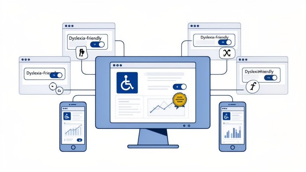
For any organization managing a large digital footprint—whether it's a dozen brand sites or hundreds of product pages—tackling accessibility one project at a time just doesn't work. It’s a recipe for inefficiency. A great solution built for one site gets forgotten on the next, leading to a patchwork of user experiences and spotty compliance. This is where scale becomes a serious roadblock.
Trying to manage it all manually creates disconnected efforts and wildly inconsistent results. A much smarter approach is to use a centralized platform to govern accessibility across every single digital property from one command center. This shifts accessibility from being a recurring fire drill to a sustainable, well-oiled part of your business.
Unifying the User Experience with Centralized Tools
Picture this: with a single click, you deploy a consistent suite of dyslexia and assistive technology tools across your entire portfolio. A managed platform makes that a reality, ensuring every visitor on every site gets the same high-quality support. That consistency isn’t just about making your life easier; it’s about building trust and reliability with your audience.
A centralized solution like the WebAbility.io platform lets you:
- Deploy Consistently: Roll out features like dyslexia-friendly fonts, text-to-speech, and high-contrast modes across all websites at the same time.
- Ensure Uniformity: Guarantee every user finds the same powerful tools, no matter which of your digital front doors they walk through.
- Simplify Updates: When a new assistive feature is ready or an old one gets an upgrade, you can push the update everywhere instantly.
By standardizing your accessibility toolkit, you create a predictable and dependable experience for users with dyslexia, who rely on these features to navigate the digital world effectively.
From Reactive Fixes to Proactive Governance
Managing accessibility at scale is also a game of monitoring and governance. Without a unified view, it’s practically impossible to know your actual compliance status, track improvements, or spot which properties are lagging. A central dashboard solves this by pulling all your accessibility data into one place.
This approach lets you graduate from just reacting to problems as they pop up. It puts your organization in the driver's seat, enabling you to manage accessibility proactively with decisions guided by real-time data from your entire digital ecosystem.
A Single Source of Truth for Compliance
A unified platform becomes the single source of truth for your whole team. It delivers clear, actionable insights that turn compliance management from a guessing game into a strategic, data-driven process.
Here’s how a centralized dashboard helps:
- Comprehensive Monitoring: Keep an eye on the accessibility health of every site from one spot, with easy-to-read scores and issue summaries.
- Progress Tracking: Watch your compliance efforts pay off over time with historical data and trend reports.
- Stakeholder Reporting: Quickly pull together reports for leadership, legal, or other stakeholders to show your commitment and progress.
This kind of oversight is non-negotiable for any organization serious about making its digital presence truly inclusive. It takes the overwhelming challenge of scaling dyslexia and assistive technology and makes it a manageable, measurable, and continuous part of how you operate.
Frequently Asked Questions
What Is the First Step to Make a Website Dyslexia-Friendly?
The single most important first step is to nail text readability. It’s all about the fundamentals. Start by choosing a clean, sans-serif font, making sure your base font size is at least 16 pixels, and locking in a strong color contrast between your text and its background. You should be aiming for a contrast ratio of at least 4.5:1, which is the sweet spot for WCAG AA standards.
Getting these basics right makes a huge difference right out of the gate. For an even bigger win, you can add a managed accessibility solution. This gives visitors instant control over their own experience with tools like dyslexia-friendly fonts, custom spacing, and contrast modes, all without you needing to rebuild your entire site from scratch.
How Should I Test If My Assistive Technology Is Working?
Good testing isn’t just about one thing; it’s a mix of automated checks and real human experience. It's one thing for a feature to be present, but it’s another for it to be genuinely helpful.
The ultimate test of any assistive technology isn't whether it passes an automated scan, but whether it actually helps a real person navigate and understand your content without a struggle.
Here’s how you can approach testing your dyslexia and assistive technology features in a way that covers all your bases:
- Automated Scans: Use tools to find technical bugs hiding in the code, like incorrect ARIA roles or low contrast ratios. Think of this as your first line of defense.
- Manual Keyboard Testing: Put your mouse aside and try to navigate your entire site using only the keyboard. This is a crucial test to ensure that every link, button, and form works for people who can't use a mouse.
- Screen Reader Walkthroughs: Fire up a screen reader like NVDA or VoiceOver and listen to your website. This is the only way to truly understand how your content is structured and announced to someone who relies on audio.
- User Feedback: This is the most important step. Get people who have dyslexia to actually use your features, like the font changers and text-to-speech. Their direct, honest feedback is the only way to know if your tools are truly effective and easy to use.
Ready to make your digital properties fully accessible and compliant? WebAbility.io provides an end-to-end platform with AI-powered tools to deploy, monitor, and manage accessibility at scale. Start your free trial at WebAbility.io today.
Quick Questions
Tap to ask AI about this article