8 Best Practices for Alt Text: Boost SEO & Accessibility

Sidharth Nayyar
Alt text often gets treated like cleanup work. That's a mistake. Done well, it supports accessibility, helps search engines understand visual content, and reduces friction for people trying to complete a task on your site.
The fastest way to improve alt text quality is to stop treating it like a caption field. Section 508 guidance says alt text should be short, convey the same information as the visual content, avoid unnecessary repetition of page text, and stay in the same language as the surrounding content. For complex graphics, a short alt text plus a longer description or linked data table is recommended, which makes a practical standard for modern content teams managing CMS workflows and approvals (Section 508 alternative text guidance).
TLDR
- Keep alt text short: A practical ceiling for screen-reader friendliness is roughly 125 characters, with the most important detail first.
- Write for purpose, not pixels: The same image may need different alt text depending on where it appears and what job it does.
- Use empty alt for decorative images: If an image adds no information and serves no function, skip the noise with
alt="". - Handle charts differently: Use short alt text for the summary, then provide a longer description or data table nearby.
- Don't duplicate nearby text: Repetition clutters the screen reader experience and adds no value.
- Use keywords naturally: Good alt text can support discoverability, but accessibility comes first.
- Use AI as a draft tool: Automation helps at scale, but humans still need to review context, accuracy, and edge cases.
- Test with assistive tech: If it sounds awkward in a screen reader, it's not done.
Strong alt text improves more than compliance. It helps product pages communicate faster, strengthens important internal pages, and supports cleaner user journeys. That matters for CRO because people convert more easily when content is understandable and navigation is predictable. It matters for SEO because search engines rely on text signals to interpret image meaning.
These are the best practices for alt text that hold up in real production environments.
1. Be Descriptive and Concise
The best alt text says enough, then stops. It gives the user the information they need without turning a quick image stop into a long interruption.
For everyday content, concise writing is a quality standard, not a compromise. Multiple accessibility references converge around a practical ceiling of roughly 125 characters, and they consistently recommend putting key details first. The same guidance also notes that image-based text should be transcribed exactly, while charts and graphs need actual data values, trends, extremes, time period, and units in a longer accessible structure when necessary (alt text implementation guidance PDF).
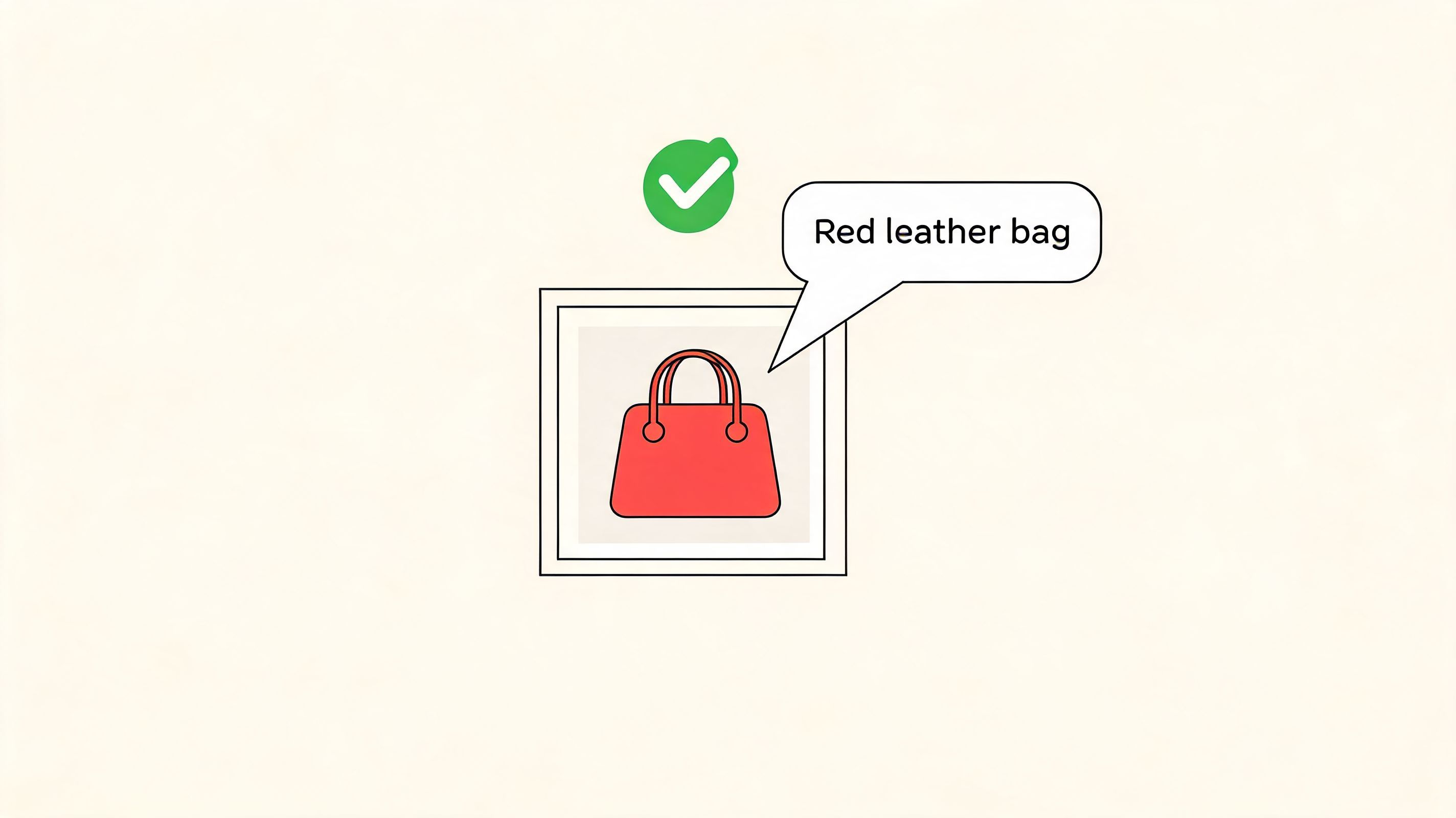
“Bag” is too vague. “Image of a bag sitting against a neutral background with visible stitching and a long strap attached to metal rings” is too long for a simple product shot. “Red leather crossbody bag with adjustable strap, front view” is about right because it names the product, distinguishes it from nearby items, and helps both users and search engines.
What concise actually looks like
A good test is to ask whether someone who can't see the image would understand why it's there. On an ecommerce collection page, “red leather crossbody bag with adjustable strap” works better than “fashion accessory.” On a SaaS tutorial, “dashboard showing monthly sales metrics with upward line graph” works better than “analytics image.”
Practical rule: Don't start with “image of” or “photo of.” Screen readers already announce that it's an image.
This is also where accessibility and business goals align. Product pages, category pages, and solution pages all benefit when image text is specific enough to reinforce meaning. If you want a deeper look at alt text for SEO, focus on natural product attributes, visible state, and intent rather than stuffing in extra terms.
2. Distinguish Decorative vs. Functional Images
A lot of bad alt text starts with a classification mistake. Teams write descriptions for visuals that should be ignored, then skip descriptions for visuals that control behavior.
Purely decorative images should usually use empty alt text. Screen reader users don't need ornamental dividers, background flourishes, or repeated brand shapes announced every time they move through a page. Functional images are different. If an image acts like a button, link, control, or meaningful status indicator, its alt text needs to communicate that function.
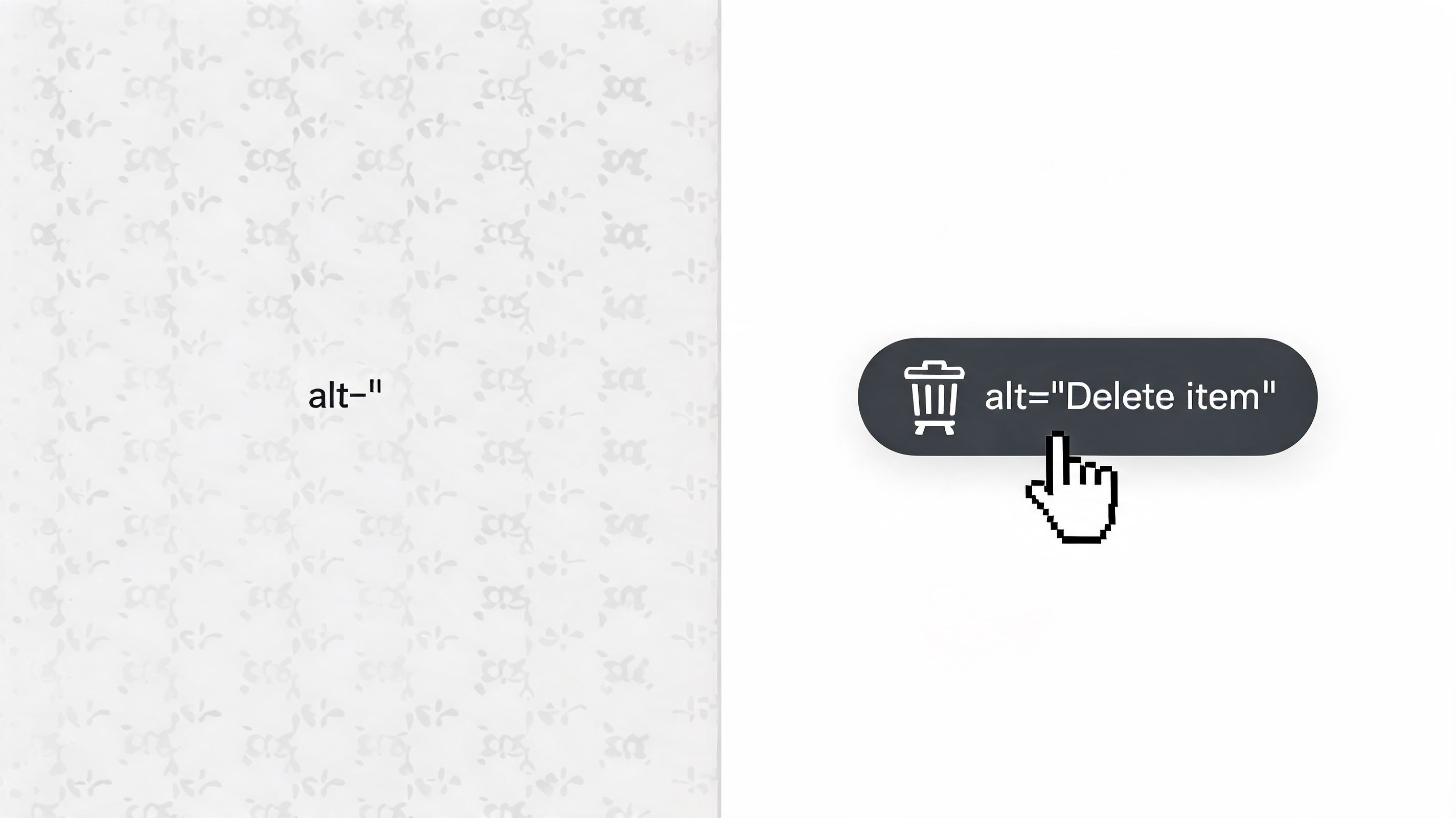
A trash icon inside a clickable control shouldn't be described as “trash can icon.” It should expose the action, such as “Delete item,” because that's what matters to the user.
A simple way to classify images
Before anyone writes alt text, sort the image into one of these buckets:
- Decorative image: Adds visual polish only. Use empty alt text.
- Informative image: Adds meaning not available elsewhere. Write descriptive alt text.
- Functional image: Triggers an action or navigation. Describe the action or destination.
- Redundant image: Repeats adjacent text exactly. Usually use empty alt text.
This sounds basic, but it's where many enterprise teams struggle. The same icon can be decorative in one component and functional in another. A logo can be branding in a footer, but a homepage link in a header. A product shot can be redundant on one template and essential on another.
Classification first, writing second. That order prevents a lot of accessibility defects.
3. Include Context-Specific Information
Alt text doesn't live in isolation. It lives on a page, inside a task flow, next to text, links, buttons, and headings. That surrounding context determines what the alt text should say.
This is one of the most overlooked best practices for alt text. Strong guidance explains that alt text should be concise and context-aware, avoid repeating nearby text, and change based on page purpose. It also highlights a real gap for teams: deciding when an image is decorative, redundant, exempt, or informative in modern scenarios like repeated product shots, screenshots, and image-heavy galleries (Harvard guidance on describing image content).
The practical takeaway is simple. The same image can require different alt text in different places.
Same image, different job
A company logo in the site header might need alt text like “WebAbility.io home” if it's the homepage link. The exact same logo inside a partner strip might need just the brand name. In a decorative hero where the company name already appears as live text, it may not need descriptive alt text at all.
Product photography creates the same issue. On a category page, the alt text should help distinguish one product from the others. On a product detail page, the surrounding page already provides the name, price, and attributes, so the alt text should focus on what the image uniquely shows, such as angle, feature, or variant.
A screenshot in a tutorial should describe the part of the interface relevant to the step. If the surrounding paragraph already explains “click the Reports tab,” the screenshot alt text should add what the user can infer visually, not just repeat the instruction.
If the surrounding paragraph already says it, don't say it again in the alt text unless the image changes the meaning.
This is also where internal linking strategy gets stronger. Important pages tend to accumulate many reused visuals. When teams rewrite alt text with page purpose in mind, those pages become clearer for assistive tech users and more semantically consistent overall.
4. Optimize for Complex Images and Data Visualization
Charts, graphs, diagrams, and infographics need a different approach. A single alt attribute can't carry everything without becoming exhausting to hear.
The better pattern is two-layered. Use short alt text to identify the image and summarize its purpose, then provide a nearby longer explanation or accessible table for the detail. That mirrors official accessibility guidance for complex graphics, which recommends a short alt text plus a longer description or linked data table when the image contains dense information.
Here's the supporting visual:
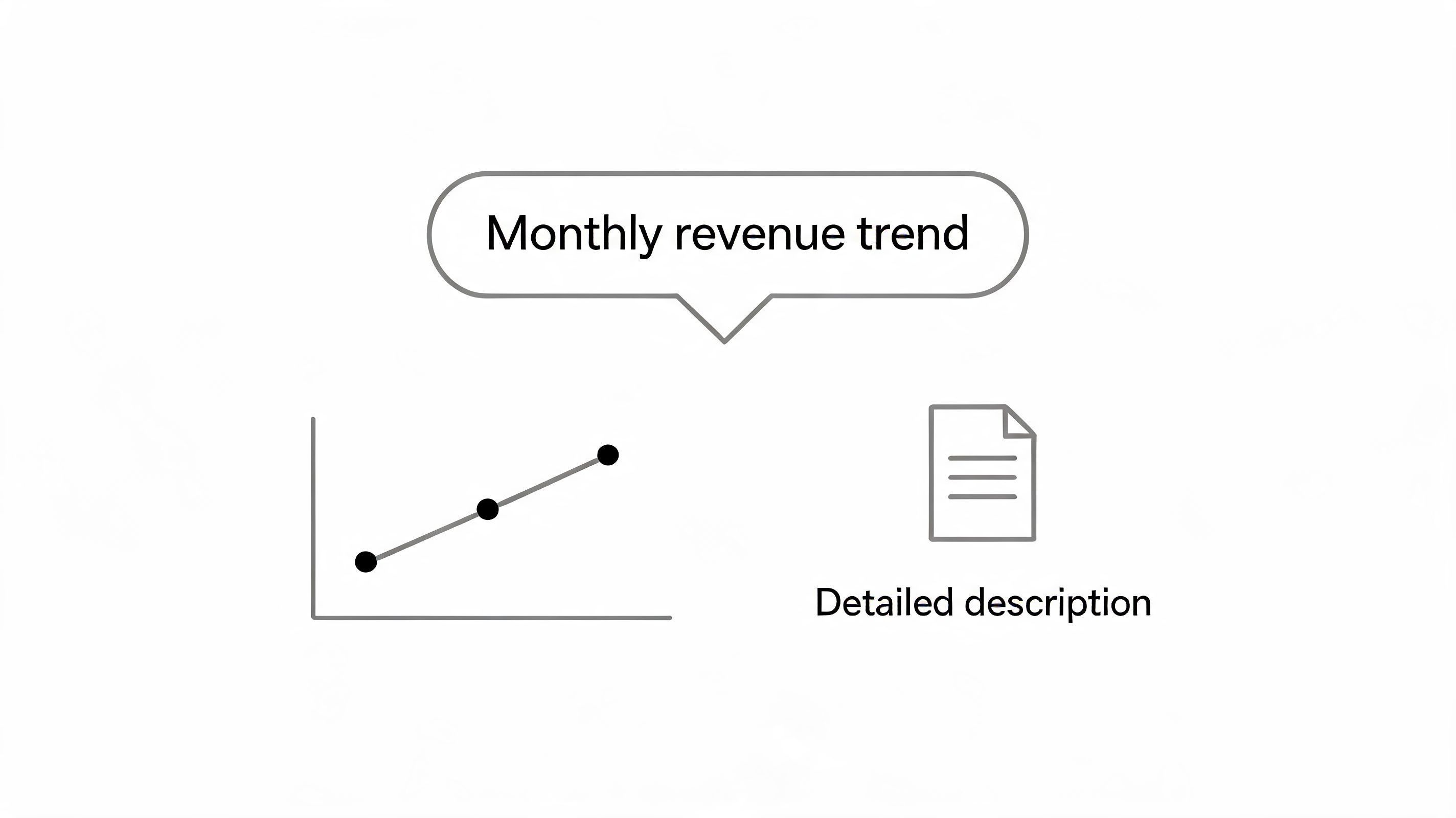
A chart shouldn't force a screen reader user to listen to a wall of prose jammed into an alt field. Short alt text like “Quarterly revenue trend chart” sets the expectation. The longer description nearby should then explain the actual message, including visible trends, highs and lows, time period, units, and any takeaway the visual is meant to communicate.
What works for charts and dashboards
For a KPI dashboard screenshot, the alt text should usually summarize the screen, not narrate every widget. For example, “Accessibility dashboard showing compliance scorecard and issue trend” is more usable than listing each card one by one.
For a bar chart, include the takeaway in nearby text or a linked data table. If the chart is central to the page argument, the written explanation should carry the same business meaning a sighted user gets from the visual.
A short walkthrough can help teams understand the pattern in practice:
This is one area where shortcuts fail fast. If your chart matters to sales, reporting, compliance, or product understanding, it needs an accessible structure beyond the alt attribute.
5. Write for Searchability and SEO Value
Alt text should first serve the user who can't see the image. It can also support search visibility when it describes the visual naturally and precisely.
That's why SEO-friendly alt text works best when it doesn't sound like SEO copy. On a product page, useful terms often appear naturally anyway: color, material, style, model, visible feature, or use case. “Blue organic cotton t-shirt with crew neck” helps more than “shirt,” and it's far more usable than a stuffed string of keywords.
Where SEO and accessibility align
The overlap is strongest on high-intent pages:
- Product listings: Distinguish variants clearly.
- Service pages: Describe screenshots or diagrams in ways that reinforce the offering.
- Editorial content: Use alt text that reflects the article topic when the image meaningfully supports it.
- Comparison pages: Describe visual comparisons with the terms users search for.
Search value drops when teams use the same generic alt text across every asset. It also drops when they write for a crawler instead of a person. If it sounds awkward aloud, it's probably weak for both accessibility and SEO.
For teams trying to align these goals more deliberately, integrating accessibility for better SEO usually starts with your most commercially important pages, not your entire media library at once. Category pages, solution pages, and evergreen content tend to produce the clearest return because they combine discoverability with conversion intent.
Good alt text doesn't chase keywords. It names what matters in language a real person would use.
6. Standardize with Style Guides and Templates
If your site has more than a handful of authors, quality won't stay consistent without standards. One editor writes useful product alt text, another writes captions into the alt field, and a third leaves the CMS default filename in place. That's how accessible sites drift into inconsistency.
A style guide fixes that by reducing decisions. Teams shouldn't have to reinvent alt text rules for every upload. They need approved patterns for common asset types, clear examples, and escalation rules for edge cases.
What to standardize first
Start with the image types that appear most often on your site:
- Product images: Include visible attributes such as color, material, and view when relevant.
- Icons: Describe function if interactive. Use empty alt if decorative.
- Screenshots: Name the tool or interface and the relevant visible state.
- Author and team photos: Include identity only when it helps the page purpose.
- Charts and infographics: Use short alt plus a long description pattern.
A good template for screenshots might look like this: product name, screen area, visible state. A product template might be visible variant, item type, and distinguishing feature. These aren't rigid formulas. They're guardrails that keep teams from writing either nothing or too much.
This is also an E-E-A-T issue. Clear editorial standards signal expertise and process. When your brand publishes accessible content consistently across documentation, landing pages, and resource hubs, users get a more trustworthy experience. Internal teams also move faster because they know what “good” looks like before content goes live.
7. Leverage AI-Assisted Alt Text Generation with Human Review
AI is useful for alt text. It's not enough on its own.
That's the practical middle ground most mature teams land on. Automation is excellent for drafting large volumes of straightforward image descriptions, especially in media libraries with repeated formats. But current guidance still points back to human judgment for semantic accuracy, context, and risk, particularly for functional images, graphs, screenshots, and text embedded in images.
There's also a newer governance gap here. Existing best-practice content still under-explains how to handle AI-generated visuals, data-dense assets, and synthetic imagery. Several accessibility sources stress concise, objective, purpose-driven descriptions, and they also warn that more descriptive isn't always better. For enterprises, the harder problem is governing AI output so it stays context-specific, non-redundant, and safe to publish at scale (Level Access guidance on alt text governance).
Where AI helps most
AI works well when you use it as a first draft for:
- Large product catalogs
- Legacy image backlogs
- Routine blog imagery
- Media libraries with repeated formats
It struggles when the image meaning depends heavily on page purpose. It also struggles with screenshots, charts, UI states, and images whose most important detail isn't visually obvious.
A workable production model is simple. Let AI suggest. Require a human to approve. Escalate complex visuals to someone who understands accessibility and the business context. If you want to test that workflow, an alt tag generator can speed up first-pass drafting, and broader engineering teams can learn from Rite NRG's approach to AI-assisted coding when building review loops around AI output.
AI should remove repetitive labor, not remove accountability.
8. Test Alt Text with Actual Assistive Technologies
The final judge of alt text quality isn't your CMS, your linter, or your content review checklist. It's the listening experience.
Alt text that looks fine in a spreadsheet can sound awkward, repetitive, or confusing in a screen reader. That's why testing matters. You need to hear where the image lands in the reading order, whether the wording is too long, whether it duplicates adjacent text, and whether functional images announce the right action.
What testing reveals quickly
A screen reader exposes problems fast:
- Redundancy: The user hears the heading, then the image repeats it almost word for word.
- Overwriting meaning: A linked image announces what it looks like, but not where it goes.
- Bad brevity: “Chart” tells the user almost nothing.
- Bad verbosity: A simple product image interrupts the flow with unnecessary detail.
Teams don't need a perfect lab setup to begin. Start with one desktop screen reader and one mobile screen reader. Test the image types that matter most to revenue and user completion first. On an ecommerce site, that means product listings, product galleries, add-to-cart controls, trust badges, and instructional graphics. On a SaaS site, that means feature screenshots, dashboards, pricing illustrations, and signup flows.
If your team needs a practical starting point, this guide to NVDA and VoiceOver testing is the kind of resource worth folding into editorial QA and release reviews. The goal isn't to turn every marketer into an assistive tech expert overnight. The goal is to build enough hands-on familiarity that weak alt text becomes obvious before publishing.
8-Point Alt Text Best Practices Comparison
| Approach | Implementation complexity | Resource requirements | Expected outcomes | Ideal use cases | Key advantages |
|---|---|---|---|---|---|
| Be Descriptive and Concise | Low–Medium, requires good writing | Content editors, small time per image | Clear, informative alt text; better comprehension | Product images, screenshots, inline illustrations | Improves screen reader comprehension and SEO |
| Distinguish Decorative vs. Functional Images | Low, policy and judgment calls | Audit time, style rules | Reduced screen reader noise; faster navigation | Sites with many icons, decorations, UI elements | Streamlines experience and aligns with WCAG |
| Include Context-Specific Information | Medium, needs editorial judgment | Editorial review, content strategy time | Relevant, non-redundant descriptions | Articles, logos, reused images across pages | Tailored descriptions that add value in context |
| Optimize for Complex Images and Data Visualization | High, technical and editorial work | Skilled writers, developers, data tables, aria support | Accessible data and insights for screen readers | Charts, infographics, dashboards, technical reports | Makes complex information fully accessible |
| Write for Searchability and SEO Value | Medium, balancing SEO and readability | SEO research tools, editorial time | Improved image search visibility and traffic | E‑commerce, SaaS pages, marketing assets | Aligns accessibility with business/SEO goals |
| Standardize with Style Guides and Templates | Medium–High, governance required | Time to create guides, training, enforcement | Consistent alt text and scalable compliance | Large organizations, distributed content teams | Ensures consistency, easier auditing and training |
| Leverage AI-Assisted Alt Text Generation with Human Review | Medium, integration + workflows | AI tool costs, human reviewers, QA process | Fast remediation at scale, baseline consistency | Large image catalogs, legacy site remediation | Efficient scale-up with human quality control |
| Test Alt Text with Actual Assistive Technologies | Medium–High, testing expertise needed | Screen readers, devices, user testing, time | Validated real‑world experience; uncovered issues | Final QA, high‑risk pages, legal compliance checks | Real-user validation and reduced legal/UX risk |
Make Accessible Alt Text Your Standard
Alt text quality rarely improves through reminders alone. It improves when teams change the system around the work. That means classifying images before writing, building templates for common asset types, reviewing AI output instead of blindly publishing it, and testing important flows with assistive technology before release.
The strongest programs don't treat alt text as an isolated compliance task. They treat it as part of content design, technical implementation, and conversion optimization. A product image that clearly distinguishes variants helps a screen reader user shop with confidence. A dashboard screenshot that summarizes the visible state helps a buyer understand the feature faster. A chart with a real text explanation makes an insight usable to everyone, not just to people who can see the visual. That's good accessibility, and it's also good business.
E-E-A-T matters in practice right here. Experience shows up in the examples you choose and the edge cases you catch. Expertise shows up in whether your alt text reflects page purpose, not just image appearance. Authority grows when your guidance is consistent across your site, your documentation, and your editorial workflow. Trust grows when users can move through key pages without confusion or missing information.
For CRO, the lesson is straightforward. Users convert more easily when images support understanding instead of adding friction. For SEO, the same discipline creates cleaner semantic signals around the images on your most important pages. For internal linking strategy, better alt text strengthens the supporting content around high-value category, solution, and resource pages, which makes those pages easier to understand in context.
The best place to start isn't everywhere. Start where clarity matters most. Audit your homepage, main navigation imagery, top product or service pages, core blog assets, and any charts or screenshots that carry real meaning. Fix the decorative-versus-functional mistakes first. Then tighten descriptions so they're concise, contextual, and useful aloud.
If your team is scaling this work across a large site, a platform like WebAbility.io can fit into that process through scanning, monitoring, and AI-assisted drafting. The actual win still comes from governance. The sites that do this well pair tooling with editorial standards and human review.
Accessible alt text doesn't need to be perfect on day one. It does need to become standard.
If you're improving alt text across a growing site, WebAbility.io can help you combine scanning, governance, and AI-assisted workflows so your team can review image accessibility more consistently across high-priority pages.
Quick Questions
Tap to ask AI about this article