Master Image Accessibility: WCAG, Alt Text & UX in 2026

Sidharth Nayyar
More than one in four images on popular home pages have problematic or missing accessibility descriptions, and 16.2% of all home page images had missing alternative text in 2026. Image accessibility means making visual content understandable to everyone, primarily through text alternatives, and it's both a compliance requirement and a practical way to improve user experience and conversion.
That's the part many teams still underestimate. Image accessibility isn't just about adding alt text to a few product photos. It's the discipline of making visual information, interactions, and image-based decisions available to people who use screen readers, keyboard navigation, zoom, high contrast settings, and other assistive technology.
The urgency is hard to ignore. Approximately 16% of the global population, or 1.3 billion people, live with significant disabilities, yet over 96% of the world's top one million web pages failed to meet WCAG 2.0 Level AA criteria in 2023. The same dataset reports an average of 50.8 detectable accessibility errors per website home page (web accessibility statistics). When image accessibility fails, users miss product details, button purpose, chart data, and trust signals. That affects compliance, UX, search visibility, and revenue at the same time.
What Is Image Accessibility and Why It Matters Now
More than one in four images on popular home pages still have description problems, and 16.2% of home page images were missing alt text in 2026. That failure is expensive. Images often carry product detail, action cues, proof points, and decision support, so when they are inaccessible, users lose information they need to trust the page and complete tasks.
Image accessibility means making visual content understandable and usable for people who cannot fully perceive the image itself. In practice, that includes text alternatives, correct treatment of decorative images, accessible names for image-based controls, readable contrast in image text, and support for zoom and reflow when images are part of the interface.
The simplest test is operational. If the image disappeared, would a user lose meaning, miss an action, or fail to finish a task? If yes, the page needs an equivalent that works with assistive technology and holds up under real use. Teams that need a plain-language baseline can start with what is image description.
The gap is bigger than many teams assume
The recurring problem is not awareness alone. It is classification and execution. Content teams write alt text without knowing the image's purpose. Designers place text inside banners that breaks under zoom or high contrast settings. Developers ship icon buttons without accessible names. QA checks whether an image exists, but not whether it communicates the right thing to a screen reader user.
That is why image accessibility should be treated as a system, not a copywriting task.
A product image, a hero banner, a chart, and a search icon do not need the same treatment. Each serves a different user goal, and each creates different risk when handled badly. Senior teams account for those differences early, then build standards into components, CMS fields, review workflows, and test plans so the right treatment is repeatable.
Practical rule: Treat every image as content first and styling second. That one shift prevents weak alt text, mislabeled controls, and missed requirements.
Why this matters now
Image usage has expanded faster than governance. Marketing teams publish more visual campaigns. Product teams rely on icons and cards to compress interfaces. Content teams embed charts, screenshots, and infographics to explain complex ideas. AI tools also increase image volume, which raises the chance of vague, duplicated, or misleading descriptions unless teams set clear rules for review.
The result is a scale problem. One missing alt attribute is a defect. Hundreds of image decisions spread across templates, campaigns, product pages, and support content become an operating issue.
Accessible image work improves more than compliance posture. It reduces user confusion, strengthens task completion, supports better QA coverage, and gives design and engineering teams a common standard they can apply across the site. This marks a significant shift. Mature organizations stop treating image accessibility as one-off remediation and start managing it as part of content operations, design systems, and release quality.
The Legal and Business Case for Accessible Images
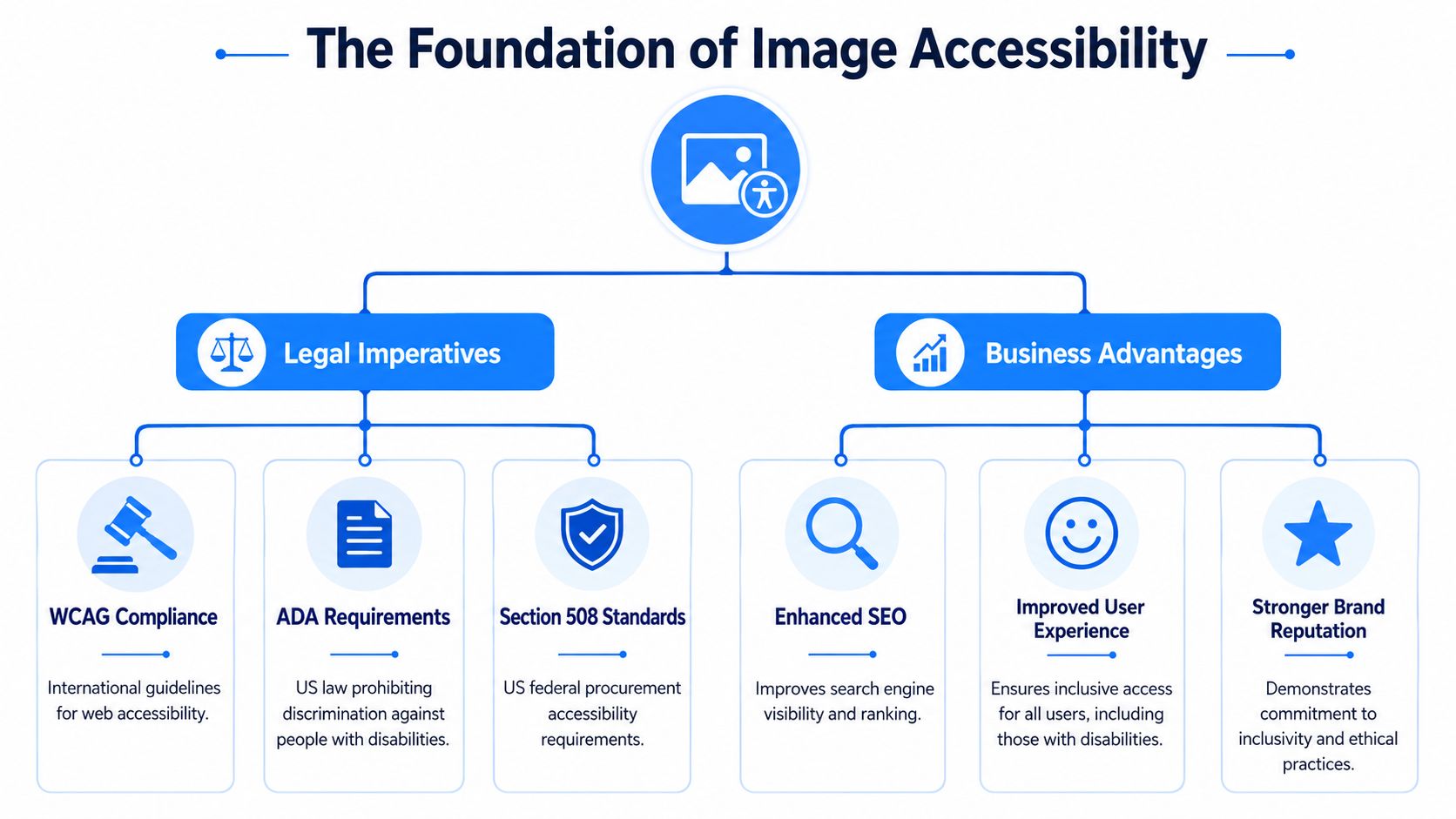
Image accessibility sits at the intersection of compliance, credibility, and conversion. The legal rule is straightforward. According to WCAG 2.1 AA and 2.2 AA Criterion 1.1.1, all images and non-text content must have a text alternative, meaning every functional image requires descriptive alt text while purely decorative images must use empty alt attributes (alt=""). This requirement applies globally and is enforced under both US ADA and international WCAG standards (WCAG requirements for non-text content).
Compliance is the floor, not the strategy
For legal review, the image requirement is rarely ambiguous. Informative content needs an equivalent. Functional imagery needs a label that communicates the action. Decorative assets need to stay silent for screen readers. If your team is treating alt text as optional editorial polish, it's already out of alignment with WCAG-based obligations.
That said, mature teams don't stop at risk reduction. They use accessibility to improve consistency and decision quality across the site. A well-labeled image card can send users to a product detail page with less friction. A clearly named icon button can raise completion rates on mobile navigation. A text equivalent for a chart can keep critical evidence available when the visual itself is hard to parse.
Where image accessibility supports CRO
Image accessibility contributes to conversion in simple, operational ways:
- Clearer intent signals: Functional icons with proper labels reduce hesitation.
- Better product understanding: Informative alt text helps users decide whether a page is relevant before they abandon it.
- Stronger internal journeys: Accessible image links can support discovery of high-priority pages like product hubs, pricing, category pages, and support resources.
- Broader reach: Inclusive content serves a larger audience without requiring a separate experience.
A lot of teams also find that accessibility work sharpens the quality of content architecture. Once you're forced to say what an image is doing, weak pages become obvious. Decorative clutter gets cut. Important links get better labels. Conversion paths become easier to scan and use.
For leadership conversations, it helps to connect compliance to audience expansion and trust. In this context, quantifying accessibility's market opportunity becomes a more useful framing than “fixing alt tags.”
Accessible images don't just protect the business. They help users reach the pages, products, and actions the business cares about most.
A Practical Guide to Accessible Image Treatments
Most image accessibility problems come from one mistake. Teams describe the image file instead of identifying the image's job on the page. WCAG's image guidance is purpose-based. Per WCAG 2.2, informative images require descriptions of essential information, functional images must describe their action (for example, “Print” not “printer icon”), and decorative images need a null alternative (alt="") to prevent noise. Complex images like graphs demand full text equivalents of the underlying data (W3C images tutorial).
Start with the image's purpose
Before writing anything, classify the image.
| Image Accessibility Treatment Guide | |||
|---|---|---|---|
| Image Type | Purpose | Alt Text Rule | Example |
| Informative | Conveys content the user needs | Describe the essential information | alt="Red waterproof hiking jacket with front zip and hood" |
| Decorative | Adds styling only | Use null alt so assistive tech skips it | alt="" |
| Functional | Triggers an action or destination | Name the action or result, not appearance | alt="Search" |
| Complex | Communicates data or relationships | Provide a short alt and a fuller text equivalent nearby | alt="Revenue trend by quarter" plus a text summary/table |
That table looks basic, but it solves most team debates. Once everyone shares the same categories, content creators stop writing novel-length descriptions, and developers stop guessing what belongs in the alt attribute.
What works in real interfaces
Informative images are common in e-commerce, education, healthcare, and publishing. The right alt text helps users decide whether to click through, compare, or keep reading. It should capture the key fact, not every visual detail.
Decorative images are where teams often over-describe. If a leaf pattern, abstract background, divider, or repeated thumbnail adds no new meaning, leave it out with alt="". Screen reader users don't need ornamental narration.
Functional images need the strictest discipline. If a printer icon prints, label it “Print.” If a trash can deletes, label it “Delete.” If an image card links to a category page, the accessible name should tell the user what opens next.
Complex images need more than alt text. A chart, infographic, map, or process diagram usually requires a visible summary, adjacent text, or a linked data table. The short alt is just the entry point.
Teams write better alt text when designers annotate image purpose in the mockup, not after launch.
Apply the same thinking to overlays and modals
Image treatment decisions also matter in layered UI. Promo banners, product quick views, and modal overlays often combine icons, text, and clickable imagery in a tight space. If your team is refining those interfaces, these mobile-responsive popup design tips are useful because they force the same questions accessibility reviewers ask: what's actionable, what's decorative, and what stays understandable on smaller screens.
For broader visual media workflows, teams that want to improve alt text and captions usually get better results when they standardize image categories first. That removes ambiguity before writing starts.
Writing Effective Alt Text Best Practices and Code
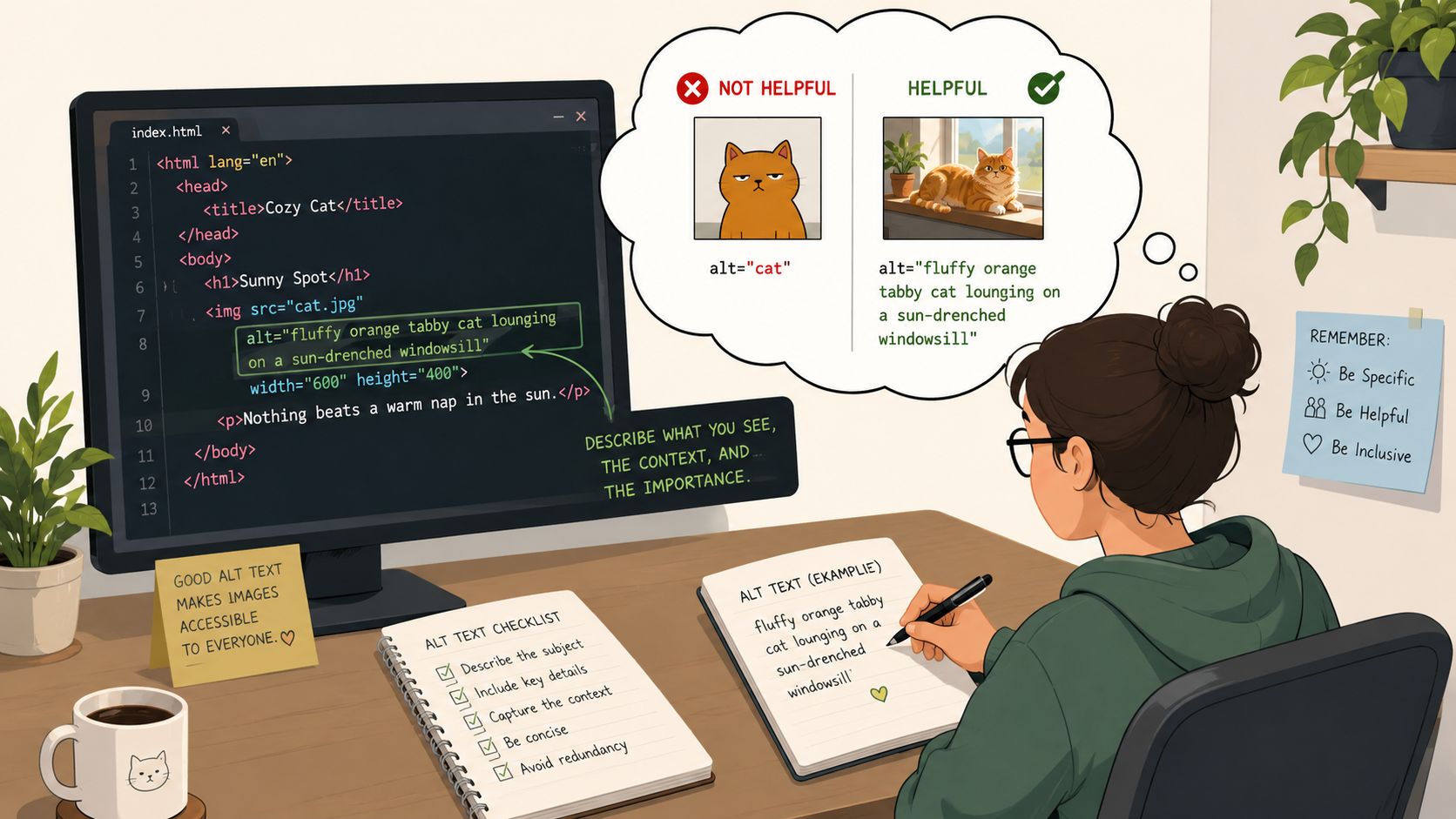
Good alt text isn't a caption, a keyword field, or a literal description of pixels. It's a concise replacement for the meaning or function the image provides in context.
Write for purpose, not appearance
The fastest way to improve alt text quality is to stop starting every description with “image of” or “picture of.” Screen readers already announce the element as an image in many contexts. What users need is the content or action.
Use these rules:
- Keep the core meaning first: Lead with the product, action, or message.
- Match page context: The same image may need different alt text on a category page than on a product detail page.
- Avoid redundancy: If surrounding text already says the same thing, don't repeat it.
- Handle text in images carefully: If the image contains essential text, the accessible equivalent must include it.
Bad and better examples
Product image
<!-- Bad --> <img src="jacket.jpg" alt="image of jacket"> <!-- Better --> <img src="jacket.jpg" alt="Red waterproof hiking jacket with hood"> Why it works: the better version gives the user the information that supports a purchase decision.
Functional icon button
<!-- Bad --> <button> <img src="search-icon.svg" alt="magnifying glass"> </button> <!-- Better --> <button> <img src="search-icon.svg" alt="Search"> </button> Why it works: users need the action, not the shape.
Team photo in an about page
<!-- Weak --> <img src="team.jpg" alt="office team"> <!-- Better --> <img src="team.jpg" alt="Customer support team in the Austin office"> Why it works: it gives enough context to support the page's purpose without turning into a paragraph.
When the image contains words
Many implementations break here. If a sale banner, quote card, or CTA graphic contains essential text, users need that same information in an accessible form. Sometimes the right answer is to move the text into HTML instead of relying on the image.
If your team needs a drafting aid, an alt tag generator can help produce a starting point. The key word is starting. It won't understand your merchandising intent, legal nuance, or conversion goal unless a human edits it.
Plain rule of thumb: if a sighted user would act on the text inside the image, that text needs an accessible equivalent.
A quick walkthrough can help teams hear the difference between present alt text and useful alt text:
A short decision test
Ask three questions before you publish:
- What would the user miss if the image vanished?
- Does my alt text communicate that exact loss?
- If the image is clickable, have I named the destination or action?
If the answer to any of those is no, revise before release.
Testing and Auditing Images A Repeatable Workflow
Teams often identify missing alt text. Fewer teams consistently catch weak alt text, bad contrast inside graphics, or mislabeled image controls. That's why image accessibility needs a repeatable audit process.
The scale of the problem is still substantial. In 2026, 16.2% of all home page images had missing alternative text. An additional 10.8% of images with text contained questionable content like alt="image", meaning more than one in four images on popular home pages have problematic or missing accessibility descriptions. The average home page contained 34 distinct instances of low-contrast text (WebAIM Million findings).
Step 1 starts with automation
Use automated scanning to flag obvious failures across templates and content inventories. Tools save time by detecting missing alt attributes, suspicious placeholders, linked images without accessible names, and some contrast issues in image-based UI.
Automation works well for:
- Finding absence: Missing alt text, empty links, unlabeled image buttons.
- Spotting patterns: Repeated issues across templates or CMS fields.
- Prioritizing pages: Home, category, pricing, cart, checkout, and support pages should go first.
Automation does not determine whether “team image” is good alt text. It also won't reliably understand whether a hero banner is decorative, persuasive, or essential to task completion.
Step 2 needs manual checks
Run the page with a keyboard. Tab to any image links, image buttons, carousel controls, and promo cards. You should be able to identify where focus is, what the control does, and where it goes.
Then use a screen reader pass. Listen for what gets announced. Poor implementations become obvious quickly:
- Unnamed controls: “Button” or “link” with no context
- Redundant noise: Decorative images announced repeatedly
- Meaningless labels: File names, “image,” or repeated boilerplate
- Missing summaries: Charts or diagrams with no usable equivalent
If a tester can't understand an image-based action without looking at the screen, the implementation isn't ready.
Step 3 checks quality, not just presence
A workable QA checklist for images should include:
- Purpose check: Is the image informative, decorative, functional, or complex?
- Alt quality check: Does the text convey purpose or only appearance?
- Text-in-image check: Is essential embedded text available accessibly?
- Contrast check: Is any text inside the image readable against its background?
- Interaction check: Do focused image controls remain visible and understandable?
This workflow is simple enough to run every sprint. The teams that sustain progress treat image accessibility as part of content QA and release readiness, not as a one-time remediation project.
Operationalizing Image Accessibility at Scale
Single-page fixes don't hold up in enterprise environments. The challenge isn't knowing that images need text alternatives. The challenge is making sure every new banner, product tile, chart, icon set, and campaign asset gets the right treatment across teams, tools, and publishing cycles.
Governance makes the work stick
Operationalizing image accessibility starts with role clarity.
Designers should mark image purpose in components and mockups. Content teams should draft alt text where editorial context exists. Developers should implement the correct semantics, including null alt for decorative assets and accessible names for image controls. QA should verify what users experience, not just whether a field is populated.
A practical governance model usually includes:
- Component standards: Define how cards, icons, logos, charts, and banners are handled in the design system.
- CMS rules: Add content guidance directly in image upload fields so authors know what to write.
- Review checkpoints: Include image accessibility in design review, content review, and release QA.
- Escalation paths: Complex visuals need a clear owner for summaries and long descriptions.
Use tooling, but keep human review in the loop
AI is useful when teams need speed, triage, and draft generation. It is less reliable when the image's meaning depends on page context, user intent, or business logic. That limitation matters because 64% of sites incorrectly embed text in images, a practice that AI generators cannot reliably transcribe without human validation (Baymard on informational image accessibility).
That's why the scalable pattern is hybrid. Use automation to discover, classify, and draft. Use humans to validate semantics and business relevance.
One practical option in that workflow is WebAbility.io, which provides automated scanning, monitoring, reporting, and accessibility tooling that teams can use alongside manual review and implementation processes. In large organizations, that kind of centralized visibility helps teams track recurring image issues across multiple sites and templates without treating every audit as a separate project.
The fastest teams don't automate judgment. They automate detection, routing, and follow-up.
Connect image accessibility to production systems
The most effective programs push image accessibility upstream:
- In design systems: Add guidance for alt behavior and icon labeling to component docs.
- In content ops: Require image purpose and alt text during upload, not after publication.
- In CI and QA: Flag missing attributes and obvious failures before deployment.
- In reporting: Track recurring templates, authoring bottlenecks, and unresolved exceptions.
E-E-A-T manifests practically as follows. Experience means the team knows which images influence decisions. Expertise means they classify and describe them correctly. Authoritativeness comes from consistent standards. Trust grows when the published result works for more people without friction.
Your Next Steps Toward Inclusive Design
Image accessibility is one of the clearest examples of inclusive design paying off operationally. The rules are known. The patterns are stable. The main challenge is execution discipline across design, content, development, and QA.
If you want progress fast, start with the pages that carry the most business value. Home, category, product, pricing, signup, checkout, and support flows usually contain the image patterns that affect both compliance and conversion. Fixing those pages first improves the user journey while building internal momentum.
A practical order of operations
- Scan high-value templates first: Focus on page types that drive revenue, lead generation, and support deflection.
- Classify every recurring image pattern: Separate informative, decorative, functional, and complex assets so teams stop improvising.
- Tighten internal linking through accessible image cards: Make sure image-based links clearly direct users to priority pages.
- Add review gates: Require image purpose and alt text before content goes live.
Keep the standard simple
Your team doesn't need a complicated policy to get traction. It needs a shared rule set and a repeatable review habit. If an image communicates information, conveys a decision factor, or triggers an action, it needs an accessible equivalent that matches user intent.
That's the work that improves experience, supports legal resilience, and makes important pages easier to discover and use.
If you're ready to move from patchwork fixes to a repeatable accessibility workflow, WebAbility.io offers tools for scanning, monitoring, and managing compliance work across sites, along with practical resources that help teams turn image accessibility into part of everyday publishing and QA.
Quick Questions
Tap to ask AI about this article