Alt Text Generator: A Framework for Quality & Scale

Sidharth Nayyar
Sidharth Nayyar
Ready to make your website accessible? Engage with our team or start a free trial today.
Tap to ask AI about this article
A good alt text generator should produce drafts that stay around 150 characters, and some batch tools can process up to 500 images per run at about $10 per 1,000 images before review labor is added. If you need a fast starting point, use the free generator from WebAbility.io early in your workflow, then treat the output as a draft that still needs editorial judgment.
Teams don't typically struggle because they ignore accessibility. They struggle because image volume gets ahead of process. Product launches create dozens of new photos, blog teams upload screenshots every week, marketers swap campaign creatives constantly, and nobody wants alt text to become a bottleneck.
That's why AI-generated alt text matters now. It isn't fringe tooling anymore. By 2026, AI-generated alt text had shifted into built-in workflow support in major platforms like Microsoft 365, which is a useful signal that accessibility teams, educators, and enterprise content owners now expect AI assistance to be part of the process. The question has changed from "Should we use an alt text generator?" to "How do we use one responsibly?"
A typical digital team has three competing pressures. Publish faster. Keep pages optimized. Avoid accessibility debt. Alt text sits right at the intersection, and that's why it often gets done inconsistently.
One editor writes useful, contextual descriptions. Another copies the file name into the alt field. A third leaves it blank because they aren't sure whether the image is decorative. Multiply that across a media library and you get a familiar pattern: some pages are excellent, many are incomplete, and nobody fully trusts the current state.
AI assistance is no longer just a browser experiment. Microsoft documents that Microsoft 365 includes an option to generate alt text using AI, with the user able to review, approve, or edit the result, which shows how mainstream workflow support has become in accessibility-focused content tools (Microsoft accessibility guidance).
That matters for agencies, in-house teams, and public-sector organizations because the issue usually isn't whether someone can write one strong alt description by hand. The problem is sustaining quality across hundreds or thousands of images without slowing down publishing.
Practical rule: Use AI to remove blank fields and speed up first drafts. Don't use it to remove judgment.
If you're evaluating where to start, free tools are useful because they let teams test process before they commit to deeper automation. WebAbility.io offers a free generator, and broader AI powered web accessibility solutions make more sense when they fit an editorial workflow instead of operating as a disconnected feature.
The common mistake isn't using an alt text generator. It's treating generation as the finish line.
That creates two problems. First, the output may describe what is visible but miss why the image exists on the page. Second, teams start applying the same process to every image type, even though decorative icons, product photos, screenshots, infographics, and charts require very different treatment.
A mature workflow solves for consistency, review, and decision-making. Speed helps, but governance is what keeps quality high.
Alt text isn't just metadata for search engines. Its main job is to help people who use screen readers understand the purpose of an image in context.
That changes how you evaluate quality. The question isn't "Did the generator identify enough objects?" It's "Did this description help the user understand what matters here?"
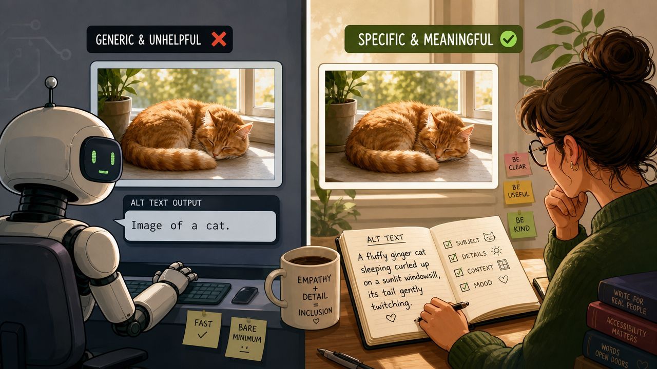
Nielsen Norman Group advises that effective alt text shouldn't be much longer than around 150 characters because screen readers present it inline, which makes concise, contextual writing more useful than exhaustive description (Nielsen Norman Group on writing alt text).
That limit is helpful because it forces discipline. Good alt text usually does three things well:
Alt text works best when it answers, "Why is this image here?"
Use this simple check when reviewing AI-generated text:
| Image type | Weak alt text | Better alt text |
|---|---|---|
| Product photo | "Black running shoe with white sole on white background." | "Black running shoe with white sole shown in side profile." |
| Team photo | "Three people smiling in an office with laptops and coffee cups." | "Customer support team collaborating at a shared desk." |
| Chart | "Bar chart with blue and green bars." | "Bar chart comparing monthly signups and cancellations." |
The pattern is consistent. Weak alt text reports visible objects. Better alt text communicates relevance.
A lot of teams improve quickly once they adopt that mental model. If a tool gives you a detailed inventory of colors, clothing, or background furniture, it's usually over-describing. If it gives you only "image of dashboard," it's under-describing.
An AI draft can still be useful if the editor knows what to trim and what to add. In practice, that means:
For teams that need a sharper editorial baseline, this guide to compliant alt text is a useful internal reference to align writers, designers, and developers.
The best workflow I've seen is simple enough that editors will readily follow it. It has three steps: Generate, Review, Refine.
That sounds obvious, but many teams skip the middle. They either trust the model too much or avoid it entirely. Both approaches create unnecessary friction.
A visual workflow helps when you're standardizing the process across content, marketing, and development teams.
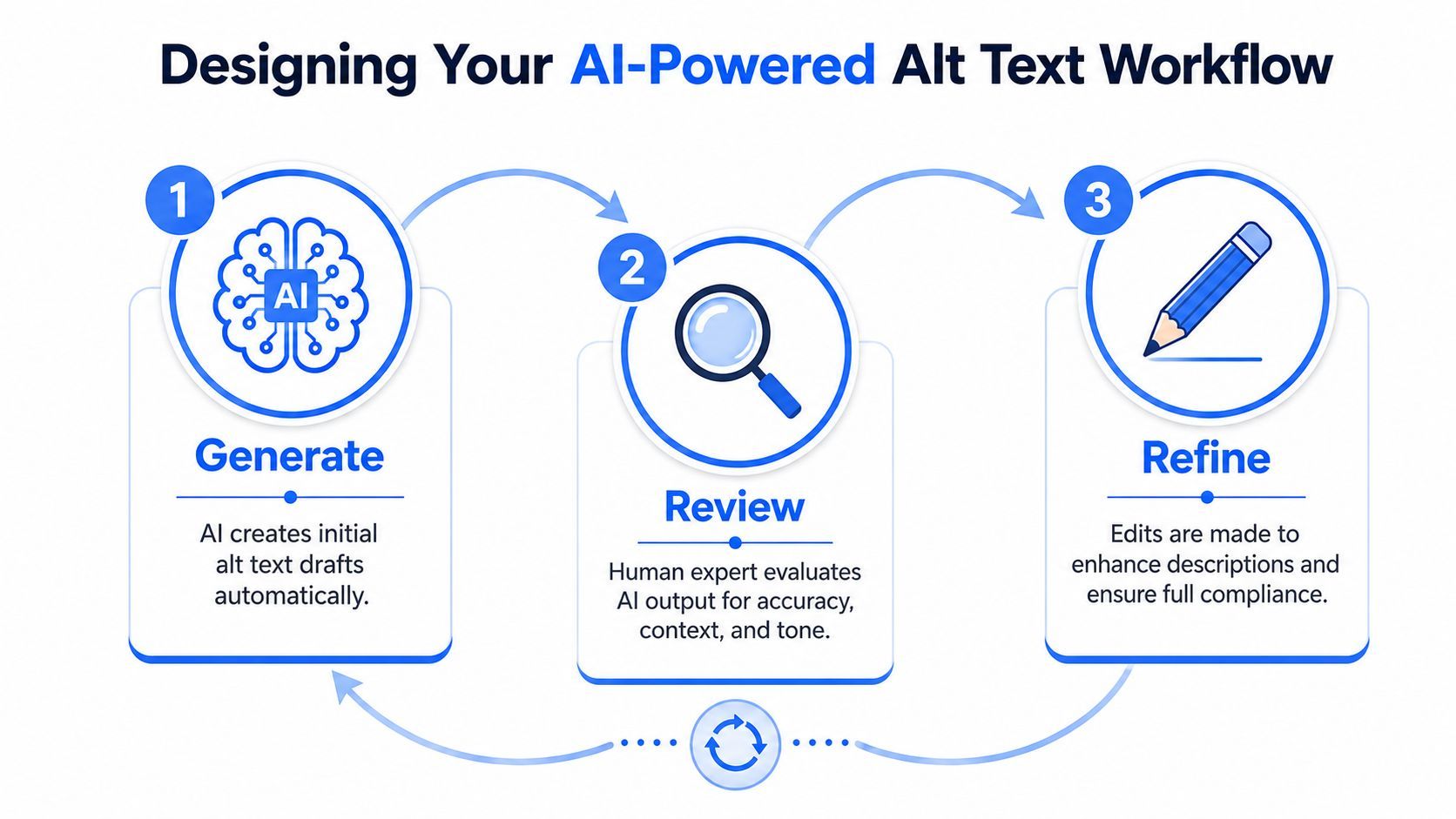
Start with the generator, not the blank field. For a new product collection, campaign gallery, or blog migration, speed matters because the first operational win is coverage.
If your team needs a starting tool, an alt text generator ai can draft descriptions for common image types before a content owner edits them. At this stage, the goal isn't perfection. It's to produce a usable first pass across the asset set.
Here's where batch economics matter. For enterprise-scale work, some services can process up to 500 images per run at a variable cost of around $10 per 1,000 images, which makes bulk generation operationally realistic but also raises the risk of scaling bad output if nobody reviews it (Apify batch alt-text details).
Alt text should never be reviewed in a spreadsheet alone if the image has functional or editorial importance. The reviewer needs to see the page, surrounding copy, and the image's role.
For example, imagine an e-commerce team adding a new collection:
That review step catches the errors that models commonly make in production. They may identify the wrong product variation, miss the purpose of a screenshot, or describe background details that don't matter to users.
Review prompt for editors: If a customer heard only this alt text, would they understand what this image contributes to the page?
Refinement is usually quick. Most edits are small. Replace generic nouns with the right product term. Remove adjectives that don't help. Add context for function.
Below is a practical example of how this plays out:
| Stage | Example output |
|---|---|
| AI draft | "Woman wearing a blue jacket standing outdoors near a backpack." |
| Edited alt text | "Model wearing the blue trail jacket with matching daypack." |
| Why it changed | The page is selling apparel, so the product context matters more than the setting. |
The same principle applies to screenshots and UI images. If the image demonstrates a feature, mention the feature. If it only decorates the layout, it may not need descriptive alt text at all.
A short walkthrough can help teams align on this process before they formalize it:
The workflow works because each stage has a different owner mindset. AI handles throughput. Editors protect meaning. Accessibility reviewers handle exceptions and critical assets.
Once a team has a reliable editorial workflow, the next step is governance. At this stage, accessibility programs become sustainable.
The core question isn't "How do we automate more?" It's "Which decisions are safe to automate, and which must stay human-reviewed?" That distinction matters far more than the model vendor.
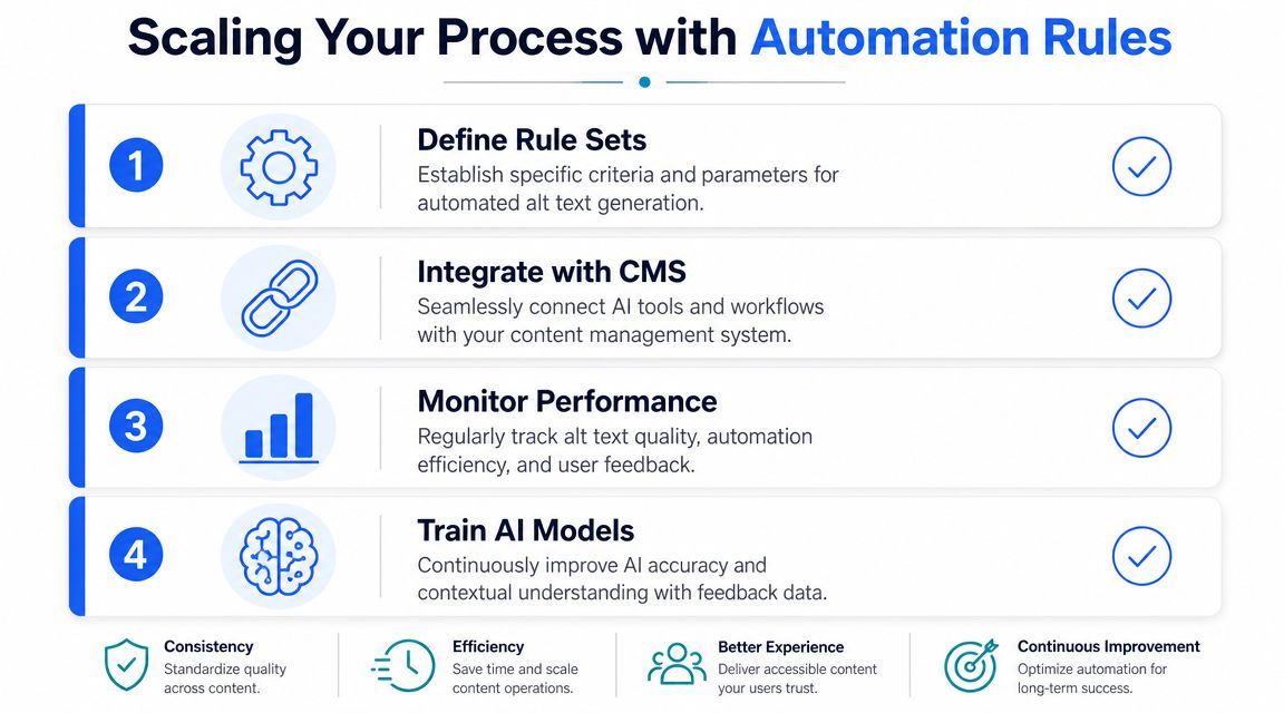
Government accessibility guidance explicitly warns that automatically generated descriptions should be manually checked, and notes that correct alt text depends on the image's purpose and context. It also points out that some images should be marked decorative or described in surrounding text instead (UK government guidance on alternative text in practice).
That guidance is useful because it shifts the conversation away from blind automation and toward decision rules. In practice, teams can sort images into categories such as:
Governance gets stronger when rules live in the CMS and QA process, not just in a style guide PDF that nobody opens.
A practical automation layer often includes:
The strongest accessibility workflows don't automate every description. They automate the decisions around what needs review.
Many teams become more effective. They stop trying to force every image through the same pipeline.
Don't rely on autogenerated alt text alone for:
| Image category | Better handling |
|---|---|
| Infographics | Summarize the key message in text near the image, then write concise alt text |
| Data charts | Describe the main takeaway, not just shapes or colors |
| Process screenshots | Explain the feature or step being demonstrated |
| Decorative dividers | Use empty alt text rather than cluttering the screen reader experience |
A mature system doesn't celebrate maximum automation. It protects user comprehension while reducing repetitive manual work.
Once the basics are in place, the harder issues usually show up in multilingual publishing, AI-search expectations, and over-optimization.
These don't break a workflow overnight, but they do expose whether the team understands alt text as accessibility content or as another place to stuff keywords.
Some tools now market support for 130+ languages and position alt text as part of image discoverability in AI-answer interfaces. That's a real product trend, but it doesn't remove the need for human review or accessibility-first writing (AltText.ai product positioning).
The challenge isn't whether a generator can translate nouns. It's whether the result still makes sense on that specific page for that audience. Literal translation often misses brand terminology, local phrasing, and the intended emphasis of the image.
A practical multilingual review standard looks like this:
Teams are asking whether alt text can help images appear in AI-generated answers and search experiences. It might contribute to discoverability, but that shouldn't change the writing principle.
If you optimize alt text primarily for bots, quality usually gets worse for users. You end up with keyword-heavy, repetitive descriptions that sound unnatural when read aloud. Accessibility guidance still points back to concise, useful descriptions that fit the page context.
Editorial filter: If the alt text sounds like SEO copy, it's probably wrong.
These are the failure patterns I see most often in production:
The advanced skill isn't generating more text. It's deciding when less text, different text, or no alt text at all serves the user better.
Organizations often don't need a bigger accessibility policy document. They need a process that content owners can follow on a busy week without guessing.
That starts with one internal standard. Agree on what acceptable alt text looks like for your organization, then make that standard visible in the CMS, content playbooks, and review process.
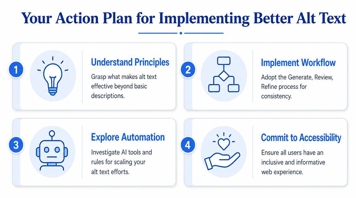
Don't begin with your entire media library. Start with one content stream where images are uploaded regularly and where ownership is clear. Product pages, blog posts, or resource centers are usually good candidates.
Use a phased checklist:
Define your quality rubric
Decide what "good" means for your team. Focus on purpose, brevity, and context.
Choose your drafting tool
Pick an alt text generator that editors can access easily during normal publishing work.
Assign review ownership
Make one role accountable. That might be a content editor, merchandiser, accessibility lead, or QA reviewer.
Document exception rules
Specify how to handle decorative images, charts, screenshots, and linked graphics.
The teams that succeed usually do a few small things consistently:
A simple decision matrix helps teams move faster without lowering standards:
| If the image is... | Then do this |
|---|---|
| Decorative | Use empty alt text |
| Informational but simple | Generate draft, then review |
| Complex or instructional | Write or heavily edit manually |
| Functional | Describe the action or destination |
Better alt text improves the experience for people who use assistive technology. It also improves content quality overall because teams become more intentional about image purpose, supporting copy, and page structure.
That has practical business value. Cleaner media workflows reduce rework. Better content governance helps teams scale faster. More accessible pages are easier to maintain across markets, authors, and platforms.
The strongest approach is not "AI everywhere." It's AI where drafting helps, people where judgment matters, and automation rules where consistency matters.
If you're implementing this now, start with one team, one image category, and one review path. Get the process stable. Then expand it across templates, campaigns, and content systems.
If you're ready to put this into practice, WebAbility.io offers a free AI alt text generator along with broader accessibility tooling for scanning, monitoring, and workflow support. It's a practical place to start drafting alt text faster while building a more reliable accessibility process across your site.