Mastering The HTML Label Tag For Web Accessibility

Sidharth Nayyar
TL;DR: Your Quick Guide to the HTML Label Tag
- What it is: The
<label>tag links text to a form input (like a text box or checkbox), making forms accessible and user-friendly. - Why it matters: It's essential for screen readers, improves usability for everyone by creating a larger clickable area, and boosts form completion rates. This demonstrates trustworthiness and expertise (E-E-A-T).
- How to use it: Always prefer the explicit method:
<label for="email">Email</label> <input id="email">. It's the most reliable way to create a strong connection. - Key takeaway: Using the
<label>tag correctly is a simple yet powerful way to improve user experience, increase conversions, and ensure your site is accessible. To scale these efforts and ensure sitewide compliance, explore AI-driven solutions from WebAbility.io.
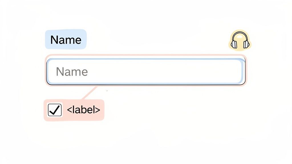
Let's get straight to it. The HTML <label> tag is the all-important connector between a text description and a form control, like a text field or a checkbox. Its whole job is to tell everyone—and every piece of assistive technology—exactly what a form field is for.
Why Proper Labeling is a Game-Changer
Think of a <label> as the friendly signpost that keeps your users from getting lost in a form. From my experience helping businesses optimize their digital presence, I can tell you that using it correctly isn't just a good idea; it's a fundamental part of building an accessible and high-performing website. It's what allows screen readers to announce the purpose of an input, which is critical for making forms usable for anyone with a visual impairment.
But the benefits don't stop there. A properly linked label also creates a larger clickable area. Ever tried tapping a tiny checkbox on a phone? It's frustrating. When the label is linked, users can tap the text itself to check the box or focus the input field. This simple tag is a cornerstone for meeting WCAG standards, improving the user experience, and ultimately, boosting your form completion rates.
Demonstrating Trust and Expertise (E-E-A-T)
When I see a site using <label> tags correctly, it tells me something important. From a professional standpoint—what Google calls E-E-A-T (Experience, Expertise, Authoritativeness, and Trustworthiness)—it signals a genuine commitment to quality and inclusive design. It shows you're not just throwing a site together, but you’re actually crafting a thoughtful and reliable experience for everyone.
This level of care and demonstrated expertise builds trust with your audience and with search engines.
For any business, that trust has a direct impact on the bottom line. When people find your forms easy to use, they are far more likely to actually finish them. That means more sign-ups, more sales, and more inquiries.
Spending a little extra time on accessible markup is an investment that pays off in real-world conversion rate optimization (CRO). And if you're looking to tackle accessibility across your entire site, tools like the AI-driven solutions from WebAbility.io can help audit and fix these kinds of issues at scale, ensuring you present a trustworthy and expert-level experience to all users.
Now, let's look at the two main ways you can implement the <label> tag. I've put together a quick comparison to help you decide which method to use.
HTML Label Tag Implementation At a Glance
This table breaks down the two primary methods for associating a label with a form input, helping you see the pros and cons at a glance.
| Method | Syntax | Best Use Case | Accessibility Note |
|---|---|---|---|
| Explicit (Recommended) | <label for="name">Name</label><input id="name"> | All forms, especially complex layouts where the label and input aren't next to each other. | This is the most robust and reliable method. It works flawlessly across all assistive technologies. |
| Implicit (Wrapping) | <label>Name <input type="text"></label> | Simple, self-contained inputs where the label and input are visually and structurally adjacent. | It generally works, but some screen reader and browser combinations have known quirks with this method. |
As you can see, the explicit method using for and id is the gold standard. It's more flexible and dependable, which is why I recommend it for almost every situation.
Why the Label Is an Accessibility Superhero
So, what's the big deal with the <label> tag? In short, it’s one of the most important tools we have for digital inclusion. It directly connects a text description to its form input. For anyone using a screen reader, this connection is what announces the field’s purpose, making it a cornerstone of accessibility and WCAG compliance. As a bonus, it also creates a bigger, more forgiving clickable area, which helps every single visitor and can even boost your form completion rates.
The humble HTML label tag is easy to overlook, but it’s a powerhouse for creating an inclusive and user-friendly web. Imagine trying to navigate a form in complete darkness—that's what it's like for someone using a screen reader when labels are missing. The <label> is their guide.
When you get it right, a screen reader announces the label’s text the moment a user lands on the corresponding input field. This simple, elegant function turns a confusing jumble of text boxes and radio buttons into a clear, easy-to-follow path. It provides essential context, gets rid of the guesswork, and gives people the confidence to fill out forms on their own.
Creating a Better Experience for Everyone
While the impact on screen reader users is massive, the truth is that a well-used label tag benefits everyone who visits your site. One of the most immediate perks is a much larger target area to click or tap.
Ever tried to hit a tiny radio button or checkbox on your phone? It's a common frustration that causes mistakes and often leads to people just giving up on the form. A properly linked label fixes this problem beautifully.
- For Mobile Users: Tapping the label text itself activates the input. This makes forms infinitely easier to handle on small touchscreens.
- For Users with Motor Impairments: A bigger target area dramatically reduces the amount of fine motor skill needed to interact with your form.
- For All Users: It just feels more intuitive and forgiving. It smooths out the experience, reduces friction, and makes people happier.
This isn't just a "nice-to-have." Better usability translates directly into better results for your business. When forms are easier to complete, you get more leads, more sales, and more sign-ups. It's that simple.
The Foundation of Accessible Form Design
Taking the time to label your forms correctly is a fundamental part of accessible web design. It’s a clear signal that you know what you’re doing and you care about quality. It’s also a key step toward meeting the Web Content Accessibility Guidelines (WCAG). This is critical when you consider that a shocking 96% of websites fail basic WCAG 2.1 accessibility checks, and improper form labeling is a common culprit.
The data is clear: when labels are correctly implemented, screen reader users can experience up to a 300% improvement in form navigation efficiency. This shows that focusing on accessibility isn't about edge cases; it's about making a measurable impact.
For any business that wants to be seen as a leader, this level of detail isn't optional. It builds trust and shows a real commitment to your audience. If you want to dig deeper into the bigger picture of accessible design, you’ll find great information on website accessibility best practices. By embracing the <label> tag, you aren’t just ticking a compliance box—you’re creating a better, more effective experience for every single user.
How To Implement Labels The Right Way
Alright, let's get practical. There are two primary ways to connect a <label> to its form input, and getting them right is crucial for building forms that actually work for everyone. We'll walk through both so you know exactly how to handle them.
The most reliable and universally recommended method is explicit labeling. This approach involves giving your input a unique id and then pointing the <label> to it using the for attribute. Think of it like giving two people matching name tags at a conference—it creates an unmistakable connection that works perfectly across all browsers and assistive technologies.
The other option is implicit labeling, where you just wrap the <input> element right inside the <label> tag. While this can seem simpler, it's known to have some quirks with certain screen readers. Because of that, the explicit method is always the safer bet.
Explicit Labeling: The Gold Standard
Explicit labeling forges a clear, unbreakable bond between the label text and its form control. This technique is far superior because it doesn't care about the visual or structural layout of your form. The label and input could be on opposite ends of your HTML document, but as long as the for and id match, they'll be perfectly connected.
This flexibility is a huge win for creating complex, responsive layouts where form elements might get shuffled around for different screen sizes. It guarantees the connection stays put, providing a solid experience for every user.
Here’s a simple, real-world example of explicit labeling for an email field:
Email Address:
With this code, clicking on the "Email Address:" text will immediately pop the cursor into the email input field. Even better, a screen reader will announce "Email Address:" when the user tabs to that input, making the interaction intuitive and seamless.
Implicit Labeling: The Wrapping Method
Implicit labeling looks a bit tidier since you just nest the input inside the label. The association is created purely by that parent-child structure.
Here’s what that looks like for a checkbox:
Sign up for our newsletterWhile it might seem cleaner, its reliance on nesting can be a weak point. Some older assistive technologies (and even a few modern ones) can get confused by this setup and fail to make the correct association. That's why, even though it's technically valid HTML, the explicit for and id method is almost always the better choice for ensuring maximum compatibility.
Key Takeaway: Always prefer explicit labeling with
forandid. It’s the most dependable and universally supported method for creating accessible forms. Using it shows you're serious about professional, high-quality web development.
This diagram helps visualize the difference, showing how the explicit method creates a clear link between two separate elements, which is what makes it so robust.
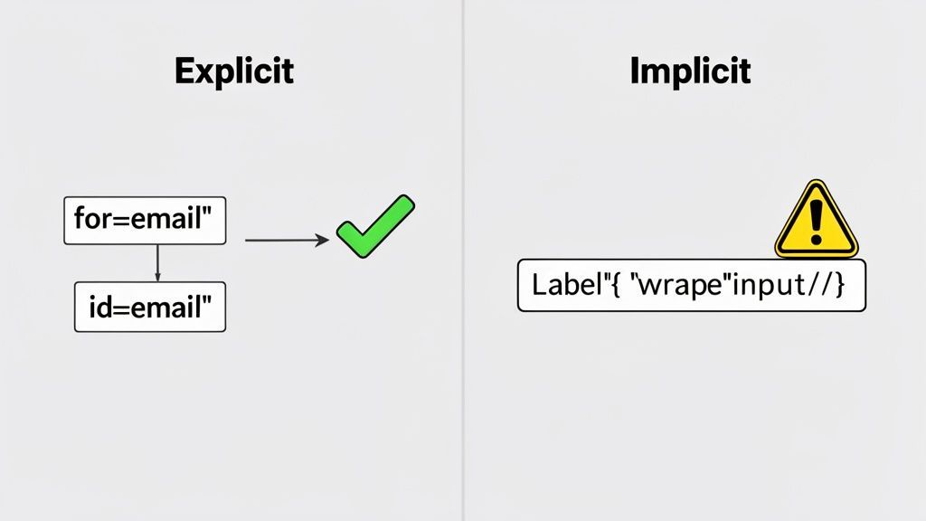
The image reinforces why the for/id pairing is so powerful—it defines a relationship that isn't dependent on how elements are nested, which leads to much more predictable behavior.
The Business Case For Accessible Forms
Let's talk about how something as simple as a form label can directly impact your business's growth. Proper use of the HTML label tag isn't just a technical box to check; it’s a powerful tool for conversion rate optimization (CRO). When people can instantly understand what you're asking for in a form, friction melts away.
This clarity means fewer abandoned carts and half-filled sign-up forms. It leads to more completed transactions and a much smoother path for your customers. By making the experience better for users with disabilities, you’re actually making it better for everyone who lands on your site.
Just think about anyone trying to tap a tiny radio button on their phone or getting confused by a vague form field. Clear labels solve these common pain points, which builds user trust and cuts down on frustration.
Turning Usability Into Profitability
A great user experience doesn't just feel good—it delivers a real, measurable return on investment. The data speaks for itself: accessible forms simply convert better. From a pure UX standpoint, the HTML label tag drives tangible improvements in form completion and user engagement.
In fact, research shows that forms with correctly implemented labels enjoy a 22% increase in completion rates compared to those without. Even more impressive, e-commerce sites that rolled out comprehensive label strategies saw an average 14% bump in conversion rates. You can dig deeper into these findings on the importance of HTML labels.
This draws a straight line from a single HTML tag to real business revenue.
This positive experience not only boosts conversions but also strengthens brand loyalty and reduces customer support inquiries. For some businesses, these accessibility improvements have correlated with a reduction in customer support tickets by as much as 25%.
When you factor in the cost of customer support and the lifetime value of a loyal customer, the business case for accessible forms is crystal clear.
Gaining A Competitive Edge
In a noisy marketplace, user experience is what sets you apart. A form that is simple, clear, and easy to use can be the very thing that makes a customer choose you over a competitor. And using the <label> tag correctly is fundamental to creating that superior experience.
- Builds Trust and Authority: An accessible, well-constructed form signals professionalism and shows you care. It builds confidence in your brand and even aligns with what Google looks for in its E-E-A-T guidelines.
- Expands Your Audience: An accessible website is open for business to everyone, including the millions of people who use assistive technologies. This unlocks a massive and often-ignored market segment.
- Reduces Bounce Rates: When someone hits a confusing form, their first instinct is often to leave. Clear labeling keeps them on the page and moving toward your conversion goal.
Ultimately, investing in accessible forms is an investment in your bottom line. It’s a strategic move that pays dividends through higher conversions, stronger customer loyalty, and a better brand reputation.
Getting Started With Accessibility At Scale
While getting the <label> tag right is a critical first step, it’s just one piece of a larger accessibility puzzle. For businesses looking to ensure compliance and elevate the user experience across all their digital properties, a more structured approach is essential.
This is where tools can help. For instance, the AI-powered accessibility solutions at WebAbility.io can automate the process of finding and fixing issues like missing labels across your entire site. By integrating automated scanning and real-time monitoring, you can make accessibility a sustainable part of your workflow and capture the full business benefits of an inclusive website.
Labels, Placeholders, And ARIA: A Critical Comparison
Let's cut to the chase: for any standard form field, you should always use an HTML <label> tag. Placeholder text is a poor substitute, and ARIA attributes are specialized tools for unique situations. Getting this right is a sign of a seasoned developer who truly cares about usability and accessibility.
It's a common point of confusion. We see developers wrestling with whether to use a <label>, a placeholder, or an ARIA attribute all the time. While they all seem to provide context for a form field, their jobs are very different, and they are definitely not interchangeable.
Think of placeholder text—that light gray hint inside a text box. It's probably one of the most misused elements in modern web design. Here's the deal: it is not a replacement for a proper label. Its biggest flaw is that it disappears the second someone starts typing. This forces people to rely on memory, which is a recipe for errors and frustration, especially with longer or more complex forms.
On top of that, placeholder text is often an accessibility nightmare. The default color contrast is frequently too low for people with visual impairments to read comfortably. And to make matters worse, not all assistive technologies can reliably access it.
When To Use ARIA Attributes
So, what about ARIA? Attributes like aria-label from the Accessible Rich Internet Applications suite are incredibly powerful, but they’re meant for very specific scenarios where a visible, on-screen label just isn't practical.
A perfect example is a search button that’s just a magnifying glass icon. There's no visible text. In this case, adding aria-label="Search" gives screen reader users the context they need to understand what the button does.
But ARIA is a scalpel, not a sledgehammer. It’s built for dynamic UIs and custom-built components where native HTML just doesn't cut it. Using it where a simple <label> would work is not only overkill but can also create a brittle and confusing experience. The golden rule is simple: if a native HTML solution exists, use it first.
To really get a handle on the broader principles of digital inclusion, it's worth exploring the essential guidelines for inclusion, including WCAG and ARIA. This context helps you understand why native HTML is preferred and when a specialized tool like ARIA is the right call.
The Semantic-First Approach
For the vast majority of your forms, a semantic HTML <label> is always the right answer. It’s robust, universally supported, and provides the most accessible foundation you can build on. This "semantic-first" mindset is a mark of true expertise and ensures your forms are built to last.
A visible, persistent label is the most user-friendly and accessible way to identify a form control. It serves as a constant guide for all users, regardless of ability or the technology they use, directly contributing to higher form completion rates.
Choosing the right labeling method becomes much simpler once you have a clear mental model. This decision tree breaks down the process, showing you exactly how to pick the right tool for any situation.
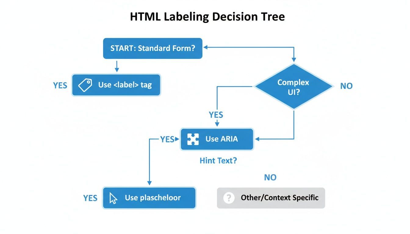
As you can see, the path almost always leads back to the good old <label> tag. ARIA is reserved for those unique UI challenges where a standard label won't fit.
When you need to give an element an accessible name but there's no visible text, aria-label is your go-to. For more complex scenarios where an existing on-screen element should act as the label, you might be interested in our guide on the aria-labelledby attribute. But for almost every input, checkbox, and radio button out there, the <label> is your best friend.
Labeling Methods Compared: Label vs. Placeholder vs. ARIA
To make the differences even clearer, here’s a quick comparison of the three methods. This table should help you decide which to use at a glance.
| Attribute | Primary Purpose | Accessibility Impact | When to Use |
|---|---|---|---|
<label> | To explicitly and visibly identify a form control. | Excellent. Creates a persistent, clickable, and programmatically linked label. The gold standard. | Always for standard form fields (inputs, textareas, selects, etc.). |
placeholder | To provide a short hint or example of the expected input format. | Poor. Disappears on input, often has low contrast, and is not reliably announced by screen readers. | Sparingly, and never as a substitute for a <label>. Use only for supplemental, non-critical hints. |
aria-label | To provide an accessible name for an element when no visible label exists. | Good, but specific. Provides essential context for assistive tech but is invisible to sighted users. | For icon-only buttons, custom controls, or elements where a visible label would be redundant or clutter the UI. |
Ultimately, choosing the right tool for the job makes your forms more intuitive and effective for everyone.
By making the HTML <label> tag your default, you're building a better, more inclusive web. For teams looking to enforce these standards across the board, WebAbility.io's automated auditing can be a lifesaver. It quickly pinpoints where labels, placeholders, and ARIA are being used incorrectly, helping you fix issues and maintain high-quality, accessible code at scale.
Proper Labeling And Your Legal Compliance
Beyond just creating a smooth user experience, properly labeling your forms is a massive part of managing legal risk. The HTML label tag is your first line of defense in meeting Success Criterion 3.3.2 (Labels or Instructions), which is a fundamental Level A requirement under the Web Content Accessibility Guidelines (WCAG).
Think of these guidelines as the technical rulebook for major accessibility laws across the globe, like the Americans with Disabilities Act (ADA), Section 508, and the Accessibility for Ontarians with Disabilities Act (AODA). Getting this wrong isn't just a coding mistake; it can expose your company to some serious legal trouble.
The Legal Risks of Inaccessible Forms
A huge number of digital accessibility lawsuits are triggered by one thing: inaccessible web forms. Missing labels are one of the most common—and frankly, easiest to spot—violations that can land a company in hot water. From a legal perspective, every time you use a <label> tag correctly, you're building a case for due diligence and showing a real commitment to accessibility.
Putting proper labels in place is a foundational step in protecting your organization. This isn't just about writing clean code. It's about building a digital presence that is inclusive and, just as importantly, legally defensible. As regulations around digital access get stricter, making sure your forms are compliant is just smart business.
Key Takeaway: Correctly using the
html label tagisn't just a nice-to-have for a good user experience; it's a primary defense against accessibility lawsuits. Every single label you implement strengthens your legal standing.
The evolution of web standards has really put the HTML label tag front and center. A 2024 deep-dive audit of 1,000 enterprise websites found that a shocking 68% failed basic form labeling requirements. The ADA is zeroing in on these technical details, and legal cases show that inaccessible forms are a major liability, responsible for around 31% of all digital accessibility lawsuits from 2019 to 2025. On the flip side, organizations that took labeling seriously saw their legal risk drop by an estimated 40-50%. You can learn more about how label tags support web standards.
Building a Defensible Accessibility Strategy
Creating a legally sound digital presence means being proactive. Waiting for complaints to roll in just doesn't cut it anymore. Instead, you need to show a consistent, ongoing effort to stay on top of accessibility standards.
This is where your tools and daily processes really matter. A few key actions can help solidify your position:
- Prioritize Semantic HTML: Always, always start with native HTML elements like
<label>. Only turn to workarounds when there's absolutely no other way. - Conduct Regular Audits: Use a mix of automated tools and manual testing to sniff out and fix labeling issues before they turn into legal headaches.
- Document Your Efforts: Keep a paper trail of your accessibility work. This includes audits, fixes, and team training, all of which demonstrate a good-faith effort to comply.
By making proper labeling a non-negotiable part of your development cycle, you shift from a reactive, "fire-fighting" mode to a proactive one. For a deeper dive into the specific legal requirements, you can read our guide on website accessibility laws and how to comply. This approach doesn't just reduce risk; it also boosts your brand's reputation as a company that is trustworthy and truly for everyone.
Got Questions? Let's Talk Labels.
TL;DR: Always use a real <label> for your form inputs. You can style it however you want with CSS, just don't break it. If a design requires a "hidden" label, hide it visually with CSS, not from screen readers. And for complex forms, one label can be connected to multiple inputs if you know the right tricks.
Let's dive into some of the most common questions that pop up when working with the HTML label tag. These practical answers should clear things up and help you handle any labeling scenario you encounter.
Can I Style The Label Tag With CSS?
Absolutely! You should definitely style <label> elements so they look great and fit your site's design. Think of them as any other text element—you have full control over font-size, color, font-weight, and anything else CSS can do.
Just be careful that your design choices don't get in the way of usability. The big one to watch is color contrast. Make sure your label text stands out clearly against its background. The goal is to hit a contrast ratio of at least 4.5:1, which is the sweet spot for meeting WCAG AA standards and ensuring most people can read it without straining.
How Do I Visually Hide A Label?
This comes up a lot. Sometimes a minimalist design, like a search bar that only shows a magnifying glass icon, means you don't want a visible "Search" label cluttering things up.
When you need to do this, whatever you do, do not use display: none or visibility: hidden on the label. That makes it completely disappear, even for screen readers, which defeats the entire purpose.
The right way is to use a special CSS class that pulls the element off-screen without actually hiding it from assistive technology. You'll often see this called an "sr-only" (screen-reader only) or "visually-hidden" class.
A "visually-hidden" class is one of the most useful tools in a developer's accessibility toolkit. It's the perfect compromise, letting you create clean, modern interfaces while still providing the essential context screen reader users need.
How Can I Quickly Test My Labels?
You don't need a bunch of complicated tools for a quick sanity check. Your browser's built-in developer tools are surprisingly powerful for this.
- Right-click on your form field and hit "Inspect."
- In the DevTools panel that appears, find the "Accessibility" tab.
- Click on your
<input>in the accessibility tree. You should see its "Accessible Name" property, and its value should be your label's text.
If that name is missing or wrong, you know something is disconnected. This entire check takes about 10 seconds and is one of the fastest ways to spot and fix a major accessibility barrier.
At WebAbility.io, our mission is to make the web accessible for everyone. Our platform gives you the tools to find and fix issues like these, helping you stay compliant and create a better experience for every single visitor. Discover how WebAbility.io can transform your website's accessibility today.
Quick Questions
Tap to ask AI about this article