How to Make Website Accessible: A Practical Guide

Sidharth Nayyar
TLDR: Making your website accessible means building it so everyone, including people with disabilities, can use it. This involves focusing on clear design (like good color contrast), writing understandable content (with alt text for images), and using clean code (like semantic HTML). An accessible site reaches a wider audience, improves user experience for everyone, and even boosts your SEO. Regular testing using both automated tools and manual checks is crucial to maintain accessibility.
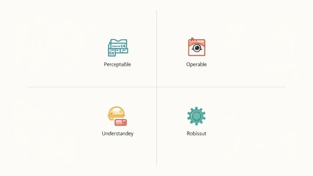
When we talk about making a website accessible, we're really talking about building it so that everyone, including people with disabilities, can use it easily and effectively. This entire practice is built on four key pillars, often remembered by the acronym POUR: Perceptible, Operable, Understandable, and Robust.
Getting these right doesn't just open up your website to a bigger audience; it has the welcome side effect of improving the user experience for every single visitor and even giving your SEO a nice boost.
Your Quick Start Guide to Web Accessibility
So, where do you begin? The best way to build an inclusive website is to make accessibility a core part of your process from day one. Thinking about it from the initial design mockups all the way to the final lines of code saves you from expensive, time-consuming fixes down the road. It's not a checkbox to tick at the end; it's a mindset.
Consider this: over 16% of the world's population—that's more than 1.3 billion people—live with some form of disability. Prioritizing accessibility isn't just about following guidelines; it's a smart business decision that connects you with a huge, and often overlooked, segment of the market.
The Core Phases of Accessibility
To get a practical handle on this, it helps to see accessibility as woven into three main stages of any web project: design, content, and development. Each one has its own set of critical tasks that build on the last to create a final product that works for everyone.
This flow shows how these pieces fit together.
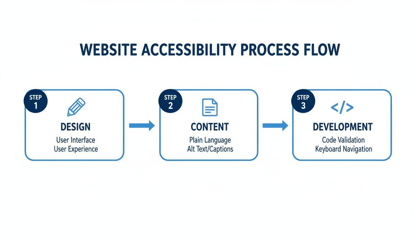
As you can see, this isn't a one-and-done task. It's a continuous effort that carries through the entire lifecycle of a project. True success comes from making sure these inclusive practices are present at every step.
Accessibility is not a feature, but a fundamental part of the user experience. By thinking about users with diverse needs from the start, you create a product that is inherently more usable, intuitive, and effective for everyone.
This table gives you a high-level checklist of the essential actions to take in each phase of your project.
Core Accessibility Action Checklist
| Phase | Key Action | Primary Goal |
|---|---|---|
| Design | Plan for sufficient color contrast and clear layouts. | Ensure the visual design is perceptible and easy to navigate for all users, including those with visual impairments. |
| Content | Write clear copy and provide alt text for all images. | Make sure all information is understandable and can be accessed by assistive technologies like screen readers. |
| Development | Use semantic HTML and ensure keyboard navigability. | Build a robust technical foundation that is operable by everyone, regardless of how they access the web. |
Think of this checklist as your starting point for weaving accessibility into your workflow from the very beginning.
The global standard for all this work is the Web Content Accessibility Guidelines (WCAG). These guidelines provide the technical requirements needed to make your site accessible. If you're just starting out, our step-by-step guide to getting started with web accessibility is a fantastic primer. From here, we'll dive deeper into the practical strategies for each phase.
Before we jump into the "how," let's take a step back and really get to grips with the "why." It's easy to view web accessibility as a technical box to tick, but that's a mistake. It’s actually a core part of a smart business strategy, and framing it that way gives you the momentum to make it a real priority.
The truth is, most websites are unintentionally putting up walls for millions of users. We're not talking about obscure coding issues here. The culprits are often basic, overlooked things like missing alt text for images, color contrast that makes text impossible to read, or navigation that flat-out doesn't work without a mouse.
The scale of this issue is genuinely staggering. Automated tests consistently find the same accessibility failures again and again, creating real legal and commercial risks for companies. An extensive study from the WebAIM Million project found that a shocking 94.8% of the top million home pages had at least one detectable WCAG 2 conformance error.
Think about that. The average page had around 51 accessibility errors, which means a visitor is likely to hit a roadblock on roughly 1 in every 24 things they try to interact with.
The data couldn't be clearer: the vast majority of the web is failing a huge portion of its audience. This means figuring out how to make a website accessible isn't just about compliance—it's about seizing a massive opportunity.
Expanding Your Market Reach
One of the most compelling reasons to get this right is the direct line it draws to your customer base. Around 1.3 billion people worldwide live with some form of disability. This community, along with their friends and family, holds serious spending power.
An inaccessible website is the digital equivalent of a shop with a locked front door. Your products could be amazing, but if a huge chunk of the population can't even get inside to browse, it doesn't matter. By building an inclusive site, you're actively welcoming a market that is all too often ignored and incredibly loyal to brands that finally meet their needs.
An accessible website isn't just for one group of people; it creates a better, more intuitive experience for every single user. Things like clear navigation, readable fonts, and video captions—all rooted in accessibility—improve usability across the board.
Enhancing Brand Reputation and Trust
In today's crowded marketplace, your brand's reputation is everything. Committing to accessibility sends a powerful signal that your company cares about inclusivity, social responsibility, and putting customers first. This builds trust not only with users who have disabilities but also with everyone else who prefers to support businesses that are genuinely trying to do the right thing.
Builds Positive Brand Association: A public commitment to accessibility shows your company values all of its users, not just some.
Mitigates Legal Risk: Getting ahead of accessibility helps protect your organization from potential lawsuits and demand letters, which are definitely on the rise.
Fosters Customer Loyalty: When people feel seen and respected by your brand, they are far more likely to stick around and become your biggest advocates.
Gaining a Competitive SEO Advantage
This is a benefit that often gets overlooked. There's a huge, valuable overlap between web accessibility best practices and search engine optimization (SEO). At their core, search engine crawlers and screen readers are trying to do the same thing: make sense of your website's content and structure.
When you focus on making your site accessible, you're almost accidentally improving your technical SEO.
Think about it. Elements like a proper heading hierarchy (H1, H2, H3), descriptive alt text for images, and a logical page layout are vital for both accessibility and search rankings. A clean heading structure helps a screen reader user jump between sections, and it also gives Google a perfect outline of your content. Alt text provides essential context for someone who can't see an image, and it gives search engines valuable information to index.
By prioritizing accessibility, you’re not just creating a better user experience; you’re building a stronger, more visible online presence that search engines will love.
Designing for an Inclusive User Experience
When you get right down to it, designing an accessible website means focusing on clear visuals and an intuitive structure. This isn't an afterthought; it's a foundational part of the design process.
Think of it this way: accessibility isn't something you bolt on at the end. It needs to be baked into the very first wireframes and mockups. When you make these inclusive choices from the beginning, you're creating a blueprint that makes development smoother and the final product work for everyone. It's about intentionally crafting an experience that welcomes all users from the start.
To truly design for an inclusive experience, you need a solid grasp of core user experience principles. A deeper dive into these fundamentals is a great place to start, and you can master user experience design principles for better UX to build that foundation.
Start with a Strong Visual Foundation
A site's visual elements are often the first thing a user encounters, so getting them right is absolutely critical for accessibility. This is about much more than just looking good; it's about making sure everything is clear and legible.
One of the most common accessibility issues I see is poor color contrast. Text that blends into the background isn't just a minor annoyance—for users with low vision or certain color vision deficiencies, it can make your site completely unusable.
The Golden Rule: The WCAG guidelines are clear: your contrast ratio should be at least 4.5:1 for normal text and 3:1 for larger text (think 18pt regular or 14pt bold).
Don't Guess: Never just eyeball your color choices. Use a free tool like the WebAIM Contrast Checker or the checkers built right into your browser's developer tools. Verify your color pairings before a single line of code is written.
It's Not Just Text: Remember, this applies to everything. Icons, buttons, and important graphics all need to meet these contrast requirements to be easily seen.
Typography plays a massive role, too. That cool, unique font might fit your brand, but if it’s hard to read, you’ve just put up a barrier for your users. Stick with clean, simple typefaces. You can rarely go wrong with sans-serif fonts like Arial, Helvetica, or Open Sans.
A key takeaway here is to never rely on color alone to convey important information. For instance, if an error on a form is only shown with a red border, a user with color blindness might never see it. Always pair color cues with an icon and clear, descriptive text to make sure the message gets through to everyone.
Design for More Than Just a Mouse
Not everyone navigates the web with a mouse or a trackpad. Many people with motor disabilities rely entirely on a keyboard, while others use assistive technologies like screen readers. Your design has to work for all of them.
A huge piece of this puzzle is the focus state. What's that? It's the visual indicator—usually a border or a highlight—that shows which interactive element (like a link, button, or form field) is currently active.
Without a clear, visible focus state, a keyboard user is navigating blind. They're tabbing through your page with no idea where they are. It’s a frustrating experience that’s easy to avoid.
Build Intuitive Forms and Controls
Forms are where accessible design really gets put to the test. A confusing form can stop a user dead in their tracks, often for good. Your goal should be to make filling out a form as straightforward and error-proof as possible.
Here are a few principles I always follow when designing forms:
Make Labels Permanent: Don't just use placeholder text inside a form field. The moment a user starts typing, that text disappears, and they're left guessing what they were supposed to enter. Always use a proper
<label>element that stays visible.Provide Clear Instructions: If a field has a specific format (like MM/DD/YYYY for a date), tell the user upfront. Don’t make them guess.
Group Related Fields: Use fieldsets to logically group related information, like the different parts of a mailing address. This gives screen reader users the context they need to understand the form's structure.
Focusing on clear structure and visual cues doesn't just help users with disabilities; it helps everyone. It creates a better experience for someone who's distracted, in a hurry, or simply trying to get something done without a hassle.
For a more detailed look at creating an inclusive blueprint from the ground up, we've put together some essential strategies on how to design accessible websites that truly work for everyone.
Developing for Core Accessibility Standards
Once the design mockups are approved, the real work of bringing your inclusive vision to life begins in development. This is where we translate those visual blueprints into functional, accessible code that plays nicely with assistive technologies. From my experience, baking accessibility into your code from the get-go is infinitely easier than trying to bolt it on as an afterthought.
The bedrock of any accessible website is clean, semantic HTML. It’s really about using the right HTML element for the right job. Instead of wrapping everything in generic <div> tags, we use specific elements like <header>, <main>, <nav>, and <footer> to give the page a clear, meaningful structure.
Most sighted users will never notice this underlying structure, but for someone using a screen reader, it's a total game-changer. It allows their software to understand the page layout and gives them the option to jump straight to the main content, bypassing all the navigation links on every page.
Building a Logical Content Hierarchy
Beyond those main page landmarks, a clear heading structure is absolutely essential. Your heading tags (<h1> through <h6>) create a logical outline of the content, which is just as important for screen reader users as it is for search engine crawlers.
The key is to follow a strict hierarchy. Every page should have one—and only one—<h1> for the main title. From there, major sections get an <h2>, and any subsections under that get an <h3>, and so on down the line. A common mistake is skipping levels, like jumping from an <h2> to an <h4>. This creates a confusing experience for assistive tech, breaking the logical flow.
If you're serious about development, you need to understand the importance of using proper heading tags in HTML for both accessibility and SEO.
Crafting Meaningful Alternative Text
Images bring a page to life, but only for those who can see them. That's where alternative text (or alt text) comes in. It's just a short, descriptive sentence you add to an image's HTML tag to explain its purpose or content to someone who can't see it.
Good alt text is an art. It’s not about stuffing keywords; it’s about conveying context. For a picture of someone signing a form, "man signing contract" is okay, I guess. But something like, "A client smiling as they sign a new home agreement" paints a much richer picture and provides real value.
Of course, not every image needs a detailed description. If an image is purely decorative—like a swirly background pattern—it's best to use an empty alt attribute (alt=""). This signals to screen readers that they can safely ignore the image, which helps reduce unnecessary noise for the user.
Demystifying ARIA for Dynamic Content
Today’s websites are full of dynamic bits and pieces—modals, accordions, and custom dropdown menus. While semantic HTML gets you most of the way there, it can’t always communicate the state or function of these complex components. This is the exact problem ARIA (Accessible Rich Internet Applications) was created to solve.
ARIA is a set of attributes you can add to your HTML to give assistive technologies extra context. It doesn't change how anything looks or behaves for visual users; it’s a behind-the-scenes layer of information for screen readers.
ARIA is incredibly powerful, but you have to use it carefully. The first rule of ARIA is: don't use ARIA if you can use a native HTML element instead. A native
<button>is accessible right out of the box. A<div>styled to look like a button needs a bunch of ARIA roles and keyboard functionality added manually just to catch up.
For instance, you might use aria-expanded="true" to signal that a menu is open, or apply role="alert" to make sure an important error message is announced immediately. These small additions can make a world of difference for the usability of your interactive elements.
Ensuring Full Keyboard Operability
Perhaps the most fundamental accessibility requirement is that your entire site must be usable with only a keyboard. Many users with motor disabilities can't use a mouse and depend on the Tab key and other keyboard commands to navigate.
This means every single interactive element—links, buttons, form fields, you name it—must be reachable and activatable from the keyboard. As a user tabs through the page, there has to be a clear and visible focus indicator (usually an outline) showing them exactly where they are.
Here are a few non-negotiables for keyboard accessibility:
Logical Tab Order: The focus should move through the page in a predictable way, typically left-to-right, top-to-bottom, mirroring the visual layout.
Visible Focus States: Never, ever use
outline: none;in your CSS without providing a custom, high-contrast alternative for focus states. Removing that outline makes your site instantly unusable for keyboard navigators.Use the Right Elements: Stick with
<button>for actions and<a>for navigation. Using the correct native elements means they're already focusable and work with assistive tech right out of the box, saving you a ton of extra work.
How to Test and Audit Your Website Accessibility
Launching an accessible website is a fantastic milestone, but the job isn't done. To make sure your site stays accessible, you need a repeatable process for testing and auditing. This isn't just a box to check at the end of a project; it's an ongoing commitment that protects both your users and your brand. A truly solid strategy is a blend of automated tools, manual checks, and—most importantly—feedback from real people.
Think of it this way: automated tools are your first line of defense. They're brilliant at catching widespread, predictable problems fast. But they can’t understand context or nuance, which is where manual testing and direct user feedback become absolutely critical. Each layer of testing builds on the last, giving you a much clearer picture of your site's true accessibility.
Combining Automated and Manual Testing
From my experience, the most effective accessibility audits always use a blended approach. Automated tools can zip through your entire site in minutes, flagging things like missing alt text or glaring color contrast errors. They are incredibly efficient for spotting common coding mistakes that violate WCAG standards.
But relying only on automation is a trap. Research consistently shows that automated scans typically catch only a fraction of WCAG failures—often estimated at around 30% of all issues. Why? Because so many accessibility requirements demand human judgment.
This is where manual testing comes in. A human tester can actually tell if alt text is meaningful, if the tab order makes logical sense for a user, or if a complex piece of interactive content is truly usable with a screen reader.
An automated tool can see if an
altattribute exists, but it has no idea if it's helpful. Only a person can judge that "image123.jpg" is a useless description for a product photo. This distinction is precisely why manual testing is non-negotiable.
Kickstart Your Audit with Automated Tools
Your first pass should always involve running a few reliable automated tools. They give you a quick, high-level look at your site's health and a concrete list of things to fix right away.
Browser Extensions: Tools like WAVE and Axe DevTools are perfect for quick, on-page analysis. They overlay icons and notes right onto your site, showing you exactly where the problems are.
Full-Site Scanners: For a more comprehensive view, other platforms can crawl your entire website and generate a detailed report. This is how you spot systemic issues that pop up on multiple pages, like an error baked into a page template.
These reports can look a bit intimidating at first. My advice is to sort the findings by severity (critical, serious, moderate) and start chipping away at the most critical issues first.
A Practical Manual Testing Checklist
Once you've cleared out the low-hanging fruit found by the bots, it's time to roll up your sleeves and do some manual checks. This process is all about simulating how people using assistive technologies actually navigate your site. You don't need to be a seasoned expert to get started.
Here’s a simple checklist to guide your manual audit:
Keyboard-Only Navigation: Unplug your mouse. Seriously. Try to get around your entire website using only the keyboard. Can you reach every button, link, and form field with the
Tabkey? Is there a clear visual focus indicator so you always know where you are?Screen Reader Experience: Fire up a screen reader like VoiceOver (built into macOS) or NVDA (a free download for Windows) and listen to your key pages. Is the content announced in a logical sequence? Are images described with useful alt text? Can you actually operate the navigation menus and fill out a form?
Zoom Functionality: Crank your browser's zoom up to 200%. Does the layout completely fall apart? Is any text or content cut off or hidden? Everything should still be perfectly readable and usable at this magnification.
Form Usability: Go through every form on your site. Are all the fields clearly labeled? Can you fill everything out and submit the form using just the keyboard? Are error messages clear, specific, and announced by the screen reader?
The Ultimate Test: User Feedback
The final—and by far the most valuable—step is to involve people with disabilities in your testing. No tool or simulation can ever replicate the lived experience of someone who depends on assistive technology every single day.
Getting this kind of feedback is pure gold. It shifts your focus from just technical compliance to genuine usability barriers. For any organization that's serious about getting this right, a formal accessibility audit that includes this kind of user testing is the only way to build a truly inclusive experience. The insights you'll gain will not only help you fix hidden problems but will also build crucial empathy within your team.
Answering Your Top Web Accessibility Questions
Once you start moving from theory to practice with accessibility, the questions start flying. It's totally normal. Getting into the details of digital inclusion can feel a bit overwhelming at first, but a few key distinctions can make a world of difference.
This is where we clear up the confusion. Let's dive into the questions I hear most often from teams who are just starting to get serious about making their websites accessible for everyone.
Accessibility vs. Usability: What's the Difference?
People often use "accessibility" and "usability" as if they mean the same thing, but they're two sides of the same coin. They're related, but distinct.
Here’s a simple way to think about it: accessibility is about whether people can use your website, while usability is about how good that experience is.
Accessibility is laser-focused on knocking down barriers for people with disabilities. Can a screen reader user navigate your checkout process? Can someone with low vision read your text? Usability, on the other hand, is about making a site efficient, effective, and satisfying for everyone.
But here’s the thing: the two are deeply intertwined. When you build an accessible website, you almost always make it more usable for all your visitors. For example, clear, logical headings are a lifeline for screen reader users, but they also make your content a breeze for anyone to scan and understand.
Does Improving Accessibility Actually Help SEO?
Yes, it absolutely does. This is one of the happiest coincidences in web development. There's a huge, beneficial overlap between what you do for accessibility and what search engines want to see for great SEO.
At their core, both search engine crawlers and assistive technologies like screen readers are trying to do the same thing: understand the structure and meaning of your content. When you make it easy for one, you make it easy for the other.
Here’s how they connect in the real world:
Alt Text: This is a classic win-win. It describes images for screen reader users and gives search engines crucial context about what your images contain.
Heading Structure: Using
<h1>,<h2>, etc., correctly does more than just style your text. It creates a logical outline that screen readers use for navigation and that Google uses to understand your page hierarchy.Video Transcripts: Providing a transcript makes your video content accessible to people who are deaf or hard of hearing. It also hands search engines a keyword-rich, perfectly indexable text version of your video.
How Often Should I Audit My Website?
Thinking of accessibility as a one-and-done task is a common mistake. It’s an ongoing process. Your website is a living thing—you're always adding new content, shipping new features, and tweaking the code.
As a solid baseline, plan for a full, in-depth accessibility audit at least once a year.
But don't stop there. You need to build smaller, more frequent checks right into your team's workflow. Any time you launch a major new feature, publish a page with a new template, or redesign a key part of your site, run it through an accessibility check. This keeps you from accumulating "accessibility debt" that becomes a massive project later.
The financial stakes are higher than you might think. Ignoring accessibility isn't just bad practice; it's bad for business. Consumer-facing businesses lose an estimated $6.9 billion every year simply because users with disabilities encounter inaccessible websites and take their money elsewhere. You can dig into more data on the economic effects of web accessibility to see just how significant the impact is.
Ready to make your website accessible and stay compliant with confidence? WebAbility.io provides an end-to-end platform with AI-powered tools and expert services to ensure your site meets WCAG and ADA standards while improving the user experience for everyone. Start your free trial today and see how easy it is to build a truly inclusive web presence. https://www.webability.io
Quick Questions
Tap to ask AI about this article