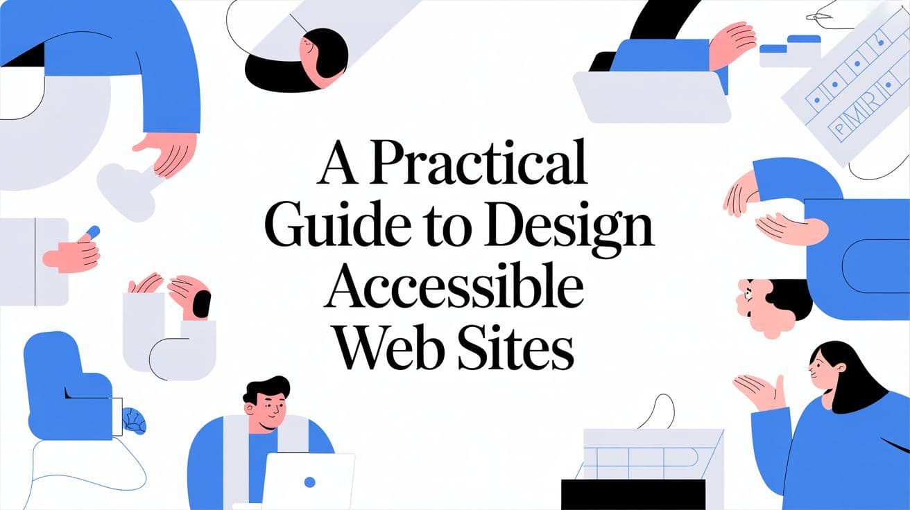
A Practical Guide to Design Accessible Web Sites

Sidharth Nayyar
Sidharth Nayyar
Ready to make your website accessible? Engage with our team or start a free trial today.
Tap to ask AI about this article
TLDR: To design accessible websites, focus on the four core principles of WCAG: making content Perceivable, the interface Operable, the information Understandable, and the site Robust for various technologies. This approach creates a better experience for all users and is a key part of modern, ethical web design. For ongoing success, combine automated tools for quick checks, manual testing for usability, and user feedback to ensure your site works for everyone in the real world.
Web accessibility simply means designing and building websites and tools that people with disabilities can actually use. But here’s the thing—the benefits ripple out to everyone, making the entire experience more intuitive and user-friendly for your whole audience. The real goal is to tear down the barriers that block people from using your site, whether they have physical disabilities, are dealing with a temporary situation, or even have a slow internet connection.
A truly accessible site accounts for the entire spectrum of human ability.
The Web Content Accessibility Guidelines (WCAG) are the gold standard here. Everything is built on four core principles, which you can remember with the acronym POUR. If you're serious about designing accessible websites, this framework is your starting point.
This visual guide breaks down the four core principles of web accessibility.
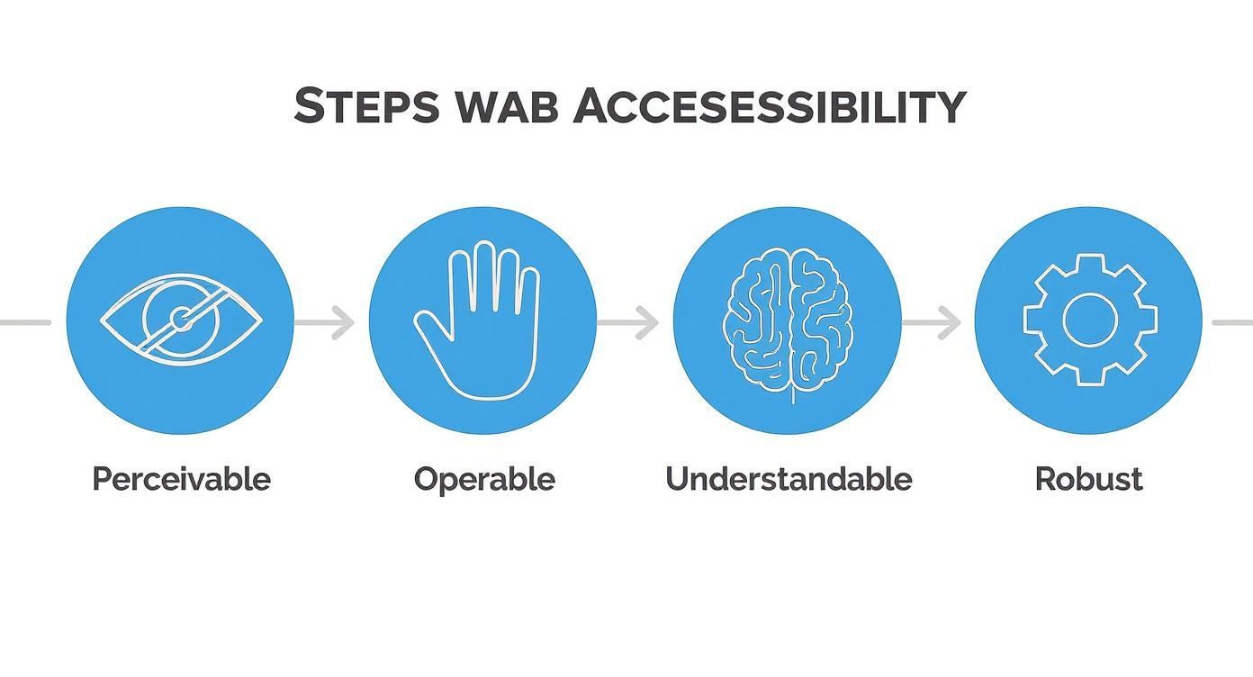
As the infographic shows, content must be Perceivable, Operable, Understandable, and Robust to be truly accessible to every user.
Understanding the role of a User Experience (UX) designer is key to building sites that work for everyone, and the POUR principles are what guide this process:
Despite these clear guidelines, a shocking number of websites miss the mark. A recent analysis of one million homepages found that 94.8% had detectable WCAG failures, with an average of 51 errors per page. That's a huge problem.
Accessibility isn't a feature you tack on at the end. It needs to be woven into your entire process, from the first wireframe to the final line of code. Thinking about it from the start saves a ton of time and leads to a much more cohesive and usable product for everyone. Our detailed guide on https://www.webability.io/blog/what-is-web-accessibility dives deeper into this crucial topic.
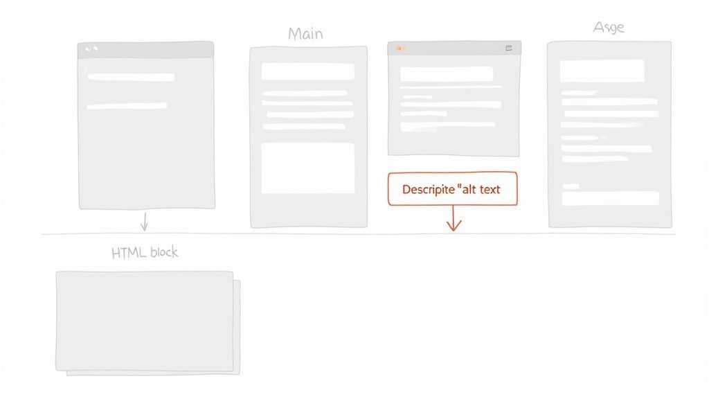
When you're building an accessible website, it's easy to get caught up in flashy designs and complex features. But the real foundation, the bedrock of accessibility, starts with something much simpler: clean, semantic HTML.
Think of semantic HTML as the architectural blueprint for your page. It uses specific tags that give meaning and structure to your content, creating a logical roadmap that assistive technologies like screen readers can actually understand and navigate.
Instead of just wrapping everything in generic <div> and <span> tags, semantic HTML gives you elements with built-in meaning. This is a game-changer for anyone not using a mouse, as it allows them to jump directly to key sections. A screen reader can announce "main content" or "navigation menu" because you used the right tags, making the whole experience far less frustrating.
The most important semantic tags are the ones that define the main regions of your website. Getting these right is a simple but incredibly powerful step toward accessibility. They create a predictable structure that assistive tech relies on to make sense of your layout.
Here are the non-negotiables you should be using on every page:
<header>: This is for your introductory content and site-wide navigation. Think logos, the site title, and your main menu.<nav>: Use this specifically for major navigation blocks. Don't just throw any group of links in here; it’s meant for primary navigation like your main menu or a table of contents.<main>: This one is crucial. It should wrap the unique, primary content of the page. And remember, there should only be one<main> element per page.<footer>: This is the spot for your copyright info, contact details, and other secondary links that typically live at the bottom of a site.By simply framing your content with these tags, you immediately make your site more understandable and easier to get around.
I can't stress this enough: headings (<h1>, <h2>, <h3>, etc.) are not just for making text bigger. They create a scannable outline of your content. Screen reader users often navigate by jumping from heading to heading to find what they need, just like a sighted person skims headlines in a newspaper.
A mistake I see all the time is developers skipping heading levels for purely visual reasons—like jumping from an <h1> to an <h3> because it looks better. This breaks the logical structure and can be really confusing. Always stick to the hierarchy.
Every page needs exactly one
<h1>for the main title. Subsections should get<h2>tags, and if you need to nest further, use<h3>, then<h4>, and so on. No skipping.
This disciplined approach ensures your content is easy to digest, no matter how someone is accessing it.
Alternative text, or "alt text," is the description a screen reader reads aloud for an image. It’s your chance to paint a picture for users with visual impairments. Writing good alt text is an art form; it needs to be descriptive enough to convey the image’s purpose without rambling.
Useless phrases like "image of" or "graphic" are just noise. Your goal is to describe what the image is and what it does. For instance, if an image is also a link, the alt text needs to explain where that link goes, not just describe the picture.
Finally, let's talk about link text. This one is huge. Vague phrases like "Click Here" or "Learn More" are an accessibility nightmare. Screen reader users often pull up a list of all the links on a page to navigate. Imagine being presented with a list of ten "Learn More" links—it's completely useless without context.
Your link text should always make sense on its own and clearly describe where the user is about to go. It’s a simple fix that helps everyone by making navigation more transparent.
| Bad Example (Avoid) | Good Example (Use) |
|---|---|
| To download our guide, click here. | Download our complete accessibility guide (PDF). |
| Learn more about our services. | Explore our web accessibility audit services. |
| Read More | Read more about WCAG 2.1 AA standards. |
Making this one small change will dramatically improve the user experience, making your site clearer and much easier to navigate for all your visitors.
Once you’ve got your site’s structure sorted with semantic HTML, the next big step is how people actually see and hear your content. This is where your design choices in color, typography, and multimedia can either open doors for users or slam them shut.
When we talk about an accessible sensory experience, it's really about two things: clarity and choice. It means someone with low vision or color blindness can understand visual information just as well as anyone else. It also means that a user who is deaf or hard of hearing gets the same value from your audio content.
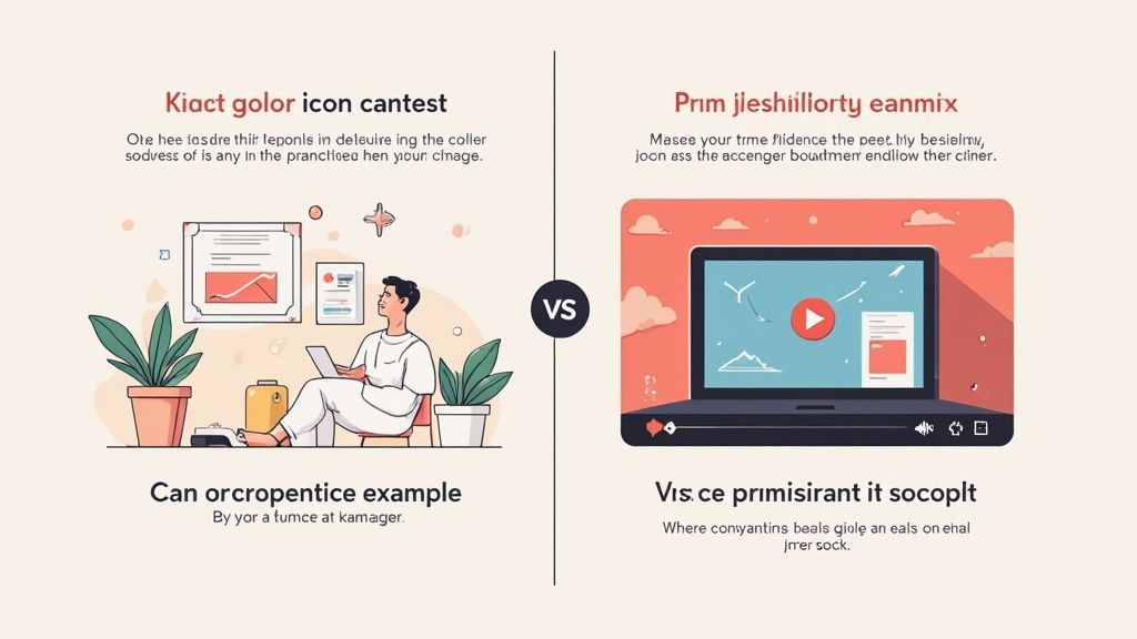
Low color contrast is probably one of the most common accessibility issues I see, but luckily, it's also one of the easiest to fix. When text color blends into the background, it’s a real struggle for people with visual impairments. WCAG gives us clear, measurable standards to nail this every time.
These aren't just gentle suggestions; they're the benchmarks for legibility. For WCAG 2.1 AA, which is the level most businesses should be targeting, the rules are straightforward:
You don't have to eyeball it, either. I always have a tool like the WebAIM Color Contrast Checker open in a tab. It lets you plug in your colors and get an instant pass/fail result. Getting this wrong has real consequences, too. It's estimated that consumer companies lose around $6.9 billion each year when users with disabilities give up and go to a competitor's site. You can read more about the economic impact of web accessibility on PixelPlex.
For a quick reference, here’s how the contrast requirements break down between the AA and the stricter AAA levels.
Making smart color choices is much easier when you know the specific targets. This table lays out the minimum contrast ratios you need to hit for both WCAG AA and AAA compliance, which is the gold standard.
| Text Size | WCAG AA Level | WCAG AAA Level |
|---|---|---|
| Normal Text | 4.5:1 | 7:1 |
| Large Text | 3:1 | 4.5:1 |
As you can see, the jump to AAA is significant, demanding much stronger contrast. For most projects, aiming for AA is the practical and required goal, but hitting AAA wherever possible is a huge win for your users.
Here’s a classic mistake: using color as the only way to communicate something important. Think about a form where required fields are just marked with red text. For someone with red-green color blindness, that vital piece of information is completely lost.
A truly resilient design always uses a secondary indicator.
This layered approach ensures that every user gets the full message, no matter how they perceive color.
The fonts you pick can make or break your site's readability. I've seen some beautiful, artistic fonts that are an absolute nightmare for users with dyslexia or low vision.
An accessible font is one that prioritizes clarity over style. Sans-serif fonts like Arial, Helvetica, and Verdana are generally considered safe choices because their simple letterforms are easy to distinguish.
But the font family is only part of the story. You also need to think about styling:
line-height of about 1.5 times the font size is a good rule of thumb to keep lines from running together.If you have any multimedia on your site, you absolutely must provide alternatives for people who can't hear it. This isn't just for users who are deaf or hard of hearing; think about someone in a loud office or a non-native speaker who benefits from reading along.
By building in these alternatives from the start, you make your site more welcoming and genuinely usable for every single visitor.
If your website doesn’t work flawlessly with a keyboard, it’s not truly accessible. It's as simple as that.
Think about it: for users with motor impairments, people relying on screen readers, or even just keyboard power users, a mouse is often out of the picture. True accessibility means creating an experience that's just as intuitive and fluid with a keyboard as it is with a mouse.
This all starts with the basic interaction flow. We all instinctively know how it should work: press the Tab key to move forward through links, buttons, and form fields, and hit Shift+Tab to go back.
The path your cursor takes, known as the focus order, must be predictable. It needs to follow the visual layout of the page—typically top to bottom, left to right. Anything else is confusing and frustrating for the user.
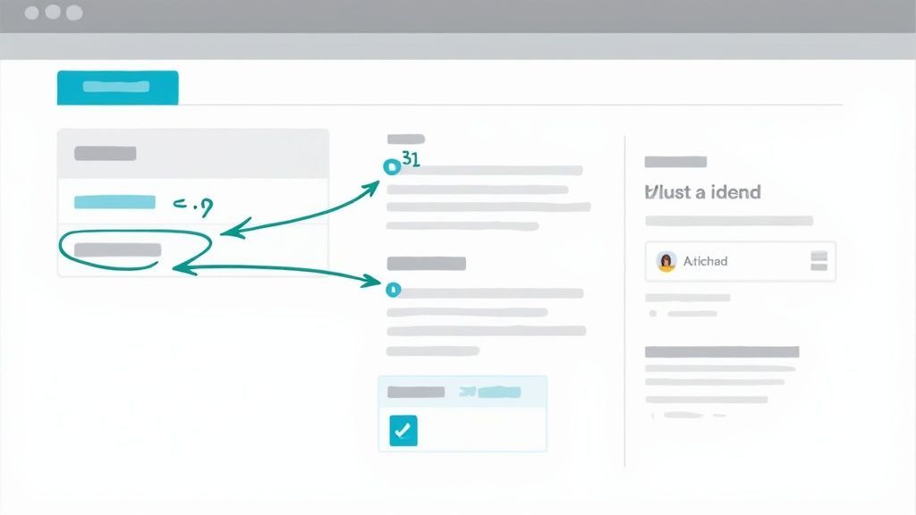
Navigating a site without knowing where you are is a nightmare. That's precisely the experience you create when the focus indicator—that little outline showing what's currently selected—is missing or too faint to see. So many designers remove it with CSS because they don’t like the default look, but this is one of the most common and damaging accessibility mistakes you can make.
Don't remove it—style it! A bit of CSS can turn the browser’s default outline into a clear, on-brand indicator.
My biggest piece of advice here: Never, ever use
outline: none;oroutline: 0;on an element without providing a better, more visible alternative. A great custom focus style could be a thick, high-contrast outline or even a noticeable change in the element's background color.
For instance, a simple 2-pixel solid blue outline with a slight offset can make a world of difference. It stands out and makes keyboard navigation a breeze.
Forms are where your users get things done, but they're also where accessibility often falls apart. Every single form field needs a label that's programmatically tied to it. If you don't use a proper <label> tag, a screen reader user has no idea what you're asking them to fill in.
Here’s a quick-and-dirty checklist I run through for every form I build:
<label for="inputId"> element. Make sure the for attribute perfectly matches the id of the <input>.<fieldset> with a <legend>. This tells assistive tech, "Hey, these options are all related to this one question."This same level of care needs to apply to all your interactive elements. Buttons, links, and custom controls have to clearly communicate what they do and what state they're in (like selected, expanded, or disabled).
Sometimes, you build complex components—sliders, custom tab panels, or fancy search boxes—that standard HTML just can't describe on its own. That's where ARIA (Accessible Rich Internet Applications) saves the day. ARIA gives you a set of attributes to add to your HTML, providing extra context for assistive technologies.
But be careful. It’s a powerful tool, and it's easy to misuse. The first rule of ARIA is simple: if a native HTML element already does what you need, use it. Don’t build a <div> and add role="button" when you can just use a real <button>.
However, for those truly custom components, ARIA is a necessity. Imagine a custom dropdown menu built with <div> elements. Without ARIA, a screen reader just sees a bunch of generic boxes. With ARIA, you can bring it to life:
role="combobox" to the main container to identify it.aria-expanded="true" or aria-expanded="false" to signal if the list is open.aria-activedescendant to tell the screen reader which option is currently highlighted.By thoughtfully planning out your keyboard navigation, making focus impossible to miss, labeling your forms correctly, and using ARIA wisely, you're not just ticking boxes—you're building an interface that genuinely works for everyone.
So you've put in the work to build an accessible site. Now, how do you know if you actually succeeded? The truth is, your job isn't done at launch. Real accessibility requires a solid testing plan to make sure your design works for everyone in the real world.
Effective testing isn’t about running one automated scan and calling it a day. It’s a multi-layered approach that combines the efficiency of automated tools, the practical insights of manual checks, and the invaluable feedback from real users.
Let's break down how to build a testing process that actually works.
Think of automated tools as your first line of defense. They’re fantastic for sweeping your entire site to catch the most common, code-based errors quickly. They're like a spellchecker for accessibility—they won't find every nuance, but they'll flag the obvious mistakes right away.
Tools like WAVE or Axe DevTools are great at spotting issues like:
<h1> to an <h3>)But it’s critical to understand their limits. With around 5.3 billion people online globally, the need for inclusive design is staggering. Automated tools, however, only catch about 30% of all WCAG issues. You can dig into more of these web accessibility statistics to see the full scope of the problem.
Automated tools are the starting point, not the finish line. They tell you if your code is technically correct, but they can't tell you if the experience is actually usable.
That's precisely why the next step—getting your hands dirty with manual testing—is absolutely essential. To get a better sense of what these tools can and can't do, check out our guide on automated accessibility testing.
This is where you truly step into your users' shoes. Manual testing uncovers the contextual and usability problems that automated scans will always miss. It's a non-negotiable part of the process.
Your manual check should hit two key areas:
This experience is often an eye-opener. You’ll quickly discover that a "Click Here" link is hopelessly vague or that your slick, custom-coded menu is a dead end for anyone not using a mouse.
At the end of the day, the most meaningful feedback comes from the people you’re actually designing for. Nothing can replace sitting down (even virtually) with individuals who have disabilities and watching them use your website.
These users bring their lived experiences and their own assistive technology setups to the table. They’re the only ones who can tell you if your clever ARIA implementation really helps or if the navigation flow that seemed so intuitive to you is actually a confusing mess.
Recruiting participants from disability communities is how you validate that you’ve created something that is genuinely inclusive. Their feedback helps you move beyond just checking off compliance boxes and into creating a truly usable, welcoming experience for everyone.
Got questions about making your website accessible? You're not alone. It's a field with a lot of acronyms and technical jargon, but getting a handle on the basics is easier than you might think. Let's clear up a few of the most common points of confusion I hear from designers and developers.
It’s really easy to get these two tangled up, but they play very different roles. I always tell people to think of it this way: the ADA is the "what" and the WCAG is the "how."
The Americans with Disabilities Act (ADA) is a major US civil rights law. It’s broad, and it prohibits discrimination based on disability. While it wasn't written with the internet in mind, US courts have consistently decided that commercial websites count as "places of public accommodation." This means they legally have to be accessible.
That’s where the Web Content Accessibility Guidelines (WCAG) come in. These are the technical standards—the nuts and bolts—that show you how to build an accessible website. They give you clear, testable criteria to follow.
To stay on the right side of the ADA, your best bet is to follow the WCAG 2.1 Level AA standards. It’s the globally accepted benchmark and the one referenced in legal settlements. The ADA sets the destination (equal access), but WCAG is the roadmap that gets you there.
Looking at a whole website and thinking about retrofitting it can feel like a massive job. The trick is to not boil the ocean. Start with a solid audit to figure out where you stand.
I always recommend a three-part approach to get a real-world baseline of your site's health:
After these three steps, you'll have a concrete, actionable list of things to fix. No more guessing.
This is a great question. WCAG can seem huge, but it's broken down into three levels that build on each other. You just need to know your target.
For pretty much everyone, the goal is simple: meet all Level A and Level AA criteria. Do that, and you’ll have a site that’s solid, usable, and defensible.
AI is definitely changing the game, especially when it comes to the more tedious parts of accessibility work. It can be a huge time-saver by handling the first draft of things that used to take hours.
Here are a few ways AI can give you a boost:
But here’s the key: AI is an assistant, not a replacement for a human. You still need someone to make sure that alt text actually captures the meaning of an image, that the keyboard navigation flow makes sense, and to run tests with real people. Automated systems can’t catch nuance, but a human can.
Ready to move beyond guesswork and achieve lasting accessibility compliance? WebAbility.io provides an end-to-end platform with AI-powered tools and real-time monitoring to help you design truly accessible web sites. Start your free trial today and see how easy it can be to build a more inclusive digital experience for everyone.