8 Colors to Avoid for Color Blindness in Web Design (2026)

Sidharth Nayyar
Color is a powerful tool in design, shaping user experience, conveying information, and evoking emotion. Yet, for the approximately 1 in 12 men and 1 in 200 women with some form of color vision deficiency, certain color choices can render digital content confusing or completely inaccessible. Designing with color accessibility isn't merely about ticking a compliance box; it's about creating a more inclusive, effective, and user-friendly product for a significant portion of your audience. To truly design for everyone, it's essential to understand human-centered design principles that place the user's needs at the forefront of every decision.
Check your own colors. Run our free color contrast checker to test any pairing against WCAG, then scan your whole site free for contrast and the other most common issues.
TL;DR: Problematic Color Pairings & Better Alternatives
For a quick overview, here are the key color combinations we'll explore and what to use instead:
Avoid: Red & Green. Instead: Use high-contrast pairs like blue and orange, and supplement with icons.
Avoid: Light Red & Light Green. Instead: Differentiate with textures, patterns, or bold/regular text weights.
Avoid: Brown & Red. Instead: Pair brown with a bright, contrasting color like teal or vibrant blue.
Avoid: Blue & Purple. Instead: Use distinct shades, like a dark navy and a light lavender, to maximize brightness contrast.
Avoid: Similar Shades of Gray. Instead: Ensure a sufficient contrast ratio (WCAG 4.5:1) between grays.
Avoid: Orange & Red. Instead: Use icons or explicit text labels (e.g., "Warning," "Critical") to supplement color.
Avoid: Pink & Gray. Instead: Opt for high-contrast alternatives like pink and dark navy blue.
Avoid: Yellow & Light Yellow. Instead: Pair yellow with a dark, contrasting color like black or deep purple.
This article provides a practical guide to the specific colors to avoid for color blindness, offering actionable alternatives and design strategies. We will move beyond theory and into direct application, showing you how to make informed choices that enhance usability without sacrificing aesthetic appeal. By proactively selecting accessible palettes, you ensure your message is clear, your calls to action are visible, and your user interface is navigable for all.
1. Red and Green Pairing
TL;DR: The combination of red and green is the most common and problematic pairing for color-blind individuals. These colors often appear as indistinguishable shades of brown or gray to those with Deuteranopia or Protanopia, which is the most prevalent form of color vision deficiency. Avoid relying on this pairing alone to convey critical information.
Why It's a Problem
Red-green color blindness is the most common color vision deficiency, affecting a significant portion of the population. When red and green are placed next to each other, especially with similar saturation and brightness, they lack sufficient contrast for these users. This makes it impossible to differentiate between them, leading to confusion and misinterpretation.
This issue is particularly dangerous in contexts where color is the sole indicator of status or meaning. For example, using red for "stop" or "error" and green for "go" or "success" without any supporting icon or text can render an interface unusable for many. Financial dashboards showing gains in green and losses in red become a muddle of similar-looking colors, defeating their purpose.
Actionable Tips for Better Design
To create more inclusive designs and avoid the pitfalls of this classic combination, you need to supplement or replace this pairing. Here are specific strategies to implement:
Introduce an Alternative Palette: Instead of red and green, use combinations with higher inherent contrast, such as blue and orange or blue and yellow. These pairs are much less likely to be confused across different types of color blindness.
Use Icons and Text Labels: Never rely on color alone. Pair a red status indicator with a cross (X) icon and a green one with a checkmark (✓). Directly labeling chart elements with "Gain" or "Loss" removes any ambiguity.
Incorporate Patterns and Textures: When designing charts or graphs, use distinct patterns to differentiate data sets. For example, a red bar could be solid, while a green bar could have diagonal stripes. This ensures the information is still clear even if the colors look the same. You can learn more about how colorblind people see to better understand these challenges.
2. Light Red and Light Green Pairing
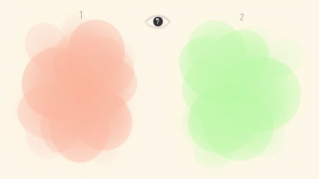
TL;DR: Desaturated or pastel versions of red and green are even more challenging for color-blind users than their vibrant counterparts. The low saturation and similar lightness levels reduce contrast to almost zero, making these colors appear as nearly identical shades of pale gray or off-white for those with red-green color vision deficiency.
The trend towards soft, pastel-themed user interfaces in modern design has inadvertently created new accessibility hurdles. While aesthetically pleasing, light red and light green pairings are among the worst colors to avoid for color blindness. The reduced color information, combined with similar brightness levels, makes it exceptionally difficult for individuals with Deuteranopia and Protanopia to distinguish between the two. This issue is often seen in wellness apps, modern SaaS dashboards, and project management tools that use soft palettes for status indicators.
Why It's a Problem
When you desaturate red and green, you remove much of the color information that a person with normal vision uses to tell them apart. For someone with a color vision deficiency, this lack of saturation compounds the problem, as they are already struggling to perceive the difference in hue. The result is two colors that blend into one another, rendering any information conveyed solely by this pairing completely illegible.
Consider a dashboard where light green signifies an "On Track" project and light red signifies "At Risk." To a color-blind user, both statuses might look like the same pale, indistinct color. This ambiguity can lead to critical information being missed, causing confusion and potential errors in professional settings. The subtle nature of these palettes makes the problem even more insidious than with bold reds and greens, as the design may appear accessible at a glance.
Actionable Tips for Better Design
To maintain a soft aesthetic without sacrificing accessibility, you must prioritize contrast and supplement color with other visual cues. Here’s how to design more effectively:
Increase Saturation and Brightness Contrast: If you must use a red/green palette, significantly increase the difference in their brightness and saturation. For instance, pair a darker, more saturated green with a much lighter red, but always test this with simulation tools.
Use Accessible Pastel Alternatives: Instead of light red and green, opt for pastel pairs that have better inherent contrast. A combination like light blue and a warm orange or pale yellow and lavender provides a soft look while being much easier to differentiate.
Emphasize Non-Color Indicators: As with any color-coding, reinforce the meaning with icons, text labels, or even font weight changes. A light green "Success" message could be paired with a checkmark icon and bold text, while a light red "Error" message uses an X icon and regular text.
Test with Simulation Tools: Before finalizing your color palette, use color blindness simulators available in design software like Figma or standalone web tools. This allows you to see your design through the eyes of users with different types of color vision deficiency and catch problems early.
3. Brown and Red Pairing
TL;DR: The combination of brown and red is a significant accessibility challenge, especially for individuals with Protanopia (red-blindness). Because brown is fundamentally a dark orange-red, these two colors can appear nearly identical, creating a low-contrast pair that is difficult or impossible to distinguish.
Why It's a Problem
For individuals with Protanopia, the red-sensing cones in their eyes do not detect red light properly. This makes reds appear much darker and less vibrant, often shifting them toward a dull brown or gray. When a true brown is placed next to red, the lack of red perception makes both colors appear as very similar, muted shades. This is a common issue in designs aiming for an earthy, natural, or rustic aesthetic, where this pairing is frequently used.
This combination can cause significant confusion in various contexts. In scientific visualizations, like soil composition charts or geological maps, it can render the data unreadable. Branding for natural products, such as those in the leather or organic food industries, may fail to communicate distinct product variations. The similar undertones in both colors create an accessibility barrier, making it one of the key colors to avoid for color blindness when used without supporting elements.
Actionable Tips for Better Design
To ensure your design is accessible while maintaining its intended aesthetic, you must provide alternative ways to distinguish between these two colors. Here are some effective strategies:
Choose a High-Contrast Alternative: Instead of pairing brown with red, opt for colors that have a clear difference in hue. Combinations like brown and teal or brown and a vibrant blue provide strong visual contrast that remains effective across most forms of color vision deficiency.
Vary Brightness and Saturation: If you must use a red-brown palette, create a stark difference in their light values. Pair a very dark, rich brown with a bright, highly saturated red. This contrast in luminance can help make the elements distinguishable even if the hues are perceived similarly.
Add Distinctive Patterns or Icons: Never let color be the only method of conveying information. For example, in a chart, use a solid fill for brown elements and a striped or dotted pattern for red ones. Adding icons or clear text labels alongside the colors removes any ambiguity.
4. Blue and Purple Pairing
TL;DR: The combination of blue and purple is challenging for individuals with blue-yellow color blindness (Tritanopia). Because these colors are close on the color spectrum and share similar wavelengths, they can appear almost identical, especially when their brightness and saturation levels are not distinctly different.
Why It's a Problem
While less common than red-green color blindness, Tritanopia makes it difficult to distinguish between shades of blue and purple. To these individuals, purple may appear as a dark, muted shade of blue or even gray. This pairing is one of the more subtle colors to avoid for color blindness because designers often assume its inherent contrast is sufficient.
This lack of distinction becomes a significant barrier in contexts where subtle color variations convey important data. For instance, in complex data visualizations like weather maps or medical imaging, where gradients from blue to purple might indicate intensity or different conditions, the entire meaning can be lost. Similarly, application interfaces using a "night mode" theme with blue and purple elements may lack the necessary clarity for navigation and user interaction.
Actionable Tips for Better Design
To ensure your designs are accessible to users with Tritanopia, you must create a stronger visual separation between blue and purple or choose alternative pairings. Here are some effective strategies:
Vary Brightness and Saturation: The most straightforward fix is to dramatically increase the contrast between the two colors. Pair a very light, bright blue with a deep, dark purple. Avoid using two pastel or two dark shades next to each other.
Introduce an Alternative Palette: A more reliable solution is to avoid pairing blue and purple altogether for critical information. Instead, pair blue with a warm, contrasting color like orange or a bright yellow. This creates a high-contrast combination that is easily distinguishable across all forms of color blindness.
Add Patterns or Outlines: When using blue and purple in charts or graphs is unavoidable, use secondary cues. For example, make the blue data series a solid color and the purple one a striped pattern. Adding a distinct, high-contrast outline (like white or black) around each shape can also help separate them visually.
5. Gray and Gray (Similar Shades) Pairing
TL;DR: Using multiple similar shades of gray without sufficient brightness contrast is a major accessibility issue. This pairing fails to provide visual distinction not only for those with total color blindness (Achromatopsia) but also for users with low vision and even those with typical vision in poor lighting conditions.
Why It's a Problem
While not a traditional "color" pairing, relying on adjacent shades of gray is a common design flaw. For individuals with Achromatopsia, who see the world in shades of gray, these elements blend together entirely. However, the problem extends far beyond this rare condition. Low-contrast grays make interfaces difficult to navigate for anyone with visual impairments and create a frustrating user experience for all.
This issue is prevalent in modern minimalist designs, where subtle gray text on a slightly different gray background is used for secondary information. It also plagues data visualizations, where grayscale charts without clear distinctions become unreadable blobs of similar tones. Important UI elements like disabled buttons, placeholders, or subtle borders can become completely invisible, rendering parts of an application unusable.
Actionable Tips for Better Design
To ensure your designs are legible and functional, you must prioritize luminance contrast over subtle tonal shifts. Here are specific strategies to avoid the pitfalls of low-contrast grays:
Prioritize Luminance Contrast: Instead of using two very similar grays, ensure there is a significant difference in their brightness. As a rule, aim for at least three distinct luminance levels (e.g., a light gray, a mid-gray, and a dark gray) to create a clear visual hierarchy.
Enforce Contrast Ratios: All text and meaningful UI components must meet WCAG's minimum contrast ratio of 4.5:1 against their background. This is a non-negotiable standard for legibility. You can learn more about color contrast for accessibility to master these requirements.
Combine Grayscale with Patterns or Icons: When color is not an option, use patterns, textures, or icons to differentiate elements. In a bar chart, for instance, one gray bar can be solid, another can have stripes, and a third can use dots. This adds a layer of visual information independent of tone.
Use Color to Add Distinction: When appropriate, introduce a high-contrast accent color to grayscale palettes. A single, well-chosen color can effectively draw attention to key actions or information without overwhelming the design.
6. Orange and Red Pairing
TL;DR: The combination of orange and red is highly problematic for individuals with Protanopia and Deuteranopia. Because orange contains red light wavelengths, both colors can appear as very similar, muted shades of yellow or brown, making it nearly impossible to distinguish between them. This is especially risky in safety and alert systems where clear differentiation is critical.
Why It's a Problem
For individuals with red-green color vision deficiencies, the distinction between red and orange is minimal. Orange is perceived primarily through its yellow and red components. When the ability to see red is diminished (Protanopia), orange and red both look like shades of yellow or dull brown. This lack of contrast renders the pairing ineffective for conveying separate meanings, which is a major accessibility issue.
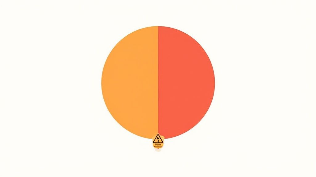
This specific combination is often used in systems designed to communicate escalating levels of urgency, such as weather alerts going from orange (watch) to red (warning), or industrial machinery status indicators. When the colors are indistinguishable, the user cannot perceive the change in status, potentially leading to dangerous situations. Safety signage and emergency user interfaces that rely on this pairing fail to communicate their intended message to a significant portion of users.
Actionable Tips for Better Design
To ensure your alerts and status indicators are universally understood, you must create contrast that does not depend on the red-orange distinction. Here are some effective strategies:
Choose High-Contrast Alternatives: Instead of grouping similar warm colors, pair orange or red with a color from the opposite side of the spectrum. Blue or teal provides excellent contrast against both red and orange, making the distinction clear for most forms of color blindness.
Add Distinctive Symbols or Icons: Never let color be the only method of communication. For a tiered alert system, use icons that clearly represent the level of urgency. For instance, pair an orange alert with an exclamation point in a triangle (⚠️) and a red alert with a stop sign icon (🛑).
Incorporate Explicit Text Labels: The most direct way to remove ambiguity is to use clear text. Labeling alerts with "Warning," "Danger," or "Critical" ensures the message is understood regardless of a user's color perception.
Test with Simulation Tools: Before finalizing a design, run it through a color blindness simulator. These tools can provide an accurate preview of how your interface will appear to users with different types of color vision deficiencies, allowing you to identify and fix problematic colors to avoid for color blindness.
7. Pink and Gray Pairing
TL;DR: The combination of pink and gray is surprisingly difficult for individuals with red-deficient color blindness (Protanopia). The desaturated red component in pink makes it appear almost identical to a neutral gray, especially when both colors share similar lightness, creating a low-contrast and inaccessible pairing.
Why It's a Problem
For individuals with Protanopia, red hues are perceived as dimmer and less vibrant. Since pink is essentially a light or desaturated red, its red component becomes muted, causing it to blend seamlessly with a similarly light gray. This lack of differentiation turns interfaces that rely on this trendy, modern aesthetic into a frustrating and confusing experience.
This issue is frequently seen in designs targeting wellness, fintech, and women's health. For instance, a mental health app might use a soft pink to highlight an active feature against a gray background, rendering the distinction invisible to some users. Similarly, breast cancer awareness materials that pair pink ribbons with gray text or backgrounds can fail to convey their message effectively, a critical flaw when clear communication is paramount. This pairing is one of the more subtle yet important colors to avoid for color blindness.
Actionable Tips for Better Design
To ensure your designs are inclusive and legible, avoid relying on the pink and gray combination alone to communicate information. Implement these strategies for a more robust and accessible user experience:
Choose a Higher-Contrast Alternative: Replace the gray with a color that provides strong luminance and hue contrast against pink. Options like dark navy blue, deep teal, or even a rich purple create a much more discernible and visually appealing pairing for all users.
Ensure Sufficient Contrast Ratios: If you must use a pink and gray palette, rigorously test the combination to ensure it meets WCAG's minimum contrast ratio of 4.5:1 for normal text. This often requires using a much darker gray or a much brighter, more saturated pink than is typical for this aesthetic.
Differentiate with Icons and Textures: Never let color be the only visual cue. Supplement pink highlights on gray backgrounds with bold text, underlines, or distinct icons. For data visualizations, applying a subtle pattern to one of the colored areas ensures the data remains understandable even if the colors appear the same.
Leverage Simulation Tools: Before finalizing your design, use color blindness simulation tools to view your interface through the eyes of users with Protanopia. This simple step can immediately reveal problematic pairings and allow you to make necessary adjustments.
8. Yellow and Light Yellow Pairing
TL;DR: Combining yellow with a slightly lighter shade of yellow creates a low-contrast pair that is difficult to distinguish. This is particularly problematic for users with low vision but also affects general usability, as the colors can appear almost identical, especially when used in data visualizations or on digital screens.
Why It's a Problem
While yellow is often a safe choice for color-blind users since it's rarely confused with other hues, pairing it with another shade of yellow introduces a different accessibility challenge: luminance contrast. When two colors have very similar brightness levels, they blend together and lack the clear separation needed to convey distinct information. This issue affects nearly everyone but is significantly worse for individuals with low vision.
This pairing is frequently found in designs that need subtle differentiation, such as temperature gradient heatmaps, layered dashboard widgets, or highlights on a light background. For example, using a light yellow to highlight a section within a larger yellow area on a financial dashboard can make the highlighted data completely invisible. The lack of contrast renders the distinction meaningless, causing users to miss critical information or misinterpret data.
Actionable Tips for Better Design
To ensure your use of yellow is both accessible and effective, focus on maximizing contrast and supplementing color with other visual cues. Here are a few strategies to implement:
Maximize Brightness Differential: If you must use two yellows, ensure their brightness values are far apart. Better yet, pair a vibrant yellow with a much darker color like navy blue, dark gray, or black to achieve strong, reliable contrast.
Use Patterns or Borders: In charts and graphs, don't rely on shades of yellow alone. Differentiate a light yellow area from a standard yellow one by adding a distinct pattern (e.g., dots or lines) or a dark, thick border to one of them.
Add Text or Numerical Labels: For data visualizations, directly label the different yellow sections with their corresponding values or text descriptions. This removes all ambiguity and ensures the information is accessible regardless of color perception. You can learn more about mastering ADA-compliant colors for web design to build more robust palettes.
Reserve Light Yellow for Backgrounds: Use light, desaturated yellows exclusively for background fills where they don't need to be distinguished from other foreground elements.
8 Color Pairings to Avoid for Color Blindness
| Color pairing | Primary affected condition | Accessibility impact | Implementation complexity (to remediate) | Resource requirements | Ideal use cases |
|---|---|---|---|---|---|
| Red and Green Pairing | Deuteranopia, Protanopia | Critical — often indistinguishable; unsafe for critical info | Moderate (recolor palette, add labels/patterns) | Low–Moderate (design changes + testing) | Avoid for status/alerts; decorative only with redundant cues |
| Light Red and Light Green Pairing | Deuteranopia, Protanopia | Severe — very low distinguishability due to desaturation | Moderate (increase saturation/contrast or swap colors, add textures) | Low–Moderate (palette updates, verification) | Avoid in UIs; acceptable as non-informative background only |
| Brown and Red Pairing | Protanopia (red-blind) | Significant — colors appear similar, problematic for maps/data | Low (use alternative pairings, add icons/patterns) | Low (simple palette/graphic changes) | Avoid for data/legends; ok in imagery where contrast not required |
| Blue and Purple Pairing | Tritanopia (rare) | Moderate — can be indistinguishable in low-saturation uses | Low (boost contrast, saturation, or add textures) | Low (design tweaks + testing) | Non-critical theming or visuals with clear contrast/patterns |
| Gray and Gray (Similar Shades) Pairing | Achromatopsia, low-vision users | Critical — fails WCAG, removes visual hierarchy | Moderate (add color, increase luminance steps, use patterns) | Moderate (redesign UI elements and validate contrast) | Avoid for conveying meaning; ok for subtle backgrounds with strong contrast elsewhere |
| Orange and Red Pairing | Protanopia, Deuteranopia | High — dangerous for alerts/warnings where distinction matters | Moderate–High (rework alerts, add symbols/contrasts) | Moderate (safety-focused redesign and testing) | Avoid in emergency or alert contexts; use distinct hues or symbols |
| Pink and Gray Pairing | Protanopia | High — desaturated pink can match gray, problematic in healthcare | Low (swap gray for darker hue, add icons/text) | Low (color swap + contrast checks) | Avoid for health/status indicators; decorative uses only with redundancy |
| Yellow and Light Yellow Pairing | Low-vision users, general contrast issues | Moderate — insufficient luminance contrast for text/graphics | Low (pair with dark colors, increase brightness differential) | Low (color adjustments, pattern/label additions) | Use as background only; not for indicators or text without dark contrast |
From Awareness to Action: Building a More Colorful (and Accessible) Web
Navigating the landscape of digital accessibility can feel complex, but as we've explored, creating a visually inclusive experience often comes down to intentional choices. Moving beyond a simple list of colors to avoid for color blindness, we've seen that the core principle is not about restriction but about enhancement. It's about ensuring that color is never the only method of conveying critical information.
The problematic pairings we've detailed, from the classic red and green to the more subtle blue and purple, all share a common thread: low luminance contrast and reliance on hue alone for differentiation. The true takeaway is that context is everything. A color combination that fails in one scenario might be acceptable in another, provided it's supported by other visual cues.
Key Principles for Accessible Color Design
Instead of memorizing every possible bad combination, focus on integrating these foundational strategies into your design workflow:
Prioritize High Contrast: This is non-negotiable. Always use a contrast checker to ensure your text and graphical elements meet or exceed WCAG AA standards. This single practice resolves many of the issues associated with color vision deficiency.
Embrace Redundancy: Don't let color do the heavy lifting alone. Supplement it with clear labels, icons, patterns, textures, and even changes in font weight. For example, an error message should use a bold "Error:" prefix, not just a red font.
Test and Validate: Use color blindness simulators and accessibility scanning tools to see your designs through the eyes of different users. This proactive testing catches issues before they impact real people.
Think Beyond a Single Solution: While designers and developers build accessible interfaces, it's also inspiring to see how technology offers new ways for individuals to perceive the world. Innovations like EnChroma Lens Technology provide a fascinating look at how specialized eyewear can help some people with color blindness experience a broader and more vibrant spectrum of colors.
Implementing Accessibility at Scale
For digital agencies, enterprise teams, and public sector organizations, applying these principles consistently across countless web pages and applications is the primary challenge. Manually checking every element is not scalable. This is where a comprehensive accessibility platform becomes an indispensable partner, transforming awareness into sustainable action.
A robust solution should empower your team to not only identify problematic color combinations but also to implement and monitor fixes efficiently. Accessibility solutions can offer on-the-fly adjustments, such as high-contrast modes, allowing users to customize their experience instantly. Simultaneously, a centralized dashboard that scans, reports, and tracks accessibility issues ensures your team maintains compliance and continuously improves the user experience for everyone. By adopting these powerful tools, you shift from a reactive, problem-fixing mindset to a proactive, inclusive-design culture, building a web that is truly accessible by design.
Ready to move from theory to implementation? WebAbility.io provides an all-in-one platform to automate and manage web accessibility, ensuring your digital assets are inclusive for users with color blindness and other disabilities. Discover how our AI-powered widget and comprehensive scanning tools can help you achieve and maintain WCAG compliance at scale by visiting WebAbility.io.
Quick Questions
Tap to ask AI about this article