how to make a website accessible: A Practical Guide

Sidharth Nayyar
TL;DR: To make a website accessible, focus on these key actions: use proper heading structures (H1, H2, H3), write descriptive alt text for images, ensure high color contrast, make sure the site is fully navigable with a keyboard, and provide captions for videos. Start with automated scanning tools to find initial issues, but follow up with manual testing to understand the real user experience.
When we talk about making a website accessible, we’re really talking about making sure everyone can use it. That includes people with disabilities who might rely on assistive technologies like screen readers or navigate exclusively with a keyboard.
Getting this right isn't just a technical exercise. A genuinely accessible website opens your digital doors to a much wider audience, builds serious brand trust, and can even give your SEO a nice little bump.
Your Quick Guide to Website Accessibility
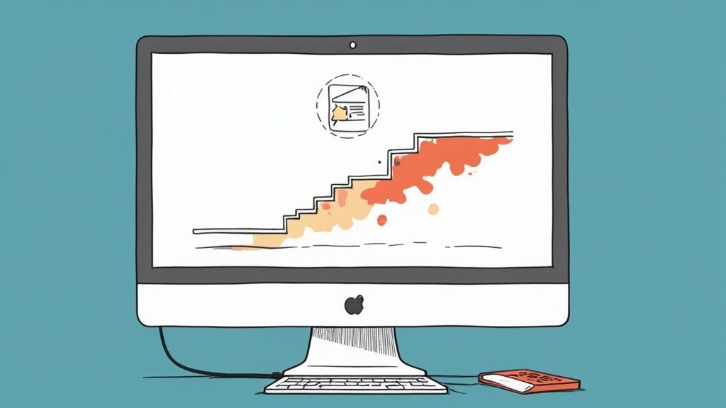
At its core, web accessibility is built on four key principles: making sure content is Perceivable, Operable, Understandable, and Robust (POUR). I like to think of it like building digital curb cuts and ramps instead of just stairs. Sure, they’re essential for some, but they end up creating a better, smoother experience for everyone.
If you're just getting started and want to get a solid grasp of the big picture, this guide on What Is Web Accessibility is a fantastic resource. It really lays out the fundamentals well.
From there, it's about putting those principles into action. It's not one single fix, but a collection of thoughtful improvements that together create an inclusive website.
Key Starting Points for Accessibility
So, where do you begin? It's easy to feel overwhelmed, but a few key adjustments can make a massive difference right away. We've gone into more detail on the basics in our article on https://www.webability.io/blog/what-is-accessibility-on-a-website, but here are the non-negotiables I always recommend starting with:
Add descriptive alt text to every meaningful image. If an image conveys information, that information needs to be available to screen reader users.
Check your color contrast. Is text easy to read against its background? If not, you're losing readers with low vision.
Structure your content with proper headings (H1, H2, H3). This creates a logical outline, which is critical for users navigating with assistive tech.
Try navigating your site with just the Tab key. Can you access every link, button, and form field without ever touching a mouse? This is a must.
Tackling these areas first will put you on a solid path toward building a website that truly works for everyone.
Why Website Accessibility Is a Business Imperative
Years ago, making a website accessible might have been seen as a "nice-to-have." Today, it's a fundamental part of running a smart business. When a website isn't built for everyone, it throws up a digital wall, blocking people from getting the information, services, or products they need. It's more than a simple inconvenience—it's a dead end for a huge slice of the population.
This isn't just about doing the right thing, either. The legal risks are real and growing. In just one recent year, businesses faced over 3,200 federal lawsuits under the Americans with Disabilities Act (ADA) for website inaccessibility. Another year saw ADA complaints hit nearly 8,800, a 7% jump from the year before. You can dig into more of these website accessibility statistics to see the trend for yourself.
Tapping Into a Massive, Overlooked Market
Setting the legal side of things aside, there’s a powerful business case for accessibility. Globally, people with disabilities—along with their friends and family—control an estimated $13 trillion in annual disposable income. That's a massive, often ignored, group of consumers.
If your site is a pain to use, you're essentially telling that entire market segment to take their business elsewhere. Building an accessible experience isn't just a box-ticking exercise; it’s a direct line to a loyal customer base actively searching for brands that actually meet their needs.
Think of it this way: prioritizing accessibility isn't just about dodging lawsuits. It’s about unlocking new growth, building a more resilient brand, and connecting with more customers. It’s a strategic move that pays off in brand loyalty and market share.
Building and Protecting Your Brand's Reputation
In a world where reputation is everything, how you treat your customers matters. A real commitment to accessibility sends a clear message: your company values everyone. It’s a tangible demonstration of corporate social responsibility that builds a positive image with all your customers, not just those with disabilities.
On the flip side, news of an accessibility lawsuit or public complaints from frustrated users can do serious damage. It can paint your brand as thoughtless or even discriminatory, which is tough to shake. A proactive approach puts you in control of the story, building a reputation as a forward-thinking, inclusive company.
Unlocking Real Business Gains
The benefits don't stop there. Good accessibility practices often go hand-in-hand with other digital best practices, like search engine optimization (SEO) and a better overall user experience (UX).
Here’s what that looks like in practice:
A Natural SEO Boost: Things like alt text on images, logical heading structures, and video transcripts give search engines more context. This helps them understand your content better and can improve your rankings.
A Better Experience for Everyone: Accessibility principles—like clear navigation, readable color contrast, and consistent layouts—make a website easier and more enjoyable for all visitors. This can directly lead to lower bounce rates and more conversions.
Preparing for the Future: When you build with accessibility in mind, your site becomes more adaptable. It works better across different devices and is ready for emerging tech like voice assistants.
When you see how the ethical, legal, and financial pieces fit together, it’s clear that accessibility is a core business strategy. It’s an investment that strengthens your brand, grows your audience, and helps create a better digital world for everyone.
How to Conduct Your First Accessibility Audit
Before you can fix anything, you have to know what's broken. An accessibility audit is your first, most critical step—it gives you a baseline, turning the vague goal of "making the site accessible" into a concrete to-do list. Think of it as a diagnostic check-up for your website, revealing everything from quick cosmetic fixes to deeper, structural problems.
This isn't just a box-ticking exercise. Most website owners are genuinely surprised by the number of barriers on their own sites. A recent WebAIM Million project, which looked at the homepages of the top million websites, found that a shocking 94.8% had detectable WCAG (Web Content Accessibility Guidelines) failures. That’s not a typo. The average page had about 51 errors. This shows just how widespread these issues really are.
The reasons for tackling this go far beyond just compliance. It hits on ethics, legal risk, and your bottom line.
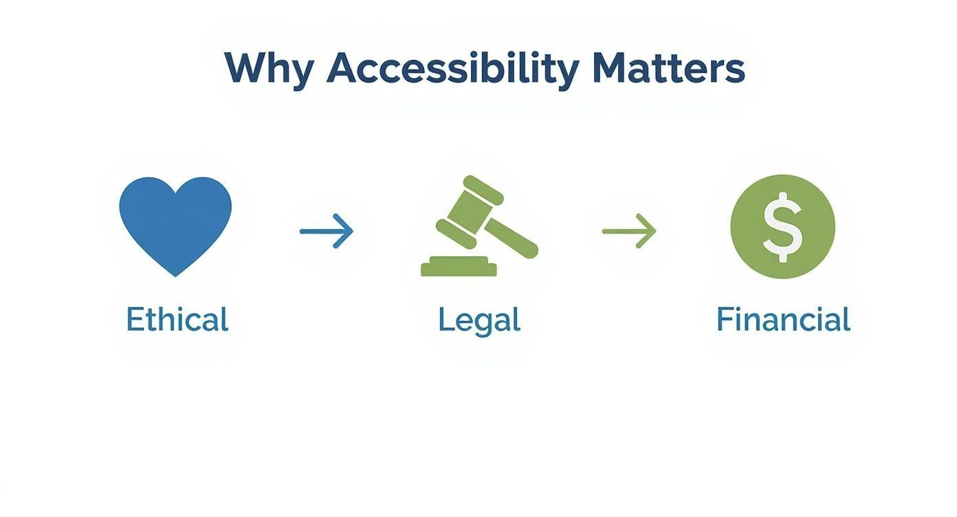
As you can see, accessibility isn't just a technical task; it's a core part of a smart business strategy.
Starting with Automated Scanning Tools
The quickest way to get a bird's-eye view of your site's health is with automated tools. I always think of these as the first line of defense. They can zip through your pages and flag common, code-based problems that are nearly impossible to spot by just looking at the site.
Automated scanners are great at catching things like:
Poor color contrast: Text that’s hard to read against its background.
Missing alternative text: Images without descriptions for screen reader users.
Empty links or buttons: Interactive elements with no clear purpose.
Basic heading structure errors: Spotting when you jump from an H2 to an H4, for example.
Tools like WAVE or the accessibility scanner on WebAbility.io can generate a report in seconds. This initial data gives you a fantastic starting point and helps you spot recurring patterns across your website.
The Necessity of Manual Testing
Here’s the catch: automated tools are great, but they only catch about 30-40% of all potential issues. They can tell you if an image has alt text, but they have no idea if that text is actually helpful or just a jumble of keywords. This is where you have to roll up your sleeves and do some manual testing. It's absolutely non-negotiable.
Manual checks are all about the real-world user experience—something a machine simply can't gauge. To really dig into this, our guide on how to conduct a web accessibility audit offers a much more detailed walkthrough.
A site can pass an automated scan with flying colors and still be completely unusable for someone who relies on a keyboard or a screen reader. True accessibility is about usability, not just code compliance.
Key Manual Checks You Must Perform
To get a true feel for your site's usability, you have to try using it the way others do. Here are the manual tests I always recommend starting with:
Keyboard-Only Navigation: This one is simple but incredibly revealing. Unplug your mouse. Now, try to get around your entire site using only the Tab, Shift+Tab, Enter, and Spacebar keys. Can you get to every link, button, and form field? Crucially, is there a visible focus indicator (like an outline) so you always know where you are on the page?
Screen Reader Walkthrough: Fire up a screen reader like NVDA (it's free for Windows), JAWS, or VoiceOver (built into every Mac and iPhone). Listen to your site. Does the content read out in a logical order? Are the link and button descriptions clear, or are you just hearing "click here" over and over? This test is a huge eye-opener for spotting confusing navigation and poorly structured content.
Form Usability: Go through every single form on your site. Are the fields clearly labeled? When you make a mistake, do the error messages actually tell you what you did wrong, or do they just flash a vague "invalid input" warning? Try to fill out and submit the form using only your keyboard and screen reader.
Turning Your Findings into an Action Plan
Once you've collected all this data from both automated and manual tests, it's time to get organized. A simple spreadsheet is all you need. List each issue, the URL where you found it, and a rating for its severity.
From there, prioritize what to fix. Start with issues that violate WCAG Level A and AA criteria, as these represent the most significant barriers for users. I also recommend tackling sitewide problems first—like fixing the keyboard navigation in your main header—because one fix can improve hundreds of pages at once. This approach turns a daunting list of problems into a clear, strategic roadmap for a much more accessible website.
Building an Accessible User Experience from the Ground Up
The Short Version: Building an accessible website starts with the fundamentals. Always use semantic HTML tags like <nav> and <button> so assistive technologies understand what they’re dealing with. Use ARIA attributes like aria-label only when you need to add clarity to complex interactive elements. Stick to high-contrast color palettes, make sure keyboard navigation flows logically with a visible focus indicator, and write alt text that genuinely describes what’s in your images.
Once you’ve found the accessibility gaps on your site, it’s time to roll up your sleeves and make the design and code changes that create a truly inclusive experience. This isn’t about slapping on a few quick fixes. It’s about weaving accessibility into your workflow from day one. By getting just a few core principles right, you can make a massive difference for people with disabilities who use your site.
And here's the best part: these practices don't just help with compliance—they make the user experience better for everyone. A well-structured, predictable, and clear website is simply a better website. Period.
The Power of Semantic HTML
The bedrock of any accessible website is clean, semantic HTML. Using the right HTML elements for the right job is the single most powerful thing you can do to communicate your site's structure to assistive technologies like screen readers.
Instead of defaulting to generic <div> and <span> tags for everything, pick the element that actually describes its function. This gives you a built-in layer of accessibility without writing a single extra line of code.
<nav>: Wrap your main navigation menu in this tag. It signals to a screen reader, "This is the primary navigation," allowing users to easily find it or skip right past it.<main>: This should contain the core content of your page. It lets assistive tech users jump straight to the good stuff, bypassing headers and sidebars.<button>: Use this for any clickable action, like submitting a form or opening a menu. A<button>is keyboard-focusable and announced as a "button" by default—a<div>with a click listener is just a silent, unusable box to many users.<header>,<footer>,<aside>: These elements create a clear road map of your page, defining key regions that are easy to navigate.
Using semantic HTML is like handing a well-labeled map to assistive tech. It provides the context they need to present your content in a way that makes sense.
Clarifying with ARIA When Necessary
While semantic HTML is your go-to tool, sometimes it’s not enough, especially with custom dropdowns, sliders, or other complex widgets. This is where ARIA (Accessible Rich Internet Applications) steps in. ARIA is a set of attributes you can add to HTML elements to give them superpowers—clarifying their role, state, and properties when HTML alone can't.
Think of ARIA as a helpful signpost. You don't need a sign to tell you a door is a door, but you might need one to clarify whether to push or pull. Use ARIA to add that extra layer of meaning.
A perfect example is an icon-only button. A screen reader has no idea what a gear icon means, so you need to provide a text alternative.
Example ARIA Usage:
Imagine a close button that's just an "X" icon. The HTML would look like this:
<button aria-label="Close dialog">✖️</button>
Here, aria-label="Close dialog" gives the screen reader a clear, descriptive name to announce. It turns a confusing symbol into an accessible action. Just be careful—use ARIA only when needed. Incorrect ARIA can create more problems than it solves.
Designing for Visual Clarity and Contrast
Your design choices have a massive impact on accessibility. One of the most common issues we see is poor color contrast between text and its background, which can make a site unusable for people with low vision or color blindness.
WCAG 2.2 Level AA, the most common accessibility standard, requires a contrast ratio of at least 4.5:1 for normal text and 3:1 for large text. You can use free tools, like the color contrast checkers from WebAbility.io, to check your color palettes in seconds.
And remember, color should never be the only way you convey information. If you mark required form fields with a red border, you should also add an asterisk (*) or the word "(required)" to the label. This gives users who can’t perceive color another way to get the message.
Implementing Predictable Keyboard Navigation
Many people navigate the web without a mouse—from users with motor disabilities to power users who just prefer a keyboard. For your site to be accessible, every single interactive element must be reachable and usable with the keyboard alone.
This boils down to two critical things:
Logical Focus Order: As someone presses the Tab key, the focus should move through the page in a way that makes sense, usually top-to-bottom and left-to-right, mirroring the visual layout.
Visible Focus Indicator: You should always be able to see exactly which element is currently selected. Browsers provide a default outline, but developers often remove it for aesthetic reasons—don't do this! Make sure your site has a clear, highly visible focus style, like a thick colored outline.
Try it yourself. Can you get through your entire site using only the Tab, Enter, and Spacebar keys? If you get stuck, you’ve found a critical accessibility barrier.
Writing Genuinely Helpful Alt Text
Alternative text, or alt text, is the description you add to an image's HTML tag. Its job is to explain the image's content and purpose to users who can't see it. This is probably the most well-known accessibility rule, yet it’s so often done poorly.
Good alt text is all about context, not just a literal description. Ask yourself, "Why is this image here?"
Informative Images: If an image contains important information (like a graph or a product photo), describe that information. For a product, you might write: "Black leather messenger bag with a front zippered pocket and adjustable shoulder strap."
Decorative Images: If an image is just there to look pretty and adds no real value, give it an empty alt attribute (
alt=""). This tells screen readers to ignore it so they don't annoy the user with irrelevant details.Images as Links: If an image is the only thing inside a link, the alt text must describe where the link goes. For a company logo linked to the homepage, the alt text should be
alt="WebAbility.io Homepage", notalt="Company logo".
By putting these core practices into place, you're doing more than just checking off compliance boxes. You're building an online experience that is truly welcoming to everyone.
Creating and Managing Accessible Content
Technical fixes are a massive piece of the accessibility puzzle, but the content itself—the actual words, images, and videos on the page—is where the other half of the battle is won. If you're a content creator, marketer, or editor, this is your domain. This is where you can make a huge difference.
Making your content accessible means building clarity and structure into everything you publish, right from the start. It ensures your message actually lands with everyone, no matter how they access it.
https://www.youtube.com/embed/xIo5zqi4Zr0
Structure Content for Easy Navigation
For someone using a screen reader, a well-structured article is a godsend. These tools can create an outline of a page using its heading structure, letting the user skip right to the section they care about.
Without that structure, they’re forced to listen to the entire page from top to bottom. It’s tedious and frustrating.
Think of your headings like a table of contents:
H1: Use this once, and only once, for the main title of your page.
H2: These are your major section titles.
H3: Use these to break down topics within an H2 section.
H4 and beyond: For even deeper sub-points, but always follow the order.
A common mistake is skipping heading levels just to get a certain look—like jumping from an H2 to an H4. Don't do it. It shatters the logical flow and confuses anyone relying on that structure to understand the page.
Write Links That Actually Mean Something
One of the easiest, most high-impact changes you can make is to ditch vague link text. Phrases like "click here" or "learn more" are practically useless on their own.
Screen reader users often pull up a list of all the links on a page to navigate quickly. Imagine if that list is just "click here," "click here," "read more." It tells them nothing.
Your link text should describe exactly where the link goes.
Instead of this: To learn more about our services, click here.
Do this: Learn more about our full range of accessibility services.
This simple tweak turns your links from confusing commands into genuinely helpful signposts. You can find more tips in our guide to breaking barriers with accessible content best practices.
Make Your Videos and Podcasts Accessible
Multimedia can be a dead end for many users if it’s not created with accessibility in mind. The non-negotiable rule here is to provide text alternatives.
Every video or audio file you publish needs two things:
Captions: This is the text that appears on-screen in sync with a video. They’re absolutely essential for viewers who are deaf or hard of hearing, covering both dialogue and important sounds.
Transcripts: A transcript is simply a plain text version of all the audio. It’s a huge help for people with hearing impairments, but also for those who just prefer to read or want to search for a specific quote.
By making this standard practice, you ensure no one is excluded from your message. And with 16% of the world's population living with a disability, this is not a niche concern. This group, along with their families, holds a global spending power of around $13 trillion.
Making content accessible isn't just the right thing to do; it's a smart business decision. When these practices become a natural part of your content workflow, everyone on your team contributes to a more inclusive web.
Keeping Your Accessibility Efforts Alive for the Long Haul
Getting your website accessible is a huge accomplishment, but the work doesn't stop there. Think of it like a garden—you can't just plant it and walk away. Websites are constantly evolving with new content, features, and updates. Without a solid plan, all that initial effort can slowly erode, and barriers can creep back in.
The trick is to weave accessibility into the very fabric of how you operate. It needs to become a routine, not a special project. This means being proactive with your checks and transparent with your users.
Make Automated Checks Part of Your Workflow
One of the smartest moves you can make is building automated accessibility checks right into your development process. It's like having an accessibility spell-checker that runs before anything new goes live. Tools can automatically scan code for common WCAG violations—things like missing alt text, poor color contrast, or unlabeled form fields.
Catching these problems early, before they ever hit the public site, is a game-changer. It saves time, reduces headaches, and keeps your accessibility standards high without a ton of manual effort from your team.
Your website is a living digital asset. Just as you update software and content, you must also consistently manage its accessibility to ensure it remains open to everyone as it evolves.
Publish a Public Accessibility Statement
An Accessibility Statement is more than just a page on your website; it's a public promise. It tells the world you're serious about inclusivity, builds trust, and gives users a direct line to you if they run into trouble.
A truly effective statement isn't just fluff. It should clearly outline:
Your Commitment: A straightforward declaration that digital accessibility is a priority for you.
Conformance Standard: Be specific about your target, like WCAG 2.2 Level AA.
How to Get in Touch: Provide a dedicated email, contact form, or phone number for users to report accessibility issues.
Known Limitations: Be upfront and honest. If you know certain areas aren't perfect yet, acknowledge them and explain your plan to fix them.
To make sure your site stays accessible, consistent website maintenance and support are non-negotiable. This ongoing effort turns your commitment from a simple statement into a core part of your site's management. By blending automated checks with public accountability, you build a resilient system that keeps your digital doors open to everyone, now and in the future.
Got Questions? We've Got Answers
When you're diving into website accessibility, a few questions always seem to pop up. Let's tackle some of the most common ones I hear from teams who are just getting started.
What's the Deal with WCAG, ADA, and Section 508?
It's easy to get these terms mixed up, but they each play a different role.
WCAG (Web Content Accessibility Guidelines): Think of this as the international instruction manual. It’s the set of technical rules and recommendations that show you how to build an accessible website.
ADA (Americans with Disabilities Act): This is a major U.S. civil rights law that prohibits discrimination against people with disabilities. While it was written before the internet was a big deal, courts have consistently applied it to websites, making accessibility a legal requirement for most businesses.
Section 508: This is a U.S. federal law, but it's more specific than the ADA. It requires federal agencies and their contractors to make their electronic and information technology accessible.
So, to put it simply: WCAG provides the technical standards, while the ADA and Section 508 are the legal reasons you need to follow them in the United States.
How Often Should We Audit Our Website?
This isn't a one-and-done task. For a thorough check-up, you should schedule a comprehensive accessibility audit at least once a year. You'll also want to run a full audit right after any big website redesign or when you launch a major new feature.
But don't stop there. The best approach is to build accessibility checks right into your development workflow. Regular automated scans and quick manual spot-checks on new pages will help you catch problems early and keep your site in good shape year-round.
Can a Website Really Be 100% Accessible?
That's the million-dollar question. While creating a flawless experience for every single person is a noble—and nearly impossible—goal, you absolutely can achieve full conformance with established standards like WCAG 2.2 Level AA.
The real aim isn't a one-time "perfect" score. It's about committing to a cycle of continuous improvement: audit, fix, and listen to what your users are telling you. This mindset is what truly makes a site welcoming for the largest possible audience and shows you genuinely care.
Ready to make your website accessible for everyone? WebAbility.io gives you an end-to-end platform with automated scanning, real-time monitoring, and a powerful AI-enhanced widget to help you achieve and maintain compliance. Start your free trial today at WebAbility.io.
Quick Questions
Tap to ask AI about this article