10 Types of Blindness and How to Make Your Website Accessible in 2026

Sidharth Nayyar
TL;DR: Blindness is a spectrum, not a single condition. Understanding different types of blindness—from the peripheral vision loss of Glaucoma to the central vision loss of Macular Degeneration and the brain-based challenges of CVI—is essential for creating truly accessible websites. Effective accessibility involves more than just compliance; it means implementing high-contrast modes, ensuring full keyboard navigation, designing zoom-friendly layouts, and using clean, semantic code. These features, often manageable with solutions like WebAbility.io, not only help users with specific visual impairments but also improve the user experience for everyone, demonstrating expertise and building trust. Ready to enhance your site? Discover how we can help.
When most people hear the word "blindness," they often imagine a complete absence of sight. However, the reality is a wide spectrum of visual impairments. Understanding the different types of blindness is not just an academic exercise; it's a critical first step for developers, designers, and business leaders aiming to build truly inclusive digital products. A one-size-fits-all approach to web accessibility fails to address the distinct challenges faced by users with different conditions.
This article, backed by extensive research into ophthalmology and digital accessibility standards, moves beyond generic definitions to provide actionable insights. We will detail ten specific types of vision loss, including common conditions like Glaucoma and Diabetic Retinopathy, as well as less-discussed impairments such as Cortical Visual Impairment (CVI). For each type, you will learn:
Core Definition: A clear explanation of the condition and how it affects sight.
User Impact: The practical difficulties users face when navigating websites and digital content.
Actionable Recommendations: Specific, code-level and design-focused accessibility fixes you can implement.
By understanding the nuances of how users with Retinitis Pigmentosa experience tunnel vision versus how someone with Macular Degeneration loses central vision, you can make more informed design and development decisions. This targeted approach not only ensures compliance with standards like WCAG but also significantly improves user experience, expands your market reach, and boosts conversion rates by removing critical barriers for millions of potential customers. Let's explore the conditions and the solutions that make a tangible difference.
1. Retinitis Pigmentosa (RP)
TL;DR:Retinitis Pigmentosa (RP) is a group of genetic eye conditions that cause progressive vision loss, starting with night blindness and leading to "tunnel vision." For web users with RP, accessibility requires high-contrast modes, full keyboard navigation, and layouts that work well with screen magnification and screen readers. Prioritizing these features improves usability and can expand your user base.
Retinitis Pigmentosa is one of the more widely recognized inherited types of blindness, affecting an estimated 1 in 4,000 people worldwide. It refers to a family of genetic disorders where the light-sensing cells in the retina, known as rods and cones, gradually break down over time. This condition, backed by decades of clinical study, typically begins in childhood with difficulty seeing in dim light (nyctalopia, or night blindness) and a progressive loss of peripheral vision. This peripheral vision loss creates the effect of seeing through a narrow tube, commonly called "tunnel vision."

As RP progresses, individuals rely on their remaining central vision, which can also become affected, sometimes leading to total blindness. This "tunnel" makes it extremely difficult to scan a web page or see elements outside of a small, focused area. Users may also experience issues with light sensitivity (photophobia) and color perception.
Actionable Accessibility Recommendations for RP
To create a positive user experience for individuals with RP, your digital accessibility strategy should focus on clarity, contrast, and navigation.
Offer High-Contrast Modes: Don't just rely on a single dark mode. Provide user-selectable themes with high-contrast pairings, such as black text on a yellow background or white text on a blue background. This accommodates light sensitivity and makes text easier to read. WebAbility.io's user-triggered adjustments include a high-contrast mode that directly addresses this need.
Guarantee Keyboard-Only Navigation: Users with significant vision loss often find a keyboard more precise than a mouse. Ensure every interactive element, from links and buttons to form fields and menus, can be accessed and activated using the
Tab,Shift+Tab,Enter, andSpacebarkeys. Visible focus indicators are crucial so users always know where they are on the page.Structure Content Logically: Because a user with tunnel vision only sees a small portion of the screen at once, a logical and predictable layout is key. Use proper semantic HTML (e.g.,
<nav>,<main>,<footer>, and heading tags) to structure content. This not only aids screen readers but also helps users with some vision build a mental map of the page. You can discover more about how blind users navigate the web to better understand their journey.
2. Age-Related Macular Degeneration (AMD)
TL;DR:Age-Related Macular Degeneration (AMD) is a common condition that causes the loss of central vision, making tasks like reading text and recognizing faces difficult. For web users with AMD, accessibility means providing flexible layouts that work with zoom, using clear, large fonts, and ensuring high color contrast. Implementing these features creates a more readable and usable site for a significant user group.
Age-Related Macular Degeneration is a primary cause of vision loss among people over 50. This condition affects the macula, the small central part of the retina responsible for sharp, detailed vision. As the macula deteriorates, it leads to a loss of central vision, while peripheral (side) vision typically remains intact. This creates a blurry or dark spot in the center of a person's visual field, making it difficult to read, drive, or recognize faces.
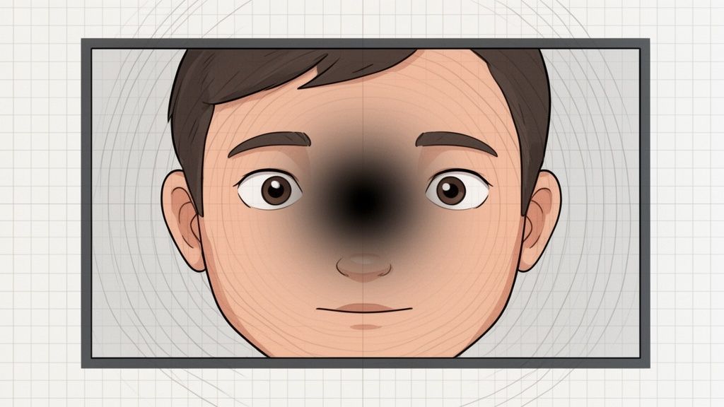
Because their peripheral vision is often preserved, individuals with AMD rely heavily on screen magnification tools to enlarge content and move it into their usable field of vision. This makes layout flexibility and text clarity absolutely essential for a functional user experience. Understanding these specific user behaviors is key when discussing different types of blindness and their impact on web use.
Actionable Accessibility Recommendations for AMD
To support users with AMD, your accessibility efforts should prioritize readability, scalability, and contrast. The goal is to make content clear and legible, even when significantly magnified.
Design Flexible, Zoom-Friendly Layouts: Users with AMD often zoom their browser to 200% or more. Ensure your layout reflows gracefully without requiring horizontal scrolling. Content should remain visible and functional, with no overlapping elements or broken components. Test your site's readability and usability at various zoom levels.
Prioritize Font Clarity and Size: Use clean, sans-serif fonts like Arial, Helvetica, or Verdana, which are easier to read at larger sizes. A base font size of at least 16px is a good starting point. Providing user-selectable font options, including dyslexia-friendly choices, through a tool like WebAbility.io can further improve the experience.
Enforce Strong Color Contrast: The loss of sharp central vision makes distinguishing between similar colors difficult. Adhere to WCAG AA contrast ratios (4.5:1 for normal text), and aim for the AAA standard (7:1) wherever possible. This simple step makes a massive difference in text legibility for users with many forms of low vision. For a deeper look into this and other strategies, you can find essential website accessibility solutions to guide your implementation.
3. Diabetic Retinopathy
TL;DR:Diabetic Retinopathy is a common complication of diabetes, causing damage to retinal blood vessels that can lead to blurred vision, floaters, and blindness. For web users, this manifests as difficulty distinguishing colors and reading text. To improve accessibility, use patterns with colors for data, ensure high-contrast text, and structure content with semantic HTML for clear screen reader navigation, making your site usable for this large audience.
Diabetic Retinopathy is a serious eye condition and a leading cause of blindness among working-age adults in many countries. It is a direct complication of diabetes, where high blood sugar levels damage the tiny blood vessels in the retina. This damage can cause them to leak fluid or bleed, distorting vision. In its early, non-proliferative stage, symptoms may be mild or nonexistent, but as it advances to the proliferative stage, abnormal new blood vessels grow on the retina, leading to severe vision loss and potential blindness.
On the web, users with Diabetic Retinopathy often experience patchy vision, "floaters" (dark spots drifting in their field of view), and a significant reduction in color perception and contrast sensitivity. This makes it difficult to read low-contrast text, interpret charts that rely solely on color, or navigate a visually complex interface. As one of the most prevalent types of blindness related to a chronic illness, addressing its impact is essential for digital inclusion.
Actionable Accessibility Recommendations for Diabetic Retinopathy
Designing for users with Diabetic Retinopathy requires a focus on visual clarity that is not dependent on perfect color vision or a completely unobstructed view.
Combine Colors with Patterns and Icons: Never use color as the sole means of conveying information. For graphs, charts, or status indicators (e.g., "success" or "error" messages), supplement colors with distinct patterns, icons, or text labels. This ensures that users who have difficulty with color perception can still understand the information.
Prioritize High Contrast and Readable Fonts: The blurred vision and reduced contrast sensitivity common with this condition make standard text difficult to parse. Implement a default text contrast ratio of at least 4.5:1 (WCAG AA). Offering a high-contrast mode through a tool like WebAbility.io can further empower users to adjust the display for maximum readability.
Ensure Semantic Structure for Screen Readers: As vision worsens, many individuals with Diabetic Retinopathy will rely on screen readers. Use proper semantic HTML (
<header>,<nav>,<main>,<h1>-<h6>) to create a logical document outline. This allows screen reader users to navigate by headings and landmarks, efficiently finding the content they need without visual scanning. To go deeper on this topic, you can learn more about color contrast for accessibility and its role in a broader strategy.
4. Cataracts
TL;DR:Cataracts cause a clouding of the eye's lens, leading to blurry vision, faded colors, and significant glare sensitivity. For web users, this makes bright, high-contrast screens difficult to view. Accessibility improvements like offering dark modes, avoiding pure white backgrounds, and ensuring ample spacing between elements can greatly improve their experience and increase site usability.
Cataracts are one of the most common types of blindness globally, particularly in aging populations. This condition occurs when proteins in the eye's natural lens break down and clump together, creating a cloudy or opaque area that blocks light from reaching the retina. The result is vision that appears blurry, dim, or as if looking through a foggy window. While surgically treatable, untreated cataracts remain a leading cause of vision loss worldwide.

For individuals with cataracts, web browsing can be challenging. Glare from bright screens is a major issue, causing discomfort and making it hard to distinguish text and interface elements. Colors may appear faded, and the overall lack of visual clarity can make small text or tightly packed content nearly impossible to parse. This vision impairment directly impacts a user's ability to navigate and interact with a website effectively.
Actionable Accessibility Recommendations for Cataracts
To accommodate users with cataracts, your accessibility focus should be on reducing glare and improving visual clarity.
Offer Dark Mode and Off-White Backgrounds: A bright white background can create intense glare for someone with cataracts. Providing a dark mode or using a softer, off-white background (like
#F8F8F8) by default significantly reduces eye strain. This simple change makes content more comfortable to read for extended periods.Provide User-Customizable Color Schemes: Because cataracts can alter color perception, allowing users to select their own text and background colors is a powerful feature. WebAbility.io's user-triggered adjustments let individuals choose combinations that work best for them, ensuring your content remains legible.
Ensure Generous Spacing: Blurry vision makes it difficult to differentiate between closely packed elements. Increase the
line-heightof your text and add adequatepaddingandmarginaround buttons, links, and form fields. This clear separation helps users confidently identify and interact with each element without accidental clicks. You can discover more about how blind users navigate the web to understand these interaction patterns better.
5. Glaucoma (Open-Angle and Angle-Closure)
TL;DR:Glaucoma is a group of eye diseases that damage the optic nerve, often due to high eye pressure, causing irreversible peripheral vision loss. For web users, this creates a "tunnel vision" effect similar to Retinitis Pigmentosa. To improve accessibility, centralize key information, ensure robust keyboard navigation with clear focus states, and provide high-contrast options. These adjustments support usability for a growing demographic and reduce user frustration.
Glaucoma is a leading cause of irreversible blindness worldwide and one of the more common types of blindness, affecting over 3 million Americans. It comprises a group of diseases that damage the optic nerve, the vital link between the eye and the brain. This damage is typically caused by abnormally high pressure inside the eye (intraocular pressure) and results in a gradual loss of peripheral vision. The most common form, open-angle glaucoma, is often asymptomatic in its early stages, earning it the name "the silent thief of sight."
As the condition progresses, the visual field narrows, producing an effect much like tunnel vision. This makes it challenging to scan a website for navigation links, sidebars, or notifications located on the periphery of the screen. Users may miss important calls-to-action or context-providing elements. A less common but more severe form, angle-closure glaucoma, can cause sudden, painful vision loss and is a medical emergency.
Actionable Accessibility Recommendations for Glaucoma
Designing for users with glaucoma means accommodating a restricted field of view and prioritizing straightforward, predictable interactions.
Centralize Critical Information: Since users with glaucoma retain their central vision the longest, place primary navigation, calls-to-action, and important alerts in the center or upper-middle portion of the layout. Avoid relying on sidebars or footers for essential tasks. A centered, single-column layout is often more usable than a multi-column design.
Provide High-Contrast Focus Indicators: Keyboard navigation is essential, but it’s ineffective if users cannot see which element is currently selected. Implement a thick, high-contrast outline for focused links, buttons, and form fields. The default browser outline is often too thin and faint to be seen easily.
Test with Peripheral Vision Loss Simulators: Use browser extensions or accessibility testing tools that simulate tunnel vision. Navigating your site with this filter will quickly reveal pain points, such as off-screen menus or notifications that are easily missed. This practical testing provides direct insight into the user experience. You can discover more about how blind users navigate the web to better understand their journey and the importance of clear focus management.
6. Corneal Scarring and Keratitis
TL;DR:Corneal scarring and keratitis cause blurred, distorted, or cloudy vision due to damage to the eye's clear front layer. For web users, this can make reading text and discerning visual details difficult. Accessible design must include strong zoom functions, clear fonts, and high color contrast. Addressing these issues makes your site usable for this audience and improves overall clarity.
The cornea is the eye's transparent outer layer, responsible for focusing most of the light that enters the eye. When it becomes damaged through injury, infection (keratitis), or disease, it can develop opaque scar tissue. This scarring blocks or distorts light, leading to blurred, hazy vision that can be likened to looking through a dirty or frosty window. It is one of the leading types of blindness globally, particularly in developing nations.
Unlike conditions that affect peripheral or central vision in a specific pattern, corneal opacity can create a general, uniform blur across the entire visual field. Users may also experience significant glare and light sensitivity (photophobia), making bright, low-contrast web pages especially challenging to navigate. The severity can range from minor blurring to a complete loss of functional sight.
Actionable Accessibility Recommendations for Corneal Scarring
To support users with corneal conditions, your accessibility approach should center on legibility, magnification, and providing non-visual alternatives.
Ensure Robust Zoom Functionality: A user with corneal scarring often relies on magnification to make blurry text large enough to read. Your site must support browser zoom up to at least 200% without breaking the layout or hiding content. Content should reflow into a single column, preventing the need for horizontal scrolling.
Prioritize Clear Typography and Contrast: Use clear, sans-serif fonts with adequate letter spacing to prevent characters from blurring together. Critically, you must adhere to WCAG's minimum contrast ratio of 4.5:1 for normal text and 3:1 for large text. This separation between text and background is essential for readability when vision is hazy.
Provide Text Alternatives for All Visuals: Since images, icons, and charts may be too blurry to interpret, every non-text element must have a descriptive
alttag. For complex visuals like infographics, provide a full text description on the page or linked nearby. This ensures that users who cannot rely on their vision can still access the information using screen readers.
7. Optic Nerve Hypoplasia and Optic Nerve Atrophy
TL;DR:Optic nerve conditions like hypoplasia (underdevelopment) and atrophy (degeneration) cause a range of vision loss, often affecting acuity and visual fields, which can lead to legal or total blindness. For users with these conditions, who often rely heavily on screen readers, robust accessibility requires clean semantic HTML, descriptive alt text for all meaningful images, and ARIA labels for clarity. Building a well-structured site is foundational for their user experience.
Optic Nerve Hypoplasia (ONH) and Optic Nerve Atrophy (ONA) are two distinct conditions that impact the optic nerve, the critical pathway transmitting visual information from the eye to the brain. ONH is a congenital condition where the optic nerve is underdeveloped at birth, while ONA involves the degeneration or wasting away of the nerve fibers over time due to injury, disease, or genetic factors. Both are significant causes of vision loss and blindness in children and adults.
The visual impact varies widely among individuals. Some may have nearly normal vision, while others experience severe impairment, including reduced visual acuity (blurry vision), visual field loss (affecting peripheral or central vision), and problems with depth perception. Because the optic nerve is not functioning correctly, simply magnifying text may not be enough; the visual information itself is not being transmitted properly to the brain. Consequently, many individuals with these conditions depend on non-visual methods, such as screen readers, to access digital content.
Actionable Accessibility Recommendations for ONH and ONA
To support users with optic nerve conditions, your accessibility focus must be on creating a site that is perfectly parsable by assistive technology. The underlying code structure is paramount.
Ensure Complete Semantic HTML: Use HTML elements according to their intended purpose (
<nav>,<header>,<h1>-<h6>,<p>,<ul>, etc.). A clean, logical document structure allows screen readers to interpret the page hierarchy correctly, letting users skip to relevant sections and understand the relationship between different content blocks.Provide Descriptive Alt Text for All Images: Since users may not be able to see images at all, alternative text is not optional. Every meaningful image must have descriptive alt text that conveys its purpose and content. For decorative images, use a null alt attribute (
alt="") so screen readers can ignore them.Use ARIA Labels for Complex Components: For interactive elements that lack clear, descriptive text (like an "X" button to close a modal), use
aria-labelto provide an accessible name. For example,<button aria-label="Close dialog">X</button>. This gives screen reader users the context they need to interact with your site confidently.
8. Retinal Detachment
TL;DR:Retinal detachment is a medical emergency where the retina separates from the back of the eye, causing sudden and dramatic vision loss, such as a dark curtain or a burst of floaters. For web users experiencing this, accessibility must be robust and immediate. Providing high-contrast themes, skip navigation links, and full keyboard support ensures the site remains usable during and after such a critical vision change.
Retinal detachment is a serious condition that happens when the retina, the eye's light-sensitive tissue, pulls away from its normal position at the back of the eye. This separation cuts off the retina from its blood supply and oxygen, leading to rapid and often severe vision loss if not treated immediately. It is considered a medical emergency, and its onset can be abrupt, appearing as a sudden increase in floaters, flashes of light, or a dark shadow or "curtain" moving across the field of vision.
Unlike other progressive types of blindness, retinal detachment can cause a person's usable vision to change dramatically overnight. Prompt surgery can often reattach the retina, but some degree of permanent vision loss is common, which can range from minor blurriness to significant visual field defects. The resulting vision can be unpredictable, making adaptable digital interfaces essential.
Actionable Accessibility Recommendations for Retinal Detachment
Since the visual outcome of retinal detachment varies widely, designing resilient interfaces that support multiple vision scenarios is key. Your accessibility strategy should prioritize flexibility and efficiency.
Provide High-Contrast Themes as Quick-Access Options: A person recovering from retinal detachment surgery may develop intense light sensitivity or find certain color combinations difficult to see. User-triggered adjustments, like those available with WebAbility.io, allow users to instantly switch to a high-contrast mode that suits their new visual needs without having to change system-level settings.
Include Skip Navigation Links: Users who now rely on screen readers or significant magnification need to navigate efficiently. A "skip to main content" link at the top of the page allows them to bypass repetitive navigation menus and jump directly to the primary content, saving time and reducing frustration.
Ensure All Functionality is Keyboard Accessible: A sudden change in vision can make mouse usage difficult or impossible. Testing your site to confirm that every button, link, and form can be operated solely with a keyboard is fundamental. This ensures that users who can no longer track a cursor can still complete tasks and access information.
9. Usher Syndrome
TL;DR:Usher Syndrome is a genetic condition causing both hearing loss and progressive vision loss (from Retinitis Pigmentosa). Accessibility for these users must address both sensory needs. Providing robust captions, detailed audio descriptions, and full keyboard navigation without audio reliance is essential. Designing for this dual-sensory experience makes digital content truly inclusive.
Usher Syndrome is a complex genetic disorder and the leading genetic cause of combined deaf-blindness. It pairs congenital (present at birth) hearing impairment with the progressive vision loss characteristic of Retinitis Pigmentosa (RP). Individuals with Usher Syndrome are born with hearing loss and later develop vision problems, typically starting with night blindness and a constricting visual field that leads to tunnel vision. This dual-sensory impairment creates unique challenges for web navigation and information consumption.
The condition's progression means users must adapt to losing two primary senses over time, making digital accessibility a critical lifeline. Because both hearing and sight are affected, standard accessibility solutions for one disability may be insufficient. For example, a screen reader's audio output is not useful for a user who is also deaf, and video captions do not help a user who has lost significant vision. This makes Usher Syndrome a profound example of why multi-faceted accessibility is so important among the various types of blindness.
Actionable Accessibility Recommendations for Usher Syndrome
To effectively support users with Usher Syndrome, your accessibility approach must address both auditory and visual needs simultaneously.
Provide Captions and Audio Descriptions: All video content must have accurate, synchronized captions for users who are hard of hearing. Simultaneously, include detailed audio descriptions that narrate visual information for those with vision loss. This dual approach ensures that no user is left without crucial context.
Ensure Non-Auditory Feedback and Navigation: Full keyboard navigation is vital, but it must function without relying on audio cues. All interactive elements should provide clear visual feedback when focused or activated, such as a prominent border or background color change. This allows users who cannot hear system sounds to track their position on the page.
Test with Diverse Assistive Technologies: Your quality assurance process should include testing with both screen readers and hardware or software for reading captions, such as refreshable braille displays. These devices translate on-screen text into tactile braille, making them indispensable for the deaf-blind community. Testing with these tools reveals gaps that other methods miss.
10. Cortical Visual Impairment (CVI) and Cerebral Vision Impairment
TL;DR:CVI is a brain-based vision issue where the eyes are healthy, but the brain struggles to process visual information. It requires simple, uncluttered designs with high contrast and predictable navigation. For web users with CVI, reducing visual complexity, providing robust screen reader support, and respecting motion preferences are critical for creating an accessible experience that improves usability and user retention.
Cortical Visual Impairment (CVI), sometimes called Cerebral Vision Impairment, is a leading cause of vision loss in children in developed nations. Unlike other types of blindness that stem from physical issues with the eyes, CVI originates in the brain. It occurs when the visual processing centers of the brain are damaged, meaning the brain cannot correctly interpret the signals it receives from perfectly healthy eyes.
This condition results in a highly variable and fluctuating visual ability. Someone with CVI might have difficulty recognizing faces, objects, or patterns, especially in a cluttered environment. They may also struggle with visual-motor skills, depth perception, and processing movement. The digital world, with its dynamic ads, complex layouts, and competing visual elements, can be exceptionally challenging and overwhelming for these users.
Actionable Accessibility Recommendations for CVI
To design for users with CVI, the guiding principle is to reduce cognitive load by simplifying the visual experience. Your accessibility efforts should focus on predictability, clarity, and minimalism.
Implement Clean, Uncluttered Interfaces: Visual complexity is a significant barrier for users with CVI. Avoid busy backgrounds, overlapping elements, and dense blocks of content. Use generous white space to clearly separate different sections of the page. A clean design helps users focus on one piece of information at a time without feeling overwhelmed.
Use Consistent Navigation and Layout: Predictability is key. Ensure that navigation menus, logos, and key interactive elements are in the same place on every page. This consistency helps users with CVI build a mental model of your site, making it easier to find information without having to re-learn the layout on each new page.
Provide High Contrast and Avoid Patterns: Strong contrast between text and its background is essential. However, it's equally important to avoid busy or distracting background patterns, as these can make it difficult for the brain to distinguish foreground elements. WebAbility.io's user-controlled adjustments allow users to select simple, high-contrast themes that eliminate visual noise.
Respect Reduced Motion Preferences: Animations, carousels, and auto-playing videos can be disorienting and make it impossible to focus. Use the
prefers-reduced-motionCSS media query to disable or reduce non-essential animations for users who have this setting enabled in their operating system or browser.
Comparison of 10 Types of Blindness
| Condition | Implementation complexity | Resource requirements | Expected outcomes | Ideal use cases | Key advantages |
|---|---|---|---|---|---|
| Retinitis Pigmentosa (RP) | High — needs combined magnification and screen-reader support | Screen readers, zoom/magnification, high-contrast themes, keyboard nav | Consistent access as peripheral vision declines; reduced navigation barriers | Users with tunnel vision or progressive peripheral loss | Multi-feature accessibility that adapts to changing vision |
| Age-Related Macular Degeneration (AMD) | Medium–High — emphasis on zoom-friendly layouts and large text | Robust zoom support, large fonts (200%+), high-contrast modes, text-to-speech | Readable central content at high magnification; preserved task performance | Older adults with central vision loss who rely on magnification | Strong readability and layout resilience under magnification |
| Diabetic Retinopathy | Medium — mix of contrast, semantic structure, and TTS needs | High-contrast schemes, semantic HTML, text-to-speech, adjustable fonts | Better comprehension of complex content and visuals; improved readability | Users with fluctuating vision and visual field changes | Combines visual and non-visual strategies for variable vision |
| Cataracts | Low–Medium — focus on glare reduction and contrast | Dark mode/anti-glare themes, adjustable contrast, text scaling, screen readers | Reduced glare discomfort and clearer text in low-light conditions | Older adults with glare sensitivity and blurred vision | Quick wins with dark/low-glare themes and larger text |
| Glaucoma (Open‑Angle / Angle‑Closure) | Medium — central placement and keyboard access prioritized | Keyboard navigation, central-focused layouts, magnification, high-contrast focus indicators | Improved usability without peripheral scanning; reliable navigation | Users with progressive peripheral loss or sudden angle-closure events | Centralized content and strong keyboard workflows reduce reliance on peripheral vision |
| Corneal Scarring & Keratitis | Low–Medium — emphasis on legibility and reduced motion | Adjustable text sizing, high-contrast modes, reduced motion options, screen readers | Easier reading with less light sensitivity and clearer content | Users with photophobia, distorted or blurred vision | Legibility-focused changes that aid those with light sensitivity |
| Optic Nerve Hypoplasia / Atrophy | High — often requires full non-visual support | Screen readers, text-to-speech, ARIA semantics, keyboard-only interfaces | Full content access without visual dependence; predictable navigation | Congenital or acquired severe visual loss requiring non-visual access | Complete screen-reader compatibility and semantic structure |
| Retinal Detachment | High — urgent need for immediate accessible alternatives | Screen reader compatibility, high-contrast quick themes, keyboard nav, scalable text | Fast transition to usable interface after sudden vision loss | Users experiencing sudden peripheral/central vision loss | Rapid-access accessibility options for emergency vision changes |
| Usher Syndrome | Very High — multi-sensory accommodations required | Captions/transcripts, audio descriptions, screen readers, haptic/tactile options | Inclusive access for users with combined vision and hearing loss | Deaf-blind users or those with both hearing and progressive vision loss | Multi-modal solutions covering both audio and visual accessibility |
| Cortical Visual Impairment (CVI) | High — requires simplified, predictable interfaces | Simplified layouts, semantic HTML, text-to-speech, reduced motion, clear focus | Better comprehension through reduced clutter and consistent patterns | Children and adults with brain-based visual processing deficits | Clean, consistent UI patterns that reduce cognitive and visual load |
Embracing the Spectrum of Vision: A Conclusion and Path Forward
This exploration of the different types of blindness and low vision reveals a crucial truth: "blindness" is not a monolith. From the peripheral vision loss of Retinitis Pigmentosa and Glaucoma to the central field defects caused by Macular Degeneration, each condition creates a distinct and personal experience of the world. Understanding these nuances is the first, most critical step for any digital agency, development team, or business aiming to create genuinely inclusive online experiences.
We've seen how a user with Cataracts might struggle with low-contrast text, while someone with Diabetic Retinopathy sees a digital landscape peppered with distracting floaters. A person with Cortical Visual Impairment (CVI), a brain-based condition, may be overwhelmed by visual clutter, even if their eyes are perfectly healthy. These are not edge cases; they are human realities that directly impact how millions of people interact with your website, application, or e-commerce platform. The key takeaway is that a one-size-fits-all approach to accessibility is fundamentally flawed.
Key Insights for Actionable Accessibility
The path to a more accessible web is paved with specific, intentional design and development choices. Instead of viewing accessibility as a final-stage compliance check, we must integrate it into the very DNA of our digital projects. The core principles we've discussed are not just about avoiding legal risk; they are about superior user experience and expanding your market reach.
Consider these high-impact takeaways:
Structure is King: For users of screen readers, a logical heading structure (H1, H2, H3) and proper use of ARIA landmarks are not just niceties; they are the primary means of navigation. A well-structured page is as important as a physical map for a sighted person.
Contrast is Non-Negotiable: For conditions like cataracts and glaucoma, sufficient color contrast is the difference between readable content and an indecipherable blur. This simple check can dramatically improve usability for a massive segment of the low-vision community.
Clarity Over Clutter: Many types of blindness, especially CVI, involve challenges with visual processing. Prioritizing clean layouts, ample white space, and predictable navigation paths benefits these users immensely, while also creating a more focused and less distracting experience for everyone.
By focusing on clear, semantic markup, you not only make your site more navigable for assistive technologies but also significantly improve its findability for search engines. When designing an accessible website, understanding the fundamentals of implementing strong and effective practices for on-page SEO is crucial, as many best practices directly contribute to usability for screen readers and other assistive technologies.
From Understanding to Implementation
Moving forward, the challenge is to translate this knowledge into your daily workflow. This means empowering designers with tools to check color contrast from the earliest mockups. It means equipping developers with the knowledge to write semantic HTML and conduct assistive technology testing. For marketers and content creators, it involves writing descriptive alt text for images and ensuring link text is meaningful out of context.
This commitment to accessibility is a powerful signal to your audience. It demonstrates expertise, authority, and trustworthiness, cornerstones of a strong brand identity. By building digital products that serve the full spectrum of human ability, you are not just complying with regulations like the ADA or Section 508; you are building better, more resilient, and more profitable products. The future of the web is inclusive, and the teams that recognize this today will be the leaders of tomorrow.
Ready to move from awareness to action? WebAbility.io provides the automated monitoring and low-code remediation tools your team needs to identify and fix accessibility issues tied to the specific types of blindness discussed here. Start building more inclusive, compliant, and user-friendly digital experiences today by visiting WebAbility.io.
Quick Questions
Tap to ask AI about this article