A Practical Guide to Accessible Web Design

Sidharth Nayyar
TLDR: Accessible web design isn't a feature; it's a philosophy. It’s about building websites that work for people with disabilities, ensuring everyone can access, navigate, and interact with your content. This approach doesn't just foster inclusivity—it dramatically improves the user experience for all, expands your audience, and builds a stronger brand.
What Is Accessible Web Design in Practice
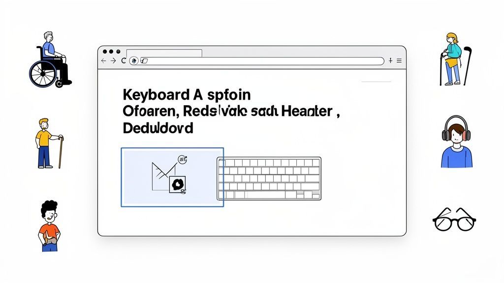
At its heart, accessible web design is the art of building websites that absolutely everyone can use, including people with disabilities. It’s not just a box to check or a niche feature to bolt on at the end. Think of it more like mobile responsiveness or site security—it’s a fundamental part of a quality build.
The entire point is to dismantle the digital barriers that prevent people with disabilities from accessing or interacting with a website. This means someone with a visual, auditory, motor, or cognitive impairment can perceive, understand, and use your site just as effectively as anyone else.
Imagine it like building a physical ramp next to a set of stairs. The ramp is essential for a wheelchair user, but it also helps a parent with a stroller or a delivery person with a dolly. Accessibility works the same way online.
More Than Just a Niche Concern
When you build a more inclusive website, the benefits ripple out to your entire audience. Good accessibility practices almost always translate into a better experience for every single visitor.
Take a look at these everyday examples:
High-contrast text is crucial for someone with low vision, but it's also a lifesaver for anyone trying to read their phone screen in bright sunlight.
Clear, logical navigation helps users with cognitive disabilities find what they need, but it also helps a brand-new visitor who’s just trying to learn about your company.
Video captions are non-negotiable for deaf and hard-of-hearing users, but they’re also used by millions of people watching videos in a loud coffee shop or a quiet office.
In essence, accessible design is user-centered design. It forces you to consider a wider range of human experiences, which almost always results in a more robust and intuitive product for your entire audience.
Ultimately, accessible design is about creating a more functional and welcoming internet. To get started, you need a solid grasp of core website accessibility best practices. By making these principles a priority, you're not just complying with standards—you're expanding your reach, improving your brand's reputation, and building something that truly works for everyone.
Why Accessibility Is a Business Imperative
Thinking of accessible web design as just another box to check on a compliance list is a huge mistake. It's actually one of the smartest business moves you can make, with real returns driven by legal requirements, financial opportunity, and the strength of your brand. When you embrace accessibility, you stop playing defense and start playing offense—opening up new markets and building much stronger relationships with your customers.
The whole mindset needs a refresh. Instead of asking, "What's the bare minimum we have to do?", the real question is, "How much value can we create by being truly inclusive?" The answer is: a lot. This simple shift turns accessibility from a line-item expense into a powerful engine for growth.
Navigating the Legal Landscape
From a legal standpoint, ignoring web accessibility just isn't an option anymore. Governments across the globe have put clear rules in place to protect the digital rights of people with disabilities, and they're not afraid to enforce them. These aren't just obscure regulations; they are major laws, and failing to comply has very real consequences.
Here are the heavy hitters you need to know about:
The Americans with Disabilities Act (ADA): This landmark US civil rights law is now consistently applied to websites, treating them as "places of public accommodation." This interpretation has fueled a sharp rise in digital accessibility lawsuits.
Section 508 of the Rehabilitation Act: If you're a federal agency or work as a contractor for one, this law is non-negotiable. It mandates that all your electronic and information technology must be accessible.
The European Accessibility Act (EAA): The EAA is coming, with a compliance deadline of June 2025. It creates a single accessibility standard across the EU, affecting everyone from e-commerce sites to banks.
The message from these laws is clear: digital access is a fundamental right. Getting ahead of the curve with an accessible web design framework is the best way to sidestep legal trouble and make sure your digital doors are open to everyone.
The Financial Case for Inclusion
If the legal risks don't grab your attention, the financial argument will. When you build a website that people can't use, you're actively shutting out a massive, loyal customer base with serious spending power. The numbers don't lie—inaccessibility isn't just a design flaw; it's a costly business blunder.
Consider this: inaccessible websites leak an incredible $2.5 billion every single month simply by excluding users with disabilities. That's a massive missed opportunity, especially when you realize this global community wields $6.9 trillion in annual spending power. Digging deeper, the data shows that 73% of shoppers with disabilities will simply leave a site they find difficult to use, costing retailers billions every year. You can explore these web accessibility statistics to see the full financial picture.
Making accessibility a priority isn't just about plugging a hole in your bucket; it's about tapping into a whole new stream of revenue. It opens your doors to an underserved market that is actively searching for brands that get it right.
Building Brand Trust and Integrity
Beyond the laws and the money, accessibility is about building a modern brand that people trust. We live in a world where consumers vote with their wallets, and they increasingly choose companies that align with their values. A commitment to inclusivity shows that you actually care about all of your customers.
An accessible website is corporate social responsibility in action. It’s tangible proof of your values, which boosts your public image, strengthens your brand reputation, and creates fierce loyalty among users who feel seen and respected. It’s a natural extension of any diversity, equity, and inclusion (DEI) initiative, solidifying your connection with customers, employees, and partners.
Ultimately, designing for everyone isn't just good practice; it's a reflection of your company's character and a cornerstone of its long-term success.
Understanding The Four Pillars of WCAG
The Web Content Accessibility Guidelines (WCAG) can feel like a dense, technical manual at first glance. But when you peel back the layers, it’s actually a practical framework built on four simple, foundational principles.
Think of them not as rigid rules, but as the essential pillars holding up an inclusive digital experience.
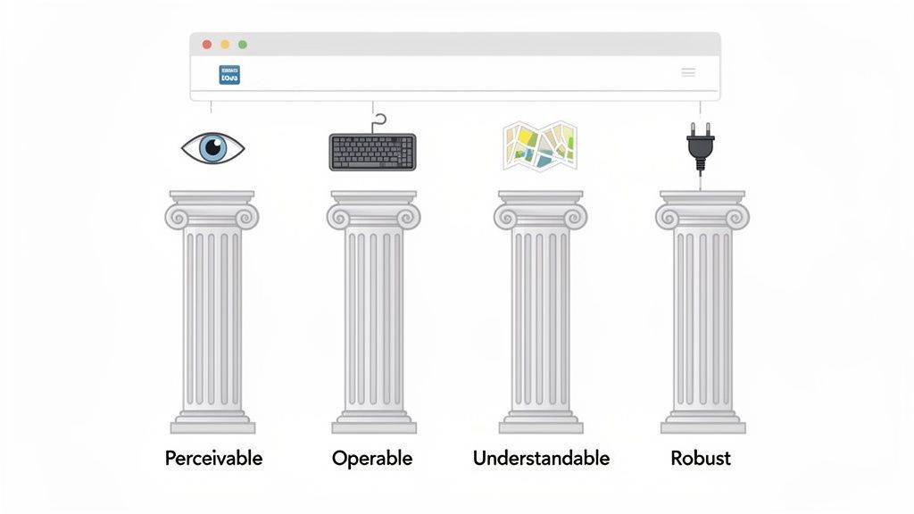
This framework is best known by its acronym: POUR. It stands for Perceivable, Operable, Understandable, and Robust. By designing with these four pillars in mind, you stop just checking boxes and start building websites that genuinely work for everyone. Each one answers a fundamental question about how people interact with your site.
Perceivable: Can Everyone See and Hear Your Content?
The first pillar, Perceivable, boils down to this: information can't be invisible to a user's senses. Everyone needs a way to recognize and process the content on your site, whether through sight, sound, or touch.
Imagine your website is a physical storefront. For the information to be perceivable, the sign out front needs to be clear, the windows large, and the entrance marked. If the store's name is painted in a color that blends into the wall, a person with low vision can't perceive it. If you only announce your daily specials over a loudspeaker, a deaf customer completely misses out.
On a website, this means providing alternatives:
Alt text for all meaningful images. This allows screen readers to describe the visual content out loud for someone who is blind.
Sufficient color contrast. Text has to stand out from its background so people with low vision can actually read it.
Captions and transcripts for videos. This ensures users who are deaf or hard of hearing can perceive what's being said.
Operable: Can Everyone Use Your Website?
Next up is Operable. This pillar demands that people can actually operate your interface. All interactive components—from links and buttons to navigation menus—must be usable.
Back at our storefront, this means the front door is easy to open, not a heavy slab of wood that requires immense strength. It means the light switches are within reach for someone in a wheelchair, and the aisles are wide enough to navigate.
In web design, this principle is all about functionality:
Full keyboard accessibility. This is a big one. Every single interactive element must be usable with only a keyboard. Many users with motor disabilities can't use a mouse.
No "keyboard traps." A user should never get stuck on a part of the page they can't tab away from.
Enough time to interact. People need enough time to read and use content, like filling out a form without being timed out too quickly.
An operable interface is one where no one is locked out because of the input device they use. Whether it's a mouse, keyboard, voice command, or switch device, the website has to respond.
Understandable: Is Your Content Clear and Predictable?
The third pillar is Understandable. Simply put, the information and the user interface must be clear and predictable. A user shouldn't need a decoder ring to figure out what to do next.
At our storefront, this translates to a logical layout. Products are in clearly labeled aisles, the checkout counter is easy to find, and the whole flow feels intuitive. You don't have to guess where to go. A chaotic store with confusing signs is a frustrating experience for everyone, but it can be an impossible barrier for someone with a cognitive disability.
This pillar is really the cornerstone of great user experience:
Consistent navigation. Menus and key links need to be in the same place and work the same way across the entire site.
Clear, simple language. Content should avoid unnecessary jargon and complex sentences whenever possible.
Helpful error messages. When someone makes a mistake in a form, the site should provide clear, constructive instructions on how to fix it, not just a red "ERROR" message.
To dig deeper into the specific tests that fall under these principles, our guide on the WCAG success criteria breaks it all down.
Robust: Will It Work With Today's and Tomorrow's Tech?
Finally, the Robust pillar ensures your content is compatible with a wide range of technologies, including the assistive tools people use today and the ones they'll use in the future.
For our storefront, this is like making sure the building is up to code. The electrical system works with modern appliances, and the structure is sound enough to last for years. You wouldn't build with proprietary, non-standard wiring that only works with one brand of lightbulb.
On the web, robustness comes down to writing clean, standards-compliant code:
Using valid HTML. Clean code without errors ensures that browsers and screen readers can interpret it correctly and reliably.
Implementing ARIA correctly. When building complex custom components, ARIA (Accessible Rich Internet Applications) attributes help assistive tech understand what an element is and how it’s supposed to work.
By sticking to web standards, you create a reliable experience across different browsers, devices, and assistive tools. Your site will not only work for more people today but will also be ready for the technologies of tomorrow.
To bring it all together, here’s a quick summary of how the POUR principles translate into real-world website features.
WCAG's POUR Principles Explained
| Principle | What It Means for Users | Practical Website Example |
|---|---|---|
| Perceivable | Users can take in all information through their available senses. | Providing text alternatives (alt text) for images so a screen reader can describe them. |
| Operable | Users can successfully navigate and interact with all components. | Ensuring the entire website can be navigated using only a keyboard, not just a mouse. |
| Understandable | The content is clear, and the site's functionality is easy to follow. | Using consistent navigation menus across all pages so users don't get lost. |
| Robust | Content works reliably with a wide range of current and future technologies. | Writing clean, valid HTML so browsers and assistive devices can interpret it correctly. |
Thinking in terms of these four pillars helps ground the work of accessibility in human experience. It's not about memorizing dozens of rules; it's about asking if your creation is perceivable, operable, understandable, and robust for every person who visits.
Putting Accessible Design into Practice
Okay, so let's move from theory to reality. This is where the rubber meets the road—translating the principles of accessible design into the code and pixels of your website. This isn't about a massive, overnight overhaul. It's about weaving specific, high-impact techniques into your daily design and development workflow.
Think of it like building a house. You wouldn't frame the walls without pouring a solid foundation first, right? And you wouldn't install windows without making sure they actually open and close. Accessibility is the same—it’s not a decorative afterthought. It’s part of the core structure that makes a website strong, functional, and welcoming to every single visitor.
Start with a Solid Foundation Using Semantic HTML
Before you even think about a color palette or write a single line of CSS, your journey begins with your HTML. Using semantic HTML is all about choosing the right tag for the right job. When you do this, you're essentially creating an instant structural map for assistive technologies like screen readers.
Imagine trying to read a book with no chapter titles, page numbers, or even a table of contents. That’s exactly what a non-semantic website feels like to someone using a screen reader. Semantic tags act as clear signposts.
<header>: This clearly marks the introductory content at the top of the page.<nav>: This tells a screen reader, "Hey, this is the main navigation menu."<main>: This indicates where the primary content begins, letting users skip past repetitive headers and get right to the good stuff.<footer>: This signals the end of the page content.
Using a <div> for everything is the "before" picture. A well-structured document using <article>, <section>, and <aside> correctly is the "after." This simple habit costs nothing but makes a world of difference.
Design with Clear Color Contrast
One of the most common and easily fixed accessibility issues is poor color contrast. When your text color is too similar to the background, it becomes difficult—or even impossible—to read for people with low vision or color blindness. The WCAG 2.1 AA guidelines give us clear targets to hit.
The minimum contrast ratio for normal text is 4.5:1, and for large text (18pt or 14pt bold), it’s 3:1. This isn't just a friendly suggestion; it’s a critical benchmark that affects a huge portion of the population.
That light gray text on a white background might look sleek and minimalist, but it almost certainly fails this test and excludes people. A simple switch to a darker gray or black ensures your content is readable for a much wider audience—and as a bonus, it improves clarity for everyone, even someone just trying to view your site in bright sunlight.
A great design is one that communicates clearly. If a significant portion of your audience can't read your message because of poor contrast, the design has failed its primary purpose.
Build Accessible Forms and Interactive Elements
Forms are the lifeblood of most websites, from simple contact pages to complex e-commerce checkouts. An inaccessible form is a dead end for a user and a lost opportunity for your business. The key to making them accessible is creating clear, programmatically linked labels for every single input field.
This means using the <label> tag and properly connecting it to its <input> using the for and id attributes. This tiny bit of code is what allows a screen reader to announce what information is needed for each field. Remember, placeholder text is not a substitute for a real label.
Beyond forms, every interactive element—from buttons to dropdowns—has to be fully usable with just a keyboard. Many users with motor disabilities rely entirely on the Tab key to get around. Make sure every interactive element can be reached and activated using the keyboard, and always provide a visible focus indicator (like an outline) so the user knows exactly where they are on the page.
Use ARIA Roles for Complex Components
Sometimes, standard HTML just doesn't have a tag that perfectly describes a complex, custom-built component like an accordion menu, a pop-up modal window, or a tabbed interface. This is where ARIA (Accessible Rich Internet Applications) comes to the rescue.
ARIA roles and attributes provide extra information to assistive technologies, explaining what an element is and how it's supposed to behave. For example, you can add role="dialog" to a modal window or aria-expanded="true" to tell a screen reader that an accordion panel is open.
But a word of caution: the first rule of ARIA is don't use ARIA. If a native HTML element already exists that does the job (like using a proper <button> element for a button), always use that first. ARIA is for bridging the gaps, not for reinventing the wheel. Getting these practical steps right is crucial, and running a regular check can help you find and fix issues. For a deeper look into this process, you can learn more about how a comprehensive website accessibility audit can guide your team.
The Unseen Cost of Digital Exclusion
It’s easy to think of web accessibility as a technical, behind-the-scenes issue. But for millions of people, it’s a daily reality filled with frustrating dead ends. We're not talking about a few buggy websites here and there; this is a systemic problem woven into the very fabric of the internet.
Think of it this way: digital exclusion is the online equivalent of a building with no wheelchair ramp, a door that’s too heavy to open, or a sign written in a language you can't read. Simple, common failures like low-contrast text, missing image descriptions, or links that only work with a mouse aren't just minor glitches. They are locked doors, preventing real people from accessing essential information, buying goods and services, and participating in society.
The Staggering Scale of the Problem
The numbers tell a story that's hard to ignore. The 2025 WebAIM Million Project report revealed that a shocking 94.8% of the top one million homepages had detectable WCAG failures. On average, each page had 51 distinct errors.
This isn't just an ethical failure; it's a massive business blunder. Companies lose an estimated $6.9 billion every year as consumers with disabilities abandon inaccessible sites for competitors that work for them. The problem is everywhere, with 94% of WordPress sites and 87% of Shopify stores falling short, effectively ignoring the $13 trillion global disability market. You can see more of these eye-opening accessibility findings to grasp the full picture.
This infographic highlights a few of the core areas where we can start making a difference, from the code itself to the final visual presentation.
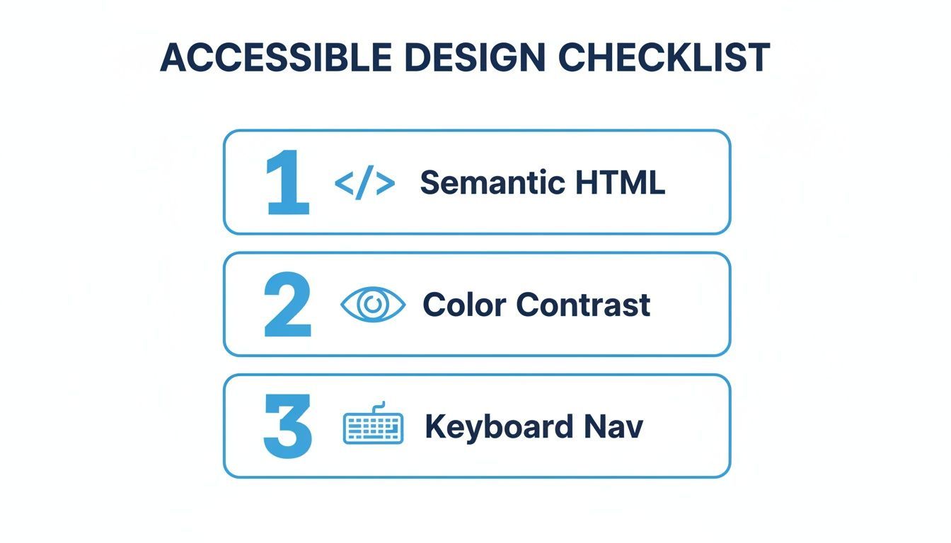
Nailing these fundamentals—clean code, clear color contrast, and reliable keyboard control—is the first real step toward breaking down these digital barriers.
Bridging the Digital Divide
The sheer volume of these errors points to a major disconnect between how we build websites and how a huge portion of the population actually uses them. Each one of those 51 average errors represents a moment of frustration, a lost opportunity, or a broken connection.
For someone using a screen reader, an image without a description is just an empty space. For a person with a motor impairment, a button they can't reach with their keyboard is a brick wall.
The data is unequivocal: nearly every digital front door is partially blocked. This isn't just a compliance issue; it’s a fundamental user experience and business problem that demands a proactive, comprehensive solution.
The only way forward is to adopt an accessible web design mindset from the very beginning. By building inclusivity into our processes, we can start to mend this divide and make the internet what it was always meant to be: a resource for everyone, not just for some.
Using Modern Tools to Enhance Accessibility
Building a truly accessible website takes commitment, but you don’t have to go it alone. The right technology can be a powerful force multiplier, helping your team implement and maintain high standards much more efficiently. Modern platforms offer a smart path forward by blending automated solutions with expert human oversight.
This hybrid approach is absolutely key. Automated tools are incredibly fast—they can scan your entire site for common issues like missing alt text or low color contrast in minutes. But they can't understand context or user experience nuances the way a person can. That's where manual expert audits come in, providing the deep analysis needed to ensure your site is genuinely usable, not just technically compliant.
When you combine the two, you get the best of both worlds: the speed and scale of automation married with the critical thinking of human experts.
Accelerating Improvements with Accessibility Platforms
One of the most direct ways to boost your site’s accessibility is by using platforms that offer an AI-enhanced accessibility widget. This is a user-facing tool that lets visitors customize their experience on the fly, immediately addressing many common barriers.
Think of it as giving each user a personal control panel for your website. With just a few clicks, they can make adjustments to fit their specific needs.
Visual Adjustments: Users can instantly switch on high-contrast modes, make text larger, or even use dyslexia-friendly fonts to make content easier to read.
Navigation Aids: The widget can add features that improve screen reader compatibility and offer robust keyboard navigation, ensuring people who don't use a mouse can still get to everything.
Content Accessibility: Features like a built-in text-to-speech reader can read page content aloud, which is a huge help for users with visual impairments or reading disabilities.
These tools offer immediate, tangible benefits to your visitors. While they don't replace the need to fix the underlying code, they serve as an effective and fast way to make your site more usable for more people, right now.
The real power of these solutions is their ability to deliver instant value to the end-user while you work on longer-term code remediation in the background. It’s a practical, two-pronged strategy.
Centralized Dashboards for Continuous Compliance
For agencies and businesses managing multiple websites, keeping track of accessibility can become a logistical nightmare. This is where a centralized dashboard becomes indispensable. Instead of juggling spreadsheets and manual reports, these platforms provide a single source of truth for your entire digital portfolio.
This screenshot shows a clean, modern interface for managing web accessibility, a key feature of platforms like WebAbility.io.
The dashboard provides a clear, at-a-glance overview of your compliance status, allowing teams to prioritize their work and track progress effectively.
These dashboards are built for proactive management, not just reactive fixes. They continuously scan your sites, giving you real-time compliance scores and detailed reports that pinpoint exactly where the problems are. This ongoing monitoring is crucial because websites are always changing—a single content update or new feature can easily introduce new accessibility barriers.
On top of that, a centralized system offers powerful governance tools. You can generate compliance reports for legal documentation, track historical trends to show improvement over time, and manage team roles and permissions. It transforms accessibility from a one-off project into an integrated, ongoing business process. For those looking to dive deeper, you can learn more about the various automated accessibility testing tools that power these dashboards.
By adopting these modern tools, organizations can move from a chaotic, reactive approach to a strategic and sustainable one. They empower teams to manage accessible web design proactively, reduce legal risks, and maintain a high standard of inclusivity for the long haul.
Common Questions About Accessible Web Design
When businesses and developers first dip their toes into web accessibility, the same handful of questions always seem to pop up. Getting clear answers to these is the first real step toward building a more inclusive digital presence.
What Is the Difference Between ADA and WCAG?
It's helpful to think of it like this: the Americans with Disabilities Act (ADA) is the "why." It’s a major U.S. civil rights law that prohibits discrimination based on disability. It sets the legal expectation.
The Web Content Accessibility Guidelines (WCAG) are the "how." These guidelines are a detailed set of technical standards that show you how to make your website and digital content accessible. While the ADA itself doesn't explicitly name WCAG, U.S. courts consistently refer to WCAG 2.1 AA as the standard for measuring whether a website is compliant.
Can I Make My Website Accessible Without a Full Redesign?
Yes, absolutely. While designing for accessibility from the ground up is the gold standard, you can make a massive difference on an existing site without tearing everything down.
One popular starting point is implementing an accessibility widget. This gives users immediate control over things like text size, contrast modes, and keyboard navigation. At the same time, you can use backend tools to scan for and fix underlying code issues. This allows you to improve accessibility iteratively, making the whole process much more manageable.
Many organizations have found success with a hybrid strategy: they use tools for immediate, user-facing improvements while systematically chipping away at the deeper code-level fixes over time. It's a practical approach that delivers value to users right away.
Is Accessible Web Design Only for Blind Users?
That's probably the biggest misconception out there. In reality, web accessibility is designed to support a huge spectrum of disabilities.
For example:
Auditory: People who are deaf or hard of hearing rely on video captions and transcripts.
Motor: Anyone who can't use a mouse depends on full keyboard navigation to get around.
Cognitive: Clear, predictable layouts and simple language are a game-changer for users with learning disabilities.
Honestly, these principles end up creating a better experience for absolutely everyone. Think about someone with a temporary arm injury trying to navigate with one hand, or even just a user trying to see their phone screen in bright sunlight. Good accessibility helps them, too.
Ready to open your website to everyone? WebAbility.io offers a complete platform with an AI-enhanced widget and a central dashboard to help you achieve and maintain compliance. Start your free trial and welcome a wider audience to your digital front door.
Quick Questions
Tap to ask AI about this article