Font Size and Font Style: An Accessible Design Guide

Sidharth Nayyar
TL;DR: Set body text to 1rem (about 16px), use a legible sans-serif, keep line-height at least 1.5, verify 4.5:1 color contrast for normal text, and size everything with relative units like rem so text can scale. For WCAG 2.2 AA, text must remain usable at 200% resize, and sites using relative units show a 98% pass rate on resize tests while fixed-pixel approaches can fail far more often (https://www.a11y-collective.com/blog/accessible-fonts/).
You can usually tell when a site is losing people before analytics catches up. The copy is fine. The offer is fine. But the text feels cramped, tiny, pale, or harder to scan than it should be, especially on mobile.
That’s where font size and font style stop being “design polish” and start affecting revenue, trust, and compliance. Good typography helps people read, decide, and act. Bad typography makes even strong content feel harder than necessary.
Why Font Size and Font Style Are Your Secret CRO Weapons
A visitor lands on a product page from search, paid social, or email. They’re interested enough to read, but the body text is small, the font is fussy, and the spacing feels tight. They don’t file a complaint. They leave.
That exit often gets blamed on messaging, traffic quality, or pricing. In practice, readability is frequently part of the problem.

Readability influences trust before conversion starts
Typography is one of the first signals users process. If text looks hard to read, people assume the experience will keep demanding extra effort. That hurts form completion, product comparison, and content engagement.
It also affects E-E-A-T in a practical sense. Expertise and authority don’t come through if users can’t comfortably read the page. Trust drops when basic reading tasks feel neglected.
A useful companion read on this business side is how teams improve website conversion rate by reducing friction across the page, not just rewriting headlines.
Practical rule: If users have to zoom just to read your body copy, the page is already underperforming.
This isn’t a new idea
The importance of font size was recognized long before modern accessibility checklists. In a 1957 letter, C.S. Lewis advised that books should be available in American editions because they used larger print, an early acknowledgment that size changes how people can engage with text (https://mereinkling.net/2020/02/27/historical-font-facts/).
What used to be treated as preference is now part of accessibility and compliance expectations. That matters for teams shipping content at scale, where one poor typography decision can repeat across templates, landing pages, and help centers.
Why this matters to growth teams
Accessible typography supports more than compliance.
Stronger reading flow: Users can scan pricing, benefits, and policies without strain.
Better page confidence: Clean, legible text makes the whole site feel more considered.
Broader reach: More visitors can read your content comfortably across age groups, devices, and visual needs.
Lower friction on high-value pages: Service pages, checkout steps, and comparison content benefit most.
If your team is tying accessibility work to business outcomes, this overview of web accessibility is a good internal reference point: https://www.webability.io/blog/web-accessibility
How to Select Accessible Font Styles and Families
Choosing a font family isn’t about whether a typeface looks modern, premium, or minimalist. The core question is simpler. Can people read it quickly, accurately, and for more than a few lines without fatigue?
Start with letterforms, not brand mood
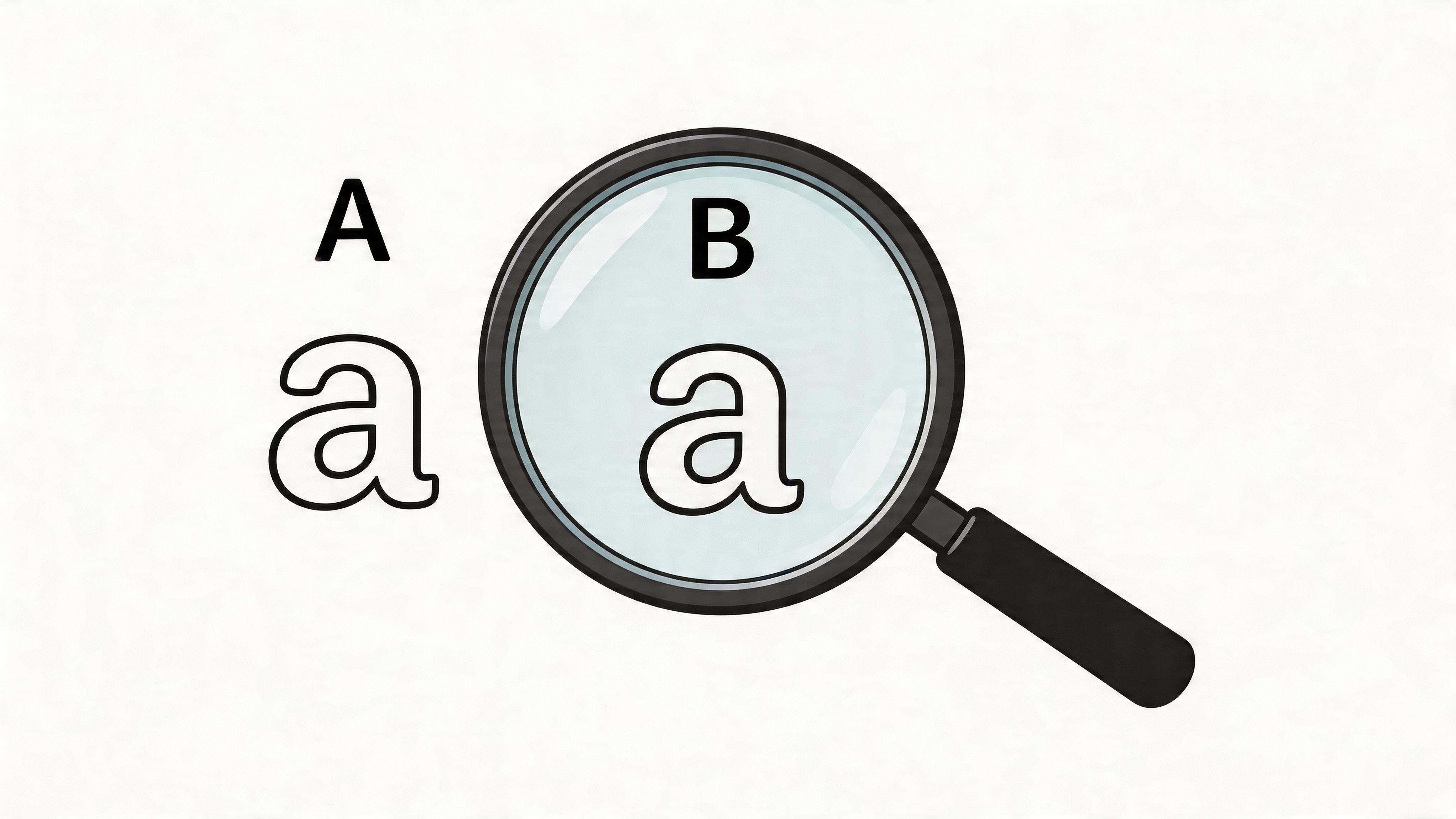
On screens, the most reliable body fonts tend to have straightforward shapes. Look for:
Clear character distinction: Users should be able to tell
I,l, and1apart.Open apertures: Letters like
c,e, andashouldn’t close up at smaller sizes.Stable weight: Thin strokes tend to break down on lower-quality displays.
Moderate width: Overly condensed fonts pack text tightly and reduce scannability.
For most interfaces, sans-serif fonts are easier to manage for body text because their forms stay cleaner under varied rendering conditions. That’s one reason accessibility guidance often favors families such as Arial, Verdana, or Source Sans Pro for digital reading contexts.
Font style has always been functional
Typography history backs this up. Nicolas Jenson’s Roman typeface in 1470 and Aldus Manutius and Francesco Griffo’s italic typeface in 1501 both increased how much text could fit on a page, helping make books more compact and affordable. Font style wasn’t just decorative. It changed access to information (https://www.toptal.com/designers/ui/typeface-history).
That same principle still applies on the web. Your choice of font style changes density, scanning speed, and reading comfort.
A readable font family solves problems before CSS refinements even start.
Serif, sans-serif, and user choice
Serif fonts can work well in specific contexts such as editorial layouts, long-form reading experiences, or strong visual brands. But for interface-heavy environments like dashboards, forms, and ecommerce pages, sans-serif usually gives you fewer legibility problems.
A practical approach is to separate roles:
| Content type | Safer default |
|---|---|
| Body copy | Sans-serif |
| UI labels and forms | Sans-serif |
| Long editorial pulls or quotes | Serif can work if tested |
| Decorative headings | Use carefully and sparingly |
If your audience includes users with dyslexia or other reading differences, personalization helps more than one “perfect” default. Giving users control over font style can reduce friction in a way fixed design systems can’t. For broader general accessibility guidelines, that user-control mindset is the right benchmark.
A good next step is reviewing examples of readable families in this reference on accessible fonts: https://www.webability.io/blog/most-accessible-fonts
What usually doesn’t work
Some patterns fail repeatedly in production:
Low-contrast ultra-light fonts: They may look refined in mockups, but they disappear in use.
Condensed display fonts for body copy: These save space at the expense of comfort.
Heavy italics in paragraphs: They reduce rhythm and make sustained reading harder.
Brand-first choices without user testing: If the font needs “getting used to,” it probably isn’t a strong body-text choice.
Building a Responsive Font Size System with CSS
Font sizing is where accessibility becomes operational. If the type system is built on fixed pixels and brittle component styles, users feel it immediately when they zoom or increase text size.
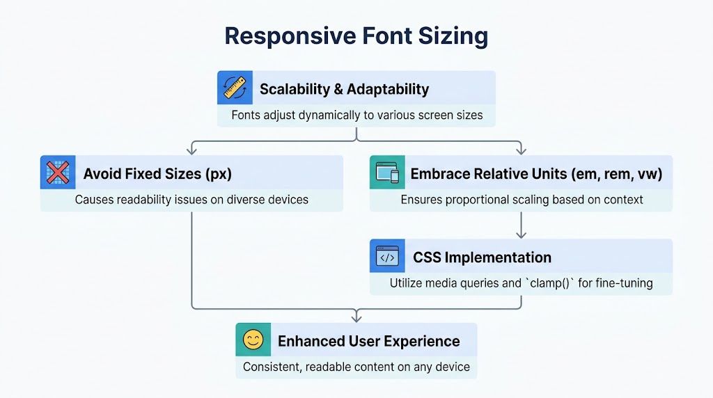
Start with a system that assumes text must scale cleanly. That aligns with WCAG 2.2 Success Criterion 1.4.4, which requires text to remain usable at 200% without loss of content or functionality. Sites using relative units like rem show a 98% pass rate on resize tests, while fixed-pixel fonts can see failure rates as high as 40% to 70% (https://www.a11y-collective.com/blog/accessible-fonts/).
Introduce the pattern visually before you implement it.
Why px breaks down
Pixels feel predictable to developers because they lock the interface. That’s exactly the problem.
When text is set in absolute pixel values across components, cards, nav items, sidebars, and buttons often stop adapting together. Users zoom in, and suddenly text overlaps, clips, or forces horizontal scrolling.
Use px when you need precise borders or icon sizes. Don’t use it as the foundation of a type scale.
A production-friendly rem baseline
Set your root size and build upward from it.
html { font-size: 100%; } body { font-family: Arial, Verdana, sans-serif; font-size: 1rem; line-height: 1.5; color: #1f2937; } h1 { font-size: 2.5rem; line-height: 1.2; } h2 { font-size: 2rem; line-height: 1.25; } h3 { font-size: 1.5rem; line-height: 1.3; } p, li, input, button, textarea { font-size: 1rem; } This does two useful things. It respects browser defaults, and it keeps all text tied to one scalable baseline.
Later, if the user changes browser settings or zooms, the whole type system responds more predictably.
Use em inside components
rem is best for global scale. em helps when a component needs internal proportional sizing.
.card { font-size: 1rem; padding: 1.5em; } .card h3 { font-size: 1.5em; } .card .meta { font-size: 0.875em; } That pattern lets the card scale as one unit if you change the parent size for a compact or dense layout.
Here’s the video worth watching if you need a quick visual refresher on responsive type implementation:
Add fluid sizing carefully
Fluid typography can help across breakpoints, but don’t let it shrink body text too far.
h1 { font-size: clamp(2rem, 5vw, 3rem); } h2 { font-size: clamp(1.75rem, 4vw, 2.5rem); } p { font-size: 1rem; } Keep body text stable unless you’ve tested extensively. Headings can flex more safely than paragraphs.
Comparison of CSS sizing units
| Unit | Relative To | Best Use Case | Accessibility Impact |
|---|---|---|---|
rem | Root font size | Global type scale | Strong. Predictable resizing across pages |
em | Parent element font size | Component-level scaling | Good when used deliberately, can compound if nested carelessly |
% | Parent or root context | Legacy scaling and some layout contexts | Useful in limited cases, less explicit than rem for systems |
px | Fixed device pixel | Hairlines, exact UI details | Weak for typography because it resists flexible scaling |
vw | Viewport width | Controlled fluid headings | Can help headlines, risky for body text without limits |
Build standard: Use
remfor type tokens,emfor component internals, andclamp()for headlines only after testing zoom and reflow.
Mastering Typographic Spacing and Color Contrast
Readable typography isn’t only about the letters. Spacing and contrast determine whether users can sustain reading across a paragraph, product description, or legal page.
A font that looks fine in isolation can become difficult once it’s packed into dense lines with weak contrast.
Spacing changes comprehension
The practical minimum for body text is simple. Keep line-height at least 1.5. That gives text enough vertical space to breathe and helps users track from one line to the next.
When teams test body text too small, the cost is measurable. A 2025 WAI study reported that for low-vision users, sans-serif fonts at 18px improved comprehension by 35% compared with 14px sizes, and a 2026 Nielsen Norman Group test found that heavier font weights boosted legibility by 15% on mobile (https://accessibility.huit.harvard.edu/typography).
That should change how you think about “clean” typography. Thin type and tight lines may look elegant in a static design review, but they often underperform in live use.
The spacing settings that hold up in practice
Use this as a working baseline:
Line-height: At least
1.5for body copy.Paragraph rhythm: Give paragraphs enough bottom margin so blocks don’t merge visually.
Letter spacing: Keep it modest. Too little can crowd letters, too much can break word shape.
Word spacing: Avoid compressed settings that make scanning harder.
Alignment: Left-align body text. Justified paragraphs create uneven spacing and ragged reading rhythm.
A simple body style might look like this:
body { font-size: 1rem; line-height: 1.5; letter-spacing: normal; word-spacing: normal; } p { margin-bottom: 1rem; max-width: 65ch; } Contrast is part of typography, not an afterthought
If text color and background color don’t separate enough, the rest of your typography choices can’t compensate. For normal body text, WCAG 2.2 AA uses a 4.5:1 contrast ratio. Teams that want a stricter reading experience often also evaluate against 7:1 for stronger contrast targets.
That matters most on:
Forms and checkout flows
Pricing cards
Help center articles
Mobile navigation and footers
Higher contrast doesn’t make a page less modern. It makes the content easier to trust and easier to finish reading.
For quick validation during design and QA, use a dedicated color contrast checker. It’s faster than guessing from the mockup and safer than relying on visual judgment alone.
When heavier weight is the better choice
There’s a common rule that body text should stay at regular weight. In many cases that’s still sensible. On mobile, high-contrast conditions, or smaller UI text, a slightly heavier weight can be easier to read.
The key is restraint. Move one step heavier when the screen and context demand it. Don’t jump straight to bold body paragraphs.
A Practical Guide to Testing and Verifying Font Accessibility
Most typography bugs don’t show up in Figma. They show up in browsers, templates, CMS blocks, and edge-case content lengths.
If your pages are generated with AI tools, check type closely. In recent designer reviews, typography was one of the top three issues on AI-built landing pages. Read what designers flag on AI-built landing pages.
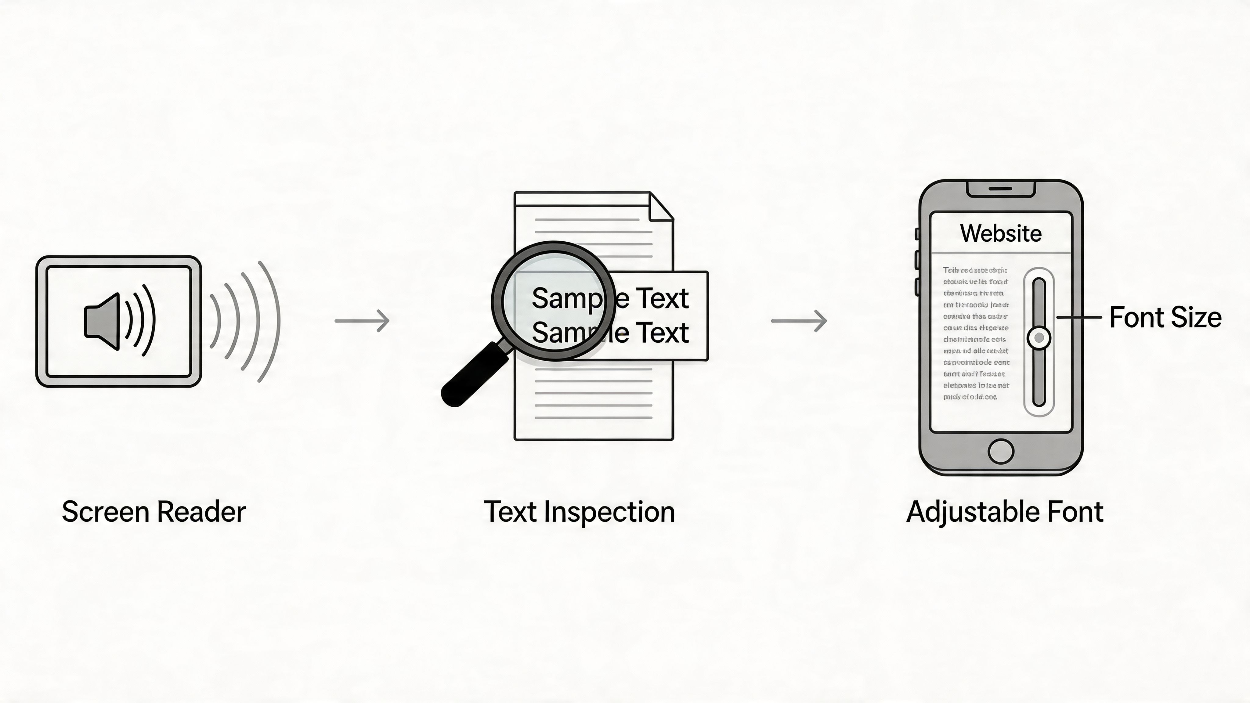
That’s why testing accessible font size and font style needs both manual checks and automated review.
Start with the checks every developer can do in minutes
Manual testing catches layout failures quickly.
Zoom the page to 200%
Read key templates at browser zoom. Check nav, modals, forms, tables, product cards, and sticky elements.
Increase spacing values
Use a text spacing bookmarklet or custom CSS to raise line-height, word spacing, and letter spacing. Watch for clipping, overlap, and hidden controls.
Tab through interactive elements
Links and buttons with larger text still need visible focus states and enough room for labels.
Check small screens last, not first
Desktop can hide overflow problems that mobile exposes immediately.
Review the pages that matter most to revenue
Not all templates deserve equal urgency.
| Priority page type | What to verify |
|---|---|
| Landing pages | Hero copy, CTA labels, testimonial blocks |
| Product pages | Specs, pricing text, variant selectors |
| Checkout and forms | Labels, help text, error messages |
| Blog and docs | Paragraph rhythm, headings, code blocks |
| Account areas | Tables, side nav, modal content |
This is also where internal linking helps CRO. High-importance pages should receive the most typography QA because they carry the most decision-making burden.
Automation catches repeat failures
Manual testing is necessary, but it won’t cover every release, content change, or inherited template.
A dedicated wcag compliance checker helps flag issues at the page level, especially when teams need a repeatable pre-launch workflow.
For ongoing monitoring, WebAbility.io provides automated scanning, centralized reporting, and user-facing controls such as text scaling and font adjustments. That combination is useful when teams need both developer visibility and visitor-level personalization without rebuilding every interface pattern by hand.
If your typography passes only on the homepage, it hasn’t passed. It has only been sampled.
What experienced teams look for
Strong accessibility reviews don’t stop at “text is visible.” They check whether the typography system survives real content.
Watch for these recurring failures:
Long button labels that wrap into unusable heights
Sidebar text that becomes tiny to preserve layout
Cookie banners and alerts with compressed line-height
CMS-generated tables that break when users zoom
Form hints and validation text set smaller than surrounding copy
The goal isn’t visual perfection at one viewport. The goal is readable, functional text under user-controlled conditions. That same principle carries over to documents shared with customers, a brochure creator that supports scalable, high-contrast text ensures the same accessibility standards apply beyond just the website.
Turn Accessible Typography into a Competitive Advantage
Accessible typography pays off when it becomes part of how your team builds, reviews, and ships pages. Not as a one-time cleanup. As a standard.
The pattern is straightforward. Choose readable font families. Size text with rem. Keep spacing generous enough for sustained reading. Validate contrast. Test zoom, reflow, and real templates before launch.
The competitive edge is consistency
Many teams still treat font size and font style as isolated design decisions. The better approach is to treat them like performance and QA concerns.
That creates practical advantages:
Content teams publish with fewer readability regressions
Design systems scale across templates more cleanly
Developers spend less time patching text overflow issues
Visitors get a reading experience that supports action
Typography also affects how credible the rest of the site feels. People notice when product details, support content, and forms are easy to read. They notice when they’re not.
Compliance and conversion can support each other
There’s no need to separate accessibility work from growth work. In typography, they often point to the same decision.
Text that’s easier to read is easier to trust. Text that scales correctly is more usable across devices and user needs. Text with stronger spacing and contrast reduces friction on the exact pages where users make decisions.
That’s a significant opportunity. Better font systems don’t just reduce risk. They help more people complete the journey you designed.
If you want to put this into practice, start with WebAbility.io. Use it to review typography-related accessibility issues, monitor compliance over time, and give visitors practical controls such as text scaling and font adjustments while your team improves the underlying experience.
Quick Questions
Tap to ask AI about this article