Form Accessibility Guidelines: Your 2026 Practical Guide

Sidharth Nayyar
Sidharth Nayyar
Ready to make your website accessible? Engage with our team or start a free trial today.
Tap to ask AI about this article
A major 2023 benchmark scanned almost 2 million web forms and found that nearly 25% were inaccessible to people with disabilitiesaccording to AudioEye's 2023 benchmark. That should change how teams think about forms.
Forms aren't just UI components. They're checkout gates, lead capture flows, onboarding steps, support requests, and account recovery paths. When a form breaks for keyboard users, screen reader users, or people dealing with cognitive overload, completion drops. Compliance matters, but so does conversion. In practice, the same improvements that make a form more accessible usually make it easier for everyone to finish.
Good form accessibility guidelines help teams build forms that are easier to understand, easier to use, and easier to recover from when something goes wrong. That's why this work belongs in CRO conversations, not only in audit backlogs.
Accessible forms convert better because they remove friction at the exact moment a user is trying to act. If someone wants to buy, book, apply, subscribe, or request a demo, the form is the final mile. That's where unclear labels, broken keyboard flow, weak error handling, and overcomplicated layouts block completion.
Start with the basics that consistently hold up in audits and production:
<form>, <label>, <input>, <select>, <textarea>, <button>, <fieldset>, and <legend> for their intended purpose.Practical rule: If a user can't understand a field, reach it with a keyboard, and recover from a mistake quickly, the form isn't done.
Teams rarely fail because they don't care. They fail because modern delivery introduces shortcuts. Designers use placeholder text as labels. Developers replace native controls with custom components. Product teams add more required fields than users need. Validation fires too early or too vaguely. Disabled submit buttons hide the reason a form can't move forward.
Those choices hurt both accessibility and completion.
The most effective form accessibility guidelines don't add decorative work. They remove ambiguity. Users don't have to guess what a field wants, what format is valid, what step they're on, or why a submission failed. That lowers abandonment and support friction.
From an E-E-A-T perspective, this is one of the clearest places where experience, expertise, authoritativeness, and trust show up in product execution. A trustworthy form is understandable, predictable, and forgiving. That's good accessibility. It's also good business.
Teams usually get into trouble when they treat accessibility as an overlay on top of custom UI. The stronger approach is to build from standards first.
W3C's guidance for forms establishes the baseline: forms need clear instructions, data format guidance, and programmatic labels that work across assistive technologies as outlined in WAI's form instructions guidance. Those rules aren't arbitrary. They exist because assistive technologies need structure they can interpret reliably.
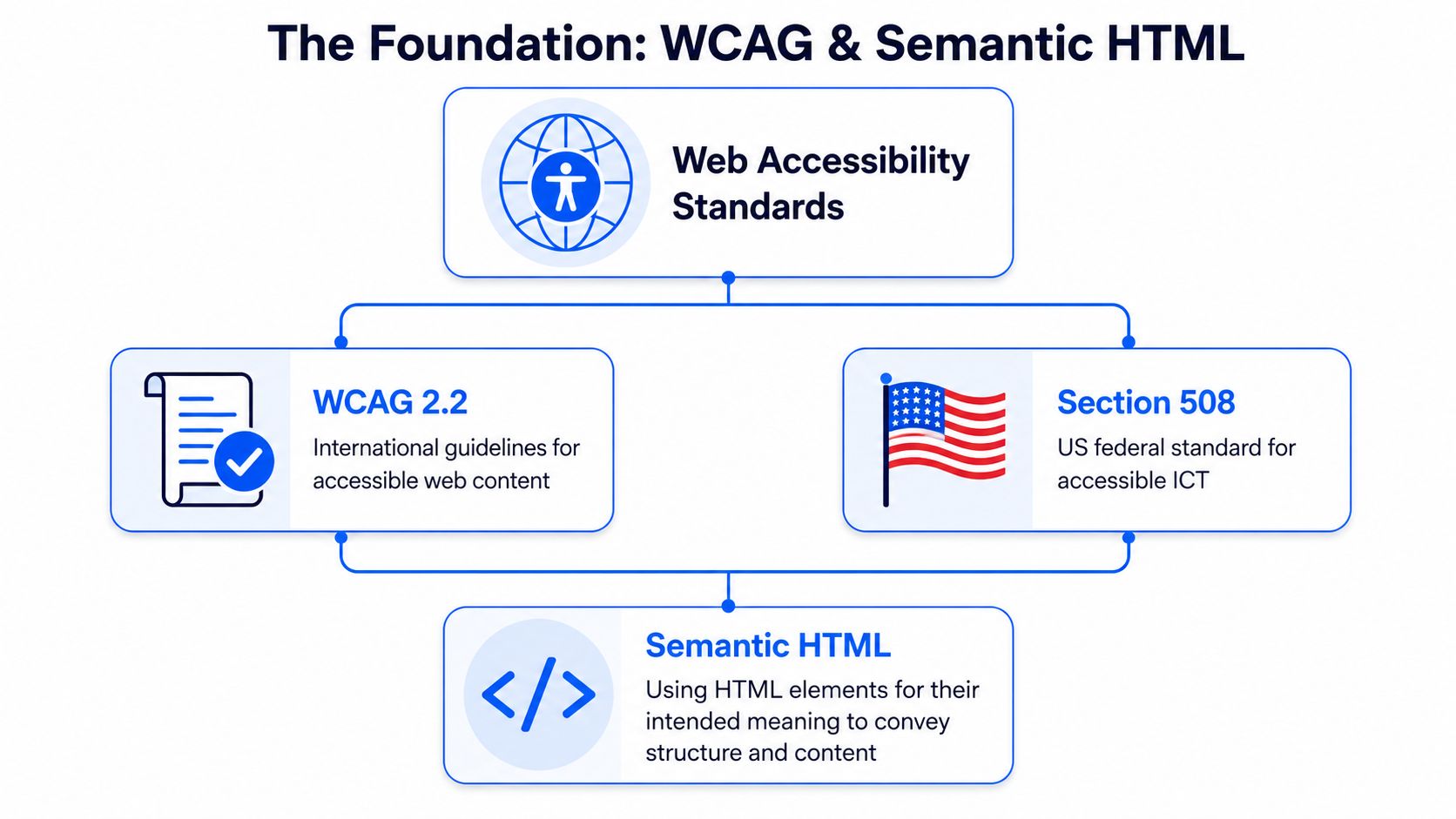
A form built with semantic HTML is like a building framed correctly before the finishes go on. You can still style it aggressively. You can still add JavaScript. But the structure underneath already tells browsers and assistive tech what each part is for.
That means:
| Element | What it gives you |
|---|---|
<form> | A defined submission region |
<label> | A proper accessible name for a control |
<fieldset> | A grouped set of related controls |
<legend> | A shared group label, especially useful for radios and checkboxes |
<button> | Native keyboard and interaction behavior |
Teams that skip those elements usually end up recreating them imperfectly with ARIA and event handlers.
Single-page apps and design systems haven't changed the underlying rule. Native semantics still do the heavy lifting. If you start with a div and try to make it act like an input, checkbox, or button, you inherit a long list of responsibilities: keyboard events, focus handling, state announcement, naming, error state communication, and more.
That's why I push teams to anchor design decisions to website accessibility standards before they componentize anything. It keeps implementation grounded in behavior, not only appearance.
Semantic HTML gives you the first layer of accessibility before you write ARIA, validation logic, or analytics events.
What works
What doesn't
div elements standing in for buttonsA good form starts with structure the browser already understands. That choice lowers implementation risk, improves interoperability, and makes every later accessibility decision easier.
Most broken forms don't fail at the visual layer. They fail at naming. A field can look polished and still be unusable if assistive technology can't tell the user what it is.
The ADA's web guidance makes the requirement plain: screen reader users must be automatically informed when they enter invalid data, and both the error and required fix need to be identified programmatically in the ADA web guidance. That only works when the field itself already has a reliable programmatic identity.
This is correct:
<label for="email">Work email</label> <input id="email" name="email" type="email" autocomplete="email"> This is not enough:
<p>Work email</p> <input type="email" placeholder="[email protected]"> In the second example, the screen may look fine. But the input doesn't have a guaranteed accessible name tied to it. Placeholder text also disappears on entry, which hurts memory and increases error risk.
For teams that need a refresher on native associations, mastering the HTML label tag is worth reviewing before building custom field components.
Native HTML should carry most of the work. ARIA helps when the relationship is more complex.
Use aria-describedby when a field needs extra guidance:
<label for="password">Password</label> <p id="password-help">Use at least one number and one special character.</p> <input id="password" name="password" type="password" aria-describedby="password-help"> Use aria-labelledby when multiple pieces of visible text together form the accessible name.
Use aria-label carefully, mostly when there is no visible label available. In forms, a visible label is usually the better choice because it supports everyone, not only assistive technology users.
If you can solve it with native HTML, do that first. ARIA should clarify semantics, not replace missing basics.
The strongest forms answer three questions before the user hesitates:
A few implementation habits help:
Radio buttons and checkbox sets need a shared prompt. Use this:
<fieldset> <legend>Preferred contact method</legend> <div> <input id="contact-email" name="contact-method" type="radio" value="email"> <label for="contact-email">Email</label> </div> <div> <input id="contact-phone" name="contact-method" type="radio" value="phone"> <label for="contact-phone">Phone</label> </div> </fieldset> Without <fieldset> and <legend>, many grouped choices lose context. Users hear the option labels, but not always the question that binds them together.
Clear labels and clear instructions do more than satisfy form accessibility guidelines. They reduce hesitation. And hesitation is where form abandonment starts.
A user lands on your signup form. They don't use a mouse. They press Tab.
The cursor enters the first field. Good. Then it jumps into a marketing carousel embedded in the page shell. Then into a hidden chat launcher. Then into a disabled coupon field. Then back to the form. At that point, the form may be technically present, but the flow is broken.
AudioEye's benchmark highlights a basic requirement that still gets missed often: keyboard-only users must be able to tab through focusable elements using keyboard commands alone. For forms, that means the interaction order has to match the visual and logical order.
Here's the standard I use during review:
A keyboard user experiences your form as a sequence, not a layout. If the sequence is chaotic, completion suffers.
W3C and VA.gov guidance both point in the same direction: long forms should reduce memory burden through multi-step flows, clear progress indicators, and consistent languagein WAI's forms guidance. That matters because users don't just answer fields. They manage uncertainty, attention, and recall while moving through the flow.
What tends to work well:
| Pattern | Why it helps |
|---|---|
| One question per page in high-friction workflows | Keeps attention on one decision |
| Progress indicators | Reduces uncertainty about effort remaining |
| Review pages before final submission | Lets users confirm without hunting backward |
| Stable button labels | Prevents confusion when the same action changes names across steps |
Some teams keep every field on one page because they're afraid extra steps will hurt completion. Others split too aggressively and create a tedious wizard. The right answer depends on complexity, but the accessibility principle stays the same: users need to know where they are, what changed, and what happens next.
That's also where broader product thinking helps. Teams working on onboarding and conversion flows can borrow from strong 2026 SaaS user experience strategies that emphasize clarity, pacing, and predictable interaction design. The accessibility angle sharpens that work because it forces the flow to remain understandable under keyboard and assistive technology use, not only under ideal visual conditions.
A form can pass field-level checks and still fail as a journey. Users complete flows, not isolated inputs.
Accessible user flow is where compliance work starts to feel like conversion work. The friction you remove isn't theoretical. It's the friction that stops submission.
Reactive forms can feel fast and polished, but they also introduce some of the most frustrating accessibility failures. Error text appears without being announced. Focus stays in the wrong place. Submit buttons remain disabled with no explanation. A user fixes one field and triggers three new messages elsewhere.
The problem isn't dynamic behavior itself. The problem is dynamic behavior without communication.
The current compliance environment makes this more urgent. The 2024 ADA Title II rule requires state and local governments to meet WCAG 2.1 AA, which raises the stakes for live validation, focus management, and accessible error handling in modern forms as reflected in the U.S. Web Design System form guidance.
The best validation patterns do three things well:
A simple pattern looks like this:
<label for="zip">ZIP code</label> <p id="zip-error">Enter a valid ZIP code.</p> <input id="zip" name="zip" aria-describedby="zip-error" aria-invalid="true"> Teams often disable the submit button until the form is “valid.” That can be acceptable in some cases, but only if users can understand why the control isn't available and how to enable it. If a control only looks disabled, the state also needs to be exposed to assistive tech.
USWDS guidance favors keeping forms enabled where possible and using aria-disabled="true" with JavaScript control when an element must appear disabled. That approach preserves communication. It avoids the dead-end feeling users get when a control exists visually but offers no path forward.
A failed submission isn't the end of the interaction. It's the moment your interface proves whether it can help.
Strong error handling usually includes:
For teams formalizing these patterns, a shared vocabulary around error recovery helps keep design, engineering, and QA aligned.
Users forgive mistakes in their own input. They don't forgive interfaces that make recovery harder than the original task.
Inline validation can absolutely improve usability. It reassures users, prevents surprises at submit time, and shortens correction loops. But it only helps when it's timely, connected, and specific. Anything else becomes noise.
Teams often ask whether automated scanning is enough for forms. It isn't.
The ADA guidance is explicit on this point: automated accessibility reports are insufficient on their own, so a clean scan doesn't prove a form is accessible. Manual testing with keyboards and assistive technologies is still necessary. VA.gov's form guidance reinforces the same operational reality by emphasizing keyboard navigation, screen reader testing with NVDA, JAWS, or VoiceOver, proper labels, and clear error association.
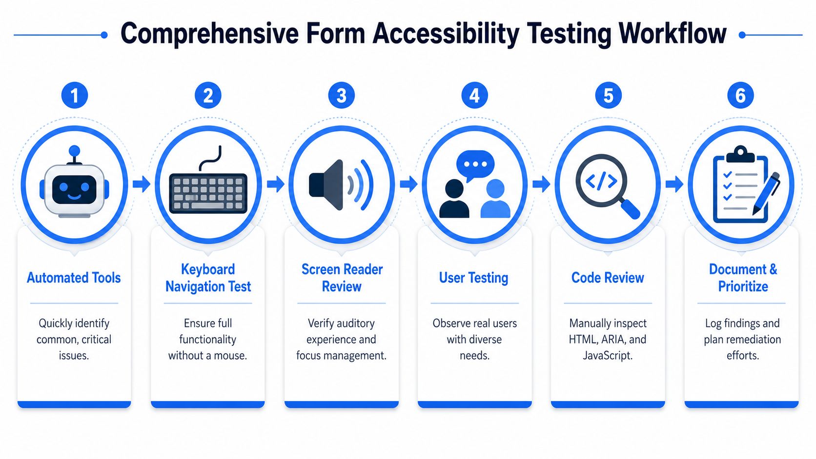
A strong form review usually follows this order:
aria-describedby, aria-invalid, field grouping, and focus management logic.A manual keyboard pass should answer questions like these:
A surprising number of forms fail not on labels, but on interactive edge cases like calendar widgets, searchable dropdowns, and conditional panels.
Here's a useful walkthrough to pair with internal QA practice: guide to web accessibility compliance.
Don't just sample fields. Complete real tasks.
Try these:
That task-based approach catches issues that isolated component checks miss.
A video walkthrough can help teams build muscle memory for the process:
Accessibility testing works best when QA treats the form like a user journey with state changes, not a static page with inputs.
The teams that catch form defects early usually aren't using magical tools. They're using a disciplined workflow and repeating it on every meaningful change.
A solid checklist keeps accessibility from becoming a last-minute interpretation exercise. It gives designers, developers, QA, and product owners one shared definition of “ready.”
Use this as a working QA tool for any lead form, checkout flow, registration path, support request form, or multi-step application.
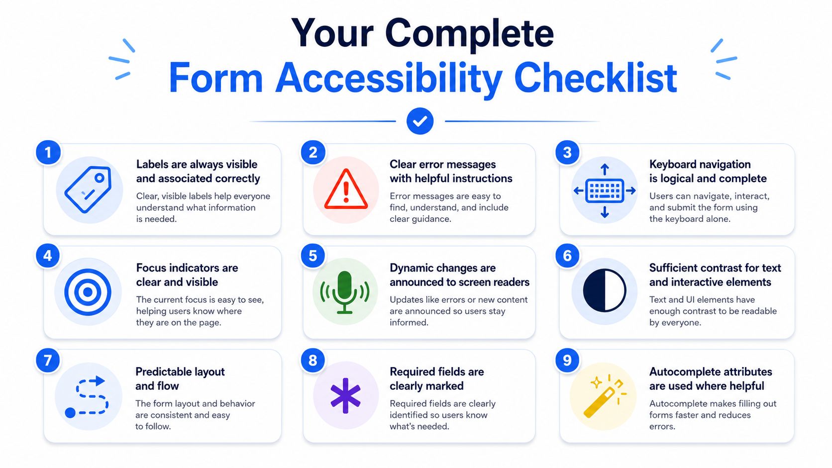
<label> first. Use ARIA only when native patterns can't express the relationship.<fieldset> and <legend>.Quality check: If a user makes a mistake, the interface should help them recover in the fewest possible steps.
A checklist's true value isn't documentation. It's consistency. Teams that use one well don't keep rediscovering the same form failures release after release.
WebAbility.io helps teams operationalize accessibility at scale with continuous monitoring, testing support, governance workflows, and tools that make it easier to sustain compliant, usable digital experiences over time. If you need a platform to support ADA, WCAG, Section 508, AODA, or EN 301 549 efforts while improving the user experience of forms and other key journeys, explore WebAbility.io.