How your form denotes required fields for better UX and CRO in 2026

Sidharth Nayyar

TL;DR: To maximize form completions and ensure a great user experience, always mark required fields both visually (with an asterisk or the word "required") and programmatically (using the required or aria-required="true" HTML attributes). This dual approach guarantees clarity for all users, including those using assistive technologies. Placing an explanatory note like "* Denotes required field" at the top of your form further reduces friction, boosts user trust, and improves conversion rates.
Here's the bottom line: Getting required fields right comes down to two things: a clear visual sign for sighted users (like an asterisk) and a programmatic cue for assistive technologies (like an ARIA attribute). This isn't optional. It's the only way to build forms that are accessible, earn trust, and actually get completed. Nail this from the start, and you'll sidestep a ton of user frustration and abandoned forms.
A Quick Guide to Marking Required Fields
Think about the last time you filled out a form. Your goal was to get it done as fast as possible, right? The way you mark required fields is a huge part of making that happen. Any confusion adds friction, which can lead to lost leads, failed sign-ups, and a frustrating user experience. Honestly, this small detail speaks volumes about your brand's commitment to creating a user-friendly and accessible website.
The principle here is simple but powerful: combine what users can see with what their technology can understand.
The Two-Part Rule for Accessible Forms
To build forms that genuinely work for everyone, you have to meet two different needs at the same time.
- For Sighted Users: You need an unmistakable visual marker. The asterisk (*) is the go-to symbol because it's universally understood. I've found that placing it just before the field label is the most effective spot. For even more clarity, especially on government or legal forms, spelling it out with
(required)leaves no room for doubt. - For Assistive Technology Users: This is where you need to think beyond the visual. Screen readers can't see an asterisk; they rely on the underlying code. Using attributes like
aria-required="true"or the HTML5requiredattribute is non-negotiable. These directly tell the software which fields must be filled out, creating an equivalent experience for non-sighted users. We dive deeper into how proper labeling works with these cues in our guide on the HTML label tag.
This dual approach ensures no one is left guessing.
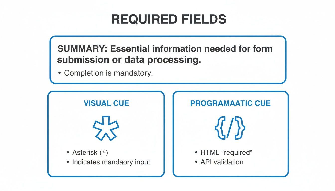
As the diagram shows, a truly accessible required field is a partnership between a visible symbol and a programmatic attribute. One without the other leaves a huge gap in usability for a portion of your audience, proving why you need a complete strategy.
Why Getting Required Fields Right Is a Game-Changer
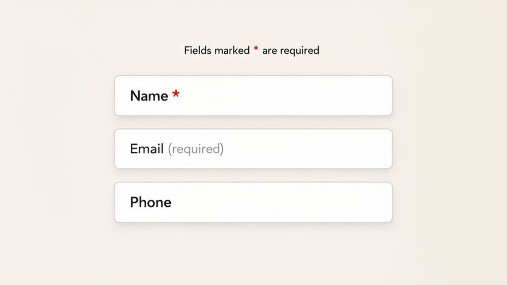
Let's be honest, confusing forms are more than just a minor annoyance. They're conversion killers. How your form denotes required fields sends a powerful message about your brand’s attention to detail and respect for your users. Get this small detail wrong, and you’re putting up a roadblock right when a user is trying to connect with you.
Think about it from the user's perspective. They’re trying to buy something, sign up for your newsletter, or get in touch. Any friction can send them packing. Unclear required fields are a classic point of failure, leading directly to higher form abandonment.
I’ve seen it happen time and again: a user hits "submit," only to be met with an error for a field they didn't know was mandatory. That frustration is often enough to make them abandon the form entirely and head straight to a competitor.
The Ripple Effect on User Experience and Conversions
A poorly designed form feels careless. When people can't immediately tell which fields are mandatory, they're forced to guess, which almost always leads to validation errors. This stop-start experience chips away at their trust and makes your business seem unprofessional.
On the other hand, a clear, intuitive form builds momentum. When it’s obvious what information you need, users can move through the process confidently and without hesitation. This smooth experience is crucial for maximizing conversions. After all, a positive interaction is a key part of how accessibility boosts your website's UX and sales.
Don't Forget Accessibility and Legal Rules
Beyond being good business, clear indicators are a fundamental part of digital accessibility. For someone using a screen reader, a simple red asterisk is invisible. Without the right code behind the scenes, like an aria-required="true" attribute, they won't know a field is required until they get an error message. It’s a frustrating and exclusionary experience.
Failing to provide these non-visual cues can also land you in hot water legally. You could be found non-compliant with major accessibility standards, including:
- Web Content Accessibility Guidelines (WCAG): Specifically, Success Criterion 3.3.2 demands that you provide labels or instructions for user inputs.
- Americans with Disabilities Act (ADA): Courts are increasingly ruling that the ADA applies to websites and digital properties.
- Section 508: This law mandates that federal agencies and their contractors make their electronic information accessible to everyone.
Ultimately, the way your website denotes required fields is a small detail that speaks volumes about your brand. It shows you value every user's time and are committed to creating an experience that works for everyone. That’s how you build a strong, trustworthy reputation online.
Designing Visual Cues That Everyone Understands
How you show users which form fields are required is your first, best chance to guide them smoothly. The classic asterisk (*) is a familiar starting point, but creating a genuinely clear experience means going a bit deeper. It's all about building a visual language that’s instantly understood, no guesswork needed.
When a user has to stop and wonder if a field is mandatory, you've already introduced friction. The small details in your design have a massive impact on how easily someone can complete a form. That’s why clear field indicators are a non-negotiable part of any good user experience and a core principle in expert UI/UX design services that focus on user-first interfaces.
Best Practices for Required Field Indicators
When it comes to visual cues, your watchwords should be consistency and clarity. A user should be able to scan your form and know exactly what you need from them in a split second.
Here are a few practical tips I always come back to for improving visual indicators:
- Place Indicators Before the Label: This is a huge accessibility win. Always put your asterisk or "(required)" text before the field label, like this:
* First Name. Screen reader users will hear "required, First Name," giving them crucial context before they get to the input box. - Use Explicit Text: An asterisk is widely understood, but spelling it out with
(required)is even better. It leaves zero room for misinterpretation, which is always the goal. - Add an On-Page Legend: Don't make users guess. A simple note at the top of the form, like "* Indicates a required field," eliminates any potential confusion right from the start.
I can't tell you how many times I've seen forms rely only on color, like making required labels red. This immediately fails for the roughly 1 in 12 men and 1 in 200 women with some form of color vision deficiency. Color should only ever be a secondary enhancement, never the primary signal.
The Role of Color and Placement
Color is a great tool for drawing attention, but it has to be paired with another indicator like an icon or text. A solid strategy is to use a distinct color for your asterisk or (required) text while also making sure it has enough contrast against the background. A dark red asterisk on a white background, for instance, is a classic for a reason.
The layout of your form matters, too. Placing labels directly above their input fields is a time-tested practice that strengthens the visual connection between the label, its indicator, and the field itself. It just makes things easier to follow.
Meeting Compliance and Building Trust
Designing clear visual cues is a fundamental part of meeting digital accessibility standards. Guidelines like WCAG stress the need for clear instructions on all forms. Taking a proactive approach here isn't just about reducing legal risk; it shows that your brand is committed to inclusivity. To get a better handle on the specifics, check out our guide on Web Content Accessibility Guidelines best practices.
Ultimately, designing cues that everyone understands comes down to respecting your user’s time and effort. When you make it easy for people to give you the right information on the first try, you build trust and dramatically improve their experience—and that’s the foundation of any high-performing website.
Making Forms Accessible for Assistive Technologies
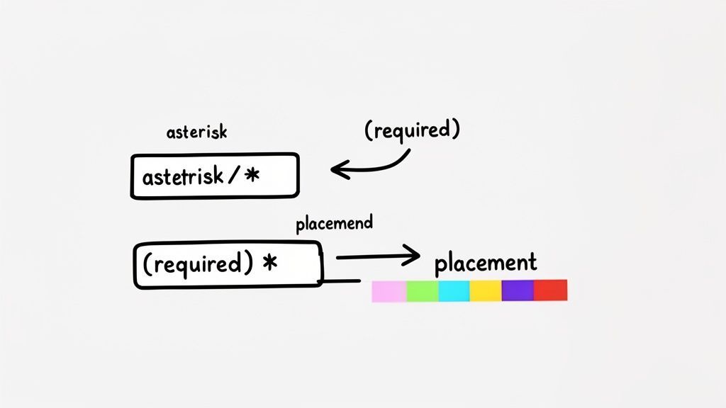
Putting a red asterisk next to a field is a great visual cue, but that’s only what sighted users see. To make a form truly accessible, it has to communicate those same requirements to people who can't see the screen. This is where the real work of digital inclusion happens—in the code.
This behind-the-scenes communication is what ensures someone using a screen reader has the same information as everyone else. Without it, a form can be a dead end. Following proper form accessibility standards is non-negotiable, especially when you're telling a user they must fill something out.
How to Tell Assistive Tech a Field Is Required
At its core, this comes down to two simple but powerful attributes: the HTML5 required attribute and aria-required="true". They might seem small, but their impact on usability is huge.
Think about it from the user's perspective. If these attributes are missing, a screen reader user has no idea a field is mandatory. They’ll tab through the form, fill out what they think is necessary, and hit "Submit"—only to be met with a vague error. By adding a single attribute, you give them the information upfront, preventing a ton of frustration.
It's like a GPS giving you a heads-up about a mandatory turn before you miss it, not after. That's the kind of clear guidance these attributes provide.
The HTML5 Required Attribute
The most straightforward method is using the native HTML required attribute. It’s a boolean, which means just having it there is enough to tell the browser and assistive tech that the field is mandatory.
Here’s what it looks like in practice: First Name
This tiny bit of code accomplishes two critical things:
- Informs Screen Readers: The software will announce something like, "First Name, required, edit text," giving the user immediate context.
- Enables Browser Validation: Modern browsers will automatically block form submission and show an error if a
requiredfield is empty.
Whenever you can, make this your default. It’s a native, widely supported HTML feature that gives you a solid, accessible foundation right out of the box.
When to Use ARIA-Required Instead
Sometimes, the standard HTML required attribute won't work, especially if you're dealing with custom JavaScript components or complex controls that aren't simple <input> elements. This is a perfect job for ARIA (Accessible Rich Internet Applications). If you're new to the concept, you can get a good overview of what ARIA is and how it helps.
The aria-required="true" attribute does the same job as its HTML cousin: it explicitly tells screen readers a field must be filled out.
You might use it on a custom div that acts like a text box, for example: Special Instructions
Handling Errors and Guiding Users to the Finish Line
Let's be realistic: even with perfectly marked fields, people are going to make mistakes. It’s inevitable. What truly matters is how your form reacts in that moment. This is where you can turn a point of frustration into a helpful, guided experience that builds trust.
The best strategy is to prevent errors before they even happen. A simple instruction at the top of your form, like "* Indicates a required field," can work wonders. It removes all the guesswork right from the start.
Think of it like a map's legend. You wouldn't hand someone a complex map without a key explaining what the symbols mean. The same logic applies here. Just as a key is essential for interpreting data in a historical archive, which you can learn more about by reviewing resources on U.S. historical statistics, a legend for your form helps users understand your visual cues instantly.
Crafting Error Messages That Actually Help
When someone does miss a field or enter the wrong information, a generic alert like "Error" is a dead end. It’s the digital equivalent of a shrug. A truly helpful error message is specific, polite, and tells the user exactly how to fix the problem.
I’ve found these practices make a world of difference:
- Be incredibly specific. Don't just say "Invalid Email." Instead, try "Please enter a valid email address, like [email protected]." This gives the user a clear model to follow.
- Keep the tone positive. Avoid language that sounds like you're blaming the user. Something like, "Oops! Looks like the 'City' field is empty" feels much more collaborative than "You failed to fill out all required fields."
- Put the message where it matters. Always display the error right next to the field that needs fixing. This is called inline validation, and it saves users from having to hunt down their mistake.
A great error message is more than just a notification—it's a course correction. It turns a moment of user failure into successful guidance, showing you’re there to help, not to judge. That small shift has a huge impact on how users see your brand.
Connecting the Dots for Screen Readers
For your error handling to be truly accessible, a visual cue isn't enough. You have to programmatically link the error message to its input field. This is non-negotiable for ensuring screen reader users know which field needs attention and what, specifically, is wrong.
The industry-standard way to do this is with the aria-describedby attribute. You add this attribute to your input field and point its value to the id of the element containing your error message text.
When you do this, a screen reader will announce the field’s label, its type (like "edit text"), and then read the error message you provided. It creates a seamless, logical flow of information that removes all ambiguity.
Getting validation right shows a deep respect for your users' time and effort. It proves you've anticipated their needs and are committed to getting them across the finish line. This is the kind of detail that doesn’t just improve form completion rates—it builds the trust that creates loyal customers.
Common Questions on Denoting Required Fields
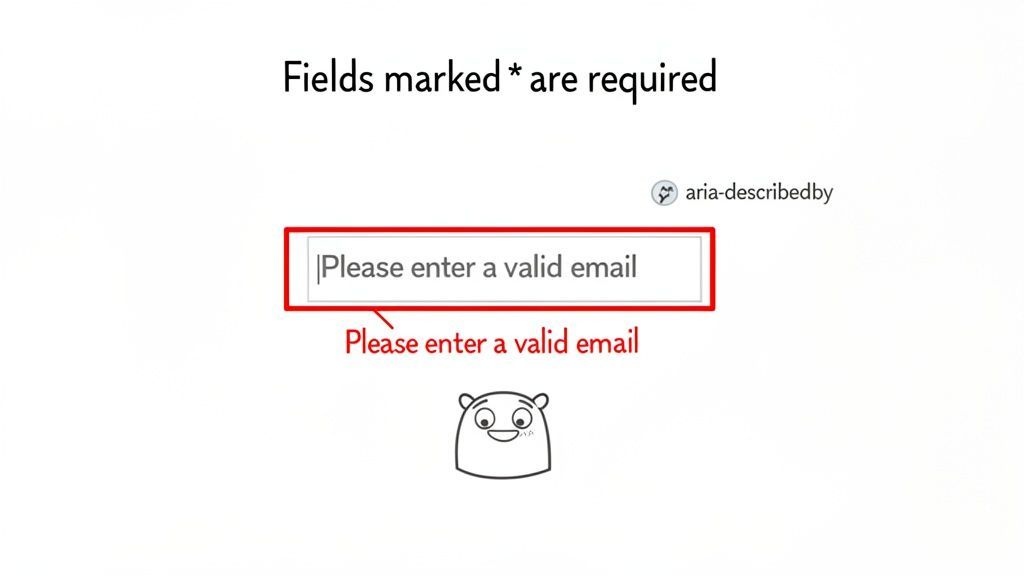
When you're building out a form, figuring out how to mark required fields seems like it should be straightforward. But as with many things in web accessibility, the details really matter. A few common questions come up time and time again from developers and designers I work with.
Let's walk through those common hangups and get you some clear, practical answers.
Is an Asterisk Enough to Denote a Required Field?
The trusty asterisk (*) is a classic for a reason—most people recognize it. But relying on it alone isn't enough to create a truly accessible form.
Think of it this way: the asterisk is a purely visual cue. For users who can't see it, it might as well not be there. That’s why you have to pair it with a programmatic indicator for screen readers and other assistive technologies. This means adding either the HTML5 required attribute or aria-required="true" to your input's code.
And don't forget the key! Always include a simple instruction at the top of your form that explains what the symbol means, like "* Indicates a required field." This combination of visual, programmatic, and textual cues ensures everyone understands what's needed.
Where Should I Place the Required Indicator?
This is one of those small details with a big impact. The best practice is to place the required indicator before the field label, not after it.
So, you’d use * First Name instead of First Name *.
Why? It’s all about the experience for screen reader users. The software reads from left to right, so it will announce "required" before reading the label itself. This gives the user crucial context right up front, telling them what’s expected before they even hear the field's name. It’s a much more logical and efficient flow.
A great user experience is about removing friction at every turn. Placing the indicator first is a small change that pays off big for accessibility, preventing confusion before it starts.
Can I Just Use the HTML5 Required Attribute?
The HTML5 required attribute is fantastic, and you should definitely use it. It's the modern standard for telling browsers and screen readers that a field is mandatory. Plus, it enables built-in browser validation, which can prevent a user from submitting an incomplete form.
But it only solves half the problem. The required attribute is entirely programmatic—it's invisible to sighted users. You still need to provide that visual marker, whether it's an asterisk or a simple word like (required), so people can see at a glance which fields they need to fill out. The magic happens when you combine both.
How Can Automated Tools Help with Required Fields?
Manually checking every form field across a large website is a recipe for mistakes. This is where automated tools and managed solutions can provide significant value, ensuring both compliance and a better user experience.
- Accessibility Scanners: These tools are brilliant at finding technical oversights. They can quickly crawl your site and flag any form fields that are missing essential programmatic attributes like
aria-required. It's like having a second pair of eyes on your code. - AI-Powered and Managed Solutions: Modern accessibility platforms and services offer a comprehensive approach. These solutions can identify issues at scale and provide efficient pathways to remediation, whether through automated code fixes or expert guidance. This allows your team to address accessibility systematically without disrupting development workflows.
Using these tools alongside manual expert audits gives you a robust strategy. The automation handles the technical, code-level issues, freeing up human experts to focus on the nuances of visual design, clear instructions, and intuitive error handling.
At WebAbility.io, we provide end-to-end accessibility solutions to help you build inclusive digital experiences that comply with global standards and open your brand to a wider audience. Discover how our AI-powered platform and expert services can help you achieve and maintain compliance at https://www.webability.io.
Quick Questions
Tap to ask AI about this article