ADA Compliant Website Design: A Complete 2026 Guide

Sidharth Nayyar
TL;DR
Making your website ADA compliant is about ensuring people with disabilities can use it. This is done by following the Web Content Accessibility Guidelines (WCAG), which are based on four principles: Perceivable, Operable, Understandable, and Robust (POUR). Key actions include providing alt text for images, ensuring keyboard-only navigation, using high-contrast colors, writing clean code with semantic HTML, and regularly testing your site with both automated tools and manual checks. Ignoring accessibility can lead to lawsuits and lost business, while an inclusive site expands your market reach and improves user experience for everyone.
In short, ADA compliant website design is all about making sure your website is usable for people with disabilities. The technical standard everyone follows is the Web Content Accessibility Guidelines (WCAG), which centers on four key ideas: making your site Perceivable, Operable, Understandable, and Robust (POUR) for everyone.
Not sure where your design stands?Scan your site free to see exactly where it fails WCAG, no signup. Then work through our ADA compliance checklist, or get expert help with our accessibility compliance services.
What Is ADA Compliant Website Design

ADA compliant website design means building your digital presence so it’s accessible to all users, including the 1.5 billion people worldwide living with a disability. It’s not just about ticking off a few boxes on a checklist; it's about fostering an inclusive space where everyone has equal access to your content and services.
The Americans with Disabilities Act itself is a U.S. civil rights law and doesn't lay out specific technical requirements for websites. Instead, the legal system consistently points to the Web Content Accessibility Guidelines (WCAG) as the benchmark for compliance.
This ultimately means your site needs to be designed and coded to work seamlessly with assistive technologies like screen readers, voice commands, and for users who rely solely on keyboard navigation.
The Four Principles of WCAG
The WCAG framework is built on four core principles. You’ll often hear them called the POUR principles, and they are the foundation of any truly accessible website.
These principles guide you in creating an experience that works for everyone, regardless of how they access the web.
Here's a quick breakdown of what each one means in practice:
The Four Principles of WCAG Explained
| Principle | What It Means | Practical Example |
|---|---|---|
| Perceivable | Users must be able to process the information on your site. It can't be invisible to all of their senses. | Providing descriptive alt text for images so a screen reader can describe the visual to someone who can't see it. |
| Operable | The interface and all its components must be usable. Users must be able to interact with buttons, forms, and navigation. | Ensuring every interactive element, like a dropdown menu or a "buy now" button, can be accessed and used with just a keyboard. |
| Understandable | The content and the site's functionality must be easy to comprehend. | Using clear, simple language and creating predictable, consistent navigation across all pages of your site. |
| Robust | Content must be compatible with a wide range of technologies, both current and future, including assistive tools. | Writing clean, standard-compliant HTML so that screen readers and other assistive devices can interpret the content correctly. |
Adopting this mindset helps you move beyond just avoiding legal trouble and toward genuinely improving the experience for every visitor. This shift not only builds a positive brand reputation but also expands your reach.
For a deeper dive into putting these ideas into action, check out these Top Website Accessibility Best Practices. It’s a great resource that sets the stage for the more detailed steps we'll cover next.
Why ADA Compliance Is a Business Imperative
Let's be blunt: ignoring your website's accessibility has gone from a simple oversight to a major business risk. This isn't just about doing the right thing anymore. It's about facing the very real financial and legal consequences of having a website that locks people out. In today's world, a digitally accessible presence isn't optional—it's just smart business.
The legal ground has become increasingly shaky for companies that drag their feet on accessibility. Since 2019, web accessibility lawsuits have been climbing at an average rate of 13% each year. In 2023 alone, businesses were hit with over 4,600 lawsuits—that's 3,086 at the federal level and 1,519 in state courts across the U.S. If you want to dig deeper, you can explore more web accessibility statistics to see just how serious this has become.
This isn't just a temporary trend. It's a clear message that the digital world is finally being held to the same standards as the physical one.
The True Cost of Non-Compliance
The financial sting of non-compliance goes way beyond legal fees. While a lawsuit is certainly expensive, it's often the hidden costs that inflict the most lasting damage on your company's reputation and bottom line.
Here’s what you’re really looking at:
Legal Penalties and Settlements: These can start in the tens of thousands and quickly climb into the millions. That figure doesn't even include your own attorney's fees or the court-ordered fixes you'll have to pay for.
Brand Damage: A lawsuit immediately brands you as exclusionary. That kind of negative press can turn away customers, scare off partners, and make it harder to attract talent who care about inclusivity.
Lost Revenue: It’s simple math. When a huge chunk of the population can't use your website, you're literally turning away customers who want to give you their money.
Forgetting about accessibility is like locking the front door of your store to one out of every four potential customers. It’s a direct loss of opportunity and a clear message that you don’t value their business.
Thinking of ADA compliant website design only as a way to avoid getting sued is missing the whole point. It's not just about defense; it's about going on the offensive to capture a massive, untapped market.
Unlocking the $13 Trillion Disability Market
It’s easy to see accessibility as just another expense, but that’s a fundamentally flawed perspective. The truth is, investing in an inclusive website is one of the smartest strategic moves you can make, opening your doors to a loyal and significant market segment.
Globally, people with disabilities and their immediate circles control an estimated $13 trillion in disposable income. This is the "disability market," and it's a powerhouse consumer group that most businesses completely ignore.
The Strategic Advantages of an Inclusive Website
An accessible website does more than just keep you out of legal trouble—it’s a powerful asset that fuels growth and, frankly, makes your site better for every single person who visits it.
Here are some of the biggest business benefits you’ll see:
Expanded Market Reach: An ADA-compliant site is usable by the 1.5 billion people worldwide living with a disability. Your potential customer base instantly gets bigger.
Enhanced Brand Reputation: Companies that get this right are seen as ethical, modern, and inclusive. That's how you build real brand loyalty and a positive public image.
Improved SEO Performance: So many accessibility best practices—like using semantic HTML, writing good alt text for images, and having a logical site structure—are also things Google absolutely loves. An accessible site almost always ranks better.
Better User Experience for All: Think about it. Features designed for accessibility, like clear navigation, readable fonts, and high-contrast colors, make the experience better for everyone, not just users with disabilities.
Ultimately, if you can shift your mindset and frame your investment in ADA compliant website design as a growth strategy instead of a compliance chore, you’re already on the right track. It's a direct path to reaching more customers, building a stronger brand, and creating a better digital experience for all.
Designing for Accessibility from the Start
If you want to build a truly ADA-compliant website, you can't treat accessibility as a line item on a final punch list. It has to be woven into the fabric of your project from the very first sketch. I've seen too many teams try to "bolt on" accessibility at the end, and it's always a painful, expensive mess that leads to a clunky user experience.
The only way to do it right is to "shift left," which just means making inclusive design a core part of your process from the earliest planning and wireframing stages. When you do this, accessibility becomes a foundational pillar of your design system, not just a patch you apply later. It sets your entire team—from designers to developers—up for success and saves you from a world of headaches and costly fixes down the road.
Despite the obvious benefits and legal risks, it's shocking how far behind the digital world is. As of 2025, a staggering 4% of websites worldwide are actually compliant with the Americans with Disabilities Act (ADA) and Web Content Accessibility Guidelines (WCAG).
Building with Empathy Through User Personas
So where do you begin? You start with people. You need to understand who you're designing for, and that means going beyond the generic user personas we all know. You have to create profiles that specifically represent individuals with different disabilities. This isn't just a box-ticking exercise; it’s about building genuine empathy on your team, which leads to better, more human-centered design choices.
Think about creating personas that cover a real range of abilities:
Someone with Low Vision: This person might rely on screen magnification or high-contrast browser settings. Their experience will immediately push you to test your color palette and ensure your fonts scale properly.
A Keyboard-Only User: Maybe they have a motor disability and can't use a mouse. This persona forces you to make sure every single interactive element—menus, buttons, forms—is reachable and usable with just the tab key.
A Screen Reader User: Representing someone who is blind, this persona shines a bright light on the need for a logical content structure, descriptive alt text for images, and properly nested headings.
These personas are practical tools that will guide your design decisions and stop you from accidentally putting up barriers. To see how to put this into practice, check out our guide on how to integrate accessibility features into your design process.
This infographic really drives home how designing for everyone from the start creates a better product for all.
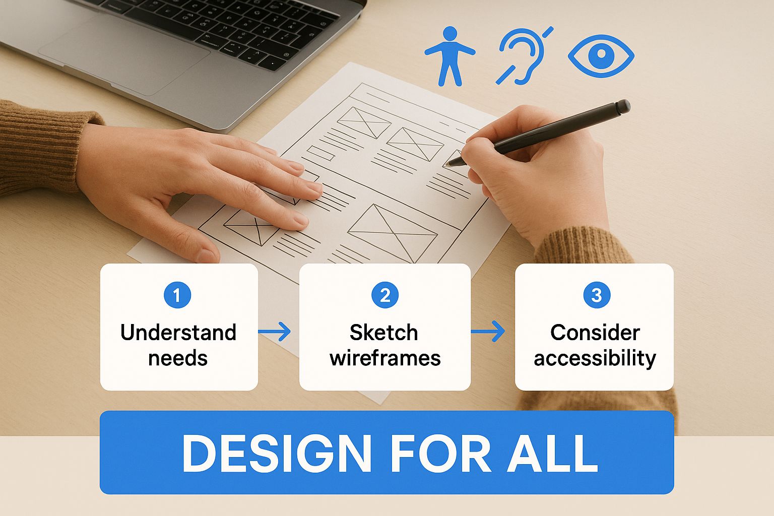
As you can see, accessibility isn't a separate track. It’s an integral part of the entire workflow that influences every decision you make, from early sketches to the final launch.
Core Pillars of Accessible Visual Design
Once you have that empathetic foundation, you can start making concrete design choices. And let's be clear: accessible design isn't about being boring or sterile. It's about creating clarity and making things easy to use.
Color and Contrast
One of the most common and easily avoidable accessibility failures I see is poor color contrast. If text is hard to read against its background, you’ve immediately failed users with low vision or color blindness.
The rule of thumb is simple: aim for a contrast ratio of at least 4.5:1 for normal text and 3:1 for large text (which is about 18pt regular or 14pt bold). Don't just eyeball it—use a reliable color contrast checker tool throughout your design process.
Typography and Readability
Your font choices matter. A lot. That super artistic, decorative font might look great in a mockup, but it can be a nightmare for users with dyslexia or vision impairments. Stick with clean, simple sans-serif fonts where the letters are easy to tell apart.
Just as important, make sure your font sizes are flexible. Users should be able to zoom in on your text without the entire layout falling apart.
Clear Visual Hierarchy
A strong visual hierarchy is your user's roadmap. It guides them through the content in a logical way. You create this with smart use of headings, white space, and consistent visual patterns.
This helps everyone, but it’s absolutely essential for people using screen readers. They rely on a well-structured heading outline (H1, H2, H3, etc.) to understand the page structure and jump to the section they need. When you wireframe with this hierarchy in mind from day one, you build a site that feels intuitive for everybody.
Developing an Accessible Website
Once your inclusive design blueprint is ready, it's time to bring it to life with clean, accessible code. This is where the rubber meets the road—translating visual concepts into a functional, tangible experience for every user. The mission here is to write code that not only renders perfectly in a browser but also communicates its structure and purpose clearly to assistive technologies.
https://www.youtube.com/embed/0hqhAIjE_8I
The absolute bedrock of an accessible website is semantic HTML. I can't stress this enough. Using the right HTML tags for the right job is the single most impactful thing a developer can do for accessibility. It’s the structural skeleton of your page.
When a screen reader hits a <nav> tag, it doesn't just read the text; it announces "navigation," instantly telling the user they've found the main menu. A <main> tag signals where the real content begins, letting them skip past a repetitive header. This isn't just about following best practices; it's about handing a clear, logical map to users who can't see the visual layout.
Writing Code That Speaks to Everyone
A classic mistake I see all the time is using a <div> for everything. Developers style a <div> to look like a button, and visually, it works. But for a screen reader user, it's a dead end. The screen reader just sees a generic container, not an interactive element.
Instead, using the actual <button> element is non-negotiable. It comes with accessibility baked right in—it’s keyboard-focusable by default, and screen readers immediately announce it as a "button." Tapping into this built-in functionality is the cornerstone of effective development.
For a deeper look into the practical steps and crucial guidelines for building an inclusive online space, check out this guide on how to make your website accessible.
Using ARIA When HTML Isn't Enough
Sometimes, standard HTML doesn't have a tag that perfectly describes a complex, custom widget like an interactive slider or a dynamic dropdown menu. That's where ARIA (Accessible Rich Internet Applications) saves the day. Think of ARIA attributes as a supplemental layer of information that gives assistive tech the context it needs.
You can use ARIA roles and properties to explain what an element does and what state it's currently in.
role="alert"can be used to announce important, time-sensitive messages.aria-expanded="true"tells a screen reader that a collapsible menu is currently open.aria-label="Close dialog"provides a clear, accessible name for a button that only has an 'X' icon.
Think of ARIA like a helpful tour guide for a screen reader user. While semantic HTML builds the museum, ARIA provides the descriptive placards that explain what each exhibit does, making the experience understandable and interactive.
Keyboard Navigation is a Must
Here's a simple, fundamental test for accessibility: can you use your entire website without touching a mouse? Many users with motor disabilities rely exclusively on a keyboard to get around. This means every single interactive element—links, buttons, form fields, menus—must be reachable and usable with just the Tab key.
As a developer, you have two critical responsibilities here:
Logical Focus Order: The tab order must follow the visual flow of the page. It should move logically from top to bottom, left to right, just as a sighted user would scan it.
Visible Focus Indicator: You have to provide a clear visual indicator (like an outline or a change in background color) showing which element is currently selected. A common, and terrible, practice is to hide this outline with
outline: none;. It leaves keyboard users completely lost.
To help you spot these issues in your own code, I've put together a quick-reference table. It highlights some of the most frequent development pitfalls and shows you exactly how to fix them.
Common Accessibility Issues and Fixes
| Common Issue | Poor Practice Example | Compliant Solution |
|---|---|---|
| Non-descriptive Link Text | Coded as <a href="#">Click Here</a> | Coded as <a href="#">Read our full annual report</a> |
| Vague Image Alt Text | alt="chart" | alt="Bar chart showing a 25% increase in Q3 sales over Q2." |
| Missing Form Labels | Using placeholder text as a label. | Using <label for="email">Email</label><input type="email" id="email"> |
Custom Button with a<div> | <div class="button">Submit</div> | <button type="submit">Submit</button> |
Focusing on these core development practices—semantic HTML, smart ARIA implementation, and solid keyboard support—is how you build a website that isn't just technically sound, but genuinely works for everyone.
Look, if you want to be sure your website is genuinely ADA compliant, you have to get serious about testing. It's not enough to just build with accessibility in mind. It's like cooking a five-course meal without ever tasting a single dish—you're just hoping for the best.
A real-world testing strategy needs a two-pronged attack. You combine the speed and efficiency of automated tools with the irreplaceable insight of manual, human-led checks. If you rely on just one, you'll leave massive gaps, opening yourself up to frustrated users and potential legal headaches.
This blended approach is the only way to catch both the black-and-white technical bugs and the nuanced usability problems that software simply can't grasp.
Automated Testing: Your First Line of Defense
Think of automated checkers as your scouts. They're great for a quick first pass. Tools like axe DevTools (a browser extension) and the WAVE Web Accessibility Evaluation Tool are fantastic for rapidly scanning your site for common, code-level mistakes.
They’re incredibly good at flagging clear-cut WCAG failures, such as:
Missing alt text on image tags.
Poor color contrast that makes text hard to read.
Form fields that aren't properly labeled.
Empty links or buttons without any descriptive text.
But here’s the reality check: automated tools can only catch about 30-40% of all potential accessibility problems. The WebAIM Million Project's annual report really drives this home. Their 2024 analysis found that 95.9% of the world's top one million homepages still had detectable WCAG 2 failures. It’s a sobering reminder of how common even these basic errors are. You can dive into the details in their full WebAIM Million Project analysis.
An automated tool can see if an image has alt text, but it has no idea if that alt text is any good. A description like "image" is technically present, but it's completely useless to someone using a screen reader. This is exactly why manual testing is non-negotiable.
Manual Testing: The Human-Centered Approach
This is where you roll up your sleeves and experience your website from the perspective of users with disabilities. Manual testing uncovers the real-world usability flaws and contextual errors that automated scanners will always miss. It’s less about checking code and more about understanding the experience.
Here are the essential manual checks your team absolutely has to perform.
Keyboard-Only Navigation
First thing: unplug your mouse. Seriously.
Now, try to use your entire website with just the keyboard. Can you get to every link, fill out every form, and trigger every button using only the Tab, Shift+Tab, Enter, and arrow keys?
As you tab through the page, keep an eye out for two critical things:
A logical focus order. The focus should move predictably down the page, not jump around randomly.
A highly visible focus indicator. You need a clear, obvious outline or highlight so you always know exactly where you are on the page. If you can't see it, it's a failure.
Screen Reader Testing
This is probably the most eye-opening thing you can do. A screen reader is software that reads the content of a screen aloud, which is essential for people who are blind or have low vision.
Get your hands on a screen reader like NVDA (it’s free for Windows), JAWS (the industry standard for Windows), or VoiceOver (which is built right into every Mac and iPhone). Fire it up and try to accomplish a key task on your site—like finding contact information or completing a checkout.
You'll immediately hear if your heading structure makes sense, if your links are descriptive enough out of context, and if your content flows logically. Review the ADA compliance checklist to evaluate whether your website meets the requirements set by the Americans with Disabilities Act.
Getting your website to an ADA-compliant state is a huge accomplishment, but it's definitely not the finish line. Websites are living things. You're constantly adding new blog posts, updating product features, and tweaking the code. Without a solid plan, all that hard work can unravel, and your site can drift back into non-compliance surprisingly fast.
True, long-term accessibility isn’t about a one-and-done project. It’s about building a sustainable process and weaving accessibility into the very fabric of your company culture. It's an ongoing commitment to keeping your digital door open to everyone as your site evolves.
Publish an Accessibility Statement
One of your first moves should be to get a clear and honest accessibility statement published on your site. Think of this as your public commitment to inclusivity. It’s a powerful document that does more than just tick a box.
For starters, it sets a clear standard for your own team and shows your users you’re serious about this. Even more crucial, it gives people a direct way to contact you if they run into a barrier. This feedback channel is invaluable—it lets you find and fix real-world problems you might have missed.
Turning a potential complaint into a chance to improve your site builds incredible goodwill.
An accessibility statement is more than just a legal page; it's a handshake with your users. It says, "We value your experience, and if we've missed something, we want you to tell us so we can fix it."
This proactive step demonstrates a good-faith effort to stay compliant and shows you genuinely care about every visitor's experience.
Integrate Accessibility into Your Workflow
The most efficient way to maintain compliance is to stop new accessibility bugs from ever going live. The best way I've seen to do this is by building automated checks right into your development workflow, specifically the CI/CD (Continuous Integration/Continuous Deployment) pipeline.
When you plug automated scanning tools like axe into this process, your development team gets immediate feedback on their code. It’s a game-changer.
This approach pays off in a few big ways:
Catch problems early: It flags common issues like missing alt text or low contrast ratios while the code is still being written. Fixing things here is way cheaper and faster than after a feature is already live.
Educate developers on the job: The instant, contextual feedback helps developers see their mistakes in real-time, which is one of the best ways for them to learn and avoid repeating them.
Enforce your standards: It creates a consistent quality gate. No new code gets pushed to the live site if it breaks the basic accessibility rules you've set.
Commit to Ongoing Team Training
At the end of the day, accessibility is a team sport. It can't just be the developer's job. Everyone who has a hand in the website—from the content writer and the marketing specialist to the UI designer—has a part to play. One of the biggest risks to your site's compliance is simply a lack of awareness across the team.
Regular training keeps everyone aligned and reminds them of the "why" behind the guidelines, not just the "how." When content creators instinctively write meaningful alt text, designers always run their colors through a contrast checker, and marketers insist on accurate video captions, you know you're on the right track.
When your entire organization shares the responsibility for an inclusive user experience, maintaining an ADA compliant website design stops being a special project and becomes a natural part of how you work.
This section breaks down some of the most common questions about ADA-compliant website design. We'll clear up the difference between the ADA and WCAG, explain why those popular "accessibility overlay" widgets aren't a silver bullet, and give you a practical schedule for auditing your site.
Frequently Asked Questions
When you start digging into ADA-compliant website design, a few key questions pop up time and time again. Let’s tackle them head-on to clear up any confusion and help you build a solid accessibility strategy.
What Is the Difference Between the ADA and WCAG?
It's really common to see these terms used interchangeably, but they serve two very distinct purposes.
The Americans with Disabilities Act (ADA) is a major U.S. civil rights law. It’s the legal foundation that bans discrimination against individuals with disabilities, and courts have consistently applied it to the digital world, including websites.
The Web Content Accessibility Guidelines(WCAG) are the technical instructions. Think of them as the detailed, how-to manual for building an accessible website. So, the ADA sets the legal requirement (the what), while WCAG provides the specific, internationally recognized standards for getting it done (the how).
Can an Accessibility Overlay Widget Make My Site Compliant?
This is a big one, and the short answer is no, not by itself. While these widgets might seem like a quick fix, they often create more problems than they solve and fail to address core, code-level accessibility barriers.
Overlays work by adding a layer of code on top of your site, but they can't fix things like poorly written HTML or a confusing navigation path for keyboard users. They're more of a band-aid than a cure.
Relying on an overlay as your sole compliance solution is a massive gamble. In fact, over 700 lawsuits have been filed against companies using an accessibility widget, proving they just aren't a reliable legal defense.
How Often Should I Audit My Website for Accessibility?
There’s no one-size-fits-all answer here. The right audit schedule really depends on how often your website changes.
As a general rule, a full, professional audit at least once a year is a great starting point for most businesses. But you'll want to be more proactive if your site is more dynamic:
Busy E-commerce Stores: It's smart to run an audit every quarter, especially after launching new products or running a major holiday sale.
Active Blogs or News Sites: If you're constantly adding content, a semi-annual check-in is a good idea.
After a Major Redesign: Always, always do a complete audit right after a new site or major feature goes live.
Staying on top of audits shows your commitment to ADA-compliant website design isn't just a one-time project, but an ongoing part of how you operate.
Ready to ensure your website is truly accessible and compliant? WebAbility.io provides an end-to-end platform with automated scanning, real-time monitoring, and a powerful AI-enhanced widget to help you achieve and maintain compliance with confidence. Discover how we can help at https://www.webability.io.
Quick Questions
Tap to ask AI about this article