Color Contrast for Accessibility: WCAG Guide (2026)

Sidharth Nayyar

Color Contrast for Accessibility: The Complete WCAG Guide for 2026
For your website to be accessible, text must be readable - and that starts with color contrast. Poor contrast is one of the most common accessibility failures on the web, yet it is also one of the easiest to prevent. This guide covers everything you need: what contrast is and why it matters, the exact WCAG ratios, the best testing tools, common mistakes, and how to build an accessible palette, implement it in code, and keep it compliant over time.
TL;DR: WCAG requires a contrast ratio of at least 4.5:1 for normal text and 3:1 for large text (Level AA), with non-text UI elements needing 3:1. Test pairs with tools like WebAIM Contrast Checker, define an accessible palette using semantic CSS variables, and automate contrast checks in your workflow so your colors stay compliant as your product grows.
What Is Color Contrast And Why It Matters

Color contrast is the measurable difference in luminance between two colors - typically text (foreground) and its background. The greater the difference, the easier the text is to read. Sufficient contrast is essential for users with low vision, color vision deficiencies, or anyone viewing a screen in bright sunlight. Get it wrong, and content becomes invisible to a meaningful share of your audience.
Think of color contrast as the difference in perceived brightness between two colors—usually your text and whatever is behind it. A high-contrast combination makes words jump off the page, sharp and clear. It’s not just a nice-to-have design detail; it’s one of the cornerstones of building an inclusive website that actually works for people.
When the contrast is too low—imagine light gray text on a white background—the letters seem to melt into the background. For some, this is a minor annoyance. For millions of others, it’s a complete roadblock.
This barrier is a serious problem for:
- People with low vision who need that sharp definition to distinguish letters.
- Individuals with color blindness who don't perceive color differences in the same way.
- Older adults, as our eyes naturally change with age and require more contrast.
- Frankly, anyone trying to read a screen in bright sunlight or a dimly lit room.
Making Your Content Readable For Everyone
Getting a handle on color contrast is one of the single most effective things you can do for your site's accessibility. It ensures the message you're trying to send can actually be received by the widest possible audience, regardless of their visual abilities or current environment. This isn't just about compliance; it directly boosts user experience, builds trust, and helps you connect with more people.
Good color contrast isn’t some advanced, optional feature. It’s the cost of entry for creating a website that people can actually read and use.
When you make clear, high-contrast design a priority, you're doing more than just ticking a box on a checklist. You're building a digital space that welcomes everyone. Making your content readable is the first, most crucial step toward making it truly useful.
TL;DR: Good color contrast is non-negotiable for making your website readable. When colors are too similar, it creates huge problems for people with visual impairments like low vision and color blindness, and even makes it hard for someone to see their screen in bright sunlight. Getting contrast right is a fundamental part of inclusive design that just makes things better for everyone.
Why Good Color Contrast Is Non-Negotiable
Strong contrast is more than a compliance checkbox. It is a universal design pillar that improves readability for everyone, reduces eye strain, and supports usability on low-quality displays and in poor lighting. It also carries legal weight: contrast failures are among the most frequently cited issues in ADA and WCAG complaints, and good contrast contributes to a better overall user experience that search engines reward.
Forget the technical jargon and compliance checklists for a moment. Let's talk about the human side of color contrast for accessibility. At its heart, good contrast is just the difference in brightness between a foreground element (like text) and its background. When that difference is too small, words and graphics get muddy and hard to make out.
Think about trying to read a note written in light grey pencil on a slightly darker grey piece of paper. You’d have to squint, tilt it towards the light, and still might not be able to read it. That's the frustrating experience millions of people have every day online when faced with low-contrast designs.
This isn’t some edge case affecting a tiny fraction of users. It’s a widespread issue that turns simple online tasks into a massive headache for a whole lot of people.
Who Are We Excluding with Low Contrast?
When a design uses colors that blend together, it puts up a wall for a surprisingly large number of people. The impact is huge, often locking them out of essential services, information, and online communities.
Here are just a few real-world examples of who gets left behind:
- People with Low Vision: For someone with a condition like glaucoma or macular degeneration, sharp definition is everything. Low contrast can make text melt into the background, turning a webpage into an unreadable blur.
- Older Adults: Our eyes change as we age, naturally requiring more light and stronger contrast to see things clearly. A design that looks perfectly fine to a 25-year-old could be a fuzzy mess for a 65-year-old.
- Anyone in a Less-Than-Ideal Environment: Ever tried to use your phone at the beach or on a sunny day? The glare completely washes out the screen, and without strong contrast, the content just vanishes.
The problem is especially severe for people with color vision deficiencies. There are around 300 million people worldwide with some form of color blindness, which dramatically changes how they see color pairings. For a deep dive into how color perception works, check out this great overview on the importance of color contrast.
It’s More Than Just a Guideline
Ultimately, paying attention to color contrast for accessibility isn't just about checking a box on a WCAG report. It's about empathy. It's about acknowledging that people will experience your website in different ways, with different abilities, and in different settings.
By intentionally choosing colors that contrast well, you’re making a clear choice to include more people. You're saying that you value every single person's ability to see and understand what you've created.
When you ignore contrast, you're essentially telling a huge part of your audience that your site isn't for them. Critical error messages go unseen, important "buy now" buttons are missed, and your carefully crafted content is never read.
Getting this simple design principle right has a massive impact on usability. A high-contrast design is more robust, more dependable, and creates a more welcoming experience for every person who lands on your site. Good contrast isn't a niche accommodation; it's a universal upgrade.
TL;DR: To meet legal accessibility standards (WCAG AA), your regular text needs a 4.5:1 contrast ratio, and large text needs 3:1. For an even better user experience (AAA), those numbers jump to 7:1 and 4.5:1. Don't forget that important graphics and UI elements, like icons and form fields, also need a 3:1 ratio.
Decoding the Official WCAG Guidelines
- Normal text (AA): at least 4.5:1.
- Large text (AA): at least 3:1. Large text means roughly 18pt (24px) and up, or 14pt (18.66px) and up if bold.
- Normal text (AAA): at least 7:1; large text (AAA): at least 4.5:1.
- Non-text elements: at least 3:1 for meaningful icons, form borders, focus indicators, and UI components.
These ratios are calculated from the relative luminance of the two colors, so a tool is far more reliable than the naked eye.
To make sure the web works for everyone, we need a common set of rules. That’s where the Web Content Accessibility Guidelines (WCAG) come in. Think of WCAG as the official building code for the internet—it gives us a shared framework to create digital spaces that are usable for people with different abilities.
These guidelines aren't just random numbers. They're rooted in solid research about how people see. They provide designers and developers with clear, measurable targets to hit, ensuring that content is readable for people with visual impairments, including different types of color blindness and low vision. Following these standards takes the guesswork out of accessible design.
Level AA: The Industry Standard
When you hear people talk about accessibility compliance, they’re almost always talking about WCAG Level AA. This is the benchmark for legal requirements in many countries and the standard that most organizations aim for.
When it comes to color contrast, Level AA boils down to two key rules:
- Normal Text (under 18pt / 24px): Must have a minimum contrast ratio of 4.5:1. This covers the vast majority of your content, like body paragraphs and labels.
- Large Text (18pt / 24px and up, or 14pt / 19px if bold): Needs a slightly lower minimum contrast of 3:1. Because the text is bigger and bolder, it’s naturally easier to see, so it doesn't require quite as much contrast.
Getting these two right is the single most important thing you can do to make sure the text on your site is readable. It's often the difference between a site that welcomes everyone and one that shuts out a huge part of your audience.
Level AAA: The Gold Standard
While Level AA is the target for compliance, there's an even higher bar you can aim for: Level AAA. This standard is all about enhanced accessibility, creating an even more readable experience for users with more significant vision loss.
The AAA standard is much stricter, requiring a 7:1 ratio for normal text and a 4.5:1 ratio for large text. While it's not typically a legal requirement, meeting the AAA standard shows a serious commitment to inclusivity.
Hitting Level AAA across an entire website can be tough, especially when you're working with a restrictive brand color palette. But it's a fantastic goal for critical information, like on government websites or healthcare portals where crystal-clear readability is non-negotiable.
This infographic gives a great overview of how different tools can help you check and verify these essential contrast ratios.
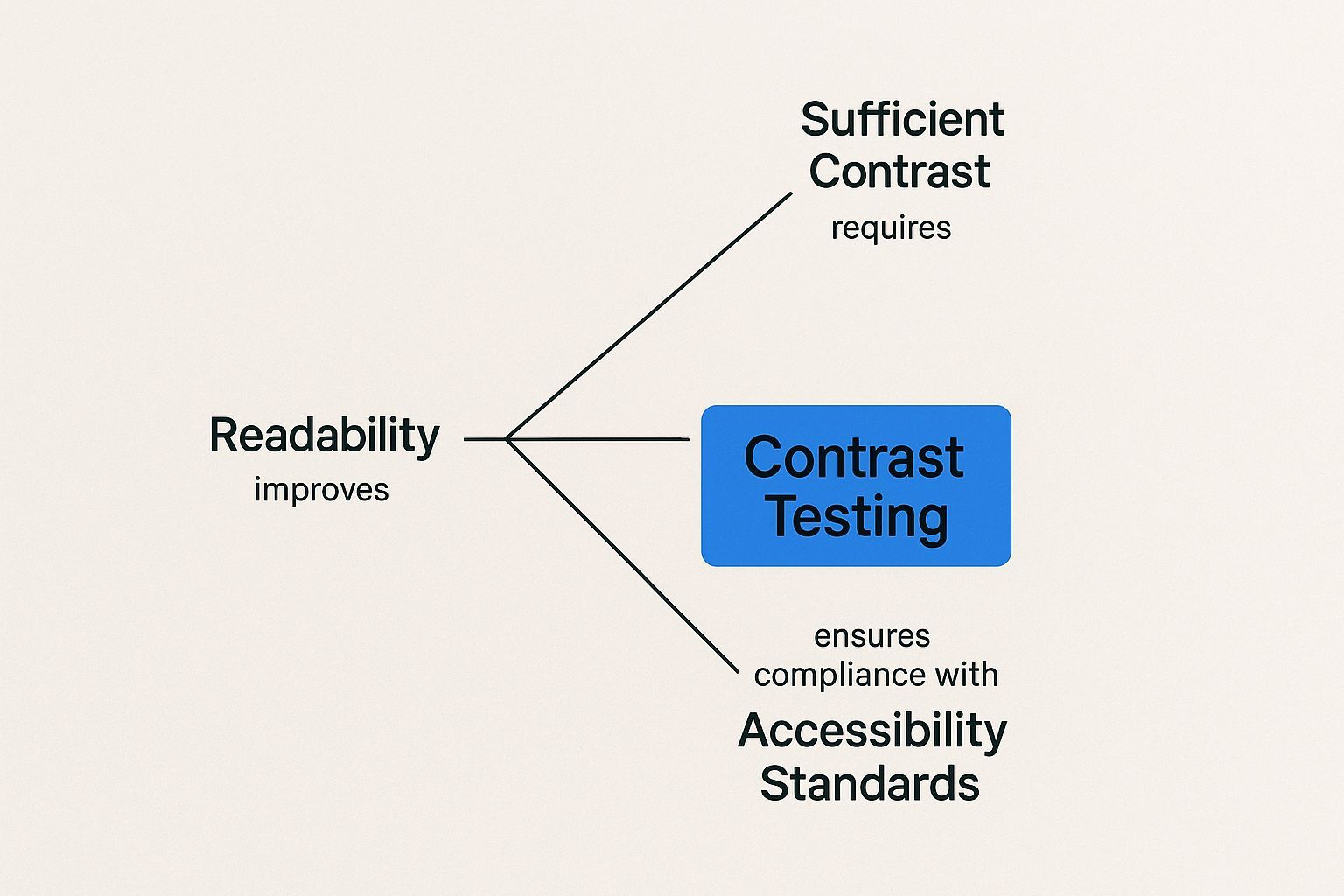
As the image shows, you can't just eyeball it. You need the right tools to get objective, reliable measurements that confirm you're meeting the WCAG standards.
Beyond Text: Contrast for UI Components
One of the biggest mistakes designers make is assuming contrast rules are just for text. The newer WCAG 2.1 guidelines expanded these rules to include critical non-text elements, like user interface components and graphics.
This means that any visual element needed to understand or operate your site must have a contrast ratio of at least 3:1 against the colors next to it. We’re talking about things like:
- Icons: That little shopping cart icon has to stand out from the header.
- Form Borders: Users need to see the outline of the input field they're typing in.
- Button Boundaries: The edges of a button must be clear so people know where to click.
- Charts and Graphs: The slices of a pie chart need to be distinct from one another.
If you ignore the contrast on these elements, your site could be impossible to navigate, even if the text itself is perfectly legible. To learn more about how all these pieces fit together, check out a comprehensive guide to accessibility in web design. Getting a handle on these official guidelines is the first step toward building websites that genuinely work for everyone.
TL;DR: Stop guessing if your colors work and start testing them. You can use a free online tool like the WebAIM Contrast Checker for a quick check or a browser extension like Axe DevTools for on-the-fly feedback while you build. These tools give you an instant pass or fail against WCAG standards, taking all the guesswork out of accessible design.
Finding the Right Tools for the Job
You should never guess at a contrast ratio. Reliable checkers include:
- WebAIM Contrast Checker - the simple, authoritative web tool for testing a foreground/background pair against AA and AAA.
- TPGi Colour Contrast Analyser (CCA) - a free desktop app with an eyedropper to sample any on-screen color.
- Deque axe DevTools and browser DevTools - flag contrast failures during development.
- Stark - checks contrast and suggests accessible colors inside Figma and Sketch.
- WebAbility WCAG Contrast Checker - an AI-enhanced tool that flags failing pairs and suggests compliant alternatives.
Test any two colors with our free color contrast checker to see whether the pair passes WCAG AA and AAA.
https://www.youtube.com/embed/V6YY0fmaocc
Knowing the theory behind color contrast is one thing, but actually putting it to work requires the right tools. Trying to calculate ratios by hand is a non-starter, and just eyeballing a color combination is a recipe for disaster. Our eyes are just not built to accurately judge luminance differences.
Luckily, there’s a whole suite of fantastic, easy-to-use tools that give you definitive pass/fail results.
These tools are your secret weapon for making color contrast for accessibility a reality. Whether you’re a designer building a new palette, a developer coding a component, or a content writer choosing link colors, a reliable checker is non-negotiable. It’s the only way to be sure your choices meet the mark.
Online Contrast Checkers for Quick Validation
When you just need a fast, simple answer, online contrast checkers are your best friend. These web-based tools are incredibly straightforward—you pop in your foreground (text) and background colors, usually as hex codes, and voilà. The tool instantly spits out the contrast ratio and the results.
They are perfect for designers in the early stages of a project or for anyone who just needs to check a single color pair without any fuss. One of the most trusted names in the game is the WebAIM Contrast Checker. It’s simple, fast, and gives you clear, immediate feedback.
A good contrast checker does more than just give you a number. It tells you exactly what that number means: a clear "Pass" or "Fail" for WCAG AA and AAA levels, for both normal and large text. That’s what makes the results truly actionable for your whole team.
Here’s a look at the WebAIM tool checking a common mistake: light gray text on a white background.
As you can see, the ratio is a dismal 2.32:1. The tool immediately shows that this fails every single WCAG requirement. That’s the kind of instant, clear feedback that helps a designer know they need to rethink that color choice.
Browser Extensions for Real-Time Feedback
While online checkers are great for one-off tests, browser extensions bring contrast testing right into your workflow. These tools can analyze live web pages, giving you real-time feedback as you work, which means no more copying and pasting hex codes back and forth. They are an absolute must-have for developers and QA testers.
A couple of the most powerful extensions out there are:
- Axe DevTools: This is a beast of an accessibility tool that goes way beyond contrast. It can scan an entire page, pinpoint every contrast error, and even tell you how to fix it.
- Stark: Built for designers, Stark plugs directly into tools like Figma and Sketch, but it also has a great browser extension. It lets you check for accessibility issues, including contrast, right from the design stage.
Making these tools part of your process is a huge step forward. For a deeper dive into how it all works, you can explore the fundamentals of contrast testing as a key to inclusive digital design.
How to Use an Online Checker
Getting started with an online checker is dead simple. Let’s walk through the steps with a tool like WebAIM’s:
- Grab Your Colors: Use a color picker or your browser’s inspector to find the hex codes for your foreground (e.g.,
#757575for the gray text) and background (e.g.,#FFFFFFfor white). - Plug Them In: Copy and paste those hex codes into the "Foreground Color" and "Background Color" fields on the checker.
- Check the Results: The tool will instantly calculate the ratio and show you clear "Pass" or "Fail" grades for WCAG AA and AAA for both normal and large text.
- Adjust and Retest: If it fails, don't worry! Just use the tool's color sliders to tweak the colors. Darken the text or lighten the background until you see those "Pass" indicators light up.
By making these tools a regular habit, you can confidently build products that aren't just beautiful, but are genuinely usable for everyone.
You’d be surprised how often accessibility issues boil down to a few simple, repeated mistakes. We see them all the time. After auditing countless designs, the same patterns emerge: light text slapped onto a busy photo, brand colors that just don't work for links or buttons, and a total blind spot for things like icons and form fields.
The good news? Once you know what to look for, these are incredibly easy to fix.
Avoiding Common Color Contrast Mistakes
- Light gray text on white - a frequent failure that looks elegant but fails AA.
- Color as the only signal - using color alone for links, errors, or status; always add text, icons, or underlines.
- Text over images or gradients - contrast varies across the image; add an overlay or text background.
- Ignoring hover, focus, and disabled states - every interactive state must still meet contrast.
- Forgetting non-text elements - icons and focus indicators also need 3:1.

Knowing the rules of color contrast for accessibility is one thing, but putting them into practice is where even experienced teams can get tripped up. These common mistakes often sneak into designs and create real barriers for people trying to use your site.
The reality is pretty sobering. Even with all the talk about inclusive design, over 96% of the world's top one million web pages have detectable accessibility failures. Low contrast text is one of the biggest culprits. The average home page has around 50.8 accessibility errors, which just goes to show how easy it is for these problems to stack up. You can dig into more of this data by checking out some eye-opening website accessibility statistics on elfsight.com.
Let's walk through the most common pitfalls so you can steer clear of them.
Placing Text Over Busy Background Images
This one is everywhere. Designers love the look of bold text directly over a beautiful, complex photograph or a vibrant gradient. Aesthetically, it can feel powerful. In reality, it's almost always a readability nightmare.
Think about it: a photograph doesn't have one single background color. It has hundreds, maybe thousands. That crisp white text might look great over the dark part of the image, but it completely disappears the moment it crosses over a patch of clouds or a sunlit window. The content becomes illegible.
Here’s how to fix it without sacrificing the look:
- Add an Overlay: Simply placing a semi-transparent dark layer between your image and text is the easiest, most effective fix. It instantly evens out the background contrast.
- Use a Text Shadow: A subtle, well-defined shadow can help lift the text off the background. You have to be careful with this, though, as a poorly executed shadow just makes things look blurry.
- Choose Simpler Images: Sometimes the best solution is picking a better photo. Look for images with areas of "negative space" or soft blurs where you can place text without it fighting for attention.
Sacrificing Readability for Brand Colors
Your brand identity is sacred, I get it. But those brand colors were probably chosen by a marketing team, not an accessibility specialist. A huge mistake we see is forcing those colors onto critical elements like buttons and links, even when they have terrible contrast.
That trendy light gray or pastel blue in your brand guide? It’s a classic offender. Using it for link text on a white background makes your navigation almost impossible for anyone with low vision.
Accessibility must always win when it's up against strict brand guidelines for interactive elements. If a brand color fails a contrast check, you have to find an accessible alternative.
Your primary call-to-action button should be the easiest thing to see on the page, not a casualty of an inaccessible color palette.
Forgetting About Non-Text Elements
This is the one that trips up even seasoned designers. We get so focused on making sure our paragraph text is readable that we forget about everything else. Since the WCAG 2.1 update, the rules are clear: graphical objects and UI components need a 3:1 contrast ratio, too.
What does that cover? All the little things that make an interface work:
- Icons: That little magnifying glass for your search bar needs to stand out from the header.
- Form Field Borders: How can someone fill out a form if they can't see the fields? Those faint gray borders on a white background are a huge fail.
- Button Boundaries: Users need to see the shape of a button to understand its clickable area.
Ignoring these elements can make your site unusable, even if all the text is perfect. By keeping these common mistakes in mind, you'll be well on your way to building interfaces that aren't just beautiful, but truly work for everyone.
Here's a fresh take on that section, written to sound like an experienced designer sharing practical advice.
TL;DR: The key to an accessible color palette is starting smart. Make sure your primary brand colors pass a 4.5:1 contrast ratio with either pure black or pure white text. From there, you can build out your palette with lighter tints and darker shades, but you have to test every single one. And for those tricky spots like text over images or gradients? A semi-transparent overlay, a subtle text shadow, or just picking images with simple backgrounds will save your design.
How to Design an Accessible Color Palette
Build accessibility in from day one rather than retrofitting it. Start with your brand colors, then define pre-approved variations for text, icons, and backgrounds that you have confirmed pass WCAG. For each core color, document compliant pairings - for example, a specific dark blue for primary button text that hits 4.5:1 on the button background, a dark gray for body copy that clears the 7:1 AAA bar, and a defined error-text shade. This turns your palette into a set of safe, reusable combinations rather than a gamble.
It's always better to design with accessibility in mind from the get-go than to go back and fix things later. When you build a compliant, flexible, and beautiful color palette from the very beginning, you're not just checking a box—you're weaving color contrast for accessibility right into your brand's DNA.
The whole point is to create a set of colors that looks fantastic but also works for everyone, ensuring that no one misses crucial information simply because it was hard to read. This isn't just a "nice-to-have" anymore. With digital accessibility laws like the Americans with Disabilities Act (ADA) gaining more teeth, being proactive is critical. In 2022 alone, there were over 3,200 federal lawsuits for website inaccessibility in the U.S.
Start with Accessible Brand Colors
Your primary brand colors are the foundation of your entire palette. Before you even think about accent colors, tints, or shades, you need to make sure these core colors can actually support readable text.
The process itself is pretty straightforward. For each of your main brand colors, test it against both black (#000000) and white (#FFFFFF) text. At least one of those combinations has to pass the WCAG AA standard of 4.5:1 for normal-sized text.
- Got a bright brand yellow that fails miserably with white text? No surprise there. But does it pass with black text? If it does, great—you've found its partner.
- What about that deep navy blue that’s unreadable with black text? Pop some white text on it. If it passes, you've got a winning combo.
If one of your primary colors fails against both black and white, it's officially off-limits for text backgrounds. It can still shine as a purely decorative element, but you can't rely on it for your functional UI. Nailing this first step is the most important part of building a solid system.
Build an Extended Palette with Tints and Shades
Once your core colors are locked in, you can start expanding your options. A classic design technique is to create tints (by mixing your color with white) and shades (by mixing with black). This gives you a whole family of related colors that naturally work well together for things like backgrounds, borders, and other interface elements.
But here’s the catch: don't ever assume a tint or shade of an accessible color is automatically accessible itself. As you make a color lighter, its contrast against white text plummets. As you make it darker, its contrast against black text does the same. You absolutely have to test every new variation.
A truly proactive design workflow means you have a color contrast checker open right next to your design tool. Every new tint, shade, or accent color gets tested on the spot, long before it ever makes it into the official style guide.
Do this, and you’ll end up with a library of pre-vetted, accessible color combinations that your whole team can use with total confidence.
Handling Text on Gradients and Images
Putting text on top of a busy background—like a photograph or a gradient—is probably the most common way designs fail accessibility tests. The background isn't one solid color, so you can't get a single, reliable contrast ratio.
Fortunately, there are a few time-tested ways to make it work.
- Use an Overlay (Scrim): This is the most reliable trick in the book. Just place a semi-transparent dark or light layer between the image and the text. This "scrim" instantly quiets the background and creates a consistent, high-contrast surface.
- Apply a Text Shadow: A subtle, clean text shadow can help lift the letters off the background. Just be careful here—a fuzzy or poorly-designed shadow can actually make the text even harder to read.
- Choose Simple Backgrounds: Sometimes the best solution is the simplest. Pick photos that have large areas of solid color or a soft, out-of-focus background. Placing your text in these "quiet" spots makes it incredibly easy to maintain contrast.
Creating truly inclusive digital products means understanding that color contrast is just one piece of a much larger puzzle; it has to fit into broader user experience design best practices. It's also vital to remember how these choices affect real people with different visual abilities. To get a better feel for this, take a look at our guide on what colorblind people see and web accessibility tips for inclusive design. When you design proactively, you ensure your palette isn’t just beautiful, but fundamentally usable for everyone.
Here's a look at some of the trickiest color contrast questions that come up all the time.
Implementing Your Palette in Code
The foundation of a modern, accessible color system is CSS custom properties (CSS variables). Define each color once and reuse it everywhere, creating a single source of truth that also makes features like dark mode far easier to build.
The key is semantic naming: name variables by purpose, not by hue. Use --color-action-primary rather than --brand-blue-500, so the name still makes sense if the brand color changes. Define your palette in the :root selector to make it globally available:
:root {
  /* Text */
  --color-text-primary: #1F2937;
  --color-text-secondary: #4B5563;
  --color-text-on-action: #FFFFFF;
  /* Backgrounds */
  --color-background-body: #FFFFFF;
  --color-background-surface: #F9FAFB;
  /* Action / interactive */
  --color-action-primary: #1D4ED8;
}
With purpose-based variables, every developer applies the same approved, accessible combinations - and a single change propagates everywhere.
Building Contrast Checks Into Your Workflow
Accessible color is not a one-time launch task; it is an ongoing responsibility. Treat contrast as a core part of your process rather than a last-minute checkbox.
- Document everything in your design system. Make your style guide the single source of truth, with explicit rules for how each color is used (primary button text, body copy, error messages). This removes guesswork for designers and developers alike.
- Automate checks in CI/CD. Add automated contrast tests to your pipeline so regressions are caught before they ship, not after a user reports them.
- Establish governance and ownership. Assign clear responsibility for the palette, review it as the product evolves, and monitor accessibility updates. This turns compliance from a one-off project into a continuous, shared habit.
Answering Your Top Color Contrast Questions
What is the minimum color contrast ratio required by WCAG?
Level AA requires at least 4.5:1 for normal text and 3:1 for large text. Level AAA raises this to 7:1 for normal text and 4.5:1 for large text.
What counts as large text for contrast purposes?
Large text is generally 18pt (about 24px) or larger, or 14pt (about 18.66px) or larger if bold. Large text only needs 3:1 at Level AA.
Do icons and user interface components need to meet contrast requirements?
Yes. Meaningful non-text content - icons, form borders, focus indicators, and essential UI components - needs a contrast ratio of at least 3:1.
Can I use color alone to convey information?
No. Color should never be the only signal. Pair it with text labels, icons, patterns, or underlines so users who cannot distinguish certain colors still get the information.
What tools can I use to check color contrast?
Use the WebAIM Contrast Checker, TPGi Colour Contrast Analyser, the contrast checks in axe DevTools and browser DevTools, Stark for design tools, or the WebAbility WCAG Contrast Checker.
Conclusion
Color contrast is where accessibility and good design meet. Learn the WCAG ratios, test every pairing with a reliable tool, build an accessible palette, implement it with semantic CSS variables, and bake contrast checks into your workflow. Do that, and readability stops being an afterthought and becomes a built-in standard for every user.
Contrast is one of many issues; run a full accessibility scan to catch the rest across your site.
Ready to stop guessing and start ensuring your website is accessible to everyone? The WebAbility.io platform provides automated scanning, real-time monitoring, and a full suite of tools to achieve and maintain WCAG compliance effortlessly. Start your free trial today and make your website work for everyone.
Quick Questions
Tap to ask AI about this article