Ada Compliance Website Design: A Practical Guide to Accessible UX

Sidharth Nayyar
TL;DR: Making your website ADA compliant isn't just about avoiding lawsuits; it's a direct path to better user experience and higher conversion rates. By following the Web Content Accessibility Guidelines (WCAG), you open your digital doors to millions more potential customers. The most effective approach is to bake accessibility into your design and development process from day one. To get started, conduct a quick website accessibility audit to understand your current standing, create a public accessibility statement to build trust, and leverage tools that streamline compliance and enhance the user experience for everyone.
Here's the bottom line: making your website ADA compliant means ensuring people with disabilities can actually use it. This isn't about some vague legal requirement; it's about following a clear set of rules called the Web Content Accessibility Guidelines (WCAG).
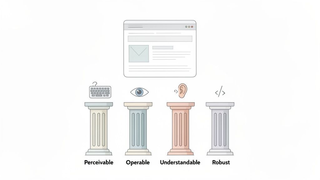
These guidelines are built around four core ideas: making your site Perceivable, Operable, Understandable, and Robust (you'll hear the acronym POUR a lot). True accessibility isn't a one-and-done project. It's an ongoing commitment that blends smart design, clean code, and regular checks to build a better experience for absolutely everyone—which, by the way, almost always leads to better conversions and engagement.
Understanding ADA Compliant Website Design
So, what does it really mean to have an "ADA compliant website"? It's the process of designing and building your digital presence so that it works for everyone, including people who navigate the web with the help of assistive technologies.
While the Americans with Disabilities Act (ADA) itself doesn't give you a technical checklist for your website, court rulings and legal settlements have consistently pointed to WCAG as the gold standard.
For anyone running a marketing team or an agency, this is far more than just a legal box to tick. I've seen firsthand that building accessibility in from the very beginning is the most cost-effective and efficient way to create a truly inclusive site. You're not just avoiding lawsuits; you're expanding your audience and making the site better for every single visitor. A more accessible site is almost always a more usable site.
The Four Pillars of Web Accessibility
The entire WCAG framework rests on those four foundational principles I mentioned earlier—POUR. These aren't just abstract concepts; they guide every practical decision you make in design and development.
This table breaks down what each principle means in the real world.
The Four Pillars of an Accessible Website
| Principle (POUR) | Core Objective | Key Design and Development Actions |
|---|---|---|
| Perceivable | Everyone can access the content, regardless of the senses they use. | Provide alt text for all meaningful images. Add captions and transcripts for videos. Ensure strong color contrast between text and backgrounds. Use layouts that can be easily resized or zoomed. |
| Operable | The site can be navigated and used without barriers. | Make sure every interactive element (links, buttons, forms) works with a keyboard alone. Avoid content that flashes or strobes. Design clear, consistent navigation with "skip to content" links. |
| Understandable | The content and functionality are clear and predictable. | Write in plain language and avoid jargon. Create predictable navigation and layouts. Provide clear instructions for forms and offer helpful, specific error messages when something goes wrong. |
| Robust | The site works reliably across different browsers, devices, and assistive tools. | Use clean, valid semantic HTML (e.g., <nav>, <button>, <h1>). Follow best practices for ARIA attributes when necessary. Test your site on different devices and with common screen readers to ensure compatibility. |
By keeping these four pillars in mind, you stop playing defense—reacting to complaints or legal threats—and start playing offense. It's a proactive, user-first approach that builds a rock-solid foundation for a better digital experience.
When you build your site around the POUR principles, you're not just checking off a compliance list. You're actively creating a welcoming space for all users, which strengthens your brand and significantly reduces your legal risk. This is the core philosophy behind our end-to-end accessibility platform at WebAbility.io.
TLDR: Building an accessible website isn't about code; it's about strategy. Start by figuring out where you stand with a quick accessibility check, create a public accessibility statement to show you're serious, and most importantly, bake accessibility into your earliest plans—like user personas and wireframes. Getting this right from the start saves a world of headaches later.
Building a Strong Foundation for Web Accessibility
If you want to get web accessibility right, you can't treat it like a final checkbox on your pre-launch QA list. True accessibility is a mindset, a core part of your project's DNA from the moment you have the first idea.
Rushing into development without a solid accessibility strategy is a recipe for disaster. It's like building a house without a blueprint—sure, you might end up with four walls and a roof, but you'll almost certainly find critical flaws later that are incredibly expensive and frustrating to fix.
This "shift-left" approach is all about thinking about users with disabilities at every single stage. It’s about building an inclusive foundation from the ground up, so every design and development decision that follows is already pointing in the right direction.
Start with a Quick Accessibility Assessment
Before you can chart a course forward, you need to know exactly where you're starting from. An initial accessibility assessment gives you that crucial baseline. This doesn't have to be a massive, line-by-line audit just yet. Think of it more as a high-level review to spot the biggest barriers and find some quick wins.
I've found that a combination of automated tools and simple manual checks gives you the best bang for your buck here.
- Run an Automated Scan: Tools are fantastic at catching low-hanging fruit like missing alt text, obvious color contrast problems, and unlabeled form fields. They give you a quick, broad overview of your site's health.
- Do a Keyboard Test: This one is simple but so revealing. Try to navigate your entire site—menus, forms, everything—using only your Tab, Enter, and arrow keys. If you get stuck, you've just found a major roadblock for many users.
- Try a Screen Reader Spot-Check: Fire up a screen reader on your most important pages (homepage, a key product page, the checkout flow). This is the best way to get a real feel for how someone with a visual impairment actually experiences your site.
This initial review turns a huge, intimidating goal into a clear, manageable to-do list. It shows your team exactly where to focus first to make the biggest impact.
Craft a Public Accessibility Statement
An accessibility statement is just a page on your site, but it does so much heavy lifting. It's your public declaration that you're committed to inclusivity, and it's a powerful tool for building trust and even reducing legal risk.
A good statement isn't just corporate jargon. It's a direct line of communication for users who run into a problem. Make sure yours includes:
- Your Commitment: A straightforward declaration that you're aiming to meet specific standards, like WCAG 2.1 Level AA.
- Conformance Status: Be honest about where you are right now. Mention any known issues or areas where you're still working on improvements.
- A Way to Get in Touch: Provide an email address or a form so users can easily report any barriers they encounter.
- Technical Details: List the browsers and assistive technologies your site is designed to work best with.
This level of transparency shows people you genuinely care about their experience and are actively trying to make things better.
Weave Accessibility into Your Earliest Plans
Here’s the single most effective thing you can do: make accessibility a non-negotiable requirement from day one. This proactive approach saves an incredible amount of time, money, and stress compared to scrambling to fix issues after the fact.
Instead of hunting down bugs, you prevent them from ever being created. During those early wireframing and persona development phases, start asking the right questions:
- User Personas: Do your personas only represent able-bodied users? It's time to add one for an individual who is blind and uses a screen reader, or someone with a motor impairment who can't use a mouse.
- Wireframes & Prototypes: As you sketch out user flows, ask yourself: can someone complete this entire task without a mouse? Are things like dropdowns and pop-up modals designed to be accessible from the start?
- Content Strategy: If you're planning video content, are captions part of the brief? A complete guide to closed captions and accessibility is a great resource to share with your content team so they understand what's needed.
When you embed accessibility into your initial project briefs and design sprints, it stops being a "compliance task" and becomes what it should be: a core feature of a great user experience. This is what the best digital teams do.
This foundational work is more important than ever. The latest WebAIM Million Report found that 94.8% of the world's top one million homepages have detectable WCAG failures, with an average of 51 distinct errors per page. By getting your foundation right, you're not just complying with a rule—you're building a digital experience that actually works for everyone.
Here’s the thing: accessible design is just good design.
When you get it right, it’s not a separate, box-checking exercise. It’s about building a better, more intuitive experience for every single person who lands on your site. Things like high color contrast, clear fonts, and keyboard navigation don't just help users with disabilities—they reduce friction for everyone.
Let's dive into the practical design principles that make this a reality.
Getting UI and UX Design Right for Accessibility
This is where the rubber meets the road—where strategy becomes a visible, tangible experience. Effective ADA-compliant website design isn't about limiting your creativity. It's about using smart constraints to solve real-world problems.
Think about it: a site that’s easy for a screen reader to interpret is also a breeze for a search engine to crawl. A form that’s simple enough for someone with a cognitive disability is less frustrating for the rest of us, too. You’re not just avoiding legal trouble; you’re building a better product.
Nail Your Color and Contrast
One of the most frequent and easily fixable accessibility issues I see is poor color contrast. For users with low vision or color blindness, text that just barely stands out from its background is completely unreadable.
Fortunately, the WCAG gives us clear, measurable standards to follow.
- WCAG 2.1 Level AA requires a contrast ratio of at least 4.5:1 for normal-sized text.
- For large text (think 18pt regular or 14pt bold) and important graphics, that ratio is a more forgiving 3:1.
Don't just guess or eyeball it. Use a reliable contrast checker during the design phase. A few seconds of testing can save a world of frustration for your users.
Design for Keyboard-Only Users
Ever tried to get around a website without your mouse? For many people with motor impairments, and for virtually all screen reader users, that's their daily reality. Every single interactive element—from links and buttons to form fields and menus—must be fully usable with just a keyboard.
This means you can reach everything using the Tab key, but just as importantly, you always know where you are on the page. That's where focus states come in.
A focus state is simply a clear visual indicator, like an outline or a highlight, that shows which element is currently selected. Without it, navigating with a keyboard is like fumbling for a light switch in a dark room. A distinct, high-contrast focus state isn’t a nice-to-have; it's absolutely essential.
Choose Readable and Scalable Typography
The fonts you use and how you present them have a huge impact on how easily people can absorb your content. The goal is simple: make reading effortless.
Here are a few typography rules I always stick to:
- Pick a Clear Font: Stick to clean, simple sans-serif or serif fonts for body text. Leave the overly decorative or script fonts for logos or special accents.
- Go Big Enough: Use a base font size of at least 16px for your main content. It makes a world of difference.
- Let Users Zoom: Your site must allow users to zoom in up to 200% without the layout breaking or text getting cut off. This is a core WCAG requirement.
- Watch Your Line Length: For the best reading experience, keep your lines between 50-75 characters long.
These practices don't just benefit users with visual impairments; they make reading more comfortable for everyone. If you want to go deeper, check out these accessible web design UX tips for better usability.
Build Forgiving and Accessible Forms
Forms are where the action happens. They're how customers sign up, check out, and get in touch. They're also one of the most common places for accessibility to fall apart.
To build a form that works for everyone, make sure you:
- Label Everything Clearly: Every single input field needs a visible, descriptive label. Placeholder text is not an acceptable substitute for a proper
<label>. - Give Clear Instructions: Don’t make people guess. If a password has specific requirements or a date needs a certain format, tell them upfront.
- Write Helpful Error Messages: When something goes wrong, tell the user exactly what the problem is and how to fix it. Instead of a generic "Invalid Input," try "Please enter your email address in the format [email protected]."
- Group Related Fields: Use
fieldsetandlegendelements to logically group related inputs, like the fields for a shipping address. This gives screen reader users crucial context about the form's structure.
By baking these principles into your design process from the start, you move beyond just checking off compliance boxes. You begin creating genuinely effective and enjoyable experiences that welcome every user, leading to better engagement and a brand people trust.
TLDR: Beautiful design is useless if the code isn't accessible. This section is for developers. Focus on using correct HTML tags like <nav>, <main>, and <button> because screen readers depend on them. For dynamic content like pop-ups or accordions, you'll need ARIA attributes to tell assistive tech what's happening. And don't forget meaningful alt text for images—it's non-negotiable. Building with these rules from the start makes your site keyboard-friendly and screen-reader-ready, ensuring your code lives up to your inclusive design.
Turning Design into Accessible Code with Semantic HTML
A pixel-perfect design can still be completely unusable. The moment a developer translates that design into code, they make hundreds of small decisions that determine whether the site is accessible or a frustrating dead end for users with disabilities. This is where the true foundation of ADA compliance website design gets built.
Think of your code as the blueprint that assistive technologies, like screen readers, use to understand and navigate your website. If that blueprint is sloppy or uses the wrong materials, the entire structure becomes confusing. That’s why your development process has to be just as committed to accessibility as your design process.
The Power of Writing Semantic HTML
At its core, accessible development starts with semantic HTML. This is a fancy way of saying: use the correct HTML element for its intended purpose. It’s the difference between building a house with a proper frame versus just tacking up drywall and hoping for the best.
When a screen reader hits a <nav> element, it immediately announces, "navigation," giving the user a clear landmark. If you just use a generic <div> with some styling, the screen reader just sees a meaningless box. That context is everything.
Here’s why it’s so critical:
- It creates a logical structure: Using tags like
<header>,<main>,<footer>, and<article>carves your page into a clear, navigable outline for assistive tech. - It provides built-in functionality: A
<button>element is inherently keyboard-focusable and clickable. A<div>styled to look like a button is not, forcing you to write extra JavaScript just to replicate basic browser behavior. - It improves SEO: Search engines, much like screen readers, rely on semantic markup to understand the structure and importance of your content.
Before reaching for a complex solution, always ask yourself: "Is there a native HTML element that already does this?" Nine times out of ten, the answer is yes. Using the right tag is the easiest and most powerful thing you can do for accessibility.
Making Dynamic Content Accessible with ARIA
Modern websites are full of dynamic parts—modals, accordions, and custom dropdown menus. While native HTML doesn't have standard tags for these, the WAI-ARIA (Accessible Rich Internet Applications) specification fills that gap.
ARIA gives you a set of attributes to add to your HTML, providing assistive technologies with more information about a component's role, state, and properties. It’s like adding helpful labels and instructions directly into your code. To get a solid grasp of these foundational concepts, our guide on what semantic HTML is is an excellent place to start.
Let's take a "read more" accordion as an example. Here’s how ARIA clarifies things:
- Role: The trigger that opens the content gets a
role="button". - State: The button also needs
aria-expanded="false"when the content is hidden andaria-expanded="true"when it's visible. - Relationship: The button should have an
aria-controlsattribute that points to theidof the content panel it controls.
With just a few attributes, a confusing interaction is transformed into one a screen reader can clearly announce: "More Information, button, collapsed."
Writing Meaningful and Contextual Alt Text
Image accessibility is about more than just adding any alt text. The goal is to provide a concise, meaningful description that conveys the same information the image does. This isn't just a box to check; it’s a crucial element of ADA compliance website design.
Context is key. For an e-commerce site, good alt text is part of the sales pitch.
- Bad Alt Text:
image of a shoe - Good Alt Text:
Men's brown leather wingtip dress shoe with intricate broguing on the toe.
What about purely decorative images that add no real information? For those, use an empty alt attribute (alt=""). This tells screen readers to simply ignore the image, preventing unnecessary noise and creating a much cleaner experience. This simple practice ensures every element on the page either serves a purpose or gets out of the way.
Here’s the thing about website accessibility: you’re never really done.
Launching a compliant website is a fantastic start, but it's just that—a start. True accessibility is a living, breathing part of your website's lifecycle. Every time you add a new blog post, update a product, or plug in a new marketing tool, you risk creating new barriers for users with disabilities.
Without a solid plan for keeping an eye on things, even the most carefully built site will slowly drift out of compliance. You have to get into a rhythm of testing, fixing, and monitoring to manage your legal risk and make sure every single visitor has a great experience.
This whole process is a continuous loop. You design for users, you code with purpose, and you test relentlessly. Then you do it all over again.
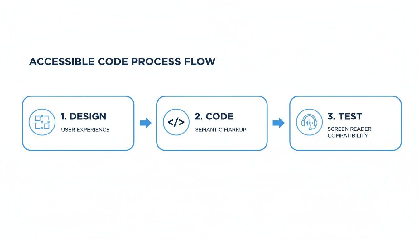
This simple flow is the heart of a sustainable accessibility strategy—it's not a final checkbox, but an integrated cycle where each step informs the next.
Find the Right Mix of Automated and Manual Testing
The most practical way to stay on top of compliance is by blending automated scans with hands-on manual testing. They each catch different kinds of problems, and you really need both to get the full picture.
Automated Scanning: Think of these tools as your 24/7 security guard. They can crawl your entire site and instantly flag the low-hanging fruit—things like color contrast errors, missing alt text, or unlabeled form fields. They’re incredibly fast and efficient for catching common, code-based violations at scale.
Manual Testing: This is where the human touch is absolutely critical. A robot can’t tell you if your keyboard navigation makes sense or if your alt text is actually useful. Getting in there and trying to navigate with just a keyboard or firing up a screen reader is the only way to understand what the real-world experience is like for your users.
Bring Everything Under One Roof
Trying to manage accessibility across a complex website with a busy team can feel like herding cats. This is where a centralized dashboard, like the one we built into WebAbility.io, makes a world of difference. It gives your entire team a single source of truth.
With a centralized platform, you can track your accessibility score over time, see exactly how site changes affect compliance, and assign specific fixes to the right people. It turns accessibility from a messy, reactive scramble into a managed, measurable part of your business operations.
This structured approach is key for showing due diligence and keeping the momentum going. It also makes it easy to generate reports for stakeholders, proving your commitment is more than just talk. This kind of disciplined process is a core principle in a practical guide to quality assurance in software development, where preventing defects is always the goal.
The Role of Accessibility Widgets and User Tools
Beyond keeping your code clean, user-facing tools like accessibility widgets can add another valuable layer. These tools empower visitors to customize the site to fit their own needs on the fly.
Someone might need to switch to a high-contrast mode, bump up the font size, or turn on a dyslexia-friendly font. This personalization can make a huge difference in their ability to use your site. Just remember, these widgets are a supplement to, not a replacement for, fundamentally accessible code. They work best when they have a solid foundation to build on.
This combined approach is more critical than ever. We're seeing accessibility lawsuits pop up far beyond the usual hotspots of New York and California, with sharp increases in states like Florida and Illinois. Interestingly, recent data shows that 22.64% of websites facing federal lawsuits had an accessibility widget installed. This tells us that widgets alone aren't a magic bullet; they must be part of a complete strategy that includes fixing the underlying code.
Getting to Grips with Website Accessibility Laws and Governance
Navigating the legal side of digital accessibility is absolutely essential for making smart business decisions and managing risk. Laws like the Americans with Disabilities Act (ADA) don't give you a technical checklist for your website, but court rulings have consistently pointed to the Web Content Accessibility Guidelines (WCAG) as the benchmark for ada compliance website design.
Honestly, this legal environment isn't about scaring people into compliance. It's about seeing a strategic opportunity. When you get proactive about accessibility, you're not just dodging potential lawsuits—you're opening your brand up to a huge and often overlooked part of the market.
The Real-World Legal Climate
It's one thing to know the laws exist, but it's another to see how they’re actually being enforced. The truth is, the number of website accessibility lawsuits is climbing every year, making this a critical issue for businesses of every size, everywhere.
The trend is impossible to ignore. In the first half of just one recent year, U.S. courts saw 2,014 ADA website accessibility lawsuits filed. That’s a staggering 37% increase from the same time the previous year. And this isn't just a New York or California problem anymore. While New York led the pack, Florida's filings nearly doubled to 487, and Illinois saw an incredible 745% jump. This data, highlighted in a mid-year ADA website lawsuit report, proves that the legal risk is spreading fast.
These numbers are a clear signal that achieving compliance once isn't enough; you have to maintain it.
Building a Solid Accessibility Governance Plan
Strong governance is what turns your accessibility efforts from a one-off project into a core part of how you do business. It's all about creating a clear, sustainable framework that keeps accessibility front and center as your website, products, and team grow.
So, what does that look like in practice? It boils down to a few key actions:
- Define Clear Roles and Responsibilities: Who owns accessibility? Make it crystal clear who is responsible for what, from your designers and developers to your content and marketing teams.
- Keep Meticulous Audit Trails: You need to document everything. Keep detailed records of your accessibility audits, all the fixes you've implemented, and your testing results. This paper trail is your best evidence of due diligence.
- Generate Regular Compliance Reports: Create and share reports with key stakeholders on a consistent basis. This keeps everyone in the loop on progress, celebrates wins, and shines a light on areas that still need work.
A proactive governance plan is your best defense against legal trouble. When you weave accessibility into your day-to-day operations and document your commitment, you create a truly resilient compliance program that both protects your business and serves your customers.
This structured approach shifts accessibility from a legal headache to a real competitive advantage. To get into the nitty-gritty, you can learn more about website accessibility laws and see exactly how they apply to your business. By managing compliance proactively, you build trust, expand your reach, and ultimately, create a better digital world for everyone.
TLDR: Let's clear up some common confusion. The ADA is the law, and WCAG gives you the technical rules to follow. Accessibility widgets are fantastic user tools, but they work best when your site's code is already accessible. And yes, you need to test your website regularly—think weekly automated scans plus an annual manual audit—to stay on the right side of the law.
Common Questions About ADA Website Design
Diving into digital accessibility can feel like learning a new language. A lot of questions come up, and getting clear answers is the first step toward building a solid strategy for your ADA compliance website design. Let's break down some of the most common questions I hear from clients.
What Is the Difference Between ADA and WCAG?
This is probably the number one question people ask, and it's easy to get them mixed up. The distinction is actually pretty straightforward.
The Americans with Disabilities Act (ADA) is a major U.S. civil rights law. It requires places of public accommodation—which courts have repeatedly ruled includes websites—to be accessible. But, it doesn't give you a technical checklist on how to do it.
That's where the Web Content Accessibility Guidelines (WCAG) come in. WCAG provides the detailed technical standards that developers and designers need. When a website's accessibility is challenged legally, courts almost always point to WCAG 2.1 Level AA as the standard to meet.
Think of it like a building code. The law (ADA) says the building must be safe and accessible. The building code (WCAG) gives the architect the exact measurements for the ramp's incline and the width of the doorways.
So, the ADA is the "what"—the legal mandate. WCAG is the "how"—the technical playbook for getting it done.
Can an Accessibility Widget Alone Make My Website Compliant?
This is a tricky one. Accessibility widgets are powerful tools. They give users incredible control over their experience with features like high-contrast modes, text resizing, and screen readers. They are a fantastic addition to any accessibility strategy.
But they can't be your only strategy. Widgets work on the surface of your site, but they can't fix fundamental problems buried in the code—like a form that's impossible to navigate with a keyboard or an image that's missing its descriptive text for a screen reader.
True, lasting compliance comes from pairing a user-facing tool with solid, accessible development practices from the ground up. It’s this combined approach that creates a genuinely robust and user-friendly experience for everyone.
How Often Should I Test My Website for Accessibility?
Accessibility isn't a "set it and forget it" task. Your website is a living thing, constantly updated with new content, features, and designs. Each change is an opportunity for a new barrier to pop up.
A good rule of thumb is to set up a consistent testing rhythm.
- Weekly Automated Scans: Use a monitoring platform to catch low-hanging fruit and quick-fix issues automatically.
- Annual Manual Audit: At least once a year, have a human expert perform a deep-dive manual audit. This is non-negotiable, as it catches the nuanced issues that automated tools always miss.
- Major Updates: Always conduct a thorough audit whenever you launch a major redesign or add significant new functionality.
The best-in-class approach is to build accessibility checks directly into your development workflow. When your team is thinking about accessibility from the very beginning, you stop problems before they even start.
Ready to turn compliance from a challenge into a competitive advantage? WebAbility.io provides an end-to-end platform with automated scanning, a powerful user widget, and centralized reporting to help you achieve and maintain accessibility with confidence. Start your free trial and see how it works.
Quick Questions
Tap to ask AI about this article