How to Make a Website ADA Compliant

Sidharth Nayyar
Sidharth Nayyar
Ready to make your website accessible? Engage with our team or start a free trial today.
Tap to ask AI about this article
TLDR: ADA is the US law requiring accessibility, while WCAG provides the "how-to" technical guide. To comply, aim for WCAG 2.1 Level AA standards. The process involves a three-step cycle: Audit your site (using both automated tools and manual testing), Remediate the issues found at the code level, and Maintain compliance over time. Avoid accessibility plugins or overlays as they don't provide legal protection. Focus on fixing common issues like low color contrast, missing image alt text, and unlabeled forms to make the biggest impact.
Making your website ADA compliant isn't just a one-and-done task. It's really a continuous cycle of auditing your site against WCAG 2.1 AA standards, fixing what you find, and then keeping it compliant as your site grows and changes. This whole process is about making sure your digital content is perceivable, operable, and understandable for everyone, especially users with disabilities.
Getting your website accessible is less of a project with a finish line and more of an ongoing commitment to inclusivity. The best way to think about it is as a cycle of continuous improvement that becomes a core part of your digital strategy.
The gold standard we're all aiming for is the Web Content Accessibility Guidelines (WCAG). These guidelines have become the accepted technical benchmark for what it means to be ADA compliant online.
When you follow this path, you're not just ticking a legal box; you're actively creating a better, more welcoming experience for every single user. The journey really boils down to three key phases.
To help clarify, let's break down what this process actually looks like in practice.
This table outlines the essential stages for achieving and maintaining website accessibility, giving you a clear roadmap from start to finish.
| Phase | Objective | Key Activities |
|---|---|---|
| Audit | Identify all accessibility barriers on your website. | Combine automated scanning tools with expert manual testing to catch everything from code-level issues to user experience hurdles. |
| Remediate | Fix all issues discovered during the audit. | Your development and content teams work together to correct code, update content, and adjust designs to meet WCAG standards. |
| Maintain | Ensure the website remains compliant over time. | Implement regular monitoring, provide ongoing team training, and bake accessibility checks directly into your development workflow. |
By breaking it down this way, the process becomes much more manageable and less overwhelming. Each phase builds on the last, creating a sustainable system for accessibility.
This visual gives you a great high-level look at the simple, three-stage process of figuring out what’s needed, putting the fixes in place, and then testing to make sure it all works.
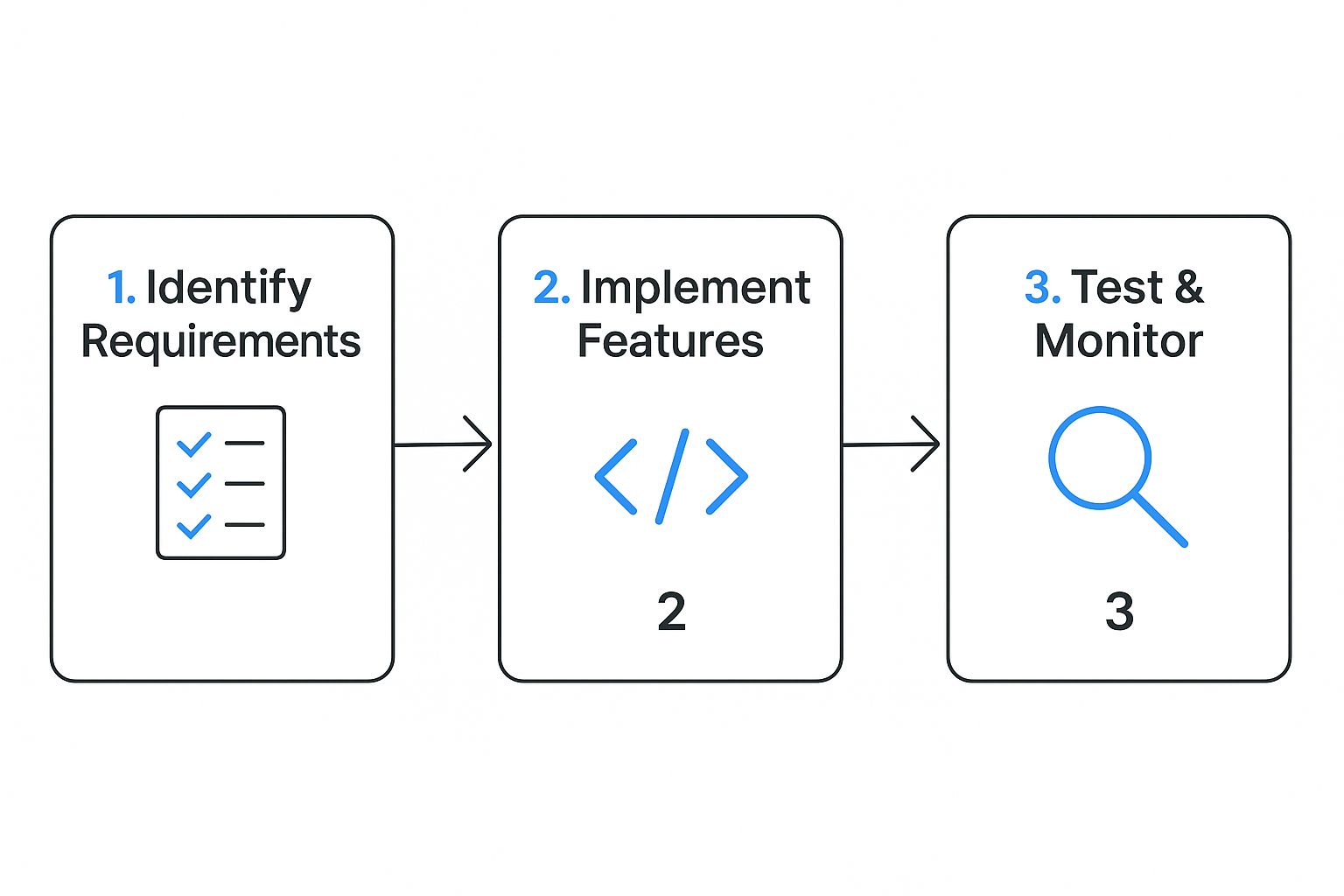
What this really shows is that compliance is a structured, repeatable process—not just a panicked rush to fix bugs as they pop up.
If you want to dig deeper into the nitty-gritty, you can explore the detailed ADA website requirements to build a solid foundation. For a quick overview of what truly makes for an inclusive online presence, check out these 7 Essential Website Accessibility Best Practices. This approach gives you a clear and actionable roadmap to building a more accessible web.
When people first ask how to make their website ADA compliant, they’re usually focused on the technical side of things. But the real starting point is understanding why it's so critical. This isn't just about avoiding a lawsuit; it's about connecting with a huge audience, making your site better for everyone, and building a stronger brand. Think of it less as a legal chore and more as a smart business move.
The legal reality is that the Americans with Disabilities Act (ADA) absolutely applies to websites. Courts consistently treat them as "places of public accommodation," just like a physical storefront. This isn't a new or debated topic anymore—it's a firm legal standard, and ignoring it is getting riskier by the day.
Don't make the mistake of thinking this is only a "big company" problem. A huge number of accessibility lawsuits are aimed squarely at small and medium-sized businesses, often the ones least prepared to handle them.
The financial hit can be massive. You're not just looking at potential fines, but also staggering legal bills and the cost of a rush-job to fix your site. Data shows a sharp increase in ADA Title III complaints, with the U.S. Department of Justice (DOJ) stepping up enforcement and issuing new guidance that makes compliance mandatory.
What's really telling is that 77% of ADA suits are filed against companies earning less than $25 million a year. This isn't a coincidence; it reflects a widespread, and costly, lack of awareness. You can dig deeper into these trends and the enforcement landscape over at Audioeye.com.
"Ignoring digital accessibility is like locking the front door of your physical store to a significant portion of your customers. It's not just bad ethics; it's bad business."
The federal government is fully committed to this. The official ADA.gov website is packed with resources, reinforcing that these rules are actively managed and enforced.
This site is the central source for understanding the law, making it clear that accessibility isn't an optional extra.
Look past the legal warnings, and you'll find a powerful business case for making your site accessible. The global population of people with disabilities represents a massive, often-ignored market with incredible spending power. An inaccessible site simply slams the door on them.
On the flip side, a website built for accessibility is a better website for everyone. Think about it: clear navigation, readable text, and high-contrast colors are just good design. These features help every visitor, whether they're using a mobile device, are in a poorly lit room, or simply prefer a straightforward experience.
This investment pays off in real, tangible ways:
Wider Audience: You're immediately able to connect with millions of potential customers you were previously shutting out.
Stronger Brand: Showing you care about inclusivity builds serious trust and loyalty. People remember brands that make them feel welcome.
Better SEO: Many of the things that make a site accessible—like descriptive alt text for images and a clean heading structure—are exactly what search engines love to see. It’s a natural SEO boost.
Ultimately, you have to shift your perspective. Making your website ADA compliant isn’t a cost to be minimized; it’s an investment in a more resilient, inclusive, and profitable future for your brand.
So, you need to make your website ADA compliant. The first step, and honestly the most important, is figuring out what's actually broken. This is where a thorough accessibility audit comes in. It's not just about running a quick scan; it's about creating a detailed map of all the roadblocks on your site.
Think of it this way: you can't fix what you can't find. A proper audit combines smart technology with real human insight to give you a complete picture. You'll uncover everything from simple coding mistakes to complex user experience problems that automated tools would miss every time.

From my experience, the only way to do a truly effective audit is with a hybrid approach. You need to pair the speed and scale of automated tools with the irreplaceable nuance of manual, human testing. One without the other just doesn't cut it.
Automated scanners are your first pass. They're great for crawling hundreds of pages in minutes and flagging common, code-based issues that violate WCAG criteria.
A huge mistake I see people make is stopping after the automated scan. Industry data shows these tools only catch about 30-40% of all accessibility issues. Relying on them alone leaves massive gaps that can only be found by a real person.
That's where manual testing comes in. It’s all about evaluating the actual user experience. You have to put yourself in the shoes of someone using assistive technology and see how your site holds up. This is how you find the usability nightmares that a machine simply can't comprehend.
I always start with automated tools to get a quick baseline of a site's health. They’re fantastic at catching the clear-cut, pass-or-fail violations.
Here are a few of the most reliable tools I keep in my arsenal:
WAVE (Web Accessibility Evaluation Tool): A browser extension that gives you visual feedback right on the page, highlighting where the errors are. It's incredibly intuitive.
Axe DevTools: This is another must-have extension. It plugs right into your browser's developer tools, which makes it perfect for developers to find and squash bugs during the build process.
Lighthouse: This is built right into Google Chrome's DevTools. It generates a full performance report, and one of its key scores is for accessibility, flagging the most common problems.
These scanners are champs at finding things like poor color contrast ratios, missing alt text on images, or links with no descriptive text. They hand you a list of "low-hanging fruit" you can tackle right away.
Alright, once the automated scan gives you a starting point, it's time to roll up your sleeves. Manual testing is where you’ll uncover the issues that genuinely frustrate users and prevent them from getting things done.
Your manual checklist needs to be focused on the real-world user journey. Here’s what I always check:
Keyboard-Only Navigation: Unplug your mouse. Can you get to everything—links, buttons, forms, menus—using only the Tab key? Is the focus indicator (that little outline showing where you are) always visible and clear? A user should never get "trapped" in a menu or a pop-up.
Screen Reader Compatibility: Fire up a screen reader like NVDA (it's free and excellent) or JAWS. Now, try to use your site. Does the content make sense when it's read aloud? Are images described properly? Can you fill out a form without getting lost?
Form Usability: Go through every form. Does each field have a clearly associated <label>? When you make a mistake, are the error messages actually helpful? They need to tell the user exactly what's wrong and how to fix it.
Heading Structure: This one's huge for navigation. Is there one, and only one, <h1> on each page? Do the other headings follow a logical order (<h2> after <h1>, <h3> after <h2>) without skipping levels? This structure is how screen reader users scan a page.
Now for the gold standard. The ultimate test of your site’s accessibility is to hand it over to people who use assistive technologies every single day. User testing with individuals who have disabilities provides the kind of real-world feedback that no tool or expert can ever replicate.
Their insights go beyond technical compliance and get to the heart of usability. For example, a form might technically pass a scan, but a screen reader user might tell you it's incredibly confusing to actually complete. This is the feedback that helps you create a genuinely inclusive experience.
An audit report collecting digital dust doesn't help anyone. The final, crucial step is to take all your findings—from both automated and manual tests—and turn them into a prioritized action plan.
I like to categorize issues by severity:
Critical: These are total showstoppers. Think of a checkout button that can't be clicked with a keyboard or a form that's impossible to submit. Fix these yesterday.
Serious: These cause a lot of frustration but might have a clunky workaround. This could be confusing page navigation or a video without captions.
Moderate: These are inconvenient but don't completely block a user. Minor color contrast issues or lists that aren't coded correctly often fall here.
Minor: These are typically best-practice tweaks that smooth out the experience but aren't critical.
This prioritized list transforms your audit from a simple report into a practical roadmap. For organizations that want a comprehensive strategy from the get-go, a professional accessibility audit can lay out this entire process and give you that actionable plan.
If you want to make a real, immediate impact on your website's accessibility, the best approach is to tackle the most common problems first. You don't need to get lost in the weeds of the massive WCAG document to get started.
Believe it or not, a recent analysis of one million major web pages found that a staggering 94.8% had detectable WCAG failures. But here's the kicker: the data shows that just six categories of errors are responsible for 96% of all accessibility issues found online. You can dig into the specifics in the full WebAIM Million report, but the message is clear.
By fixing a handful of these recurring problems, you solve the vast majority of barriers users face. It’s the most efficient way to improve your compliance and user experience.
Missing alt text is a classic, easy-to-fix mistake, yet it’s found on 55.5% of homepages. Alt text is simply a short, descriptive sentence in the HTML <img> tag that screen readers announce to users who can't see the image.
This isn't just about SEO or stuffing keywords; it's about conveying the meaning and purpose of the image. If it’s a picture of a product, describe it. If the image is a button that says "Learn More," the alt text should be "Learn More."
My go-to rule: Ask yourself, "If I couldn't see this image, what critical information would I be missing?" Your alt text should be the answer. For purely decorative images that add no real value, use an empty alt attribute (
alt=""). This tells screen readers to just skip over them.
Low-contrast text is the single most common accessibility barrier, affecting an incredible 79.1% of websites. This makes content difficult to read for people with low vision or color blindness, and honestly, it’s a pain for anyone trying to view a screen in bright sunlight.
WCAG 2.1 Level AA sets the standard here, requiring a contrast ratio of at least 4.5:1 for normal-sized text and 3:1 for large text.
Don't just eyeball it. Use a trusted color contrast checker to test your text and background combinations. The fix is often a simple CSS tweak, but it makes a world of difference in readability for everyone. To make typography responsive and accessible, many developers use relative units like rem. A good CSS REM converter tool can be a real time-saver here.
Your forms are where the magic happens—sign-ups, checkouts, and contact requests. If they aren't accessible, you're turning away customers. Missing form labels are a huge problem, found on 48.2% of sites, making it nearly impossible for screen reader users to know what to type where.
Every single input field must have a corresponding <label> that is programmatically tied to it. The standard, and best, way to do this is with the for and id attributes.
It's a simple piece of code, but it's non-negotiable for accessibility:
Full Name:
This direct link ensures that when a user focuses on the input, the screen reader announces the "Full Name" label, providing the context they need to fill it out.
If you would rather not do this yourself, WebAbility offers professional ADA compliance help covering the audit, the fixes, and an owned conformance report.
To bring this all together, here’s a quick-reference table that covers the most common accessibility issues I see in my work. Fixing these will put you miles ahead of the competition.
| Common Issue | Impact | Core Solution |
|---|---|---|
| Low-Contrast Text | Makes content unreadable for users with visual impairments. | Use a color contrast checker; adjust CSS to meet a 4.5:1 ratio for normal text. |
| Missing Alt Text | Visually impaired users miss out on crucial information conveyed by images. | Write descriptive alt text for all informational images; use alt="" for decorative ones. |
| Missing Form Labels | Screen reader users can't identify the purpose of form fields. | Link every <input> to a <label> using matching for and id attributes. |
| Empty Links | Causes confusion for screen reader users who hear "link" with no context. | Ensure all <a> tags contain descriptive text or an image with meaningful alt text. |
| Missing Document Language | Screen readers may use the wrong accent or pronunciation. | Add the lang attribute to your <html> tag (e.g., <html lang="en">). |
| Empty Buttons | Users don't know the button's function. | Provide descriptive text or an aria-label to clarify the button's action. |
Focusing your remediation efforts on these six areas is the most effective way to start. They represent the "low-hanging fruit" of web accessibility and deliver the biggest improvements for the widest range of users.
Headings (<h1>, <h2>, <h3>) aren't just for making text look big and important; they create a navigable outline of your page. Screen reader users depend on this structure to jump between sections, just like a sighted person would scan the headlines.
One of the most frequent mistakes is skipping heading levels for purely aesthetic reasons, like jumping from an <h1> to an <h3>. This breaks the logical flow and can be really confusing.
Keep your heading structure clean by following these rules:
One<h1>per page. This is your main page title. Period.
Never skip levels. Headings must be sequential (<h2> must follow an <h1>, <h3> must follow an <h2>, and so on).
Use headings for structure, not just style. If you only want to change the look of text, use a CSS class instead of a heading tag.
Getting a handle on these issues is foundational. You can learn more about the top 10 common web accessibility mistakes and how to avoid them in our other guide.
If you have video on your website, you need captions. It’s that simple. Captions are absolutely essential for users who are deaf or hard of hearing, but they're also incredibly helpful for people in noisy places or for whom English is a second language.
Most major video platforms like YouTube and Vimeo have tools to help you add captions. While auto-generated captions are a decent starting point, they are notoriously inaccurate. Always take the time to review and edit them to make sure they are precise and synced correctly with the audio.
ARIA (Accessible Rich Internet Applications) is a set of special attributes you can add to your HTML. It's designed to make modern, dynamic web components—like custom menus, sliders, and tab panels—understandable to screen readers.
But with great power comes great responsibility. The first and most important rule of ARIA is: don't use it if a standard HTML element already does the job. For example, always use a <button> element instead of slapping role="button" onto a <div>. Native HTML is always more robust.
Where ARIA truly shines is in clarifying the state of complex widgets. For instance, aria-expanded="true" tells a screen reader that a dropdown menu is currently open. Used properly, ARIA is the bridge that connects today's interactive web with the assistive technology people rely on every day.
Real, sustainable accessibility isn't a project with a finish line. It’s a fundamental shift in how your company operates. The goal is to move beyond a reactive, "fix-it-when-it-breaks" mentality and foster a proactive culture where inclusivity is just part of how you build things.
This kind of change doesn't happen by accident. It takes a deliberate strategy to weave accessibility into the very fabric of your organization, from the first design sketch to the final deployment.
To get this right, you have to shift accessibility "upstream" in your development process. When you treat it as a final-step compliance check, it becomes a bottleneck—expensive, frustrating, and often ineffective. Building it in from the start is just more efficient.
This means accessibility is a constant, ongoing conversation at every step of the journey:
Design: Are your designers thinking about keyboard navigation from the get-go? Are they checking color contrast as they create mockups, not after the fact?
Development: Are your developers reaching for semantic HTML first? Are they building components with ARIA roles in mind from the initial commit?
Content: Are your writers crafting meaningful alt text for every single image and ensuring videos have accurate captions?
QA: Is manual testing with a screen reader and keyboard a mandatory part of your pre-launch checklist?
When accessibility is a shared responsibility, it stops feeling like a chore and becomes a point of pride. This collective ownership is the secret sauce to a lasting compliance strategy.
You can't expect people to prioritize something they don't fully understand. One of the best investments you can make is in targeted WCAG training, but it can't be a generic, one-size-fits-all presentation.
Tailor the education to each role. Designers need to become masters of color contrast and logical reading order. Developers need to go deep on semantic HTML, ARIA implementation, and focus management. Content creators need to understand how to structure information for assistive technologies. This role-specific approach makes the guidelines immediately relevant and actionable.
A common mistake is to dump accessibility solely on the developers. The truth is, designers, writers, and project managers all play a huge part. Giving each of them the specific knowledge they need is what truly transforms a workflow.
The data on non-compliance is staggering. Despite the legal and ethical imperatives, only about 4% of websites are fully ADA compliant. That means a shocking 96% are failing to meet even basic accessibility standards. This isn't just a statistic; it's a clear signal that retrofitting doesn't work. You can dig deeper into what these numbers mean for businesses trying to learn about WCAG and ADA requirements.
To turn good intentions into consistent habits, you need to build guardrails directly into your tools and processes. Automation and standardization are your best allies here.
A great starting point is creating a shared accessibility checklist that every team member can reference at each stage of a project. Even better, integrate automated accessibility scanners directly into your CI/CD pipeline. Tools like Axe can be set up to run with every code commit, catching common errors long before they reach production. This creates a powerful, immediate feedback loop that reinforces best practices on the fly.
Transparency builds trust. A public-facing Accessibility Statement is an essential document that signals your commitment to all users. It’s your official declaration of inclusivity and where you state your target conformance level (typically WCAG 2.1 AA).
But this statement is more than just a mission statement. It should provide a clear, easy-to-find way for users with disabilities to report any barriers they encounter. This feedback is pure gold, effectively turning your users into partners on your accessibility journey.
By opening that line of communication, you show you're listening and dedicated to getting it right. It proves you're serious about continuous improvement, which is the entire point when you're learning how to make a website ADA compliant.
TLDR: ADA is the US law that says you must be accessible, while WCAG provides the technical "how-to" guide. For most businesses, WCAG 2.1 Level AA is the target you need to hit to stay on the right side of the law. Steer clear of accessibility plugins and overlays—they're a band-aid, not a fix, and won't protect you in court. Real compliance means auditing your site's code, fixing the problems at the source, and re-auditing at least once a year.
https://www.youtube.com/embed/Rz8rZQiqKJs
Jumping into web accessibility can feel like learning a new language. You'll run into confusing acronyms and a lot of conflicting advice. My goal here is to cut through the noise and give you clear, direct answers to the questions I hear most often from teams just getting started.
This is, without a doubt, the number one point of confusion, so let's clear it up.
Think of it this way: The Americans with Disabilities Act (ADA) is a major U.S. civil rights law. It mandates that places of public accommodation—which courts have consistently ruled includes websites—must be accessible to people with disabilities. It’s the law.
But the ADA itself doesn't hand you a technical blueprint. It doesn't say "use this HTML tag" or "your color contrast needs to be X:1." That's where the Web Content Accessibility Guidelines (WCAG) come in. WCAG is the set of technical standards created by international experts that tells you how to build an accessible website.
In short: The ADA is the law that sets the requirement (be accessible), while WCAG provides the globally recognized instructions for meeting that requirement.
This is a tempting shortcut. Accessibility plugins and overlays promise a quick, one-click fix. In my experience, they almost always cause more problems than they solve.
These tools work by adding an extra layer of code on top of your site, trying to guess and patch accessibility issues on the fly. They don’t actually fix the broken code underneath. This approach is fundamentally flawed.
They often conflict with assistive technology. The very screen readers and tools people rely on can be broken by an overlay, making the site less accessible.
They miss the complex stuff. Deep issues with keyboard navigation, forms, and ARIA implementation are almost never fixed by these automated tools.
They offer a false sense of security. Relying on an overlay won't hold up in a lawsuit. In fact, many lawsuits specifically target companies that use them, as it shows they knew there was a problem but chose an ineffective solution.
There are no shortcuts. Lasting compliance comes from fixing your website's code and content directly.
Accessibility isn’t a one-and-done task; it's a process. Your website is constantly evolving with new blog posts, product updates, and design tweaks.
As a baseline, you should commit to a full, in-depth accessibility audit at least once a year. It’s also critical to perform an audit right after any major redesign or when you roll out significant new features.
But the best approach is to weave accessibility into your team's everyday workflow. Running smaller, continuous checks during development and before publishing new content is how you stop problems from ever going live in the first place.
WCAG has three conformance levels: A, AA, and AAA.
A: The most basic, bare-minimum requirements.
AA: The globally accepted standard for robust accessibility.
AAA: The highest level, often reserved for specialized services for people with disabilities.
For nearly every business out there, WCAG 2.1 Level AA is the gold standard. It addresses the most common and significant barriers for users without being technically prohibitive for most websites to achieve. From a legal standpoint, Level AA is the benchmark cited in most accessibility lawsuits and settlements.
Ready to move beyond questions and start building a truly accessible website? WebAbility.io provides an end-to-end platform with AI-enhanced tools, real-time monitoring, and expert support to help you achieve and maintain ADA and WCAG 2.1 AA compliance. Start your free trial today and make your digital doors open to everyone at https://www.webability.io.