A Practical Guide to Test for 508 Compliance

Sidharth Nayyar
TL;DR: To test for 508 compliance, use a three-step process: run automated scans to find code-level issues like missing alt text, conduct manual testing to check keyboard navigation and usability, and validate the experience with assistive technologies like screen readers. This combined approach ensures you meet both technical requirements and real-world user needs.
Want the short version of how to test for 508 compliance? It boils down to a three-part process: automated scanning to catch code-level problems, manual testing to check the user experience, and assistive technology validation to see how it performs with tools like screen readers. This combined approach is the only way to get a complete picture of your accessibility.
Your Quick Guide to 508 Compliance Testing
Getting a handle on 508 compliance testing doesn't have to be overwhelming. A successful strategy really just combines three critical layers: automated scanning, detailed manual checks, and real-world validation with assistive technology.
Think of it like a full-scale audit. Automated tools are your first sweep, quickly identifying widespread, code-level issues across your entire site. This initial pass flags things like missing alt text or color contrast violations, giving you a solid technical baseline to work from.
But here’s the catch: automated tools can only find about 30-40% of all potential accessibility barriers. This is where the human element becomes absolutely essential.
The Human Element in Testing
Manual testing fills in the gaps that automated scans simply can't see. It’s all about context and real-world usability. For instance, you’ll be checking if someone can navigate logically through the entire site using only their keyboard—a critical test for users who can’t operate a mouse. This stage confirms that interactive elements are not just coded correctly but are actually functional and intuitive for everyone.
The final piece of the puzzle is testing with assistive technologies. This is where you experience your site exactly as someone using a screen reader would. It’s the ultimate reality check for genuine usability and the only way to be confident you're achieving true compliance.
This diagram breaks down how these stages flow together.
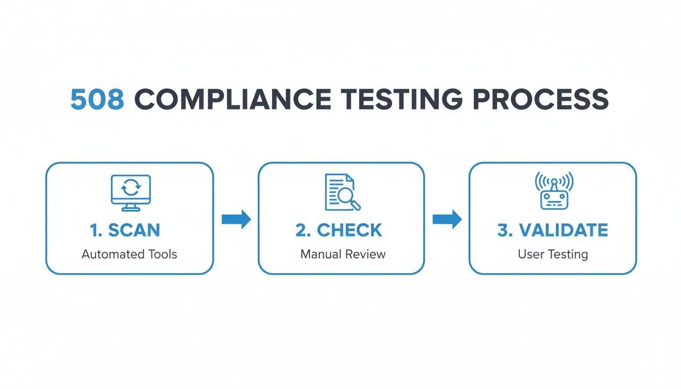
You can see how each step builds on the last, moving from broad technical sweeps to a detailed, human-focused validation. We’ll explore how to weave these stages into a seamless workflow, turning complex requirements into a clear, actionable plan.
For a deeper look into the broader field of ensuring inclusive design, you might find a comprehensive guide to accessibility testing useful.
Why Section 508 Compliance Matters More Than Ever
Let's get straight to it: Section 508 is a federal law, not a suggestion. It mandates that any technology used by federal agencies—and by extension, their contractors and partners—must be accessible to people with disabilities. Falling short can mean legal trouble, lost government contracts, and a serious blow to your reputation.
But this is about more than just avoiding penalties. Getting Section 508 right opens your digital doors to a much wider audience, improves the experience for every single user, and shows the world your brand is serious about inclusivity.
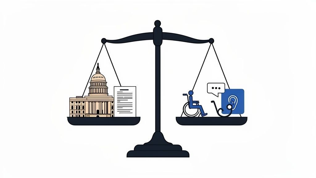
Before we jump into the "how-to" of testing, it’s vital to grasp the real-world weight behind this law. Section 508 is an amendment to the Rehabilitation Act of 1973, a cornerstone of disability rights in the U.S.
It covers all Information and Communications Technology (ICT). Think websites, internal software, mobile apps, and even electronic documents. If the federal government develops it, buys it, or uses it, it has to be accessible.
This net is cast wide. If you're a contractor, vendor, or even a university receiving federal funds, Section 508 is your responsibility, too. Simply put, doing business with the U.S. government means making accessibility a priority.
How Section 508 and WCAG Work Together
So, what does being "508 compliant" actually look like in practice? The good news is you don't have to guess. The law was updated to align directly with the global gold standard: the Web Content Accessibility Guidelines (WCAG), specifically its Level AA success criteria.
Here’s an easy way to think about it:
- Section 508 is the legal mandate—it tells you what you have to do and who has to do it.
- WCAG provides the technical checklist—it shows you how to do it.
This connection is a huge help. When you build and test your digital products to meet WCAG 2.1 Level AA, you're also meeting the technical requirements of Section 508. WCAG effectively becomes your go-to playbook for compliance.
Ignoring these standards is a risky game. The legal consequences are no longer just a possibility; they're a growing reality.
By the end of 2024, ADA Title III website accessibility lawsuits surged by 7%, hitting a total of 8,800 complaints. Many of these cases directly reference Section 508 standards for any organization connected to federal work. The trend is clear: enforcement is getting tougher.
The numbers tell a surprising story. It's not just the big fish getting caught. In 2023, small businesses with less than $25 million in revenue made up 77% of these lawsuits. This proves that no one is too small to be held accountable. With legal hotspots like California and New York seeing massive spikes in filings, proactive testing is non-negotiable, no matter where you are. You can learn more about these accessibility lawsuit trends to see just how fast the landscape is changing.
It's Not Just About Lawsuits—It's Smart Business
While staying out of court is a great motivator, seeing compliance as just a defensive move is incredibly shortsighted. When you truly commit to accessibility, you unlock some powerful business advantages that can fuel real growth.
For starters, you dramatically expand your audience. More than 61 million adults in the United States live with some form of disability. That’s a massive market segment that many companies completely ignore. An accessible website or app welcomes them in, along with their families and friends who often make purchasing decisions.
On top of that, many features designed for accessibility end up improving the experience for all of your users. Think about it: clear layouts, high-contrast text, and logical navigation help everyone. Captions are essential for a user with a hearing impairment, but they're also a lifesaver for someone watching a video in a loud office.
Finally, a genuine commitment to accessibility builds a stronger brand. It tells your customers that you care about inclusivity and doing the right thing. In a crowded marketplace, that kind of trust and loyalty can make all the difference. A solid plan to test for 508 compliance is the first step toward building that better, more inclusive experience.
Starting Your Audit With Automated Scanning
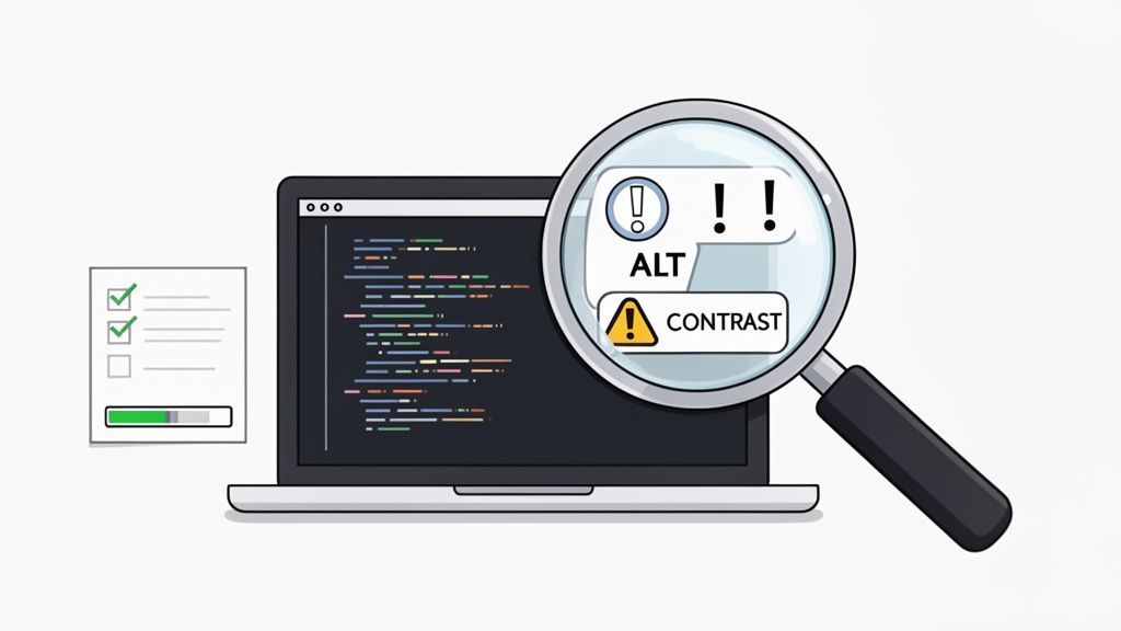
Think of an automated accessibility scan as the first, essential pass in any Section 508 audit. It’s your quickest way to get a high-level view of your website’s health, scanning every page to flag common, code-level errors. Things like missing alt text and low-contrast colors get caught right away.
While these scans don't catch everything—not by a long shot—they give you an indispensable baseline report. This initial data helps you organize your remediation efforts and track progress over time. It’s the solid foundation you’ll build the rest of your testing on, paving the way for the more nuanced manual and assistive technology checks to come.
What Automated Tools Excel At Finding
Automated scanners are brilliant at spotting the black-and-white issues—the clear violations of WCAG standards that don't need a human to interpret them. They excel at finding problems that can be identified by analyzing the code itself.
Here’s a look at the kind of low-hanging fruit a good automated scan will uncover:
- Missing Alternative Text: Immediately flags any
<img>tags that are missing analtattribute. This is a critical failure for anyone using a screen reader. - Color Contrast Violations: The tool can mathematically calculate the contrast ratio between text and its background, flagging anything that falls below the 4.5:1 WCAG AA standard.
- Empty Links or Buttons: Scanners can find interactive elements that have no text or description, which is incredibly confusing for users.
- Improper Heading Structure: A scan will highlight if headings (H1, H2, H3) are out of order, which breaks the logical navigation for assistive tech.
- Missing Form Labels: It will detect
<input>fields that aren't properly connected to a<label>, making forms a nightmare to fill out.
These findings are your starting point. You'll quickly spot patterns, like a site-wide template error causing dozens of unlabeled buttons. A single fix from your dev team could resolve a whole category of issues.
The Limits of Automation: Why Manual Testing Is Still King
It's crucial to understand what automated scans can't do. Realistically, they only catch about 30-40% of all potential accessibility problems. They're great at finding what's there in the code, but they have no understanding of context, user flow, or logic.
An automated tool can't tell you if the keyboard navigation gets stuck in a modal window. It can’t determine if the reading order of your content actually makes sense. And it certainly can't tell you if your alt text is genuinely descriptive or just gibberish. That’s where you absolutely need a human with expertise.
Automated tools are excellent for breadth, not depth. They can tell you if an
altattribute exists, but they can't tell you if the text inside it is meaningful. That's why this step must be followed by manual checks.
To help visualize this, let's break down where each testing method shines.
Automated vs Manual Testing: What Each Method Finds
The table below shows why you need a two-pronged approach. Automated tools give you scale and speed, while manual testing provides the human context and nuance that machines can't replicate.
| Capability | Automated Scanning | Manual Testing |
|---|---|---|
| Speed & Scale | Scans hundreds of pages in minutes. | Time-intensive; focuses on key user flows and templates. |
| Error Type | Finds clear, code-based violations (e.g., missing attributes). | Uncovers contextual and experience-based issues (e.g., confusing navigation). |
| Keyboard Accessibility | Limited checks for focus indicators. | Thoroughly tests tab order, keyboard traps, and element focus. |
| Screen Reader Experience | Cannot validate the actual user experience. | Simulates real user interaction, testing for clarity and logic. |
| Alt Text Quality | Checks for the presence of an alt attribute. | Checks if the alt text is meaningful and contextually correct. |
| Cost-Effectiveness | High initial ROI for identifying widespread, simple fixes. | Higher cost but essential for catching critical, complex issues. |
Ultimately, relying on just one method leaves significant gaps in your compliance efforts.
The accessibility field is also seeing a big shift with the introduction of AI. As you explore scanning tools, keep an eye on how emerging technologies, like those covered in this piece on Generative AI in Software Testing, are beginning to bridge some of these gaps.
Turning Scan Results Into an Action Plan
When the scan is done, you'll probably be looking at a long list of issues. Don't panic. The goal isn't to fix everything at once but to interpret the results and build a smart, prioritized action plan.
Start by grouping similar problems together. Are there 50 instances of the same color contrast failure in your footer? That’s one fix, not 50. Then, prioritize based on impact. A missing label on your main "Contact Us" form is far more critical than a minor heading issue on a blog post from three years ago.
This is where continuous monitoring becomes so valuable. Platforms like WebAbility.io automate this entire process, running ongoing scans and generating clear reports that make it far easier to manage, delegate, and remediate issues over the long haul. To learn more, check out our guide on automated accessibility testing tools and see how they fit into a comprehensive strategy.
Getting Your Hands Dirty: Manual and Visual Accessibility Checks
So, you've run your automated scan. That's a great first step, but it's only half the battle. Now comes the part where you need to think and act like a real user, because machines can't tell you if your site is genuinely usable.
This means putting yourself in the shoes of someone who can't use a mouse or can't perceive color differences. You’ll be doing a hands-on audit, using your keyboard to get around and your eyes to spot problems that automated tools are simply blind to. This is where you uncover the deal-breaker issues that stop people cold.
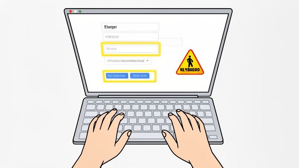
This part of the process is less about code and more about empathy and experience. It’s how you confirm your site is not just technically compliant, but actually works for people who navigate the web differently.
The All-Important Keyboard-Only Test
This is the bedrock of manual accessibility testing. You have to assume your user doesn't have a mouse. For many people with motor disabilities, the keyboard is their only way to interact with the web. Your job is to make sure they can get to and operate everything on the page without getting stuck.
It's simple to start: unplug your mouse or just put it aside. Use the Tab key to jump from one interactive element to the next—links, buttons, form fields. Use Shift + Tab to go backward. As you do this, you're on the lookout for a few critical things:
- Is the path logical? The focus should move in a predictable way. On a login form, that means username, then password, then the sign-in button. If it jumps all over the page, it’s confusing and frustrating.
- Can you see where you are? There must be a clear visual indicator—usually a border or highlight—around the element that currently has focus. If that "focus ring" is missing, keyboard users are flying blind.
- Are there any traps? A keyboard trap is a black hole. You can tab into an element, like a pop-up window or a video player, but you can't tab back out. This is a critical failure because it forces the user to abandon the page.
Think about buying something online. Could you do it all with just your keyboard? Adding items to the cart, filling out your address, choosing a shipping option, and hitting "Complete Purchase"—every step has to work seamlessly.
A keyboard trap is one of the most severe accessibility issues because it can completely halt a user's progress. Always test interactive components like video players, date pickers, and modals to ensure you can get in and out with just the Tab key.
Putting Interactive Elements and Forms Through Their Paces
Once you've confirmed you can tab through everything, it's time to actually use those elements. Tabbing to a dropdown menu is one thing, but can you open it with the Enter or Spacebar key? Can you use the arrow keys to move through the options and make a selection?
Forms are another major focus. Every single input field needs a clear, programmatically linked label. This tells screen readers and other assistive tech what information is required.
Don't forget to test for errors. Intentionally submit a form with mistakes. Are the error messages clear and helpful? "Error" doesn't cut it. A good error message explains what went wrong and where, and it's easy for the user to find.
The Simple Power of Visual Checks
Visual checks are exactly what they sound like. You're just using your eyes to spot obvious problems that are surprisingly easy to miss during development. You don't need any fancy tools, just a sharp eye and a little bit of knowledge.
Here’s a quick-and-dirty checklist for your visual review:
- Meaningful Links: Read through the link text on your page. Do they make sense on their own? Vague phrases like "Click Here" or "Learn More" are useless to a screen reader user who is just listening to a list of links. The text should describe the destination, like "Download the 2023 Annual Report."
- Captions and Transcripts: If you have videos, watch them. Do they have accurate, synchronized captions? This is a non-negotiable part of Section 508 compliance. A transcript is also essential for users who are deaf-blind or who simply prefer to read.
- Don't Rely on Color Alone: Look for any place where color is the only thing conveying information. A common example is using a red outline for a required form field. This is invisible to someone with color blindness. Always include a second indicator, like text or an asterisk.
- Readability: Step back and just look at the text. Is it easy to read? Super thin or overly decorative fonts can be a nightmare for people with low vision or dyslexia. Good contrast, clear fonts, and generous line spacing make a world of difference.
These hands-on checks are absolutely essential for a proper audit. They close the gap between what a machine can test and what a human actually experiences, ensuring your website is truly open to everyone.
Validating the User Experience with Assistive Technology
Automated scans and keyboard-only navigation are crucial first steps, but they don't paint the full picture. The real moment of truth in any serious test for 508 compliance comes when you experience your site exactly as a user with a visual impairment does: through a screen reader.
This is where we move past technical checks and into genuine usability. It’s how you find out if all that carefully structured code actually creates a coherent, easy-to-navigate experience, or just a wall of frustration for someone relying on assistive tech.
Honestly, without this step, your compliance efforts are just a box-ticking exercise. This is the ultimate reality check to ensure your website isn't just technically compliant but truly usable for everyone.
Getting Started with Screen Reader Testing
Jumping into screen reader testing can feel a bit intimidating at first, but you don’t need to be an expert to find major issues. The goal isn't to become a power user overnight. It's about building empathy and uncovering the most critical roadblocks.
The good news is that most operating systems come with a screen reader built right in.
- Windows: Narrator is included, but the gold standard for free screen readers is NVDA (NonVisual Desktop Access). It’s powerful, popular, and the best place for most people to start.
- macOS and iOS:VoiceOver comes standard on all Apple devices. Just enable it in your accessibility settings, and you're ready to go.
- JAWS (Job Access With Speech): This is the professional, paid software you’ll find in many corporate and government environments. While it has a cost, testing with JAWS can uncover unique insights, especially if that's what your target audience uses.
My advice? Just pick one—NVDA or VoiceOver are fantastic starting points—and learn a handful of basic commands. You really only need to know how to move between headings, links, and form fields to get started.
What You Should Be Listening For
Once a screen reader is running, the real work begins. I always tell people to turn off their monitor or at least close their eyes to get a more authentic feel for the experience. Try to complete a few key tasks on your site and listen carefully to what the screen reader says.
You’re listening for logic and clarity. Does what you hear make sense? Here are the things I check for every time:
- Proper Heading Announcements: As you jump from heading to heading (the primary way screen reader users skim a page), does the tool actually announce "Heading Level 1," "Heading Level 2," etc.? This structure is absolutely vital for understanding the page layout.
- Meaningful Alt Text: When you land on an image, what do you hear? "Image, graphic123.jpg" is completely useless. A helpful announcement is descriptive, like, "Image, a smiling woman sitting at a laptop."
- Descriptive Link Text: Screen readers can generate a list of all links on a page. Imagine that list is just "Click here," "Learn more," "Read more" repeated ten times. It’s impossible to use. Link text needs to be specific, like "Read our 2024 annual report."
- Clear Form Labels and Instructions: When you tab into a form field, does the screen reader announce the label ("First Name, edit text") and provide any necessary instructions or error messages? Without this, forms become a guessing game.
This process quickly reveals how much the user experience depends on clean, semantic HTML. If the code is a mess, the screen reader's output will be just as chaotic.
A critical pro-tip: Always verify the reading order. A screen reader follows the DOM (Document Object Model) order, not the visual layout. If a developer used some clever CSS to visually rearrange elements on the screen, the announced order might be completely nonsensical, making the page impossible to understand.
Testing Common User Scenarios
To get the most out of your time, focus on the most important things a user would do on your site. Don't just browse randomly; have a specific goal. This approach helps you find the barriers that have the biggest impact.
Here are a few practical scenarios to guide your testing:
- Fill Out a Contact Form: Can you easily navigate to every field, understand what’s being asked, enter your information, and submit the form? Crucially, if there's an error, is it announced clearly and immediately?
- Navigate a Data Table: Find a complex table, like one with financial data. As you move from cell to cell, does the screen reader announce the correct column and row headers? If not, the data is just a meaningless jumble of numbers.
- Make a Purchase: Try to go through a complete e-commerce flow. Can you find a product, add it to your cart, navigate the checkout process, and successfully buy it? This is often where complex interactions and third-party integrations fall apart.
Running through these real-world tests will give you a much deeper understanding of how your site actually works for people using assistive technology. You'll move beyond a simple checklist and gain true insight. For a more detailed guide, check out our comprehensive screen reader test walkthrough on the blog. It provides step-by-step instructions to help you master these fundamentals.
Turning Your Audit Findings into Action
An accessibility audit doesn't mean much if it just sits in a folder. The real value comes from turning those findings into a concrete plan for getting things fixed. This is the moment you pivot from finding problems to actually solving them.
To get developers what they need, you have to document every issue with crystal-clear detail. Think like you're filing a bug report. For every barrier you uncover, make sure to include a screenshot, the exact URL, and simple, step-by-step instructions on how to reproduce the problem. Without that context, you’re just creating more work for your team.
Building an Actionable Report
Your findings need to be packaged in a way that developers can immediately understand and act on. I’ve found the best approach is to treat each issue like a ticket in their system.
A solid report for a single issue should always contain:
- The Problem: What’s wrong, in plain English.
- Location: The specific URL and even the component name.
- WCAG Violation: Which WCAG 2.1 AA rule is being broken.
- Impact: Who this hurts (e.g., screen reader users, people navigating with a keyboard).
- Suggested Fix: A clear recommendation on how to solve it.
This structure gets rid of the guesswork. It lets a developer see the problem, understand its impact, and know how to fix it, all in one place. It helps them slot accessibility fixes right into their sprints.
The point of an audit report isn't just to list a bunch of failures. It’s to give your team a practical playbook for making things right. Clear, reproducible, solution-focused feedback is what turns a list of violations into a manageable project.
Prioritizing for Maximum Impact
Okay, you have your report. Now what? Don't just hand over a massive list of issues. That’s a surefire way to cause analysis paralysis. The key is to prioritize.
Not all accessibility bugs carry the same weight. You have to triage them. Start with the showstoppers—the issues that completely block someone from getting something done. If the login button doesn't work with a keyboard or the checkout form is invisible to a screen reader, those are your top priorities. A minor color contrast issue on a footer link can wait.
Think about both severity and frequency. A critical bug on your homepage is more urgent than a minor one on a rarely visited "About Us" page.
This strategic approach is more important than ever. The Federal Government's Fiscal Year 2024 Section 508 Assessment pointed out that a major reason for compliance gaps is a lack of testing resources. The result? Public web page conformance is stuck at a meager 62%. You can explore the full government assessment findings to see the data for yourself.
Ultimately, getting these issues fixed is a team sport. Present your prioritized list constructively, framing it as a shared effort to build a better product for everyone. If your team needs a hand turning raw data into real improvements, professional accessibility audit services can provide the deep expertise to guide you from audit to action.
Common Questions About Section 508 Testing
As you dive into Section 508 compliance testing, it's natural for a few questions to pop up. Getting straight answers to these common queries is the best way to build an accessibility strategy that actually works and lasts. Let's tackle a few I hear all the time.
How Often Should I Test for 508 Compliance?
The short answer? Constantly. But that doesn't mean you're doing full, top-to-bottom audits every week.
Think of it as a two-part rhythm. You should absolutely have automated scans running with every major code change or content update. This is your first line of defense, catching new problems right as they're introduced.
Then, at least once a year—or after any major redesign—you need to schedule a comprehensive manual and assistive technology audit. This deep dive is where you find the nuanced issues that automated tools miss. This hybrid approach keeps you on track and prevents that dreaded accessibility debt from piling up.
Can Automated Scanners Make My Site Fully Compliant?
In a word: no. Automated tools are incredibly useful, don't get me wrong. They can quickly flag a huge number of code-based errors, typically catching around 30-40% of potential accessibility barriers. They're fantastic for their speed and scale.
But they have zero human judgment. They can't understand context, which is everything in accessibility.
For example, an automated scanner can verify that an image has an
altattribute. What it can't do is tell you if that attribute provides a genuinely helpful description or if it just says "image.jpg." That's why manual testing with real assistive technology is non-negotiable for true compliance.
What Is the Difference Between Section 508 and WCAG?
This is a common point of confusion, but it's pretty simple when you break it down. Think of it like this: Section 508 is the law, and WCAG is the technical standard you have to meet to follow that law.
- Section 508 is a US federal law that mandates federal agencies (and their contractors) make their electronic and information technology accessible to people with disabilities.
- WCAG (Web Content Accessibility Guidelines) is the globally recognized set of technical rules and best practices for creating accessible web content.
The updated Section 508 rule explicitly points to WCAG 2.0 Level AA as the required technical standard. So, to meet your legal obligations under Section 508, you must ensure your site conforms to the WCAG guidelines.
Ready to put these answers into practice? WebAbility.io offers an end-to-end platform with automated scanning, real-time monitoring, and expert guidance to make your 508 compliance journey both clear and manageable. Check out our compliance solutions at WebAbility.io.
Quick Questions
Tap to ask AI about this article