Master Screen Reader Testing for WCAG & UX

Sidharth Nayyar
Automated accessibility checks are useful, but they don't tell you whether a blind user can use your product. They typically catch only about 30 to 40% of accessibility issues, which means a large share of problems still require manual verification with a screen reader, especially reading order and dynamic interaction behavior, as noted in this practical screen reader testing guide.
That changes the conversation. Screen reader testing isn't a final compliance task for legal review. It's a product quality discipline. If your team ships forms, menus, filters, modals, checkout flows, dashboards, or mobile interactions, you need a repeatable way to hear what assistive technology users hear and operate what they operate.
TL;DR
- Automation alone is not enough. It finds code-level issues, but it won't reliably validate usability.
- Manual screen reader testing is imperative for headings, links, forms, focus order, announcements, and dynamic updates.
- Use a two-pass method. Read linearly first. Then test interaction with keyboard commands.
- Test more than one setup. Screen reader behavior varies across tools, browsers, and devices.
- Document exact spoken output along with browser and screen reader versions so developers can reproduce defects.
- Build a testing matrix and move left. Treat screen reader testing as part of development and QA, not a cleanup step after release.
- Platform support matters. The right workflow, reporting, and issue tracking make manual testing sustainable at scale.
Why Screen Reader Testing Is Not Optional
If your accessibility process stops at scanning, you're only seeing part of the problem. Automated tools can flag missing alt text, some ARIA mistakes, and certain structural failures. They usually can't tell you whether a form makes sense when read aloud, whether a status message is announced at the right time, or whether focus lands where a user expects.
That gap matters because users don't experience your interface as a checklist. They experience it as a sequence of spoken labels, landmarks, headings, state changes, and keyboard actions. When those pieces don't line up, the page may look fine and still fail in practice.
What automation misses
The most expensive accessibility failures often aren't visual. They're interaction failures.
- Reading order issues mean the page is announced in a confusing sequence.
- Weak announcements leave buttons, fields, or status changes unclear.
- Dynamic behavior problems break modals, menus, autocomplete, and single-page app transitions.
- Focus management defects make users lose context or get stuck.
Practical rule: If a user has to guess what changed, where focus moved, or what a control does, the experience is not accessible enough.
This is why teams that care about outcomes treat screen reader testing as core QA. It catches defects that directly affect task completion, user trust, and support load.
Why this is also a business decision
A usable screen reader experience improves the product for more than one audience. Clear headings help everyone scan. Good button names reduce ambiguity. Reliable focus order improves keyboard use. Better error handling lowers friction during sign-up, checkout, and account recovery.
That makes screen reader testing relevant to conversion and retention, not just compliance. Teams that test manually tend to write cleaner semantic HTML, build more predictable components, and catch regressions earlier. Those habits improve product quality across the board.
For executives and delivery leads, the takeaway is simple: manual screen reader testing lowers avoidable risk and improves usability where it counts. If you need a broader strategic view, WebAbility.io's perspective on web accessibility gives useful context for why this work now belongs inside normal digital operations.
Understanding Screen Readers and Accessibility Laws
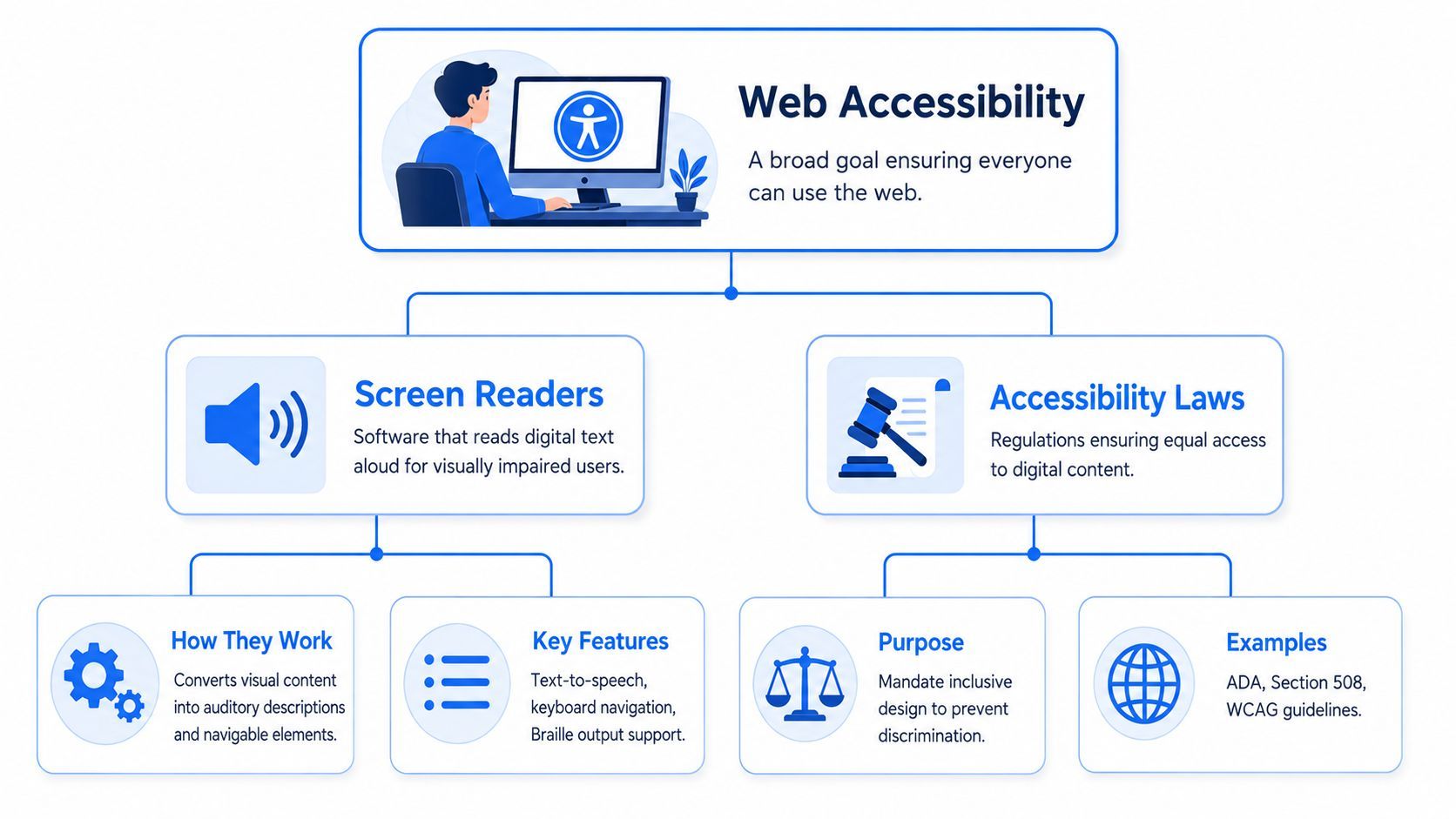
A screen reader isn't just a voice that reads text aloud. It's a navigation system that interprets structure, names, roles, states, and relationships from your code. If the underlying markup is solid, users can move quickly by heading, link, form control, landmark, or table. If the markup is weak, they hear noise.
A good mental model is this: a well-structured page feels like using a table of contents and chapter headings. A poorly structured page feels like flipping through loose pages with no labels.
What screen readers depend on
Screen readers work best when your interface communicates meaning programmatically, not visually.
That starts with a few basics:
- Semantic HTML such as real buttons, headings, lists, tables, and form labels
- Accessible names that make links and controls understandable out of context
- Logical focus order so keyboard movement follows the intended task flow
- State and status exposure so expanded menus, errors, validation, and updates are announced correctly
If you fake a button with a styled div, the visual design may pass review while the screen reader experience breaks. If a field only uses placeholder text, users may hear an edit box with no reliable label. If a modal opens without moving focus, users can stay trapped in the background page without realizing it.
Where laws and standards connect to implementation
Legal and policy frameworks matter because they define what equal access looks like in practice. WCAG provides the technical standard teams usually work from. ADA expectations shape digital accessibility obligations in many contexts. Section 508 applies directly to federal procurement and strongly influences public sector workflows.
For developers and designers, the practical point is straightforward. These frameworks don't reward surface-level fixes. They push teams toward interfaces that are perceivable, operable, understandable, and reliable. In day-to-day work, that usually means better markup, clearer interactions, and consistent keyboard support.
A page doesn't become accessible because a scanner says it's cleaner. It becomes accessible when a user can understand it, navigate it, and complete a task.
If your team needs a deeper technical baseline before testing, this complete screen reader guide is a useful companion resource.
The Two-Pass Method for Effective Testing
The fastest way to make screen reader testing consistent is to separate content reading from interaction. Trying to do both at once causes teams to miss defects. A better method is to test the page in two deliberate passes.
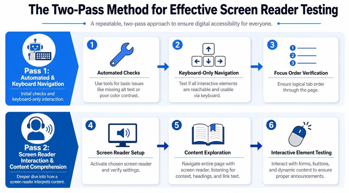
The core pattern is well established. Screen reader testing should be done in two passes: first read the page content linearly with the Down Arrow key, then use Tab and other keyboard commands to operate interactive elements, because these two modes catch different failure classes, as described by Illinois accessibility testing guidance.
Pass one for reading and structure
In the first pass, don't try to submit forms or trigger advanced widgets right away. Read.
Move through the page linearly and listen for the basics:
- Page title and language cues that establish context
- Heading structure that creates a usable outline
- Link text that makes sense without surrounding visual context
- Image alternatives that communicate meaning where needed
- List and table cues that preserve structure in speech
- Reading order that matches the intended content flow
This pass exposes pages that are technically populated but practically incoherent. It also reveals overuse of ARIA, duplicate labels, noisy content, and headings that look right visually but don't work as navigation.
Pass two for operability and announcements
Once the page reads sensibly, switch to interaction. Use Tab, Shift+Tab, Enter, Space, arrow keys, and component-specific commands where needed.
Check whether users can complete tasks:
- Follow the focus path through links, buttons, fields, menus, and dialogs.
- Activate controls and listen for clear role and state announcements.
- Submit forms and verify labels, required states, instructions, and error feedback.
- Trigger dynamic updates such as filters, accordions, sort controls, and notifications.
- Close overlays and confirm focus returns to the triggering element or the next logical point.
A lot of teams stop too early. They confirm that a button is reachable, but not whether the screen reader says the right thing before and after activation. That's how broken toggles, silent errors, and invisible state changes get through QA.
One screen reader isn't enough
Screen reader behavior varies by platform and user base. Survey data cited in the accessibility field shows usage spread across several major tools, including NVDA at 65.6%, JAWS at 60.5%, VoiceOver at 43.9%, and Narrator at 37.3%, while another cited survey reported JAWS at 53.7% and NVDA at 30.7%, which is why testing guidance recommends more than one setup and not a single-tool check, as discussed in this overview of screen reader testing and audits.
That variation is exactly why teams should test with at least two major screen readers. If you're starting with Windows workflows, ensure website accessibility with NVDA is a sensible place to begin. Then add another environment so your test coverage reflects real user diversity rather than one machine in one browser.
Building Your Screen Reader Testing Matrix
Ad hoc checks create false confidence. A page might work in one setup and still fail for another user because the browser, operating system, and screen reader handle names, focus, or live updates differently.
A workable testing matrix solves that by defining coverage ahead of time. The point isn't to test everything everywhere on every sprint. The point is to choose combinations intentionally and tie them to critical user flows.
What belongs in the matrix
A practical expert-level matrix should include at least two major screen readers and browsers, then validate real user flows such as forms, tables, and dynamic widgets. It should also log the exact versions and spoken announcement so defects are reproducible, as recommended in SitePoint's guidance on conducting accessibility testing with screen readers.
Use cases matter more than page counts. A single checkout flow often deserves more attention than dozens of low-risk content pages.
| Priority | Operating System | Screen Reader | Browser | Use Cases to Test |
|---|---|---|---|---|
| High | Windows | NVDA | Firefox or Chrome | Login, signup, checkout, account settings |
| High | Windows | JAWS | Chrome or Edge | Enterprise workflows, data tables, complex forms |
| High | macOS | VoiceOver | Safari | Navigation, modals, menus, content pages |
| Medium | iOS | VoiceOver | Safari | Mobile navigation, swipe order, forms, dialogs |
| Medium | Android | TalkBack | Chrome | Mobile filters, search, authentication |
| Targeted | Platform based on audience | Secondary setup | Secondary browser | Components with known announcement differences |
How to prioritize without overtesting
Start with combinations that map to your audience and risk. If your app serves enterprise users, include JAWS. If your mobile conversion path matters, include mobile assistive tech. If your product depends on dense data views, test tables and custom widgets early.
Keep the matrix lean enough that the team will use it. Expand it when a bug pattern or customer segment justifies more coverage.
Working habit: Every bug report should include the screen reader, browser, version details, the exact spoken output, and the user action that triggered it.
That level of detail turns "screen reader issue" from a vague complaint into a fixable defect. If your team is still deciding which tools to keep in the workflow, it helps to compare screen reader tools against your actual browser and operating system support requirements.
Integrating Testing into Your Workflow
Screen reader testing breaks down when teams treat it like a once-a-quarter audit. It works when it's part of build, QA, and release decisions.
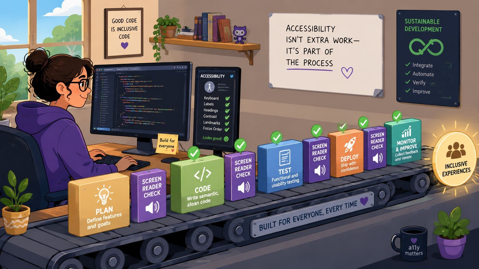
The pattern that scales is simple. Use automation for volume. Use keyboard checks for fast interaction coverage. Use manual screen reader testing for the issues that require human judgment. Each layer catches a different class of defect.
Where to place manual checks
The worst time to start screen reader testing is after design signoff, development complete, and content loaded. By then, the markup, component model, and interaction assumptions are already hard to change.
A more efficient pattern looks like this:
- During design review check heading structure, naming patterns, focus expectations, and error behavior.
- During component development test buttons, dialogs, accordions, tabs, menus, and forms in isolation.
- During feature QA run the two-pass method on the full user flow.
- Before release spot-check priority paths on a second screen reader or device setup.
- After release monitor regressions and user-reported issues as part of normal triage.
How a platform helps without replacing judgment
An accessibility platform earns its place because teams require one system for scans, issue tracking, historical visibility, and repeatable testing workflows. They also need tooling that supports manual verification instead of pretending to replace it.
For example, WebAbility.io combines automated monitoring, reporting, and governance with an accessibility widget that provides user-facing adjustments and can support broader verification workflows. In practice, that means your team can catch recurring code-level issues early, organize findings in one place, and still reserve manual screen reader testing for announcements, focus behavior, task completion, and edge cases.
That combination is what makes the process sustainable. Automation reduces noise. Manual testing protects the user experience. Workflow tooling keeps both from turning into scattered spreadsheets and untraceable tickets.
What teams should stop doing
A few habits consistently waste time:
- Late-stage accessibility sweeps after the release is already queued
- Single-page audits that ignore complete user flows
- Pass-fail thinking based only on scanner output
- Bug reports without spoken output, which force developers to guess
Teams get better results when they define minimum manual checks per feature. That doesn't mean every story gets a full audit. It means every meaningful interaction gets verified before it ships.
Testing Advanced Scenarios and Common Pitfalls
Teams can learn to test headings, links, labels, and buttons fairly quickly. The failures that remain are usually in places where modern interfaces become dynamic, visually led, or touch-driven.
Those are the areas where basic checklists start to thin out.
Mobile needs its own testing approach
A common gap in screen reader coverage is mobile and touch-based testing for VoiceOver and TalkBack, which requires different techniques for checking swipe order and gesture reachability than desktop keyboard flows, as discussed in Nielsen Norman Group's mobile accessibility research guidance.
That difference is bigger than many teams assume. Desktop testing teaches you about focus order and keyboard operation. Mobile testing teaches you whether a user can swipe through content in a sensible sequence, activate controls with gestures, and understand output at realistic speech speeds.
Watch for issues such as:
- Swipe order that doesn't match visual order
- Touch targets that are technically present but hard to reach logically
- Hidden controls revealed only by hover or mouse assumptions
- Announcements that are too vague once visual context disappears
Products built for relationship-building, community interaction, or profile browsing make this especially obvious. A platform such as the Special Bridge dating app is a useful reminder that many digital experiences depend on nuanced navigation and repeated interaction, not just static content. In those environments, gesture clarity and announcement quality matter as much as page structure.
Dynamic interfaces fail in subtle ways
Dynamic content is where teams often overestimate compliance. A modal opens. A toast appears. A filter updates results. A carousel rotates. Visually, everything seems fine. Audibly, nothing useful happens.
The common failure pattern is mismatch between visible state and spoken state.
When the interface changes but the announcement doesn't, users are forced to infer what happened from fragments.
Test these scenarios deliberately:
Modal dialogs
Confirm focus moves into the dialog, stays contained while open, and returns logically on close.
Validation and success messaging
Submit forms with errors and with valid data. Listen for whether feedback is announced clearly and associated with the right field or action.
Live regions and async updates
Trigger cart changes, search suggestions, filtering, saved states, and inline updates. Verify they are announced at the right moment without becoming noisy.
Carousels and tabs
Check control names, current state, keyboard support, and whether content changes are understandable without sight.
Single-page app route changes
Confirm users receive enough context after navigation, such as a changed title, heading, focus shift, or clear new starting point.
Advanced screen reader testing is less about checking boxes and more about verifying continuity. Can users keep their place, understand what changed, and finish the task without visual rescue?
Your Practical Screen Reader Testing Checklist
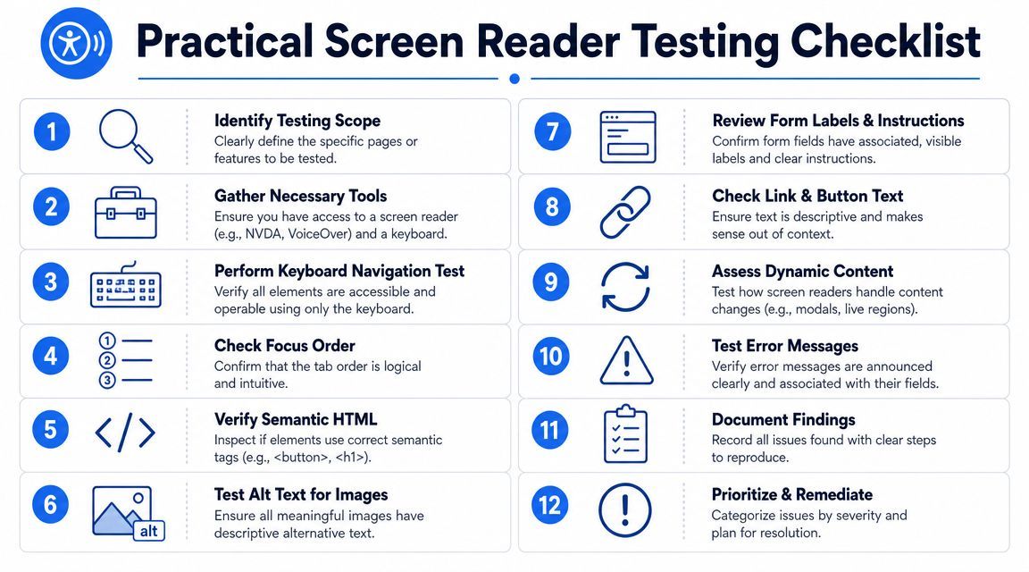
A good checklist should be short enough to use and detailed enough to prevent sloppy testing. The one below works well for feature QA, release checks, and regression review.
Core checklist for every test pass
- Define the scope. Pick the exact page, feature, or user flow before you start.
- Use a clean setup. Turn off extensions or overlays that could affect announcements unless you're testing them intentionally.
- Run automated checks first. Clear obvious code-level issues before manual review.
- Read the page linearly. Listen for title, headings, reading order, link clarity, lists, tables, and image alternatives.
- Test interaction next. Tab through controls, open menus, submit forms, and close dialogs.
- Check key components. Focus on headings, links, buttons, images, form labels, required states, and error handling.
- Trigger dynamic behavior. Test filters, results updates, live messages, modals, and SPA transitions.
- Repeat on a second setup. Validate the highest-risk flow with another screen reader or browser combination.
- Log defects precisely. Record user action, exact spoken output, and environment details.
- Retest fixes in context. Confirm the repair works in the same user flow where the issue appeared.
What a useful defect report includes
A weak bug report says: "Screen reader issue on form."
A useful one says:
- Environment with screen reader, browser, and version
- Location with page and component name
- Action taken such as tabbing to a field or submitting empty form data
- Actual spoken output
- Expected spoken output or behavior
- Impact on task completion
That format saves time for developers, QA, and accessibility reviewers. It also creates a trackable record for recurring component defects.
Bottom line: The checklist is the habit. The platform is the system that keeps the habit consistent across teams, releases, and sites.
If your team wants to operationalize screen reader testing instead of treating it as a last-minute audit, WebAbility.io gives you a practical place to centralize scanning, reporting, governance, and accessibility workflows while keeping manual verification where it belongs, inside real QA and release processes.
Quick Questions
Tap to ask AI about this article