How to Make a PDF Document Accessible a Practical Guide

Sidharth Nayyar
tldr
To make a PDF accessible, you need to add structure with tags for headings and lists, set a logical reading order for screen readers, and provide descriptive alt text for all images. Start by using accessibility features in source programs like Word or InDesign, then use Adobe Acrobat Pro to fine-tune tags, check reading order, and run the Accessibility Checker. This ensures your document is usable by everyone and meets compliance standards. For a comprehensive strategy across all your digital assets, explore our enterprise accessibility solutions.
Your Quick Guide to Accessible PDFs
If you've ever wondered how to make a PDF document accessible, you're asking the right question. It’s all about making sure that people who rely on screen readers and other assistive technologies can navigate and understand your content just as easily as anyone else.
This isn’t just about making the text readable. It's about building a complete, logical experience from the ground up. When you get this right, you’re not just ticking a compliance box—you’re genuinely opening the door for an audience that is too often left behind.
Think of it as adding a hidden layer of information that only assistive tech can see. This layer tells the software exactly how to present the content.
Structure: First, you need to add tags. This is the single most important step. Tags define the document's structure, telling a screen reader, "This is a main heading," "This is a list," or "This is a data table." Without them, a PDF is just a flat, confusing jumble of words.
Order: Next, you have to define a logical reading order. You can’t assume the software will read from top-to-bottom, left-to-right, especially with complex layouts like multi-column newsletters. You must explicitly set the sequence so the content makes sense when read aloud.
Describe: Finally, every image, chart, and graphic needs meaningful alternative text (alt text). If a visual element conveys important information, you have to describe its purpose for someone who can't see it. If it’s purely decorative, you mark it as such so screen readers can skip it.
These three actions are the pillars of PDF accessibility.
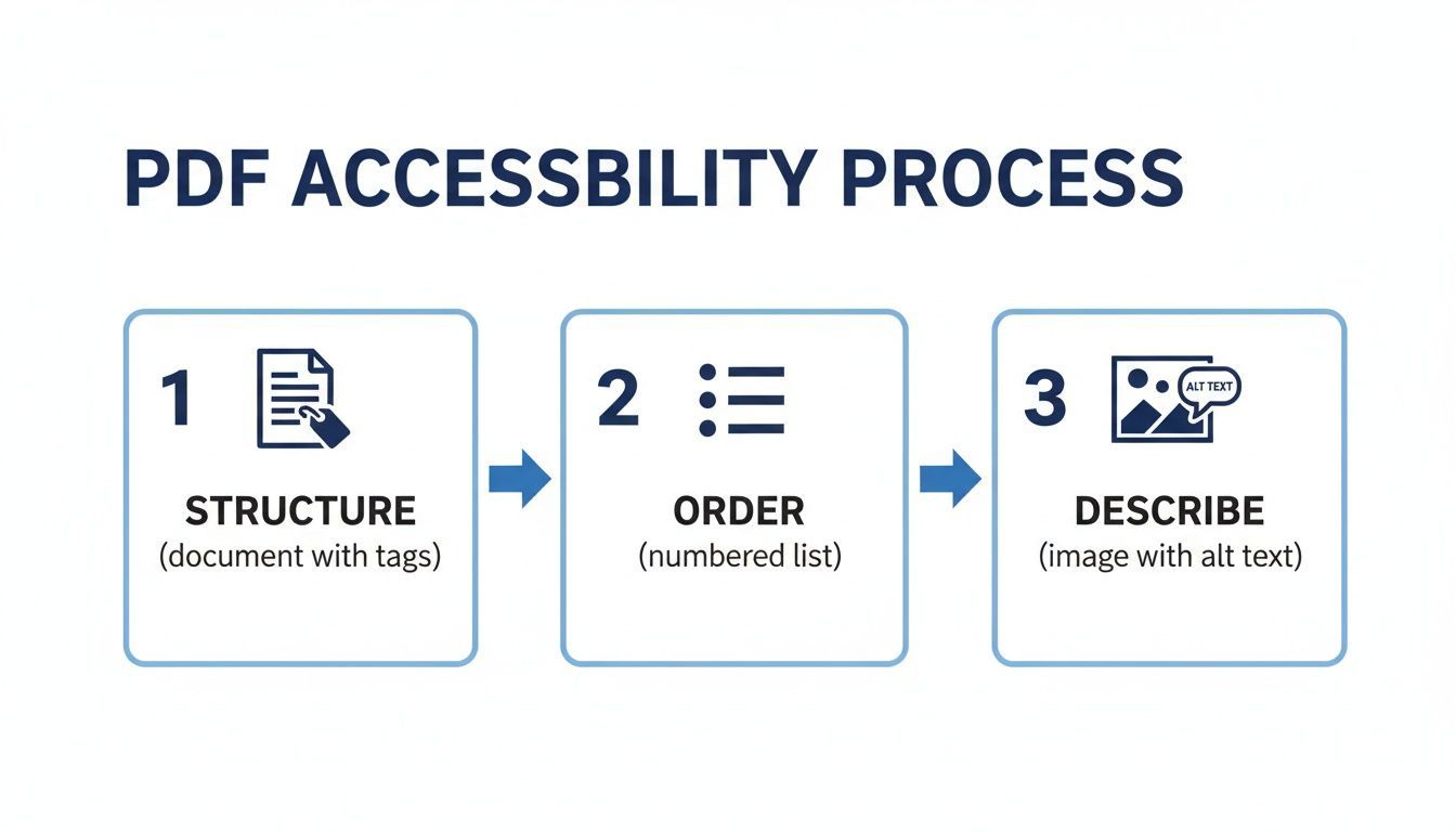
To make this a bit clearer, here’s a quick-glance table summarizing the core process.
Key Steps to Make a PDF Accessible
| Action | What It Does | Primary Tool |
|---|---|---|
| Add Structure Tags | Defines the semantic role of content (headings, paragraphs, lists, tables). | Adobe Acrobat Pro, Microsoft Word, InDesign |
| Set Reading Order | Ensures content is read aloud in the correct logical sequence. | Adobe Acrobat Pro (Order Panel) |
| Provide Alt Text | Describes the meaning and purpose of non-text content like images. | Adobe Acrobat Pro, Microsoft Word, InDesign |
| Ensure High Contrast | Makes text readable for users with low vision. | Source application (Word, PowerPoint, etc.) |
| Make Forms Interactive | Adds labels, tooltips, and a logical tab order to form fields. | Adobe Acrobat Pro (Prepare Form Tool) |
Following these steps transforms a static, inaccessible document into a usable resource for everyone.
Want to see how your entire digital presence stacks up? Check your website's accessibility now with our free scanner.
Start with an Accessible Foundation
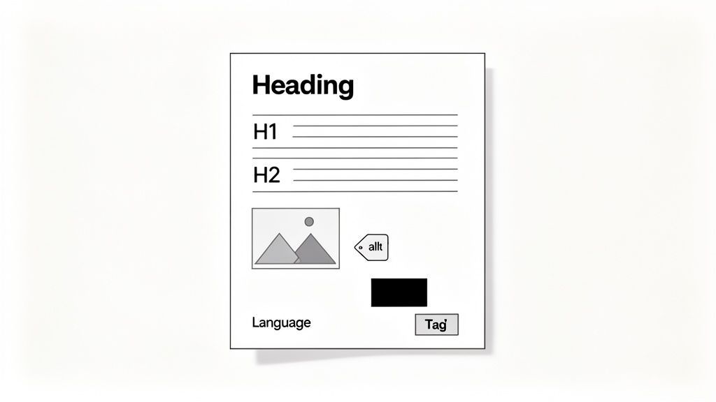
Here's a secret that will save you countless hours: the best accessible PDFs are built long before you ever hit "Save as PDF." The real work happens in your original document, whether that's in Microsoft Word, Adobe InDesign, or another authoring tool.
If you get this part right, you can knock out up to 80% of the accessibility work from the get-go. Think of it as building a house on a solid foundation instead of trying to fix a crooked frame later.
The single most important thing you can do is use your program's built-in styles for structure. It's tempting to just make text bigger and bolder to create a heading, but that's only a visual cue. To a screen reader, it's just plain text. When you use the actual "Heading 1" and "Heading 2" styles, you create a semantic roadmap that assistive technology can follow, letting users navigate the document just like a sighted person would scan for headlines.
Establish a Clear Semantic Structure
Imagine trying to read a book with no chapter titles or table of contents. That’s what a document without a proper heading structure feels like to someone using a screen reader—just a massive, undifferentiated wall of text.
Every document needs one—and only one—"Heading 1" for the main title. From there, break down the content with "Heading 2" for major sections and "Heading 3" for any subsections. This isn't just about making it look organized; you're building the logical backbone that gets translated into the PDF's accessibility tags.
Key Takeaway: Using proper heading styles is non-negotiable. It is the most impactful thing you can do in your source file to ensure it’s usable with assistive technologies.
This approach is a core part of a bigger picture. To truly get it right, you need to understand the accessible by design principles that guide how people with disabilities interact with digital content.
Describe Visuals with Alt Text
Any image, chart, or graph that isn't purely for decoration needs alternative text, or alt text. This is the description a screen reader will announce, giving users who can't see the image the same information a sighted user would get.
Good alt text is an art. Don't just describe what the image is; explain what it means. Instead of writing "Chart," a much better description would be, "Bar chart showing quarterly revenue increased by 25%, rising from $8M in Q1 to $10M in Q2."
A few quick tips for writing effective alt text:
- Be Concise: Get to the point quickly but include all the essential information.
- Be Accurate: Make sure your description faithfully represents the image's purpose.
- Avoid Redundancy: You can skip phrases like "Image of..." because the screen reader already announces that it's an image.
What if an image is just there to look nice, like a decorative flourish or a background pattern? In that case, you should mark it as an "artifact" so screen readers simply ignore it. This cuts down on unnecessary noise and lets the user focus on what matters.
Other Foundational Best Practices
Beyond structure and images, a few other habits will dramatically improve your source documents.
Meaningful link text is a big one. Instead of vague phrases like "click here," use descriptive text that tells the user exactly where they are going. For example, use "Read our complete 2023 annual report" to provide clear context.
When you're ready to export from a program like Microsoft Word, the settings matter. Choosing the 'Best for electronic distribution and accessibility' option is critical, as it carries over the structural tags far more effectively—often 90% better than the standard 'Print' setting.
Finally, always fill out the document properties. This is where you set a proper title (which can be different from the filename) and declare the document's primary language. It’s the first piece of information a screen reader encounters, and it provides essential context right from the start.
For a deeper look into all the elements that make up a compliant file, you can check out our guide on https://www.webability.io/blog/what-is-accessible-pdf.
Fine-Tuning Your PDF in Adobe Acrobat Pro
So, you've done the hard work in your source program and exported a well-structured document. You might think you're done, but the real accessibility magic happens inside Adobe Acrobat Pro. Think of your source file as getting you about 80% of the way there. Acrobat is where you'll do the detailed, hands-on work to close that final 20% gap and achieve true compliance.
This is what we call the remediation stage. It's where you put on your inspector's hat and use Acrobat's powerful tools to audit, repair, and validate your document's structure. The goal is to make sure the final PDF isn't just technically compliant but genuinely usable for everyone.
Start with the Accessibility Checker
Your first move in Acrobat should always be to run the built-in Accessibility Checker. This tool is your best friend. It scans your document against a whole set of accessibility rules and spits out a detailed report. It’ll tell you what passed, what failed, and what needs a human eye.
This report is your roadmap. It flags common problems like missing alt text, untagged content, or wonky heading structures. Don't let the list of issues intimidate you; just see it as a clear to-do list that will guide you through the fixes, one by one.
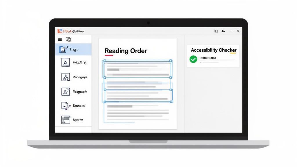
The checker neatly organizes problems into categories like Document, Page Content, and Forms, making it easy to tackle them systematically.
Meeting these standards isn't just good practice; it's big business. The global digital accessibility market is expected to reach USD 3,239.42 million by 2034, largely because of mandates like WCAG. And with the PDF editor market itself projected to hit USD 10.01 billion by 2032, tools like Acrobat are more essential than ever.
Dive into the Tags Panel
The heart and soul of an accessible PDF is its Tags panel. This is the document's logical "tree," an invisible structure that screen readers use to make sense of your content. If you exported correctly from Word or InDesign, this tree will be mostly built, but trust me, it will almost always need some fine-tuning.
Here’s what I typically look for and fix in the Tags panel:
- Correct Semantics: Double-check that headings are actually tagged as
<H1>,<H2>, etc., and not just a generic<P>(paragraph) tag. You can change tag types right in the panel with a couple of clicks. - List Structure: Make sure bulleted or numbered lists are properly nested. You should see a main list tag (
<L>) containing individual list item tags (<LI>). - Artifacting Decorative Clutter: Those lines, shapes, or background flourishes that are purely for looks? They need to be marked as "artifacts." This tells screen readers to skip right over them, creating a much cleaner experience for the user.
A clean, accurate tag tree is the bedrock of an accessible PDF. For a deeper dive, check out our guide on what it means to have a https://www.webability.io/blog/what-is-a-tagged-pdf.
Perfect the Reading Order
Here’s a common pitfall: just because your content is tagged correctly doesn’t mean it will be read in the right sequence. The Reading Order tool is your visual check for this. It overlays numbered boxes on the page, showing you the exact path a screen reader will take.
For complex layouts—think newsletters with multiple columns and sidebars—the automated reading order can get seriously mixed up. I've seen it try to read a sidebar in the middle of a main article. With this tool, you can just drag and drop the numbered boxes into the correct sequence. Easy.
Pro Tip from the Trenches: I often use the Reading Order tool for quick tagging. You can draw a box around a chunk of text or an image and assign it the correct tag (like "Heading 2" or "Figure") directly from the tool's pop-up window. It’s a huge time-saver.
It's also important to consider how all interactive elements are handled. For instance, ensuring the accessibility of features like adding comments to PDFs is a crucial part of the refinement process.
Tackle the Advanced Fixes
With the core structure solid, it's time for the final polish. These are the details often flagged by the Accessibility Checker that can make or break usability.
- Table Headers: For any data table, simply making the top row bold isn't enough. You have to go into the tag tree and define which cells are headers (
<th>) and explicitly associate them with their data cells (<td>). This is what allows a screen reader to announce "Region: North, Sales: $50,000" instead of just a confusing string of data. - Form Fields: Interactive forms need serious attention. Every single field needs a descriptive tooltip, which acts as its accessible label. You also have to check the tab order to ensure someone using a keyboard can navigate from one field to the next in a logical way.
- Color Contrast: While this is best fixed in the source document, Acrobat's checker will still flag text with poor contrast. You may need to edit the PDF directly to darken text or lighten a background to meet that minimum WCAG AA requirement of a 4.5:1 ratio.
By methodically working through the checker's report and using these powerful Acrobat tools, you can transform that nearly-accessible document into one that is truly compliant, professional, and ready for any user.
Tackling Complex Documents and Forms
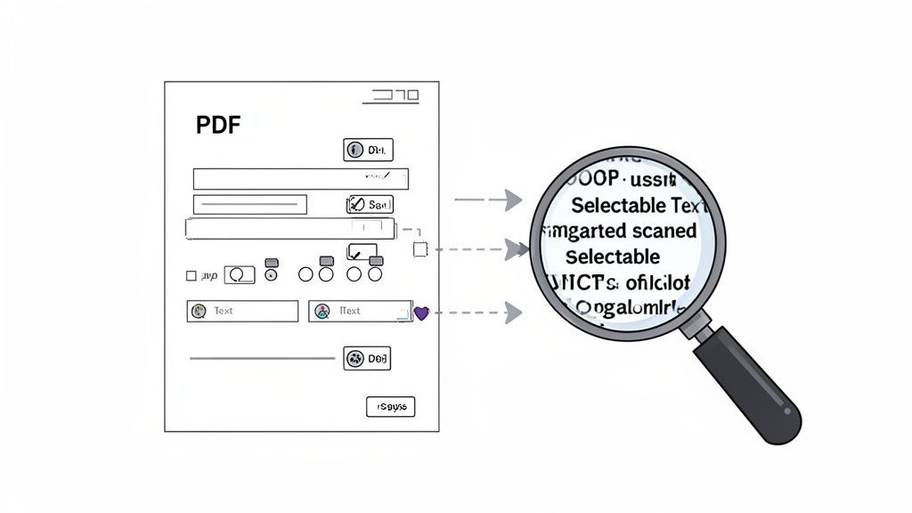
Let's be honest, not every document you get is a clean, modern file. We've all been handed an ancient scanned report or a complex interactive form and told to "make it accessible." These are the files that present some of the biggest hurdles for assistive technology, and they need a bit more muscle to transform them from digital roadblocks into genuinely useful resources.
A classic challenge is the scanned PDF. It might be a signed contract or an old user manual. To a screen reader, this kind of file is just one big, silent picture. There’s no text to read out, no headings to jump between, and no way to pull out any information. It's a dead end.
Converting Scanned PDFs with OCR
So, how do we breathe life into these image-only documents? The answer is a process called Optical Character Recognition, or OCR. This technology is built right into tools like Adobe Acrobat Pro and works by scanning the image for shapes that look like letters and words, then converting them into real text that a screen reader can understand.
This is always your first move with a scanned document. In Acrobat, you’ll find it under the "Scan & OCR" tool. Running the "Recognize Text" feature does the heavy lifting, but the results are rarely perfect on the first pass.
Expert Tip: The quality of your scan directly impacts the quality of your OCR results. Always start with the clearest scan you can get. A crisp image at 300 DPI will give you far more accurate text than a blurry, low-res photo, which will save you a ton of time on cleanup.
Once the OCR process is finished, you need to put on your proofreading hat. Go through the document and look for common mistakes—you'll often see things like "rn" misinterpreted as "m" or jumbled words, especially if the original had funky fonts or wasn't a great scan.
Making Interactive Forms Usable
Accessible forms are all about interaction. If someone can't fill out your form, they might not be able to apply for a job, sign up for a service, or give important feedback. Making a PDF form truly accessible comes down to a few critical details.
First, every single field needs a crystal-clear label. You can do this in Acrobat’s "Prepare Form" tool by adding a tooltip to each field. This tooltip is what a screen reader will announce, telling the user precisely what to enter—think "First Name" or "Email Address." It's their audio guide.
Next, you have to get the tab order right. This is the path a user follows as they hit the 'Tab' key to move through the form without a mouse.
- The flow has to be intuitive, usually top-to-bottom, left-to-right.
- Make sure related fields, like the different lines of a mailing address, are grouped together in the sequence.
- The very last stop on the tab journey should always be the "Submit" button.
This step is absolutely vital. Many people with motor disabilities rely entirely on their keyboard to navigate, and a messy tab order can make an otherwise simple form completely unusable.
Finally, things like radio buttons and checkboxes need special treatment. You need to group them correctly so that a screen reader announces both the question and the specific option. For example, it should say, "What is your preferred contact method? Radio button, Email, one of three," instead of just a confusing, standalone "Radio button."
By mastering these complexities, you’re moving past basic compliance and ensuring your documents are truly functional for everyone. Managing these advanced tasks is what separates the basics from comprehensive accessibility. And when you're dealing with lots of documents, a centralized platform makes all the difference. You can see how WebAbility.io's dashboard streamlines compliance by giving you the tools to tackle even the trickiest documents at scale.
How to Properly Test Your PDF Accessibility
Creating an accessible PDF is one thing; making sure it actually works for people is another. A document isn't truly accessible until you've put it to the test. This means going far beyond a simple automated check and actually stepping into the shoes of someone who relies on assistive technology to navigate the web.
Think of automated tools as a spell checker. They're great at catching obvious, clear-cut errors like missing tags or alt text, but they can't tell you if your sentences actually make sense. That's why a two-pronged approach—combining automated scanning with hands-on manual testing—is the only way to achieve genuine compliance.
The Role of Automated Checkers
Your first pass should always involve an automated tool. In the world of PDFs, the built-in Accessibility Checker in Adobe Acrobat Pro is the undisputed industry standard. It runs a quick scan and spits out a report that flags technical errors against WCAG (Web Content Accessibility Guidelines) criteria.
This checker is fantastic for catching the black-and-white issues:
- Is a document title present?
- Is the language correctly specified?
- Are there any images completely missing alt text?
- Does the tag structure have any glaring errors?
Running this check gives you an immediate, actionable list of technical fixes. It's the perfect way to clean up the low-hanging fruit before diving into the more nuanced, human side of accessibility.
The need for reliable testing is driving significant growth in the accessibility market, which is projected to hit USD 827.86 million by 2031. Too many documents fail even these initial automated scans. A simple trick like using Acrobat’s Reading Order tool to sequence content can fix up to 75% of reading flow issues. When you’re done, make sure to export to the PDF/UA-1 (ISO 14289) format to ensure universal access. Getting these basics right can boost usability scores by 40%, opening up your content to a much wider audience.
The Necessity of Manual Testing
Here’s the part that catches everyone: an automated checker can’t tell you if your PDF is actually usable.
It can confirm an image has alt text, but it has no idea if that alt text is meaningful or just gibberish. It can verify that a reading order exists, but not whether it’s logical.
This is exactly where manual testing comes in. It’s the only way to experience your document the same way a screen reader user would.
Expert Insight: I never consider a document compliant without a full manual review. I’ve seen countless PDFs pass an automated check with flying colors, only to be completely incomprehensible to a screen reader user because the reading order was a total mess.
To get a comprehensive view, it helps to understand how these two methods stack up.
Automated vs Manual PDF Accessibility Testing
| Testing Method | Pros | Cons | Best For |
|---|---|---|---|
| Automated Testing | - Fast and efficient for large documents. - Catches common technical errors (e.g., missing tags, alt text). - Provides a clear, actionable report. | - Cannot assess context or usability. - Prone to false positives/negatives. - Doesn't understand logical flow. | - Initial review and catching low-hanging fruit. - Quick checks during the authoring process. - Large-scale audits to identify common patterns of failure. |
| Manual Testing | - Evaluates real-world usability and user experience. - Assesses logical reading order and meaningfulness of content. - Tests keyboard-only navigation and interactive elements. | - Time-consuming and requires expertise. - Can be subjective if not guided by clear standards. - Requires familiarity with assistive technologies. | - Final compliance validation before publishing. - Testing complex documents with forms, tables, and charts. - Ensuring a genuinely good user experience. |
Ultimately, you need both. Automated tools clear out the technical clutter so you can focus your manual testing efforts on what truly matters: the human experience.
Performing a Screen Reader Test
The gold standard for manual testing is simple: listen to your document with a screen reader. The two most common desktop screen readers are NVDA (a fantastic free and open-source option) and JAWS (a powerful, enterprise-grade tool). Firing up NVDA and navigating your PDF for the first time is an incredibly eye-opening experience.
Here’s a practical checklist to guide you through a manual screen reader test:
Keyboard Navigation Only: Put your mouse away. Seriously. Can you get through the entire document using only the Tab, arrow, and Enter keys? You should be able to move logically through every link, form field, and button.
Logical Reading Order: As the screen reader announces the content, does it actually make sense? Does it flow naturally from the main heading to the introduction and then the body content? Or does it jump erratically from a paragraph to a sidebar and then back to a random image caption?
Meaningful Alt Text: When you land on an image, does the alt text accurately and concisely describe what it is and why it's there? If it's a chart, does the description convey the core data or insight?
Clear Link Text: When you tab to a link, is the purpose obvious? "Read the full Q3 financial report" is a world away from a vague and unhelpful "Click Here."
Functional Forms: Can you tab into each form field, understand its purpose from the announced label, and fill it out without confusion? Can you easily select radio buttons and checkboxes and successfully submit the form?
For a complete walkthrough, our article on how to perform a screen reader test provides more detailed, step-by-step guidance.
By pairing the efficiency of automated checkers with the irreplaceable insights of manual testing, you can move past just being "technically compliant" and start creating PDFs that are genuinely accessible and usable for everyone.
Taking Your Accessibility Efforts to the Next Level
Fixing a single PDF feels good. But what happens when you’re facing a mountain of hundreds, or even thousands, of them? That’s when you realize that a document-by-document approach just doesn't scale. To truly succeed, you have to move from one-off tactical fixes to a broader, more sustainable strategy.
The real goal is to bake accessibility right into your company's culture, not just treat it as a last-minute chore. For that kind of an undertaking, organizations are increasingly relying on integrated platforms that offer a bird's-eye view of their entire digital footprint. This is the key to managing document accessibility effectively across the board.
Get a Clear View with Centralized Monitoring
Picture a single dashboard showing you the real-time compliance status of everything you own online, including every last PDF. That’s exactly what a centralized accessibility platform delivers. No more guesswork about which documents are compliant—you get instant visibility.
These systems arm you with the data to answer the tough questions:
- What percentage of our PDFs actually meet WCAG standards?
- Which teams or departments are struggling the most with creating accessible content?
- Are we actually getting better over time?
This data-driven approach turns accessibility from a vague initiative into a measurable part of the business. You can finally spot patterns, direct your resources where they're needed most, and show real progress to leadership.
Key Insight: Accessibility becomes a real priority the moment you start tracking it like any other business metric. When you can walk into a meeting with executive reports showing clear compliance scores and trend lines, you have the power to drive real organizational change.
Speed Things Up with Smart Automation
Let's be honest: manually fixing every single document is a massive time sink. This is where modern tools can give your team a serious productivity boost. AI-powered features can handle a huge chunk of the routine work, like drafting initial alt text for images or flagging color contrast problems.
This automation frees up your accessibility experts to tackle the truly complex stuff—like untangling a tricky reading order in a report or making a complex data table make sense to a screen reader. By letting the machines handle the repetitive tasks, your team can be far more efficient.
Build a Rock-Solid Governance Framework
At the end of the day, scaling accessibility is all about good governance. A solid strategy needs clear audit trails showing who fixed what and when. This documentation is your proof of a consistent, good-faith effort toward compliance, which is absolutely crucial for managing legal risk.
Connecting your hands-on remediation skills with this kind of enterprise-level strategy is the final piece of the puzzle. It ensures everyone, in every department, understands their role in building a more inclusive digital world. To see how a unified platform can pull all of this together, you can learn about our enterprise accessibility solutions.
Ready to build a scalable accessibility strategy that lasts? Start your free trial of WebAbility.io today and see what a difference a centralized approach can make.
Frequently Asked Questions About PDF Accessibility
When you start diving into making PDFs accessible, a few questions always seem to pop up. It’s totally normal. Getting these sorted out is the key to moving from feeling a bit lost to confidently creating documents that everyone can use.
Let’s dig into some of the most common ones I hear.
What Is the Difference Between a Tagged PDF and an Accessible PDF?
This is a big one. Think of it this way: a tagged PDF is the architectural blueprint, but it’s not the finished house. Tagging adds a hidden layer of code that tells a screen reader, "Hey, this is a heading," or "This is a list." It's the absolute, non-negotiable starting point.
But a truly accessible PDF needs more than just a blueprint. It needs the whole package:
- Logical Reading Order: The content has to be read out in an order that actually makes sense.
- Alternative Text: Every important image needs a good description.
- Proper Tables: Tables need to have their headers clearly defined so a screen reader can navigate the data correctly.
- Usable Forms: Form fields must have clear labels and instructions.
- Good Color Contrast: Text needs to be easily readable against its background.
So, while tagging is essential, full accessibility is about making sure all these other pieces are in place to meet standards like WCAG.
Can I Make a PDF Accessible Without Adobe Acrobat Pro?
You can get surprisingly far without it. By setting up your source document correctly in a program like Microsoft Word or Adobe InDesign, you’re doing most of the heavy lifting upfront. A well-structured source file will export with a solid tag structure already in place.
That said, for a truly compliant, professionally polished PDF, Adobe Acrobat Pro is still the tool for the job. Free readers and editors just don't have the power tools you need to manually fix tricky tag structures, tweak the reading order, or run the final, detailed compliance checks.
How Should I Handle Complex Charts and Graphs?
Ah, the dreaded complex chart. A simple alt text description just won't cut it for something like a detailed infographic or a multi-series bar chart. You'll lose all the nuance.
The best approach here is a one-two punch.
First, write a concise alt text that gives the main point. Something like, "Bar chart showing a 25% increase in Q3 sales by region." This gives the user the quick takeaway.
Then, right after the chart in the main text, provide a full, detailed description. This could be a summary paragraph that walks through the data points or even a simple data table that presents the same information. This way, nothing gets lost.
Expert Tip: For complex data, always pair a brief alt text summary with a detailed description right in the document. This ensures that users of assistive technology get the exact same information as everyone else.
Is an Automated Report Enough to Confirm Compliance?
In a word: no. Automated checkers are fantastic for catching the low-hanging fruit—they're great at spotting technical errors like a missing tag or an empty alt text field. But even the best tools can only flag about 30-50% of potential accessibility barriers.
An automated checker has no way of knowing if your reading order is confusing, if your alt text is actually helpful, or if the color contrast works on an image with a gradient background. It can't understand context.
That’s why you always, always have to follow up with manual testing. That means tabbing through the document with just your keyboard and, most importantly, listening to it with a screen reader. It's the only way to be sure you’re delivering a genuinely usable experience, not just a technically compliant file.
At WebAbility.io, we believe in making the entire digital world accessible, one document at a time. Our platform combines smart automation with expert insights to help you manage PDF and web accessibility at scale, ensuring you're not just compliant, but truly inclusive. Learn more at https://www.webability.io.
Quick Questions
Tap to ask AI about this article