Display None vs Visibility Hidden: Key Differences for 2026

Sidharth Nayyar

display: none removes an element and its space from the page, so it disappears for users and is treated as absent in layout. visibility: hidden only makes the element invisible, leaving its space in the document flow and potentially keeping it available to assistive technology.
That sounds like a small CSS choice. In practice, it affects layout stability, keyboard access, screen reader behavior, animation smoothness, compliance work, and conversion paths.
Teams usually hit this decision in ordinary moments. A dropdown needs to close. A validation message should appear only when needed. A modal has to animate in without shifting the page. A marketing banner needs to disappear on a narrow breakpoint. The wrong hiding method often works visually in a local build, then causes problems later in audits, QA, or Core Web Vitals reviews.
A senior frontend workflow treats display none vs visibility hidden as a product decision, not just a styling detail. The right choice protects user experience, supports WCAG conformance, reduces layout instability, and keeps the UI predictable when components become more complex.
The Developer's Dilemma Hiding Elements in CSS
This distinction has been with us since CSS Level 1 in December 1996, when the split between removing an element and merely hiding it became part of the web platform. That old decision still matters because modern interfaces rely on dynamic states everywhere: drawers, tabs, toasts, filters, accordions, inline validation, sticky headers, and responsive utility patterns.
The practical difference is simple. display: none removes the element from the render tree. visibility: hidden keeps the box in place but makes it invisible. That one change determines whether the rest of the page must reflow and whether assistive technology can still encounter the element.
Why this choice stops being trivial fast
A lot of bugs blamed on JavaScript or design systems are hiding bugs. A component seems fine until:
- Keyboard users lose context: interactive content disappears from expected navigation.
- Layouts jump unexpectedly: sibling elements rush into the freed space.
- Animations feel abrupt: the element has no visible state to transition from.
- Accessibility reviews fail: hidden content behaves differently in the accessibility tree than the team assumed.
According to this CSS accessibility breakdown, misuse of display: none on interactive elements contributes to 15 to 20% of keyboard trap failures under WCAG 2.1.
Practical rule: If the element should behave as though it no longer exists,
display: noneis usually the right direction. If the element should still reserve space or support smoother UI state changes, start by evaluatingvisibility: hidden.
Why it matters beyond engineering
This decision also reaches outside the frontend team.
A hidden element can influence accessibility conformance under WCAG 2.2 AA, affect user trust when interfaces behave inconsistently, and alter layout stability in ways that show up in SEO diagnostics. For organizations managing ADA, Section 508, AODA, or EN 301 549 obligations, these aren't edge cases. They become governance issues.
That's why experienced teams don't ask only, “Which property hides this?” They ask, “What should this element do for layout, assistive tech, and interaction when hidden?”
Understanding Layout and Rendering Effects
The layout difference is where most developers build the right mental model. If you understand what the browser does with the box, you'll predict most downstream behavior correctly.
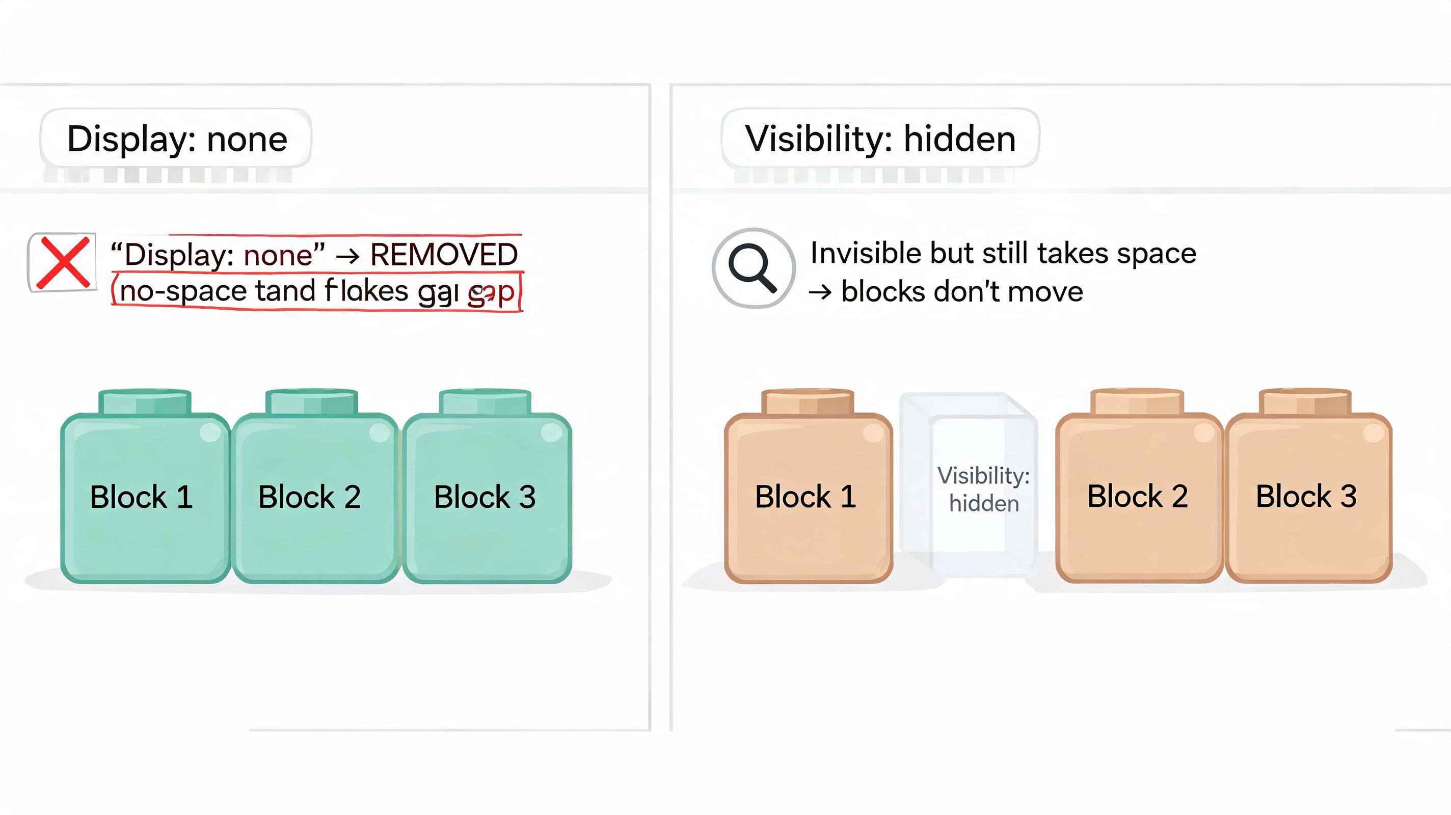
Early in a project, I like to describe the two properties this way: display: none deletes the chair from the room; visibility: hidden keeps the chair there and throws a sheet over it. The browser responds exactly that way.
| Behavior | display: none | visibility: hidden |
|---|---|---|
| Element box | Removed | Preserved |
| Space in layout | Collapses | Stays reserved |
| Effect on siblings | They shift to fill the gap | They stay where they are |
| Rendering implication | Layout recalculation is needed | Layout remains stable |
| Best fit | Truly absent content | Hidden state with fixed positioning in layout |
What the browser does with display none
When you apply display: none, the browser stops laying out that element. Its box disappears, and nearby content repositions as if the element were never there.
That can be useful when content is conditionally irrelevant. Think of a mobile-only utility bar hidden on desktop, or a completed step panel removed after a user advances. In those cases, reclaiming the space is the point.
The cost is that every surrounding element may need to adjust. In a dense flex or grid layout, this can create visible shifts and cascade through component boundaries.
What the browser does with visibility hidden
With visibility: hidden, the element still takes up space. Width, height, margins, and the surrounding layout remain intact. The user doesn't see the content, but the page structure doesn't collapse around it.
That makes it useful for UI states where consistency matters more than reclaiming space. Tooltips, staged animations, and interface shells often benefit because the page remains visually stable while the component changes state.
The cleanest interfaces often come from preserving structure first and changing visibility second.
If you're auditing these behaviors across templates, WebAbility.io's CSS validation insights are useful for catching broader CSS issues that show up alongside visibility bugs.
Why layout behavior affects business outcomes
Layout shifts don't stay confined to engineering. They change how users perceive quality and trust. If a checkout summary jumps, a menu pushes content unexpectedly, or a product card stack reflows when hidden elements toggle, users feel the interface fighting them.
That's also why teams that care about page stability usually pair hiding decisions with asset discipline. If a hidden component contains large visuals, this image optimization guide is a practical companion resource because oversized media and unstable hidden states often show up together in real-world layouts.
The Critical Impact on Accessibility and Screen Readers
Visual hiding and accessibility hiding are not the same thing. That's where many implementations go wrong.
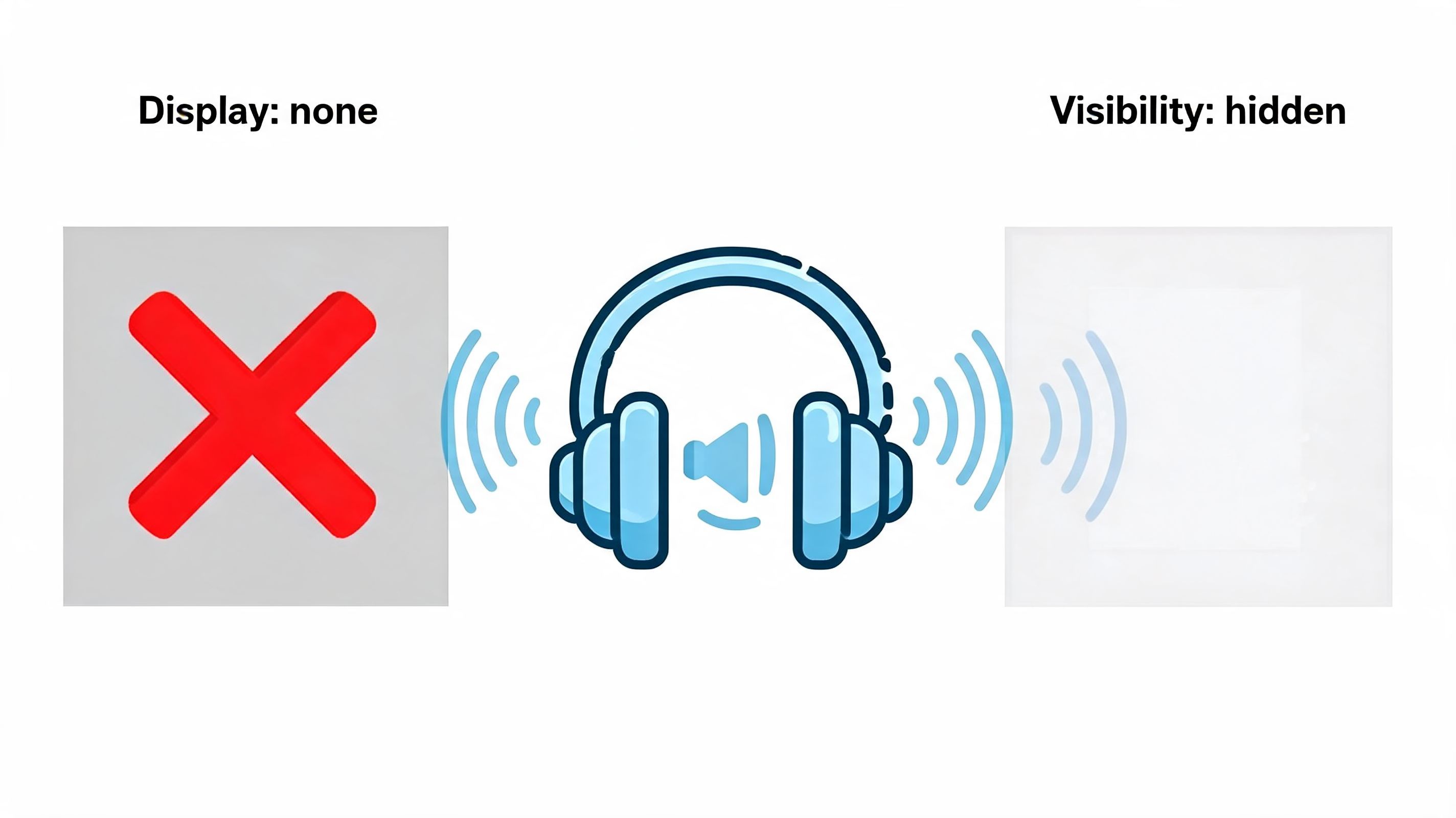
A browser builds more than a painted page. It also exposes semantic information to assistive technology through an accessibility tree. When you hide something in CSS, you're not just deciding whether pixels appear. You're deciding whether a user with a screen reader, keyboard, or other assistive setup can discover, interpret, and act on that content.
How each property affects assistive tech
display: none removes the element from the accessibility tree. If a live region, form hint, or interactive control is hidden this way, assistive technologies won't treat it as available content.
visibility: hidden is more nuanced. The element remains in the DOM and may remain represented in accessibility tooling unless you handle it intentionally. That can create confusing states where something exists semantically but isn't visibly actionable.
Teams often create “ghost” UI in these situations. A component seems hidden to sighted users but still contributes noise or ambiguity for non-visual users.
The failure patterns that matter most
According to this accessibility-focused explanation, a 2025 WebAIM Million report found 28% of homepages had hidden content issues. The same source notes that misusing display: none on ARIA live regions prevents announcements entirely, and that visibility: hidden on focusable elements without aria-hidden="true" creates confusing ghost elements for screen reader users. It also states that automated audits reveal up to 40% of sites have these compliance gaps.
That lines up with what accessibility specialists see in audits. Teams hide error messages, menu labels, dialog instructions, and utility controls visually, then assume assistive behavior will follow. It doesn't.
Accessibility check: If content must be announced, described, or navigated, never assume a visual hiding method preserves the right assistive behavior.
Common mistakes in production interfaces
A few patterns create repeated problems:
Live region announcements hidden with
display: noneError messages, success notices, and dynamic updates won't be announced when the element is removed entirely.
Focusable items hidden only visually
Buttons, links, or custom controls can remain part of the interaction model in ways that confuse users.
Modal and drawer instructions managed inconsistently
Teams hide content for one user group but leave it semantically present for another without a clear rule.
Skip and utility links hidden incorrectly
These often need offscreen techniques instead of either property discussed here.
If your team needs a grounded refresher on assistive testing context, this guide to essential screen reader technology helps connect these implementation choices to actual user behavior.
A good public-facing accessibility policy can also help align engineering and governance. For structure and language examples, via BEDHEAD is a useful reference.
What solid implementation looks like
Use display: none when content should be absent both visually and semantically. Use visibility: hidden only when preserving layout is important and you've also considered whether the element should be excluded from assistive output.
That second part matters. CSS alone rarely resolves the whole accessibility question.
In multi-team environments, automated scanning and manual review have to work together. One option teams use is WebAbility.io, which provides automated scanning, dashboard monitoring, and reporting around accessibility implementation patterns. The value isn't that it replaces engineering judgment. It helps teams catch repeated hiding mistakes across templates, components, and content workflows before they turn into audit findings or legal exposure.
Comparing Performance and Animation Behavior
Performance problems from hidden elements often look random until you inspect the rendering pipeline. A menu opens and the page shifts. A tab panel feels sticky. A modal animation drops frames on a mid-range device. In many cases, the hiding strategy is part of the cause.
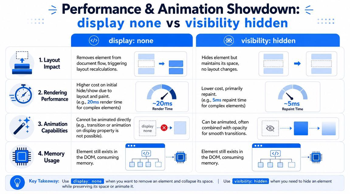
Why display changes cost more
display: none changes layout participation. The browser has to recalculate where elements belong, then repaint the result. That extra work becomes more noticeable inside flex containers, grid systems, and nested application shells.
According to this performance reference, display: none triggers 2 to 5 times higher reflow and repaint costs than visibility: hidden. The same source says applying display: none can spike CLS by 0.2 to 0.5, far above Google's 0.1 threshold for a good CLS score, while toggling visibility: hidden incurs less than 5ms overhead and maintains a CLS of 0. It also notes that maintaining low CLS can improve e-commerce conversion by 7 to 10%.
Why visibility works better for motion
visibility: hidden preserves layout, so the browser doesn't need to move neighboring elements around. That makes it a better fit for state changes where continuity matters.
It also pairs naturally with opacity, which gives you smooth entry and exit behavior. By contrast, display doesn't behave like a standard animatable property in most familiar CSS workflows, so transitions often feel abrupt unless you layer on newer patterns and progressive enhancement.
If a component should fade, slide, or reveal without moving the page around it, start from
visibilityplusopacity, notdisplay.
A practical performance lens
For frontend teams, the question isn't “Which property is faster in theory?” It's “Which property preserves a stable interaction?” Stable interactions support better Core Web Vitals, fewer visual jumps, and cleaner user journeys through product pages, forms, and checkout flows.
That matters for business reasons, not just Lighthouse scores. If users lose their place during interaction, they abandon tasks more often. If a hidden panel shifts pricing, CTAs, or input fields, trust drops immediately.
A good heuristic is simple:
- Choose
display: nonewhen reclaiming space is intentional and the state change is relatively infrequent. - Choose
visibility: hiddenwhen preserving geometry supports smoother interaction. - Combine visibility with opacity when a component should animate in a controlled way.
Practical Use Cases and Code Examples
Software engineers rarely require abstract rules. Instead, they need practical patterns to apply during implementation and code review.
According to CSS-Triggers benchmarks summarized here, visibility: hidden/visible is 7 to 10 times faster than display: none/block for animations and JavaScript-driven toggles. The same source says display toggles can take 15 to 20ms, while visibility toggles are under 2ms, which fits more comfortably inside a 16ms frame budget for smooth rendering.
Use display none when the element should be gone
This is the clean choice for content that should not participate in layout or interaction.
.promo-banner.is-dismissed { display: none; } const closeButton = document.querySelector('[data-close-banner]'); const banner = document.querySelector('.promo-banner'); closeButton.addEventListener('click', () => { banner.classList.add('is-dismissed'); }); That works well for a dismissed banner, a completed onboarding step, or a breakpoint-specific block that should disappear entirely.
Use visibility hidden for animated toggles
For tooltips, dropdown panels, and non-destructive UI reveals, keep the layout stable and animate the visible state.
.tooltip { visibility: hidden; opacity: 0; transition: visibility 0.2s, opacity 0.2s; } .tooltip.is-open { visibility: visible; opacity: 1; } const trigger = document.querySelector('.tooltip-trigger'); const tooltip = document.querySelector('.tooltip'); trigger.addEventListener('focus', () => { tooltip.classList.add('is-open'); }); trigger.addEventListener('blur', () => { tooltip.classList.remove('is-open'); }); This pattern is easier on rendering and feels smoother for users because the page doesn't have to reorganize itself.
Handle accessibility state alongside visual state
Visual hiding alone isn't enough when controls or descriptions affect assistive output.
<button aria-expanded="false" aria-controls="panel" id="toggle"> More details </button> <div id="panel" aria-hidden="true" class="panel"> Additional information </div> .panel { visibility: hidden; opacity: 0; transition: visibility 0.2s, opacity 0.2s; } .panel.is-open { visibility: visible; opacity: 1; } const toggle = document.getElementById('toggle'); const panel = document.getElementById('panel'); toggle.addEventListener('click', () => { const isOpen = panel.classList.toggle('is-open'); toggle.setAttribute('aria-expanded', String(isOpen)); panel.setAttribute('aria-hidden', String(!isOpen)); }); If your team is standardizing these patterns, it's worth taking a minute to learn about aria-hidden compliance. It helps prevent the common mistake of matching the visual state while leaving the semantic state wrong.
Advanced Alternatives and Offscreen Techniques
Sometimes neither property is the right tool. That's especially true when content should be invisible to sighted users but still available to keyboard users or screen readers.
Use visually hidden patterns for assistive-only text
A skip link, extra label text, or screen-reader-only instruction often needs to remain accessible while staying off the visual canvas until focused. That calls for an offscreen or visually hidden utility class, not display: none and not visibility: hidden.
.visually-hidden { position: absolute; width: 1px; height: 1px; margin: -1px; padding: 0; overflow: hidden; clip: rect(0 0 0 0); white-space: nowrap; border: 0; } This pattern keeps content available in the accessibility tree while removing it from ordinary visual presentation.
Use aria-hidden deliberately
aria-hidden="true" tells assistive technology to ignore an element. That can be appropriate for decorative icons, duplicated visible text, or hidden states where the content should not be announced.
But it has to align with interaction. If an element is focusable, clickable, or functionally important, hiding it from assistive tech creates a broken experience. CSS and ARIA need to agree on the intended state.
Don't use CSS hiding to solve an accessibility problem that actually requires semantic intent.
Where senior teams draw the line
A mature frontend system usually separates hiding into three buckets:
- Removed entirely: use
display: none. - Visually hidden but structurally preserved: use
visibility: hiddenwhen the layout needs to stay intact. - Visually hidden but still accessible: use an offscreen or visually hidden utility.
That last category matters a lot for keyboard-first navigation. If you're building navigation aids, forms, or utility links, this is the right time to implement skip to main content with the proper offscreen pattern instead of relying on either property covered earlier.
A Decision Framework for Choosing Correctly
A reliable decision process beats memorizing edge cases.
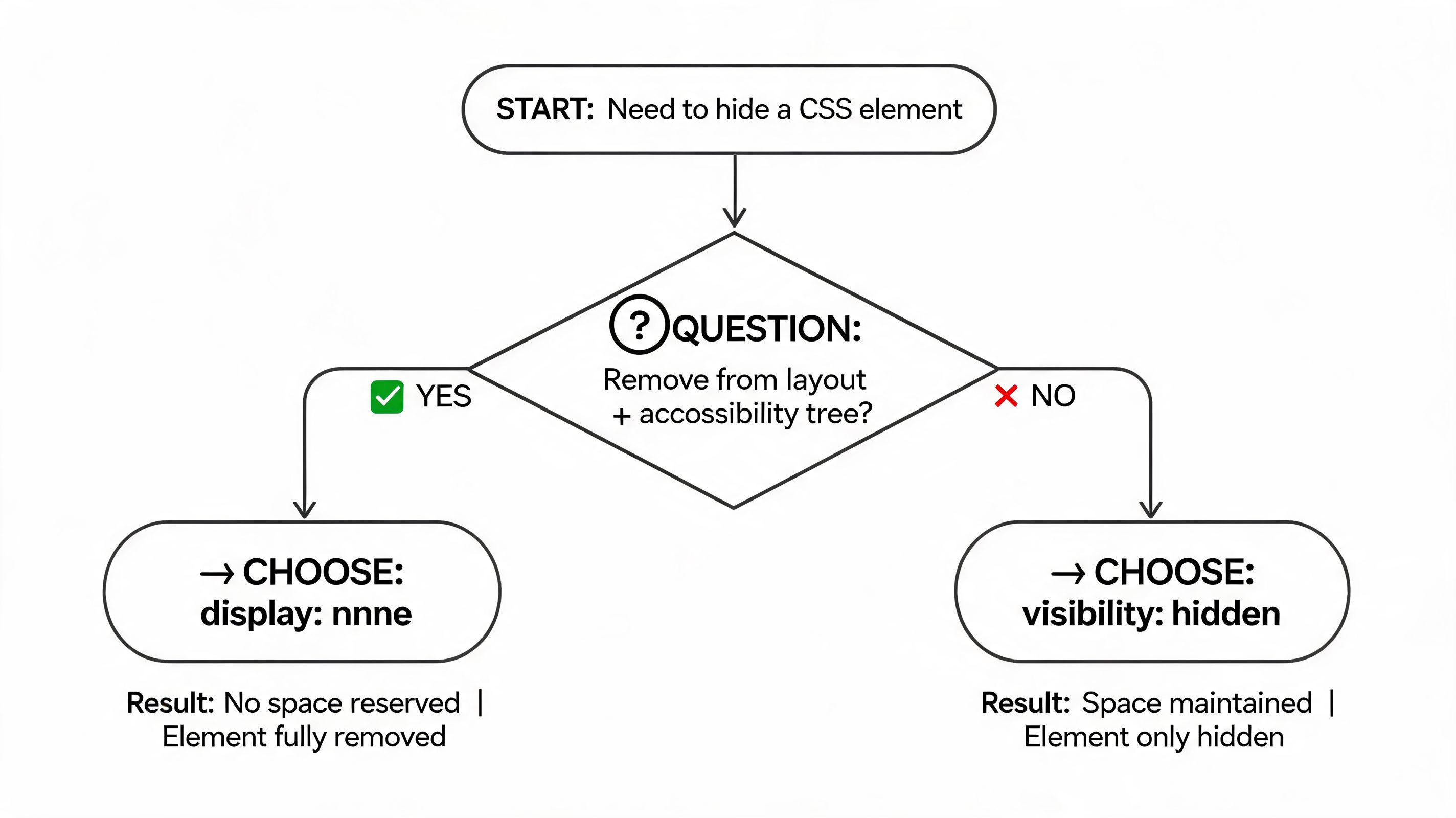
Start with four questions:
Should the element disappear from layout completely?
If yes,
display: noneis usually the correct fit.Should the page keep the element's space reserved?
If yes,
visibility: hiddenis the better starting point.Does the element need smooth transitions or motion?
If yes, prefer
visibilitywithopacity, or another animation-friendly pattern.Should assistive technology still encounter it?
If yes, neither property may be sufficient on its own. You may need a visually hidden utility or explicit ARIA handling.
Recent trend reporting says Google's 2025 Core Web Vitals updates place heavier emphasis on CLS and INP, and notes that sites overusing display: none for modals see 18% higher CLS, while visibility: hidden hybrids for state switches can reduce INP by 45ms. That same reporting also says businesses on platforms like WordPress or Shopify can improve conversions by up to 12% when they get this right.
For teams, the operational takeaway is simple. Document hiding rules in your design system. Review component behavior in keyboard and screen reader testing. Treat CLS, semantic visibility, and state transitions as one implementation concern, not three separate ones.
If your team wants a structured way to monitor these patterns across templates, components, and CMS-driven pages, WebAbility.io provides accessibility scanning, reporting, and workflow support that can help keep CSS hiding decisions aligned with WCAG, legal compliance, and conversion goals.
Quick Questions
Tap to ask AI about this article