What Is ARIA - what is a aria and how it boosts accessibility

Sidharth Nayyar
TL;DR: What Is ARIA?
- ARIA (Accessible Rich Internet Applications) adds extra information to your website to make modern, interactive elements understandable for assistive technologies like screen readers.
- It uses roles (what an element is, e.g.,
role="button"), properties (its characteristics, e.g.,aria-label), and states (its current condition, e.g.,aria-expanded="true") to add context. - ARIA is essential for making custom components like tabbed interfaces, sliders, and dynamic content accessible.
- The golden rule is: use native HTML elements first. Only use ARIA when there's no HTML equivalent.
- A powerful accessibility strategy combines expert ARIA implementation with user-facing tools like those on the WebAbility.io platform, ensuring both a solid foundation and a customizable user experience.
Ever built a slick, custom-designed dropdown menu or a dynamic search filter, only to realize it's completely invisible to a screen reader? You're not alone. Modern websites are full of interactive components that standard HTML wasn't built to describe, creating frustrating dead ends for users who rely on assistive technologies.
So, what is ARIA? It’s the solution to that very problem.
The "How" and "Why" of ARIA
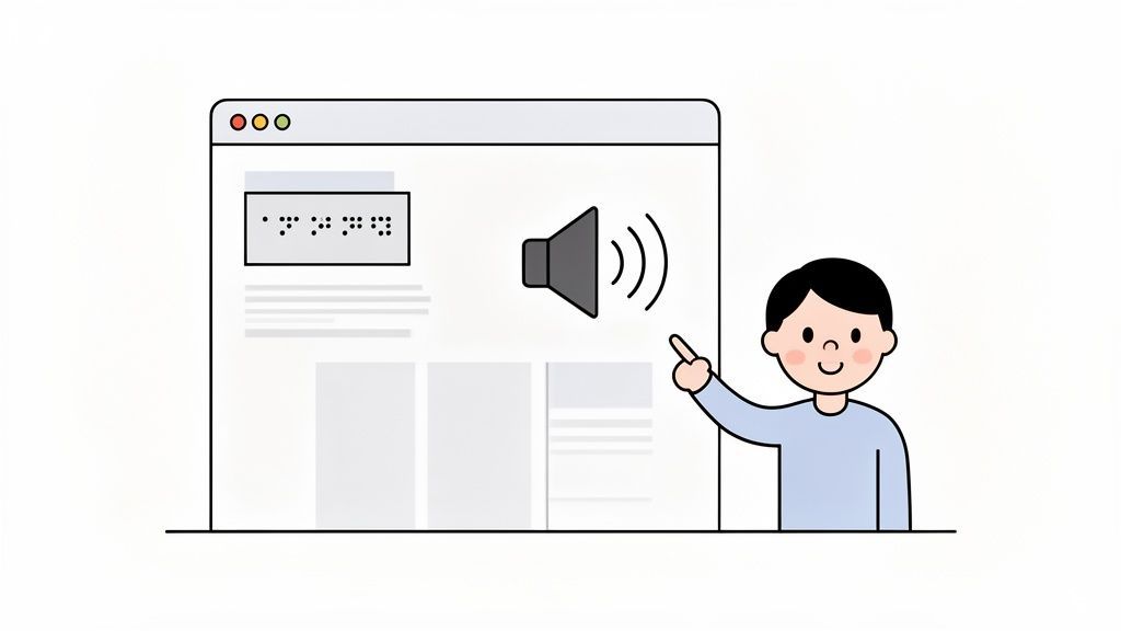
Think of ARIA (Accessible Rich Internet Applications) as a way to add extra information to your website, much like adding helpful signs to a building. While HTML provides the basic structure (the walls and doors), ARIA adds the context. It’s the label that says "This is a button" or the status update that announces "The menu is now open."
Without this extra context, a screen reader might see a <div> element that acts like a button but has no idea what it is or what it does. The user is left clicking in the dark. ARIA provides the critical missing details so assistive tech can accurately interpret and announce the purpose and state of these elements.
Expert Insight: ARIA essentially acts as a translator between your complex web components and the assistive technology a person is using. It gives a "voice" to otherwise silent interactions, making your site usable for everyone.
By correctly applying ARIA, you’re not just ticking a compliance box; you're building a genuinely inclusive experience. You’re ensuring everyone can access key features, which directly improves usability and can even boost conversions by opening your site up to 1.3 billion people worldwide who live with a significant disability.
ARIA is built on three core concepts: roles, properties, and states. If you want to jump straight into the technical definitions, our ARIA glossary entry is a great resource.
To help you get a quick handle on these fundamentals, let’s break them down with some simple analogies. The table below outlines the three pillars of ARIA.
ARIA at a Glance: Key Concepts Explained
| Component | Purpose | Real-World Analogy |
|---|---|---|
| Roles | Defines the type or purpose of an element (e.g., button, navigation). | Like a job title (e.g., "Cashier," "Manager") that tells you what a person does. |
| Properties | Describes the relationships or characteristics of an element (e.g., aria-label). | Like permanent traits (e.g., "Has a twin," "Speaks two languages") that give more context. |
| States | Communicates an element's current condition (e.g., aria-expanded="true"). | Like a current status (e.g., "Is busy," "Is available") that can change over time. |
Understanding these three components is the first step toward mastering ARIA. Roles tell a screen reader what an element is, properties describe its permanent features, and states communicate what it's doing right now. Together, they paint a complete picture for users.
Why ARIA Is Essential for Modern Web Applications
Websites aren't just pages of text and images anymore. They’re full-blown applications. Think about the last time you used a flight search with custom date pickers and filters, a project management board with drag-and-drop cards, or a live-updating news feed. These rich, interactive features are what users now expect, but they create a huge problem for accessibility.
There's often a massive gap between what a sighted user experiences and what an assistive device, like a screen reader, can actually interpret. This is where ARIA comes in. It provides the missing context that native HTML just can't offer on its own. Without it, those advanced components become confusing, silent, or completely unusable for a significant number of people.
Expert Insight: We’ve guided countless development teams through this, and the best way we've found to describe ARIA is as the "stage directions" for your website. It tells a screen reader not just what an element is, but what it does and what its current state is—like announcing, "This navigation menu is now open," or "this price slider is set to 75%."
Getting ARIA right isn't just a technical checkbox to tick off. It's about building a user experience that works for everyone. When your application is seamless and predictable for all users, you build trust, drive engagement, and ultimately support your business goals.
Bridging the Accessibility Gap
The more sophisticated our web apps become, the easier it is to accidentally build barriers. This isn't some abstract concept; it's a daily reality for millions of users trying to navigate a digital world full of beautiful designs that inadvertently shut them out.
A perfect example is a custom-styled checkbox built with <div> and <span> elements. To a sighted person, it looks and acts exactly like a checkbox. But to a screen reader, it’s just a meaningless box with no purpose. It takes ARIA attributes like role="checkbox" and aria-checked="true" to give it a real identity and make it functional for someone who can't see it.
The disconnect between knowing this and doing it correctly is a massive challenge. In fact, a February 2023 WebAIM analysis found nearly 50 million distinct accessibility errors across the home pages it tested. That breaks down to an average of 50 detectable errors per single page. You can read more about the challenges of distinguishing between ARIA and native HTML attributes.
That number is staggering. It shows just how urgently we need the right expertise and tools to make sure that as the web moves forward, it doesn’t leave millions of users behind.
ARIA's Role in Modern Components
Many of the interactive components we take for granted today simply don't have a standard HTML equivalent. ARIA is what makes them possible for everyone.
- Tab Panels: Without ARIA, a set of tabs is just a list of buttons or links next to a block of content. ARIA roles like
tablist,tab, andtabpanelcreate a clear, logical relationship that lets screen reader users know they're navigating connected sections of content. - Live-Updating Content: When a stock ticker, sports score, or chat message appears on the screen, how does a non-visual user know it's there? Using
aria-livetells a screen reader to announce that change without the user having to refresh the page or lose their place. - Custom Sliders and Progress Bars: Attributes like
role="slider",aria-valuenow,aria-valuemin, andaria-valuemaxgive screen readers the information needed to describe a slider's purpose and current value, allowing users to operate it with their keyboard.
Without ARIA, these components are effectively black boxes. By adding these simple but critical attributes, you're making sure your application is open and usable. Of course, implementing ARIA correctly is the key, and using a solution like the WebAbility.io platform can help your team verify that your code is truly accessible and maintain that standard as your application evolves.
The Building Blocks Roles States and Properties
To get ARIA right, you need to understand its three core components: roles, properties, and states. These are the tools you'll use to add meaning and context to your website, especially for those custom widgets and dynamic interfaces that standard HTML just can’t describe on its own.
Think of them as the vocabulary and grammar that let your website speak fluently with assistive technologies.
This diagram perfectly illustrates how ARIA acts as that essential translator between a modern, complex web application and the tools a person with disabilities relies on.
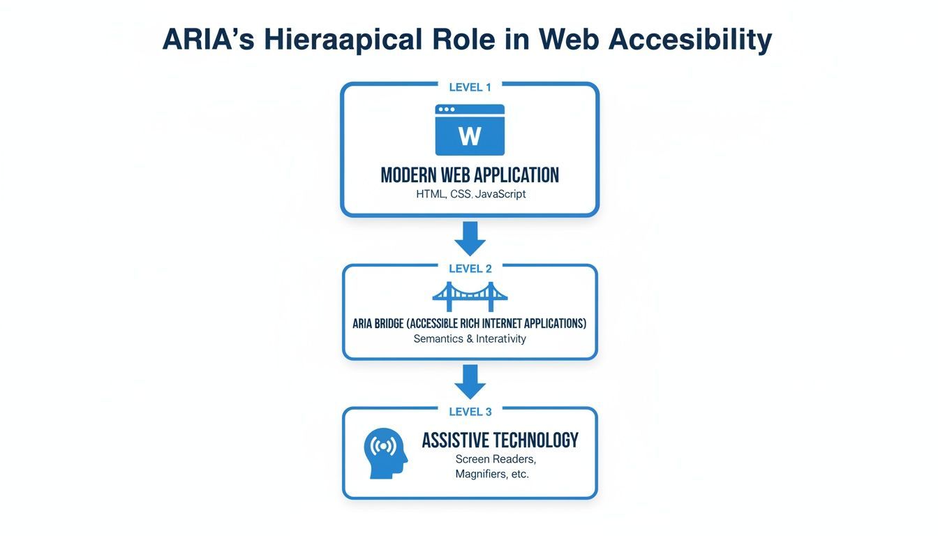
Without ARIA, the rich interactions on your site might be completely invisible to a screen reader. ARIA ensures every user gets the full picture.
Roles What an Element Is
The first piece of the puzzle is the role. A role attribute tells assistive technology what an element is supposed to be. It answers the fundamental question: "What is this thing?"
It’s like giving an element a job title. If you see someone in a store with a name tag that says "Cashier," you instantly know their function. An ARIA role like role="navigation" or role="button" does the same thing for a user navigating your site with a screen reader.
Expert Insight: By assigning a role, you’re giving an element a clear identity. This is what turns a generic
<div>from an ambiguous box into something specific and understandable, like atabor adialog.
This is absolutely crucial for custom components. Imagine you've built a beautiful tabbed interface using <div> and <span> elements. To a screen reader, it’s just a meaningless collection of containers. But add role="tablist", role="tab", and role="tabpanel", and suddenly it has the semantic structure needed for a user to navigate it properly.
Properties What an Element Has
While roles define what an element is, properties describe its essential characteristics or its relationship to other elements. Think of these as the permanent, unchanging attributes of that element. They answer the question: "What are this element's defining features?"
Let's go back to our job title analogy. If the role is "Manager," then the properties are their fixed responsibilities, like "Manages the Sales Department." These details are vital for understanding context. Some of the most common ARIA properties include:
aria-label: Gives an element an accessible name when there's no visible text to act as a label.aria-labelledby: Points to another element on the page that functions as its label. This is great for associating a form input with its text label.aria-describedby: Links an element to a separate, more detailed description elsewhere on the page.aria-controls: Specifies that an element, like a dropdown button, controls another element, like the dropdown menu itself.
Using properties correctly builds the logical connections within your interface. For instance, aria-controls creates a clear cause-and-effect link between a button and the menu it opens, which is critical for helping a screen reader user understand the outcome of their actions.
States What an Element Is Doing Now
Finally, we have states. States communicate an element's current condition, which often changes dynamically as a user interacts with the page. States are all about the here and now, answering the question: "What is this element’s status right now?"
If the role is the job title and properties are the job description, then a state is the person's current availability—"Busy," "Available," or "On a break." These conditions are temporary and change constantly.
A classic example is a collapsible accordion section. It will have an aria-expanded state. When a user clicks the header, its value flips from "false" to "true". A screen reader will announce "Expanded," giving immediate feedback that the action worked. Other common states are:
aria-checked: Shows if a custom checkbox or radio button is checked ("true","false", or"mixed"for partial selections).aria-selected: Indicates if an option within a listbox or tab group is the active one ("true"or"false").aria-busy: Notifies the user that a section of the page is loading or updating, so they should wait before interacting ("true"or"false").
Getting comfortable with these three building blocks—roles, properties, and states—is the foundation for writing ARIA that actually works. For teams focused on making sure their code is both effective and compliant with WCAG, having a solid governance process is key. A dedicated accessibility platform can make all the difference, and you can see how WebAbility.io provides that end-to-end support by exploring our platform features.
Real-World ARIA Implementation Examples
Theory is great, but seeing ARIA work in the wild is where it all clicks. Let's roll up our sleeves and look at some practical code examples that show just how ARIA can fix common components that are often inaccessible right out of the box.
These before-and-after snippets will show you how a few simple attributes can turn a frustrating user experience into a smooth, intuitive one. This isn't just about ticking a compliance box; it's about making sure every visitor can actually use your website, which is fundamental to building trust and encouraging conversions.
Creating an Accessible Custom Checkbox
Designers love creating custom-styled checkboxes to match a brand's look and feel. The problem is, they're usually built with <div> or <span> tags, which are totally invisible to a screen reader.
Before ARIA (Inaccessible): A sighted user sees a perfectly good checkbox. But for someone using a screen reader, the code below is just a generic div with some text. It has no role, no state, and can't be interacted with.
After ARIA (Accessible): Here’s where ARIA works its magic. We add three key attributes to give the <div> meaning.
role="checkbox"tells assistive technology what the element is.aria-checked="false"communicates its current state (unchecked).tabindex="0"allows someone to reach it using their keyboard.
Building an Accessible Tabbed Interface
Tabs are fantastic for organizing content without cluttering the page. Without ARIA, however, they're just a confusing mess of links and disconnected content blocks for screen reader users. ARIA is what builds the relationship between the tab control and the content it reveals.
Before ARIA (Inaccessible): Imagine hearing a list of links—"Profile," "Settings," "Billing"—followed by a random paragraph of text. There’s no way to know that clicking one of those links is supposed to change the content you see.
ProfileSettingsBillingThis is the profile content...
After ARIA (Accessible): We can give this component a proper structure using a few ARIA roles. We define the container as a tablist, each control as a tab, and each content area as a tabpanel. The aria-controls attribute explicitly links a tab to its panel, while aria-selected shows which one is active.
This is the profile content...
With proper ARIA, the screen reader announces, "Profile, tab, 1 of 3, selected," providing full context. The user understands they are in a tabbed interface and can navigate it logically.
These examples show how ARIA bridges the gap between a custom visual design and a truly functional, accessible experience. Of course, some components need to announce changes dynamically, such as when an error message appears or content is loading. To learn more about this, you can explore our guide on creating an effective ARIA live region.
The final step is always to verify that your implementations work as expected. Using an auditing platform like WebAbility.io helps ensure your ARIA code actually delivers an accessible experience for everyone, which is critical for building a site that supports all users and meets your business goals.
The Five Rules of ARIA and How to Avoid Common Mistakes
Your Quick Guide to Flawless ARIA
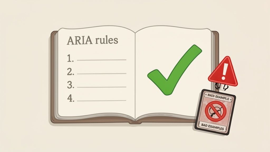
Using ARIA incorrectly can actually make your site less accessible than if you’d used no ARIA at all. It’s a hard truth, but one every developer needs to understand. To steer you in the right direction, the W3C laid out five simple rules. The most important one? If a native HTML element already does the job, use it.
Let's walk through each rule so you can write cleaner, more effective, and genuinely accessible code.
Why Bad ARIA Is Worse Than No ARIA
Think of ARIA as a set of instructions for assistive technologies. When you add the wrong roles or properties, you’re essentially giving bad directions. This can override the correct, built-in behavior of HTML, leading to a confusing and frustrating experience for users who rely on screen readers.
This isn't just a theory. The saying "No ARIA is better than bad ARIA" is backed by hard data. When WebAIM audited over one million home pages, they discovered that pages with ARIA averaged 41% more detected errors than those without it. You can read more about how ARIA and HTML can clash to understand just how high the stakes are.
To keep you out of trouble, let's get into the five official rules of ARIA.
The First Rule: Use Native HTML
This is the golden rule. Before you even think about writing an ARIA attribute, ask yourself: "Is there an HTML element for that?" If the answer is yes, use it. Native elements have keyboard accessibility, focus management, and semantic roles baked right in.
- Bad ARIA:
<div role="button" onclick="doSomething()">Click Me</div> - Good HTML:
<button onclick="doSomething()">Click Me</button>
The <div> example forces you to manually add keyboard events and manage focus states. The <button> element handles all of that for you, right out of the box. Always start with semantic HTML.
The Second Rule: Do Not Change Native Semantics
Building on the first rule, you should never try to completely change what an element is. Don't slap an ARIA role on an element to make it something it wasn't meant to be, like trying to turn a heading into a button.
Expert Insight: Overriding native semantics is like putting a "Push" sign on a door that should be pulled. It creates confusion and breaks the user's expectations.
- Bad ARIA:
<h1 role="button">This is a heading and a button</h1> - Good HTML:
<h1><button>This is a button inside a heading</button></h1>
The bad example forces a screen reader to guess. Is it a heading? A button? This conflict disrupts the page structure and makes navigation a nightmare.
The Third Rule: All Controls Must Be Keyboard Accessible
Simple enough: if you can click it, you must be able to get to it with a keyboard. If you’ve created a custom interactive component from a generic <div> or <span>, the responsibility for making it keyboard-accessible falls squarely on you.
This usually involves adding tabindex="0" to get the element into the default tab order. You’ll also need to add event listeners for key presses, like the Enter and Spacebar keys for custom buttons.
The Fourth Rule: Do Not Hide Focusable Elements
This one is a common but dangerous mistake. Never, ever apply role="presentation" or aria-hidden="true" to an element that can receive focus, like a link, button, or form field. This creates "ghost" controls.
A keyboard user can tab to the element, but the screen reader won't announce it because it's been told to hide it. The user is left wondering what they landed on and why the page seems broken. An element must either be completely hidden (and not focusable) or completely visible to everyone.
The Fifth Rule: Give Elements an Accessible Name
Every interactive element needs a name. An accessible name is the piece of text a screen reader announces to tell a user what a control is for. For many elements, the visible text does the trick, like in <button>Save</button>. For a deeper dive on this, check out our guide on understanding the name, role, value model.
But for controls without visible text, like a close button that's just an "X" icon, you must provide a name yourself. This is where aria-label comes in.
- Bad ARIA:
<button>X</button>(Announced as "X, button") - Good HTML:
<button aria-label="Close">X</button>(Announced as "Close, button")
By committing these five rules to memory, you'll ensure your ARIA implementation is a genuine help, not a hindrance. When you combine this foundational knowledge with an expert-guided platform like WebAbility.io, you empower your team to maintain compliance and deliver a truly accessible experience at scale.
How ARIA and Automated Solutions Work Together
So, which is better: hand-coding ARIA or using an automated solution? It’s a common question, but it frames the issue the wrong way. The most effective approach isn’t about choosing one over the other—it’s about using them together.
Think about it this way: your developers are the master mechanics, building a solid engine from the ground up with ARIA. They ensure every custom component is structurally sound and accessible from day one. That's where an automated platform like WebAbility.io comes in, acting as a continuous diagnostic system that monitors performance and flags issues in real-time, working alongside your team.
This partnership frees up your development team to focus on building great features. While they’re embedding accessibility deep into the product's DNA, a comprehensive accessibility solution is working around the clock to manage compliance and scale the user experience.
The Power of a Hybrid Strategy
This combined approach creates a powerful, layered strategy for accessibility. Your developers lay the strong foundation with manual ARIA, making sure complex widgets are born accessible. But websites are living things—new content gets added, features get updated, and mistakes inevitably happen.
That’s where continuous monitoring becomes so valuable. Automated scans can spot errors, regressions, or new problems that would otherwise slip through the cracks. This kind of vigilance is more important than ever. Since 2019, the use of ARIA has exploded by a staggering 400%. The problem? Home pages with ARIA actually have 68.6% to 70% more detected errors on average than pages without it. This clearly shows that good intentions don't always lead to correct implementation. You can discover more insights about these ARIA usage trends, and the data highlights a major need for better oversight.
Expert Insight: A hybrid strategy ensures your initial investment in accessible code is protected. It combines the precision of manual ARIA with the broad safety net of automation, creating a system that is both strong and resilient.
Enhancing User Experience and CRO
Beyond just catching code errors, this strategy directly improves the experience for every user. While a well-built ARIA foundation makes a site fundamentally navigable for assistive technology, an AI-powered accessibility interface gives individuals the power to customize the interface to their needs.
This empowers users to instantly fine-tune their experience with features like:
- Contrast Adjustments: Crucial for people with low vision.
- Text Resizing and Spacing: Helps improve readability for users with cognitive disabilities like dyslexia.
- Dyslexia-Friendly Fonts: Provides alternative typography for easier text processing.
These user-facing tools complement the developer’s work by providing a personalized experience that meets a person's specific needs in the moment. When your site is easier for everyone to use, satisfaction and engagement naturally go up. A more accessible site is simply a more usable site, which almost always leads to higher conversion rates.
Partnering with an end-to-end provider like WebAbility.io helps you implement this complete, layered strategy, giving you a powerful way to boost both compliance and CRO.
Frequently Asked Questions About ARIA
As you move from theory to practice, you'll inevitably run into some specific questions about ARIA. It happens to everyone. Let's tackle some of the most common ones to clear up any confusion and make sure you’re applying ARIA correctly in your projects.
Does Using ARIA Guarantee My Website Is WCAG Compliant?
Not on its own, no. This is probably the biggest misconception out there. Slapping ARIA attributes onto your code doesn't magically make your site compliant. In fact, using ARIA incorrectly can create more accessibility problems than it solves.
Think of it this way: ARIA is a precision instrument. In the hands of someone who knows how to use it, it’s incredibly powerful for building complex, accessible components. But if used improperly, it just makes a mess.
Expert Insight:ARIA is just one piece of the accessibility puzzle. Real compliance comes from a holistic approach: solid semantic HTML as your foundation, correct ARIA to fill the gaps, and consistent testing to ensure everything works for actual users.
When Should I Use ARIA Instead of a Native HTML Tag?
The first rule of ARIA is: if you can use a native HTML element, do it. Always. This isn't just a guideline; it's the most important principle to follow. For instance, never build a button out of a <div> and role="button" when the <button> element exists and does the job perfectly.
So, when do you reach for ARIA? You use it when you're building a custom, interactive component that simply has no native HTML equivalent. Good examples include things like:
- Tabbed interfaces
- Tree menus
- Custom sliders or comboboxes
ARIA is there to bridge the semantic gap where standard HTML falls short.
Can I Combine Manual ARIA Coding with an Accessibility Widget?
Absolutely. Not only can you, but they are often designed to work together to create the most effective accessibility solution. It’s a great example of a layered strategy.
Developers use ARIA to build accessibility directly into the foundation of custom components—the core code. An accessibility platform or interface then adds another layer, giving users tools for personalization (like changing contrast or font sizes) while also helping you manage and monitor overall compliance. This combination is robust, empowering, and leads to a much better experience for everyone.
What Is the Difference Between an ARIA Role and a Property?
It helps to think of them in terms of identity versus description.
An ARIA role defines what an element is or what it does. For example, role="navigation" tells a screen reader, "This block of links is the site navigation." It establishes the element's core purpose.
An ARIA property, on the other hand, describes the characteristics or state of that element. Following our example, aria-label="Main navigation" gives that specific navigation block a name, providing essential context.
Simply put, roles give an element its identity, while properties tell you more about it.
Ready to build a robust, layered accessibility strategy that combines expert ARIA implementation with powerful automation? Discover how the WebAbility.io platform can help your team achieve and maintain compliance while enhancing the user experience for everyone.
Quick Questions
Tap to ask AI about this article