Essential Best Practices Web Design: 10 Rules

Sidharth Nayyar
Accessibility problems still block revenue. They also weaken trust, hurt conversion paths, and expose teams to avoidable legal risk.
Best practices web design now means building sites that work for more people under real conditions. That includes mobile use, keyboard access, assistive technology support, fast load times, clear content structure, and forms people can complete without friction. Teams that treat those as one system usually get better results than teams that treat accessibility as a separate compliance task.
That connection matters for E-E-A-T as much as UX. Experience shows up in practical choices. Expertise shows up in semantic HTML, ARIA used with restraint, readable contrast, and predictable focus states. Authority grows when those standards hold across the site. Trust is earned when people can use what you publish.
If you want a simple place to start, add keyboard-friendly wayfinding early. Implementing Skip to Navigation Links is a small change that improves orientation for keyboard and screen reader users, and it often reveals larger structural issues worth fixing.
The business case is straightforward too. Inclusive design helps remove friction from high-intent journeys, supports stronger CRO, reduces remediation costs later, and opens access to a disability market often estimated in the trillions. For teams using WebAbility.io, the goal is not accessibility theater. It is measurable improvement in usability, credibility, and conversion.
TL;DR
Modern best practices web design comes down to a simple standard. Build for accessibility, performance, trust, and conversion at the same time.
The strongest sites usually share the same traits:
- They work without friction on mobile
- They use semantic HTML and clean structure
- They support keyboard and screen reader users
- They make contrast, forms, typography, and media easy to use
- They measure behavior and improve continuously
- They guide visitors toward high-value pages through clear internal linking
Accessibility and CRO are no longer separate conversations. Good UX investments can yield $100 return per $1 spent and conversion lifts in the 200-400% range, while 75% of organizations report that accessibility directly contributes to improved revenue. That’s why experienced teams treat inclusive design as a business system, not a compliance afterthought.
In 2026, a strong website isn’t just beautiful. It’s usable, credible, measurable, and resilient. The disability market represents an estimated $13T in spending power, and inclusive design helps brands serve more people while reducing avoidable friction. That’s also why E-E-A-T matters here. Experience shapes practical decisions. Expertise shows up in implementation. Authority comes from consistent standards. Trust comes from websites people can use.
If you want one useful example of that mindset in action, this case study on unlocking accessibility and user-friendly design is worth reviewing.
The 10 rules below focus on what works in production, what tends to break, and how to design sites that support users and business goals at the same time.
1. Keyboard Navigation and Accessibility
A surprising number of polished websites still fall apart the moment you put the mouse away. Drop-downs don’t open, close buttons can’t be reached, and focus disappears into the page chrome. That’s not a minor usability issue. It blocks access.
Keyboard navigation is one of the clearest tests of whether a design system is usable. If someone can move through the main nav, search, forms, filters, and checkout with Tab, Shift+Tab, Enter, Space, and arrow keys, the foundation is usually strong.
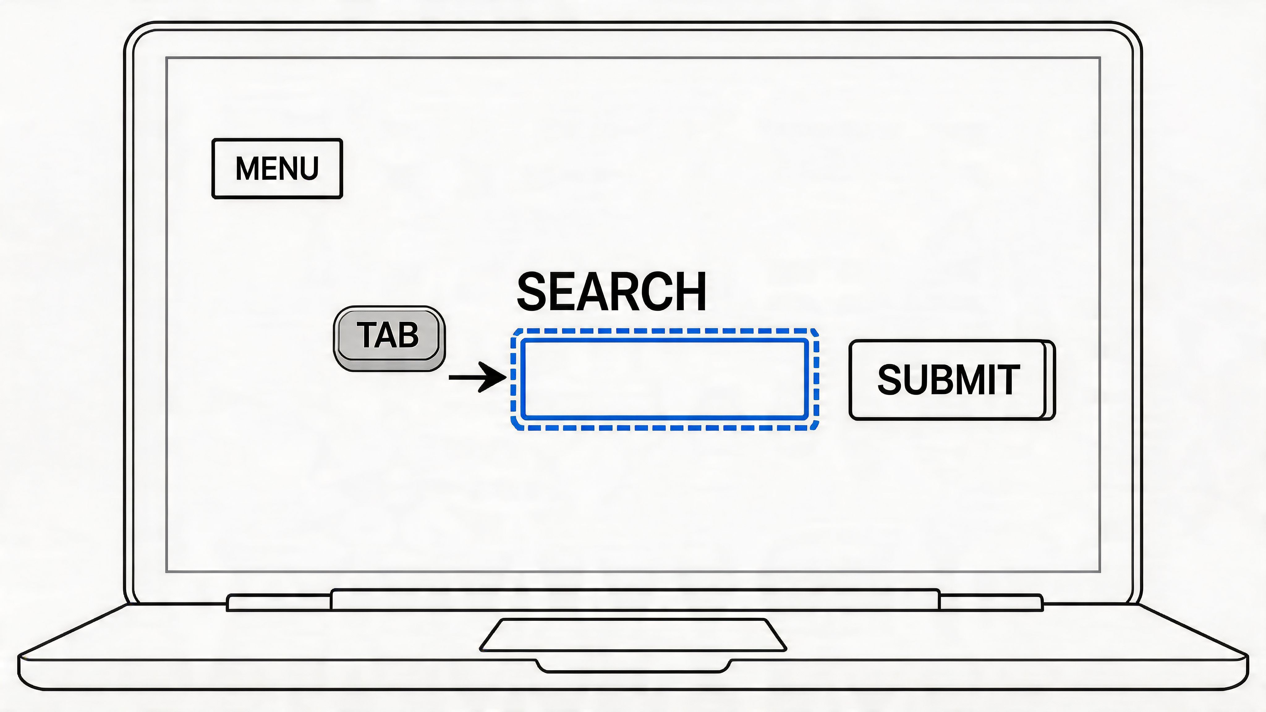
What good keyboard support looks like
Gov.uk and Microsoft both set useful examples because they treat keyboard access as part of normal interaction design, not a special mode. Menus expose clear focus states. Skip links are available. Interactive controls are reachable in a predictable order.
A practical standard is to test every template without touching a mouse. Home page, navigation, search, pricing page, contact form, modal, cart, and account area. If one component traps focus or hides it, users feel it immediately.
Practical rule: If a developer removes the default outline, they must replace it with a stronger visible focus style, not a subtler one.
A few habits make the biggest difference:
- Keep tab order logical: Follow visual reading order so people don’t jump unpredictably across the interface.
- Make focus obvious: Use
:focus-visibleto style keyboard focus separately from hover states. - Add an early escape hatch: Use Implementing Skip to Navigation Links so keyboard users can bypass repeated interface blocks.
- Test real controls: A custom menu that looks modern but fails on keyboard is worse than a plain native pattern.
Where teams usually get it wrong
The common failure isn’t lack of effort. It’s over-customization. Teams replace native buttons, links, and form controls with scripted components, then try to recreate expected behavior later. That usually costs more time than doing it right from the start.
Managed accessibility tooling can help reinforce full keyboard navigation across existing sites, especially when teams need broader coverage quickly. But it still works best when the underlying templates respect native HTML behavior and predictable focus flow.
2. Semantic HTML and Proper Markup
If the HTML doesn’t describe the page correctly, everything downstream gets harder. Screen readers lose context. search engines get weaker signals. developers spend more time adding ARIA to compensate for problems that clean markup would’ve prevented.
Semantic HTML is one of the least glamorous parts of best practices web design, but it’s one of the most impactful ones. BBC, The Guardian, and MDN all show why. Their pages feel understandable because the structure is understandable.
Start with meaning, not styling hooks
Use header, nav, main, article, section, and footer for what they are. Use button for actions and a for navigation. Put labels on form fields. Keep one clear H1 that matches the page’s purpose.
That sounds basic. It’s also where many builds drift. I still see cards made of nested divs with JavaScript click handlers, modal triggers built as spans, and placeholder text standing in for labels. All of that creates avoidable friction.
For a good primer, what is semantic html is a useful reference for teams cleaning up older templates.
The business case is stronger than people think
Semantic structure supports accessibility, and accessibility supports commercial outcomes. The content gap in a lot of design advice is that it explains compliance details but rarely connects them to business performance. One of the clearest missing links is outlined in this accessibility best practices analysis, which notes how often teams discuss standards without quantifying the conversion and revenue impact.
That gap matters. Stakeholders don’t only need to know what WCAG asks for. They need to know why structural clarity helps users complete valuable actions.
- Use headings to support scanning: Strong hierarchy helps users and improves page comprehension.
- Wrap related content with landmarks: This helps assistive tech users move around quickly.
- Choose native controls first: Native controls usually give you keyboard and screen reader support with less code.
Good markup lowers the amount of accessibility repair work you need later.
3. Color Contrast and Visual Accessibility
Low contrast does more than hurt readability. It weakens conversion paths, increases support friction, and creates avoidable accessibility risk.
Teams often catch contrast problems too late, after brand colors have already spread across buttons, links, alerts, cards, charts, and form states. At that point, remediation is not a quick design tweak. It usually means revising tokens, updating component libraries, retesting templates, and explaining to stakeholders why a approved palette now needs exceptions.
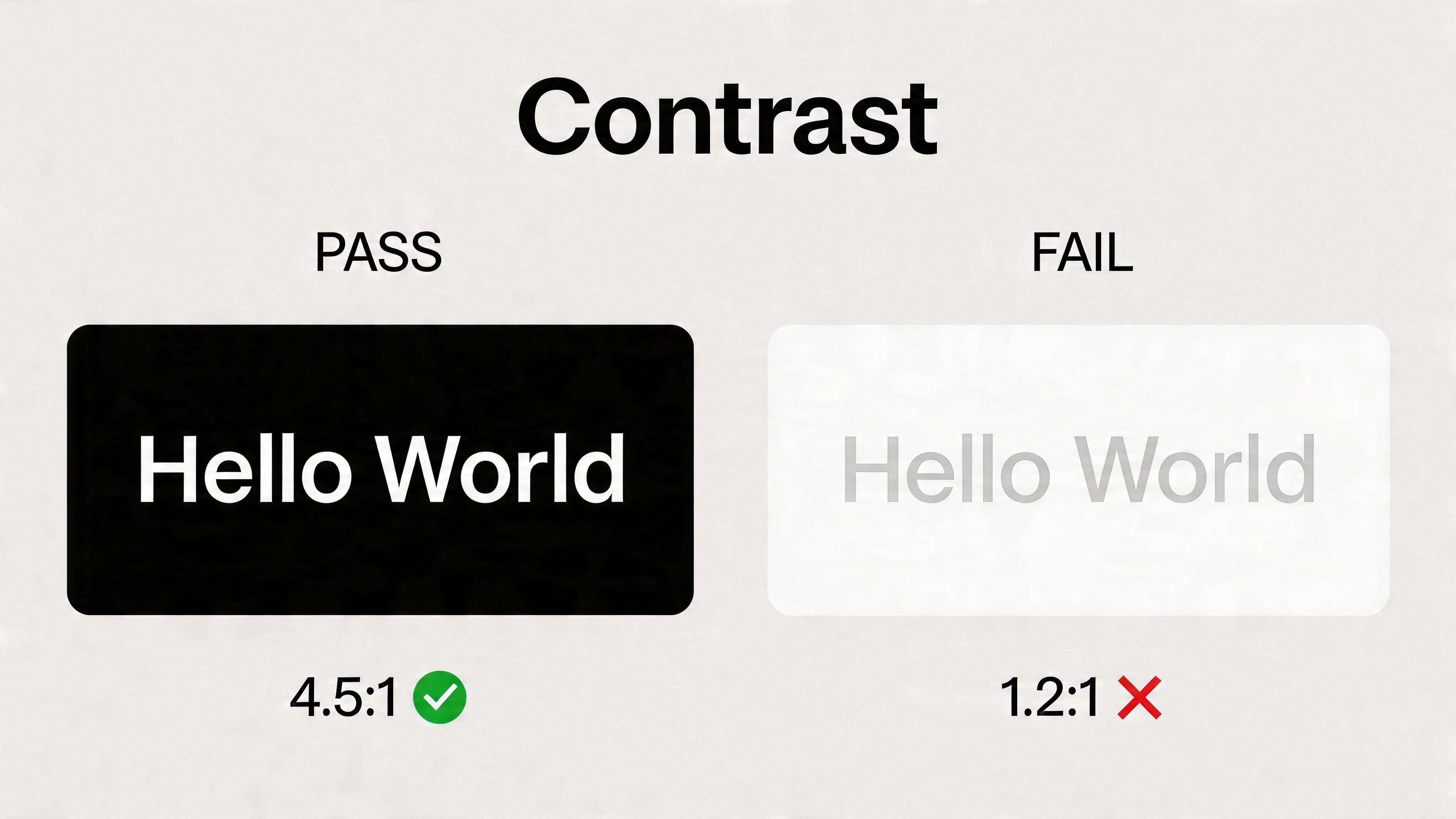
Build contrast into the design system
Strong teams treat contrast as a system rule, not a page-by-page judgment call. That matters for accessibility, but it also matters for consistency and speed. If a designer, marketer, or content editor can pick any text color over any background, failures are predictable.
That shows up in business metrics. Users miss calls to action. Error text gets ignored. Legal and pricing details become harder to scan. For brands that care about trust signals and E-E-A-T, weak readability undercuts perceived quality fast.
A better setup is simple. Define approved foreground and background pairs at the token level, document them in the design system, and map them to component states before launch. Accessible color contrast in design is a useful implementation reference for teams tightening that process.
I also recommend assigning ownership. Design can define the palette, but engineering should validate implementation in components, and QA should test real rendered states, not just Figma screens.
Check the states people actually use
The failures that matter rarely sit in a hero headline. They hide in places tied to action and feedback.
Focus rings, disabled buttons, inline validation messages, chart labels, selected tabs, filter chips, and secondary actions are common problem areas. Text over photography is another repeat offender, especially on campaign pages where brand expression starts to outrank usability.
Use a practical review checklist:
- Test every component state: Hover, focus, active, selected, disabled, and error.
- Avoid color-only meaning: Pair status with text, icons, or patterns.
- Review text over images: Add overlays or swap layouts when readability drops.
- Offer user control where needed: High-contrast modes and theme controls can reduce friction for a wide range of users.
This is also where accessibility connects directly to revenue and risk reduction. A readable interface helps more people complete forms, compare products, and recover from errors. It also helps brands reach a market that is too often treated as an edge case, even though disability inclusion represents a massive commercial opportunity. Teams using WebAbility.io should treat contrast checks as part of release workflow, alongside keyboard and screen reader testing, rather than a visual polish item at the end.
4. Alt Text and Image Descriptions
Alt text is one of the fastest ways to tell whether a site has a content process or just a design process. When teams handle it well, images add meaning without excluding anyone. When they don’t, product grids, charts, editorial features, and navigation cues turn into silence.
Good alt text isn’t about describing every pixel. It’s about communicating the image’s purpose in context. An e-commerce product image needs different alt text than a decorative background texture. A chart needs different treatment than a staff headshot.
Write for the job the image is doing
Wikipedia and major editorial sites tend to do this well because they treat images as content, not decoration. That’s the right model for product teams too. Ask a simple question: what would a user miss if this image weren’t visible?
If the image is decorative, use empty alt text. If it carries information, describe the information. If it supports a conversion path, include the detail that helps someone decide.
For teams training editors, what is alt text gives a clear baseline.
Describe the image the way you’d explain it over the phone to someone who can’t see it.
Where alt text affects CRO
On commerce pages, missing or weak alt text creates hidden friction. Product variants, material details, packaging shots, and comparison images all influence buying decisions. If those details are inaccessible, some users can’t evaluate the product properly.
The same applies to charts in SaaS, diagrams in B2B content, and screenshots in product-led growth pages. If the visual proof isn’t described, part of the value proposition disappears.
A strong workflow usually includes:
- Editorial standards: Define who writes alt text and where it’s reviewed.
- Template logic: Decorative UI images should default to empty alt attributes.
- Support for scale: AI-assisted generation can speed up drafts, but a human should review context-sensitive images.
- Audit cycles: Legacy libraries are often where the worst gaps live.
This work also supports discoverability and trust. Users notice when a site feels complete.
5. Responsive Design and Mobile Accessibility
Mobile traffic now dominates for many sites, but the design mistake is still common. Teams approve the desktop layout first, then compress it for smaller screens near the end of the project. That usually creates accessibility issues and conversion problems at the same time.
A responsive layout is not just a screen-size exercise. It decides what gets seen first, what gets tapped easily, and what still works under real constraints like glare, one-handed use, zoom, weak connections, and interrupted attention.
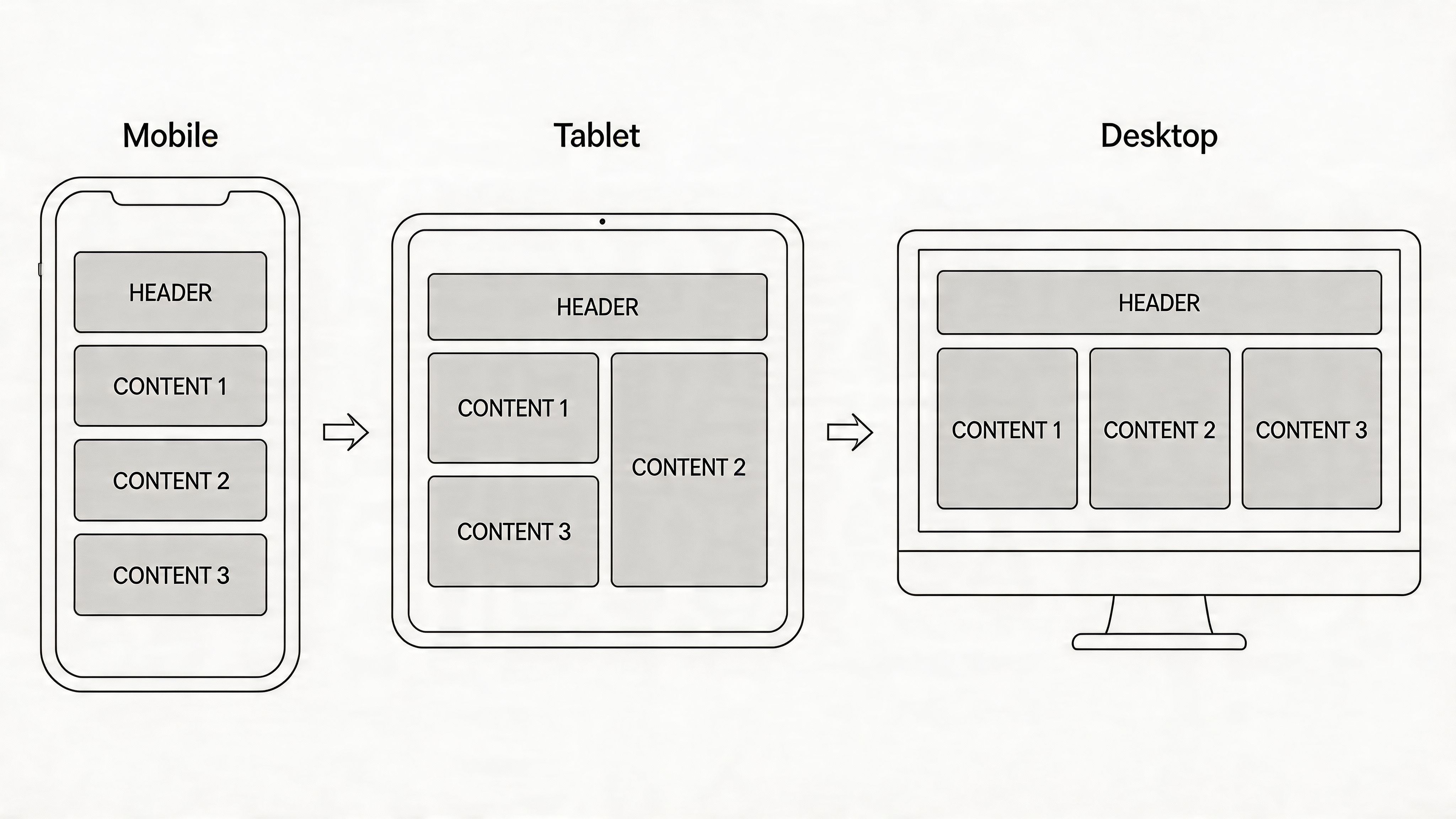
Mobile-first is a prioritization decision
Teams that handle mobile well usually make better product decisions. They choose the primary task, reduce competing elements, and give critical actions enough space to work. That discipline improves accessibility because users with low vision, motor limitations, or cognitive fatigue benefit from the same clarity that improves conversion rates.
The business case is straightforward. If a pricing page hides key information behind accordions, if a checkout button sits too close to other controls, or if a sticky banner covers content at 200% zoom, users drop off. Some leave because the experience is irritating. Others leave because the page no longer works with assistive tech or mobile browser settings. Both outcomes hurt revenue, trust, and E-E-A-T signals.
Good responsive design also reduces legal and operational risk. Many mobile accessibility failures come from design decisions that looked fine in a static mockup but break under real use. Off-canvas menus that trap focus, carousels that require precision swipes, and modal overlays that block scrolling are common examples.
What responsive work should include
Strong responsive work covers layout, interaction, and content order.
- Keep touch targets usable: Buttons, links, toggles, and form controls need enough size and spacing to avoid accidental taps.
- Preserve readable hierarchy: Headings, pricing, validation messages, and CTAs should remain obvious without forcing users to hunt.
- Support zoom and text resizing: Pages should still work when users increase text size or zoom in to read comfortably.
- Review task-critical pages first: Product, pricing, category, service, checkout, and contact flows deserve device testing before lower-value pages.
- Check responsive states with assistive technology: Test mobile layouts with screen readers, keyboard alternatives, and orientation changes, not just visual resizing in a browser.
For teams using WebAbility.io, auditing becomes more useful than another design opinion. Automated checks can catch recurring failures across templates, then product and engineering teams can fix the pattern once instead of patching page by page.
Responsive design affects credibility too. Users notice when content disappears on mobile, labels truncate, or navigation changes so much between devices that the site feels inconsistent. That inconsistency does not read as modern. It reads as unfinished.
6. Form Accessibility and Usability
Forms expose the gap between a polished interface and a usable one. They sit at the point where accessibility, trust, and conversion meet. If a user cannot understand a field, recover from an error, or submit with a keyboard or screen reader, the design has failed at a business-critical moment.
Stripe and well-built government service forms are good references because they remove guesswork. Labels stay visible. Instructions appear where users need them. Validation helps people finish the task instead of punishing them for getting one step wrong.
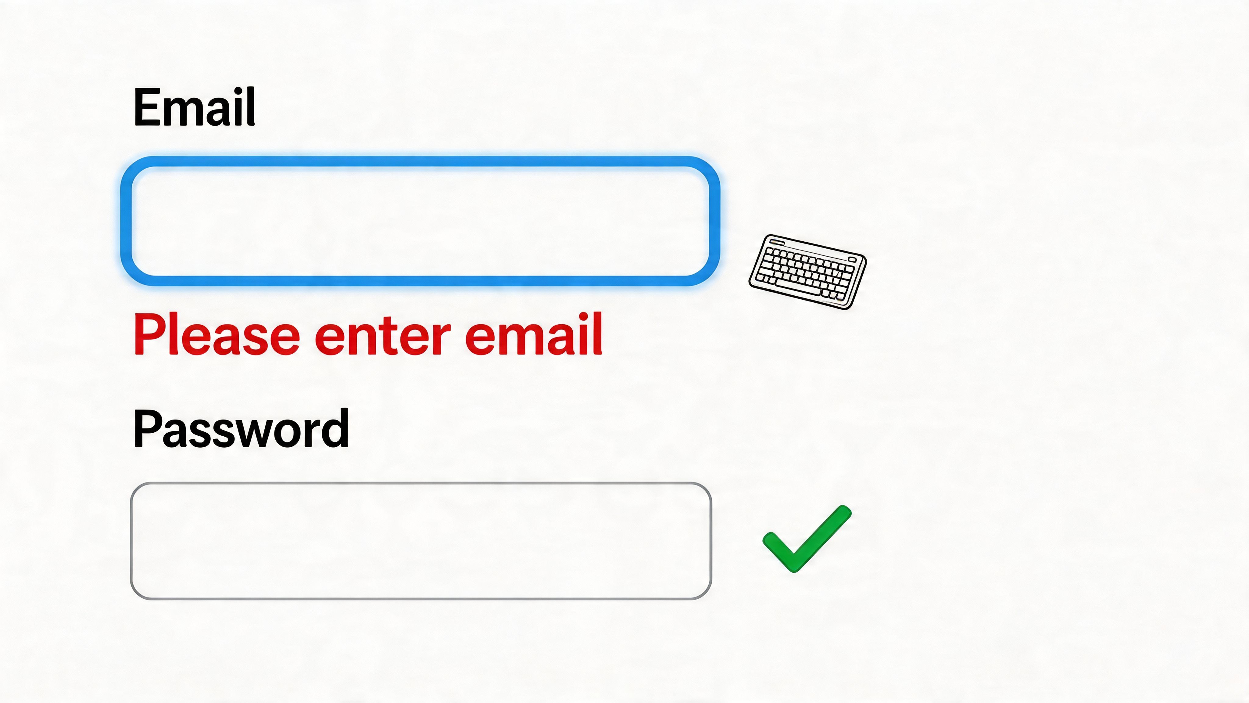
Clear forms reduce friction and failure
Placeholder-only forms often look tidy in a mockup and perform poorly in production. Once text disappears, users have to rely on memory. That creates avoidable errors for everyone, and it creates real barriers for people using screen readers, speech input, magnification, or cognitive support tools.
Good form design is explicit. Use persistent labels, concise helper text, grouped fields with fieldsets and legends, and error messages placed next to the field that needs attention. Match the input type to the task. Use email, tel, date, and numeric inputs where appropriate so browsers and assistive tools can offer better support.
I also avoid aggressive real-time validation unless the benefit is clear. Flagging an incomplete field while someone is still typing creates noise. Checking for a valid email format after focus leaves the field is usually more useful than interrupting every keystroke.
A practical review should answer four questions:
- Does every input have a programmatically associated label
- Can users complete the form without a mouse
- Do errors explain what happened and how to fix it
- Does the form still work with zoom, autofill, and assistive technology
Accessibility choices show up in conversion and trust
Form friction rarely looks dramatic in analytics. It shows up as abandonment, repeated submissions, bad lead data, and support requests that should never have been needed. Teams often treat those as separate problems. In practice, they usually point back to the same issue: the form asks too much, explains too little, or fails to work with real user conditions.
This is also where accessibility connects directly to E-E-A-T. A form that handles consent clearly, labels fields correctly, preserves user input after errors, and explains requirements before submission signals care and competence. On checkout, account creation, healthcare, finance, and lead-gen flows, that matters. People trust sites that make important tasks feel predictable.
For teams using WebAbility.io, form audits can help identify repeated failures such as missing labels, weak error associations, empty button names, or broken focus order across templates. Fixing those patterns once usually does more for completion rate and risk reduction than tweaking button color on a single page.
Start with the forms closest to revenue. Checkout, demo requests, account registration, contact flows, quote requests, and gated content forms deserve task-based testing with keyboard users and screen readers. Small improvements there often produce measurable gains because they remove friction at the exact point where intent is highest.
7. Accessible Typography and Text Formatting
Typography shapes whether people can use what you publish. Brand expression still matters, but body text has a job to do. It needs to stay readable across devices, zoom levels, screen resolutions, and reading conditions.
Teams often spend weeks refining hero sections and almost no time testing long-form reading. That is a mistake on pages where trust and comprehension drive results. Product details, pricing explanations, help content, policy pages, and service pages all depend on text people can scan, read, and return to without strain.
Readability affects credibility, completion, and reach
Readers notice poor typography fast. Tight line spacing, long paragraphs, faint gray text, and decorative font choices increase effort on every line. Users with low vision, dyslexia, fatigue, migraines, or heavy cognitive load feel that cost first, but the damage does not stop there. Everyone slows down when text presentation fights the content.
This also connects directly to E-E-A-T. If a site asks people to trust your advice, pricing, process, or compliance claims, the reading experience needs to support that trust. Clear typography signals care, editorial discipline, and technical competence. On important pages, that can affect conversion as much as the copy itself.
Accessible text settings also expand market reach. They help you serve disabled users more effectively, reduce avoidable friction, and lower the risk that a preventable reading issue turns into abandonment or a complaint.
Practical text rules that hold up in production
- Use a comfortable body size: Small type can look refined in mockups and fail in real use. Default text should read comfortably without forcing pinch-zoom on mobile.
- Keep line lengths under control: Very wide text blocks slow scanning and make it easier to lose your place. Constrain content width so long-form reading stays manageable.
- Prefer left-aligned body copy: Justified paragraphs create inconsistent spacing that can make reading harder, especially for users with dyslexia or low vision.
- Give text enough line spacing and paragraph separation: Dense blocks reduce comprehension. A little more vertical rhythm usually improves reading speed and page stamina.
- Let users resize text without breaking the layout: Text should remain usable at larger sizes, including browser zoom and custom user settings.
- Make links obvious in running copy: Color alone is not enough in many cases. Underlines or other clear treatment help users identify what is clickable.
There are trade-offs. Tight layouts let marketing teams fit more above the fold, and lighter weights can match a visual system better. In practice, readability usually wins. If a page exists to explain, reassure, or convert, text presentation should support that task first.
For teams auditing at scale, this is one of the easier places to find repeatable gains. WebAbility.io can help surface patterns such as low-contrast text, text that breaks at zoom, or components that rely on fragile font sizing across templates. Fixing the system once is far cheaper than patching readability page by page.
Good typography rarely gets praised directly. People keep reading, understand faster, and finish the task. That is the outcome that matters.
8. Accessible Video and Audio Content
Multimedia often gets published faster than it gets made accessible. A team uploads a product demo, webinar recording, or campaign video, then plans to add captions and transcripts later. Later often doesn’t happen.
That’s a mistake because media is usually high-intent content. People watch demos when they’re evaluating. They listen to founder interviews when they’re building trust. They use tutorials when they’re trying to succeed with a product.
Give users more than one way to access the content
YouTube, TED, Netflix, Vimeo, and BBC iPlayer all demonstrate the same principle. Captions, transcripts, and accessible controls don’t reduce the value of media. They expand it.
Good media publishing should include:
- Captions for spoken content: Especially for videos used in education, marketing, and product support.
- Transcripts alongside the asset: Helpful for scanning, quoting, indexing, and users who prefer reading.
- Keyboard-accessible players: Controls should be operable without a mouse.
- Descriptions for visual-only meaning: If key information appears only on screen, someone needs access to that context too.
Why this matters beyond compliance
Accessible media supports SEO, user retention, and content reuse. Captions and transcripts can also improve internal linking strategy because they give you more text context to connect related product pages, help centers, category hubs, or service content.
The larger point is that accessibility work shouldn’t end at launch. Ongoing monitoring matters because content changes introduce new issues over time. That maintenance gap is called out clearly in this discussion of inclusive web design operations, which notes how little attention most guidance gives to post-launch governance.
When teams build an accessible media workflow from the start, they avoid that slow drift.
9. Focus Management and Navigation Structure
Focus management is where many otherwise solid sites break under dynamic behavior. The page loads fine. Then a modal opens, a menu expands, results update, or a single-page app swaps content. Suddenly the keyboard user loses context.
That’s why navigation structure and focus management belong together. A site needs more than visible focus rings. It needs predictable movement.
A useful demonstration of this in action is below:
Predictability is the real goal
GitHub and Gmail are helpful examples because they manage complex interfaces without making orientation impossible. When a dialog opens, focus moves into it. When it closes, focus returns to the trigger. When new content appears, users get enough context to continue.
This sounds technical, but users experience it as confidence. They know where they are, what changed, and what happens next.
A strong focus strategy usually includes:
- Visible indicators everywhere: Not just in forms, but in nav, tabs, menus, cards, and filters.
- Controlled modal behavior: Trap focus within the modal until it closes.
- Clear return points: Send focus back to the initiating control after temporary UI closes.
- Structured navigation paths: Primary actions should appear consistently across templates.
Why navigation architecture affects CRO
Navigation isn’t only about usability. It also determines whether users reach the pages that matter. Internal linking and menu hierarchy should consistently support pricing, core service pages, category hubs, high-performing resources, and contact paths.
When teams measure user behavior through data-driven design methods and analytics implementation, they can see where navigation patterns support adoption and where users stall. Heatmaps, session recordings, and path analysis are especially helpful for identifying buried links, skipped content blocks, and menus that look clear in a design review but confuse people in use.
10. Screen Reader Compatibility and ARIA Implementation
Screen reader support rises or falls on one decision. Build with native HTML first, then add ARIA only where the interaction needs extra context.
That approach saves time and reduces failure points. A button already exposes role, focus behavior, and keyboard support. A custom div button usually needs all of that rebuilt, then tested across screen readers and browsers. I have seen polished interfaces fall apart here, especially in tabs, menus, accordions, and comboboxes that look fine in design review but announce the wrong role, miss state changes, or hide important instructions.
Use ARIA to fill gaps, not to replace semantics
Good ARIA use is specific. aria-label helps an icon-only button. aria-describedby adds help text or error context to a form field. aria-current="page" tells screen reader users which navigation item is active. aria-live can announce cart updates, validation results, or loading completions when that change matters to task completion.
Poor ARIA use creates noise. Adding roles that conflict with native elements, copying the same label into multiple attributes, or pushing every update into a live region can make a page harder to understand.
The primary goal is reliable interpretation, not attribute count.
Test the user journey with actual screen readers
Automated scans catch missing labels and some ARIA misuse. They do not tell you whether a checkout flow makes sense in NVDA, whether a filter panel is understandable in JAWS, or whether VoiceOver announces a status message at the right moment.
Test real tasks. Search. Add to cart. Submit a form with errors. Open a modal. Sort a table. Complete account recovery. Those flows expose the gaps that matter to users and to conversion.
This is also where accessibility and E-E-A-T connect in a way many teams miss. A site that communicates clearly to assistive tech is easier to trust. Labels match visible controls. Instructions are announced when needed. Error handling is understandable. Product, medical, financial, and legal sites especially benefit here because clarity reduces both abandonment and compliance risk.
There is also a direct market argument. Better screen reader support helps businesses serve disabled users more effectively and participate in the disability market referenced earlier. Teams using tools such as WebAbility.io can combine automated checks with manual review to catch recurring ARIA issues inside component libraries before those issues spread across templates.
Accessibility work at this level is product quality work. It improves task completion, strengthens credibility signals, and lowers the chance that a redesign ships with expensive usability regressions hidden behind a visually polished UI.
10 Web Accessibility Best Practices Comparison
| Item | Implementation complexity | Resource requirements | Expected outcomes | Ideal use cases | Key advantages |
|---|---|---|---|---|---|
| Keyboard Navigation and Accessibility | Medium, planning and focus management | Developer time, keyboard & AT testing | Full keyboard operability, WCAG 2.2 AA alignment | Interactive sites, SPAs, form-heavy pages | Enables motor-impaired users, improves SEO, lowers support |
| Semantic HTML and Proper Markup | Low–Medium, training and refactors | Dev education, code reviews, audits | Better AT interpretation, SEO, maintainable code | Content-heavy sites, CMS, documentation | Foundation for accessibility, reduces ARIA reliance |
| Color Contrast and Visual Accessibility | Low–Medium, design tuning and testing | Design time, contrast tools, QA checks | Improved readability, WCAG contrast compliance | Public sites, branding interfaces, data displays | Readability for low vision, reduces eye strain |
| Alt Text and Image Descriptions | Low, continuous content effort | Content editors, possible AI tooling | Screen reader access, SEO, fallback content | Image-rich sites, e-commerce, news/media | Accessible images for blind users, better indexing |
| Responsive Design and Mobile Accessibility | Medium–High, layout & touch considerations | Dev time, device testing, performance work | Usable across devices, mobile-friendly SEO | Mobile-first audiences, e-commerce, apps | Broader reach, single codebase, higher conversions |
| Form Accessibility and Usability | Medium, validation, labels, error UX | Dev & UX time, AT testing, localization effort | Lower abandonment, clearer error recovery | Checkouts, registrations, healthcare/finance forms | Higher completion rates, better data quality |
| Accessible Typography and Text Formatting | Low–Medium, CSS and design choices | Design adjustments, font licensing, testing | Improved readability, compliant text spacing | Publishers, education, long-form content | Better comprehension, reduced reading fatigue |
| Accessible Video and Audio Content | High, captions, transcripts, player controls | Captioning/transcription services, dev integration | Multimodal access, legal compliance, searchable media | Media platforms, e-learning, marketing videos | Access for deaf users, transcripts boost SEO |
| Focus Management and Navigation Structure | Medium–High, dynamic focus handling | Dev time, SPA patterns, extensive testing | Predictable navigation, reduced cognitive load | SPAs, dashboards, complex interactive apps | Consistent keyboard/AT navigation, improved UX |
| Screen Reader Compatibility and ARIA Implementation | High, correct ARIA and SR behavior | Accessibility expertise, multi-screen-reader testing | Reliable screen reader experience, accessible widgets | Custom components, rich interactive widgets | Enables complex interactions, improves semantic clarity |
From Practice to Profit Your Next Steps
The best practices web design teams follow consistently aren’t random tips. They form a system. Semantic HTML improves structure. Keyboard support and focus management improve access. Better contrast, typography, media handling, and forms reduce friction. Responsive design makes sure all of that still works when users switch devices, zoom text, or rely on assistive tools.
That system does more than satisfy a checklist. It strengthens E-E-A-T in a way users can feel. Experience shows up when your patterns hold up under real use. Expertise shows up in the implementation details. Authoritativeness grows when your site is dependable across contexts. Trustworthiness increases when users can complete important tasks without confusion or exclusion.
There’s also a direct business case. Earlier, we noted the ROI tied to strong UX and the revenue contribution many organizations associate with accessibility. Those ideas matter because stakeholders often separate design quality from business performance when they shouldn’t. In practice, the same fixes that make a site easier to use often make it easier to convert on.
If you’re deciding where to start, don’t try to overhaul everything at once. Start with the templates and pathways closest to revenue or mission-critical outcomes. For most organizations, that means the home page, top landing pages, pricing, product or service pages, lead forms, checkout or signup, support content, and primary navigation. Review those first on mobile, on keyboard, and with assistive technology in mind.
Then look at your internal linking. This is one of the most underused CRO levers in content-heavy websites. Important pages shouldn’t depend on a main menu alone. They should be linked contextually from blog posts, solution pages, help content, and comparison pages using anchor text that makes sense to users. Good internal linking improves discoverability, reinforces page importance, and helps move visitors toward action without feeling pushy.
Measurement matters too. Teams that rely on assumptions usually miss where friction happens. Use analytics, recordings, and behavior reviews to identify high-exit templates, underused calls to action, and content paths that don’t lead users anywhere useful. Accessibility should be part of that review, not isolated from it.
The work also needs maintenance. Accessibility can degrade as content changes, plugins are added, campaigns launch, and design systems evolve. That’s why ongoing scanning, regression checks, governance, and reporting are practical safeguards, not administrative overhead.
A sensible next step is to audit your current site with a free tool such as the WebAbility.io Website Scanner. If you need broader support for ongoing compliance, monitoring, and user-facing accessibility features, Start your free trial of WebAbility.io to evaluate whether it fits your workflow.
WebAbility.io helps teams improve accessibility across design, development, and post-launch monitoring. If you’re working on CRO, ADA or WCAG alignment, internal linking to high-value pages, or long-term governance, it’s a practical platform to evaluate alongside your existing workflow.
Quick Questions
Tap to ask AI about this article