7 Accessible Website Examples to Inspire Your 2026 Strategy

Sidharth Nayyar
TL;DR: The Best Accessible Website Examples & Resources
For Visual Learners: W3C Before/After Demo (BAD) shows common errors and fixes side-by-side.
For Developers: ARIA Authoring Practices Guide (APG) is the go-to for complex widget code.
For Government & Enterprise: USWDS and GOV.UK offer robust, pre-vetted component libraries.
For Foundational Knowledge: W3C Tutorials provide topic-specific guidance for teams.
For CMS Users: WordPress.org's "Accessibility Ready" filter offers accessible starting points.
For Structured Training: Deque University provides in-depth courses with practical labs.
These examples show that accessibility isn't an afterthought but a core part of a mature development process. Many organizations accelerate their journey by pairing these best practices with comprehensive platforms that offer AI-powered widgets and automated scanning to streamline compliance and enhance user control.
Understanding web accessibility can feel abstract. It's easy to read the guidelines, but seeing them in action provides the clarity needed to build truly inclusive digital experiences. This article moves beyond theory to showcase practical, replicable strategies from some of the best accessible website examples available.
We've curated a list of premier resources, from government design systems to interactive demos, that provide the blueprints for creating sites that work for everyone. For each example, you’ll find direct links, screenshots, and an analysis of what makes them effective. We break down the specific code patterns, design rationale, and actionable takeaways to guide your developers, designers, and project managers. To truly build a better web, it is essential to understand and implement key website accessibility best practices like those demonstrated in these leading examples.
This isn’t just a list; it’s a strategic guide designed to help your team find the right models for your specific needs. Whether you’re building a complex SaaS application, an e-commerce platform, or a public sector portal, these examples set the standard for digital inclusion. Let's explore the sites that get it right.
1. W3C WAI – Before and After Demonstration (BAD)
TL;DR: The W3C's Before and After Demonstration (BAD) is an essential, free educational tool that provides a side-by-side interactive comparison of inaccessible web pages and their fully corrected, accessible versions. It's the perfect starting point for developers and designers to see common accessibility failures and learn the exact code-level fixes required for WCAG conformance.
The World Wide Web Consortium (W3C) Web Accessibility Initiative (WAI) created the BAD site as a practical, hands-on learning resource. Instead of just reading about accessibility principles, this platform allows you to see them in action. Users can navigate through different page templates-including a homepage, a news article, and a complex form-switching between a deliberately broken "before" version and a fully remediated "after" version.
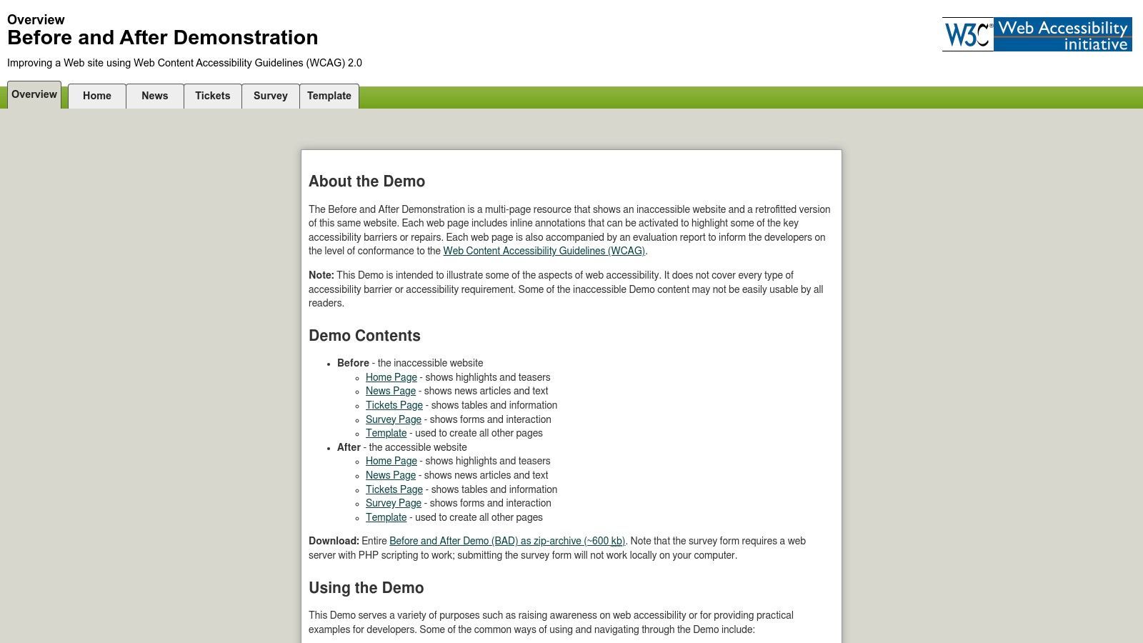
This tool is invaluable for illustrating the real-world impact of accessibility errors. The "before" pages are riddled with common barriers, such as missing alt text, poor color contrast, confusing form labels, and a lack of keyboard navigation support. The "after" pages show the same content with all issues resolved, demonstrating a seamless and inclusive user experience.
Strategic Analysis: Why It's a Top Example
What makes the W3C BAD site one of the most powerful accessible website examples is its direct instructional approach. It bridges the gap between theoretical knowledge and practical application.
Interactive Annotations: Each accessibility issue on the "before" pages is highlighted with an interactive annotation. Clicking on an annotation reveals a detailed explanation of the barrier, the user groups it affects, and a link to the corresponding WCAG success criterion.
Code-Level Solutions: The platform doesn't just identify problems; it provides the solutions. The accompanying evaluation reports offer code snippets and clear guidance on how to implement fixes using proper HTML, CSS, and ARIA attributes.
Standards-Based Authority: Coming directly from the W3C, the organization that develops web standards, this resource is the definitive source of truth for accessibility best practices. Its guidance is vendor-neutral and universally applicable.
Key Insight: The BAD demo's greatest strength is its ability to make abstract WCAG guidelines tangible. It provides a visual and functional "A/B test" for accessibility, making it an indispensable tool for team training and stakeholder buy-in. It clearly shows why certain coding practices matter.
Actionable Takeaways for Developers & Agencies
Use for Onboarding and Training: Integrate the BAD demo into your onboarding process for new developers, designers, and QA testers. It's a fast and effective way to establish a baseline understanding of common accessibility hurdles.
Demonstrate Impact to Stakeholders: When pitching the need for an accessibility audit or remediation project, use the BAD site to show non-technical stakeholders the concrete differences between an inaccessible and an accessible user experience.
Cross-Reference Your Own Code: When you encounter a tricky component like a modal or a complex form, use the "after" examples as a reference for correct ARIA implementation and semantic HTML structure. This can help you better understand what is WCAG compliance and how to achieve it on your own projects.
This resource is completely free to access and use, reinforcing the W3C's mission to make the web accessible to all.
Website:https://www.w3.org/WAI/demos/bad/
2. W3C WAI-ARIA Authoring Practices Guide (APG)
TL;DR: The ARIA Authoring Practices Guide (APG) is the definitive developer's handbook for building complex, accessible web components. It provides production-ready design patterns, keyboard interaction models, and live code examples for everything from menus and dialogs to complex grids and trees, ensuring they work seamlessly with assistive technologies.
While the BAD demo shows what accessibility failures look like, the W3C's ARIA Authoring Practices Guide (APG) provides the blueprint for building accessible components correctly from the start. It is an essential technical resource for front-end developers tasked with creating custom widgets that are not native to HTML, such as modals, custom select boxes, or tab panels. The guide details the specific ARIA roles, states, and properties required for each pattern.
The APG serves as a canonical library of accessible design patterns. Each pattern page offers a functional example, outlines the expected keyboard navigation behavior, and lists the necessary ARIA attributes. This moves beyond theory and gives developers a clear, actionable guide for implementation, helping to standardize the user experience for people who rely on screen readers and other assistive tools.
Strategic Analysis: Why It's a Top Example
The APG is one of the most important accessible website examples because it provides authoritative, implementation-level guidance. It is the go-to reference for building robust and compliant interactive components that form the foundation of modern web applications.
Prescriptive Design Patterns: The guide doesn't just suggest ideas; it prescribes specific, tested patterns for complex components. It tells developers exactly how a user should be able to navigate a tree widget with arrow keys or which ARIA roles are needed for a disclosure button.
Live Examples and Source Code: Every pattern includes a live, working example that developers can interact with directly. This is paired with links to the source code, allowing teams to inspect and adapt proven solutions for their own projects.
Standardization and Consistency: By providing a single, authoritative source for component behavior, the APG helps create a more consistent and predictable web. When developers follow these patterns, users of assistive technology don't have to re-learn how to interact with common widgets on every new website.
Key Insight: The APG's core value is in codifying the unwritten rules of accessible UX for complex components. It translates high-level WCAG principles into concrete code and interaction models, removing the guesswork for developers and ensuring a consistent experience for end-users.
Actionable Takeaways for Developers & Agencies
Bookmark as a Primary Reference: Your front-end team should treat the APG as a primary reference guide alongside MDN or other technical documentation. Before building any custom component, check the APG for an established pattern.
Standardize Your Component Library: Use the APG as the foundation for your internal design system or component library. Ensure your React, Vue, or Svelte components for modals, tabs, and menus adhere to the keyboard and ARIA patterns defined in the guide.
Validate Custom Widget Implementations: During QA and accessibility audits, use the APG's keyboard interaction models as a checklist. If your custom combobox doesn't behave exactly as the APG example prescribes, it likely has accessibility issues that need to be addressed.
This resource is maintained by the W3C and is completely free, making it an indispensable tool for any professional web development team.
Website:https://www.w3.org/WAI/ARIA/apg/
3. U.S. Web Design System (USWDS)
TL;DR: The U.S. Web Design System (USWDS) is an open-source library of accessible UI components, templates, and guidance. It provides developers and agencies with pre-built, production-ready building blocks that meet rigorous Section 508 and WCAG standards, dramatically accelerating the creation of compliant and user-friendly government and enterprise websites.
Created to standardize and improve the digital presence of the U.S. federal government, the USWDS is a comprehensive toolkit for building accessible, mobile-friendly digital services. It offers over 40 components, from simple buttons and form inputs to complex headers and side navigation, each designed with accessibility as a core requirement. It’s not just a collection of code; it's a mature design system backed by extensive research, documentation, and a supportive community.
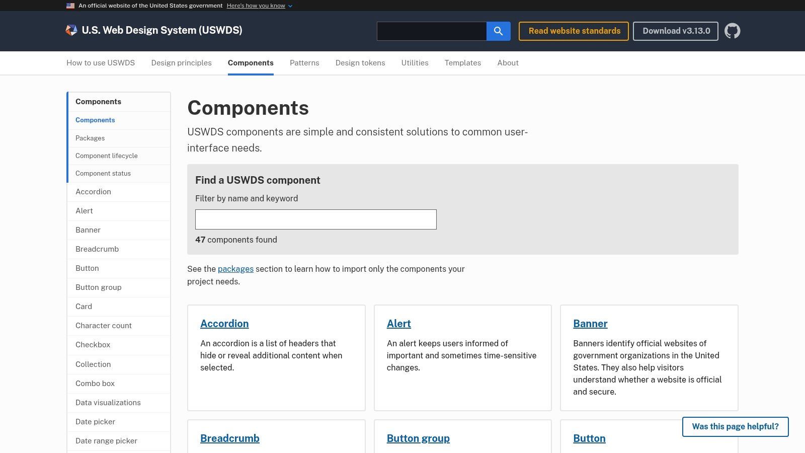
This system empowers teams to build with confidence, knowing that each component has been tested for keyboard navigability, screen reader compatibility, sufficient color contrast, and proper semantic structure. The provided guidance explains not just how to implement a component, but why specific accessibility choices were made, offering valuable lessons along the way.
Strategic Analysis: Why It's a Top Example
What makes the USWDS one of the best accessible website examples is its focus on providing a scalable, accessible-by-default foundation. It shifts accessibility from a remediation task to an integrated part of the development lifecycle.
Production-Ready Components: Each component comes with accessible HTML, modern CSS, and minimal JavaScript. This allows teams to avoid reinventing the wheel and focus on application logic rather than wrestling with low-level ARIA implementation for common patterns like accordions or modals.
Built-in Best Practices: The system’s guidance documents the built-in accessibility testing practices used for each component, including screen reader, keyboard, and automated checks. This transparency provides a clear model for teams to adopt in their own quality assurance processes.
Regulatory Alignment: While born from U.S. government needs and aligned with Section 508, the system's principles are rooted in WCAG. This makes its components and patterns universally applicable for any organization aiming for a high standard of digital accessibility.
Key Insight: The USWDS proves that accessibility can be built-in, not bolted-on. By providing a system of compliant components, it reduces the risk of human error and allows development teams to inherit a high level of accessibility from the very start of a project.
Actionable Takeaways for Developers & Agencies
Adopt as a Foundation for New Projects: For new websites, especially in the public or enterprise sectors, consider using USWDS as the foundational design system. This dramatically reduces the initial effort required to build an accessible front-end.
Use as a Reference for Custom Components: Even if you don't adopt the entire system, use the USWDS component documentation as a gold-standard reference. When building a custom date picker or navigation menu, check their implementation to ensure you are following best practices for ARIA roles and keyboard interactions.
Audit Your Existing UI Against USWDS Patterns: Compare your own website's components against the USWDS equivalents. This can be a quick way to identify accessibility gaps in your forms, navigation, or interactive elements that may have been overlooked.
This powerful design system is completely free and open-source, making it an accessible resource for any organization committed to building an inclusive web.
Website:https://designsystem.digital.gov/components/overview/
4. GOV.UK Design System
TL;DR: The GOV.UK Design System is a world-class, open-source collection of rigorously tested, accessible front-end components and patterns. It provides a robust, government-grade framework for building consistent, usable, and WCAG-compliant digital services, making it an invaluable resource for any development team.
Developed by the UK's Government Digital Service (GDS), this design system is the backbone of one of the world's most recognizable and trusted government websites. It goes beyond a simple style guide, offering a comprehensive toolkit with reusable code, detailed guidance on usage, and a strong emphasis on content design and user research. Its primary goal is to make building government services simpler, faster, and better for everyone.

Each component, from a simple button to a complex date input, has been tested with a wide range of users, including those who use assistive technologies. This real-world validation ensures the patterns are not just theoretically compliant but practically usable. The documentation for each component explains why it was designed a certain way, its accessibility considerations, and how to implement it correctly.
Strategic Analysis: Why It's a Top Example
The GOV.UK Design System is one of the best accessible website examples because it codifies accessibility into the very building blocks of a website. It demonstrates how to achieve accessibility at scale through a systematic, component-driven approach.
Accessibility by Default: Every component is designed and built to meet WCAG 2.2 level AA standards. By using the system, teams inherit a high level of accessibility out of the box, freeing them to focus on unique user needs.
Transparent Rationale: The system doesn't just give you code; it gives you the reasoning behind it. The documentation for each pattern details the research and accessibility testing that informed its design, promoting deeper understanding.
Focus on Usability and Content: It uniquely integrates content design principles with technical components. It provides clear guidance on writing error messages, form labels, and help text, recognizing that accessibility is as much about clarity as it is about code.
Key Insight: The GOV.UK Design System's power lies in its holistic approach. It proves that a design system is the most effective way to maintain accessibility and consistency across a large digital estate. It shifts accessibility from a final "check" to a foundational principle of the entire development process.
Actionable Takeaways for Developers & Agencies
Use as a Blueprint for Your Own System: If your organization is building its own design system, use GOV.UK as a gold standard. Analyze its structure, documentation style, and the way it communicates accessibility requirements for each component.
Reference for Complex Component Patterns: When building challenging components like multi-part forms, accordions, or conditional reveals, consult the GOV.UK examples. Their patterns have been thoroughly tested and offer proven solutions for keyboard navigation and ARIA implementation.
Adopt Its Content Design Principles: Beyond code, the system offers powerful lessons in writing for the web. Use its guidance on clear language, helpful error messages, and logical content structure to improve the usability and accessibility of your own projects.
This resource is completely free to use under a permissive open-source license, making its battle-tested components and patterns available to any project, public or private.
Website:https://design-system.service.gov.uk/
5. W3C WAI Tutorials (Design & Develop)
TL;DR: The W3C WAI Tutorials are a comprehensive, free library of practical guidance and code examples for building accessible web components. Organized by topic-such as forms, images, and tables-they provide designers, developers, and content authors with the specific techniques needed to meet WCAG success criteria.
Where the BAD demo shows the "before and after," the W3C WAI Tutorials provide the "how-to." This resource moves beyond high-level principles to offer detailed instructions for creating accessible web experiences from the ground up. It covers fundamental components and content types that are essential for nearly every website, making it a foundational educational tool for any web professional.
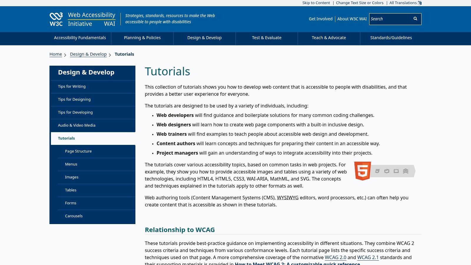
Each tutorial breaks down a specific topic, like accessible images, and explains the different contexts and solutions. For example, it doesn't just say "use alt text"; it provides distinct guidance for decorative images, functional images, complex images like charts, and more. This level of detail ensures teams can apply the correct solution for their specific use case.
Strategic Analysis: Why It's a Top Example
The W3C WAI Tutorials are a premier example of educational accessibility because they directly map WCAG theory to real-world code. They serve as an official implementation guide from the standards body itself, removing ambiguity and providing authoritative patterns.
Role-Specific Guidance: The content is structured to be useful for different roles. A content author can learn how to write effective alt text, while a developer can grab the correct HTML and ARIA for a multi-level menu.
Contextual Code Snippets: The tutorials are filled with copy-ready code snippets that are not just technically correct but also explained in detail. They clarify why a certain attribute is used and the effect it has on assistive technologies.
Direct WCAG Mapping: Every technique and example is explicitly linked to the relevant WCAG success criteria. This helps teams build a deep understanding of the requirements and confidently justify their design and development choices.
Key Insight: The true value of the WAI Tutorials is their contextual depth. They teach teams not just what to do, but how to think about accessibility challenges and apply the right pattern for the situation, making them an invaluable second step after understanding the basics.
Actionable Takeaways for Developers & Agencies
Create an Internal Component Guide: Use the WAI Tutorials as a foundation for your agency's internal development standards. Base your proprietary accessible components (e.g., carousels, modals, forms) on the patterns provided here to ensure they are robust and standards-compliant.
Train Your Content Team: Direct your content authors and editors to the tutorials on images, tables, and page structure. This empowers them to create accessible content from the start, reducing the remediation burden on developers.
Resolve Technical Debates: When your team is debating the best way to implement a complex feature, refer to the tutorials as the source of truth. This aligns everyone with official W3C guidance and leads to more consistent, accessible outcomes.
This resource is entirely free and serves as the definitive reference for applying web accessibility standards in practice.
Website:https://www.w3.org/WAI/tutorials/
6. WordPress.org Theme Directory – “Accessibility Ready” Filter
TL;DR: The official WordPress.org theme directory provides an "Accessibility Ready" filter, offering a curated list of free themes that have passed a baseline accessibility review. It's an excellent starting point for developers and site owners looking to build an accessible website on the world's most popular CMS, providing a solid, pre-vetted foundation to build upon.
For the millions of websites built on WordPress, accessibility starts at the theme level. The official WordPress.org theme directory simplifies this crucial first step with its "Accessibility Ready" tag. This feature allows users to instantly filter a vast library of free themes to find those that meet specific accessibility requirements set by the WordPress Theme Review Team, covering aspects like keyboard navigation, proper controls, and semantic structure.
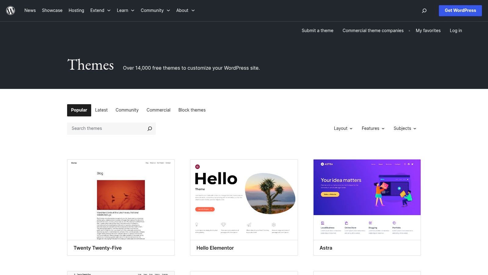
While not a guarantee of full WCAG 2.1 AA conformance out of the box, these themes provide a significant head start. They ensure that core structural and interactive elements are built with accessibility in mind, saving developers from having to fix fundamental issues later. This resource is invaluable for teams aiming to create inclusive digital experiences efficiently.
Strategic Analysis: Why It's a Top Example
The "Accessibility Ready" filter stands out as one of the most practical accessible website examples because it democratizes access to better web foundations. It integrates accessibility directly into the workflow of countless developers and businesses.
Scalable Starting Point: By vetting themes for foundational accessibility, WordPress enables a massive user base to begin their projects on the right foot. It lowers the barrier to entry for creating more inclusive websites.
Clear, Documented Standards: The WordPress Themes Team maintains a public handbook detailing the specific criteria a theme must meet to earn the "Accessibility Ready" tag. This transparency helps developers understand the requirements and learn best practices.
Hands-On Learning: Users can quickly install and experiment with these themes for free. This allows for direct, hands-on testing and learning, making it a powerful educational tool for understanding how accessible components function in a real-world CMS environment.
Key Insight: The "Accessibility Ready" directory's power lies in its integration and scale. By making accessible foundations a filterable, one-click option within the largest CMS ecosystem, it promotes better practices at an unparalleled scale and makes accessibility a more attainable goal for everyone.
Actionable Takeaways for Developers & Agencies
Prioritize "Accessibility Ready" Themes: When starting a new WordPress project, always begin your theme search using the "Accessibility Ready" filter. This saves significant remediation time and ensures your core structure is sound.
Use as a Baseline, Not a Final Check: Treat these themes as a starting point. Always conduct a full accessibility audit against your specific content and plugins, as the "Accessibility Ready" tag only covers the theme itself. It does not guarantee the accessibility of the content you add.
Enhance with Purpose-Built Tools: A solid theme is just one part of the equation. To manage dynamic content and third-party integrations, you'll need additional tools. Investigating WordPress accessibility plugins can provide the functionality needed to maintain compliance as your site grows.
All themes in the directory are free to download and use, making this an incredibly cost-effective way to build a more accessible web presence.
Website:https://wordpress.org/themes/
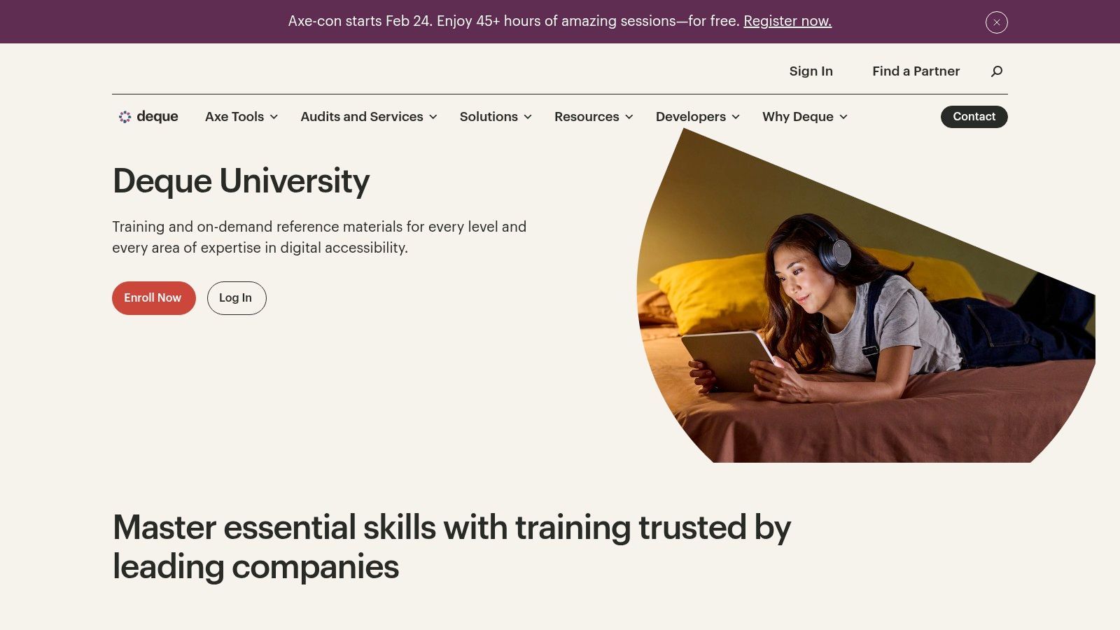
7. Deque University
TL;DR: Deque University is a comprehensive, paid training platform offering structured courses and certification paths for web accessibility. It’s an ideal resource for organizations that need to scale their team's expertise with role-based curricula, practical code labs, and alignment with official industry certifications like those from the IAAP.
While other examples on this list are public-facing websites, Deque University is a premier educational platform about creating accessible experiences. It provides in-depth, self-paced courses and instructor-led training for individuals and teams looking to master web accessibility from fundamentals to advanced remediation techniques. The platform is built by Deque Systems, a leader in digital accessibility.
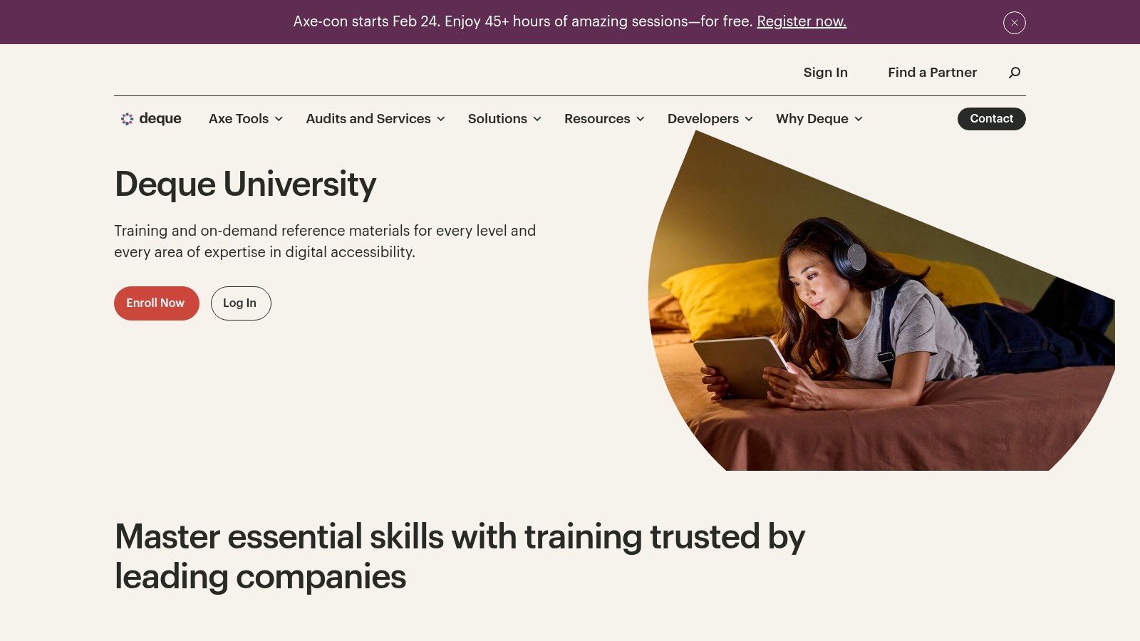
The curriculum is designed for various roles, including developers, designers, QA testers, and content creators. Instead of just theory, the courses are packed with interactive examples, code demonstrations, and hands-on labs that allow learners to practice what they've learned in a controlled environment. This approach makes it a powerful tool for building institutional knowledge.
Strategic Analysis: Why It's a Top Example
What makes Deque University one of the best accessible website examples is its focus on building sustainable, in-house expertise. It moves beyond a one-off audit by empowering teams to integrate accessibility into their daily workflows, a practice often referred to as "shifting left."
Role-Based Curricula: The training is not one-size-fits-all. It offers specific learning paths tailored to the responsibilities of different team members, ensuring everyone gets relevant and actionable information.
Example-Driven Learning: Complex concepts like ARIA states and properties, keyboard trap management, and dynamic content updates are explained using clear, functional code examples and live demonstrations within the courses.
Industry-Recognized Credibility: Deque's content is aligned with the International Association of Accessibility Professionals (IAAP) certifications, making it a trusted resource for professionals seeking to validate their skills.
Key Insight: Deque University's core value is its ability to institutionalize accessibility knowledge. By providing a structured, scalable, and credible training program, it helps organizations build a culture of accessibility from the ground up, rather than treating it as an afterthought.
Actionable Takeaways for Developers & Agencies
Invest in Foundational Team Training: Use Deque University's role-based curricula to upskill your entire digital team. This ensures a shared understanding of WCAG principles and a common language for discussing accessibility challenges.
Prepare for Professional Certification: Encourage developers and QA specialists to pursue IAAP certifications using Deque University's preparation courses. This not only enhances individual skills but also adds a significant credential to your agency's or company's qualifications.
Leverage for Complex Component Remediation: When facing a challenging component like an accessible data table or a multi-step modal, use the platform's extensive reference materials and code examples as a reliable guide for WCAG-compliant implementation. This complements the use of the best website accessibility testing tools by teaching you how to fix the issues they find.
Access to Deque University requires a paid subscription, with different tiers available for individuals and enterprise teams.
Website:https://www.deque.com/services-training/deque-university/
Comparison of 7 Accessible Website Examples
| Item | Implementation complexity | Resource requirements | Expected outcomes | Ideal use cases | Key advantages |
|---|---|---|---|---|---|
| W3C WAI – Before and After Demonstration (BAD) | Low — viewable demos | Minimal (stakeholders, designers/devs for review) | Side‑by‑side inaccessible vs fixed pages with annotated remediations | Stakeholder education, design reviews, quick workshops | Visual, standards‑based examples tied to WCAG; clear remediation callouts |
| W3C WAI‑ARIA Authoring Practices Guide (APG) | High — implementation detail for widgets | Front‑end developers with ARIA/HTML knowledge; time to implement | Production‑ready widget patterns, keyboard models, source code | Building complex interactive controls; developer reference | Canonical, detailed patterns maintained by standards body |
| U.S. Web Design System (USWDS) | Moderate — requires integration into stack | Dev/design time, adoption of tokens and components | Accessible components, templates, testing practices aligned to Section 508 | Federal/public sector projects or teams needing ready components | Proven at scale; Section 508 alignment; mature documentation and community |
| GOV.UK Design System | Moderate — integration and localization may be needed | Dev/design effort; possible localization for non‑UK contexts | Tested components with rationale, examples, and code snippets | Service design, government‑style digital services, content‑heavy sites | Exceptional clarity and consistency; real‑world government validation |
| W3C WAI Tutorials (Design & Develop) | Low to moderate — reference material to apply | Designers, developers, content authors; time to adapt examples | Topic‑organized how‑to guidance with copy‑ready snippets mapped to WCAG | Teams needing practical how‑to guidance for images, forms, media | Practical, example‑rich, standards‑aligned tutorials |
| WordPress.org Theme Directory – “Accessibility Ready” Filter | Low — installable themes | Basic CMS skills; customization to meet project needs | Accessible‑ready themes for quick prototypes (minimum review) | Rapid prototyping on WordPress; small teams/sites | Large, trusted catalog; easy installation and hands‑on testing |
| Deque University | Moderate to high — structured learning environment | Paid subscription or training budget; time for courses and labs | Course‑based training, labs, assessments, certification prep | Organizations needing formal training, labs, and certification alignment | Enterprise‑grade curriculum; IAAP/industry alignment and practical labs |
Turn Inspiration Into Action with a Scalable Accessibility Strategy
The journey through these foundational accessible website examples and design systems reveals a powerful, recurring theme: digital inclusion is not an afterthought but a core component of excellent design and development. Resources like the W3C’s demonstrations, the U.S. Web Design System, and the GOV.UK framework provide an invaluable blueprint for creating accessible components from scratch. They prove that adherence to WCAG standards enhances usability, expands audience reach, and reinforces brand integrity.
From these examples, we've distilled several critical takeaways. We've seen how semantic HTML forms the non-negotiable bedrock of accessibility, how ARIA attributes can precisely define roles and states for complex components, and how user-centric design processes that prioritize keyboard navigation and sufficient color contrast benefit everyone. These are not isolated tactics but interconnected principles that create a cohesive, usable experience for people with diverse abilities. The patterns offered by these leading resources are tested, documented, and ready to be adapted, saving your team from reinventing the wheel.
However, inspiration alone doesn't ensure sustained compliance. Building an accessible component is one thing; maintaining an accessible website across thousands of pages, multiple content contributors, and constant updates is another challenge entirely. This is where a strategic, tool-based approach becomes essential to bridge the gap between best-practice knowledge and real-world implementation at scale.
From Manual Best Practices to Automated Governance
Manually auditing every line of code and every piece of content is simply not feasible for most modern organizations. A scalable accessibility strategy requires a system that operationalizes the principles we've explored. This involves shifting from a project-based mindset, where accessibility is a one-time checklist, to a program-based mindset that integrates accessibility into the entire digital lifecycle.
This is where a comprehensive accessibility platform becomes a force multiplier. It automates the tedious and repetitive aspects of compliance, freeing up your development team to focus on complex user experience challenges and innovation. Instead of relying on periodic, expensive manual audits that quickly become outdated, a platform provides a continuous feedback loop.
Key Components of a Scalable Solution
A robust accessibility solution should combine proactive monitoring with user-facing enhancements to create a holistic ecosystem of inclusion.
Continuous Automated Scanning: Think of this as your 24/7 accessibility watchdog. It constantly scans your site for WCAG violations, providing real-time alerts and actionable reports. This allows teams to catch and fix issues as they arise, preventing them from escalating into major compliance problems.
User-Facing Accessibility Widget: While your team works on long-term, source-code fixes, an accessibility interface empowers users to immediately tailor the website experience to their needs. Features like screen reader adjustments, keyboard navigation enhancements, and customizable color and contrast profiles provide instant accessibility wins and demonstrate a commitment to inclusion.
Centralized Compliance Dashboard: A single source of truth is crucial for governance. A dashboard provides at-a-glance views of your site’s accessibility score, tracks progress over time, and generates the detailed reports needed for legal documentation and compliance statements like an Accessibility Conformance Report (ACR).
By integrating such a platform, you institutionalize the best practices showcased in the accessible website examples we've reviewed. You transform abstract guidelines into a tangible, manageable, and continuous improvement process. This ensures your digital properties not only start accessible but stay accessible, fostering trust, mitigating legal risk, and unlocking the full potential of your online presence for all users.
Ready to operationalize these insights and ensure your website is both compliant and inclusive? Discover how WebAbility.io combines 24/7 automated monitoring with a user-facing AI Accessibility Widget to provide a complete, scalable solution. Explore the platform and start your journey toward sustainable accessibility today at WebAbility.io.
Quick Questions
Tap to ask AI about this article