7 Accessible Website Examples Worth Studying (2026)

Sidharth Nayyar
TL;DR: This article provides a deep-dive analysis of 7 gold-standard examples of accessible websites and resources. We break down the specific tactics, code, and design strategies used by sites like the W3C's demonstration platform, the U.S. Web Design System, and Deque University. You'll get actionable takeaways, screenshots, and direct links to see high-level accessibility in action and learn how to replicate these practices on your own projects.
True digital inclusivity isn't just about complying with legal standards like WCAG and ADA; it’s about building an online experience that is functional and intuitive for every user. But what does a genuinely accessible website look like in practice? Moving beyond abstract guidelines, this article dives deep into real-world examples that set the benchmark for digital accessibility. We've curated a list of standout resources and platforms that masterfully implement these principles.
This is not a surface-level overview. For each of the seven examples, we provide a detailed strategic breakdown, analyzing the specific techniques they employ, from flawless ARIA implementation to solid keyboard navigation and clear semantic HTML. You’ll find direct links and screenshots to see these features firsthand. Exploring different methods is key, and as we consider various tools, it's also worth knowing how to achieve boosting web accessibility with Text to Speech to enhance the user experience further.
Whether you're a developer, designer, or project manager, these examples of accessible websites will give you a clear and replicable blueprint. You'll gain actionable insights to apply directly to your work, helping you build a more inclusive, effective, and compliant web presence.
1. W3C WAI – Before and After Demonstration (BAD)
TL;DR: An essential educational tool from the W3C that provides a live, side-by-side comparison of inaccessible and accessible web pages. It is an unparalleled resource for developers and designers to learn concrete, code-level accessibility fixes and visually demonstrate the impact of compliance to stakeholders.
The W3C Web Accessibility Initiative (WAI) Before and After Demonstration (BAD) is less a singular website and more an indispensable interactive learning platform. It presents a collection of fictional but realistic web pages, such as a news site, a university homepage, and an online store. Each page is available in two versions: an inaccessible “before” version riddled with common barriers and a fully remediated “after” version that meets WCAG standards.
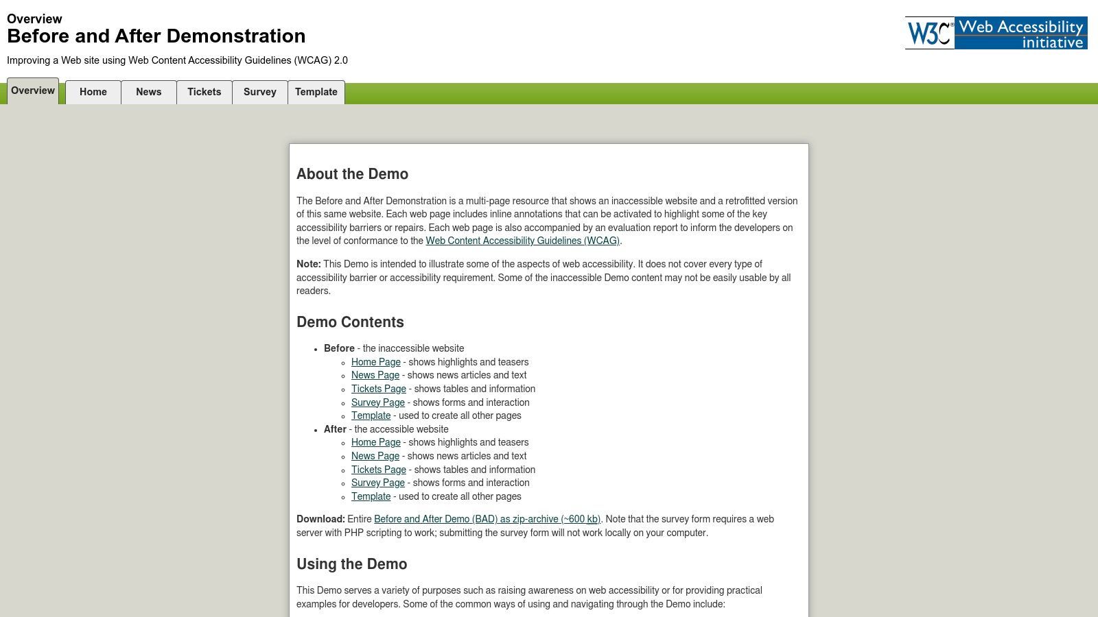
This direct comparison format is what makes it one of the most powerful examples of accessible websites available for educational purposes. It moves beyond theoretical guidelines, providing a tangible, hands-on experience that clearly illustrates the consequences of poor accessibility and the benefits of proper implementation.
Strategic Analysis & Actionable Takeaways
What makes the BAD site so effective is its granular, annotated approach. It doesn't just show a fixed website; it explains how and why each fix was made. This provides a clear roadmap for teams to follow.
Key Insight: The most impactful way to learn accessibility is to see the direct contrast between a broken and a working user experience. The BAD site operationalizes this principle, making it a powerful tool for both training and advocacy.
Replicable Strategies & Tactical Insights:
- Annotated Code: The platform provides access to the underlying HTML and CSS for both versions, with detailed comments explaining the changes. This allows developers to see precisely how an inaccessible
<div>button was transformed into a semantic<button>or how ARIA attributes were correctly applied. - Detailed Evaluation Reports: Each demonstration page is accompanied by an extensive report that lists every accessibility barrier, the techniques used to fix it, and the specific WCAG success criteria it addresses.
- Demonstrate Value to Stakeholders: Use the BAD site to show non-technical managers or clients the real-world impact of accessibility. Toggling between the "before" and "after" versions while using a screen reader is a highly effective way to gain buy-in for accessibility initiatives.
The W3C WAI BAD is a completely free resource, maintained by the very organization that develops web standards. For any team looking to upskill their accessibility knowledge or advocate for better practices, this should be the first stop.
Website:https://www.w3.org/WAI/demos/bad/Overview.html
2. U.S. Web Design System (USWDS)
TL;DR: A complete, open-source design system from the U.S. government that provides production-ready, accessible components and patterns. It is an invaluable resource for any team looking to build websites that are compliant with Section 508 and WCAG standards from the ground up, using vetted, pre-built elements.
The U.S. Web Design System (USWDS) is more than just a style guide; it's a complete toolkit for creating trustworthy, accessible, and consistent digital government services. It offers a library of code, tools, and guidance that empowers teams to quickly build high-quality, user-friendly websites. While designed for government agencies, its principles and components are universally applicable for creating accessible digital products.
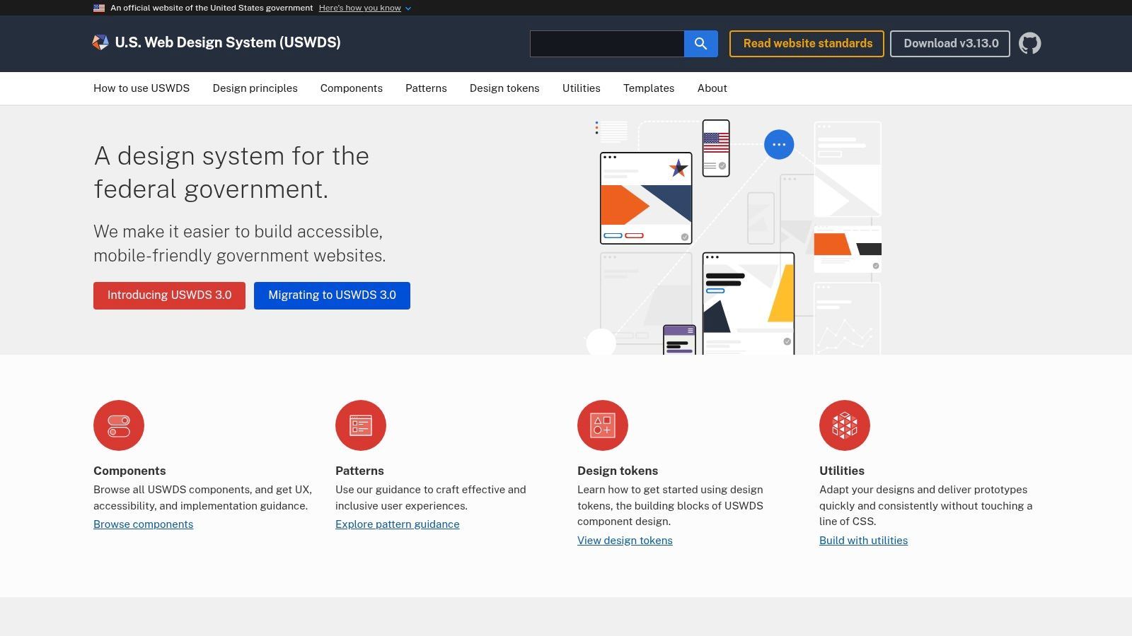
This resource secures its spot on the list of examples of accessible websites because it operationalizes accessibility. Instead of just talking about standards, the USWDS provides the actual, copy-and-paste code for accessible buttons, forms, navigation, and more. It lowers the barrier to entry for creating compliant experiences by doing the heavy lifting for developers.
Strategic Analysis & Actionable Takeaways
The USWDS is built on a foundation of "accessible by default." Each component is designed and tested to meet rigorous standards, giving teams a reliable starting point and saving them from having to reinvent the wheel for every project. This focus on reusable, compliant patterns is a strategic advantage for any organization.
Key Insight: Building accessibility into a design system from the start is the most efficient and scalable way to ensure compliance across an entire digital portfolio. The USWDS proves this model works at a national scale.
Replicable Strategies & Tactical Insights:
- Component-Level Guidance: Every component in the system-from an accordion to a date picker-comes with detailed guidance on its accessibility, user experience considerations, and implementation. This provides teams with a built-in accessibility checklist for each element they use.
- Ready-Made Compliance: The USWDS is aligned with WCAG 2.x and Section 508 requirements out of the box. Teams can use the system's Accessibility Conformance Reports (ACRs) and Voluntary Product Accessibility Templates (VPATs) to simplify their own compliance documentation.
- Accelerate Development: Use the USWDS as a starting point or a reference for your own design system. Even if your branding is different, the underlying HTML structure and ARIA implementations for its components provide a battle-tested foundation that can be adapted to your style.
The U.S. Web Design System is completely free and open source. For organizations that need to build accessible services quickly and reliably, it offers a proven, government-vetted framework that reduces risk and development time simultaneously.
Website:https://designsystem.digital.gov/
3. WordPress.org Themes Directory (Accessibility Ready)
TL;DR: An invaluable resource for anyone building a website on WordPress, offering a filterable catalog of themes that have passed a baseline accessibility review. It provides a vetted starting point for creating accessible websites, saving significant time and reducing initial remediation costs for developers and site owners.
The official WordPress.org Themes Directory is more than just a marketplace; it's a foundational resource for building compliant websites. Its key feature for our purposes is the "Accessibility Ready" tag. This tag isn't just a label; it signifies that a theme has undergone a formal review by the WordPress Theme Review Team to ensure it meets a specific set of accessibility guidelines based on WCAG.
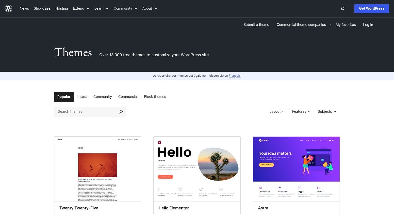
This process makes the directory one of the best practical examples of accessible websites because it curates and promotes accessibility at the source. It empowers users, even those with limited technical knowledge, to start their projects on a solid, accessible foundation. For developers, these themes serve as excellent case studies for implementing accessible code within the WordPress ecosystem.
Strategic Analysis & Actionable Takeaways
The strength of the "Accessibility Ready" directory is its standardization. The review process is transparent, with all requirements detailed in the Theme Handbook. This creates a reliable, albeit baseline, standard that developers can trust and build upon.
Key Insight: Starting with an "Accessibility Ready" theme significantly lowers the barrier to creating a compliant website. It shifts the initial development focus from fixing fundamental issues to so that the content and customizations maintain that accessible standard.
Replicable Strategies & Tactical Insights:
- Audit and Learn: Download several free "Accessibility Ready" themes and audit their code. This is a practical way to learn how experienced developers handle accessible navigation menus, forms, skip links, and ARIA implementation within the WordPress framework.
- Establish a Baseline: Mandate that all new web projects start with an "Accessibility Ready" theme. This simple policy ensures a minimum level of compliance from day one, making it easier to achieve full WCAG AA conformance later. You can learn more about the specifics of WordPress accessibility to build on this foundation.
- Educate Content Creators: An accessible theme is only half the battle. Use the theme's features (e.g., correct heading structures, alt text fields) as a training tool to teach content editors how their work impacts overall site accessibility.
Access to the WordPress.org Themes Directory is completely free. While the tag doesn't guarantee 100% compliance for all content you add, it provides an invaluable and cost-effective head start for any accessibility project.
Website:https://wordpress.org/themes/
4. Deque University
TL;DR: An enterprise-grade paid learning platform offering deep, role-based accessibility training and certification. It stands out for its complete curriculum, structured learning paths, and direct integration with the popular axe testing tools, making it ideal for teams serious about upskilling.
Deque University is a premier destination for structured accessibility education. Unlike open-ended resources, this platform provides a complete curriculum with defined learning paths for developers, designers, QA testers, and content creators. It offers a suite of self-paced courses covering everything from foundational principles to advanced techniques for web, mobile, and document accessibility.
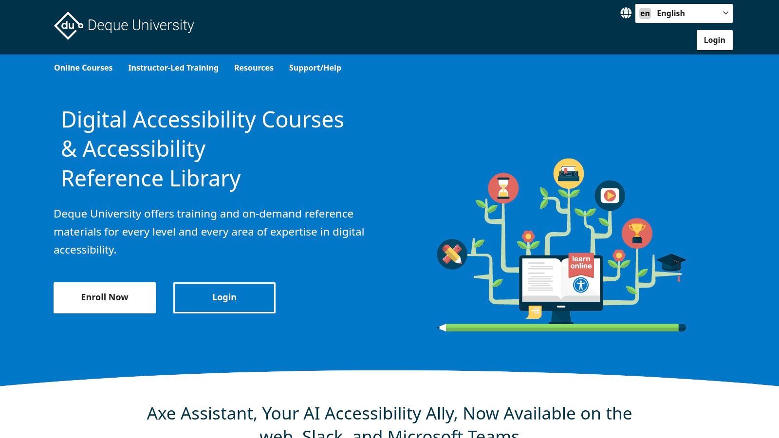
As one of the most solid examples of accessible websites for professional development, its value lies in its depth and connection to industry-standard practices. The platform itself is a model of accessibility, providing a smooth user experience for all learners. Access requires a paid subscription, which is a key differentiator from free community resources.
Strategic Analysis & Actionable Takeaways
Deque University’s core strength is its ability to transform accessibility from an abstract concept into a defined, teachable skill set. By offering courses aligned with IAAP certifications (like CPACC and WAS), it provides a clear path for individuals and teams to build and validate their expertise.
Key Insight: True organizational accessibility maturity requires a systematic, role-specific educational program. Deque University provides the curriculum and structure to implement such a program, moving teams beyond ad-hoc learning to professional competency.
Replicable Strategies & Tactical Insights:
- Role-Based Learning Paths: Adopt this model for your internal training. Instead of a one-size-fits-all approach, provide developers with code-centric courses, designers with UI/UX-focused modules, and content writers with training on semantic structure and alt text.
- Integrate Learning with Tooling: The platform’s courses often reference the axe-core rules engine. This creates a powerful feedback loop where teams learn the theory and then immediately apply it using the same tools they use for automated testing.
- Invest in Certification: Encourage team members to pursue IAAP certifications using Deque University as a primary study resource. This not only builds skills but also creates internal accessibility champions and demonstrates a tangible commitment to compliance and inclusion.
While it is a premium, paid resource, the ROI for organizations committed to building a sustainable accessibility practice is significant. It serves as both a training ground and a continuous-learning resource for keeping skills sharp.
Website:https://dequeuniversity.com/
5. The A11Y Project – Patterns
TL;DR: A community-driven encyclopedia of accessible UI patterns that acts as a quick-reference guide for developers and designers. It provides a vendor-agnostic, curated index of reliable, pre-vetted code examples for common components like accordions, modals, and carousels.
The A11Y Project is a well-respected, open-source initiative aimed at making digital accessibility easier to understand and implement. Its "Patterns" section is not a single website with a unified design but rather a practical, no-nonsense directory. It compiles and links to authoritative, tried-and-tested accessible code implementations for dozens of common user interface components from across the web.
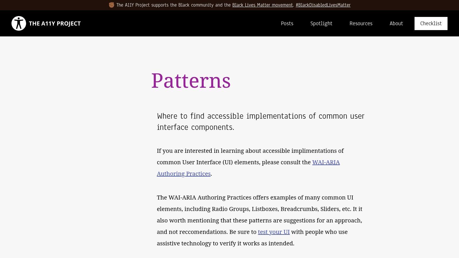
This resource is an essential bookmark for any front-end developer. Instead of reinventing the wheel and potentially introducing accessibility errors, teams can use this as a starting point to find solid, compliant solutions. It serves as one of the best examples of accessible websites because it empowers developers to build their own accessible sites by providing a map to success.
Strategic Analysis & Actionable Takeaways
What makes The A11Y Project's pattern library so valuable is its function as a trusted curator. It saves developers countless hours of searching and vetting by pointing directly to high-quality examples, often from sources like the WAI-ARIA Authoring Practices Guide or Adrian Roselli's extensive work.
Key Insight: Building accessible components from scratch is high-risk and inefficient. A curated library of proven patterns accelerates development and dramatically reduces the likelihood of introducing common accessibility barriers.
Replicable Strategies & Tactical Insights:
- Start with Proven Patterns: Before building a custom component like a tabbed interface or a tooltip, consult this library first. Use the linked, accessible examples as a functional and structural baseline for your own implementation.
- Deconstruct Authoritative Code: Encourage junior developers to explore the linked code examples. By examining how experts apply ARIA roles, states, and properties, they can gain a much deeper, practical understanding of WCAG principles.
- Validate Your Own Components: Use the patterns as a benchmark. If you've already built a component, compare its keyboard interactivity, screen reader output, and semantic structure against the vetted examples in the A11Y Project to identify potential gaps.
The A11Y Project is a completely free, community-maintained resource. It’s the perfect tool for teams who need reliable, code-level guidance without being tied to a specific design system or framework.
Website:https://www.a11yproject.com/patterns/
6. WAI-ARIA Authoring Practices (APG)
TL;DR: The essential W3C specification for building complex, interactive web components. It provides developers with the official design patterns, keyboard interaction models, and example code needed to make widgets like sliders, menus, and tabs fully accessible to assistive technology users.
The WAI-ARIA Authoring Practices Guide (APG) is the definitive technical reference for any developer implementing custom interactive components. Maintained by the W3C, this resource goes beyond the theoretical aspects of WCAG and provides concrete, code-level guidance for creating the dynamic widgets that modern web applications rely on. It is the normative blueprint for ensuring components are solid, operable, and understandable.
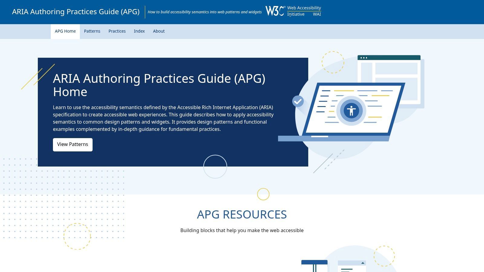
Unlike a typical website, the APG is a living specification that is an instruction manual for accessibility. Its inclusion in a list of examples of accessible websites is due to its foundational role; it provides the patterns that enable other sites to become accessible. It's the "teach a person to fish" resource for accessible development.
Strategic Analysis & Actionable Takeaways
The APG's power lies in its prescriptive and detailed nature. It removes the guesswork from implementing complex ARIA roles by providing standardized patterns that have been vetted by accessibility experts. This is critical for ensuring consistent user experiences across different websites and applications.
Key Insight: Standardizing the behavior of common web widgets (like how arrow keys navigate a menu) is a cornerstone of accessibility. The APG provides this standard, making it an indispensable engineering resource.
Replicable Strategies & Tactical Insights:
- Implement Correct Keyboard Patterns: Use the APG as a checklist for keyboard interactions. For any custom widget, consult its corresponding APG pattern to ensure you've implemented all required key commands (e.g., Arrow Keys, Home, End, Escape).
- Use Example Code: Don't reinvent the wheel. The APG provides functional, accessible code examples for dozens of common design patterns. Adapt this code for your projects to ensure a solid accessibility foundation. Explore this topic more by reading our detailed guide on the WAI-ARIA Authoring Practices.
- Resolve Technical Debates: When development teams are unsure of the correct ARIA implementation for a component, the APG should be the final arbiter. Its guidance provides a clear, standards-based path forward, preventing the implementation of non-standard or incorrect solutions.
The APG is a free public specification from the W3C. While its technical density can be challenging for newcomers, it is an absolutely essential resource for any front-end developer or engineer serious about building truly accessible interactive experiences.
Website:https://www.w3.org/TR/wai-aria-practices/
7. 18F Accessibility Guide (U.S. Federal)
TL;DR: An official U.S. government resource that provides a clear, actionable framework for integrating accessibility into digital service projects. It is an essential guide for teams needing to navigate Section 508 compliance and embed WCAG standards into agile workflows.
The 18F Accessibility Guide is a practical, process-oriented resource created by the U.S. General Services Administration's digital services agency. Rather than being a component library, this guide is a strategic playbook for federal agencies and contractors on how to build accessible digital products from the ground up. It translates complex legal requirements into a straightforward, categorized checklist for development teams.
This focus on policy and process makes it one of the most valuable examples of accessible websites for organizations in regulated industries. It provides a blueprint not just for a single accessible website, but for an entire accessibility-first culture within a project or organization, bridging the gap between developers, designers, and program managers.
Strategic Analysis & Actionable Takeaways
The guide’s strength lies in its pragmatic approach, prioritizing accessibility tasks and integrating them directly into the development lifecycle. It’s built for teams that need to deliver compliant services efficiently, without getting lost in abstract guidelines.
Key Insight: True accessibility isn't achieved with a final audit; it's a continuous practice integrated into every stage of development. The 18F guide provides the operational framework to make this a reality for cross-functional teams.
Replicable Strategies & Tactical Insights:
- Prioritized Checklists: The guide uses an A, B, C categorization for its accessibility checklist, helping teams prioritize the most critical issues first. This is invaluable for managing scope and resources in agile sprints.
- Cross-Functional Guidance: It offers specific advice for different roles, including developers, designers, and product owners. This ensures everyone on the team understands their responsibility in maintaining accessibility standards.
- Section 508 Focus: The content is explicitly tailored to meet U.S. federal requirements. For teams working through this landscape, it’s a critical resource. You can learn more about Section 508 compliance here to understand its importance.
- Pair with a Design System: The guide is designed to be used alongside a solid component library like the U.S. Web Design System (USWDS). Teams can adopt this model by pairing the 18F’s process advice with their own pre-vetted, accessible component libraries.
As a free and open government resource, the 18F Accessibility Guide is an indispensable tool for public sector teams and any private organization seeking a structured, policy-aligned approach to web accessibility.
Accessibility Features Comparison of 7 Websites
| Resource | Implementation Complexity | Resource Requirements | Expected Outcomes | Ideal Use Cases | Key Advantages |
|---|---|---|---|---|---|
| W3C WAI – Before and After Demo (BAD) | Low to moderate; hands-on examples | Minimal; browser and screen reader | Clear understanding of fixes & stakeholder demos | Education, training, stakeholder presentations | Practical, annotated demos; free and open |
| U.S. Web Design System (USWDS) | Moderate; assembling components | Development team with frontend skills | Production-ready accessible components | Government services, regulated workflows | Vetted code; Federal compliance; free open source |
| WordPress.org Themes Directory | Low; theme installation | WordPress environment | Baseline accessibility-ready themes | Quick accessible theme deployment or study | Large theme ecosystem; baseline accessibility |
| Deque University | High; structured courses & practice | Paid subscription; time investment | Proficient accessibility skills & certification | Accessibility professionals seeking depth | In-depth curriculum; certification prep |
| The A11Y Project – Patterns | Low; reference and pattern discovery | None beyond web access | Fast access to proven accessible UI patterns | Developers seeking quick pattern references | Vendor-neutral; curated community content |
| WAI-ARIA Authoring Practices (APG) | High; technical, code-level detail | Engineering expertise required | Precise ARIA widget implementations | Engineers implementing ARIA and keyboard support | Authoritative spec; detailed implementation |
| 18F Accessibility Guide (U.S. Federal) | Low to moderate; checklist and guidance | Cross-functional teams | Compliance with accessibility policies | Government teams managing digital accessibility | Policy-aligned checklists; agile process focus |
From Examples to Action: Your Next Steps in Accessibility
TL;DR: Studying examples of accessible websites like the W3C's BAD project and the U.S. Web Design System reveals that accessibility is a process, not a one-time fix. The core lessons are to use pre-vetted, compliant components, follow established patterns like ARIA Authoring Practices, and encourage a culture of continuous learning. Your next step is to translate this inspiration into a concrete strategy, integrating both foundational knowledge and modern accessibility tools to build and maintain an inclusive digital presence.
Synthesizing the Core Lessons
Exploring these powerful examples of accessible websites and resources has illuminated a clear, unifying theme: proactive, structured accessibility is far more effective than reactive remediation. We've moved beyond abstract concepts to see tangible implementations.
From the W3C's Before and After Demonstration, we learned the direct impact of small code changes on user experience. The U.S. Web Design System and WordPress's "Accessibility Ready" themes taught us the immense value of starting with a compliant foundation, saving countless hours and preventing downstream errors. Similarly, resources like Deque University and The A11Y Project emphasize that accessibility is an ongoing educational journey, not a final destination. The common thread is a commitment to embedding accessibility into the very fabric of the design and development lifecycle.
From Inspiration to Implementation: Your Action Plan
Seeing great accessibility in action is the first step; the true test is applying these lessons to your own digital properties. It’s time to bridge the gap between understanding what works and implementing it effectively. Here’s a structured approach to get started:
Audit Your Foundation: Before building anything new, assess your current digital assets. Use the principles from the WAI-ARIA Authoring Practices (APG) and 18F Accessibility Guide to evaluate your core components. Are your navigation menus, forms, and interactive elements solid and keyboard-navigable?
Choose the Right Building Blocks: When starting new projects, prioritize platforms and frameworks with a proven commitment to accessibility. As you move from understanding accessible website examples to taking action, selecting a suitable platform is important. While focusing on accessibility-ready solutions like WordPress themes, it's also worth exploring various website builder tools for Notion, always keeping in mind the necessity of integrating accessibility best practices.
Establish a System for Governance: Accessibility isn't a single person's job. Implement a governance model that includes automated scanning, manual testing, and regular training for your content, design, and development teams. A complete tool can automate much of this, providing continuous monitoring and actionable reports that keep your team aligned.
The Power of Combining Knowledge with Technology
While manual audits and adherence to best practices are irreplaceable, managing accessibility at scale across multiple web properties is a monumental task. This is where a complete platform becomes an indispensable ally. Modern tools automate repetitive scanning, monitor for regressions, and provide clear, prioritized remediation guidance that empowers your team to fix issues efficiently.
More importantly, they can enhance the user experience directly. An on-site accessibility widget, for instance, can offer users customizable options like contrast adjustments, font scaling, and reading guides. By combining the principles gleaned from the examples of accessible websites in this article with the right technology, you can move from inspiration to a sustainable, long-term compliance strategy that creates a genuinely inclusive experience for every user.
Ready to turn these examples into your reality? WebAbility.io provides an all-in-one platform that automates WCAG and ADA compliance, offering continuous monitoring and a user-facing accessibility widget. Start building a more inclusive web today by seeing how WebAbility.io can simplify your accessibility workflow.
Quick Questions
Tap to ask AI about this article