Your Ultimate Website Accessibility Checklist for 2025

Sidharth Nayyar
TL;DR: This website accessibility checklist provides eight key steps to make your site usable for everyone, including people with disabilities. Key actions include adding alt text to images, ensuring keyboard navigation, checking color contrast, using semantic HTML, labeling forms correctly, creating a responsive design, making videos accessible with captions, and using ARIA for complex elements. Following this guide helps improve user experience and reach a wider audience.
In a digital-first economy, making your website accessible to everyone is not just a legal obligation; it's a strategic imperative for creating an inclusive user experience. A truly accessible website connects you with the 1.3 billion people globally who live with a disability, representing a significant market with substantial spending power. But navigating the complexities of digital compliance can feel overwhelming. Where do you even begin the process?
This comprehensive website accessibility checklist demystifies the path forward, breaking down the most critical components into eight actionable steps. We will move beyond theory and provide a practical roadmap to help you audit and improve your site. From ensuring screen readers can interpret your content to making navigation seamless without a mouse, we'll guide you through the key principles of WCAG and ADA compliance.
Whether you are a developer coding the backend, a designer shaping the user interface, or a business owner focused on growth, this guide offers the tangible insights needed to build a more equitable and effective web presence. By integrating these practices with effective website design tips, you can create a foundation for a site that is both beautiful and universally functional. We'll demonstrate how targeted changes can produce a massive impact, transforming compliance from a technical hurdle into a powerful competitive advantage that enhances your brand and expands your audience.
1. Alternative Text for Images
TL;DR: Alternative text, or "alt text," is a written description of an image that screen readers announce to users with visual impairments. It is a critical element of any website accessibility checklist, ensuring that visual information is accessible to all users and also helping search engines understand your content.
Properly implemented alt text is a cornerstone of digital accessibility. It provides a textual alternative to visual content for users who cannot see it, including individuals using screen readers or those with slow internet connections where images fail to load. This descriptive text is embedded in the HTML <img> tag and should convey the essential information or function of the image within the page's context. Without it, screen reader users hear only "image" or a confusing file name, creating a significant barrier to understanding.
How to Implement Effective Alt Text
Writing meaningful alt text is more of an art than a science, but following best practices ensures clarity and utility. Your goal is to provide the same level of understanding that a sighted user would get from the image.
Be Specific and Concise: Describe what’s happening in the image. Instead of
alt="dog", a better description would bealt="A golden retriever catching a red frisbee in a sunny park."This paints a much clearer picture.Context is Key: The same image might need different alt text depending on the surrounding content. If an image of a chart is used to show a specific data point mentioned in the text, the alt text should highlight that data.
Include Text from Images: If an image contains important text, such as a headline or a call-to-action on a banner, that text must be included in the alt attribute.
Identify Functional Images: For images that act as links or buttons, the alt text should describe the action or destination, not the image itself. For example, use
alt="Read our full accessibility guide"for an image link, notalt="Icon of a book."
Key Insight: A simple test for effective alt text is to read it aloud to someone who cannot see the image. If they can accurately describe the image's purpose and content, your alt text is successful.
Handling Decorative Images
Not all images require a detailed description. If an image is purely for decoration, like a stylistic border or an abstract background pattern, it should have a null (empty) alt attribute: alt="". This signals to screen readers that the image is not content-critical and can be safely ignored, preventing unnecessary auditory clutter for the user. Leaving the alt attribute off entirely is incorrect; an empty alt is the proper way to handle decorative visuals.
2. Keyboard Navigation Support
TL;DR: Keyboard navigation allows users to access and operate all interactive elements on a website using only a keyboard, without needing a mouse. This capability is essential for users with motor disabilities and blind users who rely on screen readers, making it a non-negotiable part of any comprehensive website accessibility checklist.
Robust keyboard support is a fundamental pillar of an accessible web. It ensures that individuals who cannot use a mouse, whether due to a permanent physical disability, a temporary injury, or simply user preference, can still navigate and interact with all of your site's features. This includes accessing links, activating buttons, filling out forms, and using complex widgets like menus and sliders. A site that is fully keyboard-operable provides a truly equitable experience, allowing every user to access its full functionality.

How to Implement Effective Keyboard Navigation
Achieving full keyboard accessibility involves both using correct coding practices and conducting thorough manual testing. The goal is to create a logical and intuitive navigation path that mirrors the visual layout of the page.
Ensure Logical Tab Order: The order in which interactive elements receive focus when a user presses the
Tabkey must be logical and predictable, typically following the visual reading order (left-to-right, top-to-bottom).Create Visible Focus Indicators: When an element is selected via the keyboard, it must have a highly visible outline or "focus indicator." This visual cue is crucial for sighted keyboard users to know where they are on the page.
Implement "Skip to Main Content" Links: For pages with extensive navigation menus, a "skip link" should be the first focusable element. This allows users to bypass repetitive navigation and jump directly to the primary content of the page.
Manage Focus in Interactive Components: Complex components like modal dialogs, drop-down menus, and pop-ups must "trap" the keyboard focus within them until they are closed. Upon closing, focus should be returned to the element that originally triggered the component.
Key Insight: The simplest way to begin testing for keyboard accessibility is to unplug your mouse. Try to navigate your entire website using only the
Tab,Shift+Tab,Enter,Spacebar, and arrow keys. If you get stuck or cannot perform an action, you've found an accessibility barrier.
Using Semantic HTML
The most effective way to ensure built-in keyboard support is to use semantic HTML elements for their intended purpose. Elements like <button>, <a>, and <input> have keyboard accessibility baked in by default, whereas generic elements like <div> or <span> do not. When building interactive components, always start with the correct semantic element to avoid having to re-implement keyboard functionality from scratch. For more details on implementation, you can learn more about keyboard navigation support on WebAbility.io.
3. Color Contrast Ratios
TL;DR: Color contrast is the difference in light between the foreground text and its background. Meeting minimum contrast ratios, as defined by WCAG, is essential for readability and a cornerstone of any comprehensive website accessibility checklist, ensuring content is legible for users with low vision or color blindness.
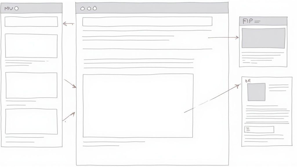
Proper color contrast ensures that everyone, including people with visual impairments like low vision and color blindness, can read the text on your website. The Web Content Accessibility Guidelines (WCAG) provide specific ratios to follow: Level AA, the most common standard, requires a contrast ratio of at least 4.5:1 for normal text and 3:1 for large text (18pt/24px or 14pt/19px bold). Adhering to these standards makes content more readable for all users, including those viewing screens in bright sunlight.
How to Implement Effective Color Contrast
Integrating accessible color choices from the start of the design process is far more efficient than correcting them later. Modern design systems like Google's Material Design and IBM's Carbon Design System build accessible color palettes directly into their frameworks, making compliance easier.
Use Contrast Checking Tools: Leverage tools like Webability's Contrast Checker or integrated plugins like Stark during the design and development phases. These tools allow you to input your foreground and background colors to instantly see if they pass WCAG standards.
Avoid Common Pitfalls: Light gray text on a white background is one of the most frequent accessibility failures. A color like
#767676is often the lightest gray that meets the 4.5:1 ratio on a white background for normal-sized text. Pay close attention to placeholder text, disabled buttons, and link colors, as these are often overlooked.Document Approved Palettes: Create and document a set of approved, high-contrast color combinations for your brand's design system. This provides a clear guide for designers and developers, ensuring consistency and compliance across all digital assets.
Test in Grayscale: A simple way to check if your design relies too heavily on color is to view it in grayscale. If text and interactive elements are still clearly distinguishable, your contrast is likely robust. To learn more about the specifics, you can explore detailed guides on Color Contrast Ratios on webability.io.
Key Insight: Don't just rely on design software simulations. Test your color combinations on a variety of actual devices and in different lighting conditions, from a dimly lit room to bright sunshine, to understand the real-world user experience.
4. Semantic HTML Structure
TL;DR: Semantic HTML involves using tags that describe the meaning and purpose of the content they contain, such as <header>, <nav>, and <main>. This provides a clear, logical structure that assistive technologies rely on to help users navigate and understand your website's layout and content flow.
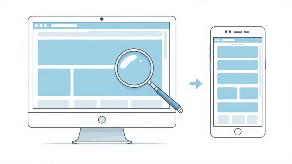
Using semantic HTML is like providing a well-labeled map for your website. Instead of relying on generic <div> and <span> tags for everything, semantic elements give inherent meaning to your content. This structure is invisible to most sighted users but is fundamental to how screen readers and other assistive devices interpret and present a webpage, making it an essential part of any comprehensive website accessibility checklist. A logical document outline allows users to easily jump between key sections like the main content, navigation, or footer without having to listen to the entire page.
How to Implement a Semantic Structure
Building a solid semantic foundation involves choosing the right HTML element for the right job. Your goal is to create a predictable and easily navigable experience for all users by defining clear landmarks and a logical content hierarchy.
Define Page Landmarks: Use elements like
<header>,<footer>,<nav>, and<main>to demarcate the major regions of your page. Ensure you use only one<main>element per page to clearly identify the primary content area.Establish a Logical Outline: Structure your content with heading tags (
<h1>through<h6>) in a sequential, hierarchical order. Never skip heading levels (e.g., going from an<h2>to an<h4>) as this can disorient users of assistive technology.Distinguish Actions from Links: Use the
<button>element for actions that occur on the current page, such as submitting a form or opening a modal. Use the<a>(anchor) tag exclusively for navigation to another page or resource.Use Lists for List Content: Employ
<ol>for ordered lists,<ul>for unordered lists, and<dl>for definition lists. This helps screen readers announce the number of items in a list, giving users context.
Key Insight: A quick way to test your site's structure is to use a browser extension that visualizes your document outline based on heading levels. If the outline is illogical or confusing, users with screen readers will likely face the same challenges.
Differentiating Multiple Landmarks
On complex pages, you might have multiple navigation regions, such as a main site menu and a secondary breadcrumb trail. In these cases, it's crucial to provide unique, descriptive labels to help users distinguish between them. You can use the aria-label attribute to achieve this. For example, a primary navigation bar would be <nav aria-label="Main menu"> while breadcrumbs could be implemented as <nav aria-label="Breadcrumb">. This small addition provides immense clarity for screen reader users trying to understand the page layout.
5. Form Labels and Instructions
TL;DR: Accessible forms require clear, programmatically associated labels for every input field. These labels, along with helpful instructions and error messages, ensure users of all abilities can understand and successfully complete forms, a crucial part of any comprehensive website accessibility checklist.
Forms are the primary way users interact with a website, from signing up for a newsletter to making a purchase. An inaccessible form creates a dead end for users with disabilities. Accessible forms ensure every input field has a visible, programmatically linked label using the HTML <label> element. This connection allows screen readers to announce the purpose of each field as a user navigates, preventing confusion and frustration.
Proper labeling is a fundamental requirement of digital accessibility. It provides a persistent, clear description of the information needed for each field. Without it, users relying on assistive technologies may have no idea what to enter, making the form unusable. This principle extends to providing clear instructions, marking required fields explicitly, and offering helpful, easy-to-understand error feedback.
How to Implement Accessible Forms
Building an accessible form means thinking about the user experience from every angle. Following best practices ensures that your forms are robust, intuitive, and usable by everyone.
Programmatically Link Labels: The most crucial step is to explicitly associate each label with its input. Use the
forattribute on the<label>element, matching it to theidattribute of the<input>element (e.g.,<label for="email">Email</label><input type="email" id="email">).Provide Clear Instructions: For complex forms, offer instructions at the beginning. For individual fields requiring a specific format, use helper text associated with the input via
aria-describedby.Indicate Required Fields Explicitly: Don't rely solely on a color or an asterisk (*) to mark required fields. Include the text "(required)" within the label itself to ensure all users understand which fields are mandatory.
Deliver Helpful Error Messages: When a user makes a mistake, the error message should be specific, identify the field in question, and explain how to fix the issue. For example, instead of "Invalid input," use "Please enter a valid email address."
Key Insight: Never use placeholder text as a substitute for a
<label>. Placeholder text disappears as soon as a user starts typing, which forces them to rely on memory. This can be particularly challenging for users with cognitive or memory-related disabilities.
Handling Validation and Error Recovery
Accessible forms must guide users smoothly through the process of correcting mistakes. When a form submission fails, summarize the errors at the top of the form and provide links that jump the user directly to the corresponding fields.
For real-time validation, ensure feedback is announced by screen readers. Using aria-live regions or associating error messages programmatically with the aria-describedby attribute helps inform users of issues as they happen. This proactive approach creates a less frustrating and more efficient experience, reflecting a well-thought-out accessibility strategy.
6. Responsive and Zoom-Friendly Design
TL;DR: A responsive and zoom-friendly design ensures your website's content reflows and remains fully functional when users magnify the view up to 200% or access it on different screen sizes. This is a crucial part of any website accessibility checklist, accommodating users with low vision, mobile device users, and anyone who prefers customized text sizes.
A website that is not responsive creates significant barriers. Users with visual impairments often rely on browser zoom to enlarge text, and if the layout breaks or forces horizontal scrolling, the content becomes difficult or impossible to read. Similarly, content must adapt seamlessly from a large desktop monitor to a small smartphone screen. Adopting mobile-first design principles is a great strategy that inherently supports responsiveness, ensuring a solid foundation for accessibility. A truly accessible design respects the user's viewing preferences without sacrificing functionality or readability.

How to Implement a Responsive and Zoom-Friendly Layout
Building a flexible layout requires a modern approach to CSS and a commitment to testing across various viewports and zoom levels. The goal is to create a fluid experience where content adapts to the user's environment, not the other way around.
Use Relative Units: Define font sizes and spacing using relative units like
remoreminstead of fixed pixels (px). This allows text and layout elements to scale proportionally when a user zooms.Set the Viewport Meta Tag: Include
<meta name="viewport" content="width=device-width, initial-scale=1">in your HTML<head>. This tag tells browsers how to control the page's dimensions and scaling, which is fundamental for mobile responsiveness.Embrace Flexible Containers: Avoid fixed-width elements that can cause content to overflow. Instead, use properties like
max-width: 100%for images and containers to ensure they never exceed the width of their parent element.Leverage Modern CSS: Use CSS Grid and Flexbox to create layouts that are inherently flexible and can intelligently reorder content based on available space. This is far more robust than older, float-based techniques.
Key Insight: The best way to test for true responsiveness is to use your browser's zoom feature (Ctrl/Cmd +) to 200%. If you have to scroll horizontally to read sentences, your layout needs reflowing. This simple test reveals issues that device emulation can miss.
Testing for Different Orientations and Devices
Responsiveness goes beyond just shrinking a desktop site. It includes ensuring usability in both portrait and landscape orientations on mobile devices. All interactive elements, like buttons and links, must remain easily tappable and functional regardless of screen size or orientation. Remember that a user might zoom in on a form on their phone; the input fields and submit button must remain visible and usable without frustrating panning. Testing on actual physical devices is always superior to relying solely on browser emulators, as it uncovers real-world interaction issues.
7. Video and Audio Accessibility
TL;DR: Multimedia content like videos and audio must have accessible alternatives, such as captions, audio descriptions, and transcripts. This ensures that users with hearing or visual impairments can understand the content, a crucial step in a comprehensive website accessibility checklist.
As video and audio become dominant forms of online content, ensuring they are accessible to everyone is non-negotiable. Without proper alternatives, users who are deaf, hard of hearing, or blind are completely excluded. Accessible multimedia involves providing synchronized captions for audio dialogue, audio descriptions for important visual information, and a full text transcript for both video and audio-only content. This multi-layered approach guarantees that no user is left behind due to the format of the information.
How to Implement Accessible Multimedia
Creating accessible media requires more than just uploading a file. It involves building in features that cater to diverse user needs, ensuring the core message is conveyed to all audiences.
Provide Synchronized Captions: Captions are a text version of the audio content, synchronized with the video. They must include spoken dialogue, speaker identification, and non-speech sounds critical to understanding, like
[applause]or[door slams]. Use the WebVTT format (.vttfile) with the HTML5<track>element for broad compatibility.Create Audio Descriptions: For content where visuals are essential to the narrative, an audio description track is needed. This is a separate narration that describes key visual elements, such as actions, characters, and on-screen text, during natural pauses in the dialogue.
Offer Full Transcripts: A transcript is a complete text version of all audio content, including dialogue and sound effects. Placing it as HTML text on the same page as the media player makes it searchable and easily accessible to screen readers and other assistive technologies.
Ensure Player Accessibility: The media player itself must be accessible. All controls, like play, pause, volume, and caption settings, must be fully operable using only a keyboard.
Key Insight: Transcripts benefit more than just users with disabilities. They improve SEO by making your video content crawlable by search engines and provide a convenient way for all users to quickly scan or reference the material.
Best Practices for Captions and Transcripts
Simply providing captions isn't enough; their quality and usability matter. Auto-generated captions, like those from YouTube, are a good starting point but almost always require manual review and correction for accuracy in spelling, punctuation, and timing.
For audio-only content like podcasts, a searchable transcript is the most critical accessibility feature. Including timestamps in the transcript allows users to easily navigate to specific points in the audio. Learn more about the nuances of video and audio accessibility on webability.io to ensure your multimedia content is truly inclusive.
8. ARIA Landmarks and Roles
TL;DR: ARIA (Accessible Rich Internet Applications) attributes add context to your HTML, helping screen readers understand the purpose and structure of your content. Using ARIA landmarks and roles is a key part of any website accessibility checklist, especially for navigating complex layouts and dynamic web applications.
ARIA enhances standard HTML by providing additional semantic information to assistive technologies. It acts as a guide for screen reader users, defining distinct regions of a page (landmarks like <nav> or <main>) and clarifying the purpose of custom interactive elements (roles like tab or dialog). While native HTML5 elements should always be the first choice, ARIA is crucial for making custom components and dynamic content understandable and navigable for all users.
How to Implement ARIA Effectively
Proper ARIA implementation requires understanding its purpose: to fill the accessibility gaps left by standard HTML. The first rule of ARIA is to not use it if a native HTML element already provides the needed semantics. When you do need it, precision is essential.
Define Page Structure with Landmarks: Use ARIA landmark roles like
role="banner"(for the site header),role="navigation",role="main", androle="contentinfo"(for the footer). These allow screen reader users to quickly jump between major sections of your site.Describe Custom Widgets with Roles: If you build a custom component that behaves like a standard widget, such as a set of tabs or an accordion, use ARIA roles (
role="tablist",role="tab",role="tabpanel") to communicate its function to assistive technology.Communicate States and Properties: Use ARIA attributes like
aria-expanded="true/false"to indicate whether a collapsible section is open or closed, oraria-selected="true"to show which tab is active. These dynamic properties are vital for user interaction.Manage Live Updates: For content that updates without a page reload (like notifications or chat messages), use
aria-live="polite"to have screen readers announce the change without interrupting the user. Usearia-live="assertive"only for urgent alerts.
Key Insight: Never override the default semantics of a native HTML element. For example, do not add
role="button"to an<h1>tag. This creates a confusing and unpredictable experience for users of assistive technology.
When to Use ARIA
ARIA should be your go-to solution when native HTML falls short. It is not a replacement for well-structured, semantic HTML but rather a powerful extension for modern web applications. Use ARIA for complex, JavaScript-powered components like custom dropdown menus, sliders, and modal dialogs where the default browser behavior doesn't provide enough information. Always consult the WAI-ARIA Authoring Practices Guide (APG) for established patterns and test your implementation with actual screen readers like NVDA, JAWS, and VoiceOver to ensure it works as intended.
Website Accessibility Checklist Comparison
| Item | Implementation Complexity | Resource Requirements | Expected Outcomes | Ideal Use Cases | Key Advantages |
|---|---|---|---|---|---|
| Alternative Text for Images | Low to Moderate (writing concise descriptions) | Time for writing and maintaining alt text | Improved accessibility for visually impaired users; SEO enhancement | Images on websites with meaningful visual content | Enables screen reader access; aids SEO; fallback if image fails |
| Keyboard Navigation Support | Moderate to High (especially custom widgets) | Development time, ongoing testing | Full keyboard operability; enhanced usability for motor-impaired users | Interactive websites, web applications | Essential for keyboard-only users; reveals usability issues |
| Color Contrast Ratios | Low to Moderate (design and testing phase) | Design resources; contrast checking tools | Better readability for low-vision users; fewer WCAG violations | All textual and interactive UI elements | Improves text legibility; benefits color-blind users |
| Semantic HTML Structure | Moderate (knowledge and refactoring needed) | Developer training; code auditing | Enhanced screen reader navigation; better SEO; maintainable code | Websites needing strong structural accessibility | Logical content outline; native keyboard support |
| Form Labels and Instructions | Moderate (design and implementation effort) | UX design; accessibility expertise | Clear form usability; reduced errors and abandonment | Forms with inputs requiring user data | Improves screen reader clarity; reduces user confusion |
| Responsive and Zoom-Friendly Design | Moderate to High (CSS complexity, testing) | Design and testing on multiple devices | Usable content at 200% zoom; adaptable layouts across devices | Mobile and low-vision users needing zoom or flexible layouts | Enhances usability on mobile and zoomed views; future-proof design |
| Video and Audio Accessibility | High (media captioning, transcription needed) | Time and cost for captioning, descriptions | Accessible multimedia; compliance with legal standards | Video/audio content for wide audience | Enables deaf/blind users access; SEO benefits; legal compliance |
| ARIA Landmarks and Roles | High (expertise and careful implementation) | Accessibility expertise; thorough testing | Accessible custom widgets; dynamic content announcements | Complex apps needing enhanced semantics beyond HTML | Enables access for complex UIs; dynamic content support |
From Checklist to Commitment: Making Accessibility an Ongoing Practice
You have navigated through the essential components of a robust website accessibility checklist, covering everything from alt text and keyboard navigation to semantic HTML and ARIA landmarks. Completing this audit is a significant and commendable achievement. It represents a critical first step toward creating a more inclusive digital experience and demonstrates a tangible commitment to serving every user, regardless of their abilities.
However, the journey to true digital inclusion doesn't end when the last box is ticked. Think of this checklist not as a final exam, but as a foundational course. The digital world is dynamic; your website is a living entity. New content is added, features are updated, and third-party integrations are introduced. Each change carries the potential to erect new barriers if accessibility isn't kept at the forefront of your strategy.
Shifting from a Project to a Process
The most impactful takeaway is the need to shift from a one-time "accessibility project" to an ongoing "accessibility process." This cultural and operational evolution is where sustainable compliance and genuine user-centric design are born. It means embedding the principles from this checklist into the very DNA of your workflow.
Design Phase: Your UI/UX designers should be validating color contrast ratios and planning for logical focus order before a single line of code is written.
Development Sprints: Developers must prioritize writing semantic HTML, implementing correct ARIA roles, and ensuring all interactive elements are keyboard-accessible as a standard practice, not an afterthought.
Content Management: Content creators need to be trained and equipped to provide meaningful alt text for images and add captions to videos as part of their regular publishing routine.
Quality Assurance: QA testing must include both automated scans and manual testing with assistive technologies, such as screen readers, to catch issues that automated tools might miss.
This proactive stance transforms accessibility from a reactive, often costly, remediation effort into a proactive, value-adding practice. By integrating these checks into your daily operations, you ensure that your website doesn't just become accessible-it stays accessible.
The Lasting Impact of an Accessible-First Mindset
Adopting an accessible-first mindset delivers benefits that extend far beyond compliance. A website built on the principles of accessibility is inherently more usable for everyone. Clear navigation, logical structure, and readable content enhance the user experience for people with temporary disabilities (like a broken arm), situational limitations (like using a screen in bright sunlight), and even those on slow internet connections. It also directly contributes to better SEO, as search engine crawlers rely on many of the same structural cues-like proper heading hierarchy and descriptive alt text-that assistive technologies use.
Ultimately, mastering the concepts in this website accessibility checklist is about more than avoiding legal risks or meeting regulatory standards. It’s about building a better, more effective, and more humane digital presence. It's about recognizing that a quarter of the global population experiences some form of disability and choosing to actively include them. By committing to this ongoing practice, you are not just improving a website; you are fostering a more equitable digital world, one user experience at a time.
Ready to move beyond a static checklist and embed accessibility into your daily operations? WebAbility.io offers an end-to-end platform with 24/7 automated scanning, real-time monitoring, and a powerful AI-enhanced accessibility widget to make continuous compliance manageable and effective. Start your free trial at WebAbility.io and transform your commitment to accessibility into a sustainable reality.
Quick Questions
Tap to ask AI about this article