Boost UX with a Website Accessibility Checker

Sidharth Nayyar
If you are reading this because a site feels hard to read, the problem is familiar. You zoom in, the menu shifts, a product card wraps awkwardly, and the text is still not comfortable. That small moment matters more than many teams realize.
I see this often when demonstrating accessibility to business owners. I start by increasing text size the way a real visitor would. In some cases, the page responds cleanly. In others, the layout fights back. That difference is not cosmetic. It affects whether someone can browse, compare, and complete a task without friction.
A website accessibility checker helps expose part of that gap. It can catch technical issues that make readability worse, and it gives teams a practical starting point for improving the experience site-wide.
Your Quick Guide to Better Readability
TLDR
- Need bigger text right now on desktop Chrome? Press Ctrl + on Windows or Cmd + on Mac.
- Need to reset the page? Press Ctrl 0 or Cmd 0.
- Want more control? Use Chrome’s Page zoom, Font size, or Minimum font size settings.
- Browsing on a site with an accessibility widget? Use it. Tools for text scaling, spacing, and contrast can make reading faster and more comfortable without changing your whole browser.
- Own the website? User-side adjustments help, but they do not replace accessible design. You still need a website accessibility checker, manual review, and a durable fix process.
Small text usually shows up at the worst time. A visitor is comparing plans, reading shipping details, filling in a form, or trying to understand a return policy. If they have to squint, zoom, or lean into the screen, readability has already become a usability problem.
That experience is widespread because the underlying issue is widespread. The 2024 WebAIM Million analysis found that 96.3% of homepages had detectable WCAG failures, with an average of 56.8 accessibility errors per page, and low-contrast text appeared on 81% of pages (WebAIM statistics summary). Readability is not a niche concern. It is one of the most common ways the web fails people.
What the user feels and what the business should notice
When a visitor increases text size, they are not asking for a special favor. They are trying to finish a task. That might be reading a product description, reviewing a pricing table, or confirming a booking.
For the business, that same moment is a signal. If the site becomes easier to use when text is larger, then text controls, scalable layouts, and readable content are part of conversion work, not just compliance work.
If your team is reviewing copy, design systems, or templates, it helps to ground those discussions in readable content rather than treating font size as a purely visual choice.
The practical mindset
A browser shortcut can help a single visitor in seconds. A site-wide accessibility approach helps every visitor who lands after them.
That is the right frame for the rest of this topic. Start with immediate user control. Then fix the design and code patterns that made the adjustment necessary in the first place.
How to Increase Text Size in Desktop Chrome
The fastest fix in Chrome is zoom. It takes one second, and for many pages it is enough.
For repeated use, Chrome also gives you more precise controls. Those controls behave differently, which matters when you are trying to read text without blowing up every element on the page.
Use the keyboard first
These shortcuts work immediately:
- Zoom in with Ctrl + on Windows or Cmd + on Mac
- Zoom out with Ctrl - on Windows or Cmd - on Mac
- Reset to default with Ctrl 0 on Windows or Cmd 0 on Mac
This method changes the whole page. Text, images, form fields, cards, and navigation all scale together.
That can be useful on visually dense pages. It can also create side effects on poorly built layouts, especially when containers have fixed widths or text is forced into small spaces.
A quick visual demo helps if you want to see the controls in action.
Change Page zoom in Chrome settings
If you prefer a persistent browser setting, use Chrome’s built-in zoom control.
- Open Chrome
- Click the three-dot menu
- Go to Settings
- Open Appearance
- Find Page zoom
- Choose the zoom level you prefer
Page zoom scales the entire page by default on sites you visit afterward. For many users, this is the simplest long-term improvement.
Here is the trade-off:
| Setting | What it changes | Best for |
|---|---|---|
| Page zoom | Text and interface elements | General readability across most sites |
| Keyboard zoom | Temporary page scaling | Quick one-off adjustments |
| Reset zoom | Returns the page to default | Pages that become cramped or misaligned |
Change Font size instead of everything else
Sometimes you want larger text, but you do not want buttons, images, and spacing to grow at the same rate. That is where Font size helps.
In Chrome:
- Open Settings
- Choose Appearance
- Locate Font size
- Select a larger option
This affects text rendering more directly than page zoom. On text-heavy sites, it can feel cleaner because it targets the part where you struggle.
It is not perfect. Some sites use styles that limit how much browser font settings can help. If a page relies on rigid CSS, the browser can only do so much.
Tip
If a site gets easier to read with browser font settings but starts to look awkward, the page is telling you something about how it was built. That is useful feedback for the site owner, not user error.
Use Minimum font size for stubborn websites
This is the setting many people never discover, and it is one of the most useful.
Minimum font size tells Chrome not to render text below a size you choose. It acts as a floor. If a site tries to display very small body text, captions, or labels, Chrome can override that.
To find it:
- Open Chrome Settings
- Search for Customize fonts
- Open that panel
- Look for Minimum font size
- Increase it gradually until reading feels comfortable
This setting helps on websites that insist on tiny supporting text. It is especially practical on long-form content, product pages, and interfaces with low-priority labels that end up unreadable.
Which method should you use
Different problems call for different controls.
- If you need a quick fix: use keyboard zoom.
- If most websites feel too small: adjust Page zoom in settings.
- If text is the problem but layout is mostly fine: try Font size.
- If specific sites keep shrinking text too far: use Minimum font size.
For business owners, this part matters for another reason. If many visitors need browser-level workarounds just to read your content, the site itself needs attention. A website accessibility checker will catch some technical causes, but readable interfaces also depend on layout choices, component behavior, and testing with enlarged text.
Adjusting Text Size on Your Mobile Device
On mobile, people usually do not start in Chrome settings. They start at the operating system level. That is the better path because it can improve readability across apps, not just inside one browser tab.
I recommend that businesses test this the same way users do. Increase text on a real phone, open the site, and try common tasks. Read the navigation. Open a product page. Fill a form. You learn very quickly whether the interface respects user preferences.
On Android
Android devices usually place text controls under display settings. The wording varies a little by manufacturer, but the path is similar.
Try this:
- Open Settings
- Tap Display or Display size and text
- Select Font size
- Move the slider until text is easier to read
Some Android devices also include a Display size control. That scales more of the interface, not just text. If a page still feels cramped after increasing font size, that broader display setting can help.
Chrome on Android often reflects these system preferences. That makes it a practical test for websites, because many visitors are not hunting for browser-specific accessibility controls. They expect the phone setting they already use to work.
On iPhone and iPad
Apple gives users a couple of paths depending on how much control they want.
The common route is:
- Open Settings
- Tap Display & Brightness
- Choose Text Size
- Move the slider to the size you prefer
There is also a dedicated accessibility path:
- Open Settings
- Tap Accessibility
- Select Display & Text Size
- Adjust related text options there
Apps that support Dynamic Type can respond well to these settings, including browsing contexts where text respects the system preference.
What businesses should test on mobile
A readable mobile site is not just one with larger letters. It is one that still works after text grows.
Look for these failure patterns:
- Navigation labels wrapping badly
- Buttons losing readable text
- Form labels colliding with fields
- Price or plan cards breaking into awkward stacks
If your team works on mobile UX regularly, this guide to web accessibility for mobile devices best practices is a useful next read because mobile text scaling problems usually show up alongside tap target, spacing, and orientation issues.
Practical check
Increase text on a phone before every release review. It takes little effort and catches problems that static desktop previews miss.
The user-side and site-side view
On mobile, user settings are powerful. They are also not enough on their own.
If the site was built with inflexible components, enlarged text exposes the weakness quickly. That is why a mobile-friendly accessibility process should include both user testing with larger text and a website accessibility checker as part of QA, especially for templates that repeat across many pages.
Beyond Browser Settings with Extensions and Widgets
I often show this to business owners on a live product page. I increase the text until I can read comfortably, then try to compare plans, open a menu, and reach the cart. That small exercise makes the point fast. Personal controls help me read, but the site still has to hold together when text gets larger.
Where browser extensions help
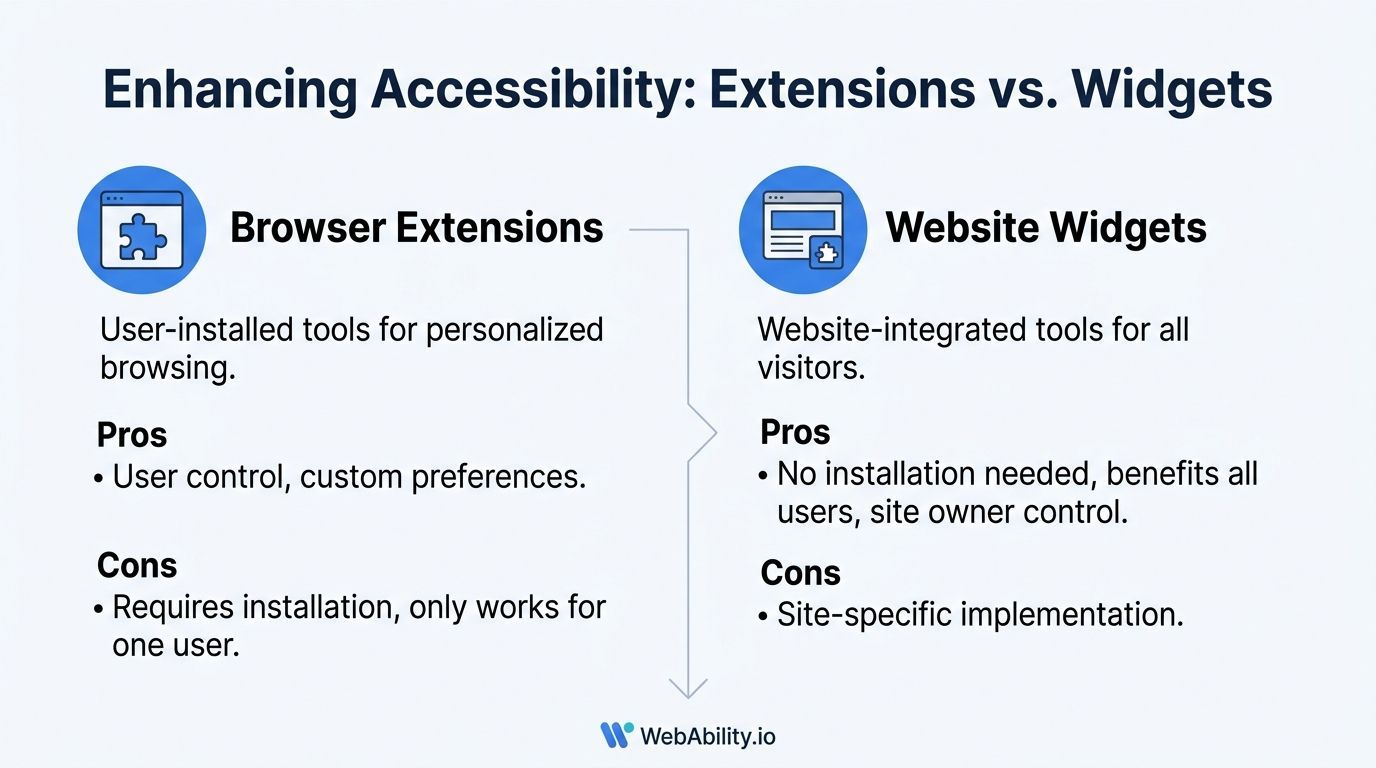
Browser extensions serve the individual user. They travel with that person across sites in the browser where they are installed, which makes them useful for people who want a consistent reading setup.
Typical controls include:
- Text scaling for pages that still feel too small
- Contrast adjustments for hard-to-read color combinations
- Font changes for users who read better with different letterforms
- Reading aids such as screen masking or focus support
That control is valuable. It is also limited to the person who installed the tool, on the device and browser where they use it.
Why site widgets matter to business owners
A site widget gives visitors those controls without asking them to install anything first. That matters on high-intent pages where people want to read, choose, and act quickly.
Useful widgets usually include text size, spacing, contrast, and similar reading adjustments. Some also remember preferences for return visits, which removes repeat effort for users who need the same setup every time.
For a business owner, the trade-off is straightforward. A widget improves access at the moment of need, but it does not replace design and code work underneath. If enlarged text still clips in buttons or breaks a pricing table, the control exposed the weakness. It did not create it.
Extensions and widgets work differently
| Option | Who controls it | Where it works | Typical use |
|---|---|---|---|
| Browser extension | The user | Across that user’s browser | Personalized browsing preferences |
| Website widget | The site owner provides it, the visitor uses it | On that specific website | Immediate access to reading and interaction controls |
Teams often treat this as a choice between one or the other. In practice, they solve different parts of the problem. A user may already rely on browser-level adjustments and still need the site to offer readable defaults and quick on-page controls.
That complementary view matters. User-side tools protect personal comfort. Site-side tools show that the business expected real people to arrive with different reading needs.
Effective strategies
The strongest approach combines visitor controls with site-wide accessibility work. If you are comparing options, this roundup of web accessibility widgets for 2025 is a practical reference point.
WebAbility.io is one example in this category. It combines a user-facing widget with scanning, monitoring, reporting, and workflow features so teams can support visitors directly while also managing broader accessibility work across the site.
Text controls also need to sit inside the wider visual system. Choices around contrast, spacing, and hierarchy affect readability long before a user opens a widget, which is why design teams should understand the power of color in web design as part of accessibility work, not as a separate branding discussion.
Key takeaway
User-side adjustments and site-side accessibility work solve different problems. People need both.
Best Practices for Accessible Text on Websites
Readable text starts in design and ends in implementation. If either side gets careless, users feel it quickly.
For developers and site owners, a website accessibility checker is useful, but it should sit inside a broader text strategy. Readability problems often come from component decisions, rigid CSS, weak contrast choices, or text that expands badly under zoom.
Build text to scale
If text can only look correct at one exact size, the site is fragile.
A better baseline includes:
- Relative units like
remoreminstead of hard-coded pixel thinking - Flexible containers that allow text to wrap without clipping
- Enough line height and spacing so enlarged text remains readable
- Content patterns that avoid squeezing labels into tiny interface elements
These choices make browser zoom and user preference changes less likely to break the layout.
Use a checker for what it does well
A website accessibility checker is good at spotting repeatable technical issues. For text, that often includes low contrast, structural heading problems, empty controls, and markup patterns that create barriers at scale.
It is especially useful in recurring templates. If a text contrast issue exists in a card component or callout style, the checker can help teams find where that pattern repeats.
But teams should avoid treating a clean scan as proof that the reading experience is solid. Context still matters. So does manual review with enlarged text, keyboard navigation, and actual task testing.
Keep standards current
Teams also need to watch their standard coverage. The European Accessibility Act deadline has passed, and WCAG 2.2 adds new criteria. Relying on outdated tooling creates risk, especially when a checker does not scan for newer success criteria such as Focus Not Obscured (2.4.11) (WCAG 2.2 and EAA update).
That point matters beyond legal alignment. If your toolset is behind, your team can miss issues introduced by modern interfaces, especially dynamic components and application-style experiences.
Readability is not just font size
Color decisions shape readability as much as typography does. Designers working on brand systems should think about text contrast early, not as a cleanup task after launch. This overview of the power of color in web design is useful because it connects visual identity choices to how people perceive and use interfaces.
A practical operating model
For many teams, the strongest setup looks like this:
- Scan regularly with a website accessibility checker to catch recurring issues.
- Review designs and components manually with zoomed text and keyboard use.
- Test real flows like search, signup, pricing review, and checkout.
- Give visitors adjustment tools so they can tailor the reading experience when they arrive.
That mix is what keeps accessible text from becoming a one-time remediation project.
Troubleshooting Common Text Readability Problems
When text gets bigger and the page starts misbehaving, the cause is usually in the site build, not in the user’s choice to enlarge text.
Industry guidance on website accessibility checkers notes that automated tools detect only 30% to 50% of potential barriers, and text that becomes unreadable when resized often needs manual testing plus user feedback to catch fully (accessibility checker limitations).
Common issues and quick fixes
- Text gets cut off. This often means containers were given fixed heights. As a user, try page zoom instead of font-only changes. As a site owner, review components that trap text inside rigid boxes.
- Layout overlaps at high zoom. This points to inflexible spacing or positioning. A widget, if the site offers one, may handle scaling more gracefully than browser-only adjustments.
- The words are bigger but still hard to read. Contrast may be the core issue. If you are evaluating combinations, use a color contrast checker.
- Settings do not seem to stick. Some websites or browser sessions reset behavior. Extensions or site widgets can provide more consistent personal settings.
Tip
If a site repeatedly breaks when text is enlarged, report it. User feedback is one of the fastest ways teams discover readability problems that automated scans miss.
Frequently Asked Questions About Text Size
A question I hear often from business owners is simple: if users can enlarge text themselves, why should the site do any more? Because both sides matter. A visitor may raise text size in Chrome or on their phone to meet their own reading needs, but the site still has to respond well when that happens.
Does increasing text size slow down Chrome
Usually no. Browser zoom and text scaling are built-in features, so they rarely create a noticeable performance hit on their own. If a page becomes slow after you enlarge text, heavy scripts, large media files, or poor front-end code are the more likely cause.
What is the difference between page zoom and font size
Page zoom enlarges the full interface, including text, images, form fields, and spacing. Font size changes are more text-focused.
That distinction matters in practice. If someone needs larger buttons and interface controls as well as larger words, page zoom is usually the better choice. If the main problem is reading paragraph text, font size changes can feel cleaner and create less visual disruption.
Why do some websites still look bad after I enlarge text
Because user controls cannot repair a layout that was built inflexibly in the first place. Analysts at Accessible.org found that automation has clear limits under WCAG, which is why a page can pass a scan and still break when text is resized (WCAG automation limits).
I see this regularly during reviews. A user does the right thing by increasing text size, then headings overlap, buttons shift, or copy gets clipped. That is a site issue, not a user issue.
Should a business rely only on a website accessibility checker
A website accessibility checker is useful for spotting repeatable code issues and keeping an eye on regressions over time. It does not tell you whether real people can comfortably read pricing tables, product descriptions, help content, or checkout forms after adjusting text settings.
Manual testing fills that gap. So does trying the site the way a visitor would, with larger text, browser zoom, and mobile text settings turned up.
Are widgets useful if users already have browser controls
Yes, because they serve a different purpose. Browser controls are personal tools users carry from site to site. On-site widgets give immediate access to reading adjustments without asking visitors to change device or browser preferences first.
That is the complementary model that works best. Users keep control over their own reading experience, and businesses provide visible, site-level support that reduces friction. If you want to combine those user-facing adjustments with scanning, monitoring, reporting, and expert review, WebAbility.io provides those pieces in one accessibility workflow.
Quick Questions
Tap to ask AI about this article