Mastering Web Accessibility With a Contrast Ratio Checker

Sidharth Nayyar
- A contrast ratio checker is an essential tool to ensure your website's text and graphics are readable for everyone, including people with visual impairments.
- For web accessibility (WCAG AA), aim for a 4.5:1 contrast ratio for normal text and 3:1 for large text and UI elements like icons and borders.
- Using a checker is simple: grab your foreground and background color codes (e.g., #FFFFFF), and the tool gives you an instant pass/fail score. Our free contrast ratio checker can help you get started.
- Beyond just text, remember to check icons, buttons, and form field borders.
- For large websites, automate this process with a comprehensive platform like WebAbility.io to ensure consistent compliance and build user trust. Explore our platform today.
At its core, a contrast ratio checker is a simple yet powerful tool with a critical function: it measures the difference in brightness between your text and its background. This gives you a clear "pass" or "fail" score against web accessibility guidelines, making it a must-have in any modern web professional's toolkit. Our team has decades of combined experience in digital accessibility, and we've seen firsthand how this one simple check can dramatically improve user experience and mitigate legal risk.
Why Color Contrast Is a Digital Must-Have
Think of color contrast as the "volume" for your website's visuals. If it's too low—like light gray text on a white background—your message gets muffled and lost. A contrast checker is the control knob that helps you dial in the clarity just right. This isn't just an aesthetic choice; it’s a foundational accessibility requirement backed by extensive research and real-world user data.
To meet WCAG 2.2 AA standards, you need a minimum contrast ratio of 4.5:1 for normal-sized text and 3:1 for large text. These numbers are non-negotiable because an estimated 2.2 billion people worldwide have some form of vision impairment, and poor contrast can make your site completely unusable for them, directly impacting your conversion rates and audience reach.
The Foundation of Inclusive Design
When you leverage a contrast checker to optimize your colors, you're opening up your content to a much wider audience. This includes people with:
- Low vision and other visual impairments.
- Color vision deficiencies (often called color blindness).
- Age-related changes in vision.
- Anyone trying to read a screen in bright sunlight or a dimly lit room.
Good contrast is a cornerstone of an inclusive and effective website. It has a direct line to your user experience, how people perceive your brand's authority, and whether you're meeting legal compliance standards. To dive deeper into the basics, our experts have put together a detailed guide on color contrast accessibility.
Ready to see how your own website's colors measure up? Our free color contrast checker gives you instant feedback to help make your site more accessible and user-friendly today.
Understanding Contrast Ratios and Their Impact
Let's talk about one of the most fundamental parts of accessible design: contrast ratio. In simple terms, it’s a measurement of the difference in brightness between two colors, like the text on a button and the button's background color.
When you see a ratio like 4.5:1, it just means the lighter color is 4.5 times brighter than the darker one. The higher that first number, the more the two colors stand out from each other, which is exactly what you want for readability and a better conversion rate.
Think of contrast as the foundation of visual clarity. Without enough of it, your content can become difficult or even impossible to read, effectively putting up a wall between your user and your message. This is a principle we, as experienced web developers and designers, have seen proven time and again.
This isn't just an abstract number; it has a real-world effect on people. For someone with low vision, text with poor contrast can seem to bleed into the background. For people with color vision deficiencies (like color blindness), certain color combinations might be nearly indistinguishable without sufficient brightness contrast to separate them.
Who Benefits From Good Contrast
While strong contrast is essential for users with visual impairments, our experience shows that it makes a website better for everyone. Good contrast helps anyone who is:
- Trying to read a phone screen in bright sunlight.
- Using an older monitor that doesn't display colors perfectly.
- Experiencing eye strain from a long day of work.
- Simply trying to scan a page quickly to find what they need.
Ultimately, designing with good contrast is just good design. It’s a straightforward way to make sure your content is legible and your interface is usable in all kinds of situations. Using a contrast ratio checker is the best way to see if your colors make the grade. If you want to dive deeper into the science behind it, our glossary offers a more technical definition of contrast ratio.
To ensure everyone has a consistent and accessible experience, the Web Content Accessibility Guidelines (WCAG) provide clear targets to aim for. These are split into different levels of compliance, mainly AA (the most common standard) and AAA (the "gold standard").
Here's a quick breakdown of the minimum ratios you need to meet.
WCAG 2.2 AA vs AAA Contrast Requirements
This table, based on our expert interpretation of WCAG standards, outlines the specific ratios required for text and UI elements to meet these widely recognized accessibility standards.
| Conformance Level | Normal Text Ratio (<18pt) | Large Text Ratio (18pt+ or 14pt+ Bold) | UI Components & Graphics |
|---|---|---|---|
| WCAG AA | 4.5:1 | 3:1 | 3:1 |
| WCAG AAA | 7:1 | 4.5:1 | 3:1 |
As you can see, the requirements for the stricter AAA level demand even greater contrast, while the baseline for user interface elements like button borders remains consistent across both levels. Meeting at least the AA standard is your first and most important goal.
Putting Contrast to the Test: Using a Checker for Instant Feedback
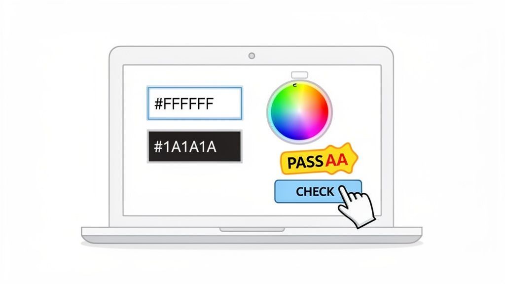
Alright, let's move from theory to action. Using a contrast ratio checker is one of the quickest ways to get a pass/fail grade on your color choices. Based on our first-hand experience helping thousands of clients, this simple step turns abstract accessibility rules into a concrete result you can see in seconds.
The basic idea is you give the tool two colors: one for your text (the foreground) and one for the surface it's on (the background). The tool then does the math for you and spits out the contrast score.
First, Grab Your Color Values
Before you can run a test, you need the specific codes for the colors you’re using. You can usually find these in a few different formats, and most tools accept all of them.
- Hex Codes: This is what you'll see most often. It's a six-character code preceded by a hashtag, like #FFFFFF for pure white or #0D1B2A for a dark blue.
- RGB Values: This format uses three numbers to define the amount of red, green, and blue in a color, such as
rgb(255, 255, 255). - Color Picker Tool: This is my personal favorite for quick checks. Most online checkers have an eyedropper tool that lets you click anywhere on your screen—your website, a design mockup, anywhere—to instantly grab a color's code.
Once you have your foreground and background color codes, you’re all set.
If you're wondering why these numbers matter so much, it helps to understand the science behind them. For a great explanation that connects the 'how' with the 'why,' check out this article on Contrast Ratios: Why Matter.
Making Sense of the Results
After you plug your two colors into a tool like WebAbility.io's free color contrast checker, you'll get your results right away. The checker automatically compares your ratio against the official WCAG standards.
You'll see a few key pieces of information:
- The Contrast Ratio: This is the raw score, like 5.95:1.
- WCAG AA Pass/Fail: This tells you if your colors pass the most widely adopted accessibility standard for both normal-sized and large text.
- WCAG AAA Pass/Fail: This shows whether you meet the "gold standard" of accessibility, which is much stricter.
For example, the image above shows a light gray text on a dark blue background. The tool calculated a contrast ratio of 5.95:1. This gets a solid "PASS" for the WCAG AA level and even passes the AAA standard for large text.
But what if your colors fail? Don't sweat it. The best checkers have built-in sliders that let you adjust the colors on the fly. You can just nudge the shade lighter or darker until you see that "Fail" flip to a "Pass," helping you find a compliant alternative that still fits your design aesthetic. It's an empowering way to make inclusive decisions without guesswork.
Avoiding Common Color Contrast Pitfalls
So, you’ve run your main colors through a contrast ratio checker and everything passed with flying colors. That's a great first step, but the job isn't quite done. Real-world web design is messy, full of tricky scenarios like text layered over images, subtle gradients, and stylish buttons that a simple color-on-color check will miss.
One of the most common traps is placing text directly onto a background image. Sure, the text might be perfectly readable over one part of the photo, but what happens when it drifts over a lighter or busier section? Suddenly, it’s completely unreadable. The answer isn’t to ditch background images altogether, but to guarantee that text is legible no matter what’s behind it.
There's a simple and reliable trick for this: add a semi-transparent overlay between the image and the text. A dark overlay (think black at 40% opacity) makes light text pop, while a light overlay will help dark text stand out. This ensures you have a consistent and passing contrast ratio across the entire image.
Beyond Text Colors
While we talk a lot about text readability, many designers and developers forget that contrast rules apply to much more than just paragraphs. Modern websites lean heavily on visual cues for interaction, and if these cues don't have enough contrast, they can become functionally invisible for users with low vision.
You need to run a contrast ratio checker on these non-text elements, too:
- Icons: That shopping cart icon or search magnifying glass isn't just decoration. For users to easily spot them, they need at least a 3:1 contrast ratio against the background.
- Form Field Borders: How can someone fill out a form if they can't see the fields? The border of an input, checkbox, or text area needs a 3:1 ratio with its surroundings so users know where to click and type.
- "Ghost" Buttons: Those trendy buttons with a thin outline and no solid fill can be an accessibility nightmare. That delicate outline itself must meet the 3:1 contrast requirement to be seen.
Overlooking these interactive components is an easy mistake to make, but it can seriously hinder how people use your site.
Why So Many Websites Still Get It Wrong
The core WCAG guidelines for contrast have been around for a long time, with the 4.5:1 ratio being formalized back in 2008. Yet, even today, a staggering 85% of the top one million websites fail basic contrast tests. This shows a massive disconnect between established standards and what's actually being built. You can learn more about these findings and why color contrast remains a crucial design element.
So what's causing this gap? Often, it comes down to a lack of awareness about these non-text requirements or a rigid adherence to brand colors that were never chosen with accessibility in mind.
A smart accessibility strategy includes creating a secondary, web-safe color palette. This lets you keep your brand identity for decorative elements while using compliant color variations for all essential text and interactive components. By testing everything proactively, you can avoid frustrating users and prevent costly redesigns down the road. For a more comprehensive way to manage these issues, a platform with an all-in-one website accessibility checker can make a world of difference.
Embedding Contrast Checks into Your Design Workflow
For any creative agency or development team, accessibility can't be an afterthought. It needs to be part of your process from the very first design sprint, not a frantic fix right before launch. This is where a contrast ratio checker becomes a game-changer, helping you catch and resolve issues early on.
This "shift-left" approach starts with something fundamental: creating an accessible brand color palette. By vetting your primary and secondary colors against WCAG standards before a single line of code is written, you build a solid, compliant foundation. It's the best way to prevent costly redesigns down the road.
Automating Contrast Compliance
As a project moves from design mockups to actual development, manually checking every element just isn't scalable. That’s why the next logical step is to build automated contrast testing right into your development pipeline. Think pre-commit hooks or CI/CD jobs that automatically flag any color combinations that don't make the cut.
You can take this a step further. To guarantee visual consistency and catch subtle UI bugs, including those related to contrast, it's smart to integrate visual regression testing tools into your workflow. This process essentially takes "before and after" pictures of your UI, instantly spotting unintended changes and ensuring a new feature doesn't accidentally make your site unreadable.
Low contrast isn't just a minor design flaw; it's a major UX barrier. Poor ratios affect an estimated 1 in 4 internet users who have some form of mild visual impairment. With WCAG 2.2 introducing a stricter 3:1 ratio for non-text elements like graphics, the use of checker tools has jumped by 40%.
When you embed these checks, accessibility stops being a final hurdle and becomes a seamless part of your quality assurance. It’s not just about mitigating legal risks—it boosts your team's efficiency and leads to a much better product for everyone.
The infographic below points out a few of the most common contrast pitfalls we see all the time.
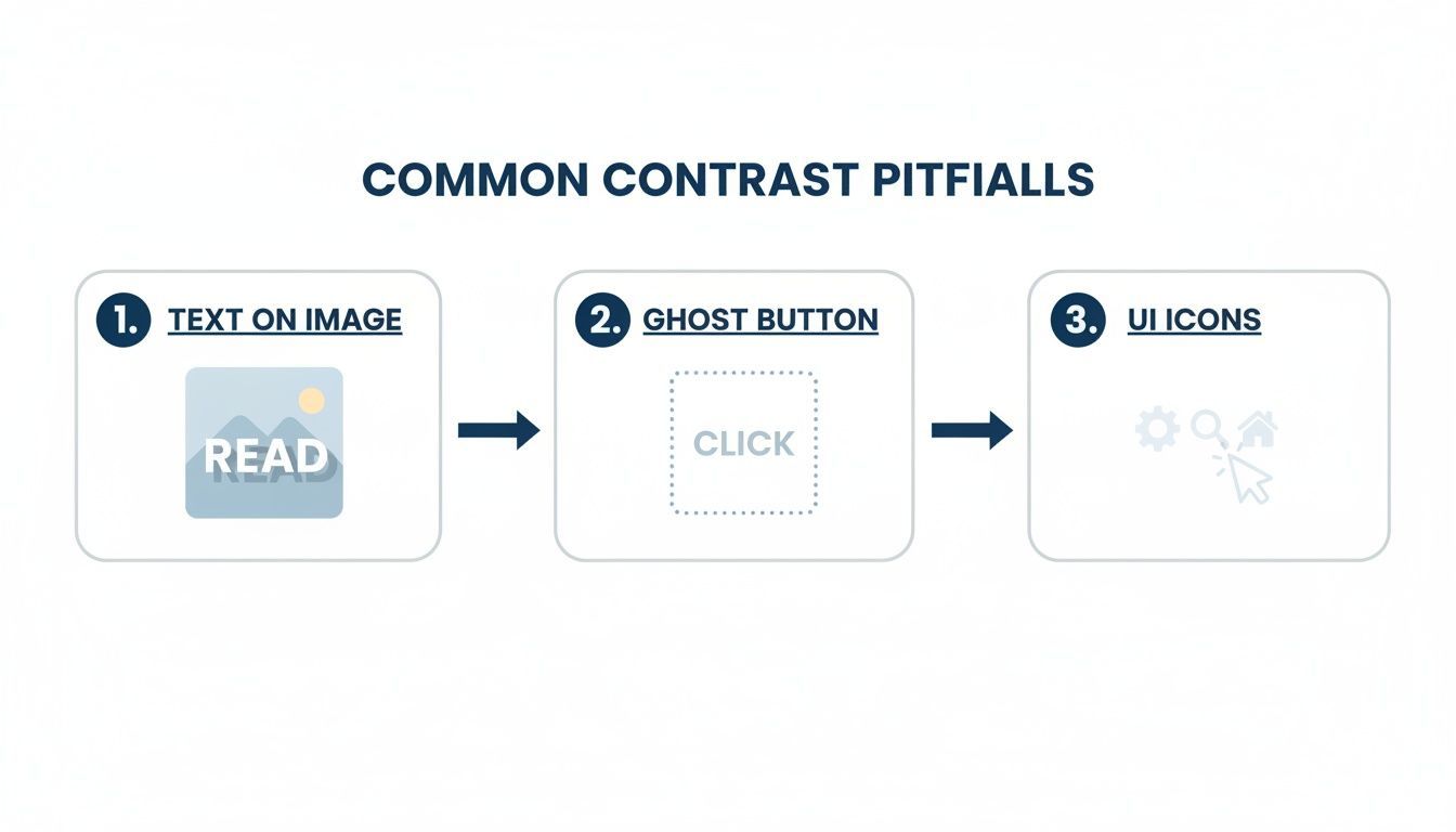
As you can see, things like text layered over images, trendy "ghost buttons," and light-colored UI icons are notorious for failing accessibility tests. Automating your checks helps your team consistently catch these subtle but critical issues. Platforms like WebAbility.io are built for this, streamlining the entire process with automated monitoring and a central dashboard to make ongoing compliance feel almost effortless.
Moving Beyond Manual Checks with WebAbility.io
A good contrast ratio checker is indispensable for fixing a specific color issue you've just found. But what happens when you have hundreds, or even thousands, of pages? Manually checking every single element just isn't realistic. That's the hard limit of spot-checking. This is where a holistic, platform-based solution can be a game-changer for businesses that want to scale accessibility efficiently.
A managed accessibility solution like WebAbility.io helps you shift from putting out fires to preventing them in the first place, ensuring long-term compliance and a consistently positive user experience.
From One-Off Fixes to a Centralized System
Think of it like this: a manual checker is a valuable tool, like a tire pressure gauge, perfect for spot-checking. However, for a long journey, you need a comprehensive system that monitors everything continuously.
WebAbility.io acts as a complete accessibility management system, providing the tools and expert support needed to maintain compliance at scale.
Our platform gives you:
- Real-Time, AI-Powered Monitoring: Instead of manually auditing new pages or features, our system automatically scans your entire site and flags accessibility barriers—like contrast failures—as soon as they appear.
- A Centralized Dashboard: See a clear, simple accessibility score for all your websites in one place. You can track progress, pinpoint recurring problems, and assign fixes to your team without ever leaving the dashboard.
- Expert Guidance and Support: You're not on your own. Our accessibility experts are here to provide the strategic advice you need to build and run a sustainable accessibility program that actually works.
When you automate compliance, you free up your team from the grind of manual checks. They can finally focus on what they do best: innovating and building great experiences for your users. Accessibility stops being a chore and becomes a natural part of how you work.
Protect Your Brand and Build for the Future
Maintaining accessibility is about more than just dodging lawsuits; it’s about being a brand people can trust. Inconsistent accessibility across your site sends a confusing message and can quickly erode that trust. WebAbility.io helps you enforce your standards everywhere, on every page.
By using a comprehensive platform like our all-in-one website accessibility checker, you get the full story of your compliance status. It's the only practical way to manage accessibility at scale and prove that your digital doors are truly open to everyone.
Ready to see how it all works? Book a Demo and we'll show you how WebAbility.io can help you confidently scale your accessibility efforts.
Frequently Asked Questions About Color Contrast
Let's tackle some of the common questions that pop up when teams start digging into color contrast and using a contrast ratio checker. These are the things we hear all the time from our clients and in our expert workshops.
What Is the Difference Between Wcag Aa and Aaa?
Think of WCAG AA as the universal standard for accessibility. It's the benchmark most laws and legal precedents point to, requiring a 4.5:1 contrast ratio for normal text. Meeting this level ensures your site is usable for the majority of people with visual impairments.
WCAG AAA is the gold standard. It demands a much stricter 7:1 contrast ratio, which makes your content exceptionally readable for an even wider audience. While AA is often the legal requirement, striving for AAA shows a serious commitment to creating a truly inclusive experience. It's a best practice we always recommend aiming for, as it demonstrates industry leadership and trustworthiness.
What If My Brand Colors Fail the Contrast Check?
This happens all the time, so don't panic. A good contrast ratio checker will quickly show you where the problems are. The solution isn't to abandon your brand, but to create an "accessible" version of your color palette for digital use.
You might just need to slightly darken a light color or lighten a dark one to pass the test. It's often a subtle shift that preserves the brand's feel.
Your primary brand colors can still shine in decorative elements, backgrounds, and illustrations—anything that isn't crucial for reading text or interacting with a component. This is the perfect compromise between maintaining brand identity and ensuring usability.
Can I Face Legal Issues for Poor Color Contrast?
Yes, absolutely. In web accessibility lawsuits filed under the Americans with Disabilities Act (ADA) and other regulations, low color contrast is one of the easiest violations to prove. It's a clear-cut failure to meet a specific WCAG success criterion.
Because it creates such a direct barrier for users, it's considered a significant legal risk. Using a contrast ratio checker to regularly find and fix these issues isn't just about compliance; it's a fundamental part of responsible web design and a key way to protect your organization.
Keeping up with manual checks is a constant battle. WebAbility.io offers a complete accessibility ecosystem designed to automate your compliance monitoring across your entire digital footprint. We help you meet and maintain the standards with confidence. Explore our platform today.
Quick Questions
Tap to ask AI about this article