Web Site Usability Test: A Guide to Higher Conversions

Sidharth Nayyar
A lot of teams ask for a web site usability test only after the usual warning signs show up. Traffic is decent, paid campaigns are running, the redesign looks cleaner than the old site, but leads still stall, checkouts wobble, and support keeps hearing the same confused questions.
That’s usually not a traffic problem. It’s a friction problem.
When you run a proper usability test, you stop debating opinions in Slack and start watching people try to complete real tasks. You see where labels fail, where trust drops, where forms ask too much, and where accessibility issues block users who should have been able to convert. That’s where the useful work starts.
TLDR Your Quick Guide to Usability Testing
A typical first round looks like this. The team wants answers fast, the PM needs something concrete to schedule, and stakeholders want proof that any changes will improve conversion, not just tidy up the interface.
Use this checklist to keep the study focused and make the results usable.
- Start with one business outcome: Choose one high-value flow such as quote requests, demo bookings, checkout, account creation, or a key service-page path.
- Define success before testing: Write the exact end state for each task and decide how you will judge completion, failure, hesitation, and recovery. Metrics like task success rate help keep the discussion objective.
- Recruit participants who match the audience: Avoid internal stand-ins unless your staff match buyers or users. A short screener usually does the job.
- Write tasks around goals: Give people a realistic objective, not a set of clicks. “Find the right plan for a five-person team” will reveal more than “open the pricing page.”
- Pick the format based on the question: Moderated sessions are better when you need to diagnose confusion and ask follow-up questions. Unmoderated tests are better when you need faster volume and simpler comparisons.
- Build accessibility into the same workflow: Test keyboard-only use, zoom, focus order, contrast, form labels, and screen-reader basics during the usability session. That catches issues that hurt both disabled users and conversion performance.
- Capture behavior and friction, not opinions alone: Note what users tried, where they paused, what they missed, and what blocked progress.
- Report findings in a format product teams can act on: Each issue should include evidence, severity, affected task, recommended fix, and owner. A finding without a path to implementation rarely changes the product.
That is the short version. The stronger version is to treat accessibility, usability, and CRO as part of the same decision-making process from the start.
Beyond Guesswork Why a Usability Test Is Your CRO Superpower
You can’t optimize what you haven’t seen.
Analytics can tell you where users drop. Session recordings can hint at hesitation. Heatmaps can show where people click. But none of those methods replaces hearing a target user say, “I don’t know what happens if I press this,” right before they abandon a form that marketing has been paying to fill.
That’s why a web site usability test is one of the most practical conversion tools you can run. It connects user behavior to business outcomes without requiring a huge research program. According to VWO’s roundup of usability research, only 55% of companies conduct any type of online usability testing, while foundational work also shows that testing with just 3 to 5 participants can uncover approximately 80% of usability problems. You can review that benchmark in VWO’s summary of usability testing statistics.
That gap matters. Plenty of teams are still shipping pages based on stakeholder confidence, not observed user behavior.
Why CRO teams should care
Conversion rate optimization often gets narrowed down to button color debates and A/B testing ideas. In practice, the fastest wins usually come from removing friction in a critical flow. A signup path that feels obvious converts better than one that looks polished but forces users to stop and interpret.
If you’re trying to improve website conversion rates, usability testing gives you the missing layer between analytics and action. It shows why users hesitate, what they misunderstand, and what they need from the interface to move forward with confidence.
Practical rule: Run usability testing before you run a major CRO experiment on the same flow. Otherwise, you risk testing variants of a journey that’s fundamentally confusing.
Good usability includes accessibility
Teams often split “usability” and “accessibility” into separate workstreams. Users don’t experience your site that way. They experience one interface. If the menu can’t be used with a keyboard, if contrast makes text harder to read, or if a widget helps a visitor tailor the page to their needs, those things affect comprehension, trust, and completion.
From a conversion standpoint, accessibility isn’t an extra. It’s part of whether the path works.
Blueprint for Insight Planning Your Usability Study
Most weak usability studies fail before the first participant arrives. The problem usually isn’t the moderator. It’s the setup. Vague goals, loose tasks, the wrong participants, and no agreement on what success means will ruin the quality of the findings.
Pick one decision that the study needs to support
Don’t start with “we want to see if the site is easy to use.” That produces broad observations and weak prioritization. Start with a decision someone on the team needs to make.
Examples of good study goals:
- Checkout focus: Find out where users lose confidence before payment.
- Lead generation focus: Learn whether prospects understand the difference between service lines.
- Navigation focus: Check whether visitors can locate high-intent pages without using site search.
- Accessibility focus: Confirm whether key tasks are workable with keyboard-only navigation and common assistive workflows.
A practical test plan usually includes three layers:
Business goal
Reduce friction in a flow that affects revenue, lead quality, or support volume.
Research question
What prevents users from completing the task cleanly?
Success criteria
What counts as completion, friction, and failure?
That last part matters more than many new PMs expect. Nielsen Norman Group’s guidance on task success rate is clear that the analysis hinges on objective completion criteria, and that over 90% success suggests intuitive design while below 70% points to a design that likely needs rework.
Define completion before you observe behavior
A surprising amount of confusion comes from teams changing the definition of success after they’ve seen the sessions.
Avoid that. Write your criteria in advance.
Here’s a simple template:
- Task: Request a consultation for web accessibility services
- Success looks like: User reaches the completed confirmation state
- Major issue: User completes, but with clear hesitation, wrong-page detours, or repeated backtracking
- Minor issue: User completes with one small moment of uncertainty
- Failure: User abandons, states they are confused, or reaches the wrong endpoint
That framework keeps analysis consistent. It also helps you brief stakeholders before the first session, which reduces debates later.
If the team can’t agree on what “task completed” means, don’t schedule participants yet.
Recruit for behavior, not convenience
The fastest way to get misleading results is to test with internal staff, friends, or anyone who already knows how the site works. A web site usability test is useful only when the participant’s mental model is close to that of the intended audience.
Use a screener. Keep it short. Ask enough to filter for fit without coaching people into the desired profile.
A good screener usually checks:
- Role or context: Are they the buyer, researcher, admin, patient, parent, donor, or operator you serve?
- Relevant experience: Have they previously purchased or evaluated similar services or products?
- Exclusion criteria: Do they work in UX, web development, or your own industry in a way that would distort “normal” behavior?
- Accessibility needs when relevant: Do they use keyboard navigation, screen readers, high contrast, text resizing, or language support features as part of normal browsing?
For new project managers, the biggest trade-off is speed versus fit. It’s tempting to recruit quickly and call it close enough. Don’t. Five well-matched participants will teach you more than a larger pile of badly matched ones.
Write tasks that sound like life, not a test script
A lot of task prompts accidentally tell users where to go. Once you do that, you’re no longer testing usability. You’re testing whether they can follow instructions.
Bad task:
- Click the Services menu and find the accessibility audit page.
Better task:
- Your organization needs help reviewing whether its site meets accessibility requirements. Find the page that seems most relevant and explain what you’d do next.
Notice the difference. The better version tests navigation, comprehension, confidence, and content clarity in one move.
A simple task-writing formula
Use this structure:
Situation + motivation + end goal
Examples:
- You’re comparing agencies for a redesign and want to understand what support is available after launch.
- You need to check whether this site offers accommodations that would make reading and navigation easier for you.
- You want to contact the company, but only if you can first confirm they work with organizations like yours.
Keep the plan lean enough to survive contact with reality
Early studies go off the rails when the team packs in too many tasks. People get fatigued, moderators rush, and the final tasks produce weak data.
A tighter plan works better:
- Primary tasks: The flows you must learn from
- Backup task: One extra if time allows
- Post-task questions: Ask what they expected, what confused them, and what they’d do next
- Closing questions: Capture trust, clarity, and perceived ease
If you’re getting buy-in from stakeholders, present the study in product language. Don’t say “we’re doing some UX research.” Say “we’re testing whether users can complete the quote request path without confusion, and whether accessibility barriers show up in the same journey.” That lands better because it sounds tied to delivery and conversion, not a separate research exercise.
Choosing Your Testing Toolkit Methods and Modalities
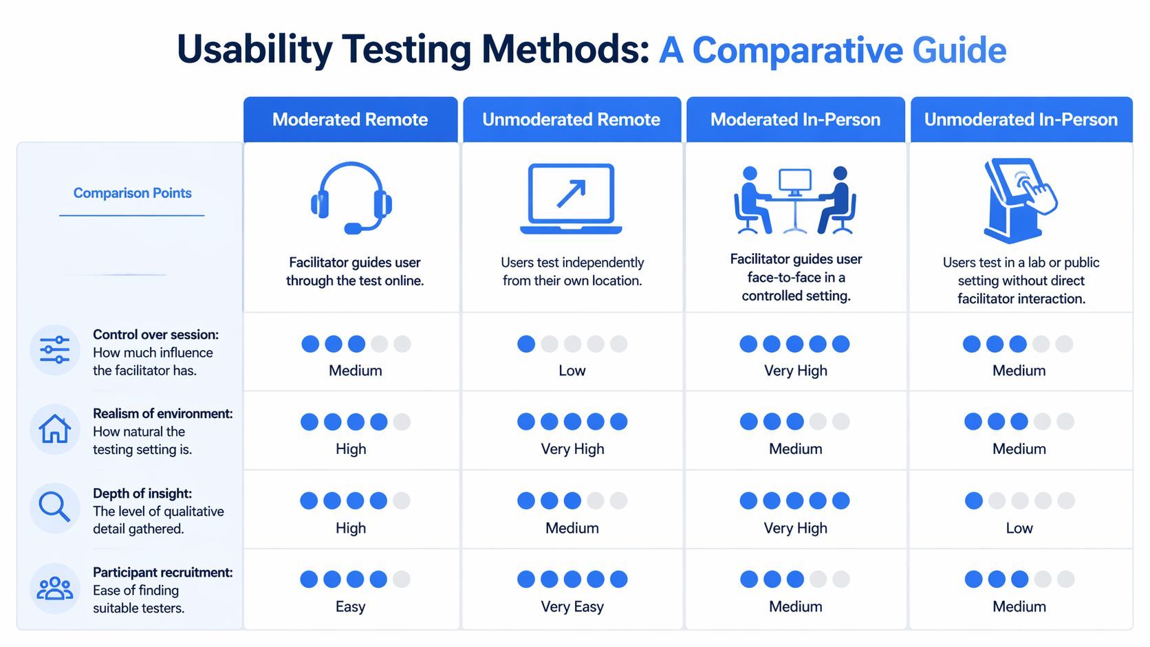
The right testing format depends on what you need to learn, how quickly you need it, and how much facilitator involvement the flow requires. New teams often ask which method is best. That’s the wrong question. The better one is which method creates the clearest evidence for this decision.
Moderated versus unmoderated
Moderated testing means a facilitator is present. Unmoderated testing means the participant completes tasks alone, usually through a platform.
Here’s the cleanest way to compare them.
| Criteria | Moderated Testing | Unmoderated Testing |
|---|---|---|
| Facilitator involvement | High. You can probe, clarify, and observe live reactions. | Low. The task script must do the work. |
| Best for | Complex flows, early prototypes, trust-sensitive journeys, accessibility observation | Faster validation, simpler flows, larger batches of sessions |
| Risk | Moderator bias if prompts are sloppy | Thin insight if users get stuck and no one can ask follow-up questions |
| Speed | Slower to schedule and run | Faster to launch |
| Depth | Rich qualitative insight | Useful directional insight |
Field note: Choose moderated sessions when the journey has legal, financial, or accessibility complexity. Choose unmoderated sessions when the path is simple enough that the task can stand on its own.
Remote versus in-person
Remote testing usually gives you more natural behavior because users are on their own device in their own environment. In-person testing gives you tighter observation and more control. Neither is universally better.
Use this decision frame:
- Choose remote when your users are geographically spread out, device context matters, or you need to observe real-world setups such as browser zoom, screen reader preferences, or personalized interface settings.
- Choose in-person when body language matters, the workflow involves a physical environment, or you need controlled hardware and fewer environmental variables.
A practical matrix for common project types
For marketing websites
Moderated remote tends to work well. You can hear users explain why they trust or distrust a page, where service descriptions lose them, and whether navigation supports natural exploration.
For ecommerce flows
A mixed approach often works best. Moderated sessions help diagnose hesitation, while unmoderated runs can quickly reveal whether task wording and flow structure hold up at scale.
For accessibility-focused checks
Remote testing is often stronger than teams expect because you can observe users in the environments and with the tools they already rely on. If you need a baseline scan before human testing, run a website accessibility checker to identify obvious issues that could interfere with task design.
Don’t confuse tools with methods
Maze, UserTesting, Lookback, Zoom, Google Meet, Figma prototypes, and screen recording software are all useful. But they don’t choose the method for you. The method comes first.
A practical stack might look like this:
- Moderated remote: Zoom or Meet for live facilitation, Figma or staging site for the test object, shared note-taking doc for observers
- Unmoderated remote: Maze or another testing platform for task distribution and recordings
- Accessibility support during testing: browser zoom, keyboard-only navigation, screen reader workflows, and any site-level personalization features already available
One place where teams lose time is trying to make a single study answer every question. If you need diagnosis, pick the method that allows observation and follow-up. If you need directional confirmation, use the lighter option.
What usually doesn’t work
A few patterns reliably produce weak evidence:
- Unmoderated testing for a broken prototype: If the prototype is fragile, participants won’t know whether the issue is their misunderstanding or the prototype itself.
- In-person testing for geographically narrow convenience samples: You end up testing whoever is nearby, not whoever matches the audience.
- Moderated sessions with too many observers interrupting: Stakeholder visibility is useful, but the participant experience has to stay calm and consistent.
A new project manager usually earns buy-in by showing that the chosen method matches the decision. That’s easier than trying to argue for a favorite research format on principle.
The Live Session Running Tests and Integrating Accessibility
The session itself should feel calm, direct, and boring in the best way. If the moderator is doing too much, the test is already drifting off course.
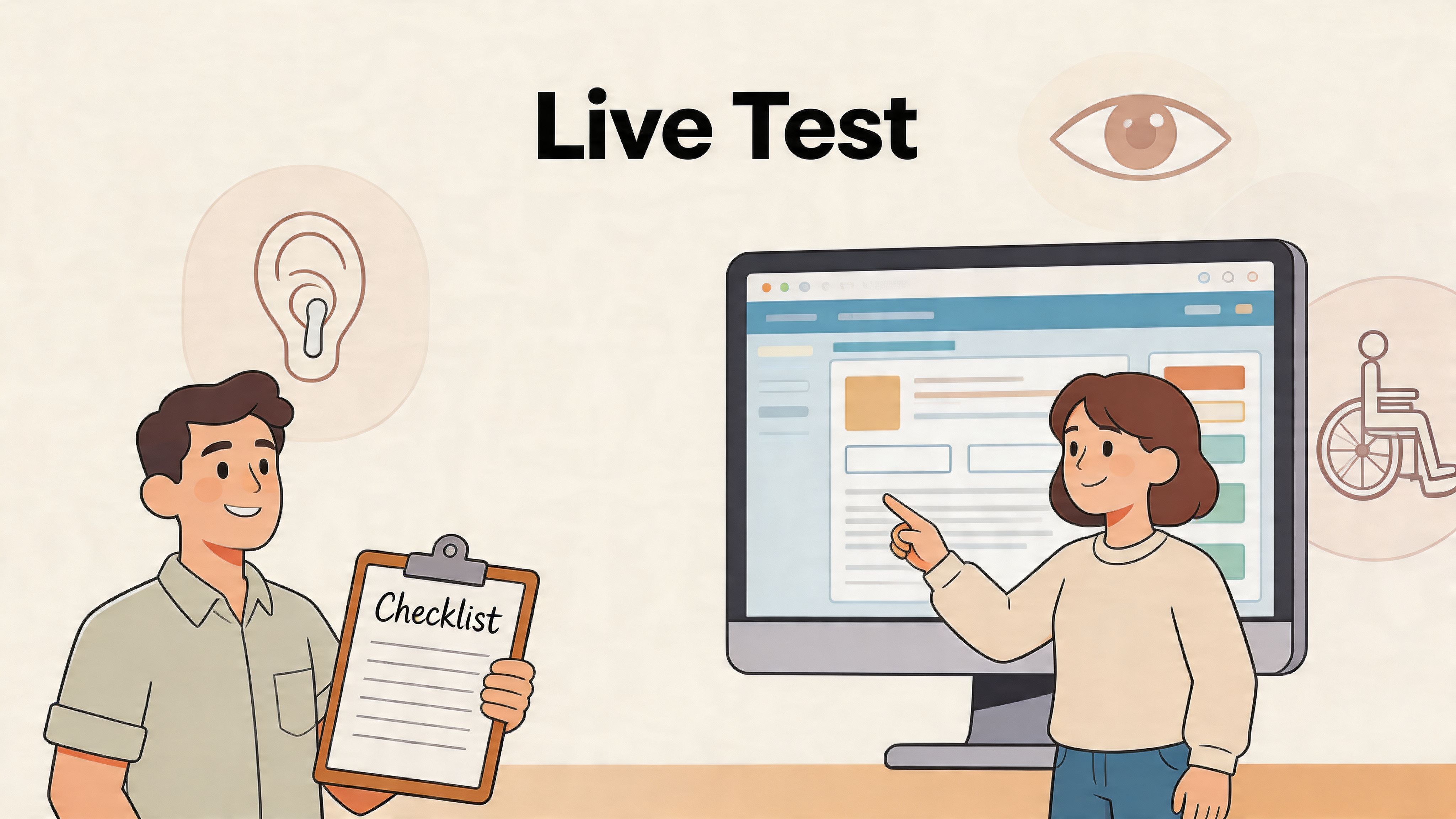
Open the session without biasing it
A clean opening script does three things. It lowers participant anxiety, sets expectations, and protects the validity of the session.
Cover these basics:
- Explain the purpose: You’re testing the site, not the participant.
- Ask for think-aloud behavior: Encourage them to say what they expect, what they notice, and what feels uncertain.
- Give permission to struggle: If something is confusing, that’s useful data.
- Confirm recording and timing: Keep logistics simple and professional.
Then get out of the way.
The best moderators don’t perform expertise during the task. They listen, track behavior, and ask neutral follow-ups only when needed.
Prompt without leading
A new moderator’s instinct is to help. Resist it.
If a participant pauses, use prompts that keep ownership with them:
- What are you looking for here?
- What do you expect to happen if you click that?
- What made you choose this option?
- What would you do next if you were alone?
Avoid prompts that steer:
- Did you see the menu at the top?
- Would you click the button on the right?
- The form is lower on the page.
Stay curious, not helpful. Helpful moderators create cleaner sessions. They also create worse data.
Bring accessibility into the same workflow
Most usability frameworks still treat accessibility as a separate pass. That misses the point. UserWay’s discussion of usability testing for websites highlights that testing should answer practical questions such as whether a site is navigable for someone using a keyboard instead of a mouse.
That’s not a niche concern. It’s a usability concern.
Simple accessibility checks to add to standard sessions
You don’t need to turn every test into a full audit. You do need to make accessibility observable inside the experience.
Try adding prompts like these:
- Keyboard task: Complete this step without using a mouse.
- Readability task: Increase zoom or adjust the page to a more comfortable reading setup, then continue.
- Navigation task: Move through the main menu and form fields using standard keyboard controls.
- Assistive workflow observation: If the participant uses a screen reader or other support tool, observe how the site responds without interrupting their normal process.
If your team needs a stronger baseline for assistive-tech review, this guide to a screen reader test is a useful reference for what to watch during task execution.
Include personalization tools in the session
If the site includes accessibility support features, use them during the test. That includes text scaling, contrast modes, reading support, keyboard enhancements, language tools, and user-controlled display adjustments.
This is also where managed accessibility features can contribute to the session in a positive way. If a visitor can tailor the interface quickly and then complete the task with more confidence, that’s relevant usability evidence. For teams reviewing implementation ideas more broadly, this overview of website accessibility best practices is a practical complement to live testing.
A good live session shows not just where users fail, but what helps them recover.
What observers should capture in real time
Don’t let observers write novels. Give them a note-taking frame.
Use four columns:
| Moment | Evidence | Impact | Follow-up |
|---|---|---|---|
| What happened | User clicked wrong nav item twice | Delays task, lowers confidence | Check label clarity |
| What they said | “I’m not sure these are different services” | Messaging problem | Review information architecture |
| What blocked access | Couldn’t see focus state while tabbing | Accessibility and usability issue | Inspect keyboard visibility |
| What helped | Increased text size and continued smoothly | Feature supports completion | Preserve and validate pattern |
Later in the session, when the participant has completed a few tasks, a short visual example can help teams align on what accessible interaction review looks like in practice.
Know when to stop talking
The strongest moments in a web site usability test often happen after a participant says, “Hmm,” and you wait. They reveal assumptions, not polished feedback.
Silence is part of the method. Use it.
From Observation to Action Analyzing Data and Reporting Findings
The hard part isn’t collecting sessions. It’s turning them into decisions the team will act upon.
Too many usability reports die because they read like transcripts. Stakeholders don’t need every comment. They need a clear view of what happened, how often it mattered, what kind of risk it creates, and what should change first.
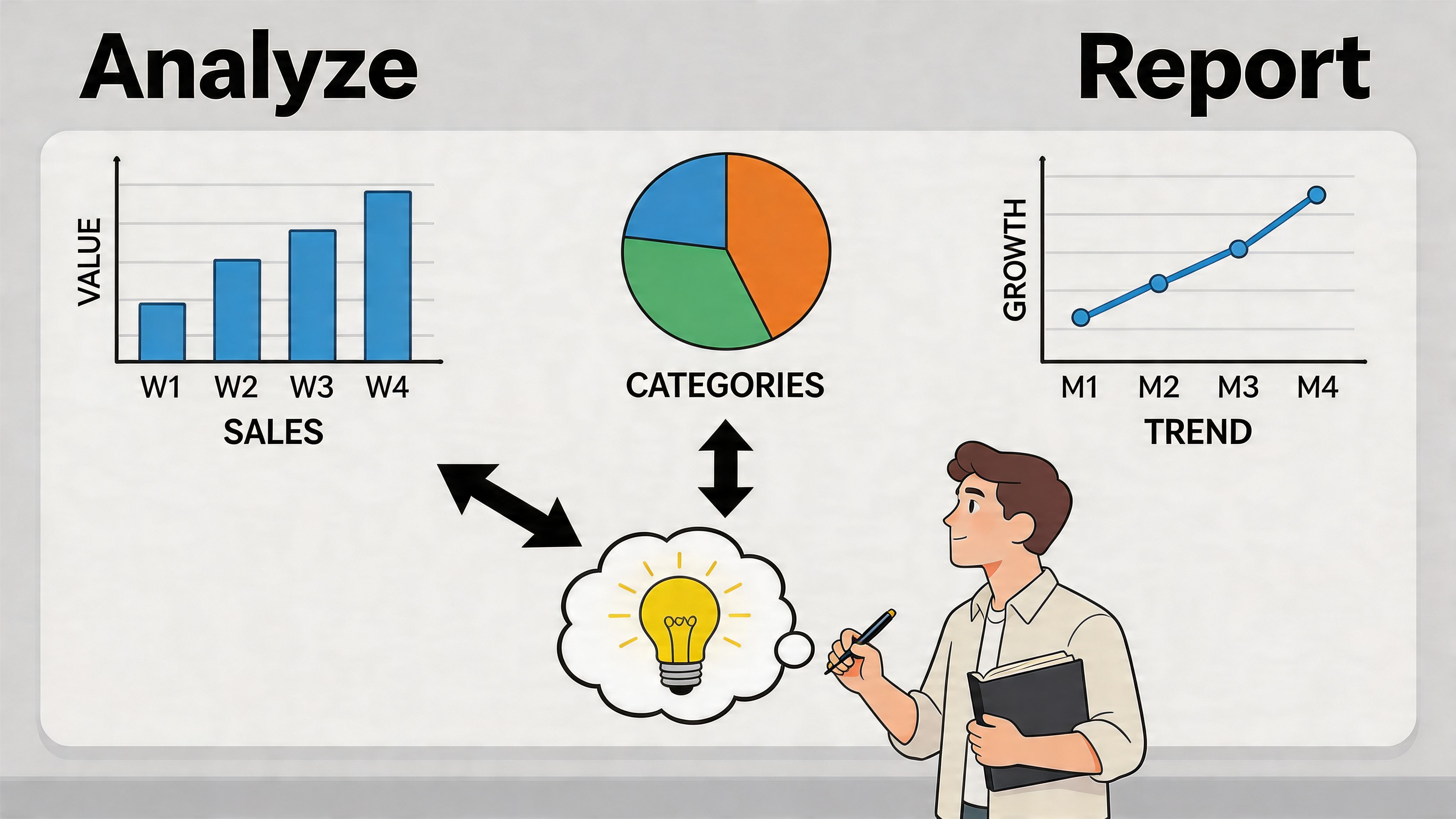
Start with task outcomes
Your first pass should be brutally simple. For each task, mark whether the participant:
- Completed successfully
- Completed with a major issue
- Completed with a minor issue
- Failed
That gives you a task-by-task view of where the journey breaks down. If one path repeatedly produces hesitation or wrong turns, you’ve found a priority area even before you synthesize the qualitative notes.
Use SUS to benchmark perceived usability
Behavior tells you what happened. Perception helps explain how usable the experience felt overall.
Maze’s guidance on measuring usability metrics notes that the System Usability Scale (SUS) is a gold-standard metric built from a 10-item questionnaire, and that the industry average is 68. That gives your team a practical benchmark when comparing versions or tracking changes over time.
You don’t need to overcomplicate SUS in a project readout. Stakeholders usually need three things:
- The score
- Whether it sits above or below the average benchmark
- What the sessions revealed that likely influenced the score
Reporting advice: Don’t present the SUS score as a verdict on the entire product. Present it as one signal, paired with task evidence and direct observation.
Group observations into themes
After the metrics pass, synthesize the qualitative patterns. Affinity mapping still works well because it forces the team to move from isolated anecdotes to recurring issues.
A simple grouping structure:
Navigation and findability
Users can’t predict where key information lives, or labels don’t match their mental model.
Content clarity
Users read the copy but still don’t understand what’s offered, what happens next, or why one option differs from another.
Form friction
Fields ask for too much, labels are unclear, or error handling doesn’t support recovery.
Trust and reassurance
Users hesitate because they can’t confirm legitimacy, process, timing, support, or privacy.
Accessibility barriers
Keyboard flow breaks, focus states disappear, contrast reduces readability, or personalization is necessary but hard to find.
If you want a practical example of what this synthesis looks like in context, this walkthrough of a usability analysis of a website is a useful reference point.
Build a report that creates action
Teams don’t need a long report. They need a report they can prioritize from.
Use this structure:
| Section | What to include |
|---|---|
| Executive summary | Core problems affecting task completion and confidence |
| Method snapshot | Audience tested, tasks used, test format |
| Key metrics | Task outcomes and SUS summary |
| Top findings | Evidence, severity, and business impact |
| Recommendations | Specific design or content changes |
| Appendix | Clips, raw notes, and screenshots if needed |
Then assign every recommendation a simple triage label:
- Fix now: Direct blocker to completion, trust, or access
- Fix next sprint: Strong friction point with clear solution path
- Monitor: Worth tracking, but not yet severe enough to outrank current priorities
What usually gets buy-in is not the volume of evidence. It’s how clearly the evidence maps to a change request. A PM should be able to turn the report into tickets without rewriting the logic.
The Next Level Continuous Monitoring and Optimization
One usability study can change a roadmap. It can’t protect a site forever.
That’s the blind spot in standard guidance. As Maze notes in its article on website usability testing, most guidance focuses on point-in-time studies and doesn’t provide a framework for automation or for tracking usability degradation over time. Continuous monitoring closes that gap by helping teams catch issues before they create user impact or increase legal exposure.
What changes after launch
Sites don’t stay still. Marketing adds landing pages. Developers introduce new components. third-party tools appear in forms and checkout. Accessibility regressions can slip in. So can plain old usability problems.
That means your first web site usability test should become a baseline, not a one-off deliverable.
What to monitor continuously
Not everything can be automated, but plenty can be watched between live studies.
A practical ongoing model includes:
- Critical flow reviews: Re-check high-value journeys after major releases
- Accessibility regression checks: Watch for broken keyboard paths, contrast changes, and code-level issues
- Template-level spot checks: Review page types that get reused across the site
- Trend review: Compare current performance and issue patterns to the baseline established in earlier tests
For teams that need a structured way to keep compliance and user experience visible over time, automated monitoring can support that operational layer. One example is WebAbility.io, which provides continuous scanning, compliance scoring, and historical reporting. If you’re evaluating that kind of workflow, this overview of automated compliance monitoring is a helpful starting point.
The mindset shift that matters
The biggest change isn’t technical. It’s organizational.
Teams that get lasting value from usability work stop treating it like a special project. They treat it like quality control for digital experience. That’s when findings stop collecting dust and start shaping releases, content updates, and conversion improvements.
Web Site Usability Testing FAQs
How many people do I need for a web site usability test?
For early diagnostic work, a small group is often enough to reveal the biggest issues. The key is participant fit and task quality, not just volume.
Should I test before launch or after launch?
Both. Before launch helps you catch structural issues while change is cheaper. After launch helps you validate the experience in production and spot regressions introduced by updates.
What’s the difference between usability testing and A/B testing?
Usability testing shows why users struggle or succeed while completing tasks. A/B testing compares variants in live traffic. Usability testing is usually better for diagnosis. A/B testing is better for confirming which version performs better once the core journey already makes sense.
Can I test a low-traffic site?
Yes. Usability testing doesn’t depend on high traffic because you’re observing recruited participants complete defined tasks.
Do I need to include accessibility in every test?
Yes, at least at a practical level. If users can’t find their way by keyboard, adjust the interface to their needs, or complete key tasks with their normal browsing setup, that’s a usability problem, not a side issue.
If your team wants to turn a one-time usability project into a repeatable practice, WebAbility.io can help you connect accessibility, monitoring, and user experience work in one operational workflow. That’s useful for agencies managing multiple sites and for in-house teams that need clearer evidence, cleaner reporting, and fewer regressions between releases.
Quick Questions
Tap to ask AI about this article