Your Guide to Usability Analysis of a Website for CRO

Sidharth Nayyar
TLDR: A website usability analysis is your key to unlocking higher conversion rates (CRO) by revealing why users drop off. This guide, grounded in the E-E-A-T framework (Experience, Expertise, Authoritativeness, and Trustworthiness), shows you how to move from guesswork to a data-driven action plan. By combining expert reviews, analytics, and user testing—all while making accessibility a priority—you can pinpoint friction points and prioritize fixes that directly impact your bottom line. Use an Impact vs. Effort matrix to focus on quick wins and strategic projects, creating a clear roadmap for both leadership and your development team.
Ever wonder why your website analytics show plenty of traffic, but your sales or sign-ups just aren't matching up? A usability analysis is the bridge between that data and real-world answers. It’s a methodical review where we get to the bottom of hidden friction points—things like confusing navigation, weirdly worded buttons, or broken forms that make people give up and leave.
Think of it as watching over a user's shoulder to see exactly where they get stuck. By finding these barriers, you can stop guessing and start making targeted fixes that actually grow your business.
Why Usability Analysis Is Your CRO Secret Weapon
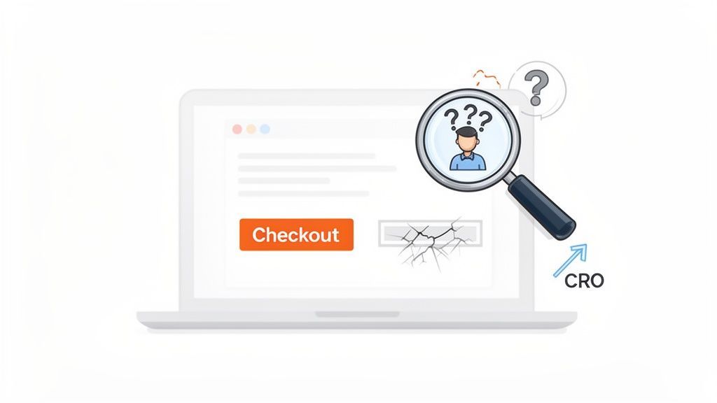
Here's the thing: analytics reports tell you what is happening on your site, but a usability analysis of a website finally explains why. That difference is everything when it comes to effective Conversion Rate Optimization (CRO). Your data might scream that the checkout page has a high drop-off rate, but it takes watching a real person struggle with an unclear form field to understand the root cause.
This process, built on years of hands-on experience in digital marketing and user experience, gives you undeniable proof of what needs fixing. Suddenly, usability isn't just a "nice-to-have" design detail; it becomes one of your most powerful tools for business growth. The ROI is staggering—for every $1 invested in user experience, you can see a return of up to $100. That’s a direct line from a better user journey to a healthier bottom line.
Connecting the Dots Between Usability and Conversions
It’s simple, really. When people can find what they need and complete tasks without getting frustrated, they're far more likely to buy something or sign up. A good usability analysis pinpoints the exact moments where that smooth journey falls apart.
To truly see the impact, you need to understand how to improve conversion rates by solving these user-facing problems. It helps you connect a small fix—like clarifying a button’s text—to a measurable increase in sales.
These insights let you prioritize fixes based on what will make the biggest difference. Imagine you discover that 20% of users are abandoning their carts simply because they can’t find the shipping information. Solving that one problem could give your revenue an immediate and significant lift.
Why Accessibility Is Non-Negotiable in Modern Usability
Today, a usable website has to be an inclusive one. That means making sure everyone, including people with disabilities, can navigate and interact with your content. This isn't just about compliance; it's a core part of creating an excellent experience for all.
A truly usable website is one that is accessible to everyone. When you design for accessibility, you often create a better experience for all users by improving clarity, navigation, and overall site structure.
By baking accessibility checks into your analysis, you’re not only doing the right thing—you're opening your brand to a much wider audience. Modern tools for AI-powered accessibility checks and compliance monitoring make it easier than ever to find and fix these barriers, ensuring your site is welcoming to every single visitor. To learn more about how to create an inclusive digital space, our authoritative guides on our accessibility platform provide in-depth expertise.
Setting the Stage for a High-Impact Analysis
Honestly, the most critical work in a usability analysis happens before you ever sit down with a user. The prep work is what separates a report that gets filed away from one that genuinely sparks change. This is where you lay the groundwork and build the strategic case for your entire project.
The first, most common mistake I see is starting with a vague goal like "make the site easier to use." That's a recipe for fuzzy results. We need to get specific and tie our efforts directly to business outcomes.
Define Your Goals and Success Metrics
What's really hurting the business right now? Are checkout funnels leaking money? Is the support team drowning in tickets about things users should be able to do themselves? Frame your analysis around solving those real-world problems.
Think in terms of concrete, measurable goals. For example:
- Boost mobile checkout completions by 15% this quarter.
- Cut down on password reset support tickets by 30%.
- Shave 20 seconds off the average time it takes a user to find product specs.
- Lift the task success rate for new account sign-ups from 70% to 90%.
Having hard numbers like these gives your work a clear purpose and makes it much easier to show the value of your findings to leadership.
Secure Stakeholder Buy-In Early
I can't stress this enough: don't do this work in a silo. You could uncover the most brilliant insights, but if the product managers, developers, and executives aren't on board from the beginning, your report will just become a well-researched paperweight.
Getting buy-in isn't just a box to check; it’s about turning stakeholders into allies. When they help shape the goals, they become invested in the outcome.
Get everyone in a room for a kickoff meeting—product, engineering, marketing, sales, the works. Walk them through your proposed goals and, more importantly, ask for their input. This collaborative start ensures everyone understands why this analysis matters and gives them a sense of ownership. A similar approach is key for other major site reviews, something we touch on in our guide to conducting a comprehensive technical website audit.
Develop Rich User Personas and Journeys
You simply can't assess usability without a crystal-clear picture of who you're building for. Go deeper than simple demographics to create user personas that feel like real people. Give them names, jobs, frustrations, and varying levels of tech-savviness.
And please, don't forget to include personas that represent users with disabilities. With an estimated 16% of the world's population living with a disability, designing without them in mind means you're intentionally building an incomplete and exclusionary experience. A great start is creating a persona like "David," who has low vision and depends on a screen reader and keyboard to navigate.
With your personas in hand, start mapping their most important user journeys—the steps they take to get things done on your site.
Focus on These Common Critical User Journeys:
- Discovery to Conversion: The path from the moment someone lands on your site to when they make a purchase or sign up.
- Information Seeking: How a user digs up crucial details like pricing, features, or how to get in touch.
- Account Management: The entire flow of signing up, logging in, or changing personal settings.
- Post-Purchase Support: The journey a customer takes to find help, track their order, or start a return.
By mapping these specific paths, you can focus your website usability analysis on the moments that truly matter to your users and your bottom line. This strategic prep ensures your effort is targeted, efficient, and ready to make a real difference.
Choosing Your Analysis Methods for a Complete Picture
After doing this for years, I can tell you there's no magic bullet for usability analysis. The real breakthroughs come when you layer different methods together. Each one gives you a unique piece of the puzzle. Think of it like a detective building a case—you need the forensic evidence, the witness statements, and the security footage to see the whole story.
Before you dive in, you need a plan. It's about starting with your core business goals and tracing them all the way down to the specific user journeys you need to examine.
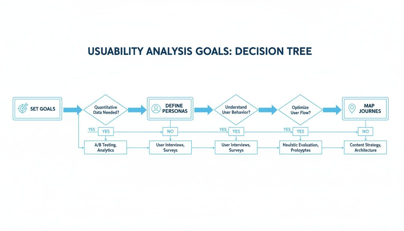
This kind of strategic thinking is what separates a good analysis from a great one. It ensures you're not just testing for the sake of it, but are focused on what truly matters to your users and your business.
Start with an Expert Review Using Heuristics
I almost always kick things off with a heuristic evaluation. It's a fast, efficient way for an expert (or even your internal team) to audit a site against established usability principles. Think of Jakob Nielsen's 10 Usability Heuristics as your rulebook.
You’re essentially walking through the experience looking for common slip-ups:
- Is there clear feedback? If a user submits a form, a missing confirmation message leaves them wondering if it worked.
- Is the design consistent? When buttons and links look different from page to page, it erodes trust and causes confusion.
- Are you preventing errors? A form that lets someone enter letters in a phone number field is just setting them up for failure.
This first pass is fantastic for spotting the low-hanging fruit and obvious friction points without the overhead of recruiting and running user tests.
Digging for Clues in Your Website Analytics
Your analytics platform, whether it's Google Analytics or something else, is a treasure map. It doesn't give you the answers, but it sure tells you where to dig. You're hunting for anomalies that scream "user friction!"
Look for red flags like:
- High Exit Rates on Key Pages: Are people abandoning your checkout flow or signup form? Something on that page is scaring them away.
- Low Time on Page: If visitors spend just a few seconds on a long article, they probably found the content overwhelming or hard to read.
- Unexpected User Flows: I once saw users bouncing back and forth between a features page and a pricing page. It was a clear sign our value proposition was muddled.
Use this data to form solid hypotheses, which you can then take into qualitative testing to find out the "why."
Moderated vs. Unmoderated User Testing
Now it's time to bring in real users. This is where you decide between two powerful, but very different, approaches: moderated and unmoderated testing.
Moderated user testing is a live, one-on-one conversation. A facilitator guides a participant through specific tasks, asking questions along the way. It’s perfect for digging into the why behind their actions.
I once watched a user completely ignore a bright green "Sign Up" button during a moderated session. When I asked about it, they said, "Oh, I thought that was an advertisement." That single piece of feedback was more valuable than a month's worth of A/B testing data.
Unmoderated user testing, on the other hand, is all about scale. You send out tasks for participants to complete on their own time, with software recording their screen and voice. It's a fantastic way to get quantitative data—like task success rates—from a much larger group of people. It’s also great for validating findings from your earlier moderated sessions. If you want to get into the weeds on this, check out our complete guide on how to conduct usability testing.
Usability Analysis Method Comparison
Choosing the right mix of methods is crucial. This table breaks down the core approaches to help you decide what fits your timeline, budget, and research goals.
| Method | Best For | Primary Output | Resource Level |
|---|---|---|---|
| Heuristic Evaluation | Finding obvious, common usability problems quickly. | A list of issues ranked by severity, with heuristic violations noted. | Low (1-2 experts, no users) |
| Moderated Testing | Understanding the "why" behind user behavior and getting rich, qualitative feedback. | Detailed observations, quotes, and insights into user thought processes. | High (Requires moderator, recruiting, incentives) |
| Unmoderated Testing | Gathering quantitative data (e.g., success rates, time on task) from a large user group. | Videos of user sessions, click maps, and performance metrics. | Medium (Requires platform, recruiting, incentives) |
| Analytics Review | Identifying problem areas and forming data-backed hypotheses at scale. | A list of high-exit pages, confusing user flows, and conversion drop-offs. | Low (Requires analytics access & expertise) |
Ultimately, a combination is almost always best. Use analytics to find a problem, moderated testing to understand it, and unmoderated testing to confirm its impact.
Don’t Forget Accessibility
Let’s be clear: an inaccessible website is an unusable website. An effective usability analysis must include accessibility. The numbers are staggering—a recent study found that 96.3% of websites have basic accessibility failures. The average homepage has over 50 distinct errors, with common issues like low-contrast text found on 83.6% of sites and missing image alt text on 22.1%.
Weaving this into your process isn't difficult. Use free color contrast checkers and automated accessibility scanners to flag initial problems. Making accessibility a non-negotiable part of your workflow doesn't just expand your audience; it improves the experience for every single user.
Turning Raw Data Into an Actionable CRO Roadmap
So, you've done the heavy lifting. You've run the user tests, combed through the analytics, and finished your heuristic evaluation. Now you’re facing a mountain of raw data—user quotes, session recordings, heatmaps, and metrics. Honestly, this is the point where most usability projects lose steam.
The key to a successful usability analysis of a website isn't just finding what’s broken. It's about translating those findings into a clear, prioritized action plan that gets everyone, from developers to executives, on board. This is how you build a powerful roadmap for Conversion Rate Optimization (CRO).
Finding the Patterns in the Noise
Your first job is to connect the dots. One user complaining about a clunky filter is an anecdote. But when you have five different people struggling with that exact same filter? That's a pattern, and it’s a problem you need to solve.
I like to pull all my notes, quotes, and data points into one place—a spreadsheet, a Miro board, whatever works for you. Then, I start grouping them.
- "User #1 couldn't find shipping costs anywhere."
- "User #3 bailed on their cart right at the shipping step."
- "User #5 literally said the shipping options were 'super confusing'."
Suddenly, it’s not just a few random comments. You have a clear theme: Users are abandoning carts because they can't find or understand shipping information. This is how you move from isolated incidents to systemic issues that are almost certainly tanking your conversions.
The Impact vs. Effort Matrix: Your Prioritization Power Tool
Once you have a list of problems, you’ll inevitably face the big question: What do we fix first? If you try to do everything at once, you’ll end up getting nothing done. This is where a simple Impact vs. Effort matrix becomes your best friend. I use it on every project.
You just map out each proposed fix into one of four buckets:
- High Impact, Low Effort (Quick Wins): These are your immediate priorities. They deliver a big payoff for minimal work, giving you momentum and proving the value of your efforts right out of the gate.
- High Impact, High Effort (Major Projects): Think big, strategic changes, like a complete checkout overhaul. These need careful planning and significant resources but can deliver game-changing results.
- Low Impact, Low Effort (Fill-ins): These are the nice-to-haves. Small tweaks you can slot in when the dev team has some downtime, but don’t let them derail the bigger-picture items.
- Low Impact, High Effort (Time Sinks): Avoid these like the plague. They burn through time and budget for almost no return.
Prioritizing with an Impact vs. Effort matrix is the fastest way to move from analysis to action. It forces you to think critically about both the user benefit and the business cost, ensuring your team focuses on what truly matters.
Making the Business Case for Every Change
"Users find the button confusing" isn't a compelling pitch. To get buy-in and budget, you have to speak the language of the business: metrics, KPIs, and revenue.
Instead of saying this: "Users don't like the product page layout."
Frame your recommendation like this: "Our analysis shows the current product page layout hides key specifications, which is contributing to a 15% bounce rate on these pages. By making a few low-effort tweaks, we project we can increase 'Add to Cart' clicks by 10%."
This small shift in framing changes everything. You’re no longer just pointing out flaws; you're a strategic partner focused on growth. It’s the same discipline you’d apply when performing a technical website audit—you always have to connect the technical issue to its business consequence.
The financial fallout from a poor user experience, particularly around accessibility, is massive. According to authoritative research, consumer companies lose a staggering $6.9 billion every year simply because their websites are inaccessible. With approximately 1.3 billion people worldwide—or 16% of the world's population—living with a disability, that’s a huge market to ignore.
The data on user behavior is even more telling: a staggering 73% of disabled users will leave a site immediately if it’s difficult to use. Accessibility isn't just about compliance; it's a direct driver of engagement and sales. This trustworthy data underscores the business imperative of an inclusive website.
How to Report Your Findings So People Actually Act on Them
Once you've wrapped up your usability analysis of a website, the real work begins. All that incredible insight is worthless if it never leaves your hard drive. This is where you have to take off your researcher hat and become a storyteller, translating raw data into a compelling narrative that gets people to make a change.
Your job isn't to just dump a pile of findings on someone's desk. It's to build a rock-solid case for improvement that gets everyone from the C-suite to the front-line developers excited to solve the problems you've uncovered. A great report is what turns identified issues into celebrated wins.
Crafting a Report for Different Audiences
Here’s a lesson I learned the hard way: not everyone cares about the same things. The CTO is thinking about tech debt and resources, while a UX designer is focused on interaction patterns. If you send them the same document, you'll fail to connect with either one.
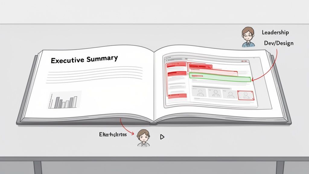
I’ve found a two-pronged approach works best. You create two distinct reports from the same pool of findings.
1. The Executive Summary for Leadership This needs to be a hard-hitting, one-to-two-page document. Assume your audience has about 90 seconds to spare.
- Lead with the Bottom Line: Connect your findings directly to business metrics. Talk about lost revenue, high cart abandonment, or the potential lift in conversions. Frame usability as a financial opportunity.
- Show the Big Picture: Group your findings into 3-5 major themes. For instance, "Our confusing checkout process is causing a 40% drop-off right before payment."
- Give Them Clear Choices: Pull recommendations straight from your impact-effort matrix. Offer up a few "quick wins" and one or two high-impact projects they can champion.
2. The Detailed Report for Your Boots-on-the-Ground Team This is the playbook for your designers, developers, and product managers. It needs to be loaded with context, evidence, and crystal-clear instructions.
- Annotated Screenshots are a Must: Don't just describe a problem, show it. Use arrows, boxes, and notes to pinpoint exactly where users got stuck.
- Use Video Highlights: Nothing hits harder than a 30-second clip of a real user sighing in frustration. A well-edited highlight reel is more persuasive than a ten-page summary.
- Be Hyper-Specific: Vague recommendations lead to vague results. Instead of "Improve the form," write "The phone number field needs inline validation and should automatically format entries to prevent user errors."
The Secret Weapon: The Compliance Report
In many companies, nothing gets budgets approved faster than the word "compliance." Accessibility is no longer a nice-to-have; it's a legal and financial necessity, and you can use that to your advantage. A formal compliance report from a tool like WebAbility.io provides an objective, data-driven look at your site’s accessibility gaps.
The legal landscape is pushing this front and center. The U.S. Department of Justice's 2024 rule gave state and local governments a clear deadline to meet WCAG 2.1 Level AA, and the private sector is taking notice. With the global website accessibility software market projected to be worth $420 million in 2025, it’s obvious that this is a serious business risk. You can read more about how ADA compliance in 2026 is driving growth and why it matters to everyone.
A compliance report isn't about blaming anyone. It’s about providing a clear, unbiased roadmap to reduce risk. It gives leadership a definitive list of what needs fixing and why, making it much easier to secure the resources you need.
Closing the Loop: Validate and Follow Up
Your job isn't over when the report is sent. To truly make an impact, you need to validate that your proposed changes actually work and establish a process for ongoing improvement. This is how you shift from a one-off project to a core business function.
I always push for A/B testing any significant change, especially if it's tied to conversion rate optimization. This gives you undeniable proof that your usability work delivered a positive ROI, which makes getting approval for the next project a whole lot easier.
Finally, get into a rhythm of regular, lightweight usability checks. Maybe it's a quick unmoderated test on a new feature each quarter or a handful of moderated sessions twice a year. This continuous feedback loop prevents your site from slowly drifting away from what your users actually want and need, keeping the experience sharp and the business healthy.
Common Questions About Website Usability Analysis
Even the most detailed playbook can leave you with a few nagging questions. I've been there. Before you dive in, let's tackle some of the most common ones that come up time and time again.
How Often Should I Conduct a Usability Analysis?
My advice is to think on two different timelines. You'll want to schedule a big, comprehensive analysis annually or anytime you're planning a major site redesign. This gives you that crucial, high-level benchmark of your site's health and overall user sentiment.
But the real magic happens when you stop treating usability as a once-a-year event. The best teams I've worked with build smaller, more frequent checks right into their workflow. Think quick quarterly reviews on a new feature or testing a key checkout flow. This approach helps you spot and fix friction almost as soon as it appears, keeping your user experience strong as your site evolves.
What Is the Difference Between Usability and Accessibility?
This is a big one, and it's easy to get them confused. The simplest way to think about it is that accessibility is a non-negotiable foundation for true usability.
- Usability is about making your site easy and efficient for a general audience to use. Can they find what they need without getting frustrated?
- Accessibility is about making sure that everyone, including people with disabilities who might use assistive tech like screen readers, can use your site.
You simply can't have a "usable" website if it's not accessible. If a portion of your audience can't use your site at all, it has failed the most basic test of usability. That's why we built our accessibility platform to help teams make their digital products work better for everyone.
Can I Perform a Usability Analysis on a Tight Budget?
Yes, absolutely. Don't let a small budget stop you from gathering powerful insights. Some of the most revealing findings come from scrappy, low-cost efforts.
You just have to be resourceful. Start by digging into free tools like Google Analytics to find pages with suspiciously high exit rates or low engagement—that’s your treasure map. From there, you can run a heuristic evaluation with your own team.
And when it comes to user testing, you don't need dozens of participants. Decades of research have shown that testing with just 5 to 7 users from your target audience will uncover the vast majority of critical issues.
At WebAbility.io, we know that a truly usable website has to be an accessible one. Our platform is built to help you find and fix issues, achieve compliance, and ultimately deliver a better experience for every single user. See how we can help you turn accessibility into a real competitive advantage at https://www.webability.io.
Quick Questions
Tap to ask AI about this article