Web Site Evaluation: A Step-by-Step Playbook for 2026

Sidharth Nayyar

Many teams still treat web site evaluation like a maintenance task. That framing is too small.
A strong evaluation tells you whether your site earns trust, supports conversions, and works for people with different abilities, devices, and intents. It also tells you whether your most important pages are easy to reach, easy to understand, and easy to act on. That’s where E-E-A-T becomes practical. If visitors hit confusing navigation, inaccessible forms, weak internal linking, or inconsistent page quality, they don’t experience expertise or trustworthiness. They experience friction.
The business case is hard to ignore. Approximately 94.8% of website home pages have accessibility failures, and those failures correlate with bounce rates spiking by 32% on inaccessible pages, according to Digital Silk’s website statistics roundup. In other words, web site evaluation isn’t about standards. It’s about protecting demand, guiding users to key pages, and removing preventable leakage from the funnel.
The Full Audit Playbook
If you need the short version, use this operating model.
- Start with business goals: Tie the evaluation to outcomes like stronger lead generation, cleaner checkout flow, better internal linking to revenue pages, improved trust signals, or accessibility conformance.
- Scope critical journeys first: Review the pages that matter most. Home, category, product, pricing, sign-up, forms, support, and policy pages deserve priority.
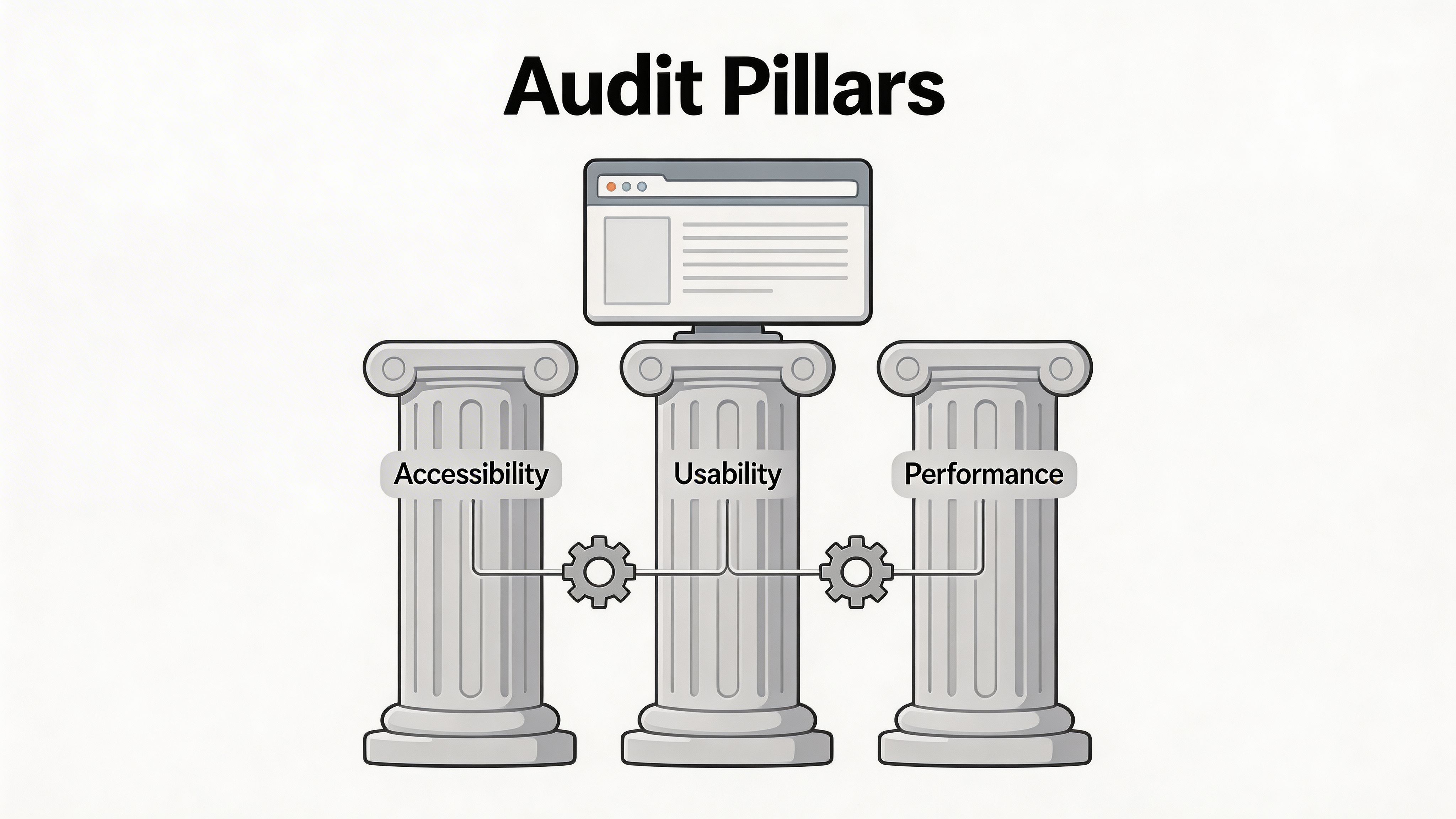
- Audit three layers together: Accessibility, usability, and performance should be reviewed as one system, not three separate projects.
- Prioritize by impact: Fix barriers that block key tasks, weaken trust, or interrupt high-value navigation before you chase minor polish items.
- Make the output usable: Turn findings into sprint-ready tickets, owner assignments, and a simple executive summary.
- Build governance: Sites change constantly. Monitoring, reviews, and publishing standards keep gains from slipping.
For a practical companion checklist, this website audit checklist is a useful starting point for turning broad evaluation goals into a repeatable review process.
Bottom line: The best web site evaluation process improves compliance and conversion at the same time.
Why Your Next Website Evaluation Needs a Bigger Goal
A narrow audit mindset creates narrow results.
If your team only evaluates a web site to “find issues,” you’ll get a list of issues. You won’t necessarily get a stronger site. The stronger approach is to evaluate the site against the outcomes the business cares about. Trust. Discoverability. Conversion paths. Content clarity. Accessibility. Repeat visits.
E-E-A-T is visible in the interface
E-E-A-T gets discussed like an abstract SEO framework. On a live site, it shows up in concrete ways.
Experience appears in the specificity of your content and the quality of your user journeys. Expertise appears in how clearly you explain services, products, and decisions. Authoritativeness appears in structure, consistency, and supporting evidence. Trustworthiness appears in every detail that removes doubt, including accessible navigation, clear policies, usable forms, and reliable page behavior.
A page can have strong copy and still undermine trust if the call to action is hard to find, the heading structure is confusing, or the navigation buries the pages that matter most. That’s why web site evaluation belongs in the same conversation as brand credibility and revenue operations.
Compliance and CRO belong in the same room
Accessibility work is isolated from conversion work. That separation hurts both.
A site that’s easier to use, easier to read, and easier to operate with a keyboard produces cleaner user flows for everyone. Better labels help users complete forms. Better hierarchy helps people scan. Better contrast and focus states reduce hesitation. Better internal linking helps users move from informational pages to money pages without friction.
If your team is refining funnels, this primer on Conversion Rate Optimization is a useful complement because it frames conversion work as a disciplined process rather than a series of isolated page tweaks.
Poor evaluation scope creates a familiar problem. Teams fix what’s visible to them, not what blocks users from converting.
A bigger goal changes what gets reviewed
When the goal is bigger, the audit questions get sharper:
- Journey quality: Can a first-time visitor get from an entry page to a key conversion page without confusion?
- Trust signals: Do your critical pages look maintained, coherent, and credible?
- Accessibility reality: Can users operate the site without relying on ideal conditions?
- Internal linking logic: Are high-importance pages supported by navigation, contextual links, and clear pathways?
- Commercial clarity: Do users understand what you offer, why it matters, and what to do next?
That’s the difference between a technical chore and a strategic web site evaluation. One produces observations. The other produces decisions.
Scoping Your Evaluation for Actionable Insights
The fastest way to waste an audit is to start scanning before you decide what success looks like.
Scoping determines whether your review turns into a backlog of noise or a set of decisions the team can act on. In practice, the strongest scopes are narrow enough to stay useful and broad enough to expose structural problems.
Start with the commercial question
For an e-commerce site, the primary question isn’t “Is the site good?” It’s more specific.
Is the path from category page to product page to cart to checkout clear and accessible? Are high-margin products easy to discover? Are policy pages helping conversion or creating doubt? Are internal links pushing people toward priority pages or leaving them stranded in low-intent content?
For a SaaS company, the commercial question may center on demo requests, free trial starts, or self-serve sign-up. For a public sector site, it may center on task completion and accessible service delivery. The method changes less than people think. The intent changes everything.
Define what the audit must include
A scoped evaluation needs explicit boundaries. I want teams to agree on these before any tooling starts:
- Business objective: Revenue growth, lead quality, compliance readiness, service completion, or content trust.
- Audience focus: New visitors, returning users, applicants, customers, support seekers, procurement teams, or mixed audiences.
- Critical templates: Home, landing, category, product, pricing, article, resource, checkout, account, contact, and policy pages.
- Core journeys: The handful of flows that matter enough to justify engineering time.
- Decision owners: The people who can approve remediation, content changes, and release priorities.
Without this, teams end up arguing about edge cases while the core path stays broken.
Scope by journey, not by department
Departments describe responsibility. Journeys describe reality.
A buyer doesn’t care that navigation belongs to one team, product detail pages belong to another, and checkout belongs to a third. They experience one connected path. Your web site evaluation should follow that path.
For a retailer, a useful scope might include:
- Discovery path: Home or search to category to product detail.
- Decision path: Product detail to reviews, shipping, returns, and related products.
- Purchase path: Add to cart through checkout confirmation.
- Support path: FAQ, contact, and policy access before purchase.
That approach reveals where internal linking is weak, where trust breaks down, and where accessibility barriers interrupt intent.
For technical reviews that support this step, a structured technical website audit can help align UX, code health, and page-level issues inside a single review scope.
Practical rule: If a page matters to revenue, trust, or compliance, it belongs in scope even if it gets less traffic than the homepage.
Choose depth before you choose tools
Not every evaluation needs the same depth.
A full-site baseline makes sense when the site is large, recently inherited, or heading into redesign, procurement, or legal review. A targeted evaluation works better when leadership needs quick wins on a high-value path.
Here’s a simple way to choose:
| Evaluation mode | Best fit | What you learn |
|---|---|---|
| Targeted journey audit | Specific conversion or UX problem | Friction in key flows |
| Template-based audit | Medium to large sites with repeated layouts | Structural issues across page types |
| Full-site baseline | Governance, migration, enterprise oversight | Broad risk and prioritization map |
Write the success criteria down
Good scopes include a definition of “better.”
That might mean easier navigation to priority pages, fewer blockers in forms, stronger consistency across templates, clearer trust signals, or fewer accessibility barriers in critical journeys. Keep the language operational. Vague goals produce vague reports.
A scoped evaluation doesn’t limit ambition. It protects relevance.
The Full Audit Playbook
A useful web site evaluation rests on three pillars: Accessibility, usability, and performance. Treating one as primary and the others as optional creates rework.
Accessibility review
Accessibility is the first pillar because it affects who can use the site at all. It also has direct implications for trust, UX quality, and operational risk.
The strongest audits combine automated scanning with manual checks. Automation is excellent for surfacing repeatable issues across templates. Manual testing is where you confirm whether the site works for real users navigating with keyboards, assistive technology, zoom, and altered visual settings.
What I want reviewed on every important template:
- Keyboard operation: Menus, popups, forms, search, filters, and modals should work without a mouse.
- Visual clarity: Contrast, focus states, readable text, and zoom behavior should support comfortable use.
- Semantic structure: Headings, labels, landmarks, button names, and form instructions should make sense in sequence.
- Media handling: Images need meaningful text alternatives when they carry information. Decorative visuals should stay quiet.
- Error handling: Validation messages, inline instructions, and recovery paths should help users complete the task.
A platform-supported approach can help teams scale this work across active sites. One example is a website accessibility audit, which can be used to surface WCAG-related issues and organize remediation work alongside broader governance.
Where widgets and managed accessibility fit
Modern accessibility programs benefit from layered support. That can include code remediation, publishing standards, scanning, dashboarding, and user-facing tools that let visitors adapt the experience to their own needs.
That layered model matters because one mechanism rarely covers every accessibility need on its own. Managed accessibility workflows can help teams sustain progress, and accessibility widgets can give users immediate control over features such as contrast, text scaling, reading support, keyboard assistance, and personalization. Used as part of a wider program, these tools support both usability and inclusion.
Usability review
Accessibility tells you whether users can operate the site. Usability tells you whether the path feels understandable and efficient.
A practical audit combines two methods that work well together:
- Cognitive walkthroughs
- Expert heuristic reviews
According to the scoping review and inspection guidance summarized in the source material, combining cognitive walkthroughs with expert reviews lets teams identify up to 80% of usability issues with just 3 to 5 evaluators, and cognitive walkthroughs were used in nearly half of the reviewed usability studies in the cited research from PMC and MeasuringU.
That matters because it gives teams a realistic, high-efficiency model. You don’t need a massive research operation to catch serious UX problems in critical flows.
Run a cognitive walkthrough on your money path
Take one key task and walk it step by step.
For e-commerce, that might be “find a product, understand it, add it to cart, and begin checkout.” For SaaS, it might be “compare plans, start a trial, and submit onboarding details.” At each step, ask:
- Will the user try to take this action?
- Will they see where to do it?
- Will they understand what happens next?
- Will they know they succeeded?
This method is useful for internal linking decisions. A blog post may attract intent, but if it doesn’t point readers toward a pricing page, product page, category page, or contact page with the right context, the path breaks even when the content itself is good.
For teams that want a practical outside perspective on how to conduct a website user experience audit, that guide is a solid reference for reviewing flow clarity, friction, and page-level experience.
Use heuristics to catch system-wide UX patterns
Heuristic review is where experienced evaluators inspect the site against established principles such as clarity, feedback, consistency, error prevention, and user control.
I’d look for patterns like:
- Repeated CTA inconsistency across templates
- Navigation labels that reflect internal org charts instead of user intent
- Important pages buried too deep in menus
- Search experiences that fail to support product or content discovery
- Forms that ask for too much before trust is established
Fixing one broken page helps. Fixing a repeated pattern across templates changes the whole site.
A good heuristic review also exposes internal-linking problems. Many sites have enough links, but not enough intentional links. The pages the business cares about most should receive prominent, context-rich support from navigation, in-body copy, related content blocks, and footer architecture.
A useful checkpoint for internal linking is simple: if a page matters commercially or operationally, users shouldn’t have to hunt for it.
Here’s a compact review sheet many teams can use:
| Usability area | What to inspect | Strong signal |
|---|---|---|
| Navigation | Labels, menu depth, orientation | Users can predict where pages live |
| Content hierarchy | Headings, summaries, CTA placement | Scanability improves decision-making |
| Internal linking | Contextual links to key pages | Priority pages gain clear pathways |
| Form UX | Labels, help text, validation | Users can complete tasks without guessing |
A short explainer can help align teams on what to watch for during manual review.
Performance review
Performance is where many teams drift into the wrong question. They ask whether the site is “fast” in general. That’s too vague.
The right question is whether speed and responsiveness support the journeys that matter. A fast blog page doesn’t offset a sluggish cart, delayed filtering system, or heavy script load on pricing and form pages.
Performance review should focus on:
- Critical page templates: Home, category, product, pricing, cart, checkout, and lead forms
- Mobile experience: Layout stability, tap target clarity, and responsive behavior
- Third-party overhead: Tag managers, chat tools, video embeds, review widgets, personalization scripts
- Asset discipline: Images, fonts, and front-end bundles that affect rendering
The trade-off is real. Richer experiences can support conversion, but every script and asset needs to justify its place in the path. That includes accessibility-related enhancements. The answer isn’t “add nothing.” It’s “add intentionally, test continuously, and remove what doesn’t earn its weight.”
What works and what doesn’t
What works:
- Auditing the same journey through all three pillars
- Reviewing templates instead of random pages
- Testing important forms manually
- Linking high-intent content to high-value pages with clear context
- Documenting issues in ticket-ready language
What doesn’t:
- Treating accessibility as a separate compliance appendix
- Reviewing only the homepage
- Assuming analytics alone will explain friction
- Overloading pages with competing calls to action
- Publishing audit findings without owners, screenshots, or fix guidance
A thorough playbook is less about finding every flaw and more about finding the flaws that interrupt trust and action.
From Findings to Action Plan Scoring and Prioritization
An audit becomes valuable when the team can decide what to fix first without another week of debate.
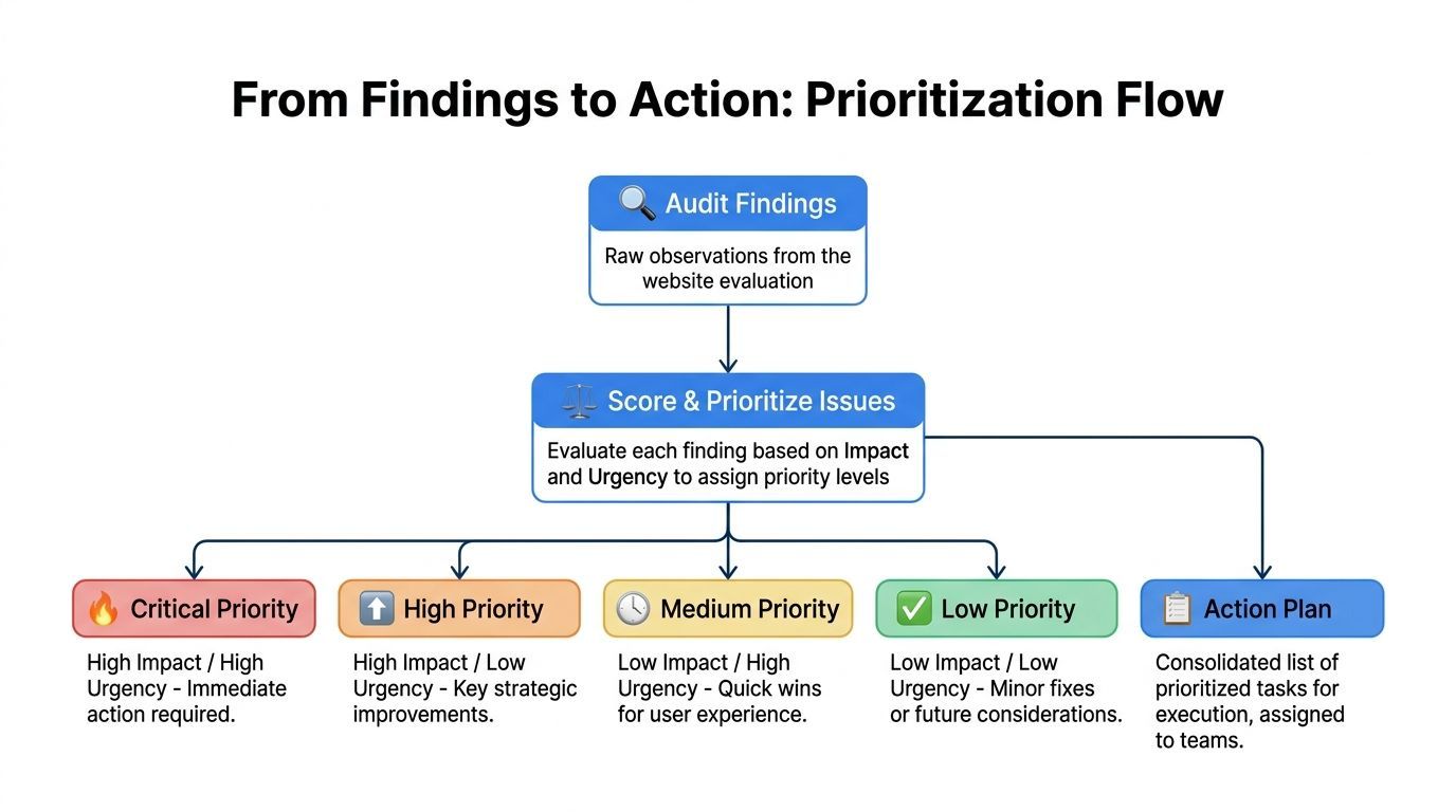
That requires a scoring model that’s simple enough to use and strong enough to support trade-offs. Teams don’t need a complicated formula. They need a reliable way to separate blockers from background noise.
Use impact and effort first
The most practical model is a two-axis score.
Impact asks how much the issue affects users, conversion paths, trust, and compliance exposure. Effort asks how difficult the fix is in design, content, engineering, QA, or governance terms.
That sounds basic because it is. Basic is good when multiple teams need to act on the same report.
A missing form label on a lead form has high impact and low effort. A navigation redesign may have high impact and high effort. A minor spacing inconsistency on a low-priority template may have low impact and low urgency.
Score through the lens of business importance
Not all issues deserve equal attention, even if they share the same category.
A low-friction defect on a checkout page matters more than a similar defect on a low-value archive page. A broken internal link to a service page can hurt more than an imperfect visual detail on a resource page. Prioritization improves when you factor in the role of the page itself.
Here’s a practical matrix teams can use during triage.
Remediation Prioritization Matrix
| Priority | Issue Category | Example | Impact (1-5) | Effort (1-5) |
|---|---|---|---|---|
| Critical | Accessibility blocker | Checkout button unreachable by keyboard | 5 | 2 |
| High | Internal linking | Pricing page has weak contextual links from key intent pages | 4 | 2 |
| High | Form usability | Error messaging doesn’t explain how to recover | 4 | 3 |
| Medium | Content hierarchy | Important service page buries CTA below low-value copy | 3 | 2 |
| Medium | Performance | Heavy media slows a secondary landing page | 3 | 3 |
| Low | Visual polish | Minor alignment inconsistency in a non-critical component | 1 | 1 |
Write findings for execution, not for applause
The report should help three audiences do their jobs.
Leadership needs a decision summary
Executives don’t need every annotation. They need a concise view of exposure, business impact, and the order of operations.
Include:
- Core risks: What’s blocking revenue, trust, or inclusive access
- Priority themes: Navigation, forms, content clarity, accessibility, or performance
- Recommended sequencing: Quick wins, sprint work, and structural initiatives
- Ownership view: Which teams need to move first
Product and engineering need ticket-ready detail
If the output can’t be turned into work items quickly, it slows down.
For each issue, document:
- Page or template affected
- User scenario affected
- Why it matters
- Recommended fix direction
- Screenshot or markup reference
- Related standard or heuristic if relevant
That level of detail removes ambiguity. It also prevents audit reports from becoming passive documentation instead of active inputs to delivery.
Execution test: If a developer or content owner can’t tell what to change from your finding, the finding isn’t finished.
Content and SEO teams need pathway insight
This part gets missed.
A web site evaluation should tell content teams where internal linking is underpowered, where high-intent pages aren’t getting enough support, and where informational content fails to move users toward decisions. That’s one of the cleanest ways to connect UX with CRO. Stronger pathways improve discoverability without resorting to aggressive page design.
Avoid three reporting mistakes
- Dumping raw tool output: Screenshots and issue exports aren’t a strategy.
- Mixing blockers with cosmetic notes: Teams need signal, not equal-weight clutter.
- Ignoring ownership: Every major finding should have a likely team attached.
A scoring system doesn’t need to be fancy. It needs to make action obvious.
Building a Governance Framework for Continuous Improvement
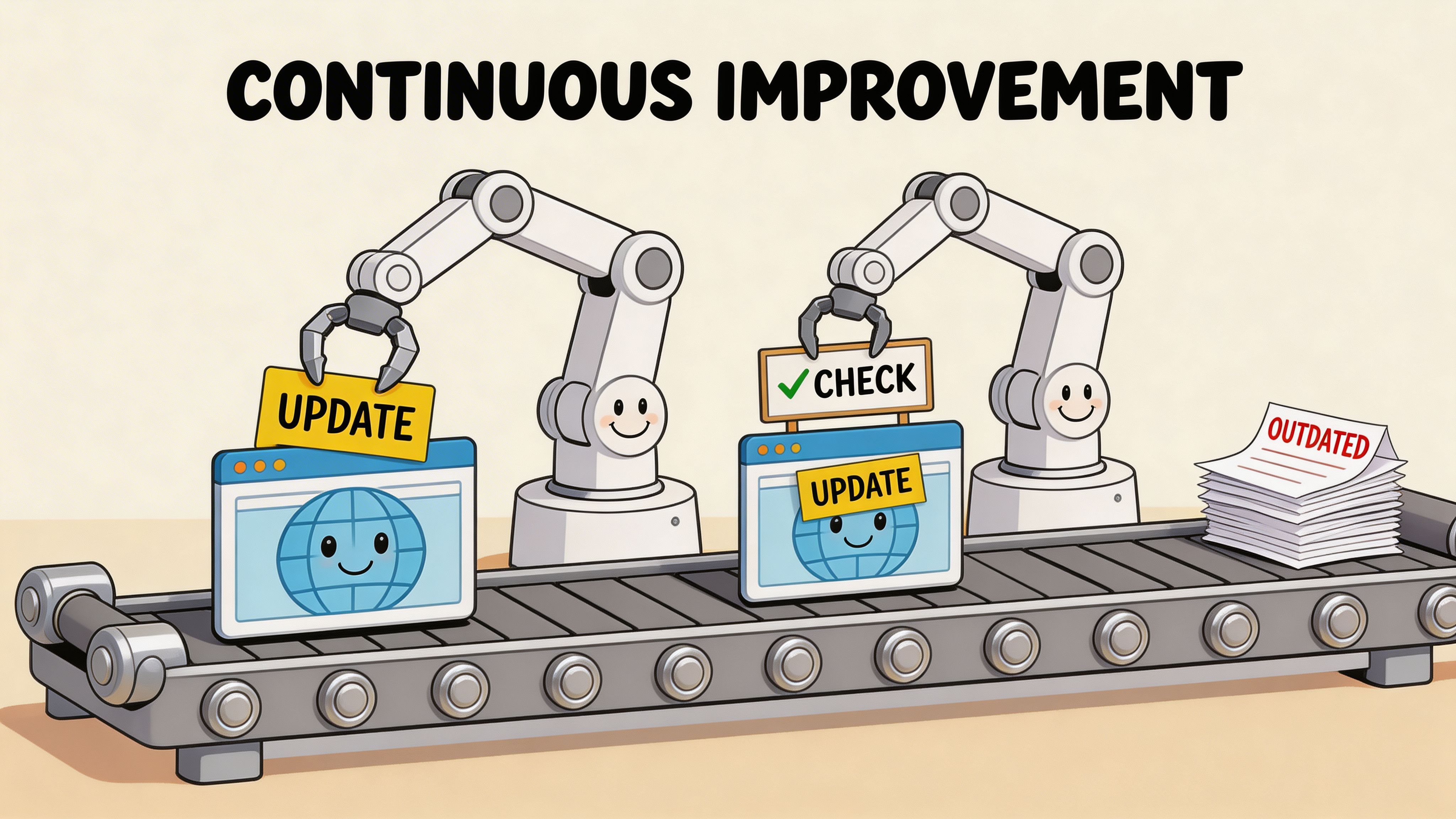
One-time audits produce snapshots. Sites don’t stay still long enough for snapshots to carry the whole load.
Content teams publish. marketers launch campaigns. developers ship features. vendors add scripts. design systems evolve. That movement creates drift, and drift is where hard-won accessibility and UX gains get lost.
Why governance matters after remediation
The source material makes the risk clear. Static, one-time audits are insufficient for modern websites; post-launch compliance regression can reach 70% as dynamic content changes, and ADA web lawsuits surpassed 4,000 in 2023, which is why continuous monitoring and governance matter in real-world compliance work, as noted in the WCC research toolkit summary.
That’s the operational argument for governance. Not fear. Operations.
Build the framework around publishing reality
A workable governance model should fit how your organization ships.
That means:
- Continuous scanning: Automated monitoring catches recurring issues across active templates.
- Release checks: New features and major content changes should pass a pre-launch review.
- Editorial standards: Content teams need rules for headings, links, alt text, tables, embeds, and CTA placement.
- Design system controls: Reusable components should carry accessible defaults.
- Issue intake: Users and internal teams need a simple way to report barriers.
For teams thinking beyond one-off audits, this guide to automated compliance monitoring is useful because it frames monitoring as an operating discipline rather than a periodic task.
Assign owners, not just responsibilities
Governance fails when “the team” owns everything.
Ownership should be specific:
| Area | Primary owner | Typical responsibility |
|---|---|---|
| Design system | UX or design lead | Accessible components and pattern updates |
| Content publishing | Content lead or editor | Headings, links, media, page clarity |
| Feature releases | Product and engineering | Pre-launch checks and remediation |
| Monitoring and reporting | Operations, compliance, or digital lead | Review cadence and escalation |
When a site has multiple brands, regions, or business units, central standards matter even more. Teams need one scoring model, one reporting rhythm, and one place to review what changed.
Support users while the program matures
Governance shouldn’t be limited to internal QA. User support belongs in the model too.
That can include accessible help pathways, issue reporting, and adaptive interface options that let visitors tailor the experience to their needs. In practice, the strongest programs combine structural remediation with support tools that improve usability in the moment.
One option in that category is WebAbility.io, which provides continuous scanning, compliance scoring, dashboard reporting, user issue intake, and an accessibility widget with user controls such as contrast, text scaling, keyboard support, and reading aids. In a governance program, tooling like that can sit alongside manual QA, content standards, and release reviews.
Sustainable accessibility work looks less like a campaign and more like product operations.
Review on a cadence that matches change
High-change sites need tighter review loops than static ones.
An enterprise commerce site may need regular dashboard review, release checkpoints, and template-specific oversight. A smaller brochure site may rely on lighter recurring reviews plus pre-publish checks. The right cadence depends on how often the site changes and how costly regression would be.
Governance works when it becomes ordinary. Not dramatic. Not occasional. Ordinary.
Frequently Asked Questions About Website Evaluation
How often should a web site evaluation happen
A formal evaluation makes sense before redesigns, migrations, major campaigns, procurement reviews, and accessibility initiatives. Between those moments, teams should use lighter recurring reviews tied to releases, publishing workflows, and monitoring alerts.
What’s the difference between a website audit and a web site evaluation
An audit implies issue detection. A web site evaluation is broader. It looks at whether the site supports business goals, user tasks, accessibility, trust, internal linking, and page quality. Audits are part of evaluation, but they aren’t the whole discipline.
Should small businesses evaluate the whole site at once
Not usually. Start with the pages that matter most. Home, service or product pages, contact paths, forms, and any page that directly supports conversion or trust are the right first targets. Expand once the team has fixed the highest-value issues.
Can automated tools replace manual review
No. Automated tools are useful for scale and consistency, but they don’t fully capture task flow, content clarity, or real interaction barriers. Manual review is still needed for forms, navigation, keyboard use, messaging, and internal-linking logic.
Where does internal linking fit into web site evaluation
It belongs near the center. Internal linking shapes how users move from awareness to action. If your most important commercial or service pages aren’t easy to reach from high-intent content, the site leaks opportunity even when the pages themselves are well written.
What’s the most common mistake teams make
They produce a long report and stop there. The better approach is to turn findings into prioritized fixes, assign owners, and build ongoing review into how the site is maintained.
If you're ready to turn web site evaluation into an ongoing accessibility and CRO practice, WebAbility.io gives teams a practical way to monitor issues continuously, organize remediation, and support users with adaptable accessibility features across growing sites.
Quick Questions
Tap to ask AI about this article