Web for the Blind: A Practical Accessibility Guide

Sidharth Nayyar
TL;DR:96.3% of the top 1,000,000 home pages have at least one detectable accessibility error, averaging 56.1 errors per page, which is why a practical web for the blind starts with five pillars: semantic HTML, thoughtful ARIA for dynamic interfaces, full keyboard access, testing with both tools and real users, and ongoing governance. Done together, those pillars improve usability for everyone and help organizations reach people too often excluded from digital experiences.
Development teams typically don't set out to exclude blind users. They launch fast, stack on components, ship redesigns, and assume an accessibility scan at the end will catch the important stuff. It won't. Blind users experience the web through structure, names, states, focus order, and feedback. If those pieces are weak, the interface may look polished and still be hard to use.
That matters at a much larger scale than many teams realize. The web still has deep accessibility gaps, and those gaps carry both UX and business consequences. A web experience that works for blind users usually becomes clearer, faster, and more conversion-friendly for everyone else too.
Building an Inclusive Digital Front Door
A useful way to frame web for the blind is this: your site isn't a collection of pages. It's a decision environment. People arrive to compare products, complete forms, request services, manage accounts, or find answers under time pressure. If the structure is unclear or the controls don't announce themselves properly, blind users lose confidence long before they reach the final CTA.
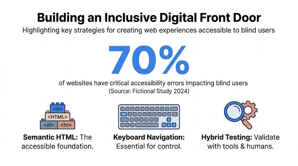
In 2026, WebAIM's Million report found that 96.3% of the top 1,000,000 home pages had at least one detectable WCAG 2.2 error, with 56.1 errors per page on average. The same analysis ties those barriers to a much bigger reality: 2.2 billion people are affected by visual impairments, within a $13 trillion disability economy. Accessibility isn't just a compliance issue. It's market access, trust, and completion rate.
What teams should optimize for
Blind users don't "browse around" in the same way many sighted users do. They move by headings, landmarks, links, form controls, and predictable focus. That changes what good design looks like.
A strong implementation usually improves:
- Task completion: Users can move from page entry to a meaningful action without guessing what an unlabeled control does.
- Internal discovery: Important pages become easier to scan when heading structure, landmarks, and link text are meaningful.
- Conversion paths: Checkout, sign-up, booking, and support journeys become more predictable because the interface communicates state clearly.
- Content findability: Better semantics often sharpen internal linking decisions because teams have to define what each page and section is for.
Practical rule: If a blind user can't confidently understand where they are, what changed, and what happens next, the page isn't ready.
Teams tackling their first major overhaul often need a mix of code changes, workflow fixes, and tooling support. Resources like the Accesstive Human First Accessibility Platform can help teams compare approaches and think beyond a one-time audit toward a maintainable process.
Accessibility and E-E-A-T in practice
The strongest accessible sites tend to signal credibility in ways search engines and humans both value. They use clear content hierarchy, descriptive links, consistent labels, understandable forms, and dependable navigation patterns. That strengthens experience, expertise, authoritativeness, and trust because the site behaves like a system people can rely on.
For developers and digital teams, that's the opportunity. Don't treat accessibility as a layer you add after design sign-off. Treat it like performance engineering for human understanding.
The Foundational Layer of Semantic HTML
If your markup is weak, every other accessibility fix becomes harder. Screen readers need reliable structure to build a mental map of the page, and semantic HTML gives them that map by default.
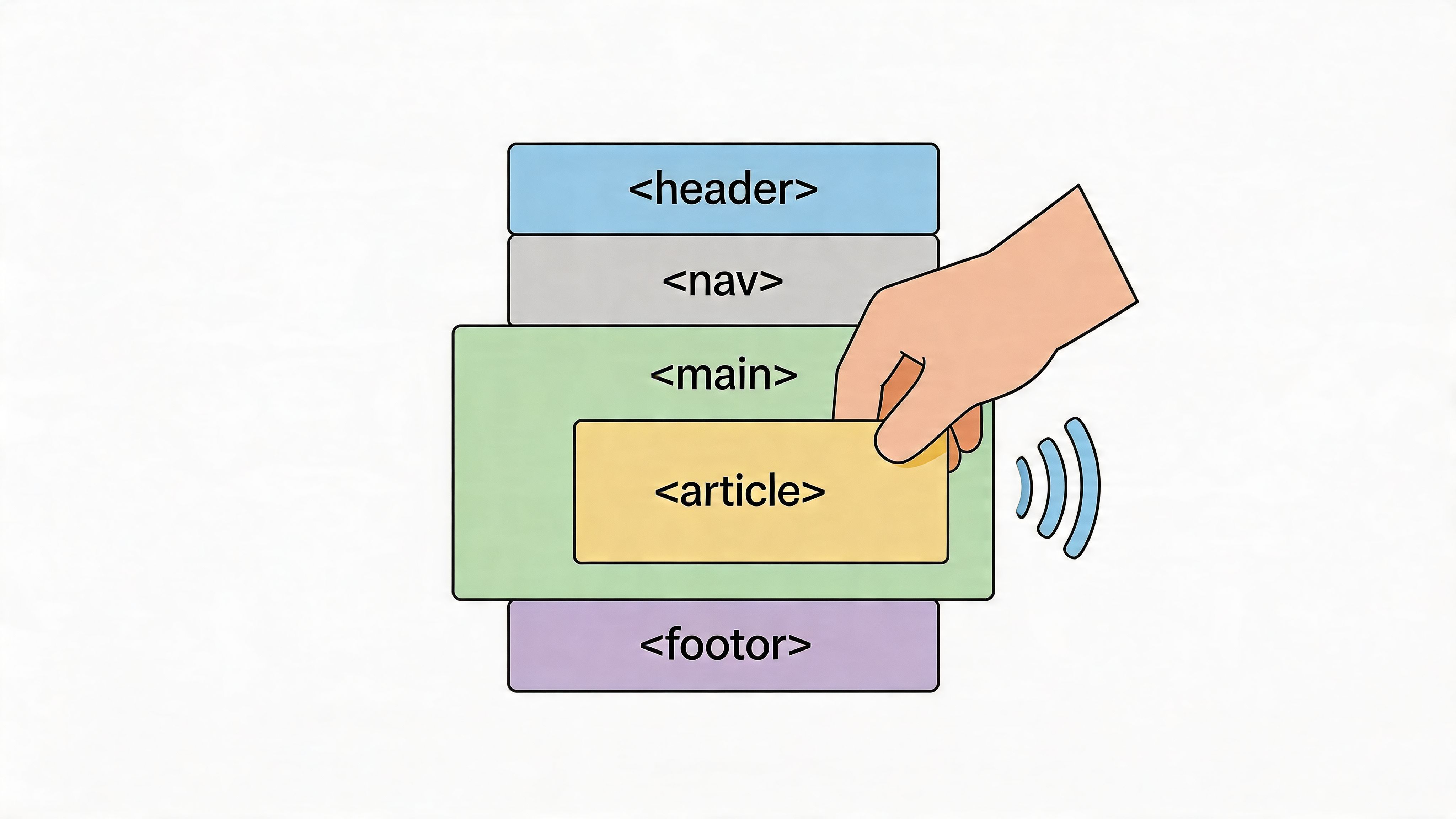
Start with regions, not divs
A common anti-pattern is a page made from nested <div> elements with CSS classes that describe layout but not meaning. Sighted users can infer the structure from spacing and visual hierarchy. Screen readers can't. They need landmarks and native elements.
Use semantic regions first:
<header> <a href="#main-content" class="skip-link">Skip to main content</a> <nav aria-label="Primary"> <ul> <li><a href="/services">Services</a></li> <li><a href="/pricing">Pricing</a></li> <li><a href="/contact">Contact</a></li> </ul> </nav> </header> <main id="main-content"> <article> <h1>Website accessibility services</h1> <p>Improve usability, reduce risk, and support inclusive browsing.</p> </article> </main> <footer> <nav aria-label="Footer"> <ul> <li><a href="/accessibility-statement">Accessibility Statement</a></li> <li><a href="/support">Support</a></li> </ul> </nav> </footer> This isn't just cleaner code. It creates recognizable page regions that screen reader users can jump between quickly.
For teams that need a shared reference vocabulary, WebAbility's glossary entry on semantic HTML is a useful baseline for design and development discussions.
Headings are navigation, not styling hooks
Many teams still use headings to make text look large. That creates a broken outline. A screen reader user often uses the heading list first, then decides where to go. If heading levels are skipped or used decoratively, the page becomes harder to scan.
Use one <h1> that describes the page purpose. Then nest headings in a logical order.
<main> <h1>Compare ecommerce accessibility plans</h1> <section> <h2>What's included</h2> <p>Overview of audits, monitoring, and remediation support.</p> </section> <section> <h2>Pricing model</h2> <h3>Monthly plans</h3> <p>Best for ongoing governance.</p> <h3>Project engagements</h3> <p>Best for redesigns and remediation sprints.</p> </section> </main> A quick test works well here. Open the page outline mentally and ask, "If I heard only the headings, would I understand the page?" If the answer is no, rewrite the structure before touching ARIA.
Semantic HTML often fixes problems before you run a scanner. It gives screen readers the nouns and boundaries they need.
Lists, buttons, and links need their native elements
The web for the blind breaks down fast when teams simulate native controls. A clickable <div> isn't a button. A row of visually separated items isn't a list unless it's coded as one. Native elements carry role, keyboard behavior, and announcement patterns for free.
Use this checklist during implementation:
- Use real buttons for actions: If something submits, opens, toggles, or expands, prefer
<button>over a styled<div>or<span>. - Use lists for grouped items: Navigation items, feature lists, steps, and filters should use
<ul>,<ol>, or<dl>as appropriate. - Use links for navigation: If the control moves the user to another URL, it should be an
<a>element. - Keep labels explicit: Every form field needs an associated label users can hear and understand.
A short comparison helps teams catch common mistakes:
| Pattern | Better choice | Why it matters |
|---|---|---|
Clickable card built from <div> | Link or button inside a semantic container | Native controls announce purpose and support expected interaction |
| Bold text used as a section title | Proper heading element | Users can jump by heading |
| Visual bullet layout with paragraphs | <ul> or <ol> | Screen readers announce list context |
| Placeholder used as label | Visible <label> | Placeholders disappear and often create ambiguity |
Semantic structure improves internal linking too
Accessibility and internal linking support each other more than is generally understood. When a page has a clear <h1>, meaningful section headings, and descriptive anchor text, it becomes easier to link users to the right destination with confidence.
That matters for CRO. A vague link like "Learn more" forces extra interpretation. A clear link like "View ADA audit process" or "Compare accessible checkout patterns" reduces friction, especially for screen reader users pulling up a links list out of context.
Enhancing Experience with ARIA and Screen Reader Support
Semantic HTML gets you far, but modern interfaces often need more. Filters update without reloads. Validation messages appear inline. Dialogs open over the page. Tabs, disclosures, and custom widgets expose state that plain HTML doesn't always communicate on its own. That's where ARIA helps.
Used well, ARIA fills in missing meaning. Used poorly, it adds noise or conflicts with native behavior. The discipline is knowing when to enhance and when to leave the browser alone.
Use ARIA to describe dynamic behavior
Research from WebInSight's screen reader accessibility paper notes that implementing ARIA landmarks and attributes correctly can reduce screen reader verbosity by 40-60%. The same source says task completion rates for blind users can drop by as much as 55% when dynamic content changes aren't announced through live regions. That's the difference between a site feeling responsive and a site feeling broken.
Here is a common pattern for status updates:
<form id="newsletter-form"> <label for="email">Email address</label> <input id="email" name="email" type="email" /> <button type="submit">Subscribe</button> </form> <div id="form-status" aria-live="polite"></div> <script> const form = document.getElementById('newsletter-form'); const status = document.getElementById('form-status'); form.addEventListener('submit', function (e) { e.preventDefault(); status.textContent = 'Subscription request sent. Check your inbox for confirmation.'; }); </script> Without aria-live, a blind user may trigger the action and hear nothing. The form appears to do nothing even when the request succeeded.
Landmarks and states reduce cognitive load
Many teams think of accessibility as "make it readable by a screen reader." That's too narrow. The better question is whether the interface communicates purpose, location, and state efficiently.
Consider these practical uses:
- Landmarks:
role="navigation"and labeled regions help users jump between major sections. - Expanded state:
aria-expandedtells users whether a disclosure or menu is open. - Control relationships:
aria-controlscan clarify what a trigger affects. - Hidden decorative content:
aria-hidden="true"removes non-informative clutter from announcements.
<button aria-expanded="false" aria-controls="faq-panel-1" id="faq-button-1"> Shipping questions </button> <div id="faq-panel-1" hidden> <p>Delivery times vary by location and shipping option.</p> </div> When the button state changes, update aria-expanded and the hidden state together. Don't update one without the other.
Screen reader support is a usability practice
A lot of sites can pass technical checks and still feel exhausting to use. That's the screen reader usability gap. The issue isn't always a missing attribute. Sometimes it's over-explaining, duplicating labels, or announcing irrelevant content because teams tried to "help" by adding too much ARIA.
If native HTML already communicates the role and state correctly, adding ARIA often makes the experience worse, not better.
That matters especially with managed accessibility layers and dynamic enhancement tools. They can accelerate progress when teams use them to support user preferences, surface issues, and strengthen workflows. But they work best when the underlying code is already clear and predictable. Native semantics still do the heavy lifting.
A practical review process for screen reader support should include:
- Check the trigger name: Can the user understand what the button or link does out of context?
- Check the state: Does the control announce whether it's expanded, selected, pressed, or busy?
- Check the result: When the page updates, is that change announced?
- Check the exit path: Can the user move away without getting trapped or lost?
Teams that want to sharpen their process can use a hands-on guide to screen reader testing workflows to align QA, development, and design around real interaction patterns instead of checkbox compliance.
Ensuring Full Control with Keyboard-Only Navigation
Blind users often browse with a keyboard, either directly or alongside a screen reader. If your interface requires a mouse for any critical action, the task chain is broken.
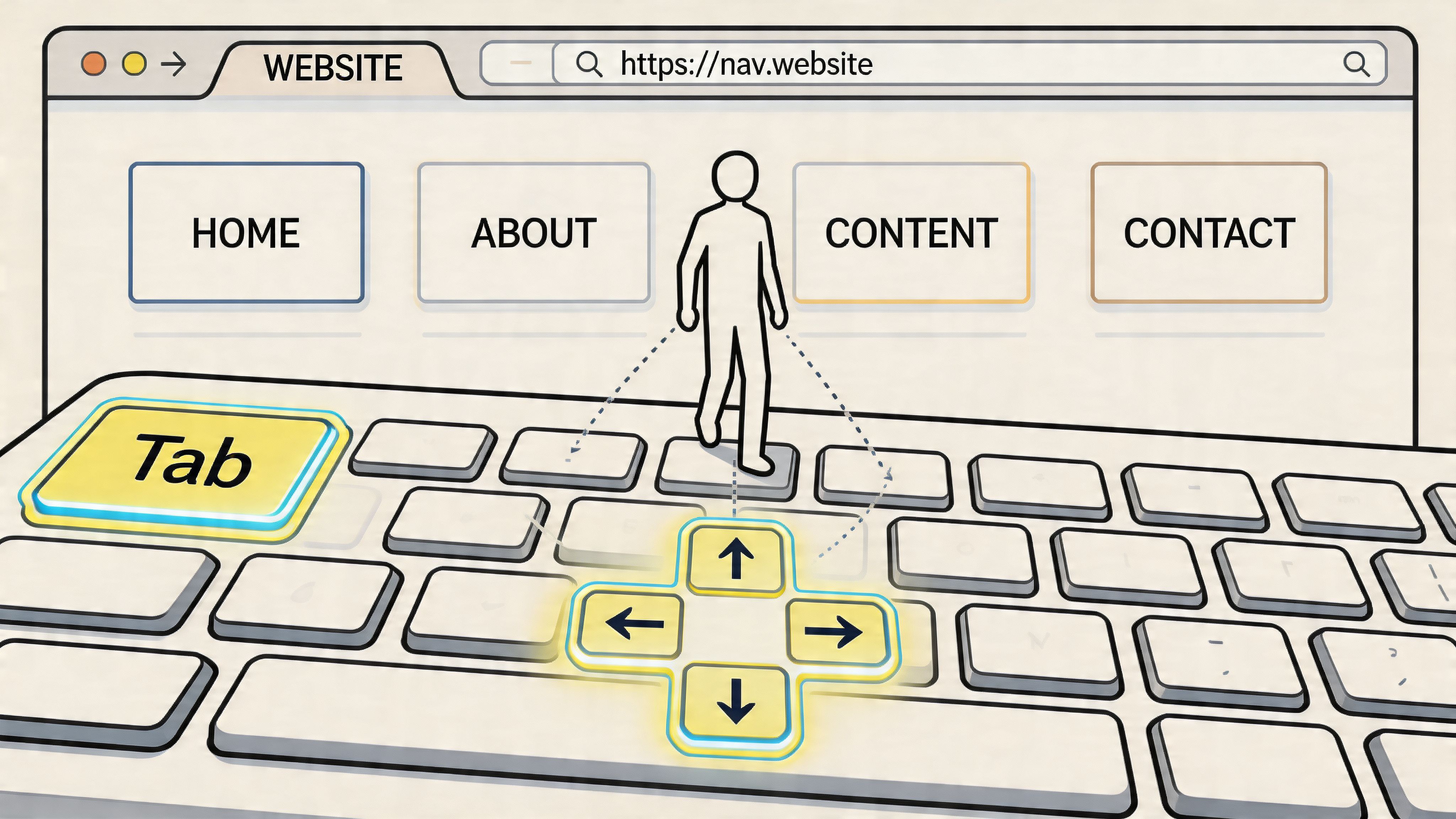
The standard is straightforward. WCAG 2.1.1 keyboard guidance discussed by A11Y Collective states that all functionality must be keyboard accessible. The same source notes that trapping focus properly in modals with aria-modal='true' helps prevent 80% of common escape-related failures, and that a visible focus style such as outline: 2px solid #007cba is mandatory to prevent disorientation.
Fix the tab journey first
Keyboard accessibility isn't about making Tab cycle through everything on the page. It's about making focus move in a logical order through interactive elements. When focus jumps unpredictably, users lose context.
The first pass should answer four questions:
- Does focus start where a user expects?
- Does each Tab move forward through the interface in a sensible order?
- Can every interactive control be activated with the keyboard?
- Is the current focus location always visible?
A simple skip link is one of the highest-value fixes you can ship:
<a href="#main-content" class="skip-link">Skip to main content</a> <style> .skip-link { position: absolute; top: -40px; left: 0; z-index: 999; background: #ffffff; color: #000000; padding: 8px 12px; } .skip-link:focus-visible { top: 0; outline: 2px solid #007cba; } </style> That link gives keyboard users a fast route past repeated navigation and into the page's real content.
Focus visibility is part of the interface
Design teams sometimes remove outlines because they don't match the visual system. That choice creates an invisible interface for keyboard users. The better approach is to design a strong focus treatment on purpose.
button:focus-visible, a:focus-visible, input:focus-visible, select:focus-visible, textarea:focus-visible { outline: 2px solid #007cba; outline-offset: 2px; } Use :focus-visible rather than styling every focus event the same way. It preserves a cleaner mouse experience while keeping keyboard focus obvious.
For teams documenting shared implementation patterns, a glossary reference for keyboard navigation can help reduce inconsistency across products and repos.
Keyboard check: Unplug your mouse, reload the page, and complete the primary conversion task. If you hesitate because focus disappears or lands in the wrong place, users will hesitate too.
Modals and custom components need active focus management
The most frustrating keyboard failure is the trap that shouldn't exist. A modal opens, focus stays behind it, or Tab falls into the page underneath. The user hears content from two places and can't tell what is active.
Use a pattern like this:
<div role="dialog" aria-modal="true" aria-labelledby="dialog-title" hidden id="subscribe-dialog"> <h2 id="dialog-title">Subscribe for updates</h2> <button type="button">Close</button> <input type="email" aria-label="Email address" /> <button type="submit">Submit</button> </div> When the modal opens, move focus into it. Keep focus cycling within the modal while it's active. When the user closes it, return focus to the trigger that opened it.
A quick visual walkthrough can help teams see the mechanics in action:
Custom widgets deserve extra caution. If you build custom tabs, menus, accordions, or carousels, define keyboard behavior deliberately. Don't assume users will discover non-standard shortcuts. Native controls remain easier to maintain, easier to test, and usually easier to use.
What works better than heroic patching
When teams inherit a complicated front end, they often patch one keyboard bug at a time. That helps in the short term, but the stronger move is to create component rules:
| Component | Minimum keyboard expectation |
|---|---|
| Navigation menu | Reachable by Tab, visible focus, clear current item |
| Accordion | Trigger is a button, Enter or Space toggles state |
| Modal | Focus moves in, stays in, returns to trigger on close |
| Form | Labels are associated, errors are announced, submit is reachable |
| Carousel | Controls are buttons, focus isn't hijacked by auto-rotation |
That approach scales better than ad hoc remediation because future builds inherit accessible behavior by default.
A Hybrid Approach to Accessibility Testing
Testing is where teams usually discover the difference between "technically present" and "practically usable." A scan can tell you a button has no accessible name. It can't tell you whether the checkout flow is understandable when heard line by line through a screen reader.
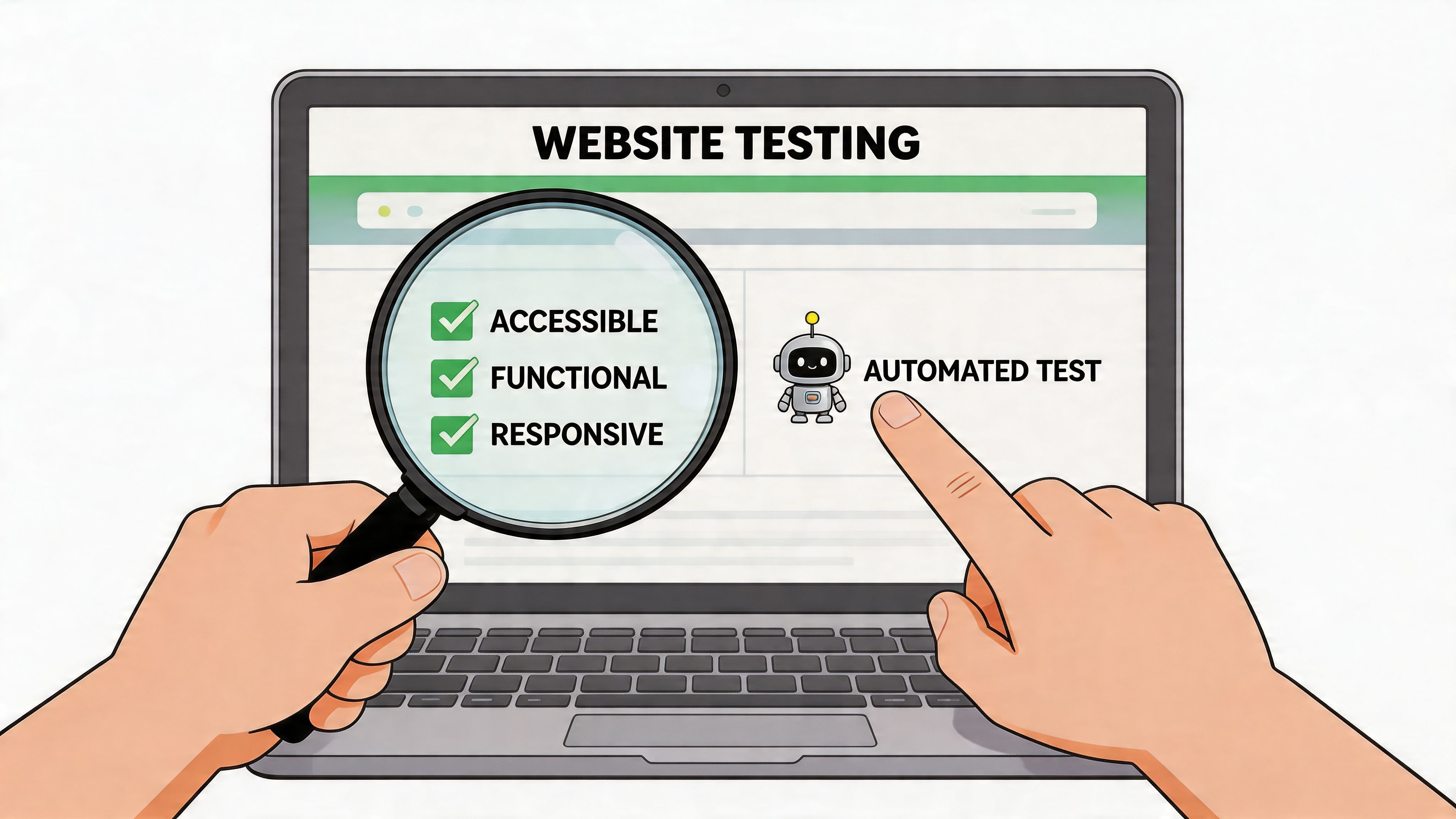
The strongest teams use both automated and manual methods because each catches a different class of problem. That blended practice matters even more for the web for the blind, where structure, timing, state changes, and clarity all shape the experience.
What automation does well
Automation is fast, repeatable, and good at surfacing programmatic issues across many pages. It can flag missing alt text, contrast failures, form labeling problems, duplicate IDs, and landmark gaps before a human tester opens the page.
Automated scanning's rightful place is:
- During development: Catch regressions before merge or release.
- Across templates: Find recurring issues in shared components.
- After content changes: Detect accessibility drift introduced by marketing or CMS updates.
- At scale: Monitor large sites where manual review of every page isn't realistic.
For teams building a repeatable workflow, this guide to automated accessibility testing is a practical starting point for deciding what to scan continuously and what to reserve for manual validation.
What human testing reveals
According to NVISION's internet accessibility guidance, over 75% of users with vision loss rely on screen readers, yet many audits stop at technical compliance. That creates a usability gap where a site may satisfy rules on paper while still feeling confusing in real use. The same guidance is direct about the remedy: testing with actual screen reader users is the only way to close that gap.
A manual review should include at least three passes.
Keyboard-only pass
Start at the browser address bar and move through the page with Tab, Shift+Tab, Enter, Space, and arrow keys where appropriate. Try the site's key journeys: navigation, search, form submission, checkout, support request, and account access.
Screen reader pass Use NVDA, JAWS, or VoiceOver. Listen for heading hierarchy, landmark usefulness, link clarity, form labeling, error handling, and status announcements. If dynamic changes occur without announcement, the task flow is likely broken.
Task-based user review
Watch a blind user complete real goals. During this, teams usually learn that a "minor" implementation choice created friction at exactly the wrong moment.
A scanner can find code defects. A user can show you where your product stops making sense.
A practical test matrix
A lightweight matrix helps teams avoid vague QA notes:
| Test type | Best for | Misses if used alone |
|---|---|---|
| Automated scan | Repeated code errors, template issues, basic programmatic failures | Real comprehension, workflow friction, ambiguous labels |
| Keyboard-only review | Focus order, keyboard traps, unreachable controls | How content is announced |
| Screen reader review | Names, roles, states, headings, live updates | Broader user preference differences |
| User testing | Real-world confidence, mental model, task friction | Full site coverage at scale |
If you're triaging what to test first, start with pages that drive revenue, service access, or lead generation. Homepage issues matter, but inaccessible product detail pages, pricing pages, account portals, and contact forms usually create the most immediate business damage.
Embedding Accessibility into Ongoing Governance
Accessibility work fails when teams treat it like a pre-launch event. A redesign ships, an audit closes, and then the CMS, app releases, campaign pages, and plugin updates slowly reintroduce the same problems. Sustainable accessibility needs governance.
The broader market context makes that clear. AudioEye's accessibility statistics summary notes that only 3% of the web is accessible. The same source says 70% of e-commerce and government sites contain critical blockers, which is why continuous monitoring matters. One update can break a flow that used to work.
Governance needs owners, not just intentions
The most effective governance models assign accessibility responsibilities to named roles inside the delivery process. When nobody owns it, everybody assumes someone else checked it.
A workable model usually looks like this:
- Design owns pattern decisions: Focus styles, error messaging, color combinations, and component behavior.
- Engineering owns implementation quality: Semantics, keyboard support, labels, state management, and regression prevention.
- QA owns validation: Keyboard flows, screen reader checks, defect verification.
- Content teams own editorial clarity: Heading structure, link text, alt text, and document accessibility.
- Leadership owns prioritization: Accessibility requirements stay funded, scheduled, and visible.
Put checks into the delivery pipeline
Accessibility governance should behave more like security and performance. It belongs in daily operations, not in a panic sprint after a complaint.
Use a recurring operating rhythm such as:
| Cadence | Governance action |
|---|---|
| Per pull request | Run automated checks on changed components and templates |
| Per release | Validate key user journeys manually |
| Monthly | Review top issues, regressions, and unresolved exceptions |
| Quarterly | Audit representative page sets and review policy alignment |
This is also where software support can help teams stay consistent. WebAbility.io provides automated scanning, dashboard-based monitoring, historical reporting, and workflow support that can fit into ongoing governance alongside manual review and remediation planning.
Publish standards that survive staff changes
Teams change. Vendors change. Platforms change. If your accessibility process lives only in one consultant's notes or one engineer's memory, it won't survive.
Document the essentials:
- Definition of done for accessible components and pages.
- Testing requirements before release.
- Escalation rules for blockers affecting critical user paths.
- Exception handling for issues that need phased remediation.
- Accessibility statement that explains support channels and commitment.
A public accessibility statement matters for more than compliance posture. It tells users where to report problems, gives support teams a reference point, and helps internal stakeholders treat accessibility as a maintained service quality standard.
Governance turns accessibility from a snapshot into a living system. That's when progress stops slipping backwards.
The payoff isn't just reduced risk. It is steadier UX quality, stronger brand trust, cleaner delivery discipline, and fewer expensive surprises after launch.
Conclusion: Building a Web for Everyone
A durable web for the blind rests on five working parts. Semantic HTML creates structure. ARIA adds the missing context modern interfaces need. Keyboard support gives users full control. Hybrid testing shows what code alone can't reveal. Governance keeps progress from fading after the next release.
Teams that get this right rarely describe accessibility as a side project for long. It improves page clarity, strengthens internal linking decisions, reduces friction in revenue paths, and forces better component discipline across the product. Those are product quality wins, not just compliance wins.
Blind users shouldn't need workarounds to buy, learn, apply, subscribe, or get help online. Building for that standard creates digital experiences that are easier to trust and easier to use. That is good for users, good for search visibility, and good for conversion.
If you're building accessibility into a live product or preparing for a larger remediation effort, WebAbility.io can help you combine continuous scanning, governance workflows, and implementation support so accessibility stays part of the development lifecycle instead of becoming a one-time project.
Quick Questions
Tap to ask AI about this article