Inclusive Design Principles for Accessible, Engaging UX

Sidharth Nayyar
Sidharth Nayyar
Ready to make your website accessible? Engage with our team or start a free trial today.
Tap to ask AI about this article
Inclusive design is a philosophy for creating products that serve the widest possible range of people. Instead of designing for a single "average" user, it embraces human diversity from the start. This approach focuses on offering choices and flexibility, ensuring everyone can interact with a product in a way that works for them. By solving for one group's specific needs, the result is often a better, more intuitive experience for everyone.
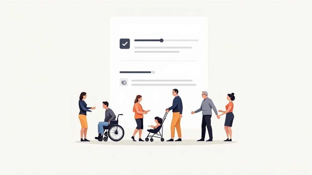
Inclusive design is less of a rigid process and more of a philosophy. It’s a complete shift away from designing for the so-called "average" user—a person who doesn't really exist. Instead, this approach embraces the full, messy, wonderful spectrum of human diversity right from the start.
It starts with a simple recognition: a person’s ability isn't static. Someone might have a permanent disability, like blindness. Another might have a temporary impairment, like a broken arm. And someone else might face a situational challenge, like trying to see their phone screen under the glare of bright sunlight. Inclusive design helps us build solutions that work beautifully in all of these situations.
The core idea is refreshingly simple: solving for one group often creates better experiences for everyone. A classic example is the curb cut. Originally designed for wheelchair users, it ended up helping parents with strollers, travelers with rolling luggage, and delivery drivers with carts.
This way of thinking forces us to lead with empathy and view human diversity not as a problem to solve, but as a wellspring of great ideas. It’s about putting control back into the user’s hands. This could mean letting them change font sizes, navigate with a keyboard instead of a mouse, or turn on captions for a video.
It’s a proactive strategy, not a reactive one. Rather than patching up a product to meet compliance checklists at the end, we build it from the ground up to be fundamentally user-centered.
Inclusive design doesn’t mean you're designing one thing for all people. You're designing a diversity of ways for people to participate in an experience with a sense of belonging.
To really grasp the difference, it helps to see how this approach stacks up against more traditional design methods. The table below breaks down the key philosophical shifts.
This table compares the core philosophies of inclusive design against traditional design methodologies to highlight the key differences in approach and goals.
| Aspect | Traditional Design Approach | Inclusive Design Approach |
|---|---|---|
| Target User | Designs for the "average" user. | Designs for a diverse range of users. |
| Problem Solving | Solves for the majority. | Solves for one, extends to many. |
| Diversity | Treats diversity as an afterthought. | Sees diversity as a source of innovation. |
| User Control | Offers a single, fixed experience. | Provides choice and flexibility. |
| Accessibility | Considers it a feature or compliance task. | Integrates it as a core principle. |
Looking at them side-by-side, you can see that traditional design often unintentionally excludes people by focusing on a narrow ideal. Inclusive design, on the other hand, intentionally includes people from the very beginning, making the end product more resilient, innovative, and useful for all.
To get inclusive design right, you have to move past a simple checklist mentality. It’s really about a fundamental shift in mindset—a commitment to recognizing and celebrating the huge spectrum of human diversity right from the start of any project.
A perfect real-world example is the "curb-cut effect." You know those little ramps on street corners? They were originally designed to help people in wheelchairs get on and off sidewalks safely. But who else uses them? Parents with strollers, travelers dragging rolling suitcases, delivery workers with handcarts, even kids on skateboards.
That’s the heart of inclusive design in a nutshell. When you solve a problem for a specific, often excluded group, you almost always end up creating a better, more elegant solution for everyone. It’s about reframing human diversity not as a limitation to work around, but as a resource for innovation.
Inclusive design pushes us to think about "ability" in a much broader sense. It acknowledges that how someone interacts with a product can be impacted by permanent, temporary, or even situational challenges.
Permanent Disabilities: Think of long-term conditions like vision or hearing loss, or a motor disability.
Temporary Impairments: This covers short-term issues—maybe you have a broken arm, a scratched eye, or are just recovering from surgery.
Situational Limitations: These are challenges tied to your environment, like trying to see your phone screen in bright sunlight, being in a noisy room, or trying to use your phone one-handed while holding a baby.
When you design for these "edge cases," you build products that are more robust, flexible, and just plain easier for everyone to use. For example, a website with high-contrast text is a necessity for someone with low vision (permanent), a huge help for someone with eye strain (temporary), and useful for anyone trying to read their screen in the glare of the sun (situational). It's this thinking that helps turn your digital presence into a pathway for inclusion. For more on this, check out our guide on moving from disability to accessibility.
At its core, inclusive design is proactive. It’s about more than just physical or cognitive disabilities; it considers everything from age and culture to language and economic background. The goal is to ditch the idea of an "average" user—who doesn't really exist—and instead, develop a deep empathy for a wide range of people, building products that adapt to their needs.
This isn't just a nice idea; it has proven benefits. Research from Microsoft, for instance, showed that applying inclusive design principles can boost usability by an average of 30% for all users, not just those with disabilities. You can read the full research on inclusive design's broad impact to see the data for yourself.
Inclusive design is a methodology that enables and draws on the full range of human diversity. Most importantly, this means including and learning from people with a range of perspectives.
Ultimately, this philosophy isn't about finding a single, one-size-fits-all solution. It’s about offering choice and flexibility. It gives people the power to interact with your brand in the way that works best for them, creating a genuine sense of belonging and making sure no one gets left out.
Inclusive design is more than just a nice idea; it's a practical framework for building digital experiences that genuinely welcome everyone. It pushes us beyond the abstract and gives us a lens to examine every design choice, ensuring we're serving the widest possible audience.
At its core, this framework is built on empathy and flexibility. It gets us asking the right questions: "How can we give people more control?" and "Are we creating an equally valuable experience for everyone, no matter how they access our product?" Let's break down the core principles that help us find the answers.
One of the most powerful things you can do is put users in the driver's seat. This principle acknowledges a simple truth: there's no single "right" way to interact with a product. People need to be able to engage with your content in whatever way best suits their individual needs.
This goes way beyond just offering a dark mode. It’s about letting people:
Adjust text sizes until they're comfortable.
Manage notification settings so they aren't overwhelmed.
Stop auto-playing videos or animations that can be distracting or even triggering.
Customize an interface to put their most-used features front and center.
When you offer choice, you build trust. You're showing users you respect their individuality by creating an experience that adapts to them, not the other way around.
A cornerstone of inclusivity is making sure everyone can get the same thing done, even if they use different methods. The experience doesn't have to be identical, but it absolutely must be comparable in value. No one should be left with a subpar interaction because of their abilities or their current situation.
Providing a comparable experience means ensuring that people can accomplish tasks in a way that suits their needs without undermining the quality of the content or the core function of the product.
This is where thoughtful design really comes to life. Think about alt text for images—it’s a perfect example. Someone using a screen reader can't see the photo, but a well-written description gives them a comparable experience by conveying the image's meaning and context. The same goes for video transcripts, which offer a comparable way to get information for people who are deaf, hard of hearing, or just in a loud coffee shop.
This infographic does a great job of showing how designing for a spectrum of needs—permanent, temporary, and situational—ends up creating better solutions for absolutely everyone.
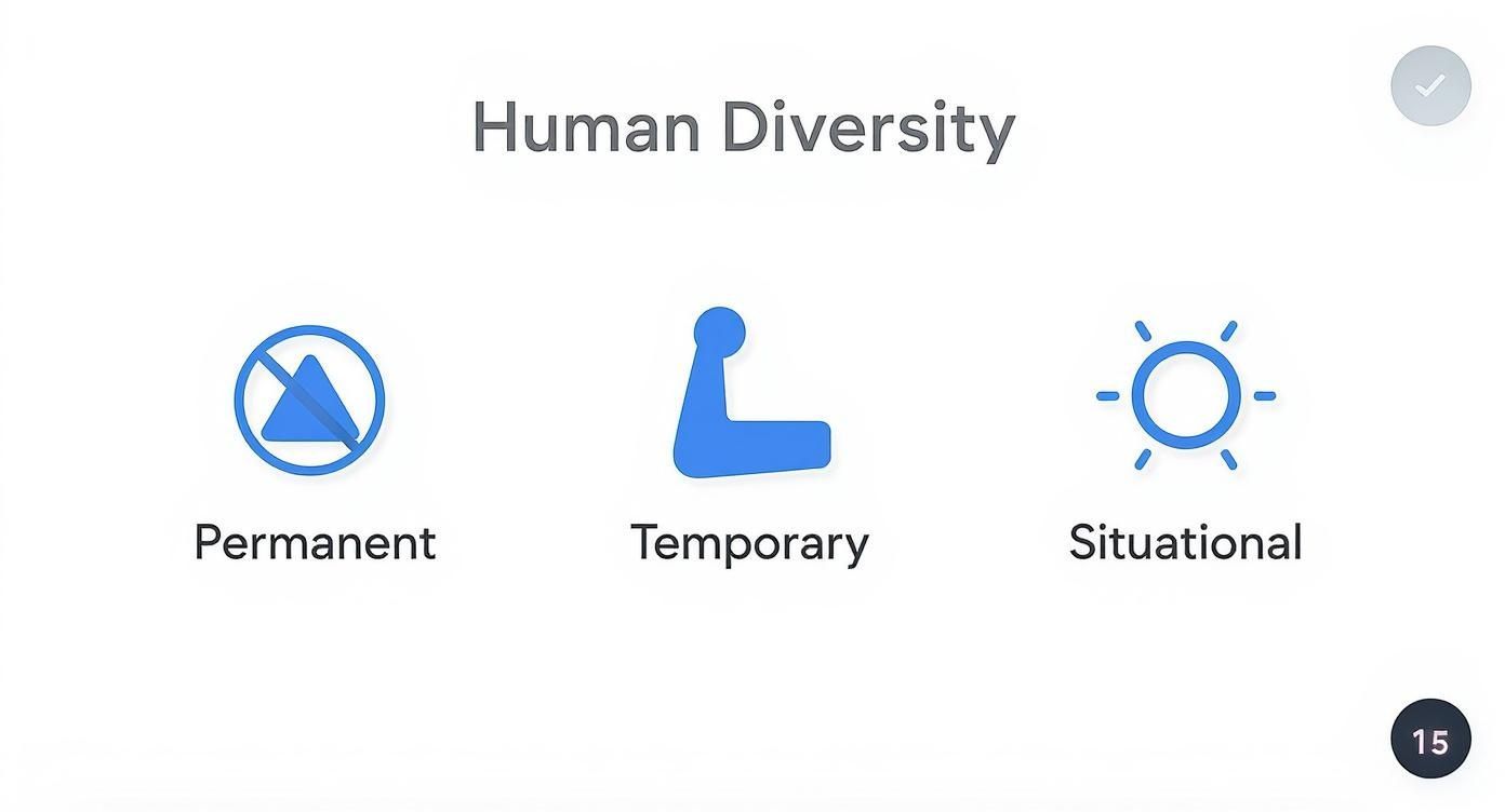
It highlights how one simple solution, like high-contrast text, can solve for a permanent visual impairment, help someone with temporary eye strain, and even assist a person dealing with sun glare on their screen.
Great inclusive design cuts through the noise. It puts the most important tasks and information first, presenting them clearly and logically. By doing this, you lower the cognitive load it takes to use your product—a huge win for everyone, but especially for those with cognitive disabilities or anyone feeling stressed and distracted.
This is all about creating a clear visual hierarchy. Crucial information should stand out. The path to completing a key action should feel obvious. Don't make people work to find what they need.
Working hand-in-hand with clear priorities is consistency. People rely on familiar patterns to find their way around. When a button or menu acts one way on one page and completely differently on another, it just leads to confusion and frustration.
Consistency means:
Navigational elements stay in the same place across the entire experience.
Interactive components like links and buttons look and behave predictably.
Language and terminology are used uniformly from start to finish.
A consistent design feels reliable, intuitive, and almost effortless. That predictability is vital for users of assistive technologies and, frankly, makes the product easier for every single person to learn and use. When you weave these principles into your work, you lay the foundation for truly user-centric products.
Let's shift our thinking. For a long time, inclusive design was seen as a philosophical ideal or a box-ticking exercise. But that view is outdated. Today, it’s a core part of a smart business strategy and a non-negotiable for modern success.
Embracing inclusive design principles isn't just about doing the right thing; it’s a powerful way to drive growth, spark real innovation, and earn rock-solid customer loyalty. It forces you to look beyond the imaginary "average" customer and see the huge, diverse market you might be missing.
The most straightforward benefit of inclusive design? You immediately open your doors to a much larger audience. It brings millions of people, who are often shut out by typical design choices, directly to your products and services.
Let's talk numbers. Around the world, there are roughly 1 billion people—that’s about 15% of the population—living with some form of disability. Yet, so few products are built with them in mind. When you also consider the rapidly growing number of older adults who are developing new accessibility needs, the market potential is staggering. Customers are also taking notice and actively choosing brands that practice inclusion.
This isn't some small niche. It’s a massive economic force with real spending power. By designing for them from the start, you’re not just being more equitable—you’re tapping into a seriously underserved market.
Here’s something that might surprise you: limitations breed creativity. When you challenge your team to solve problems for people with a wide range of abilities, you force them to think outside the box and find solutions that are better for everyone.
Think about it. Designing for a "typical" user makes it easy to fall back on the same tired patterns. But when you have to figure out how someone using a screen reader will navigate your website or how someone with limited mobility will use your app, you stumble upon simpler, more elegant solutions. These breakthroughs often end up creating a more intuitive experience for all your users. Our guide on how to boost growth with inclusive design digs deeper into this very connection.
People care about what your brand stands for. A genuine, public commitment to accessibility sends a powerful message that you value every single customer. This builds a kind of trust and loyalty that advertising simply can’t buy.
A brand that actively includes everyone sends a clear message of respect and empathy. This doesn't just attract new customers; it creates passionate advocates who will champion your brand.
On the flip side, an inaccessible product doesn't just create a bad experience; it actively excludes people, which can seriously tarnish your reputation. Beyond the damage to your brand, there are also growing legal risks. Lawsuits over digital inaccessibility are becoming more common, and failing to comply with standards can lead to expensive legal fights and fines.
By weaving inclusive design into your process, you do more than just build better products. You build a stronger, more resilient brand that’s protected from unnecessary risks. It’s an investment in your customers and in the future of your company.
Theory is one thing, but seeing inclusive design principles in action is where you really see them shine. It turns out, the most successful and beloved products often have inclusivity baked right into their DNA. This isn't just about doing good; it's a proven recipe for market success.
These products teach us a valuable lesson: when you solve a challenge for one specific group of people, you often end up creating a better experience for absolutely everyone.
Believe it or not, this idea isn't new, and it's not limited to the digital world. One of the best-known examples comes from a place we all know well: the kitchen. The story behind OXO Good Grips tools, famous for their soft, chunky handles, began when the founder saw his wife, who had arthritis, struggling to use a simple vegetable peeler.
His goal was to create kitchen gadgets that were comfortable for anyone with limited hand strength.

The result? He made tools that everyone adored. The ergonomic design wasn't just for people with arthritis—it reduced strain and simply felt better in every hand. This is the curb-cut effect in its purest form. By solving for a specific need, OXO created a universally superior product.
That same philosophy translates perfectly to the digital products we use every day. So many of the features we now take for granted started out as solutions for specific accessibility needs.
Think about a common feature on streaming services like Netflix or YouTube: customizable subtitles.
The Original Need: Subtitles are absolutely essential for viewers who are deaf or hard of hearing.
The Broader Benefit: Now, they’re used by everyone. People use them in noisy gyms, on their morning commute, while learning a new language, or just to watch a show late at night without waking anyone up.
This simple feature is all about offering choice. It hands control over to the user, letting them adapt the experience to whatever situation they're in.
By designing for the edges of human experience, we create solutions that are more robust, adaptable, and ultimately more human-centered for everyone. This is the hallmark of a winning product.
Another fantastic example is the rise of voice-activated assistants like Siri and Alexa. What started as a critical tool for people with motor impairments or vision loss—who couldn't easily use a keyboard or a touchscreen—has become a household convenience. Millions of us now ask them to set timers while cooking, play music, or get directions when we're driving. The innovation came from a real barrier, but its value spread to a massive audience.
The best products don't just tack on inclusive features; they build flexibility into their very structure. High-contrast modes, which you'll find in most operating systems and websites, are a great illustration. This feature is a lifeline for users with low vision, but it's also a huge help for anyone trying to read a screen in bright sunlight or whose eyes are just tired after a long day.
It's also worth looking at how responsive web design templates ensure a great experience across different devices. This kind of adaptability is fundamental to inclusivity, making sure a website is just as usable on a smartphone as it is on a giant desktop monitor.
Each of these examples—from kitchen tools to digital text—tells the same story. When you start with empathy and a genuine desire to solve real human problems, you don't just make an accessible product. You make a better product, period.
https://www.youtube.com/embed/42RojZSB0Yg
Thinking about inclusive design shouldn't be a last-minute compliance check. It’s a complete cultural shift. The real goal is to weave this mindset into every single part of your team's process, making it as automatic as thinking about your product's core features.
This whole journey starts with empathy, not code. You have to move past generic user profiles and start developing rich, detailed personas that truly reflect a wide spectrum of abilities, backgrounds, and even temporary situations your users might find themselves in.
Great inclusive design is built on real human stories. You can’t just make assumptions about how people will interact with your product. You have to get out there and engage directly with individuals from all sorts of communities. This proactive research is the bedrock of everything else.
Here are a few ways to get started:
Develop Diverse Personas: Don't just stick to the basics. Create personas that include permanent disabilities (like vision loss), temporary impairments (like a broken wrist), and situational limitations (like a new parent holding a baby).
Embrace Co-Design: A simple but powerful shift—don't just design for people with disabilities, design with them. Bring them into workshops and feedback sessions right from the very beginning. Their firsthand insights are invaluable.
Prioritize Lived Experience: Actively seek out the perspectives of people who navigate the world differently. Their experience is your most powerful design resource.
This approach builds a foundation of genuine empathy that will guide every decision you make from here on out.
Once you have that foundation of empathy, the next move is to embed inclusive practices into your day-to-day work. This means making accessibility a shared responsibility, not a job that gets siloed with one person or team. Everyone has a role to play, from product managers to developers to marketers.
Let's be honest, the state of digital accessibility shows we have a long way to go. A jaw-dropping 94.8% of homepages fail to meet basic Web Content Accessibility Guidelines (WCAG) 2.0 standards. That number isn't just a statistic; it's a massive gap between intention and reality. It shows a critical need to move beyond just talking about policies and actually build these practices into our design and development workflows.
Making inclusivity a shared responsibility transforms it from a requirement into a collective mission. It empowers every team member to contribute to creating products that truly work for everyone.
To make this happen, you have to give your team the right tools and a clear process. To see what this looks like in practice, you can learn more about how to integrate accessibility features into your design process.
Finally, testing isn't a final hurdle you jump over before launch. It’s an ongoing activity that should happen all the time. If you want to build genuinely inclusive products, your testing strategy has to reflect the same diversity as your user base.
This means a multi-layered approach:
Automated and Manual Audits: Use automated tools to catch the low-hanging fruit throughout the development cycle. But always, always follow up with manual testing to find the nuanced usability problems that machines miss.
Assistive Technology Testing: Get hands-on. Regularly test your product with screen readers, keyboard-only navigation, and other common assistive technologies. See how it actually performs.
Diverse User Testing: This is the most important part. Involve users with different abilities in your usability testing. Watch how they interact with your product in real-world scenarios.
By turning research, integration, and testing into a continuous loop, inclusive design stops being a "special project" and simply becomes the way you build great products for everyone.
As more teams start to embrace inclusive design, a few questions tend to pop up again and again. Getting these sorted out can really help clear the path, making it easier to build products that truly work for everyone. Let's dig into some of the most common ones.
This is a big one, and it's easy to see why they get mixed up. Both aim to make things more accessible, but they get there from slightly different angles.
Universal Design is all about creating one single solution that works for as many people as possible, right out of the box, with no need for special adjustments. A classic example is automatic doors at a supermarket—they open for a parent pushing a stroller, a wheelchair user, and someone with their arms full of groceries, all in the same way.
Inclusive Design, on the other hand, is more of a mindset. It acknowledges that one size rarely fits all. Instead of chasing a single perfect solution, it focuses on providing different ways for people to engage, ensuring that everyone has a way to participate. It's about offering choices that accommodate the true diversity of human experience.
Absolutely not. This is probably the most persistent myth out there, and it couldn't be further from the truth. The idea that inclusive design leads to boring, clunky, or purely utilitarian products just isn't accurate.
In reality, the constraints of designing for a broader range of human needs often spark incredible creativity. It forces you to be more thoughtful and intentional, leading to solutions that are not only accessible but also more elegant and intuitive for everyone.
Great design is inherently inclusive. When a product is easy to understand, simple to navigate, and delightful to use for people with diverse abilities, it elevates the experience for every single user.
Think of it this way: aesthetics and accessibility aren't enemies. They're partners. When you weave inclusive principles into your design process from day one, you improve usability—a fundamental ingredient of any beautiful, well-crafted product.
It’s easy to feel overwhelmed, but the best starting point is surprisingly simple: empathy. Before you write a single line of code or sketch a wireframe, take the time to learn from people with different abilities and life experiences. Don't guess what they need—ask them.
Bring people with disabilities into your design process early and often through interviews, user testing, and co-design workshops. Their insights are invaluable.
From there, you can take a few practical first steps:
Pick one principle to focus on. You don't have to boil the ocean. Try applying "Offer Choice" to a single feature and see what you learn.
Run an audit. Use accessibility tools to find the low-hanging fruit. Fixing things like poor color contrast or missing alt text can make a huge difference right away.
Just start the conversation. Talk with your team. Make inclusivity a shared goal, not just a box to check on a project plan.
Ready to make inclusive design a core part of your workflow? WebAbility.io provides an end-to-end accessibility platform to help you achieve and maintain compliance while creating better experiences for all users. Explore our AI-enhanced tools and start your free trial.