A Practical Guide to Accessibility in Website Design

Sidharth Nayyar
TLDR: Accessibility in website design is all about making sure your website works for everyone, regardless of their abilities. It means actively removing barriers that could prevent someone with a physical, cognitive, visual, or auditory disability from using your site. Getting this right isn't just about avoiding legal trouble; it creates a better, more inclusive experience for every single visitor.
What Is Accessibility in Website Design?
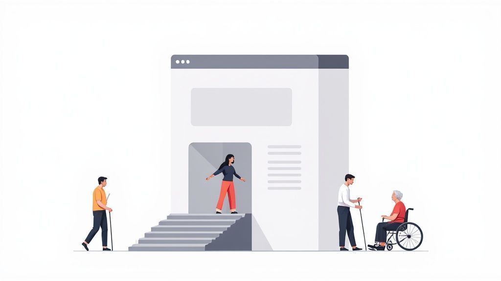
At its heart, accessible web design is about crafting digital spaces that don't shut people out. The best analogy is a physical one: think of a ramp alongside a flight of stairs at a building's entrance. That ramp is absolutely essential for someone in a wheelchair, but it also helps a parent pushing a stroller or a delivery person with a hand truck.
Web accessibility works the same way. It ensures that people with disabilities can perceive, understand, navigate, and interact with your site. When you consider that over one billion people worldwide live with some form of disability, ignoring accessibility means you're essentially putting up a "closed" sign for a huge portion of the population.
The Four Core Principles of Web Accessibility
So, how do we actually build accessible websites? The entire practice is guided by four foundational principles, neatly summarized by the acronym POUR. These aren't just suggestions; they are the bedrock of the internationally recognized Web Content Accessibility Guidelines (WCAG).
To make a website truly accessible, you have to nail all four. Think of them as the legs of a table—if one is missing, the whole thing collapses.
This table breaks down what each of the POUR principles means in practice.
| Principle | What It Means for Users |
|---|---|
| Perceivable | Users must be able to process the information being presented. This means it can't be invisible to all of their senses. For example, images need text descriptions for screen readers, and videos need captions for those who can't hear. |
| Operable | Users must be able to interact with all controls and navigation elements. This includes ensuring the entire site can be used with just a keyboard, as not everyone can use a mouse. |
| Understandable | The content and the user interface have to be clear and predictable. This means using plain language, providing clear instructions, and making sure navigation works in a consistent, logical way. |
| Robust | Your content must be compatible with a wide variety of user agents, especially assistive technologies. It needs to work reliably with screen readers, voice recognition software, and other tools people depend on. |
Getting a handle on these four pillars is the first real step toward building websites that are open, inclusive, and ultimately more effective for everyone who visits.
Why Digital Accessibility Is More Important Than Ever
Let's cut to the chase: Digital accessibility isn't a "nice-to-have" anymore. In a world where we bank, learn, shop, and connect online, an inaccessible website is the equivalent of a shop with stairs and no ramp. It locks people out. Ignoring accessibility means excluding over a billion people with disabilities, opening your business to serious legal trouble, and leaving a massive amount of money on the table.
More than that, building an inclusive website just makes for a better user experience for everyone. It's a win that also happens to boost your SEO and solidify your brand's reputation as a company that genuinely cares.
From Convenience to a Basic Right
Think about how much of your life happens online. Managing finances, booking a doctor's appointment, taking a class—these are no longer just conveniences, they're fundamental parts of modern life. This shift makes accessibility in website design a social and ethical responsibility, not just a box to check on a technical to-do list.
When a website is built without accessibility in mind, it throws up barriers that many of us never see. Imagine trying to fill out a critical government form, but your screen reader can't make sense of the fields. Or what if you're trying to watch an important training video for work, but there are no captions? For millions of people, this isn't a thought experiment; it’s a daily reality that prevents them from participating fully online.
The True Scale of the Problem
The number of people impacted by poor digital design is massive. More than one billion people globally live with some form of disability, including visual, auditory, motor, and cognitive impairments. But accessibility's reach extends far beyond that. It helps older users whose abilities are changing, someone with a temporary injury like a broken arm, or even a parent trying to watch a video while their baby is sleeping.
When you design for accessibility, you aren’t just accommodating a small fraction of users. You're creating a more resilient and intuitive experience for every single person who lands on your site. An accessible design is simply a better design.
Unfortunately, the web is largely failing at this. The WebAIM Million Project analyzed the homepages of the top one million websites and found that a shocking 94.8% had detectable accessibility failures according to WCAG standards. These weren't minor slip-ups; the sites averaged 51 distinct errors per page, from missing image descriptions to terrible color contrast. You can dig into the specifics of these widespread issues in the full website accessibility report.
Good for People, Great for Business
Beyond the powerful ethical argument, a real commitment to accessibility is one of the smartest business decisions you can make. It directly impacts your bottom line, protects your brand, and sets you up for long-term success.
An accessible website is a powerful statement. It shows you're serious about corporate social responsibility and that you value every customer. In a crowded market, people increasingly choose to do business with brands that reflect their own values. Inclusivity isn't just a buzzword; it's a competitive advantage that builds lasting trust and loyalty.
Grow Your Market and Protect Your Future
By making your website accessible, you're unlocking the door to a huge, and largely ignored, market. Globally, the disposable income of people with disabilities is estimated to be in the trillions. An inaccessible site is a "Closed" sign for this entire demographic.
Here’s how that translates into real-world business wins:
Expand Your Customer Base: You instantly gain a competitive edge by welcoming millions of potential customers who can't use your competitors' sites.
Boost Your SEO: It turns out that Google and people with disabilities have a lot in common. Practices like using alt text for images, creating a logical heading structure, and providing transcripts are all accessibility wins that also help search engines understand and rank your content higher.
Lower Your Legal Risk: Lawsuits related to website accessibility are on the rise. Proactively following standards like the ADA and WCAG is your best defense against costly legal battles and brand damage.
Improve UX for Everyone: Features designed for accessibility—like clear navigation, high-contrast text, and predictable layouts—make your site easier and more enjoyable for every single visitor, which naturally leads to better engagement and higher conversion rates.
Understanding the Web Content Accessibility Guidelines
TLDR: Think of the Web Content Accessibility Guidelines (WCAG) as the global standard for making websites usable for everyone. It’s broken down into three levels—A, AA, and AAA, similar to safety ratings. For most, Level AA is the sweet spot, providing strong compliance and a genuinely good user experience. Following these guidelines isn't just about ticking boxes; it's about making sure real people can actually use your site.
If creating an accessible website is your destination, then the Web Content Accessibility Guidelines (WCAG) are your roadmap. Developed by the World Wide Web Consortium (W3C), WCAG gives us a single, shared standard for building web content that works for people with a wide range of disabilities. It's essentially the universal blueprint for an inclusive web.
Don't let the name fool you—this isn't just a stuffy list of technical rules. It’s better to think of WCAG as a framework that explains the why behind accessible design. The whole point is to ensure digital content is Perceivable, Operable, Understandable, and Robust (an easy-to-remember acronym: POUR). These four principles are the bedrock of almost every accessibility law on the planet.
Breaking Down the Conformance Levels
To make things more manageable, WCAG is split into three levels of conformance: A, AA, and AAA. A great way to think about them is like car safety ratings—some are essential, while others go above and beyond.
Level A (The Essentials): This is the baseline. Meeting these criteria knocks down the biggest and most common roadblocks for users with disabilities. It's a critical first step, but on its own, it doesn't guarantee a truly usable experience.
Level AA (The Industry Standard): This is the target for most organizations. Level AA tackles a much broader set of issues and is the standard most often cited in legal cases and regulations around the world. Hitting Level AA means your site is accessible and usable for the vast majority of people without much trouble.
Level AAA (The Gold Standard): This is the highest you can go. It represents the absolute best-in-class accessible experience. However, meeting every single AAA criterion isn't always practical or even possible for all types of content. It’s usually a goal for specialized sites or government services that need to serve absolutely everyone.
For most businesses, Level AA is the sweet spot. It gives you a legally sound and robust foundation for accessibility that also happens to create a fantastic user experience for everyone.
The image below highlights a few of the common pitfalls that keep websites from meeting these standards.
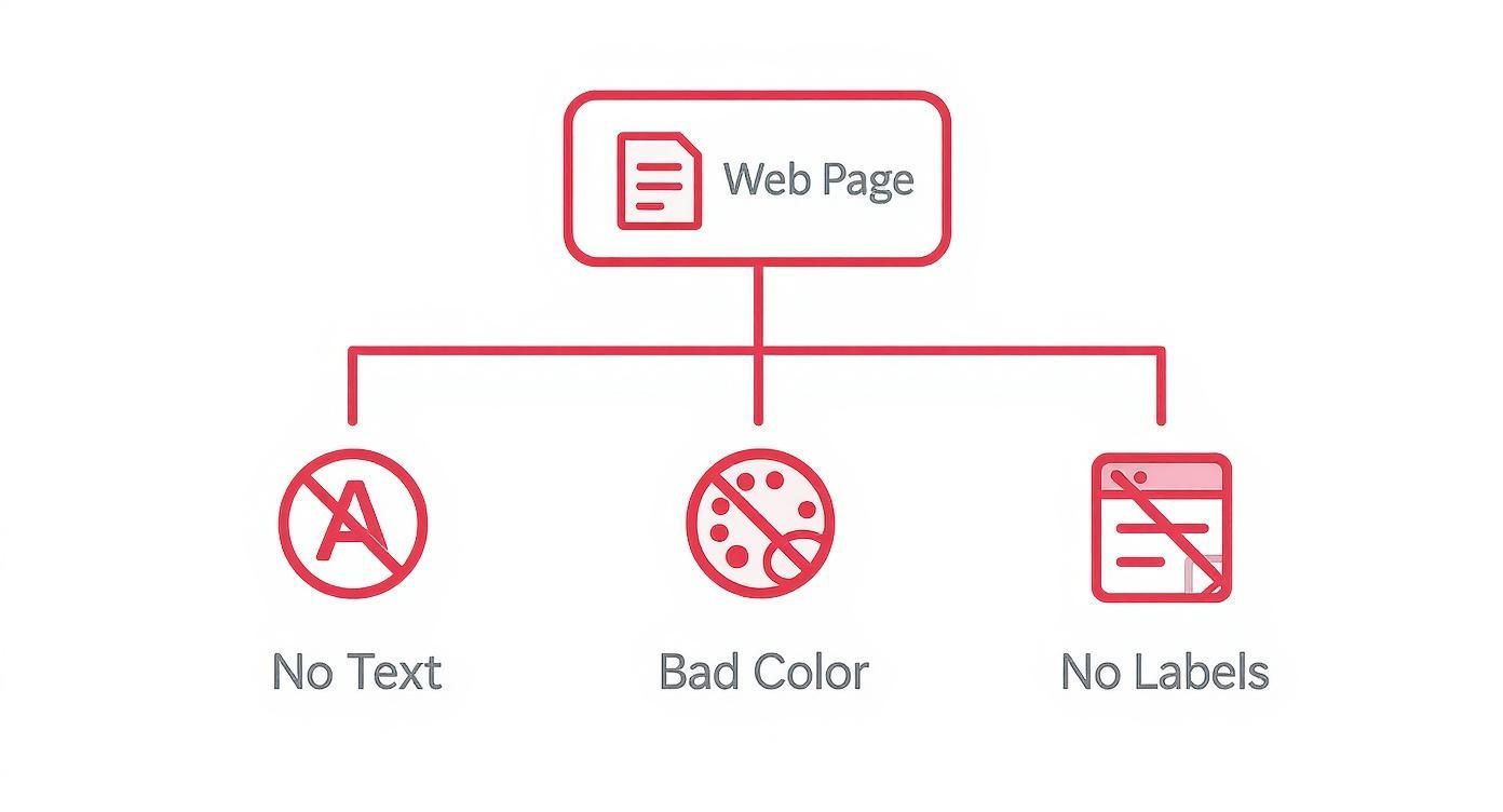
As you can see, simple mistakes like missing text alternatives for images, poor color contrast, and unlabeled form fields can create massive barriers for users.
Why These Guidelines Matter in Practice
At the end of the day, WCAG isn't about abstract concepts; it’s about solving real problems for real people. The guidelines translate directly into a better, less frustrating experience for your visitors.
Take something as basic as providing "alt text" for images. This guideline exists so that someone using a screen reader can understand what a visual element means. Without it, they’re left completely in the dark, and your message is lost.
WCAG is more than just a set of rules. It’s a roadmap to creating digital experiences that are easier for everyone to use. By following these guidelines, you can not only conform to accessibility standards but also provide better experiences for all visitors.
Another high-impact example is ensuring strong color contrast between text and its background. This doesn't just help users with low vision; it helps anyone trying to read your site on their phone in the bright sun. The same goes for consistent navigation—it's a lifeline for users with cognitive disabilities, but it also makes the site feel more intuitive for every single visitor.
If you want to get into the nitty-gritty, you can explore the full range of WCAG success criteria that form the building blocks of an accessible website.
Ultimately, these guidelines take the guesswork out of the equation. They give designers and developers a clear, internationally recognized framework for building an internet that’s truly open to all.
The Business Case for an Accessible Website
TLDR: Treating web accessibility as an afterthought is a huge mistake. Making your site accessible isn't just the right thing to do; it’s a powerful business strategy that protects you from legal headaches, opens your doors to millions of potential customers, and even gives your SEO a nice bump. It's an investment that pays for itself.
Let's move past the "it's the right thing to do" argument for a moment, because as true as that is, building an accessible website is also one of the smartest business decisions you can make. This isn't about charity; it's about growth, risk management, and building a brand that people genuinely trust. The returns are real, touching everything from market share to how well you rank on Google.
Think about it: an inaccessible website is like having a shop with a locked front door. You're turning away a massive chunk of the population. When you make your digital space welcoming to everyone, you're not just being inclusive—you're creating new revenue streams and fostering a level of brand loyalty that's hard to buy.
Getting Ahead of Legal Risks
One of the most pressing reasons to focus on accessibility is to avoid getting hit with a lawsuit. Laws like the Americans with Disabilities Act (ADA) in the U.S. and the European Accessibility Act are increasingly being applied to the digital world. Your website is now seen as a public space, and if it's not accessible, you're opening yourself up to expensive legal action.
It’s always better to be proactive than to be forced into a reactive fix by a court order. Weaving accessibility into your design and development from day one is far cheaper and more effective than trying to bolt it on later. Consider it an investment in your company's stability and reputation.
Tapping into a Huge, Untapped Market
An accessible website is more than just a legal shield; it's an open door to opportunity. Globally, over one billion people live with some form of disability. That’s a massive market that many businesses simply ignore. When your website works for everyone, you gain access to this entire demographic, plus their families and friends.
An accessible website isn't just a legal shield; it’s a welcome mat. It signals to a vast community of potential customers that you value their business and are committed to serving their needs, creating a powerful competitive advantage.
And this isn't just about people with permanent disabilities. Accessibility benefits everyone. Think about an older customer whose eyesight isn't what it used to be, a parent trying to browse with one hand while holding a baby, or someone watching a video in a loud cafe who needs captions. Universal design makes your site better for all your users. For a deeper look, discover how accessibility boosts your website's UX and sales.
The Surprising Link Between Accessibility and SEO
Here’s something many people don’t realize: the things you do to make your site accessible for people also make it much easier for search engines to understand. Google's web crawlers and a screen reader have something in common—they both need a well-structured, logical, and predictable site to make sense of your content.
Here’s how building for accessibility directly helps your SEO:
Alt Text for Images: Writing descriptive alt text is crucial for users with screen readers, but it also tells search engines exactly what your images are about.
Logical Heading Structure: Using headings (H1, H2, H3) in the right order creates a clear outline of your page. This helps both assistive tech and search engine crawlers understand your content hierarchy.
Video Transcripts: Transcripts are a lifeline for users with hearing impairments, and they also give search engines a full, indexable text version of your video content.
Beyond the ethical imperative, a strong business case for accessibility often involves meeting key non-functional requirements that enhance product quality and market reach. For more on this, consult a comprehensive guide to non-functional requirements.
Despite all these clear benefits, the reality is pretty shocking: a staggering 96.3% of websites have basic accessibility failures. With a global internet user base of approximately 5.56 billion people, this means countless users are being shut out. The problem is especially bad in public services, where nearly 80% of U.S. hospital websites and 92% of U.S. federal websites don't meet minimum accessibility standards. It’s a huge gap in digital inclusion and a massive opportunity for businesses willing to get it right.
Putting Accessible Design into Practice
Ready to make your website truly work for everyone? This section is your practical starting point. We'll skip the jargon and get right to the high-impact changes that make a real difference.
Focus on getting these five things right: clear alt text for images, strong color contrast, full keyboard-only navigation, logical semantic HTML, and user-friendly accessible forms. You don't need to be a coding genius to implement these, and they will dramatically improve the experience for every single visitor.
Alright, let's move from theory to action. This is where the principles of accessibility in website design come off the page and onto the screen. The guidelines tell you why accessibility matters, but these practical steps will show you how to do it.
The best part? You don't need to tear down your website and start over. It's all about making a series of small, intentional choices that, together, create a massive positive impact.
Think of it like building a house. An architect wouldn't design a beautiful skyscraper and then try to bolt on a wheelchair ramp as an afterthought. It's built into the blueprint from day one. That's the mindset we need—baking accessibility into every stage of a project is more efficient, saves money down the road, and creates a better, more welcoming experience for all.
Nail Your Color Contrast
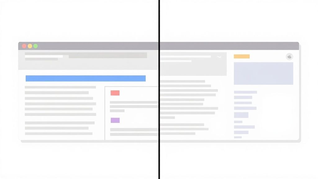
One of the most frequent (and easiest to fix) accessibility fails is poor color contrast. When text and background colors are too similar, it's a huge problem for people with low vision or color blindness. Honestly, it’s a pain for anyone trying to read a screen in the bright sun.
To meet the widely accepted WCAG AA standards, your text needs a contrast ratio of at least 4.5:1 for normal-sized text. For larger text (think 18pt regular or 14pt bold), you can get by with 3:1. Hitting these numbers ensures your content is crisp and legible for almost everyone.
Before: That trendy light gray text on a white background might look cool and minimalist, but it almost always fails contrast checks and makes people squint.
After: Simply switching to a dark gray or black text on the same white background instantly boosts readability without ruining your clean design.
Write Alt Text That Actually Helps
Alternative text, or alt text, is the short description of an image that a screen reader reads aloud to a user who can't see it. It’s absolutely essential for providing context. Without it, you leave a gaping hole in the user’s experience where an important image should be.
Good alt text gets straight to the point. It should clearly describe what the image is and, more importantly, what it means in the context of the page.
Think of alt text as telling a story for someone who can't see the pictures. A few well-chosen words can turn a confusing blank space into a key piece of information, making your site more engaging and understandable.
For example:
Bad Alt Text:
alt="graph"Good Alt Text:
alt="Bar chart showing a 25% increase in Q3 sales compared to Q2."
And what if the image is just for decoration, like a swirly background pattern? Use an empty alt attribute (alt=""). This tells screen readers to just skip it, which is exactly what you want.
Make Sure Everything Works with a Keyboard
Not everyone uses a mouse. Many people rely entirely on their keyboard or other assistive devices to get around the web. Making sure your site is fully usable with just a keyboard isn't a "nice-to-have"—it's a fundamental requirement of accessibility in website design.
This means that every single interactive element—links, buttons, form fields, dropdown menus—has to be reachable and usable with the Tab key. Just as critical, there must always be a clear visual focus indicator, like an outline, so the user knows exactly where they are on the page at all times. No one likes guessing which button they're about to press.
Use Semantic HTML for a Solid Foundation
Using the right HTML tag for the right job is what we call semantic HTML. This isn't just a technical detail; it’s the blueprint of your website. It provides a clear, logical structure that both assistive technologies and search engines can understand.
When you use tags like <header>, <footer>, <nav>, and <main>, you're creating landmarks that help screen reader users jump to different sections of the page. The same goes for headings. Using a single <h1> for the main title and <h2> for major sections creates a clear hierarchy that makes your content a breeze to scan.
Before (Non-Semantic): Slapping
<div>tags on everything and styling them to look like buttons or headings is a recipe for disaster. For a screen reader, the page is just a flat, confusing mess.After (Semantic): Using a
<button>tag for an actual button and an<h2>for a heading provides built-in keyboard functionality and a logical flow that just works.
Build Forms That Don't Frustrate People
Forms are where the magic happens. It’s where users sign up, buy things, or get in touch. An inaccessible form is like a locked door right when your customer is ready to come inside.
Here’s how to get them right:
Label Everything Clearly: Every single input field needs a visible
<label>tag linked to it. Placeholder text is not a label—it vanishes the moment someone starts typing, leaving them to guess what they were supposed to enter.Give Clear Instructions: If a password needs a special character or a date needs to be in a specific format, say so upfront. Don't make users guess.
Show What's Required: Mark mandatory fields with more than just a splash of color. An asterisk (
*) paired with a note like "Required fields are marked with an *" is a classic for a reason.Handle Errors with Grace: When someone makes a mistake, don’t just turn a box red. Provide a clear, helpful message right next to the field explaining what went wrong and how to fix it. Make sure that message is also connected programmatically so screen readers can announce it automatically.
Tools and Methods for Accessibility Testing
TLDR: So, how do you know if your site is actually accessible? It takes a mix of automated tools and real human testing. Scanners like WAVE and Lighthouse are fantastic for a quick first pass, catching common errors instantly. But they can't tell you if the user experience makes sense. That’s where manual checks, like keyboard navigation and screen reader testing, are absolutely critical. You really need both to get the full picture.
Building an accessible website isn't a "set it and forget it" task—it's an ongoing commitment. To make sure your design truly works for everyone, you need a smart testing strategy. This means going beyond a quick visual check and embracing a blended approach that pairs the efficiency of technology with the irreplaceable insights of human experience.
Think of it like getting a new car inspected. An automated diagnostic scan is great for flagging low tire pressure or an engine code in seconds. But it can’t tell you if the seat is comfortable on a long drive or if the mirrors have a massive blind spot. You need both the hard data and the real-world feel to know the car is ready for the road. The same exact principle applies to accessibility in website design.
Automated Testing Tools
Automated testing tools are your first line of defense. These are the scanners and browser extensions—like WAVE, Axe, and Google's Lighthouse—that crawl your site and flag common WCAG violations in a flash. They are incredibly good at catching clear-cut, code-based problems.
A few things they excel at finding:
Missing Alt Text: Instantly spots images without a text description.
Low Contrast: Identifies text and background color combinations that fail contrast ratios.
Heading Structure: Checks if your
<h1>,<h2>, and<h3>tags are in a logical, sequential order.Missing Form Labels: Pinpoints input fields that aren't properly connected to a label for screen readers.
These tools are perfect for integrating into your development workflow for quick, routine sanity checks. And they're getting smarter. One 2023 report measured an average of 37 accessibility issues per page. By late 2024, that number shot up to 297 detected issues per page. This jump doesn't mean the web got worse; it shows the technology got much better, covering more WCAG 2.2 criteria and spotting more complex barriers. You can read more about these advancements in accessibility testing on AudioEye.com.
Manual Testing Methods
For all their power, automated tools have a critical blind spot: they can't understand context. A tool can tell you an alt tag exists, but it has no idea if the description is actually helpful or just gibberish. That’s where you come in.
Manual testing is where you step into your users' shoes. It’s the process of navigating your website using the same tools and techniques that people with disabilities rely on every day, revealing the nuanced usability issues that automated scans will always miss.
Here are a few essential manual checks to run:
Keyboard-Only Navigation: Unplug your mouse. Can you get to every link, button, and form field using only the Tab key? Just as important, is there a clear visual focus indicator showing you where you are on the page?
Screen Reader Walkthroughs: Fire up a screen reader like NVDA (it's free for Windows) or VoiceOver (built into macOS and iOS). Does the content make sense when read aloud? Are the links descriptive, or do they just say "click here"?
Content and Layout Checks: Try zooming in to 200%. Does the layout completely break, or does it reflow gracefully? Is the language simple and easy to understand?
For a deeper dive into specific accessibility and usability testing methods, exploring different techniques will round out your skills. And if you’re looking for a good starting point, check out our guide on website accessibility testing tools.
By combining the speed of automation with the empathy of manual checks, you build a robust testing process that leads to a genuinely accessible experience.
Common Questions About Website Accessibility
Diving into accessibility in website design always stirs up a few practical questions. As teams start to put these principles into action, a handful of common myths and concerns usually pop up. Let's clear the air and tackle some of the most frequent queries so you can move forward with confidence.
Is Accessibility Only for Blind Users?
This is probably the biggest misconception out there. While making a site work for screen reader users is a huge part of accessibility, the truth is it helps a much, much wider group of people. Think about users with auditory, cognitive, physical, and neurological differences.
But it goes even further. Accessibility also supports people in temporary situations—like someone with a broken arm who can't use a mouse, or someone trying to watch a video in a loud airport. It even helps in situational challenges, like trying to read a screen in bright sunlight. Good accessibility is really just good design that makes a website better for everyone.
An accessible website is like a building with a ramp. It's absolutely essential for a wheelchair user, but it also helps a parent pushing a stroller, a delivery person with a dolly, or someone on crutches. The design helps everyone.
Does an Accessible Website Have to Be Plain or Ugly?
Absolutely not. This is one of the most stubborn myths in web design—the idea that you have to choose between a beautiful site and an accessible one. An accessible website doesn't mean a boring, text-only version of your brand.
In fact, the opposite is often true. The constraints that come with accessible design can be a catalyst for real creativity. When you focus on things like clean typography, strong color contrast, and a logical layout, you often end up with a design that's more modern, elegant, and easier for everyone to use. Great design and an inclusive experience aren't just compatible; they go hand-in-hand.
Where Should I Start if My Budget Is Limited?
You don't need a huge budget to make a real difference. If you're just getting started, the key is to focus on the high-impact, low-cost fixes that knock down the biggest barriers first. These foundational steps give you the most bang for your buck.
Here’s where to begin:
Keyboard Navigation: Can someone use every link, button, and form field with just their keyboard? Make sure they can.
Alt Text: Go through your images and write simple, descriptive alt text for anything that conveys information.
Heading Structure: Use your heading tags (H1, H2, H3) logically to create a clear outline of your page content.
Color Contrast: Run a quick check to ensure your text is easy to read against its background.
What Is the Difference Between Accessibility and Usability?
It’s easy to mix these two up because they're so closely connected, but they aren't the same. Usability is about making a website easy and efficient for most people to use. Accessibility, on the other hand, is a specific part of usability that makes sure people with disabilities can use it, too.
Here’s the simplest way to think about it: an accessible site is almost always a more usable one. When you design for the edge cases and solve the toughest interaction challenges, you almost incidentally create a smoother, more intuitive experience for every single person who visits your page.
Ready to build a truly inclusive website and stay ahead of compliance requirements? WebAbility.io provides an all-in-one platform to monitor, manage, and maintain web accessibility. Try our AI-enhanced solutions and free tools to start your journey.
Quick Questions
Tap to ask AI about this article