The 7 Universal Design Principles for Web Success in 2026

Sidharth Nayyar

The disability economy represents about $13 trillion. For web teams, that number reframes accessibility fast. Universal design is not only about reducing legal risk. It is a growth strategy that helps more people complete tasks, trust your brand, and convert.
The seven principles became a formal framework in 1997 through the Center for Universal Design at North Carolina State University, under the leadership of Ronald Mace. His work established a practical standard for creating products and experiences that work for people with a wide range of abilities from the start. A useful history of universal design and its evolution into modern accessibility practice appears in this overview of universal design origins and principles.
For websites, the business case is direct. Inclusive design often leads to clearer navigation, fewer form errors, better mobile use, and less checkout friction. Those are accessibility wins, but they are also CRO wins. A site that is easier to perceive, understand, and operate usually performs better for everyone, including customers using phones in bright sunlight, older users with changing vision, and busy buyers trying to complete a purchase quickly.
The legal pressure is real too, and many teams now pair design improvements with ada compliance solutions to reduce risk while improving customer experience. The more useful mindset is to treat the seven principles like a blueprint. WCAG 2.2 gives you the testable requirements. Universal design explains the intent behind them, much like an architectural sketch explains why a building needs ramps, signage, and automatic doors before construction begins.
TL;DR The 7 Principles for a Better Web
- Equitable Use: Give people equivalent access to the same core experience.
- Flexible Use: Support more than one way to interact and complete tasks.
- Simple and Intuitive Use: Make paths, labels, and actions easy to understand.
- Perceivable Information: Present content in ways people can see, hear, or read.
- Tolerance for Error: Prevent mistakes and make recovery easier.
- Low Physical Effort: Reduce repeated actions, strain, and unnecessary motion.
- Size and Space for Approach and Use: Make interfaces usable across body sizes, devices, and input methods.
What makes these principles useful for modern teams is their direct connection to implementation. In the sections that follow, each principle is mapped to relevant WCAG 2.2 criteria, translated into web-specific design and development actions, and tied back to outcomes marketers care about, such as lower abandonment and broader market reach. Platforms such as WebAbility.io help operationalize that work by turning broad accessibility goals into repeatable audits, fixes, and monitoring across the customer journey.
1. Equitable Use
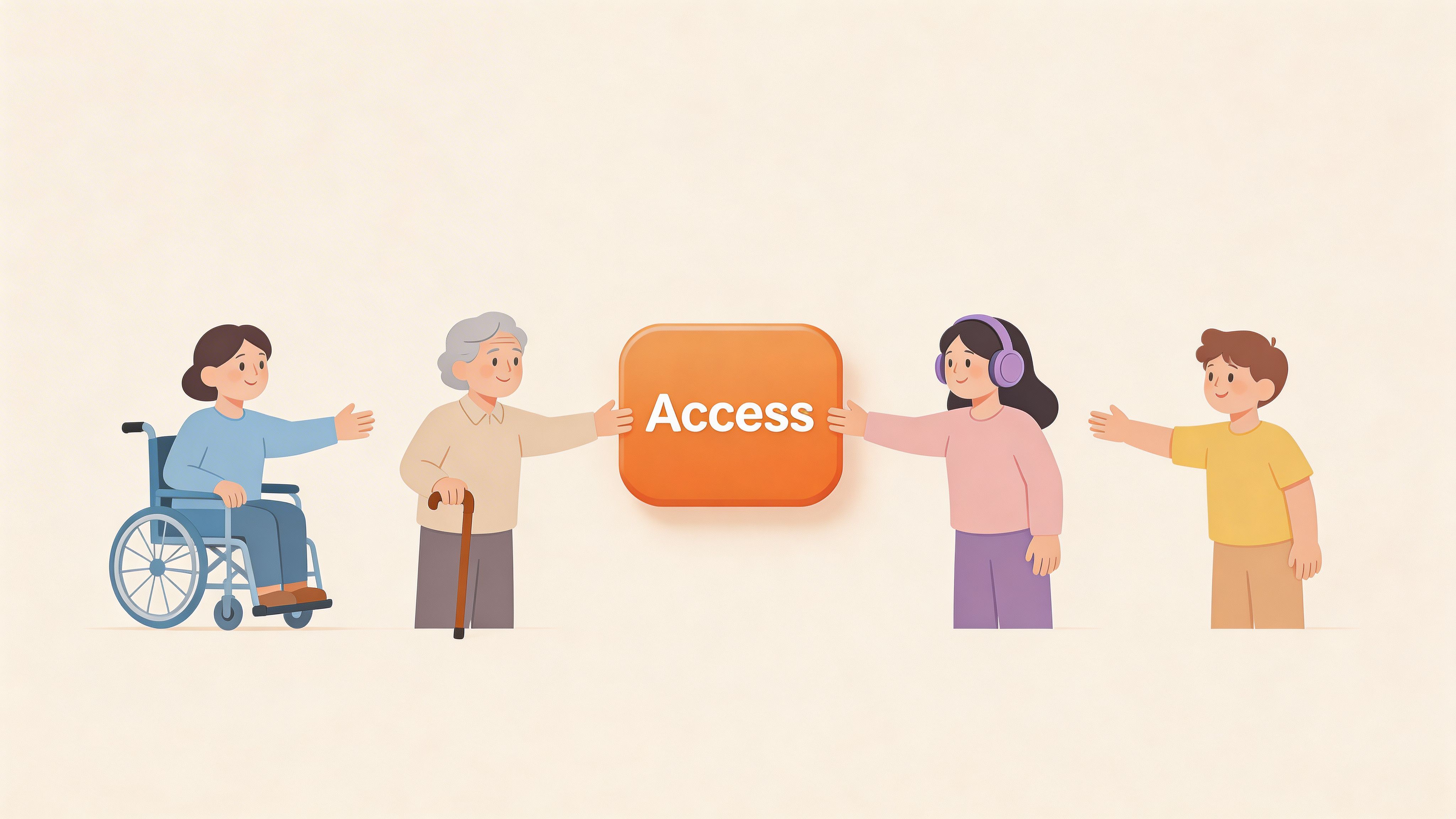
Equitable Use means people shouldn’t have to take a lesser path to complete the same task.
If a shopper can browse products, apply filters, watch demos, and complete checkout with a mouse, a keyboard user should be able to do the same. If a hearing user can consume a product video, a deaf user should get equivalent value through captions or transcripts. The key idea is parity. Not identical pixels, but equivalent access.
What it looks like on the web
A strong example is a retail site that lets every customer search by category, keyword, and navigation menu, while also supporting keyboard focus states, readable labels, and text alternatives for image-led product cards. The experience feels unified because all users are moving through the same system.
This principle also supports managed accessibility features when they’re implemented as part of one coherent experience rather than a segregated fallback. A centralized codebase, shared design system, and consistent user controls make accessibility easier to maintain and easier for teams to scale.
The original 1997 principles define Equitable Use as design that’s useful and marketable to people with diverse abilities. That’s still the right standard for web work today, especially when teams are balancing design systems, CMS constraints, and conversion goals.
Practical rule: If a revenue-generating action exists, every user should have a dependable way to complete it without needing special assistance.
WCAG mapping and implementation moves
Equitable Use connects closely to WCAG expectations around keyboard access, non-text alternatives, adaptable content, and predictable structure. In day-to-day work, that means:
- Build one complete journey: Don’t make keyboard users rely on hidden routes or support tickets to finish tasks.
- Provide equivalent media access: Add captions, transcripts, and image descriptions where they carry meaning.
- Keep accessible functionality first-class: Treat it as product work, not cleanup work.
- Test conversion paths directly: Check homepage navigation, product discovery, signup, forms, and payment flows with assistive tech.
For organizations working through policy and risk, ada compliance solutions become useful.webability.io/compliance/ada) become useful. They help teams align business-critical pages with legal expectations while preserving a consistent customer experience.
Why marketers should care
Equitable Use protects revenue. Every blocked path is a missed lead, abandoned cart, or failed signup. It also affects brand trust. When people can access the same offer, information, and purchase journey as everyone else, your brand communicates competence and respect.
That’s why Equitable Use isn’t just an accessibility principle. It’s a conversion principle.
2. Flexible Use
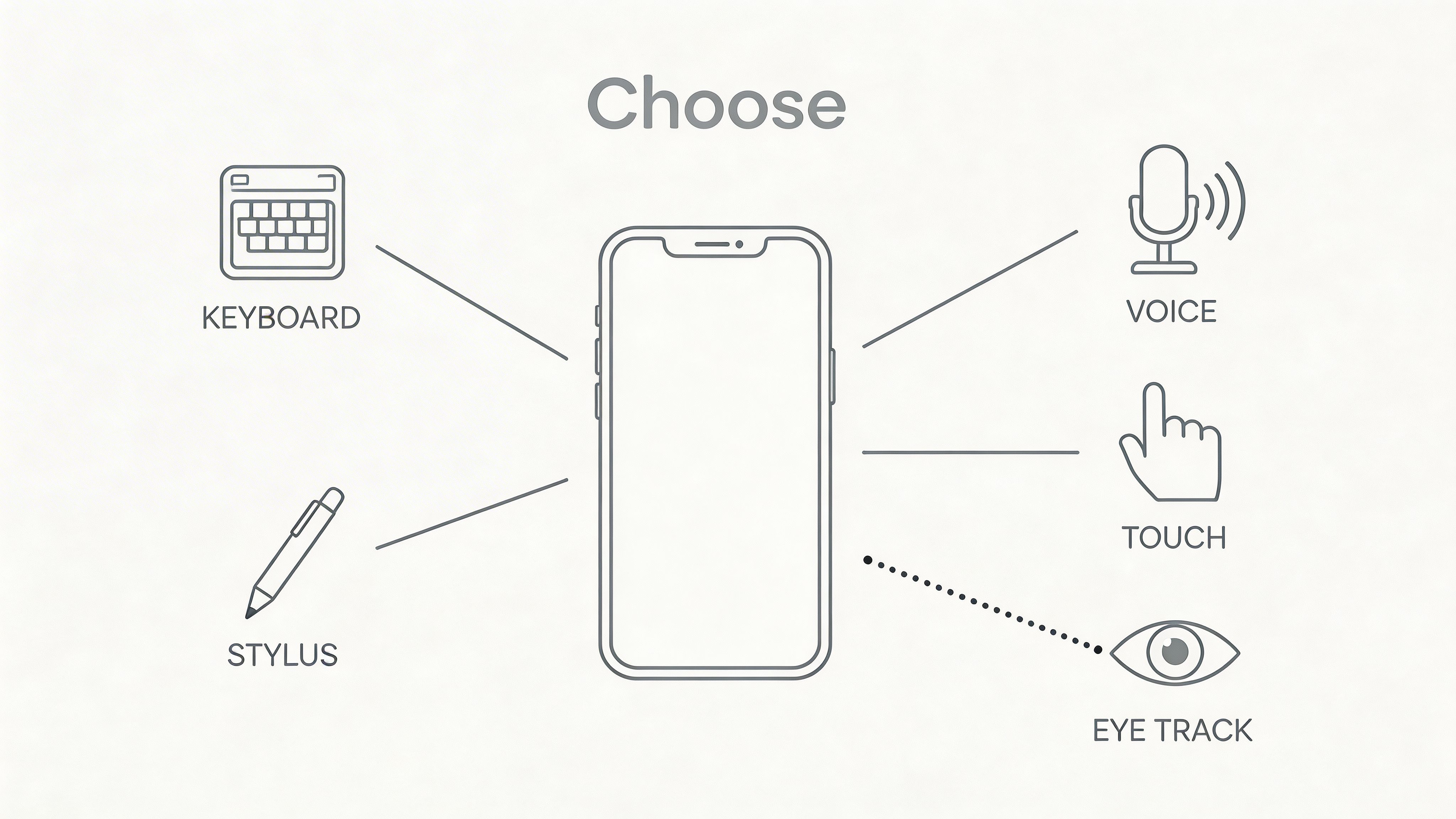
A useful website works like a building with more than one entrance. The destination stays the same, but people should be able to choose the route that fits their device, ability, context, and habits.
That is the core of Flexible Use.
On the web, this principle means a task should not depend on one input method, one presentation style, or one narrow way of interacting. A shopper may tap through a product page on a phone with one hand. A procurement manager may tab through the same flow with a keyboard at work. Another user may rely on voice control, screen magnification, or browser zoom. If your interface only works well for one of those patterns, conversion drops long before the user reaches the form or checkout.
A banking portal makes this easy to see. Logging in, reviewing balances, transferring funds, and confirming actions should all work with keyboard input, touch, visible focus states, readable text at higher zoom levels, and controls that do not require precise dragging or hovering. Flexible Use removes that interaction bottleneck.
How Flexible Use maps to WCAG 2.2
This principle connects closely to WCAG 2.2 rules that govern how people operate a page in different ways. The most relevant criteria often include keyboard access, visible focus, target size, alternatives to complex gestures, and content that still works when users adjust spacing, zoom, or orientation.
For web teams, that usually translates into a practical checklist:
- Make every core action keyboard operable. Check menus, filters, date pickers, modal dialogs, carousels, and checkout steps against WCAG 2.2 Success Criterion 2.1.1 Keyboard.
- Keep focus visible at all times. Users need a clear indicator of where they are on the page, which aligns with 2.4.7 Focus Visible and 2.4.13 Focus Appearance.
- Avoid interaction traps. If a component opens with the keyboard, users must be able to leave it just as easily.
- Support touch without requiring precision. Larger tap areas help mobile users and align with 2.5.8 Target Size (Minimum).
- Do not rely on drag, pinch, or swipe alone. Provide a simple alternative that supports 2.5.1 Pointer Gestures.
- Let users adapt the presentation. Text resizing, spacing changes, and contrast adjustments help more people complete tasks without assistance.
The business case is straightforward. Each extra interaction barrier removes a segment of potential buyers. Fixing those barriers improves completion rates for people using assistive technology, and it often speeds up task completion for everyone else.
Design choices that create real flexibility
Flexible Use is not about adding random options. It is about supporting common user preferences in places where they affect outcomes.
Start with navigation and forms. If a header menu only opens on hover, keyboard and touch users are at a disadvantage. If a checkout form uses tiny checkboxes and crowded fields, mobile completion suffers. If product images carry important meaning but the text alternative is missing or vague, users who cannot see the image lose a key part of the offer. Tools like an alt text generator can help content teams write useful image descriptions faster, especially across large catalogs and campaign landing pages.
Then test content formats. A product page can pair visuals with plain-language specs, FAQs, and short video walkthroughs so people can choose the format that matches their needs and context. That flexibility helps accessibility, but it also helps hesitant buyers compare faster and reduces avoidable drop-off.
For teams using platforms like WebAbility.io, this principle is operationalized through an accessibility widget that provides user controls for keyboard navigation, text scaling, and contrast modes. That approach is useful on large sites where multiple templates, campaigns, and content owners make consistency harder to maintain manually.
Later in the workflow, test with the tools people use. Screen readers, browser zoom, switch access, voice control, and keyboard-only testing reveal friction that design reviews often miss.
A quick visual overview helps show why varied inputs matter:
Why this helps CRO
Flexible Use improves conversion because it preserves momentum. If a user cannot hover, drag, pinch, or tap a tiny target accurately, they still need a clear path to continue.
That alternative path benefits more than accessibility users. Keyboard access helps power users move faster. Larger targets reduce mobile mis-taps. Preference controls reduce repeat friction for returning visitors. Inclusive interaction design expands your reachable market while making high-value journeys easier to complete.
3. Simple and Intuitive Use
Users decide within seconds whether an interface feels clear or confusing. That first impression shapes whether they keep moving toward signup, checkout, or contact, or leave to find an easier path.
Simple and Intuitive Use is about reducing mental effort. A person should be able to tell where they are, what each option means, and what happens next without decoding internal jargon or guessing at icons. On the web, that matters for first-time visitors, distracted mobile users, people with cognitive disabilities, and anyone reading in a second language.
Clear structure reduces friction
A SaaS dashboard makes this easy to see. If a page is filled with unlabeled icons, vague headings, and settings hidden behind unclear menus, users slow down. If the same page uses familiar labels, grouped actions, visible system status, and predictable navigation, users complete tasks with less hesitation.
Clarity works like good signage in an airport. People should not need to stop and interpret every turn. The interface should keep answering three questions: Where am I? What can I do here? What happens if I click this?
As noted in guidance from the Center for Universal Design, these principles can be used to evaluate existing designs and guide new ones. For digital teams, that means treating simplicity as a design requirement, not a stylistic preference.
How this maps to WCAG 2.2
This principle connects strongly to WCAG 2.2 requirements that make content understandable, predictable, and easy to complete. The standards are technical, but the goal is practical. Help people understand the interface on the first pass.
Key criteria to review include:
- 2.4.6 Headings and Labels. Use headings and labels that describe the topic or action clearly.
- 2.4.2 Page Titled. Give each page a title that matches user intent and confirms location.
- 3.2.3 Consistent Navigation. Keep repeated navigation in the same relative order.
- 3.2.4 Consistent Identification. Use the same icon, label, or component pattern for the same function.
- 3.3.2 Labels or Instructions. Explain what fields require and how to complete them.
- 3.3.3 Error Suggestion. Tell users what went wrong and how to fix it.
- 3.3.7 Redundant Entry. Avoid making people enter the same information again during a process.
You can see the pattern. Simple and Intuitive Use is not just about clean layouts. It is about making meaning obvious.
It also makes web content accessibility guidelines easier to apply in day-to-day production, because teams can connect abstract success criteria to concrete UX decisions.
What to check in real projects
Use this principle during design review, content QA, and conversion testing:
- Choose plain labels: “Billing” is clearer than “Monetization Center” unless your audience already uses that term.
- Keep primary actions stable: Place core actions like Buy, Book, Save, and Continue where users expect them across devices and templates.
- Make hierarchy visible: Headings, spacing, and grouping should show what belongs together.
- Write instructions before errors happen: Input hints and examples reduce failed submissions.
- Explain errors in plain language: State the problem, point to the field, and tell users how to fix it.
- Reduce choice overload: A page with too many equal-weight options often lowers completion rates.
- Match CTA language to intent: If an ad promises a demo, the landing page should clearly say “Book a demo,” not “Get started.”
For larger websites, a website accessibility audit helps teams find the exact places where confusing structure, inconsistent labels, or unclear forms are blocking both accessibility and conversion.
Platforms like WebAbility.io can also support this principle operationally by helping teams identify recurring issues across templates and user journeys. That matters for marketing sites with frequent campaign launches, because clarity often breaks when new pages are published quickly.
CRO payoff
Confusion costs money. It slows onboarding, increases support tickets, and creates drop-off at high-intent moments such as form fills, demo requests, and checkout.
Clear interfaces improve conversion because they shorten the distance between interest and action. Designers get cleaner task flows. Developers get fewer edge-case failures caused by unclear forms and inconsistent components. Marketers get landing pages where message, structure, and CTA all point in the same direction.
Simple and intuitive design serves accessibility, but it also serves revenue. When people understand your interface faster, more of them finish what they came to do.
4. Perceivable Information
People miss content for many reasons. They may use a screen reader, watch video on mute, browse on a phone in bright sunlight, or enlarge text because standard sizing is hard to read. Perceivable Information addresses all of those situations by making the same meaning available in more than one way.
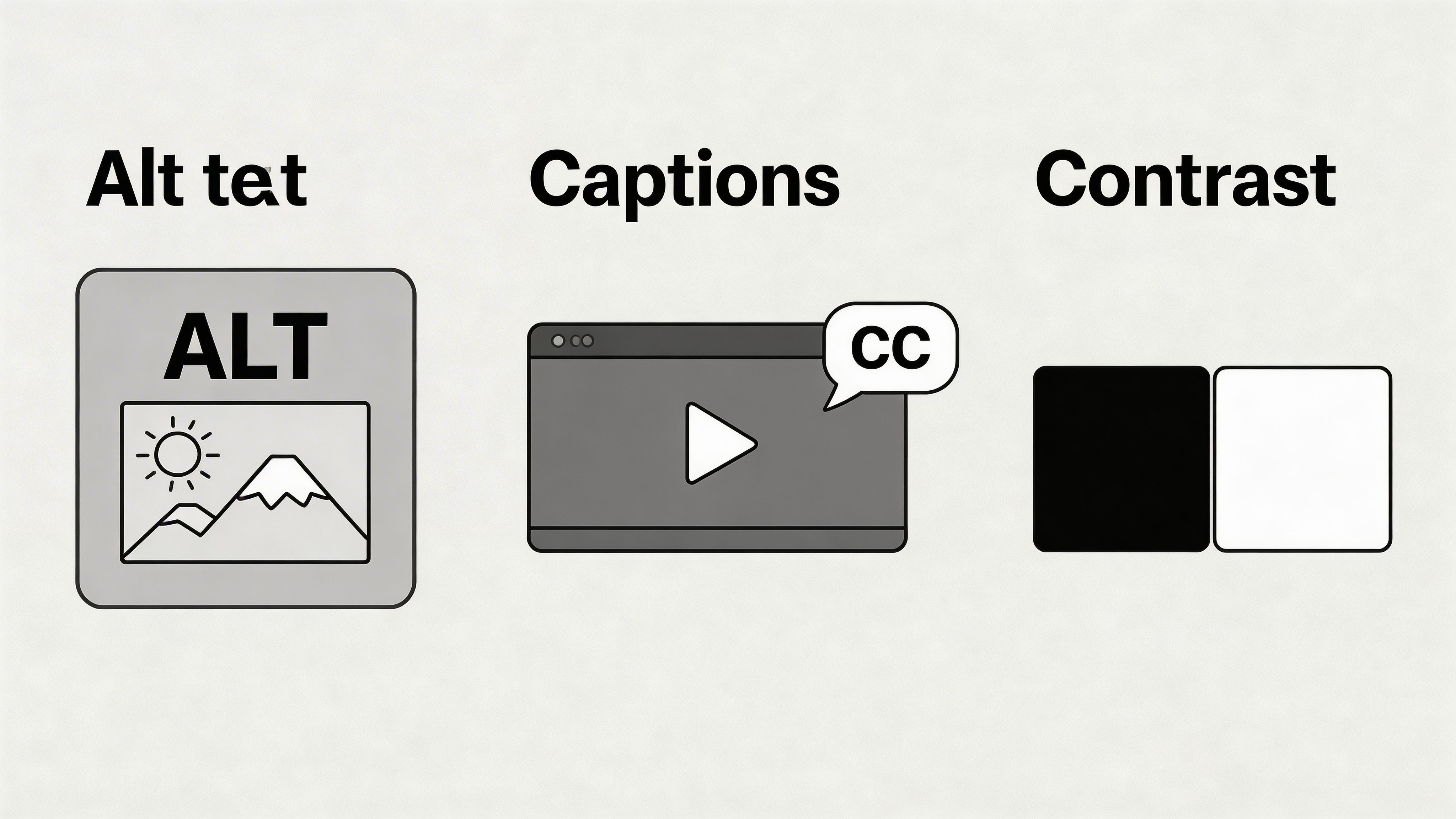
On the web, this principle maps directly to several WCAG 2.2 requirements. Developers will recognize patterns such as text alternatives for non-text content, captions for prerecorded media, contrast minimums, meaningful structure, and content that still works when users resize text or change spacing. Designers can read this as a simple rule. If meaning lives only in one channel, part of your audience will miss it.
A status badge is a good example. If success appears only in green and error appears only in red, some users lose the message. Add text, an icon, and programmatic cues, and the interface starts communicating like a well-designed airport sign system. Color helps, but color is not the whole instruction.
Where teams usually miss it
Perception problems often hide inside everyday marketing and product work. A homepage hero image ships without alt text. A webinar replay has no captions. A pricing table looks clean visually but collapses when text is enlarged. A CTA is technically present, yet its contrast is too weak to stand out for low-vision users.
These are not edge cases. They affect campaign traffic, product onboarding, support content, and search visibility at the same time.
WCAG 2.2 checks that map well to this principle
Use Principle 4 as a filter, then test against concrete standards:
- Text alternatives: Add useful alt text for informative images and linked graphics. This supports WCAG 2.2 Success Criterion 1.1.1.
- Captions and transcripts: Caption prerecorded video and provide transcripts where they help users review content quickly. This connects to WCAG 1.2 criteria.
- Color and contrast: Meet contrast requirements for text and key interface elements, and never rely on color alone to communicate state. This aligns with WCAG 1.4.1 and 1.4.3.
- Resizable content: Check that layouts still work at larger text sizes and increased spacing. This supports WCAG 1.4.4 and related presentation requirements.
- Semantic structure: Use headings, lists, table markup, labels, and landmarks so assistive technologies can interpret the page correctly. This supports multiple criteria across the perceivable and operable categories.
If you are unsure where to start, a website accessibility audit will usually surface these issues quickly because they repeat across templates, CMS blocks, and campaign pages.
Web-specific implementation tips
Start with high-traffic assets. Product images, explainer videos, lead-gen forms, comparison tables, and landing page headers usually create the biggest return because they influence both access and conversion.
For developers, that means checking semantic HTML before adding ARIA, testing zoom at 200%, and verifying focus indicators against real backgrounds. For designers, it means building contrast and text-resize checks into the design system instead of treating them as QA cleanup. For marketers, it means writing alt text and captions as part of publishing, not after launch.
For content-heavy teams, an alt text generator can help speed up image workflows, especially when large libraries need a first pass before editorial review.
Good perception design repeats meaning on purpose. Text, structure, and visual cues should support each other.
CRO payoff
Perceivable content removes friction before users feel it. Captions increase video completion in muted environments. Clear headings improve scanning. Strong contrast helps visitors keep reading on mobile. Better alt text can also strengthen image context for search and make linked graphics easier to understand.
The business result is straightforward. More people can consume the message, trust what they are seeing, and act on it. Inclusive presentation improves compliance, widens market reach, and helps high-intent visitors reach the CTA instead of dropping off because the page was hard to perceive.
5. Tolerance for Error
A preventable form error can stop a conversion seconds before the finish line.
Tolerance for Error means designing flows that prevent mistakes where possible and make recovery easy when mistakes still happen. On the web, that applies to checkout, sign-up, account changes, applications, booking flows, and any task where one wrong click can cost time, money, or trust.
A good comparison is a parking garage with guardrails and clear exit signs. The goal is not to prove that drivers never drift. The goal is to keep a small mistake from becoming a crash. Digital products need the same mindset.
Error-tolerant design starts before validation fires
Consider a payment form. A weak version waits until the user clicks submit, then posts a vague error summary and clears part of the form. A stronger version labels required fields clearly, formats inputs as people type, preserves entered data, points to the exact problem, and offers a review step before the final charge.
That approach maps directly to WCAG 2.2. Start with 3.3.1 Error Identification, so users can tell what went wrong. Add 3.3.2 Labels or Instructions, so they know how to succeed before they fail. For transactions and other high-impact actions, 3.3.4 Error Prevention (Legal, Financial, Data) requires checks such as confirmation, review, or reversibility. If an error occurs, 3.3.3 Error Suggestion helps users correct it quickly.
Universal design offers practical advantages for web teams. The principle is broad. WCAG gives you testable requirements.
What teams should implement
Developers, designers, and marketers each shape error tolerance in different ways:
- Confirm destructive actions: Deleting records, canceling subscriptions, or publishing changes should require deliberate confirmation.
- Preserve user input: Keep completed fields intact after validation fails or a session drops.
- Write specific guidance: “Use month/day/year” is useful. “Invalid entry” is not.
- Show errors near the field: Put the message where the problem happened, then move focus in a predictable way.
- Support review and reversal: Order review screens, undo options, draft recovery, and version history lower the cost of mistakes.
- Use forgiving input patterns: Accept common phone number formats, tolerate extra spaces in email fields, and allow paste where security rules permit.
- Warn before timeouts: Session expiration should not surprise users in the middle of a long task.
For developers, the practical checklist is straightforward. Use semantic form controls, connect error text with aria-describedby, keep focus visible after submission, and test with keyboard-only input and screen readers. For designers, build inline help, confirmation patterns, and error states into the design system instead of inventing them screen by screen. For marketers, treat form copy as conversion copy. Field labels, helper text, and confirmation messages affect completion rates just as much as headlines do.
A website accessibility audit should review these moments closely, especially in checkout, lead capture, and account management flows. Platforms such as WebAbility.io help teams operationalize this work by surfacing recoverability issues that sit between compliance and conversion, like missing instructions, weak error messaging, and broken focus behavior after failed submissions.
The CRO connection
Tolerance for Error protects high-intent visitors. By the time someone reaches a quote form, checkout, or application, they have already invested attention and intent. If the interface punishes a small mistake, the business loses a conversion it had nearly won.
The market benefit is broader than compliance. Recovery-friendly design helps people using autofill, small screens, assistive tech, slow connections, or divided attention. That means fewer abandoned forms, fewer support tickets, and more completed revenue actions.
Good error handling does not hide mistakes. It helps users fix them quickly and keep going.
6. Low Physical Effort
A site shouldn’t require unnecessary strain to use.
Low Physical Effort is about reducing fatigue, repetition, and precision demands. For digital products, that means fewer forced interactions, easier navigation, larger targets, efficient shortcuts, and alternatives to drag-heavy or pointer-heavy controls.
Small friction adds up fast
Think about a user filling out a long registration form on mobile. They pinch to zoom because text is small, repeatedly tap tiny fields, re-enter information the browser could have prefilled, and scroll past sticky elements that cover labels. None of those issues may seem dramatic alone. Together, they create physical and mental fatigue.
This principle is especially important for users with mobility limitations, chronic pain, tremors, repetitive strain injuries, or temporary constraints. It also helps everyday users moving quickly on small screens.
The broader universal design literature also connects Low Physical Effort to features such as touchless controls, efficient interactions, and interfaces that remain comfortable for aging populations and users with mobility constraints (discussion of universal design and implementation).
Better interaction design with less effort
Design and development teams can improve this area by tightening a few fundamentals:
- Reduce required steps: Remove optional fields and combine related actions.
- Support autocomplete and prefill: Don’t make people type information you already know.
- Add keyboard shortcuts where appropriate: Power users benefit immediately.
- Avoid precision traps: Tiny close icons, narrow sliders, and drag-only interactions create fatigue.
- Provide alternatives: If something can be dragged, it should also be clickable or keyboard accessible.
This is one of the easiest principles to connect to revenue work. One-click reorders, faster account access, simplified forms, and persistent settings all reduce effort. Reduced effort usually means lower abandonment.
A practical benchmark for teams
If a user has to repeat the same physical action several times to complete a basic task, revisit the flow. That could mean tabbing through too many focusable elements, dismissing the same banner on every visit, or manually selecting settings that should persist.
Low-effort design is often invisible when it’s done well. Users don’t praise it directly. They just keep moving.
7. Size and Space for Approach and Use
Small spacing errors create big barriers. On the web, this principle is about giving people enough room to read, tap, zoom, and complete tasks without the layout fighting back.
In physical spaces, size and space determine whether someone can approach a doorway or use a counter comfortably. Digital products have an equivalent. A checkout button needs enough tap area. A form needs room for labels, helper text, and error messages to stay readable at larger text sizes. A mobile layout needs to hold together when the viewport shrinks or the user zooms in.
That connection maps directly to WCAG 2.2. Teams should pay close attention to Reflow (1.4.10), Text Spacing (1.4.12), Orientation (1.3.4), Resize Text (1.4.4), and Target Size (Minimum) (2.5.8). Together, these criteria answer a practical question: can someone still use the page when space gets tight or interaction gets less precise?
Space problems often look like conversion problems
A campaign landing page can have strong copy, a clear offer, and healthy traffic, then still underperform because key controls are cramped on mobile. Users tap the wrong element, lose their place at 200 percent zoom, or abandon a form because labels and fields collide.
That is not just an accessibility defect. It is revenue leakage.
Marketers often read this as weak messaging. Designers may see it as a visual polish issue. Developers may treat it as a breakpoint bug. In practice, it is all three, because inclusive spacing affects comprehension, task completion, and trust at the same time.
What good implementation looks like
A useful mental model is sidewalk design. A wide, unobstructed path helps everyone, not only wheelchair users. Digital spacing works the same way. Generous target areas, stable reflow, and readable text help users with motor disabilities, older users, people on small screens, and anyone trying to act quickly with one thumb.
Use this principle in design systems, QA, and CRO reviews:
- Make tap targets easier to hit: Give buttons, links, checkboxes, and icon controls enough size and separation to reduce accidental taps.
- Test reflow early: At narrow widths and high zoom, content should stack cleanly without horizontal scrolling on core tasks.
- Protect text spacing: Custom CSS should not break when users increase line height, paragraph spacing, letter spacing, or word spacing.
- Support both orientations where relevant: Key journeys should remain usable in portrait and horizontal views unless a specific orientation is required.
- Use relative units and flexible containers: Layouts built with rem, em, percentages, minmax, and fluid grids adapt better than fixed pixel assumptions.
For teams using platforms such as WebAbility.io, this principle becomes easier to operationalize because audits can flag reflow failures, touch target issues, and viewport-specific friction before they affect campaign performance. That turns universal design from a general intention into a repeatable QA process tied to both compliance and conversion goals.
Where teams get tripped up
The common mistake is designing for the mockup instead of the actual user session. A page may look clean at 1440 pixels in Figma, then fail when a user increases browser zoom, opens it on a phone in horizontal mode, or tries to select a tiny close icon while walking.
The fix is straightforward. Test the same high-value flows under stress. Zoom to 200 percent. Increase text spacing. Rotate the device. Try every key action with your thumb on a small screen. If the layout starts overlapping, clipping, or forcing horizontal scrolling, the spacing model needs work.
Clear space signals quality. It also removes friction from the moments that matter most: signup, checkout, lead capture, booking, and account access. Inclusive spacing helps more people complete those tasks successfully, which is exactly where accessibility and conversion rate optimization start to reinforce each other.
Universal Design: 7-Principle Comparison
| Principle | Implementation complexity | Resource requirements | Expected outcomes | Ideal use cases | Key advantages | Key limitations |
|---|---|---|---|---|---|---|
| Equitable Use | Medium–High (may require redesign) | Cross-team design/dev effort, diverse user testing | Single unified experience for all users, broader market reach | Consumer platforms, public services, mainstream products | Unified codebase; reduces need for separate accessible versions; inclusive branding | Higher upfront cost; ongoing maintenance; requires organizational commitment |
| Flexible Use | High (multiple input pathways) | Development for many input methods, extensive testing | Users select preferred interaction; higher accessibility for varied abilities | Apps requiring varied inputs (voice, touch, keyboard), enterprise tools | Personalization of interactions; supports assistive tech; improves usability | Testing complexity; potential interface bloat; added support overhead |
| Simple and Intuitive Use | Medium (UX and content work) | UX research, content strategy, usability testing | Lower error rates, faster task completion, better adoption | Dashboards, onboarding flows, consumer apps, learning platforms | Reduces cognitive load; fewer support needs; better conversion | May hide advanced features; needs continual tuning and research |
| Perceivable Information | Medium (content-focused) | Captioning/transcription, alt text creation, contrast checks | Content accessible across sensory differences; improved discoverability | Media-rich sites, educational content, public information portals | Makes content perceivable ( captions, alt text ); SEO benefits | Ongoing captioning/content work; layout constraints at large text sizes |
| Tolerance for Error | Medium (UX + backend) | Implementation of undo/auto-save, validation, recovery systems | Fewer destructive mistakes, improved confidence and retention | Editors, e-commerce checkouts, complex forms, data-entry apps | Reduces data loss and support tickets; supports recovery workflows | May slow workflows; complex undo/version logic; extra server resources |
| Low Physical Effort | Medium (interaction redesign) | Larger touch targets, keyboard/voice support, shortcuts | Reduced fatigue, improved efficiency and independence | Mobile apps, workplaces, accessibility-focused products | Minimizes physical strain; benefits mobility-limited and aging users | May require redesign; voice/shortcut discoverability challenges |
| Size and Space for Approach and Use | Medium (responsive work) | Responsive layouts, spacing adjustments, cross-device testing | Usable across devices and postures; better readability and reach | Multi-device sites, government services, commerce platforms | Supports various screen sizes and dexterity needs; scalable text | Extensive device testing; redesign for high-density layouts may be needed |
From Principles to Practice Your Universal Design Checklist
Roughly 1 in 6 people worldwide live with a disability. For a web team, that is not a niche edge case. It is a large share of your market, your leads, your customers, and your returning visitors.
The practical value of universal design is that it gives teams a way to turn accessibility from a one-time fix into a repeatable operating method. On the web, each principle can be tied to specific WCAG 2.2 requirements, then translated into design reviews, development tickets, QA checks, and campaign standards. That connection matters because compliance work often stalls when teams can see the rule but not the product decision behind it.
A useful way to read the seven principles is to treat them like a weekly checklist for friction. Equitable Use asks whether the same goal is available to different users without second-class paths. Flexible Use asks whether people can complete that goal with a keyboard, touch, zoom, or assistive technology. Simple and Intuitive Use checks whether the journey makes sense on first contact. Perceivable Information asks whether the content can be seen, heard, or understood. Tolerance for Error looks at recovery. Low Physical Effort reduces repeated strain. Size and Space for Approach and Use checks whether controls still work in real conditions, on real devices, with real hands.
That is where the business case becomes concrete.
A landing page that follows these principles usually does more than satisfy an accessibility review. It removes hesitation. Clear headings improve scanning. Better contrast keeps users reading. Visible focus states help keyboard users and also make interfaces easier to follow during demos, testing, and mobile use. Error prevention and saved form progress reduce abandonment. The same changes that support WCAG 2.2 often improve conversion rate optimization because both disciplines focus on reducing friction between intent and action.
For web teams, this is a workable review model:
- Equitable Use: Check whether core actions such as signing up, purchasing, contacting sales, or downloading content are available through equivalent experiences. Map this to WCAG 2.2 criteria around keyboard access, name-role-value, and consistent identification.
- Flexible Use: Test key flows with keyboard-only input, screen readers, zoom, portrait and horizontal mobile views, and reduced-motion settings. Look closely at drag actions, hover-only interactions, and time-based steps.
- Simple and Intuitive Use: Review menus, headings, labels, instructions, and page order. A good test is whether a first-time visitor can predict what happens before clicking.
- Perceivable Information: Validate text alternatives, captions, color contrast, focus indicators, heading structure, link purpose, and status messages. This principle often carries SEO and content performance benefits too.
- Tolerance for Error: Add inline validation, clear recovery paths, confirmation screens for destructive actions, auto-save where needed, and useful error text that explains both the problem and the fix.
- Low Physical Effort: Reduce unnecessary typing, repeated taps, precise cursor movements, and interaction fatigue. Support autofill, larger targets, shortcuts, and logical defaults.
- Size and Space for Approach and Use: Test reflow at high zoom, spacing around controls, responsive breakpoints, and target size on touch devices. If a button only works for a steady pointer on a large screen, the design is not finished.
Different teams will apply this in different places. Designers can build these checks into components, templates, and design QA. Developers can map each principle to WCAG 2.2 acceptance criteria before a ticket is marked done. Marketers can apply the same lens to campaign pages, lead forms, webinar registrations, downloadable assets, and video content. That shared structure is how accessibility becomes part of operations instead of a scramble before launch.
WebAbility.io fits into that operating model by giving teams one place to scan for issues, monitor changes, report on progress, provide user controls, and manage audits. The platform does not replace design judgment. It helps teams maintain the review cycle across larger sites where manual checks alone are hard to sustain.
For a broader UX review process, this audit resource for school websites focused on enrolment and usability offers a useful companion perspective on how usability issues affect outcomes.
The goal is steady progress. Use the seven principles as your filter, WCAG 2.2 as your technical benchmark, and your conversion data as proof that inclusive design improves business performance as well as access.
If you want to turn the 7 universal design principles into a working accessibility and CRO program, explore WebAbility.io. It offers end-to-end support for ADA, WCAG 2.2 AA, Section 508, AODA, and EN 301 549 compliance, along with continuous scanning, reporting, accessibility tools, and implementation support for teams managing websites at scale.
Quick Questions
Tap to ask AI about this article