Skip to Main Content Links: A Developer's Guide (2026)

Sidharth Nayyar

Sidharth Nayyar
Ready to make your website accessible? Engage with our team or start a free trial today.
Tap to ask AI about this article
For someone who can't use a mouse, navigating a website can be a grind. Imagine landing on a page and pressing Tab dozens of times, through the logo, the menu, the search bar, the login button, just to start reading. Now imagine doing that on every page. A skip link solves exactly this problem, and you can build, style, manage focus for, and test one that works.
TL;DR: A skip link is an anchor placed as the first focusable element in the DOM that lets keyboard and screen reader users jump past repetitive navigation. Build it with a simple anchor and a matching target ID, hide it visually until it receives focus, move focus correctly on activation, integrate it into your platform or framework, and test it with the keyboard. It satisfies WCAG 2.4.1 (Bypass Blocks).
<a href="#main-content">) as the very first focusable element in your <body>. Your main content area (e.g., <main>) needs a matching id and tabindex="-1".:focus pseudo-class. Never use display: none or visibility: hidden, as this removes it from the accessibility tree.preventDefault() and then programmatically set focus() on the target main content element. This ensures the user's keyboard focus moves correctly, which a simple anchor link won't do on its own.A "skip to main content" link is one of those small but mighty accessibility features. For users who use a keyboard or screen reader, it’s extremely helpful. It lets them bypass all the repetitive stuff at the top of a page, like logos, navigation menus, and search bars, and get straight to the good stuff.
This simple link is a direct way to meet WCAG 2.4.1 Bypass Blocks, and it shows you respect your user's time and effort.
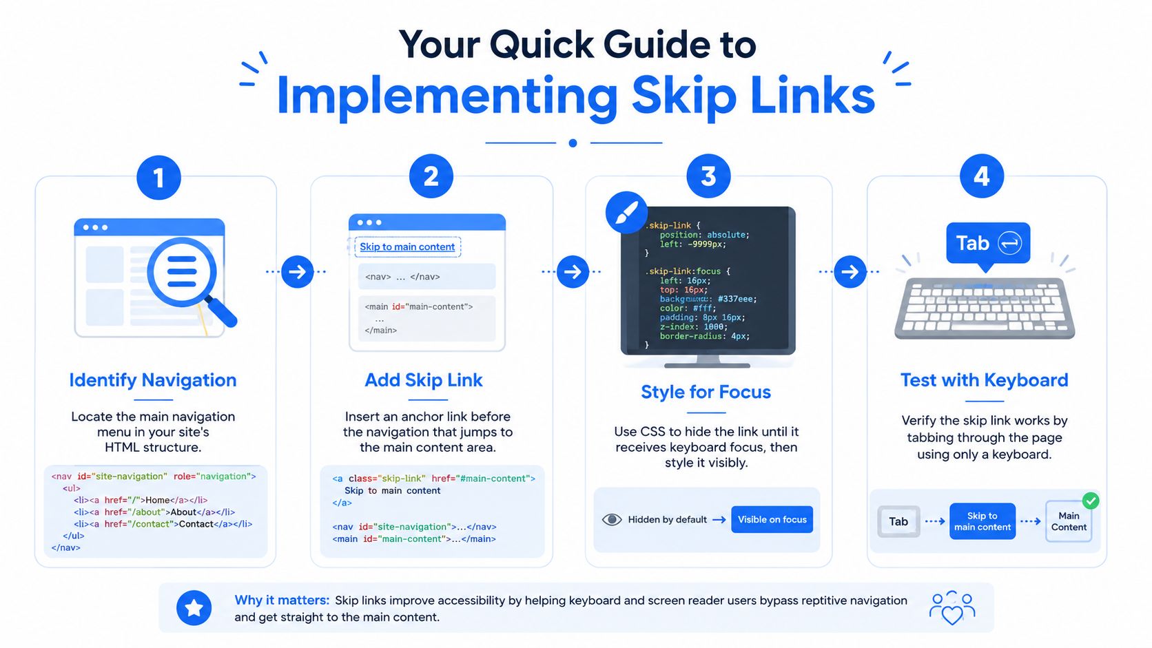
A skip link is a simple anchor (for example, <a href="#main-content">Skip to main content</a>) pointing to the ID of your main content region. Place it as the very first focusable element so it is the first thing a keyboard user reaches. Hide it off-screen until focused, then reveal it. These steps provide basic accessibility for keyboard users.
If you're a developer or a PM who needs the fast-track version, you've come to the right place.
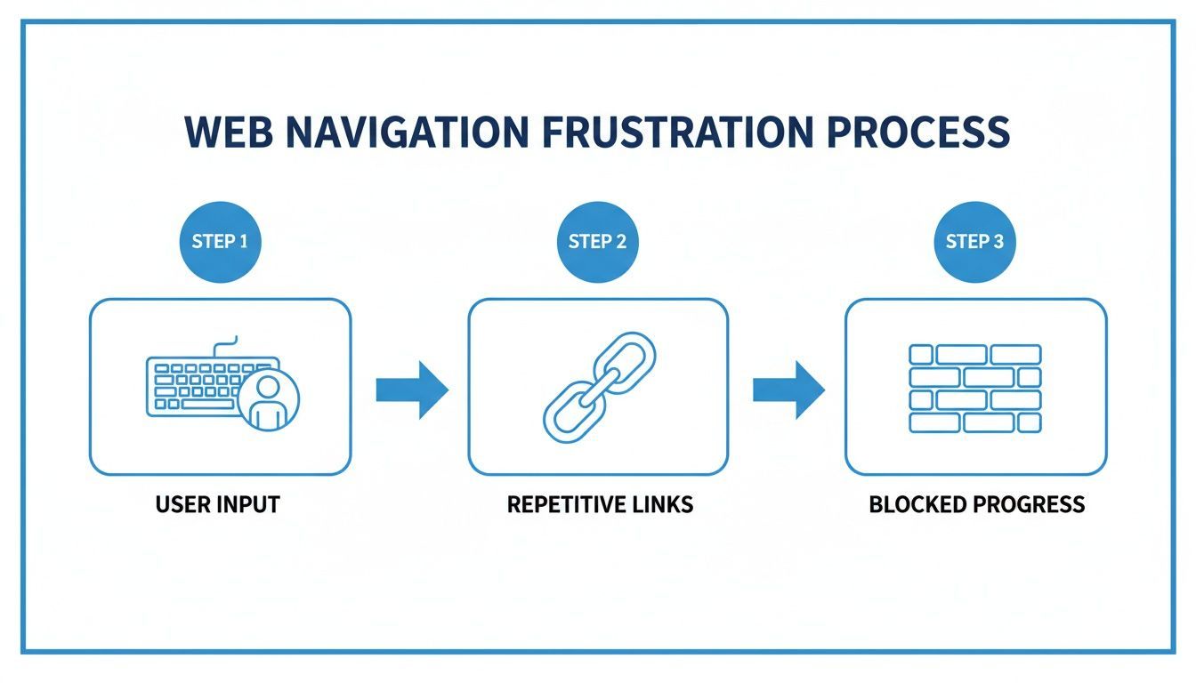
Put yourself in the shoes of someone who can't use a mouse. Picture navigating a massive e-commerce site like Amazon. On some pages, you could be pressing the Tab key over 40 times just to get past the header. Now imagine doing that on every single page load. It's exhausting and a huge barrier for anyone with a motor impairment.
A skip link is the elegant solution here. It’s typically the very first focusable element on a page—an anchor link that’s visually hidden until you hit the Tab key. Once it appears, a quick press of the Enter key zips the user right down to the main content.
Getting a skip link right comes down to three key pieces that need to work in concert. They're all pretty straightforward, but you need all three for a functional and compliant implementation.
<a>). The key is that its href points directly to the id of your main content container.:focus selector.By linking directly to your primary content container, you're building an essential shortcut. A great first step is making sure your page structure is semantic, and understanding the proper use of the main role in HTML is fundamental to that.
I reviewed the examples in this guide against the problems that most often fail in audits, not just whether the page visually jumps. The baseline was keyboard-first testing: on initial page load, the first Tab press had to reach the skip link; activating it had to move the viewport and the keyboard focus; and the next Tab press had to continue inside the target region instead of snapping back to the header. I also checked whether the target was announced clearly by assistive tech, whether landmarks made the destination predictable, and whether the pattern survived real build environments instead of only working in a static demo.
The implementation standards here were consistent across plain HTML, CMS templates, and SPA contexts. Acceptable patterns included a native anchor to a valid target, a focusable destination such as <main id="main-content" tabindex="-1">, and framework or CMS placement that keeps the link first in the actual focus order. Disqualifying failures were scroll-only behavior, hidden links removed from the accessibility tree, mismatched IDs, and SPA routing that leaves focus stranded after content swaps.
In practice, I prioritize the boring details that break most often: theme updates in WordPress, component rendering order in React and Vue, and CSS that looks neat in a design review but makes the link undiscoverable by keyboard users. If an example would confuse a sighted keyboard user or require guessing where focus landed, it did not make the cut.
Skip links remove a repetitive, exhausting barrier for keyboard and screen reader users, letting them bypass blocks of navigation that repeat on every page. Beyond the clear usability win, they directly support WCAG 2.4.1 Bypass Blocks (Level A), making them a baseline requirement for accessible, compliant sites.
Picture this: you walk into a building, but to get to the elevator, you're forced to walk past the same fifty reception desks every single time. Sounds incredibly frustrating, right?
For millions of people who use the web with a keyboard, this isn't just an analogy, it is their daily reality. For someone with a motor impairment, having to press the Tab key repeatedly through a huge header full of links isn't just annoying, it is a genuine barrier to getting things done.
This is exactly the problem that a "skip to main content" link solves. It's an express lane, letting users blow past all the repetitive navigation menus, search bars, and promotional banners. Instead of fighting through the header on every page, they can jump straight to the content they came for.
This isn't a minor "nice-to-have" feature; it's a cornerstone of inclusive web design. It shows you understand that not everyone uses a mouse and directly addresses the physical and mental drain that comes with keyboard-only navigation. Accessibility experts also note that the skip link is often the only fast bypass available to a sighted keyboard user who is not using a screen reader, which is why the pattern deserves a place in standard navigation design, not in a last-minute accessibility patch. See this concise skip links guide for the underlying pattern, and for broader enterprise design context, Kogifi's guide is a useful companion resource.
For users with motor disabilities, the simple act of tabbing through a dozen links can be physically tiring or even painful. Each keystroke is a small effort, but it adds up quickly as they move from page to page. A skip link cuts this marathon down to a sprint: one Tab to find the link, and one Enter to jump ahead.
Screen reader users get a huge boost from this, too. While they have other shortcuts to move between regions, a well-placed "skip to main content" link is a predictable and immediate way to get their bearings. It lets them dive right into the page's core information without having to listen to the entire header first.
"A mechanism is available to bypass blocks of content that are repeated on multiple web pages." This isn't just friendly advice—it's the essence of WCAG 2.4.1 Bypass Blocks, a critical rule for building accessible websites. The skip link is the simplest and most widely understood way to meet this requirement.
When this feature is missing, it creates a digital divide, making the web much harder to use for a huge portion of the population. The accessibility gap is staggering—a recent analysis found that 94.8% of the world's top one million homepages have detectable WCAG failures. The study uncovered over 50 million distinct errors, averaging 51 errors per page, which directly hurts the millions of people who depend on features like skip links. Accessibility guidance is especially blunt about repeated navigation as a time cost for keyboard users, and the scale of those barriers shows up clearly in the latest WebAIM Million analysis.
The Web Content Accessibility Guidelines (WCAG) are the gold standard for web accessibility, and Success Criterion 2.4.1 is crystal clear. This rule exists because repetitive navigation is one of the most common and frustrating hurdles for keyboard users.
The screenshot below from the W3C's own documentation gets right to the heart of the guideline.
It clearly separates the repeated elements (the header) from the unique main content, showing exactly why a direct path to the good stuff is so vital for efficient navigation.
Adding a skip link is the most straightforward and effective technique to nail this criterion. It provides that clear "mechanism" that is easily discovered by the users who need it the most. By making it the very first thing a user can tab to, you ensure it's immediately available the second they land on the page.
Ultimately, a website's usability is the sum of all its parts. Even tiny improvements can make a huge difference. Understanding how micro-interactions that drive user satisfaction can make a site feel more intuitive and thoughtful shows just how important details like skip links are in creating a better experience for everyone.
If this link suddenly appears on a page, nothing is wrong. In most cases, you are seeing an accessibility feature become visible because keyboard focus reached it.
The most common trigger is pressing Tab right after the page loads. A well-built skip link is intentionally the first focusable element in the document, so the browser highlights it before the logo, menu, or search field. Designers usually hide it visually until that moment to avoid adding clutter for mouse users, then reveal it on focus so keyboard users can see where they are.
I also see this appear unexpectedly when custom scripts auto-focus the page on load, when browser extensions alter focus behavior, or when a user has been navigating without realizing the keyboard focus is active. On a responsive site, it can be more noticeable because the link may shift into a prominent position once focused.
What matters is the behavior after it appears. If activating the link moves you to the main region and the next Tab stays inside the content, the pattern is doing its job. If it only flashes briefly, scrolls without moving focus, or appears after several other links, that usually points to an implementation issue worth fixing.
A production-safe skip link needs more than a fragment of HTML. The reliable pattern is: place the link first in the focus order, point it at a real target, make that target focusable for programmatic focus, and only add JavaScript when the browser’s native jump is not enough for the experience you want.
.skip-link { position: absolute; left: -9999px; top: 0; } .skip-link:focus { left: 0; padding: 0.75rem 1rem; background: #1D4ED8; color: #fff; z-index: 1000; } Start with valid HTML that works before any framework code touches it. This is the baseline pattern recommended in accessibility guidance, including the W3C skip link technique:
<body> <a class="skip-link" href="#main-content">Skip to main content</a> <header> <a href="/">Home</a> <nav aria-label="Primary"> <ul> <li><a href="/products">Products</a></li> <li><a href="/pricing">Pricing</a></li> <li><a href="/about">About</a></li> </ul> </nav> </header> <main id="main-content" tabindex="-1"> <h1>Your Page Title</h1> <p>This is where the main content begins.</p> </main> </body> A few implementation notes matter here:
<main> region because it is the clearest shared target across a site.tabindex="-1" does not put <main> in the regular Tab order. It only allows scripts or hash navigation support patterns to focus it when needed.About the wording people often use: many teams talk about a “skip to main content button,” but this control should usually be a link, not a <button>. It navigates to another location in the same page, which is anchor behavior. If you want it to look like a button for visibility, style the link like a control; don’t swap semantics just to match the visual design.
The skip link should stay available to assistive tech and keyboard users while remaining unobtrusive until focus reaches it. I prefer a simple pattern that avoids animation-heavy reveal effects, because those effects are where I most often see clipping, overlap, or unreadable focus states.
.skip-link { position: absolute; top: 0; left: 0; transform: translateY(-120%); padding: 0.75rem 1rem; background: #0f172a; color: #ffffff; text-decoration: none; border-radius: 0 0 0.5rem 0; z-index: 10000; } .skip-link:focus, .skip-link:focus-visible { transform: translateY(0); outline: 3px solid #93c5fd; outline-offset: 2px; } main:focus, main:focus-visible { outline: 3px solid #2563eb; outline-offset: 4px; } This keeps the link in the accessibility tree and reveals it as soon as the keyboard lands there. Avoid display:none, visibility:hidden, or aria-hidden="true" on the link itself. Those approaches hide it from the exact users who need it.
Building a skip link is a great example of internal linking, and understanding the broader benefits of internal linking for SEO and UX can really put its value into perspective.
.skip-link { position: absolute; top: -40px; /* Hides it off-screen */] left: 0; background: #000000; color: white; padding: 8px; z-index: 100; transition: top 0.3s; } .skip-link:focus { top: 0; /* Brings it into view on focus */ } Here’s the nuance that gets oversimplified in a lot of tutorials: native anchor behavior is sometimes enough. On many static pages, linking to #main-content correctly scrolls to the <main> region, and some browser and screen reader combinations will give users acceptable context. If your testing shows that the next Tab continues naturally from the content area, you may not need any extra script.
However, if activation only scrolls the page and the next Tab returns the user to the header, add explicit focus management. That is especially common when the target is not naturally focusable, when sticky headers obscure the destination, or when a framework intercepts navigation.
document.addEventListener('DOMContentLoaded', () => { const skipLink = document.querySelector('.skip-link'); const target = document.getElementById('main-content'); if (!skipLink || !target) return; skipLink.addEventListener('click', (event) => { event.preventDefault(); target.focus({ preventScroll: true }); target.scrollIntoView({ block: 'start' }); history.replaceState(null, '', '#main-content'); }); }); I only recommend this script when testing shows a real focus problem. Adding JavaScript automatically is not more accessible by default; it is better to use the smallest pattern that produces reliable focus movement.
document.querySelector('.skip-link').addEventListener('click', function(e) { e.preventDefault(); const targetId = this.getAttribute('href'); const targetElement = document.querySelector(targetId); if (targetElement) { targetElement.focus(); } }); Dropping this pattern into a component-based framework like React or Vue is pretty straightforward when the markup stays close to the plain HTML model.
import { useRef } from 'react'; export default function AppLayout() { const mainRef = useRef(null); const handleSkipLink = (event) => { event.preventDefault(); mainRef.current?.focus({ preventScroll: true }); mainRef.current?.scrollIntoView({ block: 'start' }); window.history.replaceState(null, '', '#main-content'); }; return ( <> <a className="skip-link" href="#main-content" onClick={handleSkipLink}> Skip to main content </a> <header>{/* site header */}</header> <main id="main-content" ref={mainRef} tabIndex={-1}> <h1>Dashboard</h1> <p>Main page content.</p> </main> </> ); } <script setup> import { ref } from 'vue'; const mainRef = ref(null); function handleSkipLink(event) { event.preventDefault(); mainRef.value?.focus({ preventScroll: true }); mainRef.value?.scrollIntoView({ block: 'start' }); window.history.replaceState(null, '', '#main-content'); } </script> <template> <a class="skip-link" href="#main-content" @click="handleSkipLink"> Skip to main content </a> <header><!-- site header --></header> <main id="main-content" ref="mainRef" tabindex="-1"> <h1>Documentation</h1> <p>Main page content.</p> </main> </template> In WordPress, the safest pattern is to inject the skip link with wp_body_open or place it in the earliest body output your theme guarantees. That keeps it from being buried after menus or overwritten by theme changes.
<?php add_action('wp_body_open', function () { echo '<a class="skip-link" href="#main-content">Skip to main content</a>'; }); Then make sure your theme’s main region has a matching target:
<main id="main-content" tabindex="-1"> <?php while (have_posts()) : the_post(); the_content(); endwhile; ?> </main> To ensure you've covered all your bases, here's a quick checklist to run through during implementation.
import { useRef } from 'react'; function App() { const mainContentRef = useRef(null); const handleSkip = (e) => { e.preventDefault(); mainContentRef.current?.focus(); }; return ( <> <a href="#main-content">Skip to main content</a> {/* Header Content */} {/* Main Content */} </> ); } | Component | Requirement | Purpose |
|---|---|---|
| HTML Link | Place <a> as the first focusable element in <body>. | Ensures keyboard and screen reader users encounter it first. |
| HTML Target | The main content container needs an id that matches the link's href. | Creates the anchor point for the link to jump to. |
HTML tabindex | The target element must have tabindex="-1". | Allows a non-interactive element like <main> to receive programmatic focus. |
| CSS Styling | Use an off-screen positioning technique to hide the link by default. | Keeps the UI clean for mouse users while remaining in the accessibility tree. |
| CSS Focus State | Use the :focus pseudo-class to make the link visible. | Provides clear visual feedback for keyboard navigators. |
| JavaScript | Add an event listener to preventDefault() and focus() the target when testing shows native behavior is insufficient. | Manages keyboard focus correctly when scroll alone does not create a usable result. |
Following these steps guarantees a skip link that not only meets compliance standards but improves the experience for your users.
And remember, while "skip to main content" is the most common use case, this technique isn't limited to that. You can easily adapt it for other scenarios. In fact, you can find a guide to implement skip-to-navigation links right here, which is perfect for pages with large utility or sub-navigation menus.
Activating a skip link should move both the visual viewport and the keyboard focus to the target. Add tabindex="-1" to the target container so it can programmatically receive focus, and ensure focus lands there on activation. This guarantees the next Tab continues from the main content rather than jumping back to the top of the page, a subtle but important detail for a working skip link.
The whole point of a skip link is to provide a clean, predictable path. When a user clicks it, their context shifts instantly. If we don't handle the focus perfectly at that moment, they can become completely disoriented, which defeats the purpose entirely.
What happens when your page has more than just a header and main content? Think about a complex dashboard. It might have a primary navigation bar, a secondary sidebar menu, and then the main content area. Forcing a keyboard user to tab through two huge navigation blocks is still a major barrier.
In these situations, offering multiple skip links can make a big difference. You could provide:
The trick is to present them in a logical sequence. The "skip to main content" link should almost always come first, since it addresses the most common need. Any other skip links can follow, creating an ordered pathway through the page's major regions.
One of the most common and frustrating bugs I see is a broken or invisible focus outline on the target element. A user activates the skip link, the page jumps down, but because the <main> element isn't naturally interactive like a button, many browsers don't show a focus ring by default. Sighted keyboard users are left guessing where their focus just landed.
We can fix this with a little CSS. While you might be tempted to slap a generic outline on :focus, a more surgical approach is better. I prefer using the :focus-visible pseudo-class, which modern browsers intelligently apply only during keyboard navigation, not on mouse clicks.
main:focus-visible { outline: 2px solid #337eee; outline-offset: 4px; } This simple snippet ensures that when your <main> element gets focus from the skip link's JavaScript, a clear, high-contrast outline appears. It's the critical visual feedback keyboard users need, without cluttering the interface for mouse users.
A visible focus indicator isn't just a best practice; it's a fundamental requirement for keyboard accessibility. For many users, an invisible focus is the same as no focus at all.
SPAs built with frameworks like React, Vue, or Angular introduce their own unique headaches. When a user navigates from one "page" to another, the browser doesn't do a full reload. The content in the main area gets swapped out, but the user's focus often gets left behind on the link they just clicked.
This completely breaks the "skip to main content" flow. A user might load a new view, but their very next Tab key press sends them somewhere totally unexpected on the old page structure.
The only way to solve this is to manage focus programmatically after every route change. As soon as a new component mounts, you need to manually set focus to the main content container or—even better—the <h1> of the new page.
Here’s a conceptual example of how you might handle this with React hooks:
import { useEffect, useRef } from 'react'; import { useLocation } from 'react-router-dom'; function PageComponent() { const location = useLocation(); const pageTitleRef = useRef(null); useEffect(() => { // On route change, focus the H1 pageTitleRef.current?.focus(); }, [location.pathname]); return ( // ...rest of the page content ); } This pattern ensures that after any client-side navigation, screen readers announce the new page title and keyboard focus is reset right to the top of the content. To really master this, you'll want to dig deeper into the concepts of accessible focus management in dynamic applications.
Finally, never forget that skip links are just one piece of a larger accessibility puzzle. They work best when they're supported by solid semantic HTML, especially ARIA landmarks.
Screen reader users have another powerful way to move through content: a list of landmarks. When you use proper semantic elements like these, you give them a high-level map of the page:
<header><nav><main><footer><aside>A screen reader user can pull up a menu of these landmarks and jump directly to the <main> region without ever even seeing a skip link.
So, does that make skip links redundant? Absolutely not. They are still essential for sighted keyboard-only users who aren't using a screen reader. By providing both—a visible skip link and semantic landmarks—you create a layered, robustly accessible experience that helps everyone.
These are not competing patterns; they solve different navigation bottlenecks. A site with one repeated header and a straightforward content area may only need a single link to the main region. A more complex page may need several shortcuts, such as navigation, search, filters, or sidebar results, because “main content” is not always the only destination users need quickly.
On a marketing site, one well-implemented skip link to the <main> region is usually enough. The top navigation repeats across pages, and the primary need is getting past that repeated header into the headline, copy, and CTA.
On an ecommerce category page, a single link to main content often works if the main region begins with product results. But if users must regularly reach faceted filters before results, a second skip link to filters can be justified. I would not add one by default; I would add it only when the filters are long, keyboard-heavy, and clearly separate from the product list.
On a web app or dashboard, multiple skip links are often the right choice. A persistent global nav, app sidebar, search, and data grid can create several repeated blocks before a user reaches the task area. In that case, links such as “Skip to main content,” “Skip to navigation,” and “Skip to search” can all be useful if they map to stable regions.
On a documentation site, the best pattern depends on layout. If the left sidebar table of contents is long and the main article is the dominant goal, prioritize the content link first. If the documentation experience depends heavily on sectional navigation, a second link to the documentation nav can help frequent keyboard users move between chapters faster.
When you offer multiple skip links, order them by the most common user need and keep the list short. In most cases, that means content first, then major repeated regions like navigation or search. Avoid link overload. A stack of six shortcuts at the top of every page can become another navigation burden rather than a solution.
The targets should also line up with real landmarks so users land in predictable places: <main> for content, <nav> for primary navigation, <aside> for filters or supporting panels, and a clearly labeled search region where relevant. Predictability matters more than clever wording. If the label says navigation, the focus target should be the navigation region, not a wrapper div that still forces extra tabbing.
Skip links complement broader navigation strategy; they do not replace menus, breadcrumbs, landmarks, or a sensible heading structure. Think of them as fast-entry points into repeated page regions. The menu still needs to be usable, the landmarks still need to be meaningful, and the information architecture still needs to make sense after users arrive.
How you inject the link depends on your stack:
header.php directly (which a theme update can overwrite), add the link via the wp_body_open action hook so it loads reliably at the top of the body.Putting a "skip to main content" link on your site is a great start, but the job isn't done until you've proven it works for the people who rely on it. That's when the rubber meets the road, when you make sure your code delivers a measurable improvement in user experience, not just a theoretical one.
Think of testing as more than just a QA checkbox. It’s a core part of building an inclusive site. You're confirming that your solution is solid, reliable, and removes barriers instead of accidentally creating new ones.
The first, and frankly most important, test is also the simplest: unplug your mouse. Nothing builds empathy or exposes flaws faster than forcing yourself to rely solely on a keyboard.
Load a fresh page and hit the Tab key right away. Your skip link should be the very first thing that receives focus. If you have to tab through a logo or other elements first, something's off with its placement in the DOM.
From there, check these required behaviors:
That last point is where I see most implementations fail. If the next Tab press jumps the user back to the second link in your header navigation, the entire feature is broken. Your JavaScript focus management isn't working, and you haven't actually helped anyone skip anything.
Next, you need to experience your work through a screen reader. Tools like NVDA (a fantastic free option for Windows), VoiceOver (built into all Apple devices), or JAWS give you a direct window into how your site functions without visuals.
Fire up your screen reader and open the page. Just like with the keyboard test, the skip link should be announced almost immediately. Listen closely to what it says. You want to hear something clear and unambiguous, like, "Skip to main content, link."
Activate it and pay attention to what's announced next. A successful implementation will move the user's focus to the <main> element, and the screen reader will typically announce the new context, perhaps "main region," followed by the page's <h1>. This is the confirmation you're looking for—a smooth, logical transition that makes sense to the user.
While nothing can replace manual testing for understanding actual user experience, automated accessibility scanners are a powerful ally. Tools like WebAbility.io’s scanner can instantly flag technical issues related to WCAG 2.4.1 Bypass Blocks, catching common code-level mistakes that are easy to miss.
An automated tool can spot if a skip link is present but hidden with display: none (making it inaccessible), if its target anchor is missing, or if the necessary focus management scripts are broken. Weaving these scans into your development pipeline helps catch regressions before they ever get to production, maintaining a baseline of quality.
This mix of manual and automated testing is more important than ever. User perception of web accessibility has been frustratingly stagnant. Recent data shows 42.3% of users with access needs feel accessibility hasn't improved over the last year. Worse still, 18.5% believe it's gotten worse, often because of widespread navigation barriers. You can find more of these insights on Recite Me’s web accessibility statistics page.
By properly validating your skip links, you're directly addressing one of the core frustrations behind those numbers and doing your part to fix a real problem.
Putting a "skip to main content" link on a site feels like a simple win, but I've seen them go wrong in a few predictable ways that make them totally useless. These are the kinds of mistakes that are easy to make when you're moving fast, but thankfully, they're also easy to fix once you know what to watch for.
Getting these details wrong isn't just a technical problem; it has real financial consequences. Businesses lose an estimated $2.5 billion every month by not meeting the needs of users with disabilities. For consumer-facing companies, that number jumps to $6.9 billion lost annually as frustrated customers go elsewhere. You can learn more about the growing financial impact of web accessibility over at PixelPlex.
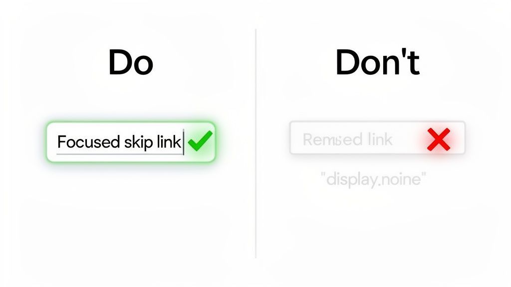
The number one mistake I see is hiding the skip link with display: none; or visibility: hidden;. It’s an intuitive CSS choice to make something disappear, but it also yanks the link right out of the browser's accessibility tree.
The result? Screen readers can't find it, and keyboard users can't tab to it. The feature is effectively gone for the exact people it was built to help.
How to fix it: The goal is to hide the link visually, not programmatically. The classic, bulletproof method is to position it way off-screen until it receives focus.
.skip-link { position: absolute; left: -9999px; width: 1px; height: 1px; overflow: hidden; } .skip-link:focus { /* Bring it into view when a user tabs to it */ left: 10px; width: auto; height: auto; } Another huge pitfall is thinking the HTML anchor link is enough. A simple <a href="#main-content"> will scroll the viewport down, which looks right, but it doesn't move the keyboard's focus.
This creates a horribly confusing experience. A user hits Enter on the skip link, the page jumps, but when they press Tab again, their focus snaps right back to the top of the page, probably to the second link in the navigation.
This is a showstopper bug. A skip link that doesn't manage focus fails at its one job. It creates a jarring "scroll and snap back" effect that's more frustrating than helpful.
How to fix it: You need some JavaScript. An event listener can intercept the click, prevent the default jump, and then programmatically set the browser's focus on the main content area. That produces a smooth transition for keyboard navigation.
Finally, it's common for developers to forget about the focus state entirely. This applies to both the skip link itself and the main content area it jumps to. If a sighted keyboard user tabs to the link and nothing appears, how would they know it's there?
The same goes for after they've used it. A clear visual indicator on the main content block confirms the jump was successful. A faint, low-contrast, or non-existent outline makes the whole interaction feel broken.
How to fix it: Make your :focus and :focus-visible styles impossible to miss. They need to be bold, clear, and meet WCAG contrast requirements. A thick, high-contrast outline is the standard for a reason—it provides unambiguous feedback and makes the feature trustworthy.
It means a keyboard-accessible link lets a user bypass repeated page elements—usually the header, navigation, promo bars, and search—and move directly to the page’s primary content region. The reason this pattern became standard is simple: repeated navigation blocks are a known accessibility problem addressed by WCAG 2.4.1 Bypass Blocks, and guidance on skip links consistently points to the first tab stop pattern as the practical fix.
“Skip to content” is usually shorthand for the same pattern. Some sites label the link “Skip to main content,” others use “Skip to content,” and some use “Skip to page content.” The exact wording matters less than clarity. Pick a label that matches the destination users will reach.
Usually because you pressed Tab and the site correctly revealed its first keyboard shortcut. The link is often visually hidden until it receives focus, so it can seem to appear out of nowhere. Sighted users also notice it when browser extensions, keyboard navigation, or scripted focus on page load place focus near the top of the page. If it appears, that is generally a sign the site is exposing a keyboard-accessible bypass as intended.
Use a link as the first focusable element, point it to a real target ID, and make the target focusable if you need to move focus there programmatically:
<a href="#main-content">Skip to main content</a> at the top of the body.<main id="main-content" tabindex="-1"> around the page’s primary content.display:none.Yes. Landmarks help screen reader users jump between regions, but they do not provide the same visible shortcut for sighted keyboard users. In audits, I treat landmarks and skip links as complementary, not interchangeable.
Usually a link. It changes the user’s location within the page, which is navigation behavior. Teams often call it a “skip link button” informally, but the semantic element should normally remain an anchor.
A skip link is one of the highest-impact, lowest-effort accessibility features you can add. Place it first, hide it until focused, manage focus correctly, wire it into your platform or framework, and test it with the keyboard. Do that, and you remove a daily barrier for keyboard and screen reader users while ticking off a core WCAG requirement.
Ready to make your entire site accessible and compliant? WebAbility.io offers a complete platform with automated scanning, real-time monitoring, and an AI-enhanced widget to help you meet WCAG standards effortlessly. Start your free trial at WebAbility.io and see the difference.