Your Guide to Using a Website Contrast Checker for WCAG Compliance

Sidharth Nayyar
TL;DR: Your Quick Path to Better Contrast
- What is a Website Contrast Checker? It's a tool that measures the color contrast between text and its background to ensure readability for everyone, especially users with visual impairments.
- Why It Matters for CRO: Good contrast isn't just about compliance; it directly boosts conversion rates. When users can easily read your content and see your call-to-action buttons, they are more likely to stay, engage, and convert. A clear, accessible site builds trust (E-E-A-T) and expands your audience.
- Key WCAG Ratios: For standard text, aim for a 4.5:1 ratio (Level AA). For large text, the minimum is 3:1.
- How to Use a Checker:
- Get the HEX codes for your text and background colors.
- Paste them into a tool like WebAbility.io's free contrast checker.
- Adjust your colors until you get a "Pass" for WCAG AA.
- Scale with Solutions: For ongoing compliance, automated tools and managed accessibility solutions provide continuous monitoring to catch issues sitewide, ensuring your website remains accessible and trustworthy.
At its core, a website contrast checker is a simple but powerful tool. It measures the difference in brightness between the text on your website and the background it sits on. This is crucial for making sure your content is readable for everyone, especially people with visual impairments like low vision or color blindness.
Using a checker isn't just a technical task; it's a fundamental part of building a high-quality, user-friendly, and legally compliant website.
Your Quick Guide to Website Contrast Checkers
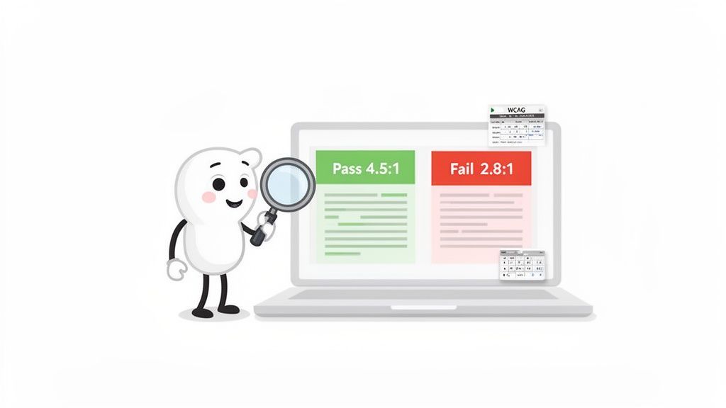
Think of a contrast checker as your digital readability expert. It helps you send a clear signal to both users and search engines that your site is built with genuine expertise and care. This directly ties into the principles of E-E-A-T (Experience, Expertise, Authoritativeness, and Trustworthiness), as an accessible site is inherently more trustworthy and provides a better experience.
Good contrast is much more than a subjective design choice—it's a cornerstone of web accessibility. The official standards, known as the Web Content Accessibility Guidelines (WCAG), set specific benchmarks called contrast ratios. If your site doesn't meet these minimums, it can become incredibly difficult, or even impossible, for millions of people to use.
WCAG 2.1 Contrast Ratio Requirements at a Glance
So, what exactly is a website contrast checker looking for? It's comparing your color choices against the official WCAG contrast ratios. These ratios are a mathematical way of expressing the difference in perceived brightness (luminance) between your foreground (like text) and background.
To pass, your colors need to meet specific thresholds. Here’s a quick breakdown of the minimums for the two main conformance levels, AA and AAA.
WCAG 2.1 Contrast Ratio Requirements at a Glance
| Conformance Level | Normal Text (<18pt or <14pt bold) | Large Text (≥18pt or ≥14pt bold) |
|---|---|---|
| AA (Minimum) | 4.5:1 | 3:1 |
| AAA (Enhanced) | 7:1 | 4.5:1 |
Hitting these numbers is the first major step toward creating a more inclusive website. When your colors pass these checks, you're not just ticking a compliance box; you're building a better experience that can lead to higher engagement and show every visitor that you value their ability to access your information.
If you want a seamless way to find and fix these issues, you can discover how WebAbility.io's accessibility solutions can elevate your website. Our tools are built to make the entire process simpler, helping you build a site that is both compliant and deeply trustworthy.
Why Good Color Contrast Matters for Everyone
Ever tried to read a sign through a thick fog? The information is technically there, but it’s so obscured that it’s frustrating and useless. For many people, that’s exactly what it feels like to browse a low-contrast website—a simple task turned into a real headache.
Good color contrast is the digital equivalent of that sign on a clear, sunny day. It makes sure your message gets across to the widest possible audience, no matter their visual ability. When you prioritize clarity, you’re sending a strong signal to every visitor that you care about their experience, which goes a long way in building Expertise, Authoritativeness, and Trustworthiness (E-E-A-T).
More Than Just a Box to Check
Sure, using a website contrast checker helps you stay on the right side of WCAG compliance, but the real benefits go way beyond that. Strong contrast has a direct impact on usability for every single person who lands on your site. Even someone with perfect vision will feel the eye strain after trying to read light gray text on a slightly-less-light gray background for too long.
Think about someone trying to look at your site on a phone while sitting in bright sunlight. High contrast keeps your content readable; low contrast makes it all but disappear. That simple design decision can be the difference between someone sticking around and someone leaving in frustration.
Strong color contrast isn't just an accessibility requirement. It's a core design principle that improves readability, reduces mental effort, and creates a better experience for everyone, in every situation.
When you make your text clear and easy to read, you’re creating a more comfortable and effective experience. People can find what they’re looking for faster, understand your message with less effort, and will probably stick around longer. It’s a direct line to better business metrics.
The Business Case for Better Contrast
A more usable website is almost always a more profitable one. It’s simple: when people can actually read your product descriptions, see your menu options, and spot your call-to-action buttons, they are much more likely to convert. In fact, a 2023 report found that 73% of people with disabilities will just leave a site if it's too hard to use. That's a huge audience to lose.
Here’s a quick look at how strong contrast helps your bottom line:
- Better Engagement: When content is easy to read, users stay on the page longer. This lowers bounce rates and gives them more time to connect with your brand.
- Higher Conversion Rates: If your "Buy Now" or "Sign Up" button blends into the background, it might as well not be there. High-contrast CTAs get clicked more often, plain and simple.
- A Wider Audience: Roughly 1 in 12 men and 1 in 200 women have some form of color vision deficiency. Good contrast makes your site usable for them, not to mention the millions of older adults with age-related vision changes.
Good color contrast isn't a niche concern; it's a critical part of effective user experience optimization, making your site work better for everyone who visits.
Building Trust Through Inclusive Design
At the end of the day, your color choices say something about your brand. They can either say, "We built this for everyone," or they can accidentally say, "We only designed this for a select few." An accessible design shows empathy and tells every potential customer that you value them, which is a powerful way to build trust.
When a user with low vision can easily use your site, you’ve earned their confidence. This is where tools from WebAbility.io can make a huge difference, helping you check, fix, and maintain high standards across your entire site. That commitment turns accessibility from a chore into a genuine strategic advantage, creating loyalty and strengthening your reputation.
Understanding WCAG Contrast Ratios
When you first see the numbers from a website contrast checker, they might look a little technical. But the core idea is actually quite simple. A contrast ratio is just a score measuring the difference in brightness—what’s technically called relative luminance—between two colors, like your text and its background.
Think of it this way: the higher the number, the bigger the difference, and the easier it is for people to read your content. These numbers aren't random, either. They come from years of research into how people see and read on screens. The Web Content Accessibility Guidelines (WCAG) use these ratios to set clear, global standards for what makes a design accessible. Getting familiar with them is the first step toward creating a genuinely better experience for everyone.
Good color contrast does more than just make your site readable; it builds trust, attracts users, and shows you care about quality.
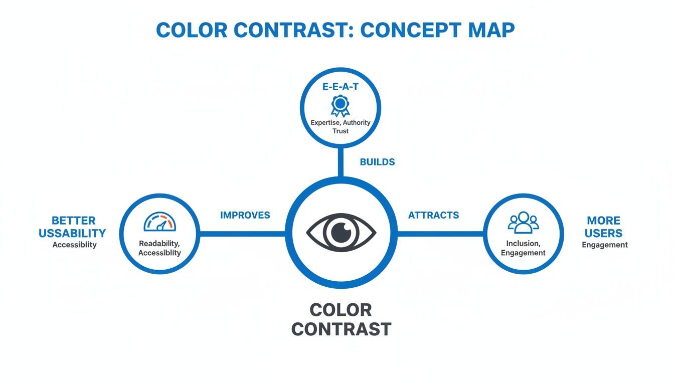
As you can see, making smart color choices kicks off a positive feedback loop that strengthens your entire website.
The Two Main WCAG Levels: AA and AAA
For color contrast, the two most important benchmarks you'll hear about are from WCAG 2.1: Level AA and Level AAA. You can think of Level AA as the essential, widely accepted standard, while Level AAA is the gold standard for enhanced accessibility.
Here’s how they break down:
WCAG 1.4.3 Contrast (Minimum) - Level AA: This is the one most sites need to meet. It requires a contrast ratio of at least 4.5:1 for normal text and 3:1 for large text (which is defined as 18pt/24px or larger, or 14pt/19px if bold).
WCAG 1.4.6 Contrast (Enhanced) - Level AAA: This is a much stricter level that provides a superior reading experience, especially for users with vision loss. It calls for a ratio of 7:1 for normal text and 4.5:1 for large text.
Meeting the Level AA standard is a huge win for inclusivity. While hitting Level AAA everywhere on a site can be tough, it’s a fantastic goal for your main body text and other critical content to ensure it's as readable as possible.
Seeing the Ratios in Action
So what do these numbers look like in a real design? Let’s take an example.
Imagine you have light gray text (#757575) on a plain white background (#FFFFFF). A contrast checker would show a ratio of 4.6:1. This squeaks by the AA standard for normal text but fails AAA. Someone might be able to read it, but it could cause eye strain over time.
Now, let's swap that for a dark gray text (#333333) on the same white background. The ratio shoots up to 12.6:1. This easily passes both AA and AAA levels, creating a much clearer and more comfortable reading experience for a far wider range of people. Using a good website contrast checker lets you spot these differences instantly.
To dive deeper into putting these principles into practice, you can check out our detailed guide on choosing accessible color palettes.
Alright, let's move from theory to practice. Knowing why contrast matters is one thing, but actually finding and fixing issues on your site is where you’ll see the real impact. Let's walk through how to use a website contrast checker—it’s far simpler than you might think.
Think of a contrast checker as a simple, honest friend. You show it two colors—your text and its background—and it tells you straight up if they're a good match. It takes all the guesswork out of designing for accessibility.
Step 1: Pick Your Colors
First things first, you need to identify the two colors you want to test. On the web, every color has a specific code, most often a HEX code that looks something like #FFFFFF (for pure white) or #000000 (for pure black). You'll need the HEX codes for both your foreground (text) and background colors.
Not sure where to find them? You have a few easy options:
- Check your brand guide: Most established brand style guides list the official color palette with their exact HEX codes. This is always the best place to start.
- Use your browser's developer tools: This is a trick developers use all the time. Right-click on any element on your site and choose "Inspect." In the panel that appears, look for the "Styles" tab, where you’ll find the
colorandbackground-colorcodes. - Grab a color picker extension: Tools like ColorZilla are lifesavers. These browser extensions add a little eyedropper tool that lets you click anywhere on a page to instantly copy its HEX code.
Once you have your two codes, you're ready for the next step.
Step 2: Run the Check and Read the Results
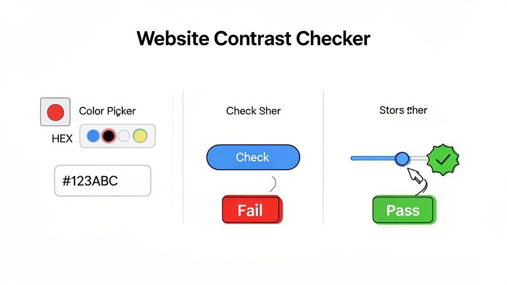
With your HEX codes ready, the actual check is a breeze. Most tools, like the free one we offer at WebAbility.io, just have two simple input fields: one for the foreground color and another for the background. All you have to do is paste your codes into the correct boxes.
The tool does the rest, instantly calculating the contrast ratio and showing you the results. You'll see right away if your combination passes or fails the WCAG AA and AAA standards for both normal and large text.
Here's a look at what you can expect from the WebAbility.io free contrast checker.
In this example, the light blue text on a white background is a clear failure across the board. The feedback is immediate and visual, leaving no doubt about which color combos just aren't working.
Step 3: Adjust and Retest Until You Pass
So, what happens if your colors fail the check? This is where a great website contrast checker really shines. Instead of just pointing out a problem, it becomes your design assistant.
The goal isn't just to find failures, but to fix them efficiently. A great contrast checker lets you make real-time adjustments, turning a failed test into a successful design choice in seconds.
Most tools include interactive color pickers or sliders. If your light gray text on a white background fails, you can simply use the slider to make the gray darker. The contrast ratio and the pass/fail indicators update in real-time as you make adjustments. Keep tweaking until you see that satisfying "Pass" for the WCAG AA level. The tool will then give you the new, compliant HEX code to use in your website's code.
Don't Forget to Check More Than Just Text
It's easy to focus on body text, but good contrast is crucial for a lot more than just your paragraphs. Many other parts of your interface need to be clearly visible for everyone to use your site effectively.
Remember to test these often-overlooked elements:
- Icons: Any icon that conveys meaning, like a shopping cart or a search magnifying glass, needs a 3:1 contrast ratio against its background.
- Form Field Borders: The outlines of your input fields, dropdown menus, and text boxes also need a 3:1 ratio. If users can't see where to type, the form is useless.
- Button Boundaries: While the text on a button needs to meet text contrast rules, the button itself should also have a 3:1 contrast against the page background so people can tell it's a clickable element.
By taking the time to test these components, you're not just ticking a compliance box—you're creating an interface that is genuinely easier and more pleasant for everyone to use. You can get started right now with our free WCAG contrast checker and begin improving your site immediately.
Scaling Accessibility with Automated Solutions
Manually checking contrast ratios on your site is a great first step. Honestly, it’s essential for getting a feel for where your design stands. But if you’re managing a website with a steady stream of new pages, blog posts, and marketing updates, that spot-checking approach just doesn't scale.
It’s a bit like trying to keep a large garden weed-free by pulling weeds one at a time. You might clear one section, but by the time you're done, new ones have already popped up behind you. To really stay on top of accessibility, you need a system that can watch the entire garden at once.
Beyond Manual Spot-Checks
Relying only on one-off manual checks creates gaps. A new landing page goes live, the marketing team updates a banner, or a new product is added—each change can introduce color combinations that fail accessibility standards. Without a system in place, these new elements can easily go unnoticed, creating real barriers for users and exposing your organization to risk.
This is where automated platforms like WebAbility.io come into play. They continuously scan your entire site for contrast failures and other accessibility problems, giving you a full, ongoing overview.
Automation transforms accessibility from a never-ending cycle of reactive fixes into a proactive, manageable process. It’s the only practical way to maintain sitewide compliance and deliver a consistently good experience for everyone.
Shifting to an automated approach isn't just about saving time; it's about building a reliable foundation. You’re essentially creating a safety net that catches accessibility issues before they can affect your users or damage your brand's reputation.
The Power of Continuous Monitoring
The real value of an automated tool is its ability to give you a complete, up-to-the-minute picture of your website’s accessibility health. Instead of guessing whether a new feature meets WCAG standards, you get clear reports and alerts that tell you exactly what’s broken and where.
This proactive approach is becoming non-negotiable. The market for digital accessibility software is projected to grow at a compound annual growth rate (CAGR) of 6.31% from 2025 to 2033. This growth shows a clear global shift: businesses now recognize that accessibility is not just a compliance checkbox but a core part of building a successful and reputable brand.
Tools like WebAbility.io take this a step further by empowering your team and your site visitors:
- Accessibility Monitoring Dashboard: This gives you a central hub to see your site's overall compliance. You can track your accessibility score, identify recurring problems, and even assign remediation tasks directly to your team.
- High-Contrast Widget Modes: The WebAbility.io widget lets users take control of their own experience. With a click, they can switch the site to a high-contrast, dark, or monochrome theme that best suits their visual needs.
- AI-Enhanced Scanning: Smart technology works 24/7 to find a wide range of issues beyond just contrast, including missing alt text, keyboard navigation traps, and more.
When you pair automated scanning with user-empowering tools, you build a much stronger accessibility practice. For a closer look at how this works, you can learn more about implementing automated accessibility testing tools.
This strategy saves countless hours of manual work and provides the concrete data you need to make smart decisions. It also gives you the reports and audit trail to prove your commitment to inclusion, building the expertise and trustworthiness that both users and search engines reward.
Common Questions About Website Contrast Checkers
Once you start digging into contrast ratios and WCAG guidelines, a few practical questions almost always pop up. It's one thing to understand the theory, but another to put it into practice on a real website. Let's walk through some of the most common questions I hear from designers and developers.
How Do I Find a Color's HEX Code?
The quickest way is already built right into your web browser. Simply right-click on the text or background you want to check, choose "Inspect," and look at the CSS rules in the "Styles" panel. You'll see the color and background-color properties with their HEX codes, ready to be copied into a website contrast checker.
If you need to do this often, a browser extension like ColorZilla is a lifesaver. It adds a little eyedropper tool to your browser, letting you click anywhere on a webpage to instantly grab a color's HEX code.
Do Images with Text Need to Be Checked?
Yes, absolutely. If you have text baked into an image—like in a promotional banner, an infographic, or a chart—it still needs to meet the same WCAG contrast requirements as regular text.
The rule of thumb is simple: if the text is there to be read, it has to be readable for everyone. Accessibility standards don't care if it's live text or part of a JPG.
You can use a color picker tool (like the ones mentioned above) to get the HEX code for the text and the specific part of the image directly behind it. Pop those two codes into your contrast checker to see if you get a passing grade.
Can Accessibility Be Fully Automated?
Automation is a powerful and essential component of modern accessibility. Automated tools, like the monitoring platform from WebAbility.io, are fantastic for scanning your entire site and catching thousands of technical issues at scale. They provide continuous monitoring and serve as your first line of defense.
However, a truly comprehensive accessibility strategy often integrates technology with human expertise. Automated tools excel at spotting technical errors, while managed services and expert-led manual testing can address nuanced user experience issues, like logical navigation flow for screen readers. The best approach combines the strengths of automation for broad coverage with the insight of human experience for depth, ensuring your site is both technically compliant and genuinely usable.
Ready to build a more accessible and trustworthy website? WebAbility.io provides an end-to-end platform to help you achieve and maintain compliance while improving the experience for every visitor. Discover how our automated tools and expert support can transform your accessibility efforts today.
Quick Questions
Tap to ask AI about this article