web accessibility best practices: 10 tips for inclusivity

Sidharth Nayyar
TL;DR: The Essentials of Web Accessibility
To create an inclusive website, focus on these core principles: use semantic HTML for structure, provide descriptive alt text for images, ensure full keyboard navigation, meet color contrast standards, and build accessible forms with clear labels. These practices not only serve users with disabilities but also improve the overall user experience and SEO.
Creating a digitally inclusive environment is no longer a niche consideration; it's a fundamental aspect of modern web development and a powerful business strategy. An accessible website not only opens your doors to the estimated 1.3 billion people worldwide living with a significant disability-a market with a disposable income of $13 trillion-but it also improves the user experience for everyone. Think of a parent multitasking with one hand, a user in bright sunlight struggling to see their screen, or someone with a temporary injury who relies on keyboard navigation.
This guide moves beyond theory to provide a comprehensive roundup of web accessibility best practices. Each section is designed to give your team clear, actionable guidance with practical implementation details and real-world examples. You will learn how to build websites that are not just compliant, but genuinely usable and welcoming to all. We will break down each practice into digestible steps, helping you integrate these principles directly into your development workflow.
1. Semantic HTML Markup
TL;DR: Using HTML elements like <header>, <nav>, and <main> instead of generic <div> tags creates a meaningful structure that screen readers and other assistive technologies can easily interpret. This foundational practice is one of the most impactful web accessibility best practices for building an understandable and navigable user experience for everyone.
Semantic HTML involves using elements that describe their meaning and purpose to both the browser and the developer. Instead of relying on a sea of non-descriptive <div> tags, semantic markup provides a clear, logical structure. This allows assistive technologies, like screen readers, to understand the layout of a page, identify key landmarks, and help users navigate content efficiently. For example, a screen reader can announce "main navigation" when it encounters a <nav> element, giving users immediate context.
Why It's a Best Practice
A well-structured document is the bedrock of web accessibility. When you use elements like <article> for a blog post or <footer> for site information, you're building a "map" of your content. This map enables users of assistive tech to skip directly to the main content, find navigation links, or understand the relationship between different sections without having to parse through every single line of code. It's a crucial step that also benefits SEO, as search engines use this structure to better understand and rank your content.
Actionable Implementation Tips
To effectively implement semantic HTML, follow these clear guidelines:
Structure with Landmarks: Wrap your primary page sections in landmark elements. Use
<header>for introductory content,<nav>for main navigation blocks,<main>for the core content of the page, and<footer>for the site footer.Organize Content Logically: Use
<article>for self-contained, distributable content like news stories or forum posts. Use<section>to group thematically related content within a larger piece.Maintain Heading Hierarchy: Always start your page with a single
<h1>and follow a logical order (<h2>,<h3>, etc.) without skipping levels. This creates a navigable outline for screen reader users.Use Elements for Their Purpose: Choose
<button>for actions and<a>for navigation. While they can be styled to look similar, their underlying semantic purpose is distinct and vital for accessibility.
Leading websites like Gov.uk use semantic elements to structure complex legal documents, making them more navigable for all citizens. Similarly, news outlets like The Guardian use <article> and <section> tags to clearly delineate stories and content blocks. You can find out more by exploring this comprehensive guide to Semantic HTML.
2. Alternative Text for Images (Alt Text)
TL;DR: Providing descriptive alternative (alt) text for images allows screen readers to convey the image's content and context to visually impaired users. This simple yet powerful practice is essential for an inclusive experience and ensures no one misses out on important visual information.
Alt text is a written description of an image that is read aloud by screen readers. It serves as a crucial replacement when an image cannot be seen, either due to a user's visual impairment, a slow connection, or an error that prevents the image from loading. Good alt text accurately describes the image's purpose and content, providing equivalent information to sighted users. This ensures that all users, regardless of ability, can understand the full context of the page.
Why It's a Best Practice
Without alt text, images are invisible barriers to users of assistive technology. Screen readers might announce a generic file name like "IMG_5042.jpg" or simply say "image," leaving the user with no understanding of its significance. Implementing descriptive alt text is one of the most fundamental web accessibility best practices. It also positively impacts search engine optimization, as it helps search crawlers understand image content, aligning with many on-page SEO best practices that improve how content is indexed and understood.
Actionable Implementation Tips
To write effective alt text, concentrate on conveying meaning clearly and concisely:
Be Descriptive but Brief: Aim for under 125 characters. Describe what is happening in the image, including any important details, objects, or people.
Handle Decorative Images Correctly: If an image is purely for decoration and adds no informational value, use an empty alt attribute (
alt=""). This tells screen readers to ignore it, preventing unnecessary clutter.Avoid Redundancy: Don't start with phrases like "image of" or "picture of." Screen readers already announce that it is an image, so this is redundant.
Transcribe Text in Images: If an image contains important text, the alt text should include that exact text to ensure the information is accessible.
Summarize Complex Images: For charts or infographics, provide a concise summary of the key data point or conclusion in the alt text. Place a more detailed description in the surrounding text.
Leading platforms like Twitter have integrated features that prompt users to add alt text, while sites like the CDC provide detailed descriptions for complex health infographics. These examples show a commitment to ensuring visual information is accessible to everyone.
3. Keyboard Navigation Support
TL;DR: Ensuring every interactive element on your site, like links, buttons, and form fields, can be accessed and operated using only a keyboard is essential. This practice supports users with motor disabilities, screen reader users, and power users who navigate without a mouse, making it a cornerstone of functional web accessibility best practices.
Keyboard navigation support means that a user can move through a webpage, interact with its content, and access all its functionality using keys like Tab, Shift+Tab, Enter, Space, and arrow keys. Many users cannot operate a mouse due to motor impairments or are blind and rely on keyboard commands to use their screen readers. Without robust keyboard support, these users are effectively locked out of your website.
Why It's a Best Practice
Accessible keyboard navigation is a non-negotiable requirement for a usable website. It ensures that individuals who cannot use a mouse can still complete critical tasks like filling out a form, navigating a menu, or making a purchase. A logical and predictable tab order that follows the visual layout of the page creates an intuitive experience. Furthermore, a highly visible focus indicator shows users exactly where they are on the page, preventing confusion and frustration. This fundamental practice benefits everyone, not just users with disabilities.
Actionable Implementation Tips
To implement effective keyboard navigation support, focus on these actionable steps:
Ensure Visible Focus: Create a highly visible and high-contrast style for focused elements (e.g., a prominent outline) so users always know their current position on the page. Never remove outlines with
outline: none;in CSS without providing a better alternative.Establish a Logical Order: The tab order of interactive elements must follow the visual flow of the page from left-to-right and top-to-bottom. This is typically handled by default with well-structured HTML.
Make Custom Components Focusable: For custom interactive elements created with
<div>or<span>, addtabindex="0"to include them in the natural tab order. Avoid using positive tabindex values, as they disrupt the expected flow.Implement "Skip" Links: Add a "Skip to Main Content" link as the first focusable item on the page. This allows keyboard users to bypass repetitive navigation headers and jump directly to the primary content area.
Manage Focus in Modals: When a modal window or dialog opens, programmatically move the keyboard focus to an element inside it. When it closes, return the focus to the element that originally triggered it.
Leading platforms like GitHub and Google Workspace are excellent examples of complex applications with comprehensive keyboard support. They allow users to navigate repositories, edit documents, and manage emails efficiently, often providing documented shortcuts to enhance productivity. For more guidance, explore this WebAIM article on keyboard accessibility.
4. Color Contrast Requirements
TL;DR: Ensuring text and UI elements have sufficient color contrast against their backgrounds is essential for readability, especially for users with low vision or color blindness. Following WCAG-recommended ratios makes content legible for a wider audience and is a cornerstone of accessible design.
Color contrast is the difference in brightness between two colors, typically foreground text and its background. For content to be readable, this difference must be significant enough to be perceived by people with visual impairments, including color blindness and low vision. Adhering to established contrast ratios is one of the most critical web accessibility best practices, as it directly impacts a user's ability to read and interact with your content.

Why It's a Best Practice
Low contrast designs can render a website unusable for millions of people. Text that is faint or blends into the background is difficult to read for everyone, but it can be an insurmountable barrier for users with visual disabilities. By meeting Web Content Accessibility Guidelines (WCAG) contrast requirements, you ensure your content is clear and legible in various environments, such as on low-quality screens or in bright sunlight. This practice improves the overall user experience and demonstrates a commitment to inclusive design.
Actionable Implementation Tips
To guarantee your site meets color contrast standards, integrate these steps into your design and development workflow:
Meet WCAG Ratios: Aim for a contrast ratio of at least 4.5:1 for normal text and 3:1 for large text (18pt or 14pt bold). For enhanced accessibility (AAA), the ratios are 7:1 and 4.5:1, respectively.
Use Verification Tools: Regularly use tools like the WebAIM Contrast Checker or browser developer tools to verify your color combinations meet the required ratios.
Check Interactive States: Ensure that
:hover,:focus, and:activestates for links and buttons also maintain sufficient contrast. Don't forget disabled elements, which should also be legible.Don't Rely on Color Alone: Never use color as the only means of conveying information, such as indicating an error in a form field. Combine it with an icon, text, or another visual cue.
Companies like GitHub masterfully implement this by offering high-contrast light and dark modes that have been rigorously tested. Likewise, Apple's iOS interface is a benchmark for meeting AAA standards, ensuring text is readable across all its native applications. To deepen your understanding, you can explore this guide on color contrast for accessibility.
5. Form Accessibility with Labels and Error Messages
TL;DR: Associating <label> elements with their form inputs and providing clear, descriptive error messages are essential for users of assistive technologies. These practices ensure everyone can understand what information is required, navigate the form efficiently, and correct mistakes without confusion.
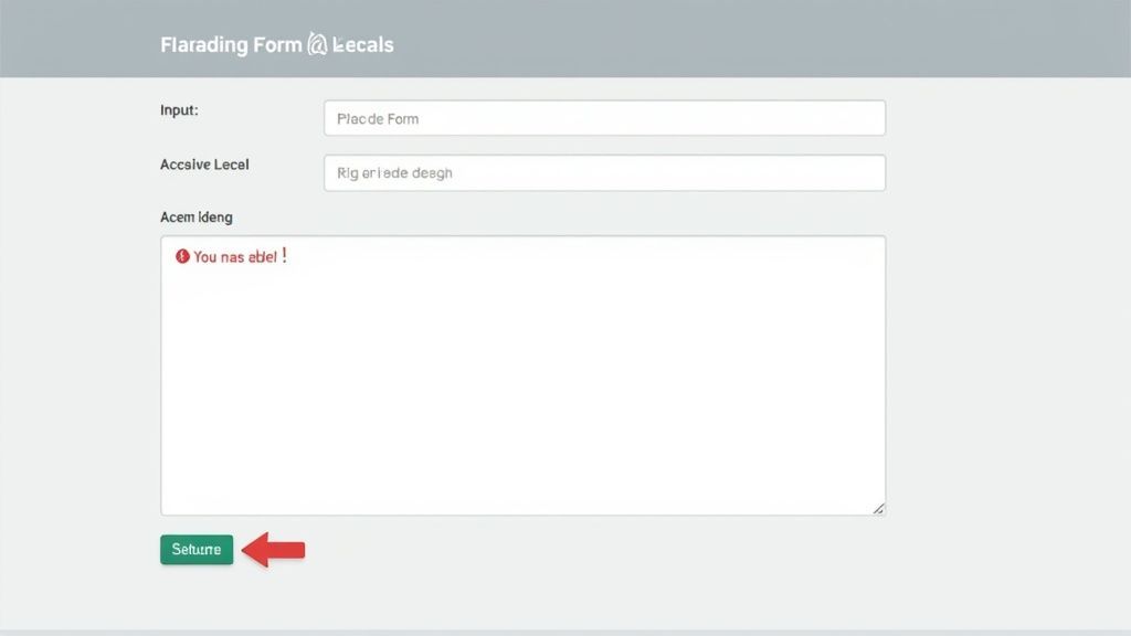
Accessible forms are critical for user interaction, from simple contact forms to complex checkout processes. The core principle is ensuring a clear, programmatic connection between a form field and its description. This is achieved by explicitly linking a <label> to an <input> using the for and id attributes. This connection allows screen readers to announce the label when the user focuses on the input, providing necessary context that placeholder text alone cannot offer.
Why It's a Best Practice
An inaccessible form is a dead end for many users. Without proper labels, individuals using screen readers may not know what data to enter into a field. Vague or poorly communicated error messages can cause frustration and lead to abandonment. Implementing accessible forms is one of the most vital web accessibility best practices because it directly impacts a user's ability to complete key tasks like registering, making a purchase, or contacting support. This not only improves usability for everyone but also expands your potential user base and reduces legal risk.
Actionable Implementation Tips
To build accessible and user-friendly forms, integrate these clear guidelines:
Link Labels and Inputs: Always use a
<label>with aforattribute that matches theidof its corresponding<input>. This creates a robust connection for assistive technologies.Provide Clear Instructions: Place labels visibly above or to the side of their inputs. Clearly mark required fields, either with an asterisk and instructional text or by adding
aria-required="true".Deliver Specific Error Messages: When an error occurs, the message should be specific, like "Email address must include an '@' symbol." Programmatically associate this error message with the input using the
aria-describedbyattribute.Group Related Fields: Use
<fieldset>to group related controls (like a set of radio buttons for a shipping method) and a<legend>to describe the group. This provides context for the entire set of options.
Leading platforms like Typeform and Google Forms excel at this by ensuring every input field is paired with a clear, visible label. E-commerce giants like PayPal also provide excellent examples of accessible checkout forms with explicit field requirements and helpful error handling, ensuring a smoother transaction process for all users. You can learn more from the foundational form accessibility guidelines by WebAIM.
6. Focus Management and Visible Focus Indicators
TL;DR: Clearly highlighting the interactive element a keyboard user is currently on (the "focus") and managing where that focus moves are critical for navigation. Never remove the default browser focus outline without providing a more visible, high-contrast alternative.
Effective focus management is a cornerstone of web accessibility best practices, ensuring that users who rely on keyboards or other input devices can navigate a website with confidence. It involves two key parts: providing a visible focus indicator so users always know where they are, and programmatically managing focus when the interface changes dynamically, such as when a modal dialog opens. Without this, keyboard navigation becomes a confusing guessing game.
Why It's a Best Practice
For users who cannot use a mouse, the focus indicator is their cursor. It’s the only visual cue showing which link, button, or form field will be activated if they press Enter or Space. Removing this indicator (a common but misguided aesthetic choice) makes the site unusable for them. Similarly, when a modal window appears, focus must be moved into it; otherwise, the user is trapped, tabbing through the hidden content behind the overlay. Proper focus management creates a logical and predictable user flow.
Actionable Implementation Tips
To ensure your site has robust focus handling, implement these essential techniques:
Never Remove Outlines: Do not use
outline: none;oroutline: 0;on focusable elements without providing a custom, highly visible alternative. A good custom style could beoutline: 3px solid #005fcc;.Enhance Visibility: Use the
:focus-visiblepseudo-class to show focus indicators for keyboard users without affecting mouse users. Ensure the indicator has a contrast ratio of at least 3:1 against the background.Manage Modal Focus: When a modal or dialog opens, programmatically move focus to the first interactive element inside it. When it closes, return focus to the element that originally triggered it (e.g., the "Open" button).
Announce Dynamic Changes: Use
aria-liveregions to inform screen reader users about content that changes without a page reload, preventing them from missing important updates or error messages.Test Thoroughly: Navigate your entire site using only the keyboard. Use Tab to move forward, Shift+Tab to move backward, and arrow keys for components like radio buttons. Ensure the focus is always visible and moves in a logical order.
Leading design systems like Microsoft's Fluent Design incorporate prominent and consistent focus indicators across all components. You can explore this topic further in this detailed guide on focus indicators.
7. ARIA Labels and Descriptive Attributes
TL;DR: Use ARIA (Accessible Rich Internet Applications) attributes to add necessary context for assistive technologies when standard HTML isn't enough. ARIA enhances the accessibility of dynamic content and complex UI components, like custom menus or live notifications, making them understandable to all users.
ARIA is a set of attributes you can add to HTML elements to make web content and applications more accessible. It works by providing extra information to the accessibility tree, which assistive technologies like screen readers use to interpret a page's structure and state. When you have a complex, interactive component, such as a custom-built date picker or a dynamic "add to cart" notification, ARIA bridges the gap where native HTML semantics fall short, ensuring these interactions are clearly communicated.
Why It's a Best Practice
While semantic HTML is the foundation, modern web applications often contain custom components that have no native HTML equivalent. ARIA is a crucial web accessibility best practice because it allows developers to define roles, states, and properties for these components. For example, aria-expanded="true" tells a screen reader user that a collapsible section is open, while aria-label="Close" provides a descriptive name for an icon-only button. Without ARIA, these custom elements would be confusing or entirely invisible to users of assistive tech.
Actionable Implementation Tips
To implement ARIA effectively, remember its first rule: no ARIA is better than bad ARIA. Use it as a supplement, not a replacement, for semantic HTML.
Prioritize Native HTML: Before reaching for ARIA, always check if a native HTML element already provides the needed semantics. For instance, use a
<button>element instead of a<div>withrole="button".Label Interactive Controls: Provide accessible names for controls that lack visible text. Use
aria-labelfor icon-only buttons (e.g.,<button aria-label="Settings">⚙️</button>).Communicate Dynamic Changes: Use
aria-live="polite"to announce non-urgent updates, like a "search results updated" message. Reservearia-live="assertive"for critical alerts that require immediate user attention.Describe Component States: Clearly indicate the state of interactive elements. Use
aria-expandedfor accordions and menus,aria-pressedfor toggle buttons, andaria-hidden="true"to hide purely decorative elements from screen readers.Test with Screen Readers: Always test your implementation with tools like NVDA, JAWS, or VoiceOver to ensure ARIA attributes are providing the intended experience for users.
8. Responsive and Mobile Accessibility
TL;DR: Ensuring your website functions correctly and remains accessible across various devices, from desktops to smartphones, is crucial. This involves implementing responsive design principles like adequate touch target sizes, supporting zoom functionality, and ensuring usability in both portrait and landscape orientations. This practice is a cornerstone of modern web accessibility best practices, as a huge portion of web traffic is mobile.
Responsive and mobile accessibility means designing and developing websites that provide an equivalent and usable experience for everyone, regardless of the device or screen size they use. With mobile browsing often surpassing desktop usage, it's vital that accessibility considerations extend to touchscreens, small viewports, and varied input methods. This includes not just how a site looks, but how it functions for users with motor impairments, low vision, or those relying on mobile-specific assistive technologies like VoiceOver or TalkBack.
Why It's a Best Practice
An inaccessible mobile experience can completely block users from completing essential tasks. For users with motor disabilities, small, tightly-packed buttons can be impossible to use accurately. For those with low vision, disabling the ability to zoom in on content can render a site unusable. By focusing on mobile accessibility, you ensure that your digital content is reachable by the widest possible audience, improving user satisfaction and preventing the exclusion of a significant user base. This approach supports WCAG principles like operability and understandability in a mobile context.
Actionable Implementation Tips
To ensure your website is accessible on mobile devices, follow these guidelines:
Enlarge Touch Targets: Ensure all interactive elements like buttons and links have a minimum touch target size of 48x48 CSS pixels to accommodate users with limited motor precision. Maintain adequate spacing between targets.
Never Block Zoom: Do not use
user-scalable=noin your viewport meta tag. Users with low vision rely on the pinch-to-zoom gesture to magnify content, and disabling it is a major accessibility barrier.Allow Content Resizing: Text should be resizable up to 200% without breaking the layout or requiring horizontal scrolling to read a line of text.
Support All Orientations: Your site's content and functionality must be available and usable in both portrait and landscape orientations without loss of information.
Test on Real Devices: While browser emulation is useful, always test your site on actual mobile devices with built-in accessibility features like VoiceOver (iOS) and TalkBack (Android) turned on.
Institutions like the BBC excel at this, with mobile sites featuring large, well-spaced touch targets. Likewise, major financial apps often include voice control and other alternative input methods, demonstrating a strong commitment to mobile accessibility. You can learn more by exploring Google's Material Design accessibility guidelines.
9. Page Structure and Landmark Navigation
TL;DR: Using landmark elements like <header>, <nav>, <main>, and <footer> creates a digital "map" of your webpage. This map allows users of assistive technologies to understand the page layout and jump directly to key sections, making navigation efficient and intuitive.
Just as a building has a lobby, hallways, and main rooms, a webpage needs a clear and logical structure. Landmark navigation provides this structure by using specific HTML5 elements to define the purpose of different regions on a page. When a screen reader encounters a <main> tag, for instance, it can announce "main content," allowing a user to skip introductory banners and navigation links. This is one of the most fundamental web accessibility best practices for creating a usable experience.
Why It's a Best Practice
A well-defined page structure is essential for users who cannot visually scan a page to quickly understand its layout. Without landmarks, a screen reader user has to listen to every single element in order, which is a slow and frustrating process. By implementing landmark roles, you provide a high-level overview of the page, enabling users to move between the header, main content, and footer with single keystrokes. This drastically improves navigational efficiency and overall user experience.
Actionable Implementation Tips
To create a clear and navigable page structure, follow these specific guidelines:
Define Core Landmarks: Wrap your primary page sections in the appropriate elements. Use
<header>for introductory content,<nav>for primary navigation,<main>for the core page content, and<footer>for site-wide information.Use
<aside>for Tangential Content: Place supplementary content, like related links or advertisements, inside an<aside>element to signify it's separate from the main flow.Label Multiple Navigation Regions: If you have more than one navigation block (e.g., main and secondary), differentiate them with an
aria-label. For example:<nav aria-label="Main navigation">and<nav aria-label="Secondary navigation">.Provide a "Skip to Content" Link: Implement a "skip link" as the first focusable element on the page. This allows keyboard and screen reader users to bypass repetitive navigation and jump directly to the
<main>content area.
Leading sites like The New York Times and Mozilla's developer documentation use robust landmark structures to help users navigate complex articles and technical information efficiently. Government websites, which are required to be highly accessible, also rely heavily on these landmarks to ensure all citizens can access their content.
10. Text Readability and Legibility Optimization
TL;DR: Designing text for maximum readability by optimizing font size, line spacing, and font choice is a critical web accessibility best practice. Clear, legible text supports users with low vision, dyslexia, and cognitive disabilities, ensuring your content is accessible to the widest possible audience.
Text is the primary way information is conveyed online, and its presentation directly impacts how easily users can understand it. Readability and legibility optimization involves making conscious design choices about typography to create a comfortable reading experience. This includes selecting appropriate fonts, managing sizing and spacing, and ensuring text formatting enhances rather than hinders comprehension. For users with visual impairments or reading disabilities like dyslexia, these considerations are not just helpful, they are essential for accessing content.
Why It's a Best practice
Illegible text creates an immediate barrier, excluding a significant portion of users. When text is too small, lines are too long, or spacing is too tight, it forces users to strain, which can cause fatigue and frustration. For those using screen magnifiers, poorly spaced text can become a jumbled mess when zoomed in. By prioritizing clear typography, you create an inclusive experience that benefits everyone, improving engagement and ensuring your message is effectively communicated. This practice aligns directly with WCAG success criteria related to visual presentation and is a cornerstone of user-centered design.
Actionable Implementation Tips
To effectively optimize your text for readability, implement these specific guidelines:
Establish a Baseline FontSize: Use a minimum of 16px for body text. This provides a readable foundation for most users on standard desktop screens.
Implement Generous Line Spacing: Set the
line-heightproperty to at least 1.5 (or 150%) of the font size. This prevents lines from visually merging and helps users track their place.Control Line Length: Keep lines of text between 50-75 characters long. This optimal range prevents eye strain from both overly long and excessively short lines.
Choose Legible Fonts: Prioritize simple, clear sans-serif fonts like Arial, Helvetica, or Verdana for body copy, as they often render more clearly on screens.
Avoid "All Caps": Text set in all capital letters is significantly harder to read, especially for users with dyslexia, as it removes the distinct shapes of letters.
Ensure Sufficient White Space: Use adequate margins and padding around text blocks to reduce cognitive load and improve focus on the content itself.
Leading platforms like Medium have built their reputation on providing an exceptional reading experience through optimized typography. Similarly, Apple's Human Interface Guidelines provide detailed recommendations for text sizing and legibility across devices. For more font-specific guidance, you can explore the accessibility notes within the Google Fonts library.
Top 10 Web Accessibility Best Practices Comparison
| Item | Implementation complexity | Resource requirements | Expected outcomes | Ideal use cases | Key advantages |
|---|---|---|---|---|---|
| Semantic HTML Markup | Low–Medium — knowledge and refactor effort | Minimal — developer time, refactoring for legacy | Improved screen reader navigation, clearer document structure, SEO gains | Content sites, articles, documentation, new builds | Native semantic meaning; broad browser support; no extra scripts |
| Alternative Text for Images (Alt Text) | Low — content writing task | Low — authoring time, editorial review | Screen reader access to images, fallback when images fail, SEO help | Any site with images, e-commerce, news, infographics | Essential for non-visual users; improves discoverability |
| Keyboard Navigation Support | Medium–High — tab order and custom components | Moderate — dev effort, QA with assistive tech | Full keyboard operability, better usability and efficiency | Web apps, SPAs, interactive interfaces, dashboards | Critical for motor-impaired and power users; improves usability |
| Color Contrast Requirements | Low — design adjustments and testing | Low — design time, contrast tools | Better readability, WCAG compliance, fewer access barriers | Text-heavy sites, UI components, brand palettes | Improves legibility for low-vision users; easy to test |
| Form Accessibility with Labels and Error Messages | Medium — markup and validation logic | Moderate — dev, UX, and testing time | Fewer errors, higher completion rates, a clear field purpose | Checkout flows, registration, data-entry forms | Clear guidance for users; better screen reader support |
| Focus Management and Visible Focus Indicators | Low–Medium — CSS + focus handling | Low — styling and some scripting, testing | Visible focus state, predictable keyboard navigation | Modals, custom widgets, complex forms, interactive UIs | Essential for keyboard users; implementable with CSS |
| ARIA Labels and Descriptive Attributes | Medium–High — requires ARIA expertise | Moderate — developer knowledge, screen reader testing | Semantic support for complex widgets, announced dynamic updates | Custom controls, dynamic content, rich widgets | Bridges gaps where HTML is insufficient; announces changes |
| Responsive and Mobile Accessibility | Medium — responsive layouts and touch targets | Moderate — design/dev, device testing | Accessible mobile UX, proper touch targets, zoom support | Mobile-first sites, apps, public services | Expands mobile reach; improves touch and dexterity access |
| Page Structure and Landmark Navigation | Low — semantic regions and headings | Minimal — IA planning and markup | Faster navigation for assistive tech, consistent site structure | Large sites, documentation, news portals | Enables rapid navigation; improves SEO and indexing |
| Text Readability and Legibility Optimization | Low — typography and spacing choices | Low — design adjustments, possible web fonts | Higher comprehension, easier reading for diverse users | Articles, long-form content, educational material | Helps low-vision and dyslexic users; increases engagement |
Making Accessibility an Ongoing Practice, Not a Project
The journey toward a truly inclusive digital experience doesn't end with a one-time audit or a single project sprint. As we've explored, implementing web accessibility best practices is a continuous commitment woven into the very fabric of the design and development lifecycle. It’s about building empathy and foresight into every line of code and every design choice.
From structuring your content with semantic HTML to ensuring all users can navigate with a keyboard, these practices are not isolated fixes. They are interconnected principles that create a robust, resilient, and user-friendly web for everyone. Providing meaningful alt text for images, managing focus states, and implementing clear form labels aren't just about compliance; they are hallmarks of a high-quality, professional website that respects its entire audience. When you prioritize readable text, sufficient color contrast, and logical page landmarks, you are not just meeting a standard, you are enhancing the user experience for all visitors, including those on mobile devices or those with temporary or situational limitations.
From Principles to Sustainable Practice
Adopting these web accessibility best practices transforms your approach from reactive problem-solving to proactive, inclusive design. The goal is to move beyond a checklist mentality and cultivate a culture where accessibility is considered from the very beginning. This shift ensures that every new feature, content update, and design refresh builds upon a strong, accessible foundation rather than creating new barriers.
The true value emerges when these concepts become second nature to your team.
Developers start thinking in terms of semantic structure and ARIA roles automatically.
Designers build color palettes and typography systems with WCAG contrast ratios in mind from day one.
Content creators write descriptive alt text as a standard part of their publishing workflow.
This cultural integration is the key to scaling your accessibility efforts and avoiding the costly, time-consuming remediation cycles that plague many organizations. It turns a daunting legal and ethical obligation into a powerful competitive advantage, fostering brand loyalty and expanding your market reach. The most effective web accessibility best practices are those that are consistently applied, monitored, and refined over time.
Empowering Your Team with the Right Tools
Maintaining this level of vigilance and consistency across a growing digital landscape can be challenging. Manually auditing every component, testing every user flow, and keeping up with evolving standards requires significant resources. This is where a comprehensive accessibility platform becomes an indispensable ally, transforming an ongoing, complex process into a streamlined and manageable workflow.
Instead of treating accessibility as a series of disparate tasks, a centralized solution helps unify your efforts. It provides the monitoring, reporting, and remediation tools needed to integrate these best practices directly into your existing processes. By leveraging automation and expert guidance, you empower your team to build inclusively and efficiently, ensuring that accessibility becomes a sustainable part of your operations, not an afterthought. This approach allows you to focus on innovation, confident that your digital properties remain welcoming and usable for all.
Ready to turn these best practices into a seamless, sustainable part of your workflow? WebAbility.io provides an all-in-one platform with an AI-enhanced widget and centralized dashboard to help you achieve and maintain compliance effortlessly. Discover how our solution can empower your team by exploring our features at WebAbility.io.
Quick Questions
Tap to ask AI about this article